With clean and neutral lines, Ana Mirats Studio creates a custom logo for Vezavena, a brand specialized in knitwear.
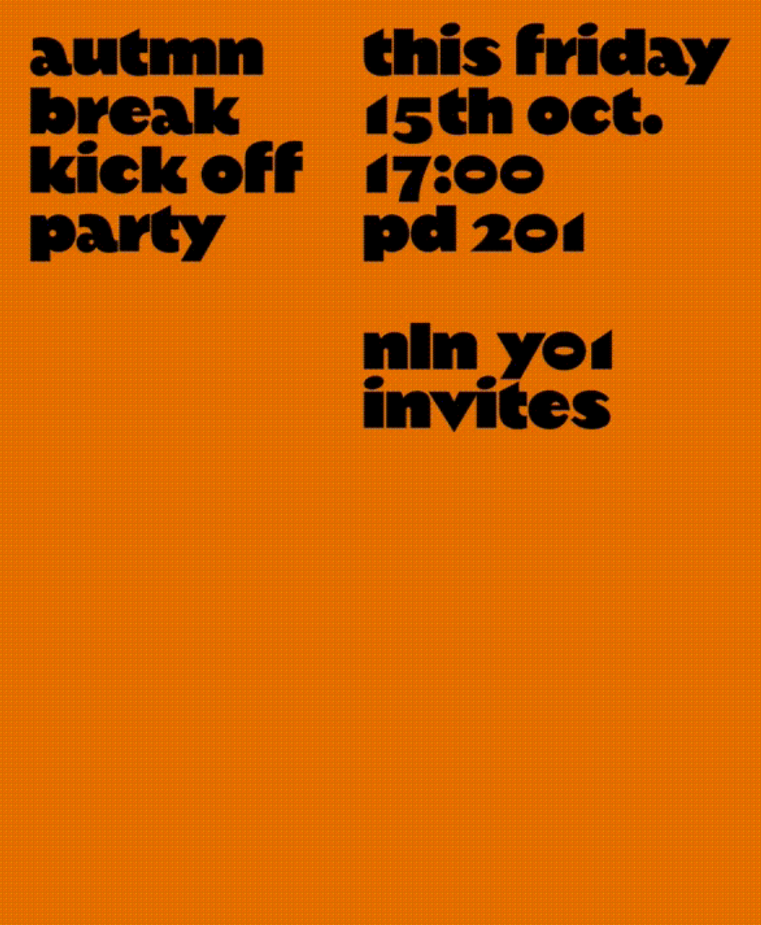
An autumn break party of students at KABK, using Margiel in their posters, a geometrical display font by Warsaw Types.
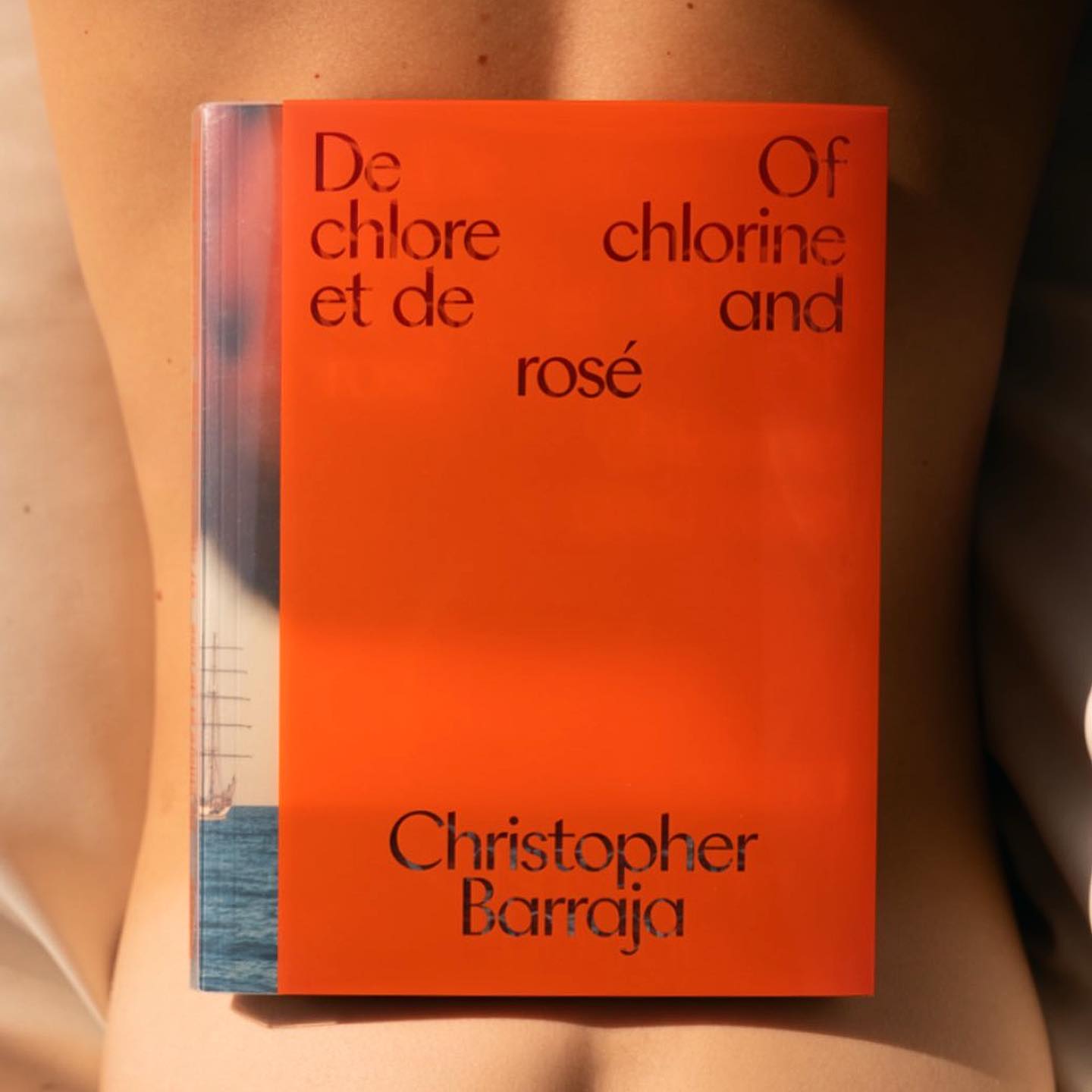
The humanist and geometric font Centra nº1 by Sharp Type in the full-service production, art buying & casting services company Yours.
With a playful and minimalist approach, Friss Kombucha utilizes Herbus Bold to set itself apart from competitors.
A winning combination of fonts from ABC Dinamo, Walter Neue and Simon Mono for Satisfy Running x Oakley.
Geometric and heavy, Skrappa appears as a contrast in the visual identity of Arts Broadcasting Studio at Anteism.
Sylvan Lanz designed a custom variable font, for soccer Swiss team FC Basel, based on the typographic heritage of the city.
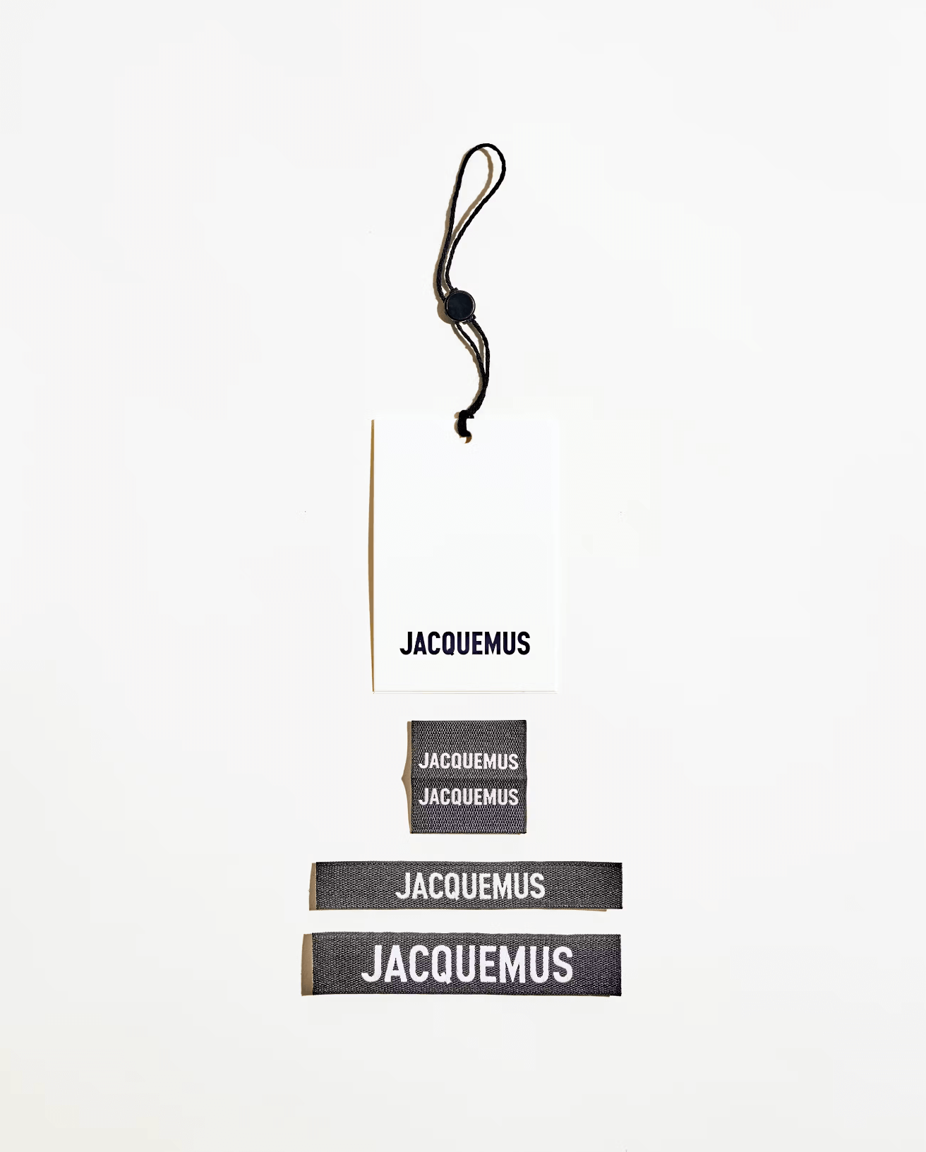
Guillaume Sbalchiero designed a warm sans serif typeface, as well as the global identity for Jacquemus.
Square or rounded? Maybe both. Apparat is a typeface with an interesting interplay between its shapes and counters, inspired by the fonts of 1970s television.