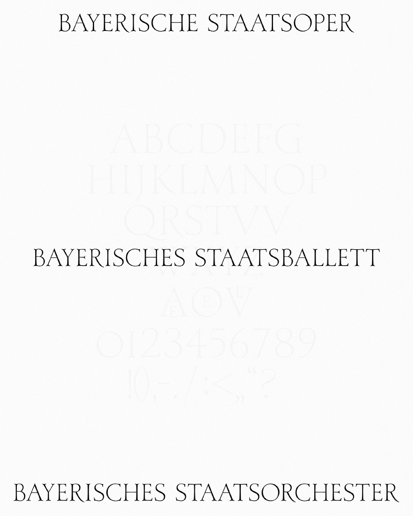
As part of the visual identity that Bureau Borsche created for the Bavarian State Opera, a digitized typeface —developed by Samara Keller— was created, based on a design found in the opera’s facilities.
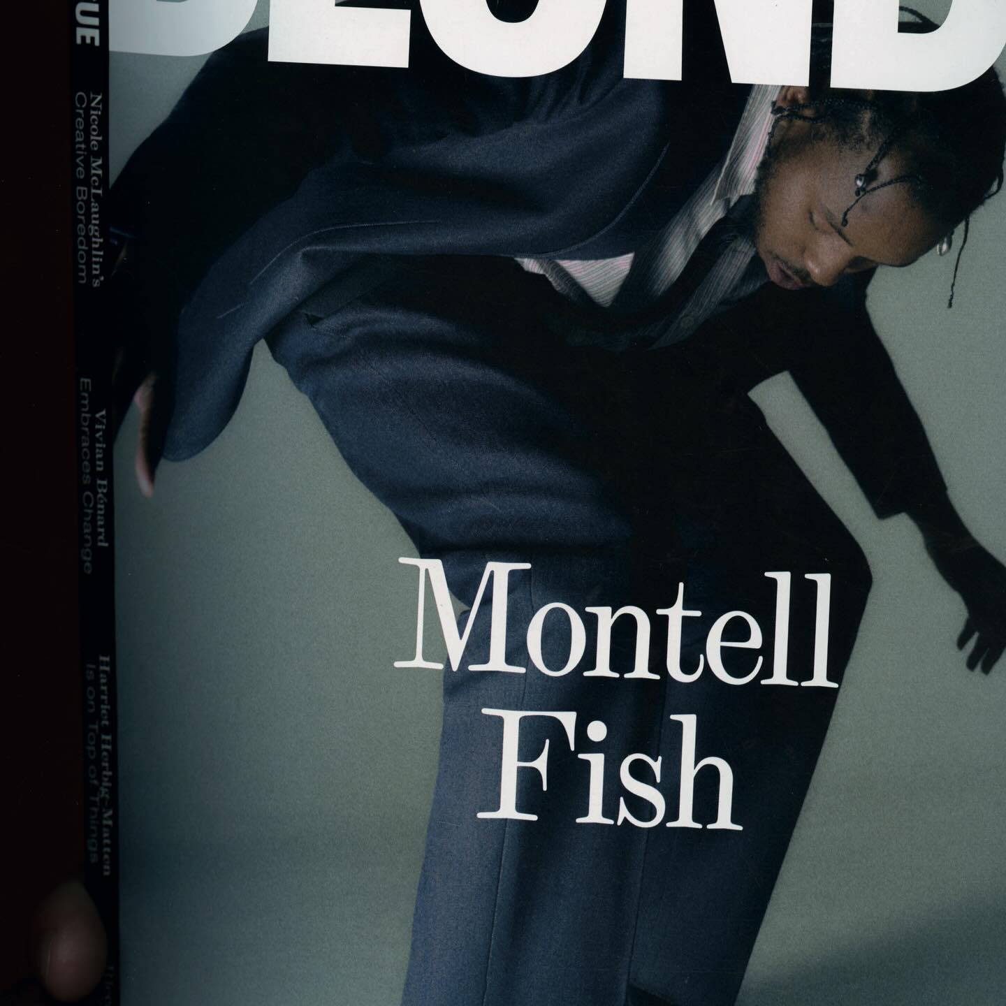
The type selection for Blonde Magazine’s redesign, managed by Hei Agenda, includes Contrast Foundry on the logo, Counter Forms for the serif (Eyla), and sans fonts by Lucas Liccini & Elias Hanzer (HAL Four Grotesk)
As fun as family movie nights, Moore by Eliott Grunewald was used in this list of films curated by A24 and approved by kids and adults alike. Designed by Jordi Ng and Elana Schlenker.
Justin Sloane used this interesting mix of Gothic letters (Castilla by Sharptype) and sans serif (Octave by Josh Finklea) for a vinyl cover.
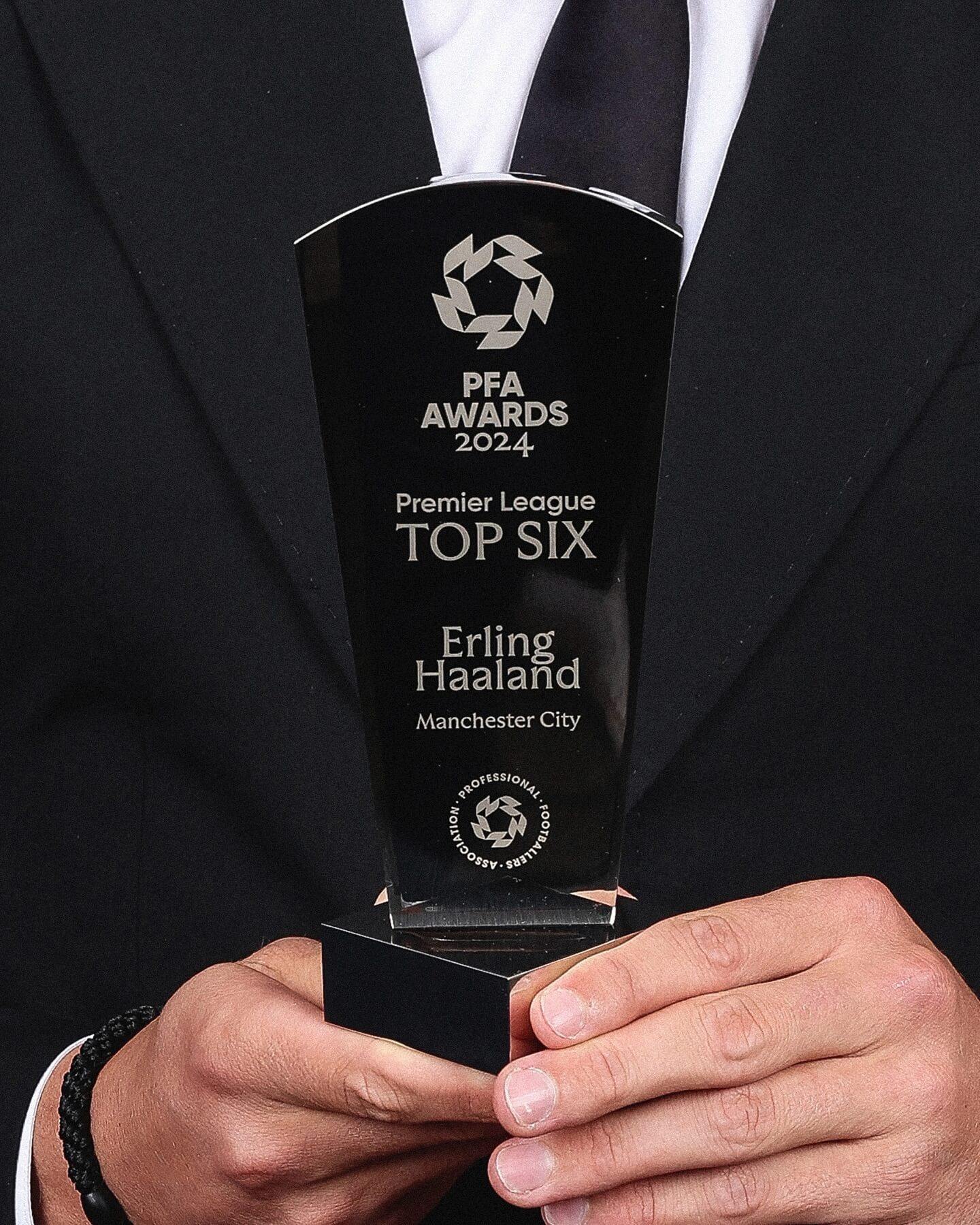
Realm by Approximate Type being used in this annual award ceremony for the best player of the year in the English league.
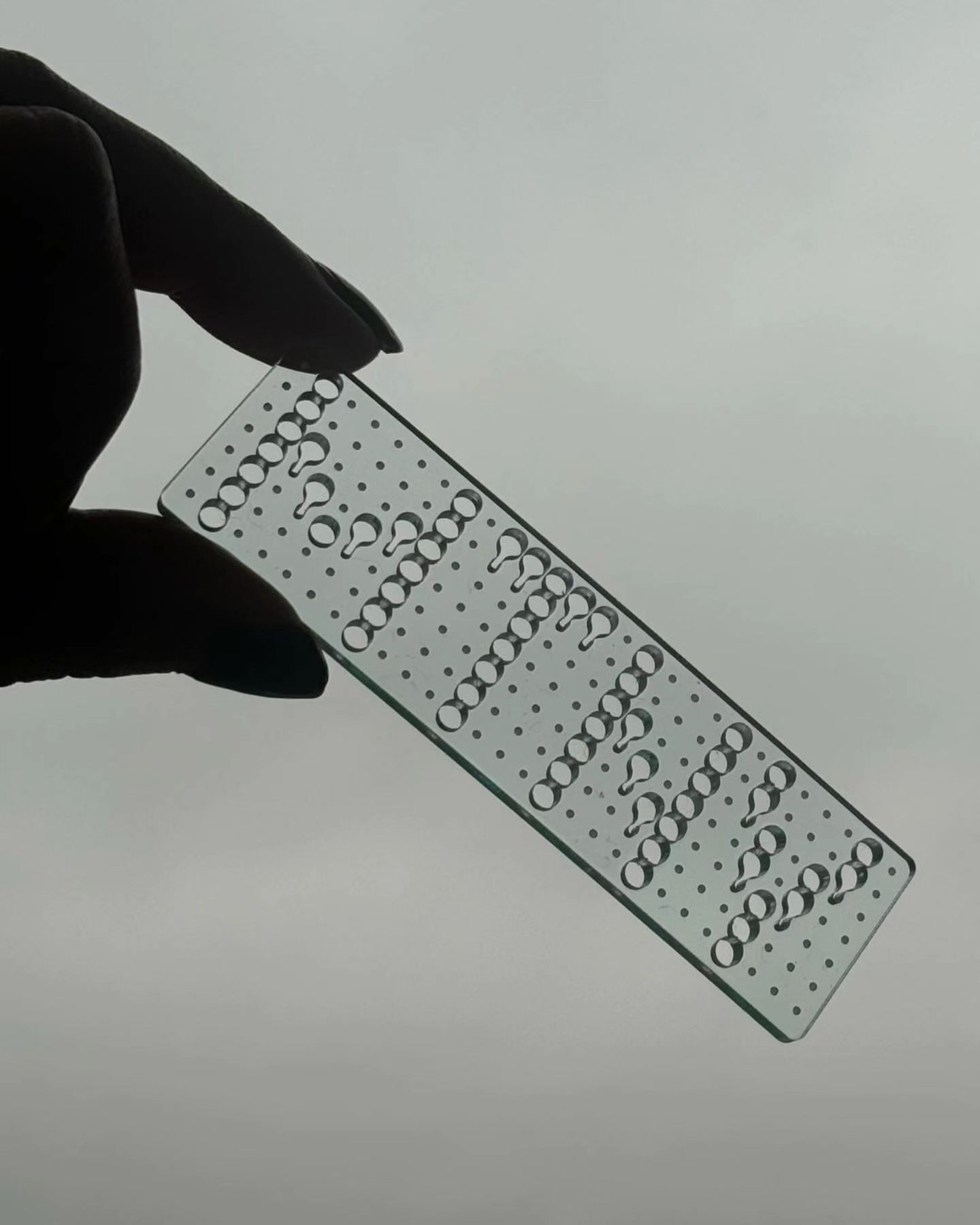
This series of keychains, the result of Pauline Esguerra’s exploration with laser cutting, uses, among other typefaces, Eurocat by Maxitype.
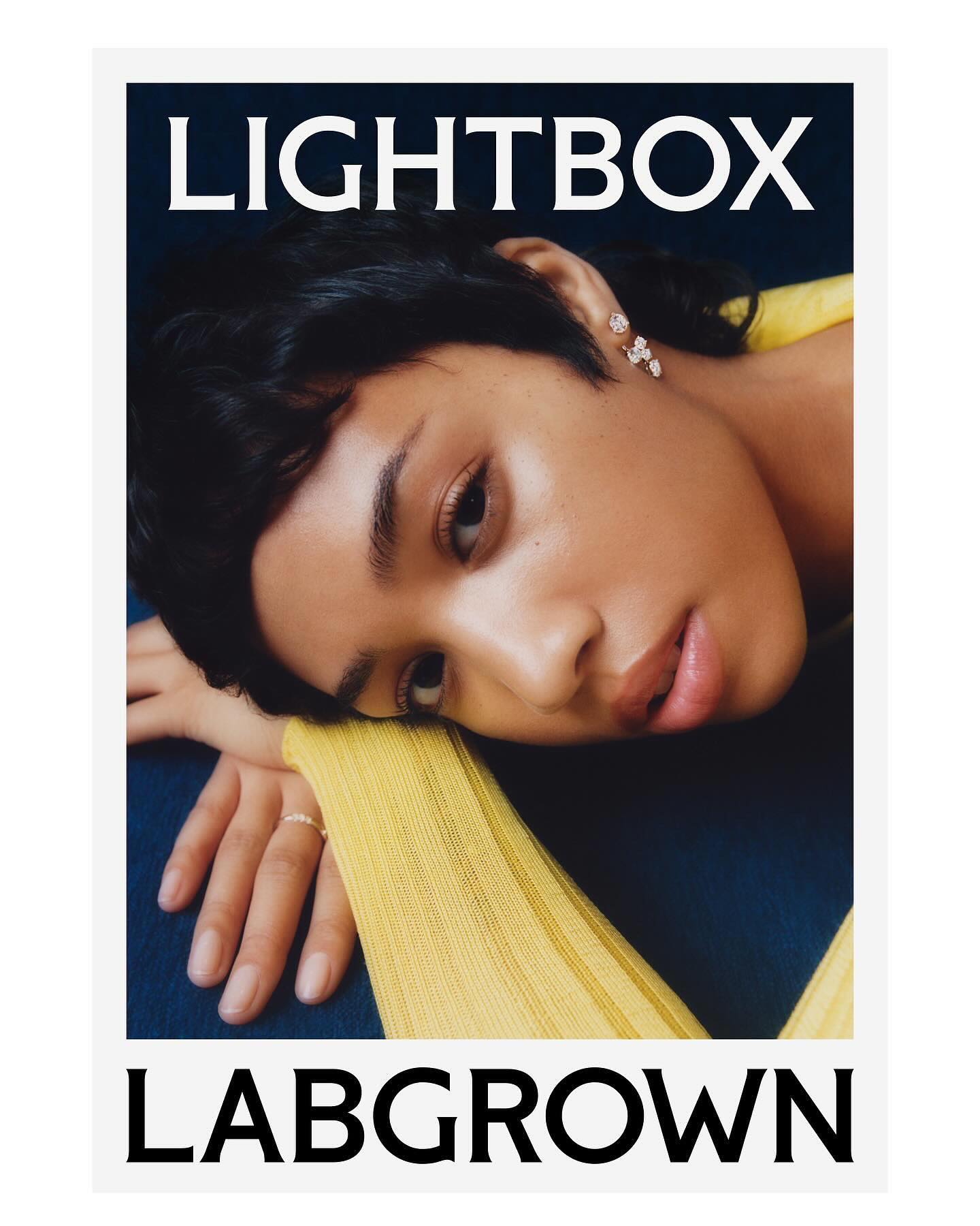
Decade created this visual identity to position an innovative lab-grown diamond brand, proposing a custom flare logo designed by Colophon Foundry.
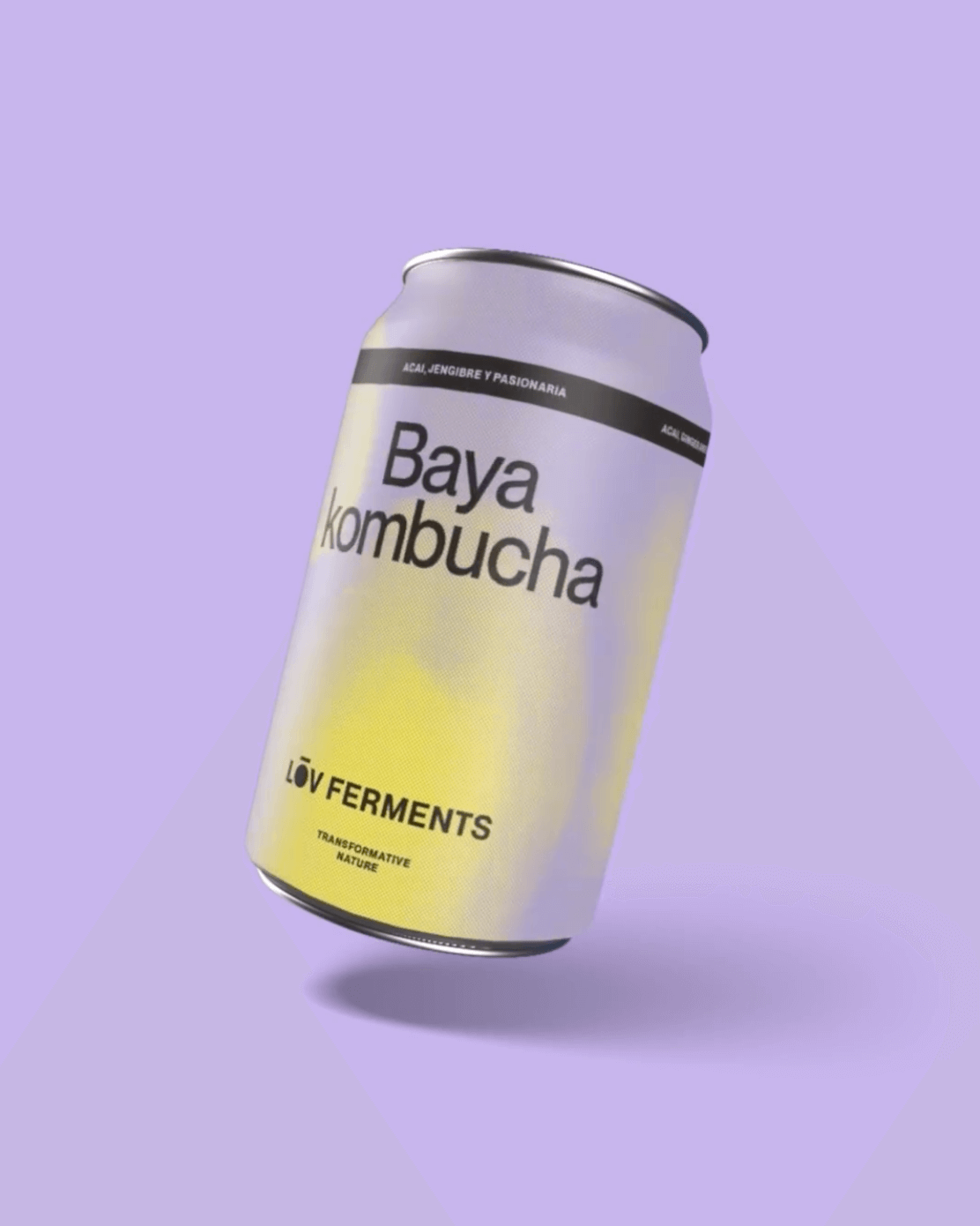
Casa Bien used Neue Montreal by Pangram Pangram and Items by Schick Toikka to build the visual identity for LOV Ferments, a brand set to change the beverage market.
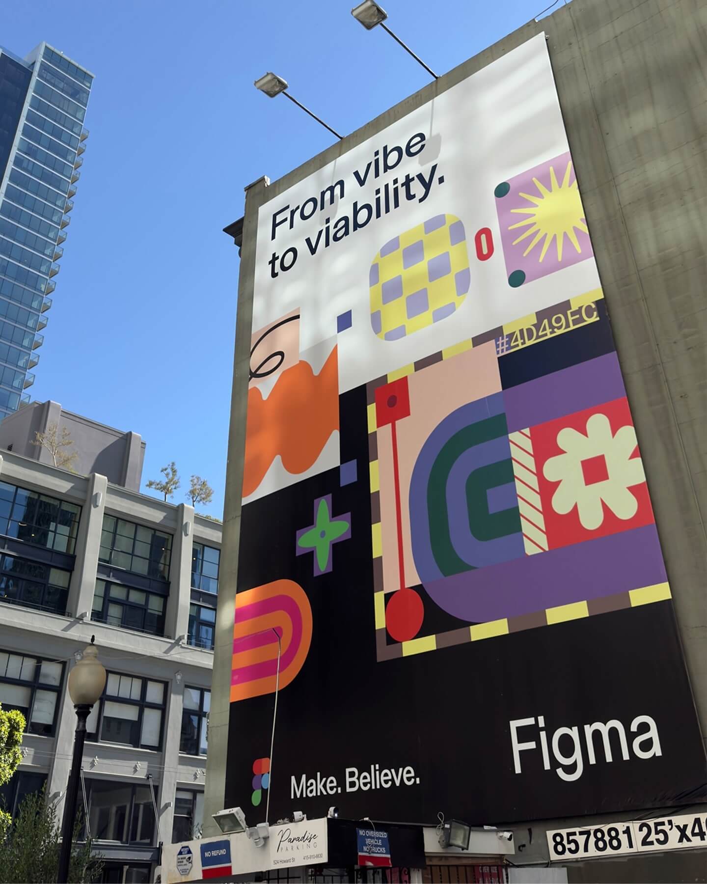
Grilli Type took on this ambitious project and proposed Figma Sans; a typeface with personality but practical, focused on efficiency, and free of unnecessary embellishments.
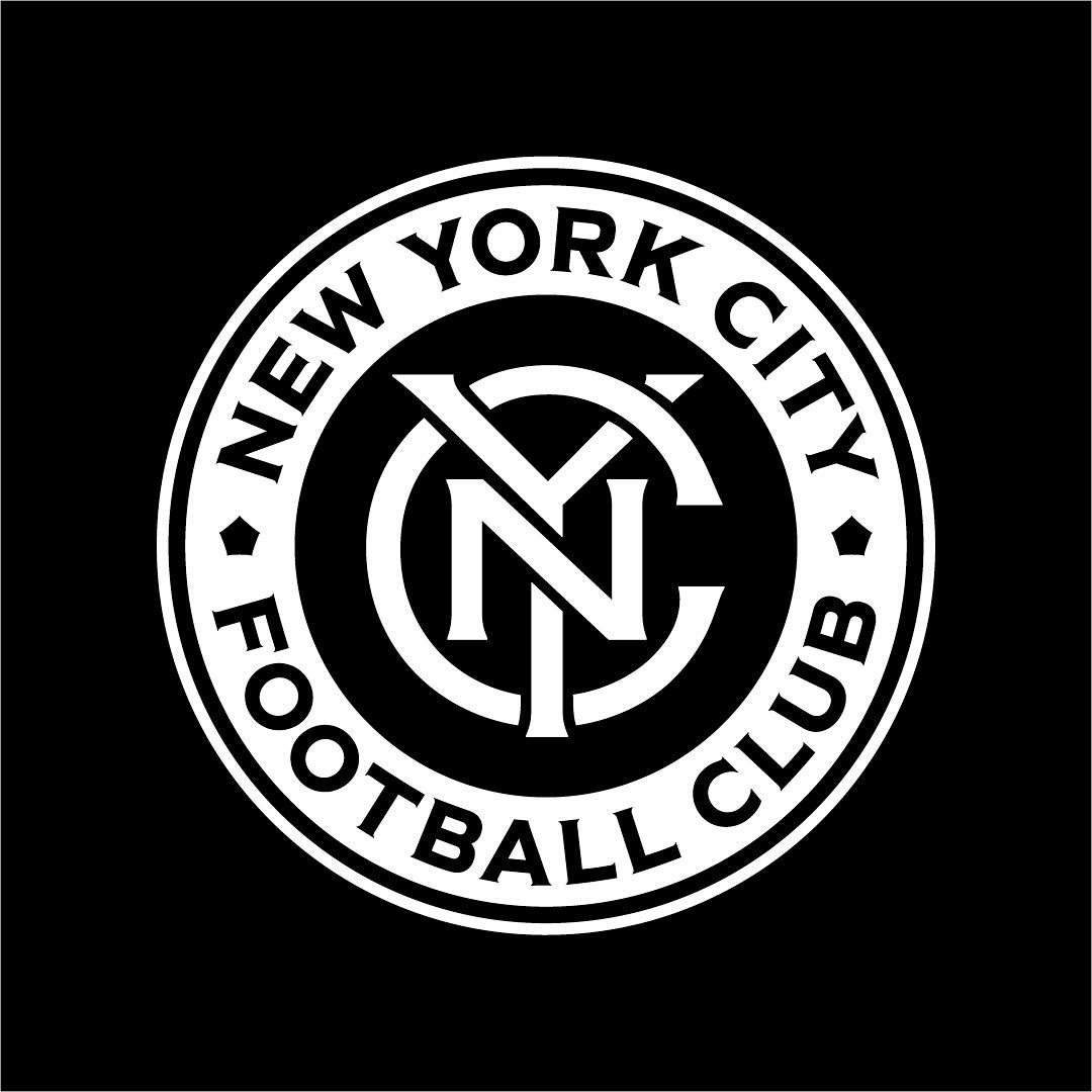
Frere-Jones was tasked with redesigning the New York City Football Club badge, and carefully adjusting each character to fit the circular arc of the badge.