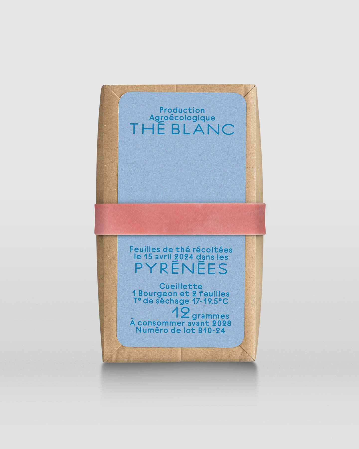
In a comprehensive project including handwriting, drawing, packaging conception, and global branding, Quentin gave @the.pyrenees an organic and approachable identity.
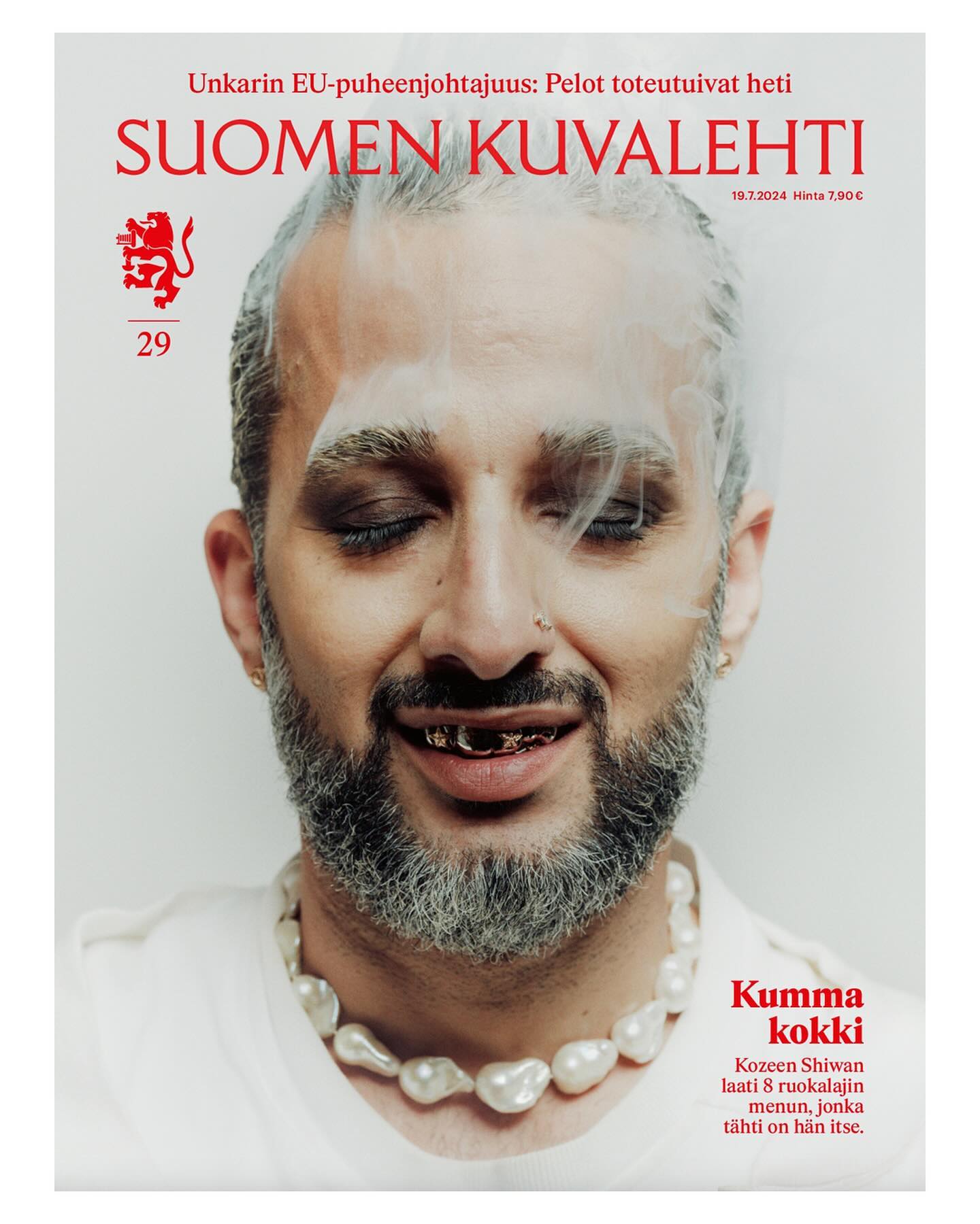
This historic Finnish newspaper refreshed its image with a new logo, using a custom typeface created by Schick Toikka, drawing inspiration from the newspaper’s earlier logos from the 1920s to 1940s.
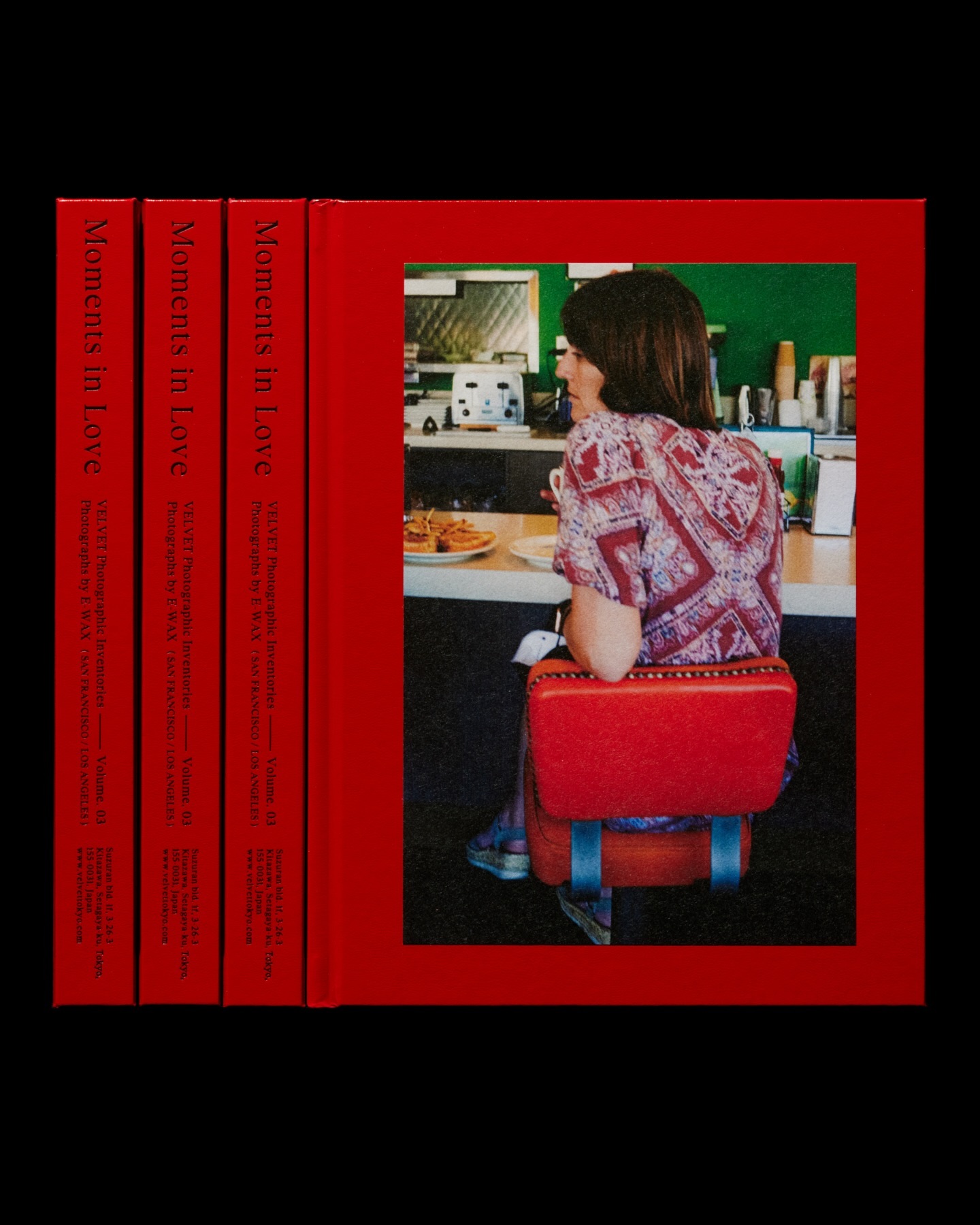
Moments in Love narrates a new way of portraying fashion, blending it with photos of passersby. Designed by the studio Siun, using FT Bureau.
A studio and shop at the same time, or a shop that also functions as a studio; Polar Ltda brings together various design professionals to offer a fresh creative approach.
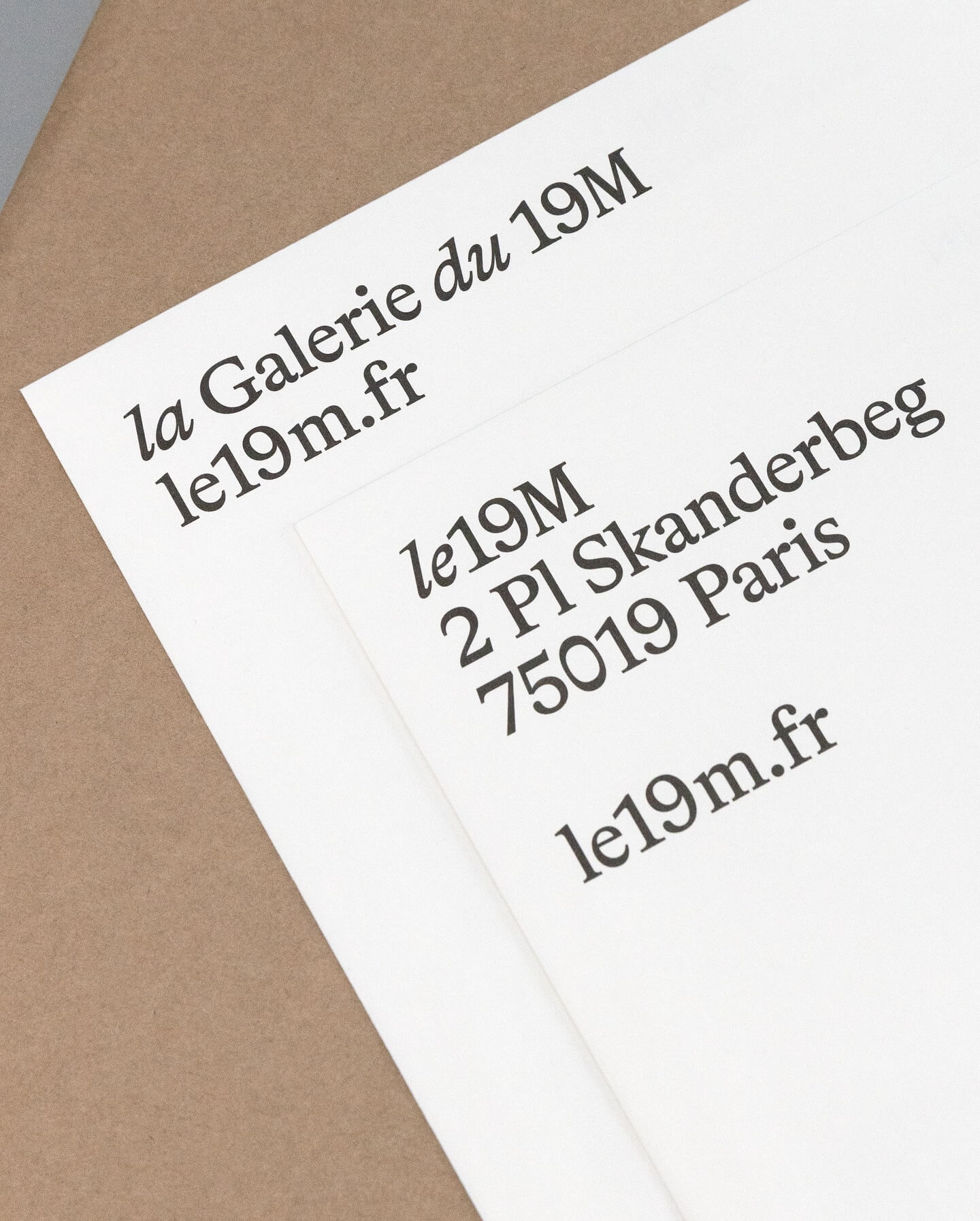
Hort Berlin used this serif typeface with classic and elegant forms (Bradford) for the visual identity they designed for the cultural center le 19M.
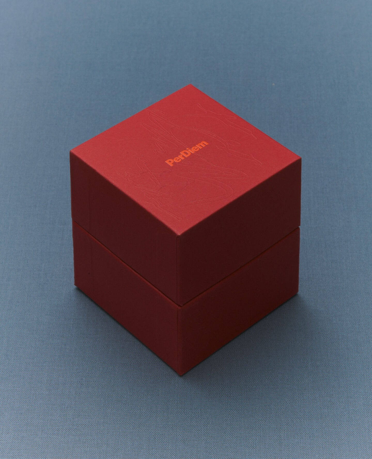
A jewelry brand that saves us from monotony and invites us to live creatively. Brand identity and art direction by Tino Nyman, featuring the typefaces Onsite, Exposure and GT Pressura.
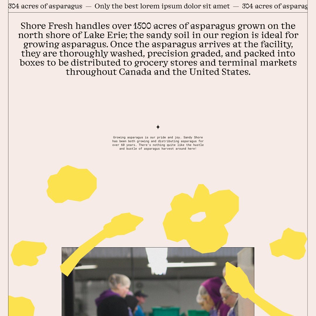
Alongside a colorful identity and illustrations, Studio Tux proposed Nordic Pavilion and Roboto Mono as the typefaces for this farm.
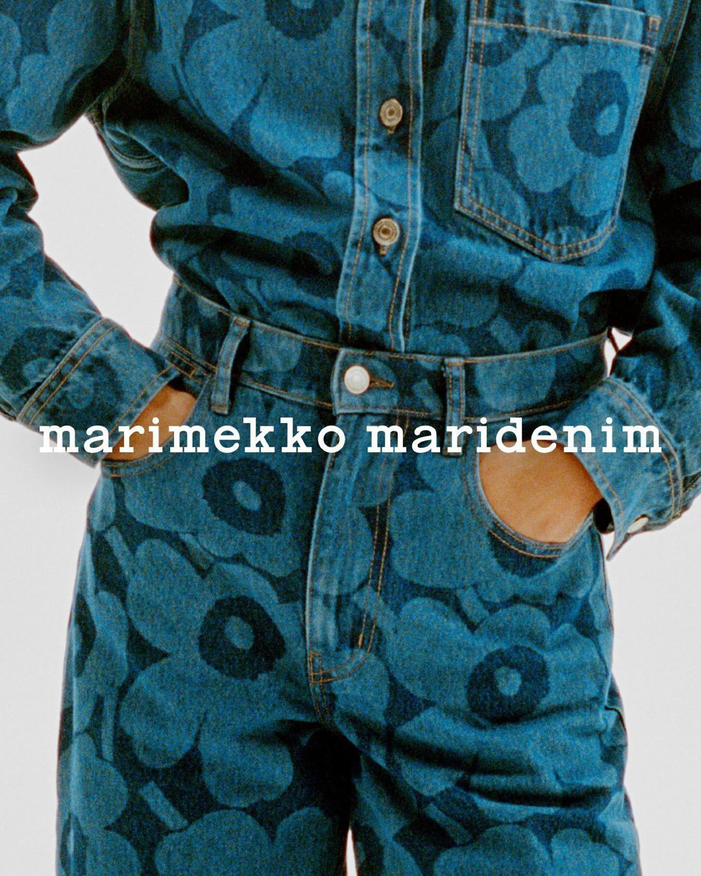
Maridenim just made its debut at the Fall/Winter 2024 show during Copenhagen Fashion Week. Blending their iconic bold designs with a fresh denim twist.
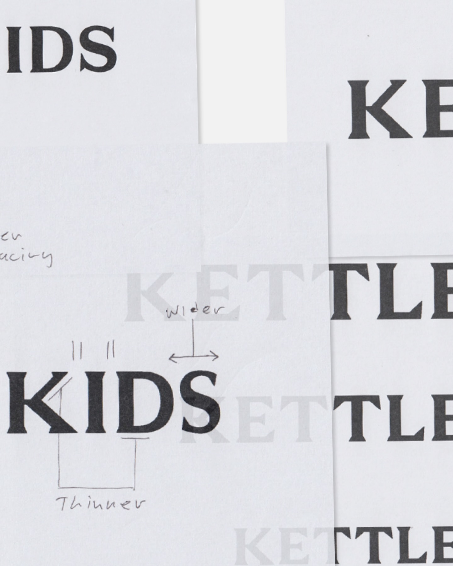
Two Times Elliot designed the logo, typography, and monogram for Kettle Kids, drawing inspiration from London’s historic architecture and signage.