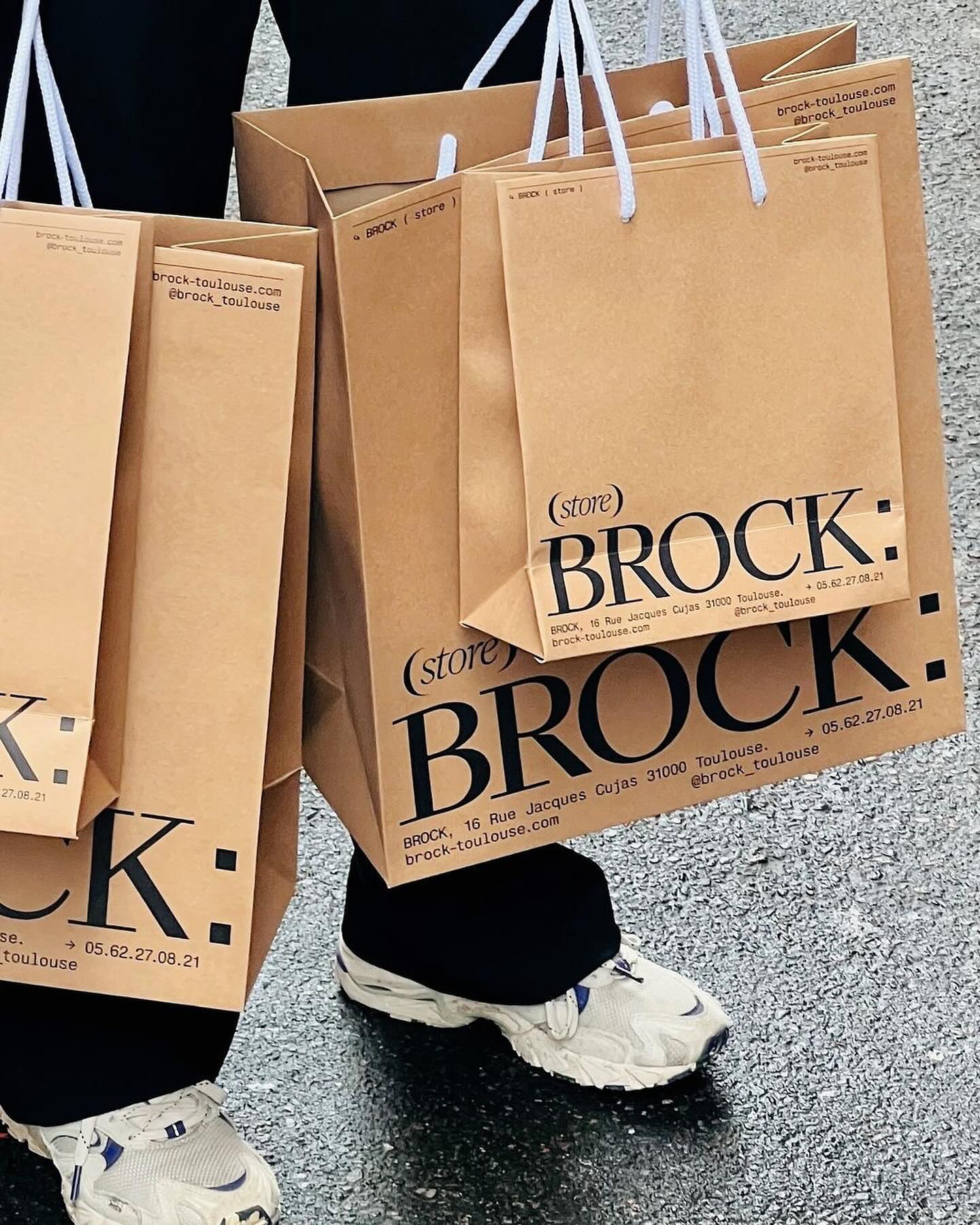
Quatrième Étage revamped the visual identity of the iconic Brock store, selecting the ES Face typeface for its logo, a 19th-century inspired serif with contemporary finishes.
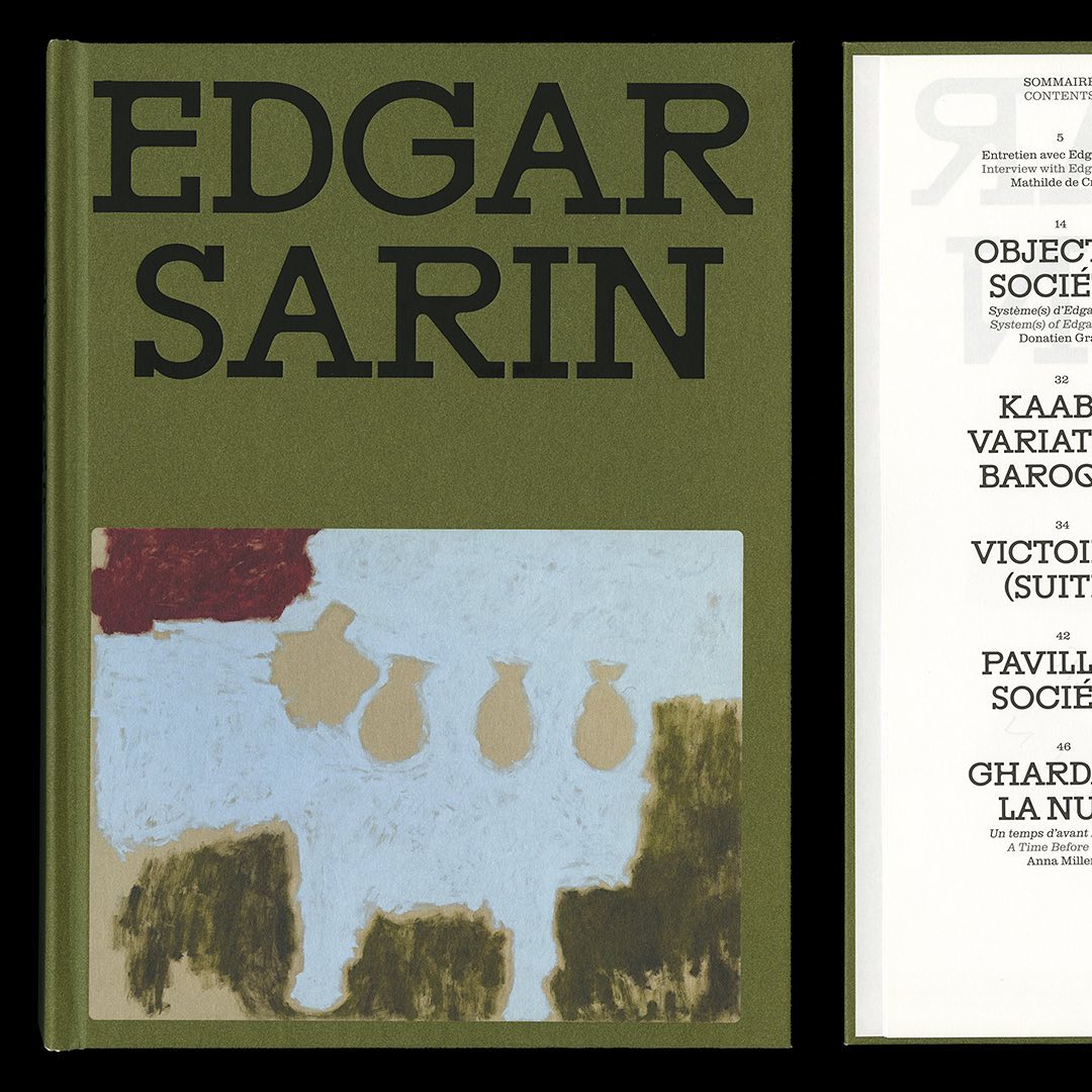
Resonanz B by Out of the Dark and Clarendon Graphic were the typefaces selected by Lisa Sturacci for the editorial design of this book about about Edgar Sarin’s work.
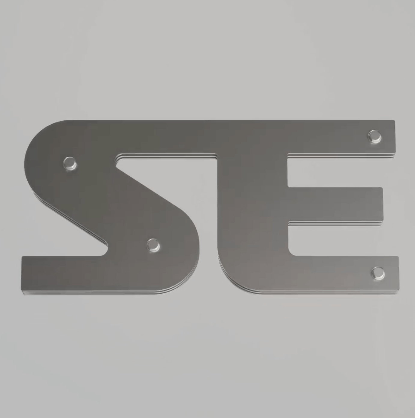
Apparat Bold + Buch Schmal, both from Kimera, were part of the update newkid made for Standard Equipment, a system of household objects.
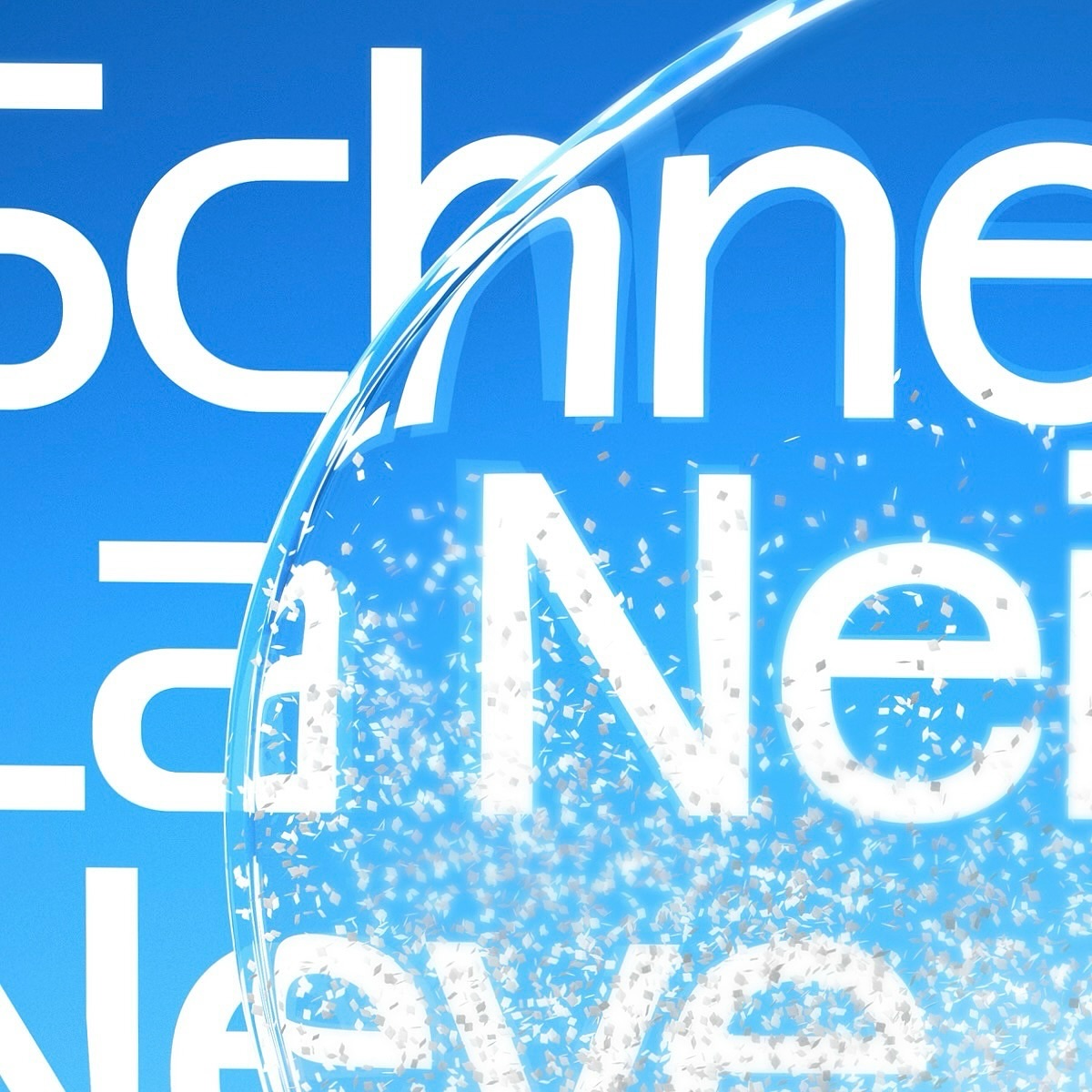
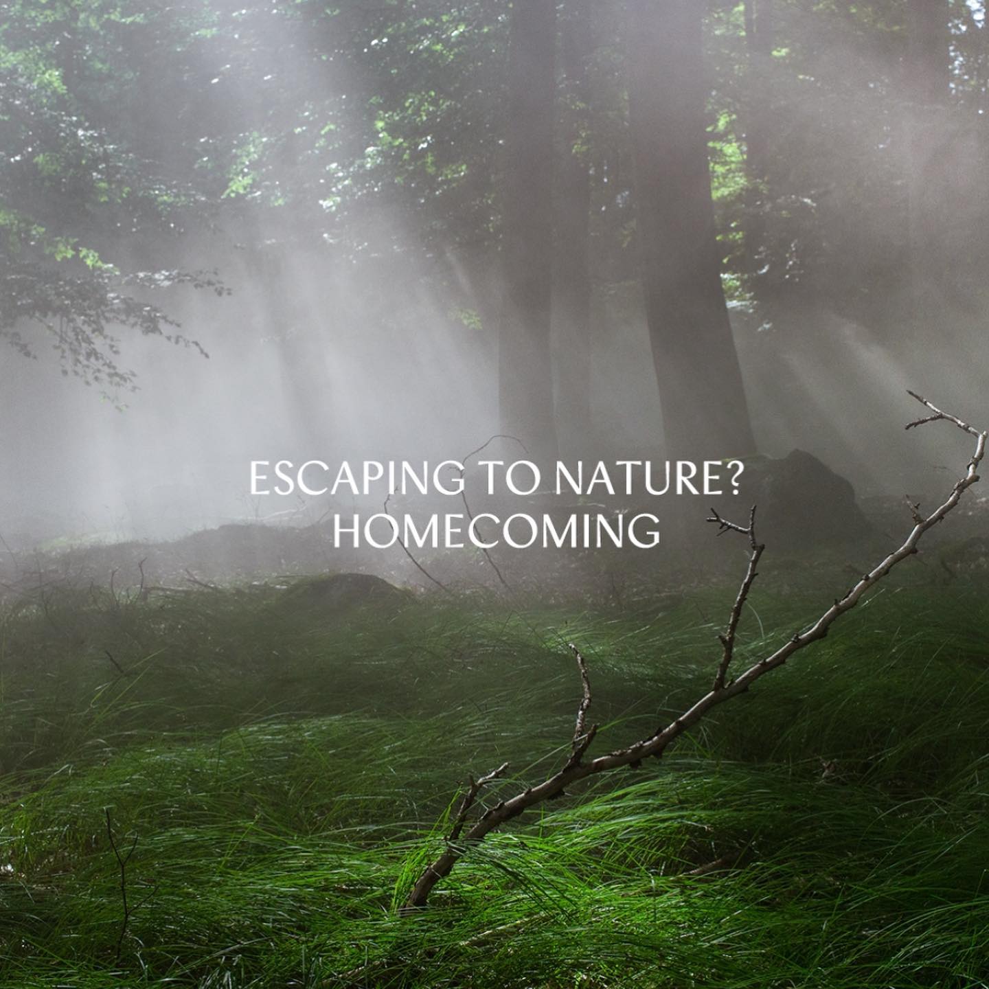
Maison Standard used Azeret from Displaay Typefaces for the identity of this exhibition at the National Library of Switzerland, which explains the impact of snow on our society.
Moser Crystal launched an autumn collection, and Studio Marvil designed its image using the Atlantic typeface from Heavyweight.
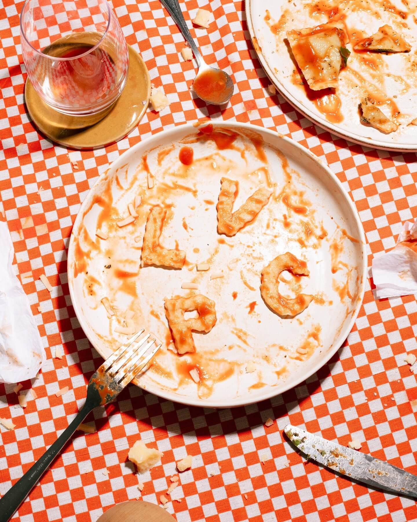
Andrés Higueros designed this custom typeface for the private dining experiences hosted by La Vera Pasta.
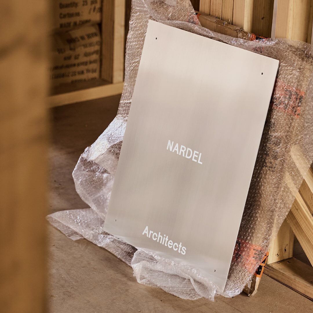
Simple and subtle; Both Studio created a brand identity that aligns with the proposal of Nardel Architects.
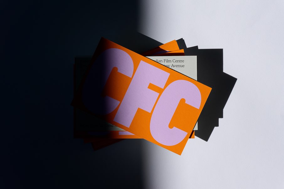
Helping to create a bold and inclusive visual identity, Quentin Coulombier’s Buzz and the well-known Cooper were selected by Underline Studio to represent the Canadian Film Centre (CFC)
New typefaces for the new identity of the production company L’Éloi; Principal Studio chose Review by Commercial Type and Skandia by Store Norske Skriftkompani.
Vibrant and loud, just like the conversations after an excellent dinner in Italy, that’s how Grand Bacàn Sans is, a custom typeface created by Pentagram for the Italian restaurant in Brooklyn; Bacàn