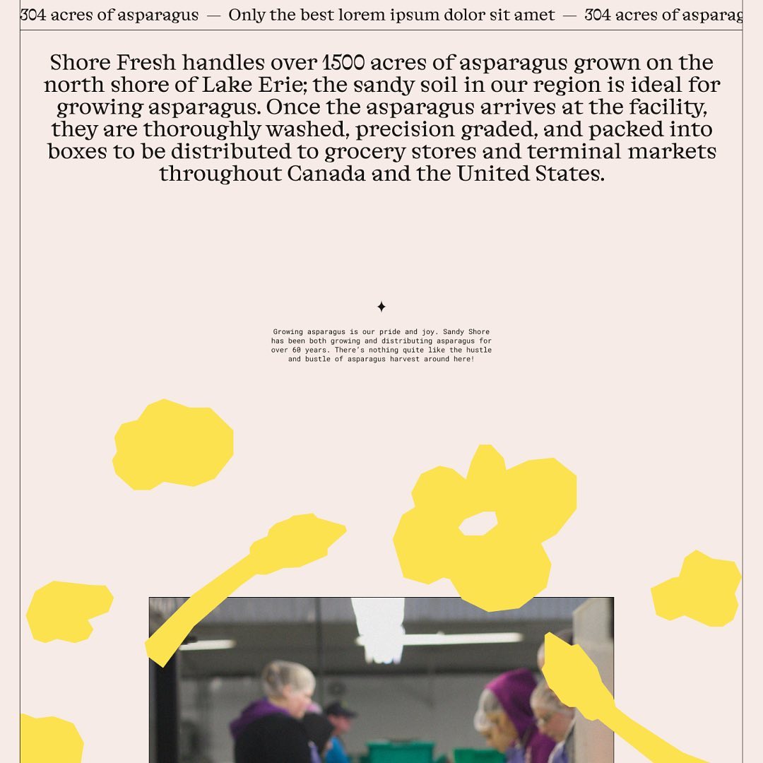
Alongside a colorful identity and illustrations, Studio Tux proposed Nordic Pavilion and Roboto Mono as the typefaces for this farm.
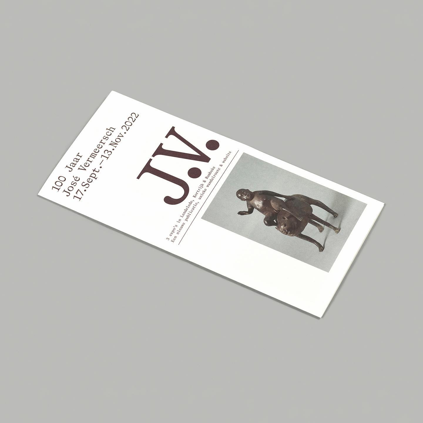
On the 100th birthday of artist José Vermeersch, an exhibition was held to celebrate his work, where the Bradford Mono typeface played a crucial role.
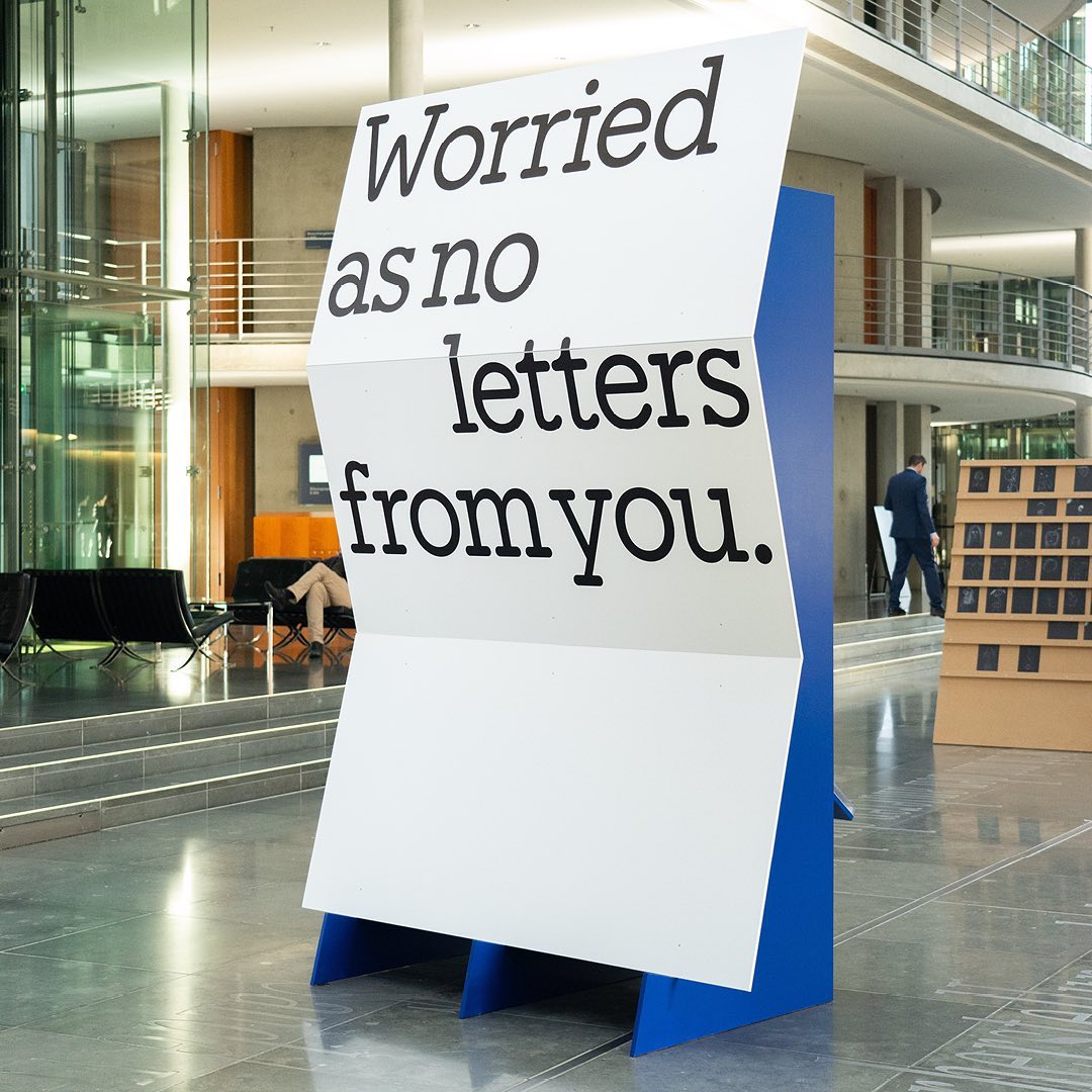
I said, ‘Auf Wiedersehen’ (I said ‘Goodbye’) displays the letters exchanged by five families separated during World War II, hoping to reunite one day. The texts are set in Repost, with supplementary texts in HAL Four Grotesk.
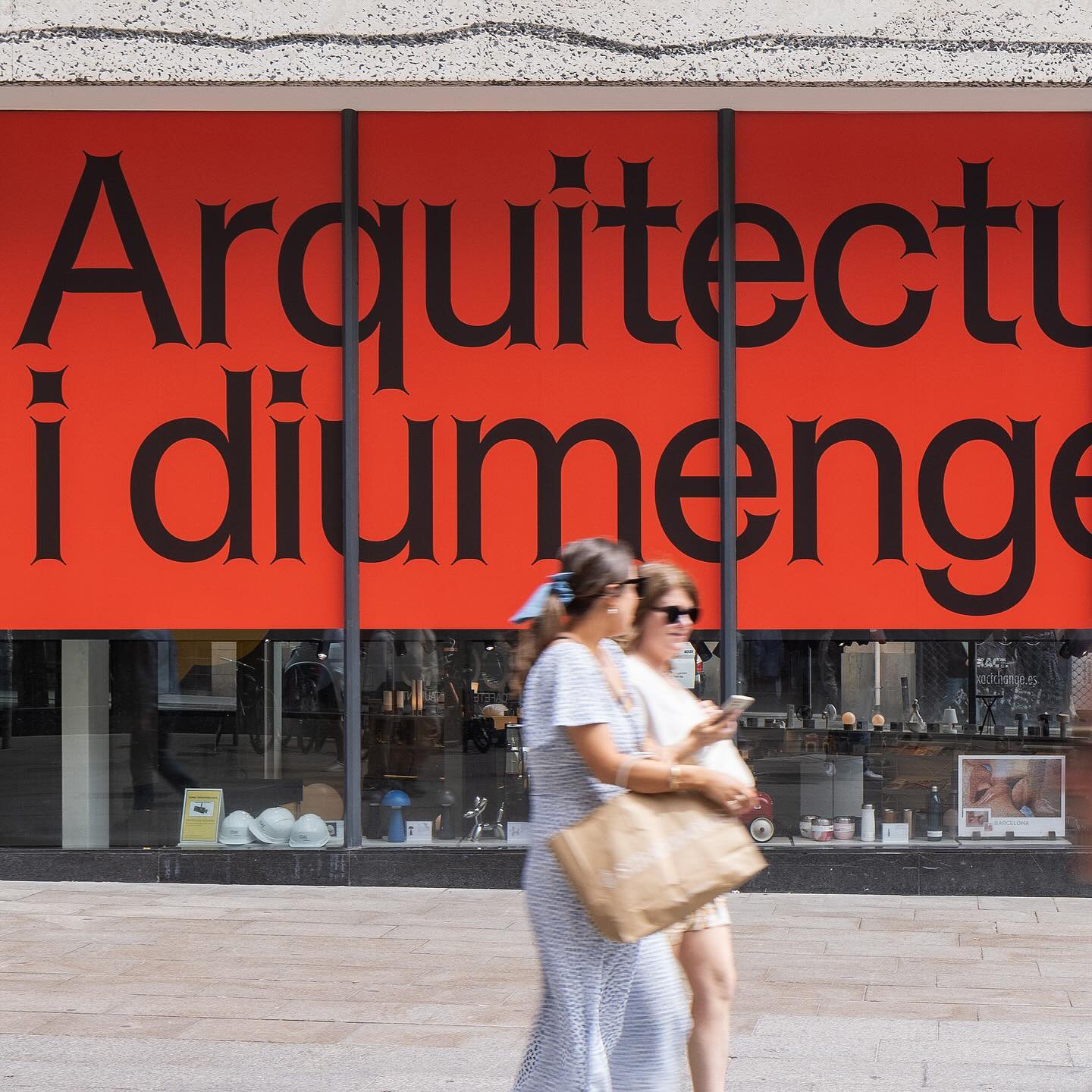
Graphic design for different spaces of this exhibition at the Architects’ Association of Catalonia, by PFP Disseny. Using Helveesti by Dinamo.
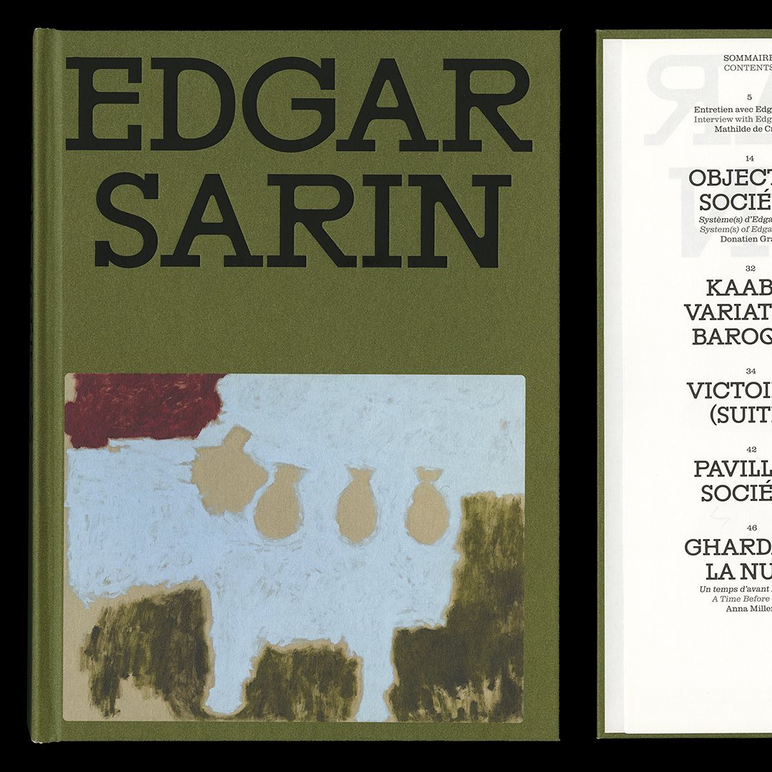
Resonanz B by Out of the Dark and Clarendon Graphic were the typefaces selected by Lisa Sturacci for the editorial design of this book about about Edgar Sarin’s work.
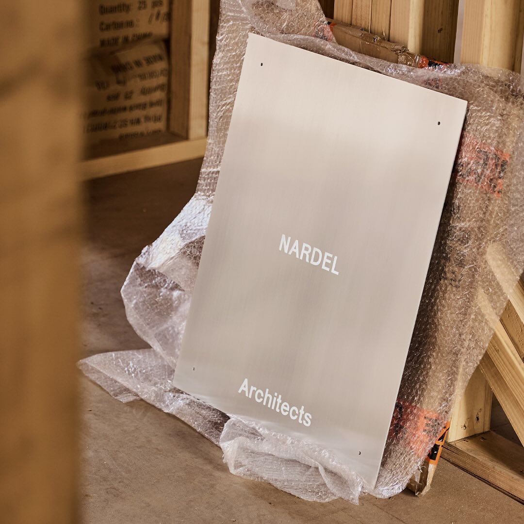
Simple and subtle; Both Studio created a brand identity that aligns with the proposal of Nardel Architects.
Low key Design Company used Boris by Giulia Boggio to complement this identity for a friendly, relaxed, and gentle café, just like a wandering sheep.
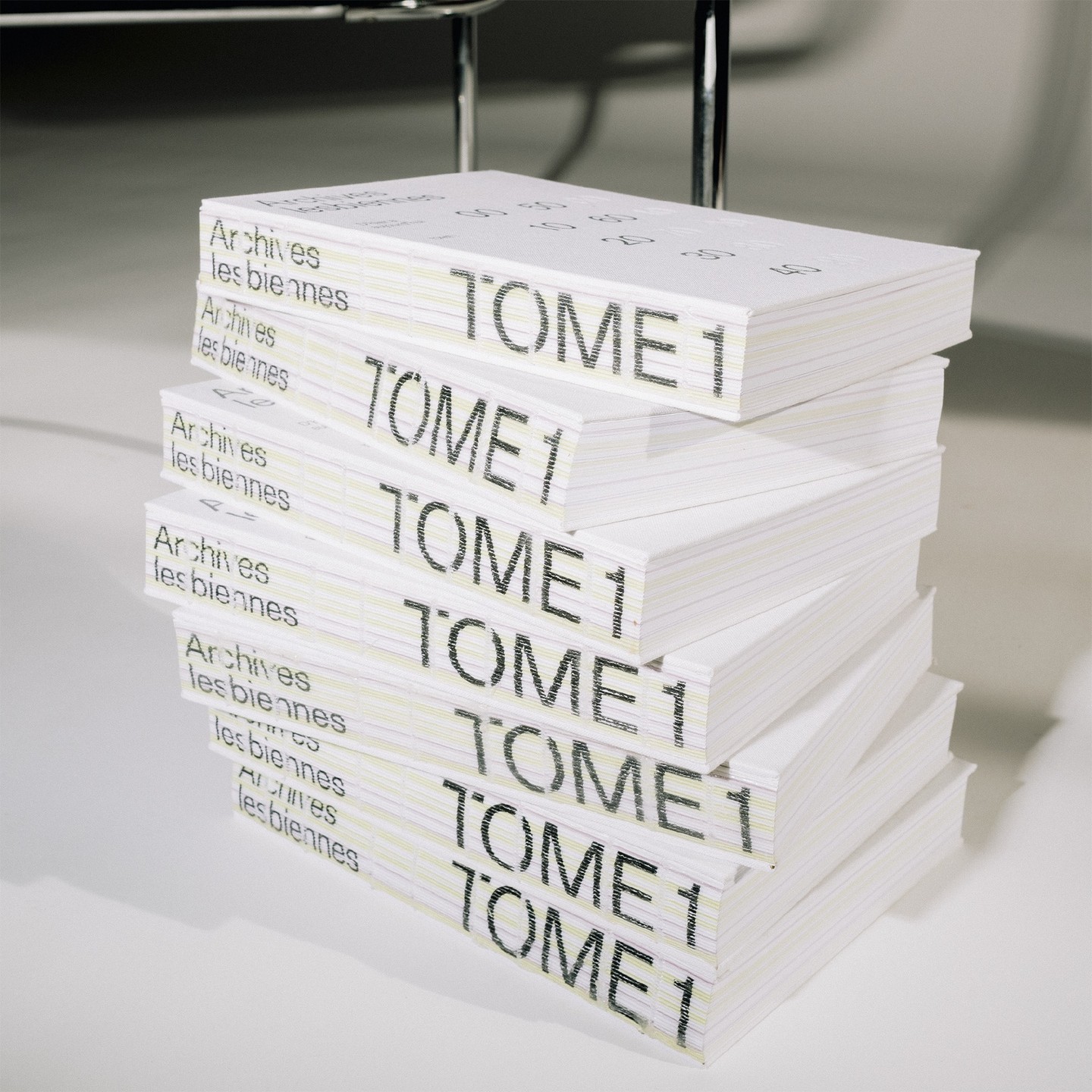
In this book that compiles the lesbian legacy in Quebec, we find Gerstner-Programm FSL as the main typeface, along with “handwritten” numbers using Sebastian Bobby. Designed by Harrison Fun Studio.
A sans and serif custom logo, besides Quadrant Text Mono by Matter of Sorts on the website and identity Querida Studio designed for Laker Studio.