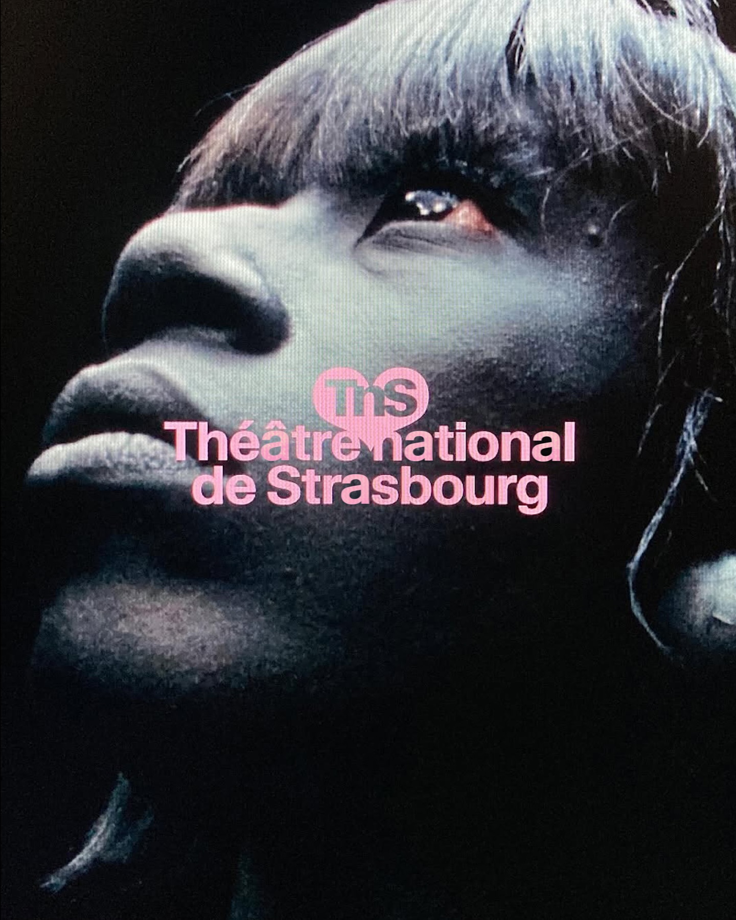
Different versions of the Waldenburg typeface by Kimera for the new identity of the Théâtre National de Strasbourg.
In Arte Tracks and Arte Tracks East, typography breaks into lines and reconfigures into ever-evolving graphics. Logotype, visual identity, and generic system by H5paris.
Animo Typeface by Heavyweight shapes the identity of Grande Paolo, a pop-up sports bar in Prague for the Euro Championship.
The redesign of ArkDes in Stockholm by AM Stockholm features custom typefaces where dots and dashes create a unique typographic system. Alongside Diatype, these fonts redefine the museum’s identity.
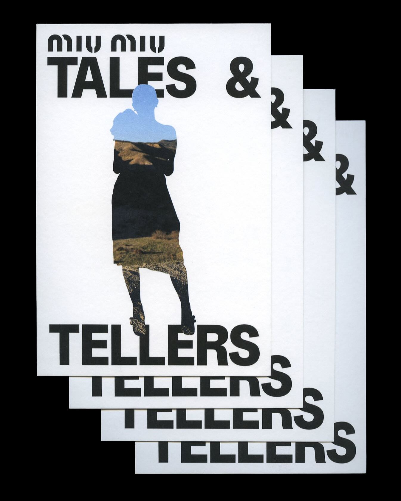
Kern typeface is featured in Tales & Tellers, a Miu Miu campaign that revisits various representations of femininity from past runway shows and short films.
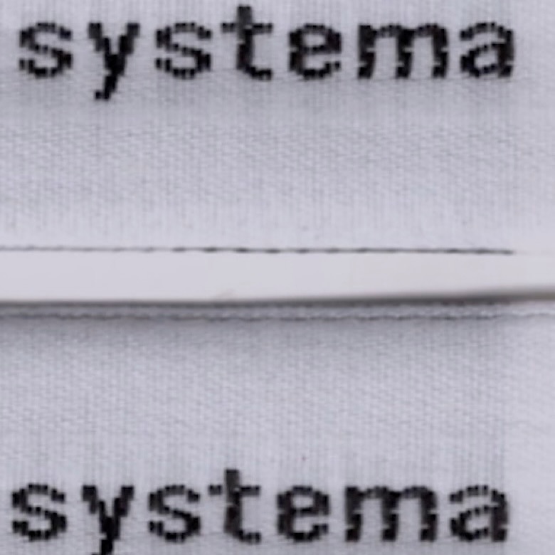
The French studio Plus Mûrs used Diatype Mono by Dinamo for the logo of the sophisticated sports brand, Counter Systema.
República Studio used Review from Commercial Type for this visual identity, aiming to communicate directly and consistently, while leaving the spotlight to the displayed photographs.