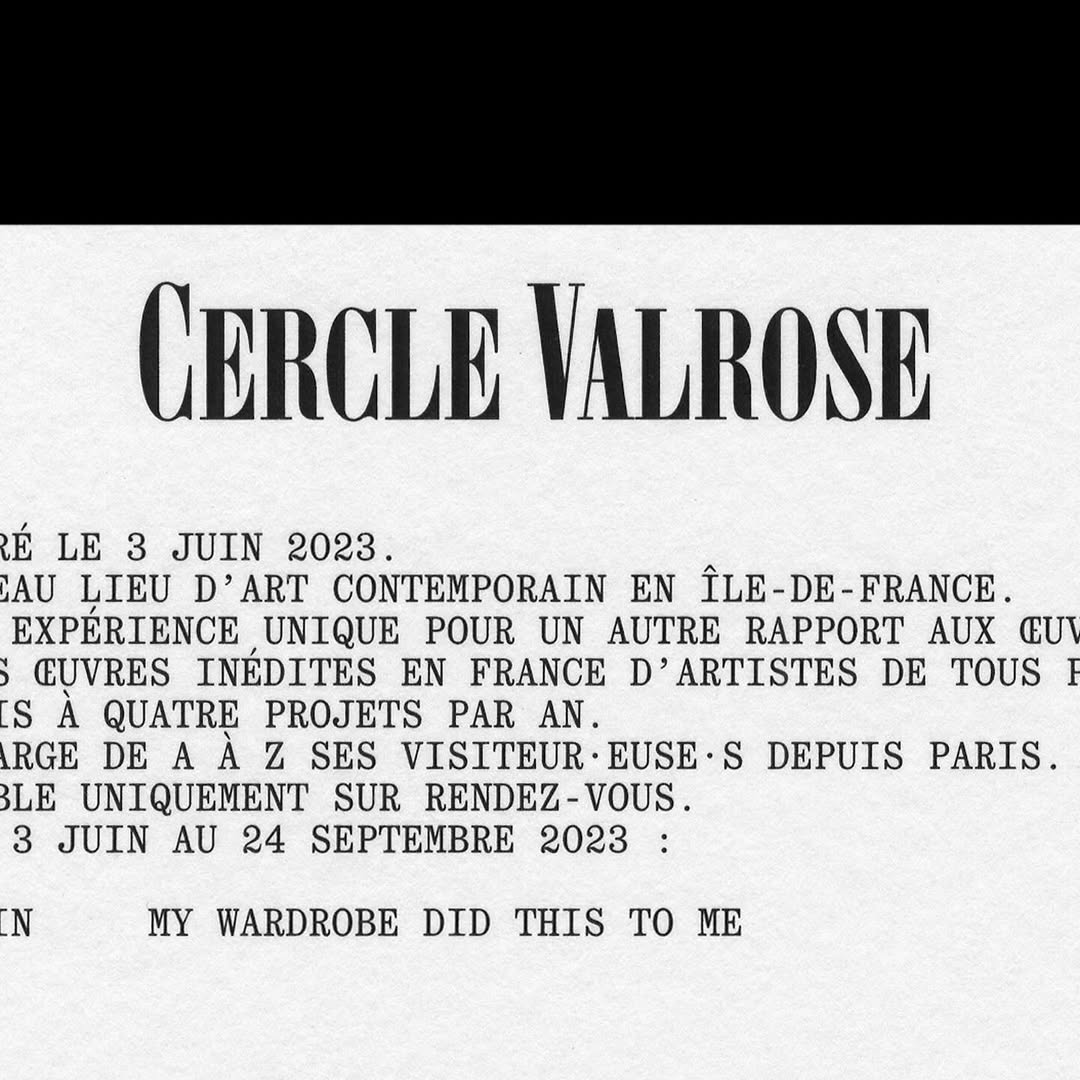
OTT Harker by Ornamental & Title Type is used in the logo for Cercle Valrose. The design is by Bizzarri-Rodriguez, who also created the typeface. Quadrant by Matter of Sorts is used for the supporting text.
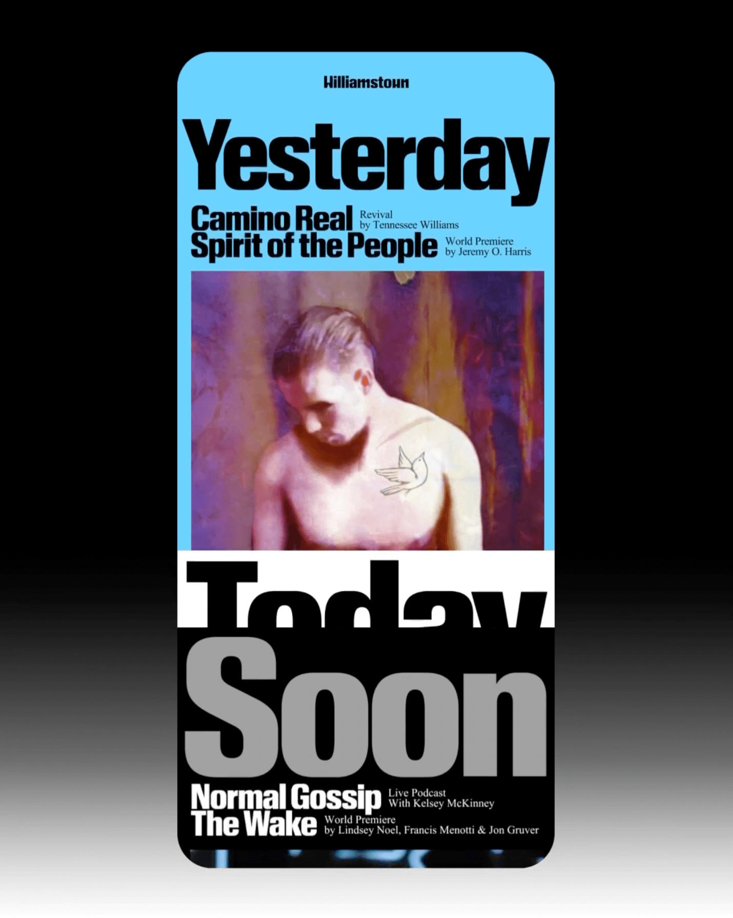
The identity that Pentagram created for the Williamstown Festival transforms the stage into a dynamic graphic system. A custom logo is complemented by Times New Roman and Review from Commercial Type.
Inspired by Chicago’s sign painting, the packaging of Foxtrot’s potato chips captures the essence of the iconic Maxwell Street Market hot dog.
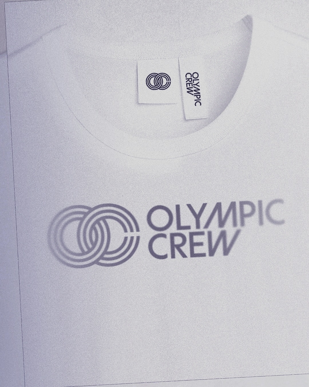
BonTemps studio designed the identity for Olympic Crew, combining the custom logotype and the iconic OC symbol to capture collaboration and modernity. They used the Univers Condensed Bold typeface.
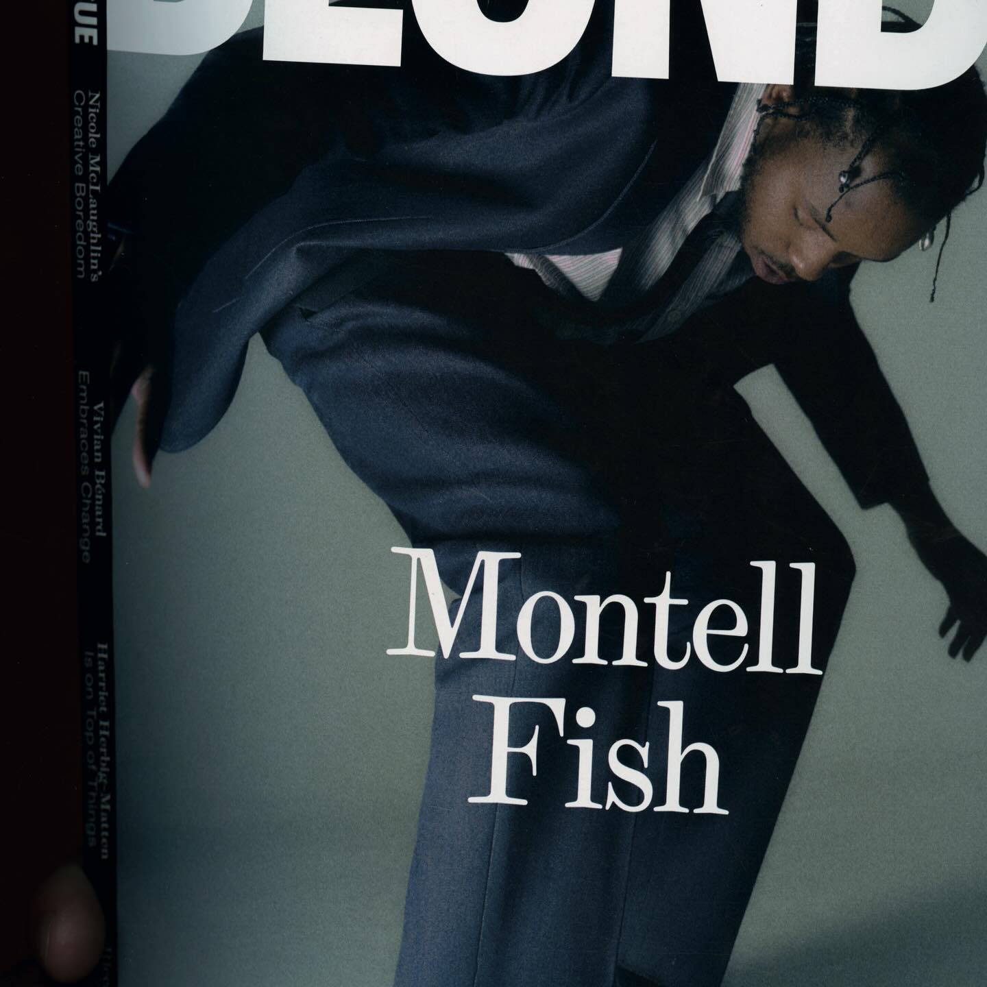
The type selection for Blonde Magazine’s redesign, managed by Hei Agenda, includes Contrast Foundry on the logo, Counter Forms for the serif (Eyla), and sans fonts by Lucas Liccini & Elias Hanzer (HAL Four Grotesk)
As fun as family movie nights, Moore by Eliott Grunewald was used in this list of films curated by A24 and approved by kids and adults alike. Designed by Jordi Ng and Elana Schlenker.
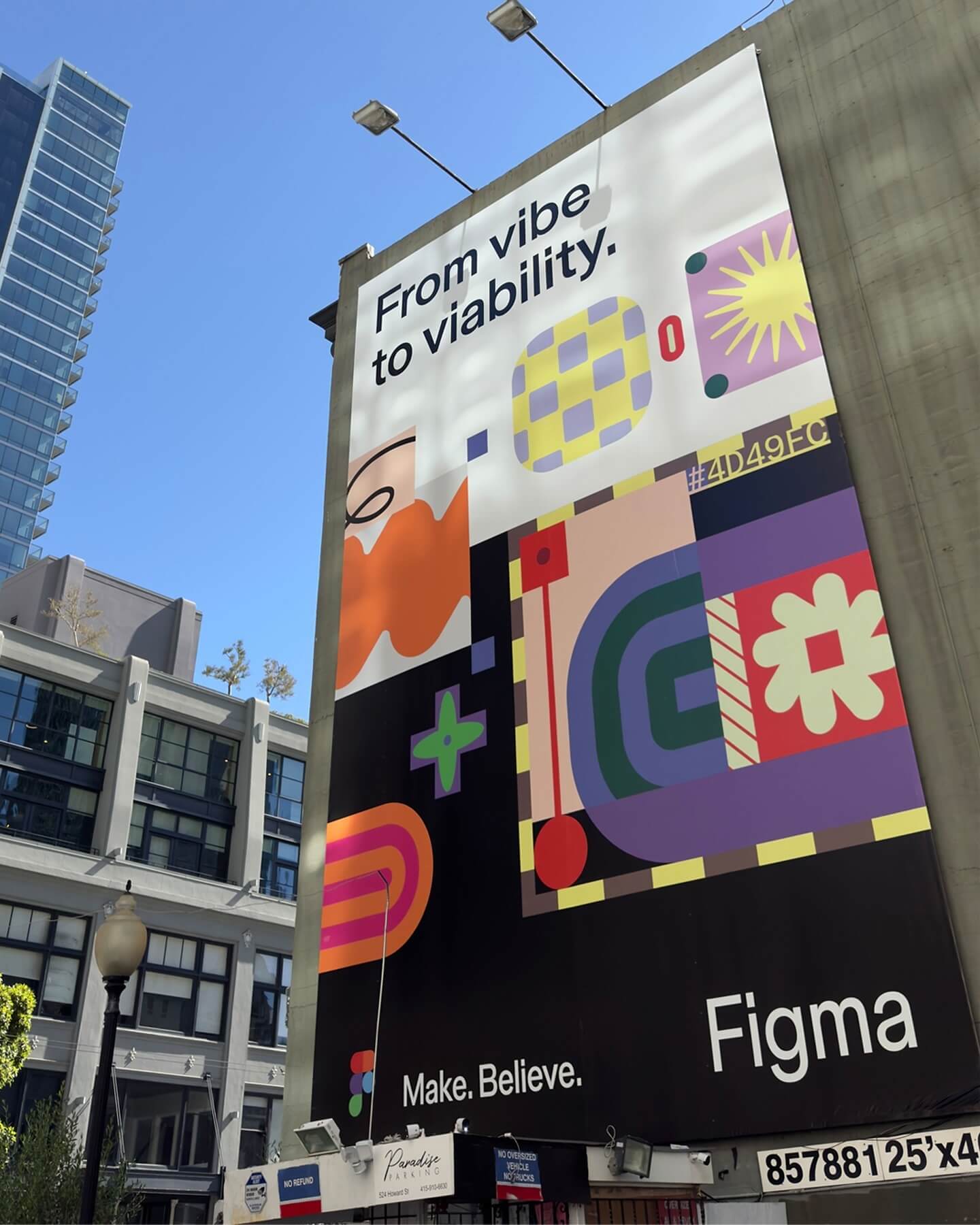
Grilli Type took on this ambitious project and proposed Figma Sans; a typeface with personality but practical, focused on efficiency, and free of unnecessary embellishments.
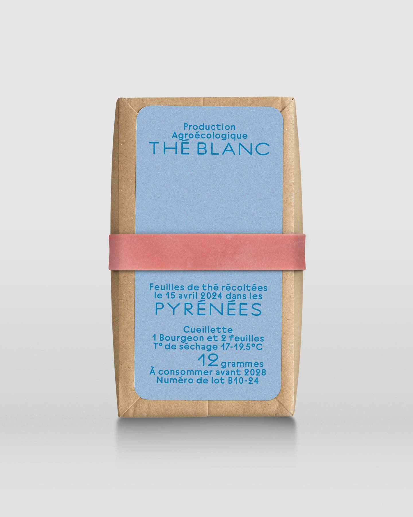
In a comprehensive project including handwriting, drawing, packaging conception, and global branding, Quentin gave @the.pyrenees an organic and approachable identity.
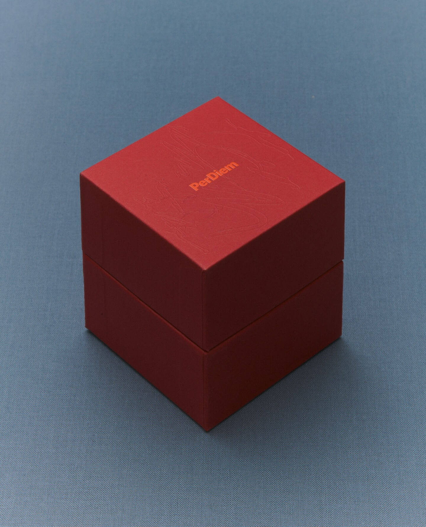
A jewelry brand that saves us from monotony and invites us to live creatively. Brand identity and art direction by Tino Nyman, featuring the typefaces Onsite, Exposure and GT Pressura.
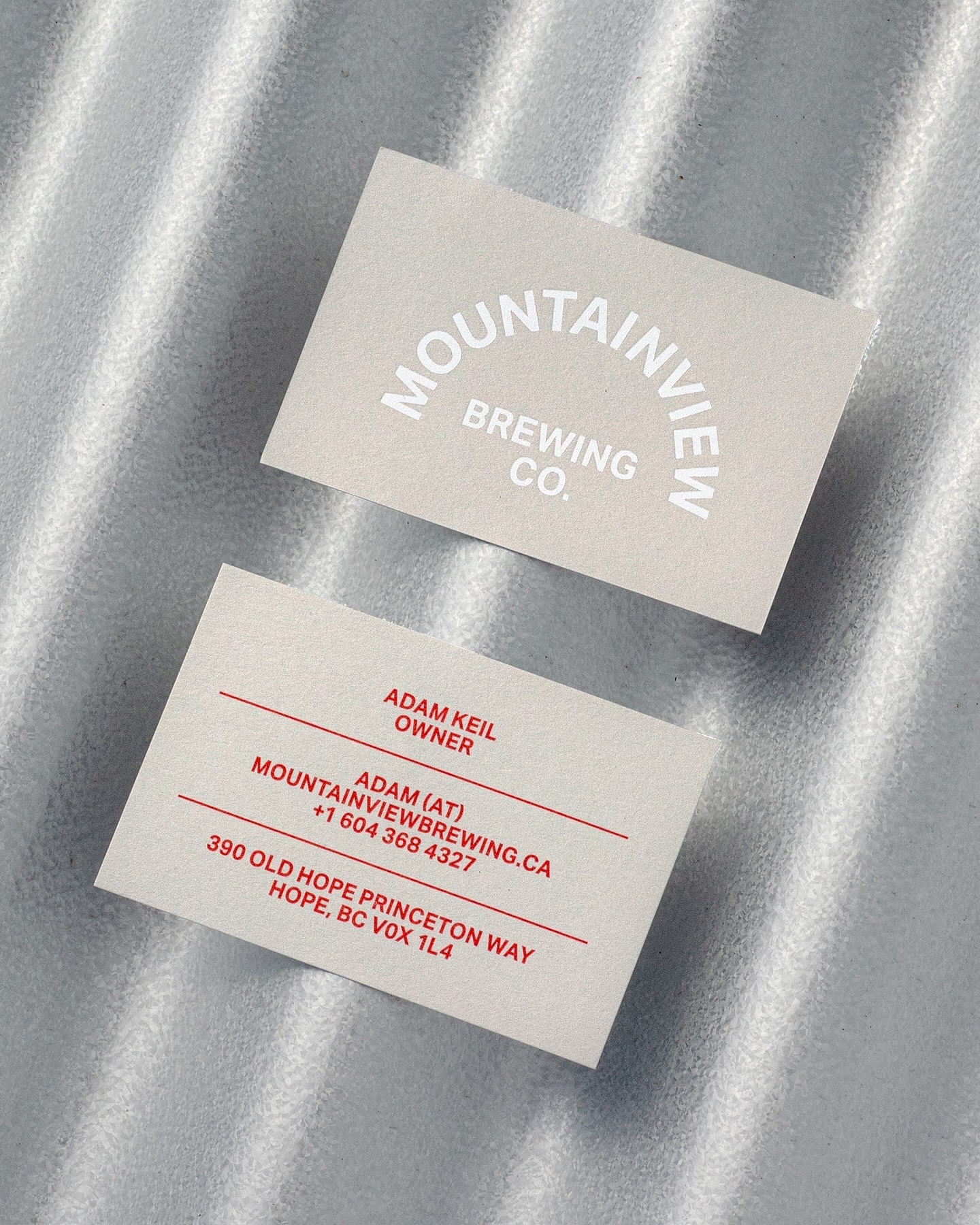
Memory Studio was inspired by vintage elements, like old book covers, and used Aktiv Grotesk to create the identity for this craft brewery.