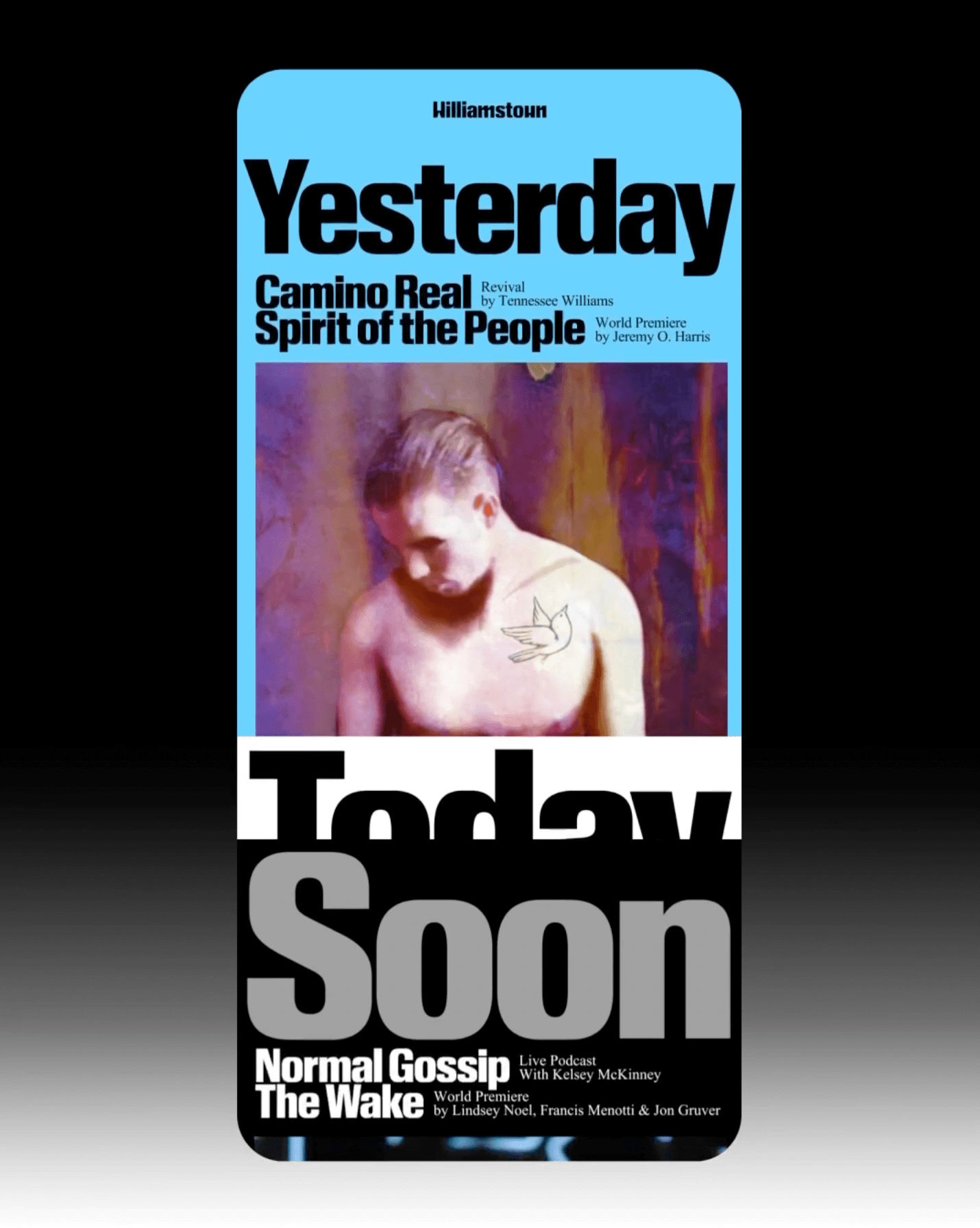
The identity that Pentagram created for the Williamstown Festival transforms the stage into a dynamic graphic system. A custom logo is complemented by Times New Roman and Review from Commercial Type.
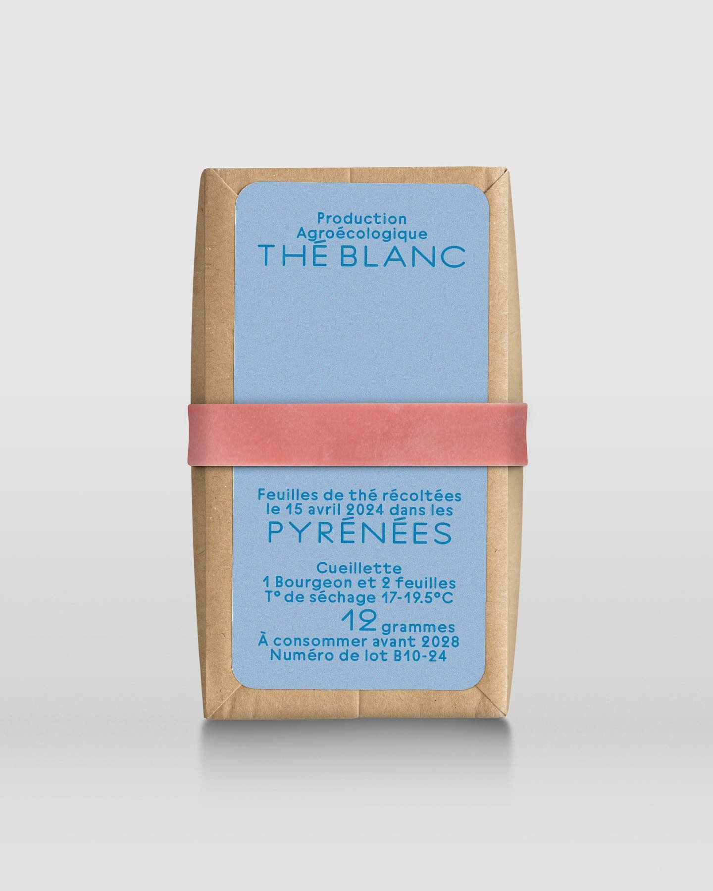
In a comprehensive project including handwriting, drawing, packaging conception, and global branding, Quentin gave @the.pyrenees an organic and approachable identity.
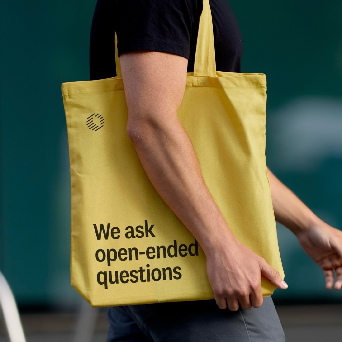
Classics with a modern twist; National 2, Atlas Grotesk, and Atlas Typewriter, were used by Play for the identity they created for Open Research.
Architecture and how it becomes part of our everyday landscape. For Not Found, Mike Tully proposes an editorial design that plays with the visibility of certain elements using transparent varnish.
An identity that balances between distinctive and sober is composed of a bold uppercase logo, vibrant colors, and two specially customized typefaces; Saans from Displaay Foundry and LL Ruder Plakat from Lineto. Designed by Porto Rocha.
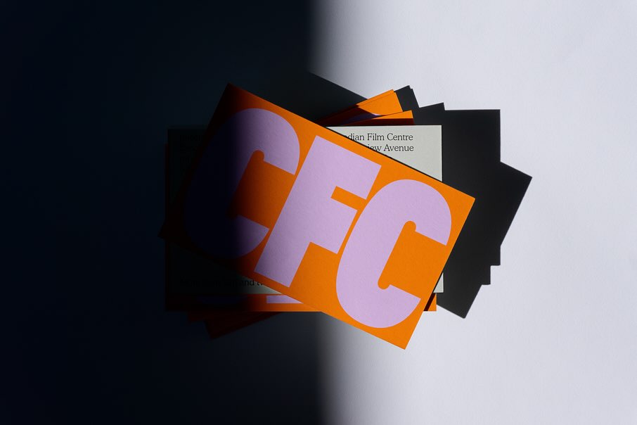
Helping to create a bold and inclusive visual identity, Quentin Coulombier’s Buzz and the well-known Cooper were selected by Underline Studio to represent the Canadian Film Centre (CFC)
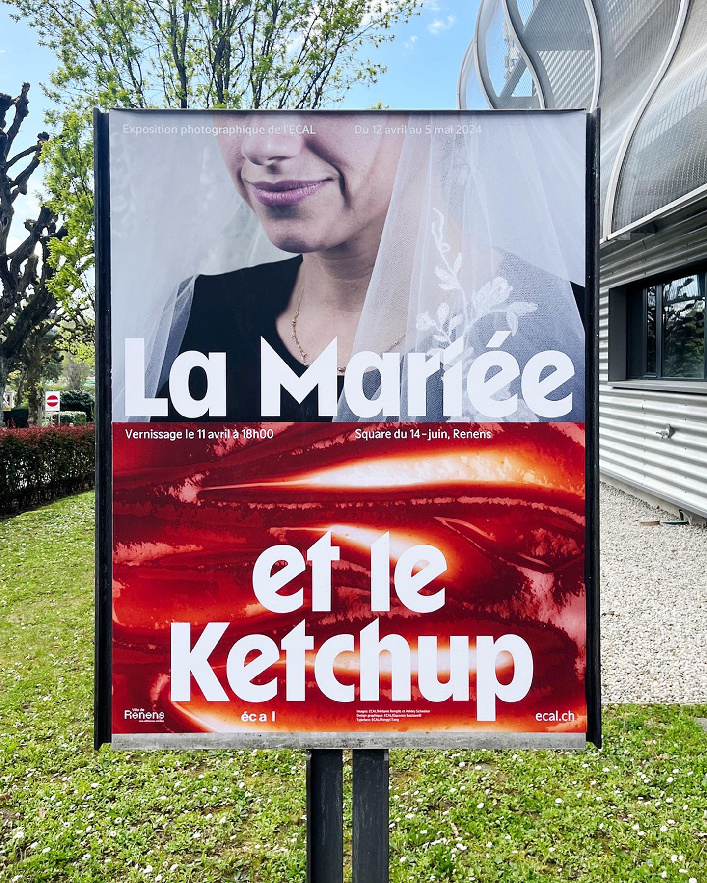
WaterPolo Display by @dontnotdon was used in this series of posters portraying the ordinary and extraordinary aspects of Renens.
Editorial New, ITC Franklin Gothic, and Antique No.6 were brought together by The Office of Ordinary Things to create contemporary compositions in the identity of Mad, a agriculture organization.