Grilli Type took on this ambitious project and proposed Figma Sans; a typeface with personality but practical, focused on efficiency, and free of unnecessary embellishments.
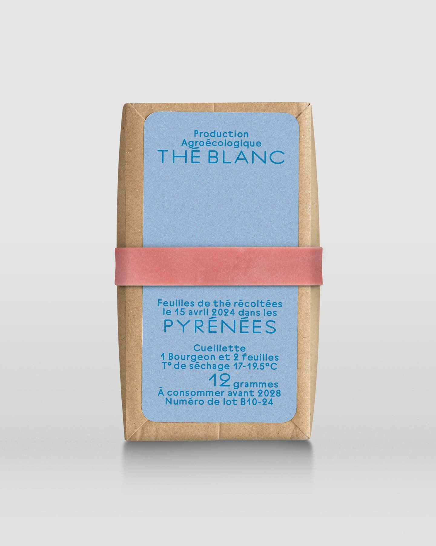
In a comprehensive project including handwriting, drawing, packaging conception, and global branding, Quentin gave @the.pyrenees an organic and approachable identity.
A jewelry brand that saves us from monotony and invites us to live creatively. Brand identity and art direction by Tino Nyman, featuring the typefaces Onsite, Exposure and GT Pressura.
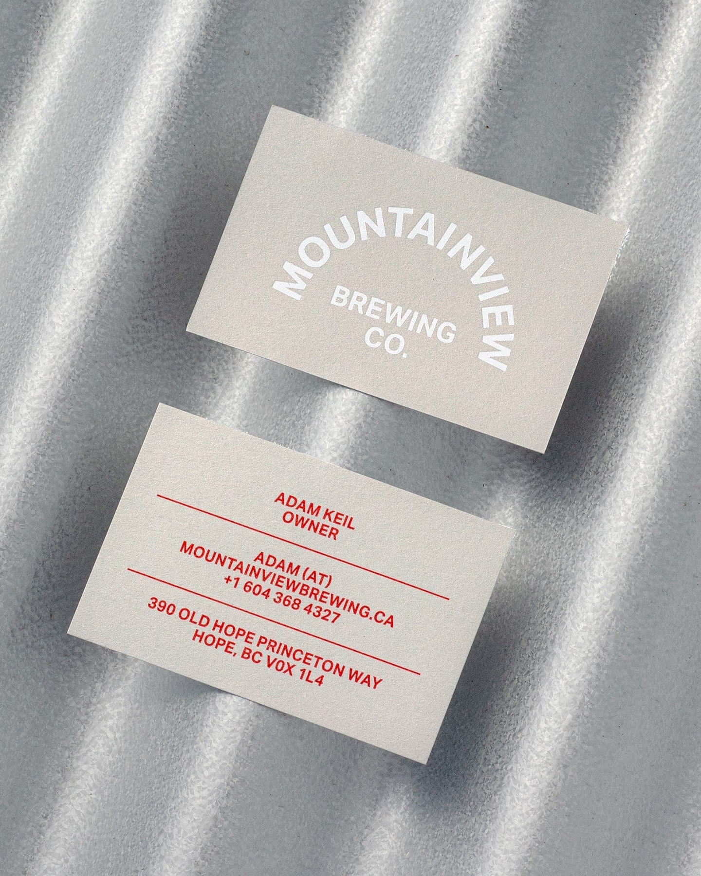
Memory Studio was inspired by vintage elements, like old book covers, and used Aktiv Grotesk to create the identity for this craft brewery.
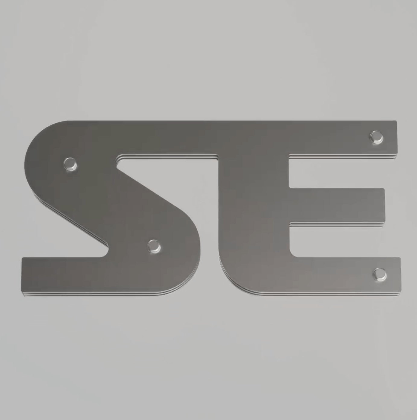
Apparat Bold + Buch Schmal, both from Kimera, were part of the update newkid made for Standard Equipment, a system of household objects.
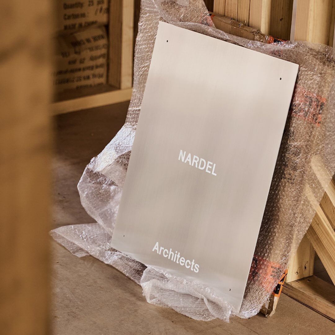
Simple and subtle; Both Studio created a brand identity that aligns with the proposal of Nardel Architects.
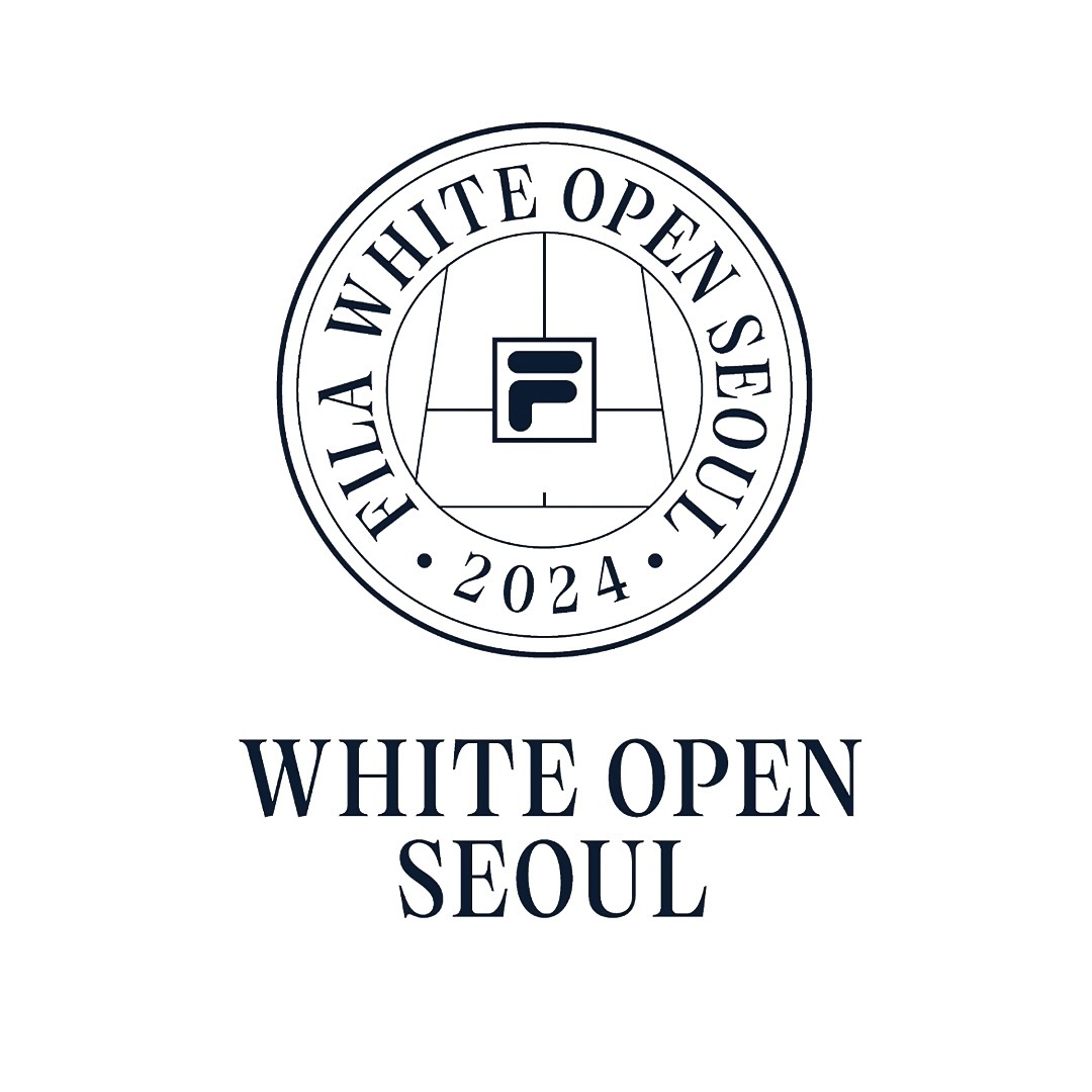
Tartuffo by Bouk Ra for Lift Type in the identity created by Fila Korea for the 2024 White Open Seoul; a tennis open where everyone can participate.
This fresh and fun poster design for the Teatro Prospero uses Review Condensed from Commercial Type, a Principal Studio project
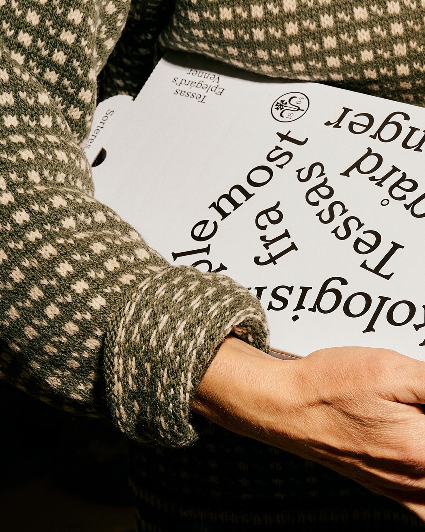
A story of friendship between agriculture and its natural habitat, between the design by Olsson Barbieri and the Or Lemmen typography proposed by them for the image of an organic orchard in Hardanger, Norway.
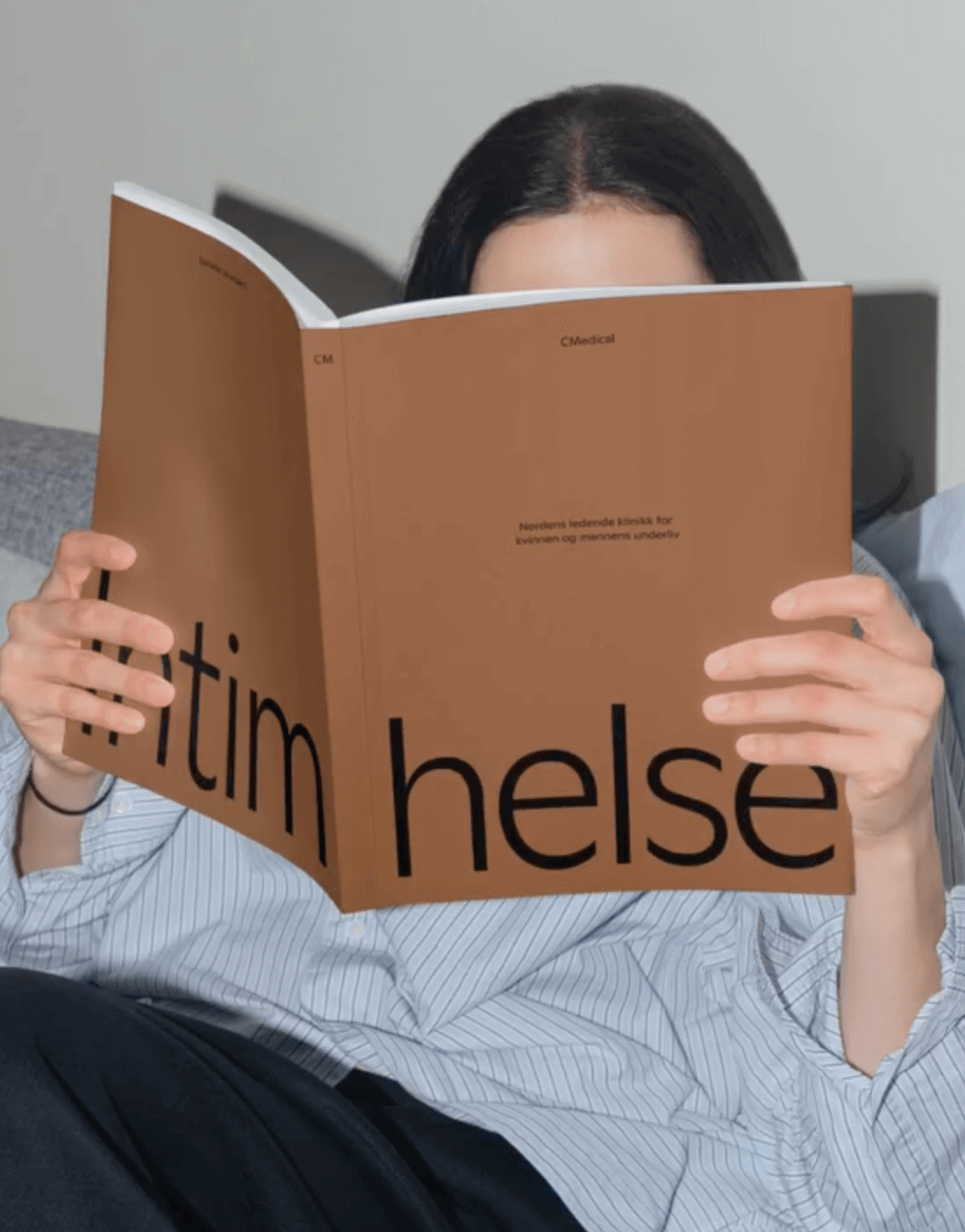
EY Doberman used Ginto from ABC Dinamo in different weights to achieve a consistent stroke throughout the visual identity for CMedical.