Hiro builds developer tools that bring Web3 to Bitcoin. In its identity, Porto Rocha chose several fonts from the Aeonik family – Mono, Fono, and Bold –
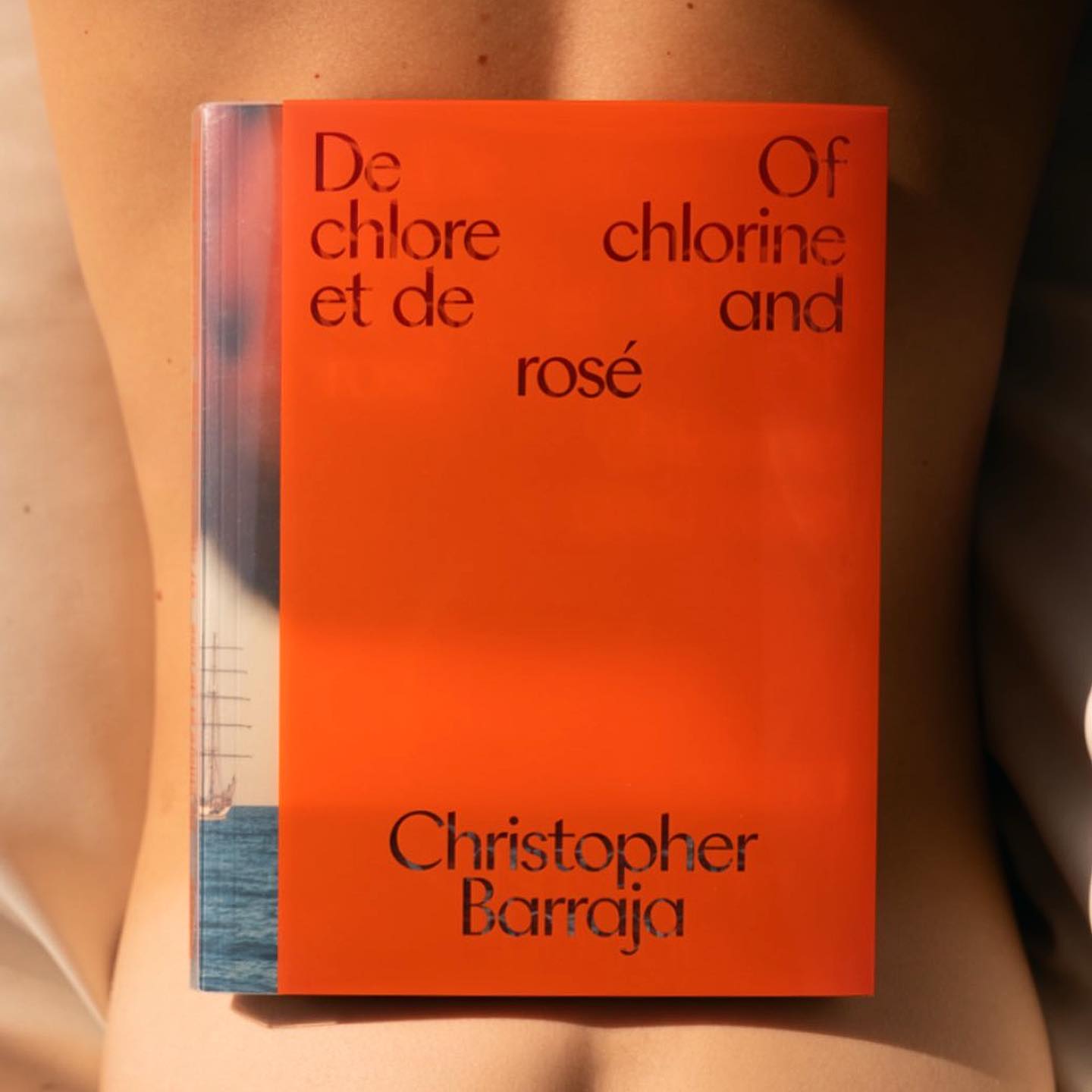
HAL Timezone by Hal Typefaces in the typographic selection used for the book Pocket Call by Paul Spengemann, designed by Hanzer Liccini.
Customizing Klarheit Kurrent Book for its logotype, Glasfurd & Walker created a very minimalist and balanced identity for CBD-forward brand, Nowadays.
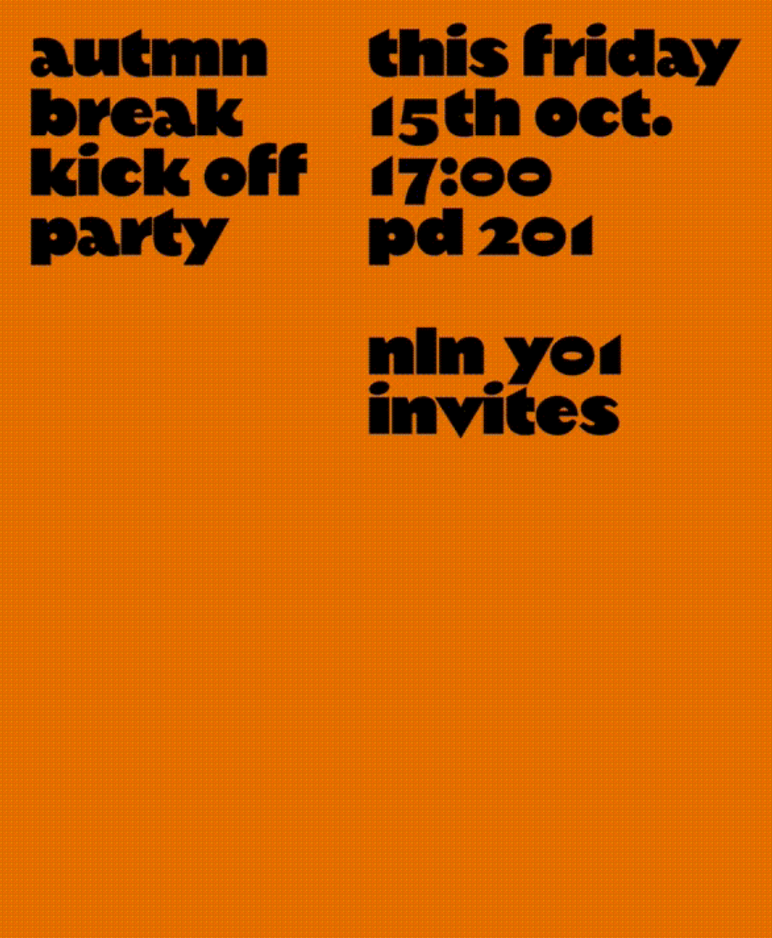
An autumn break party of students at KABK, using Margiel in their posters, a geometrical display font by Warsaw Types.
The humanist and geometric font Centra nº1 by Sharp Type in the full-service production, art buying & casting services company Yours.
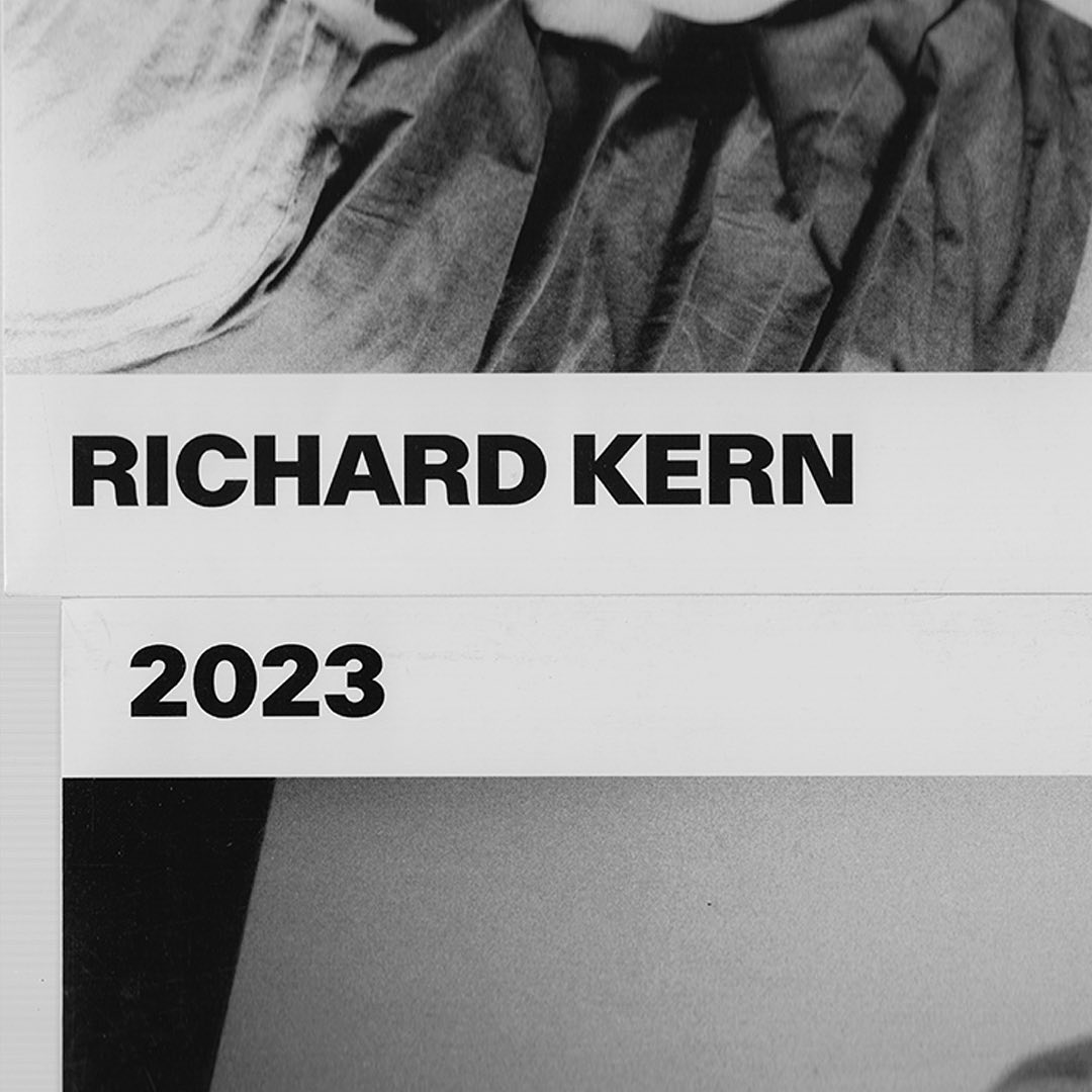
A gritty and beautiful array of Kern’s favorite unpublished photographs, using AP Grotesk by All Purpose Fonts in its editorial design.
With a playful and minimalist approach, Friss Kombucha utilizes Herbus Bold to set itself apart from competitors.