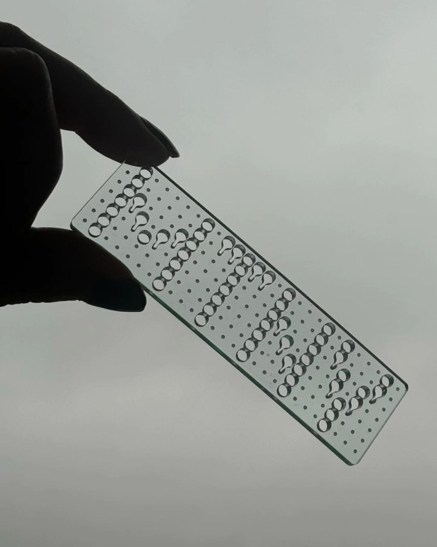
This series of keychains, the result of Pauline Esguerra’s exploration with laser cutting, uses, among other typefaces, Eurocat by Maxitype.
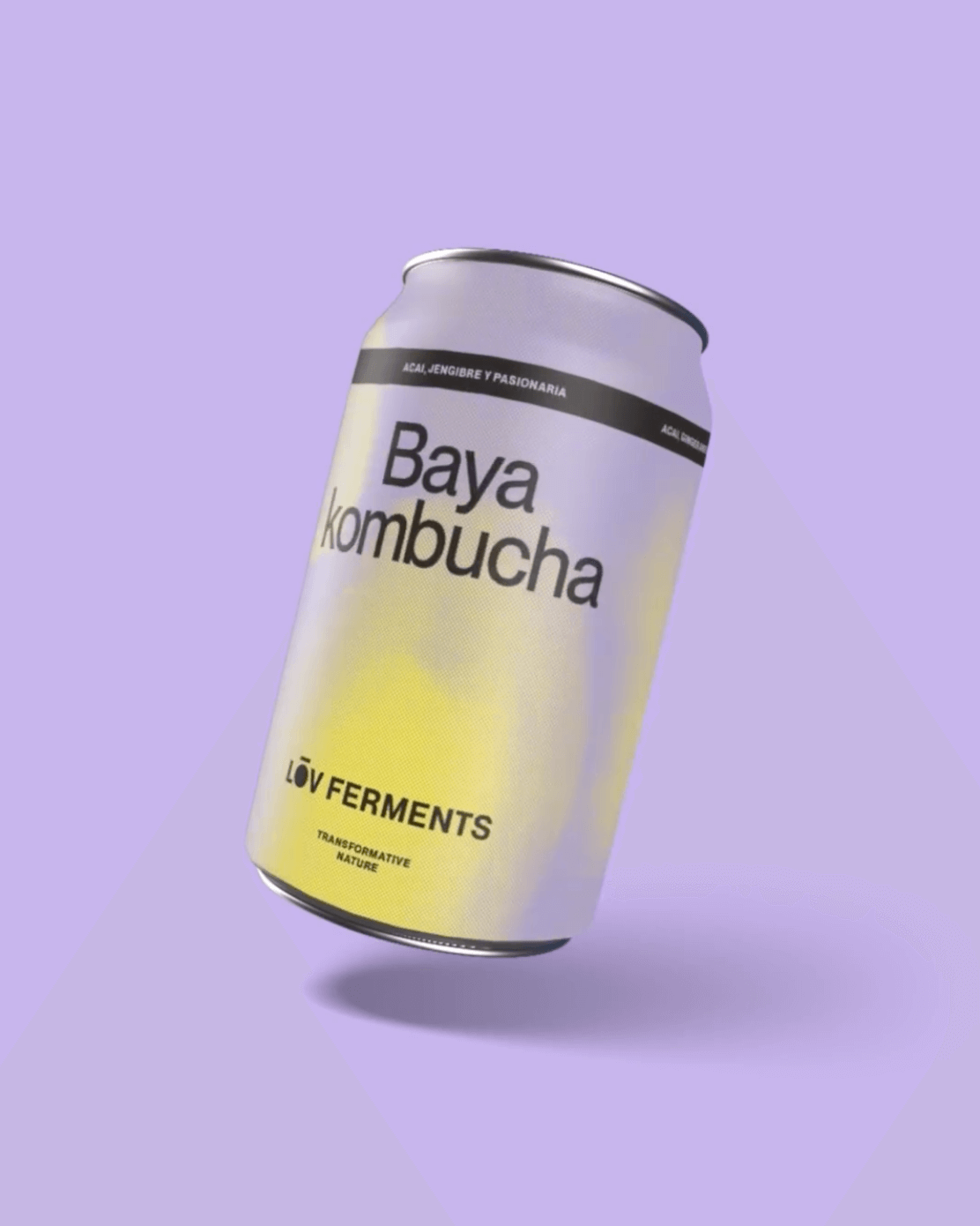
Casa Bien used Neue Montreal by Pangram Pangram and Items by Schick Toikka to build the visual identity for LOV Ferments, a brand set to change the beverage market.
Logotype custom-designed by Bureau Bernklau, drawing inspiration from the distinctive features of Ehmcke Antiqua, an early 20th-century typeface.
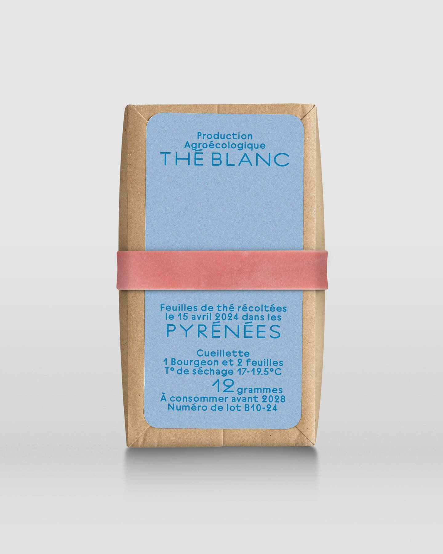
In a comprehensive project including handwriting, drawing, packaging conception, and global branding, Quentin gave @the.pyrenees an organic and approachable identity.
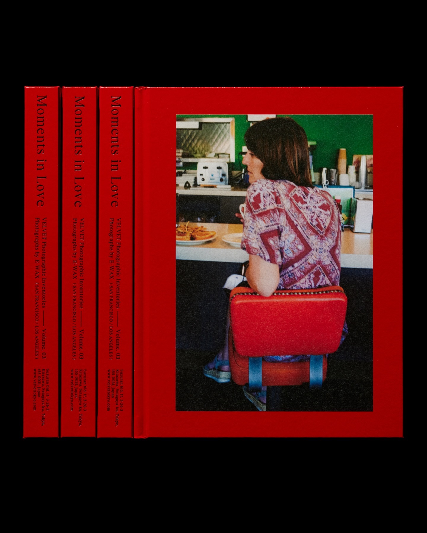
Moments in Love narrates a new way of portraying fashion, blending it with photos of passersby. Designed by the studio Siun, using FT Bureau.
A studio and shop at the same time, or a shop that also functions as a studio; Polar Ltda brings together various design professionals to offer a fresh creative approach.
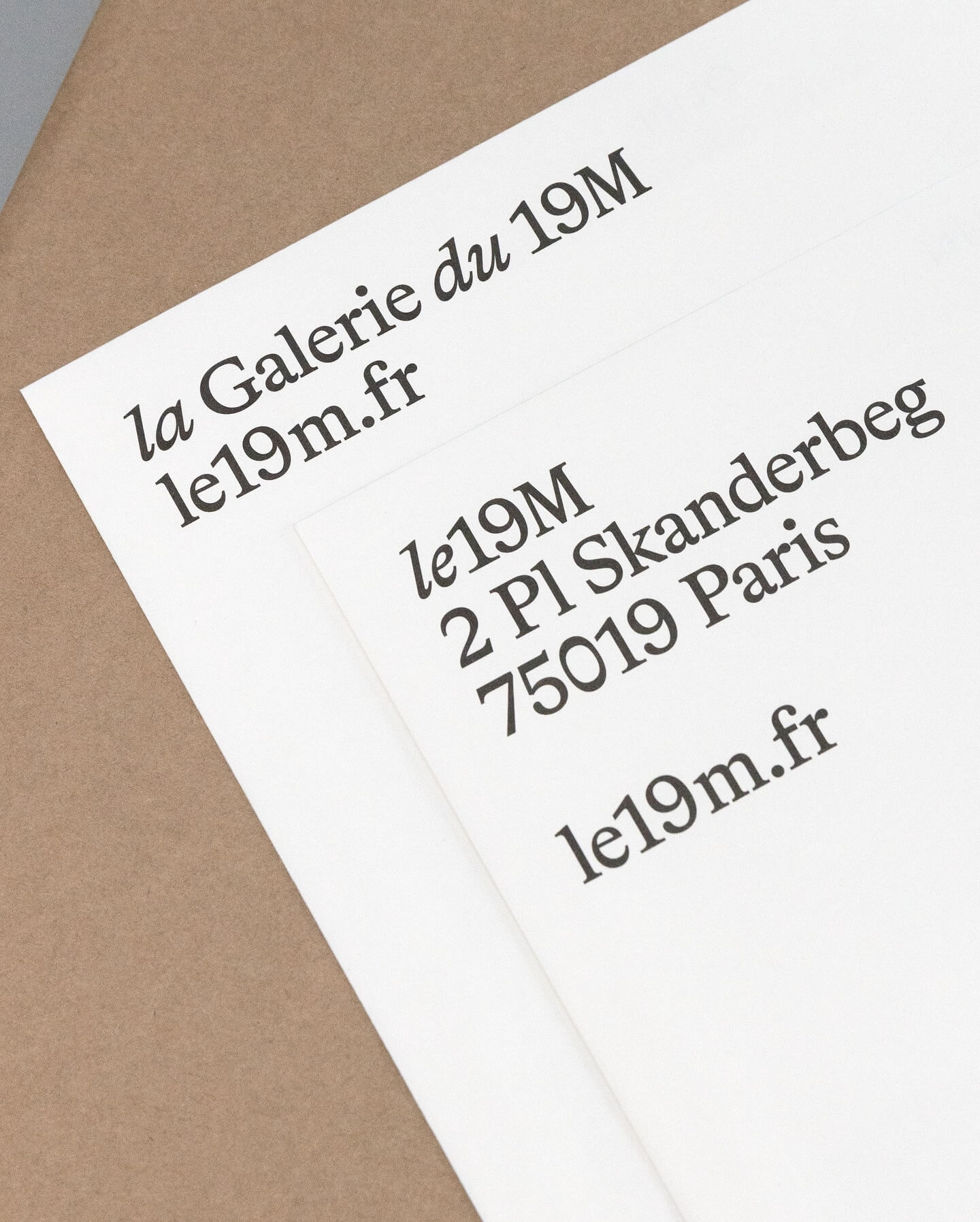
Hort Berlin used this serif typeface with classic and elegant forms (Bradford) for the visual identity they designed for the cultural center le 19M.
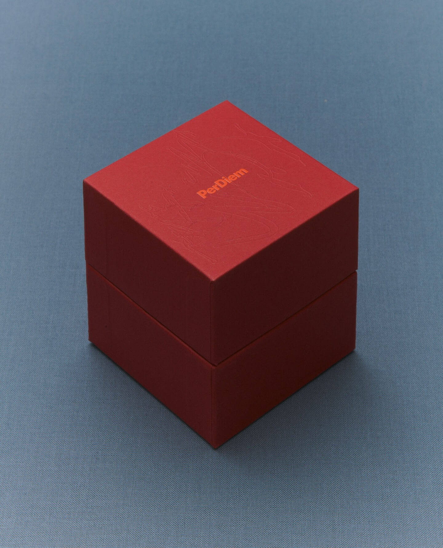
A jewelry brand that saves us from monotony and invites us to live creatively. Brand identity and art direction by Tino Nyman, featuring the typefaces Onsite, Exposure and GT Pressura.
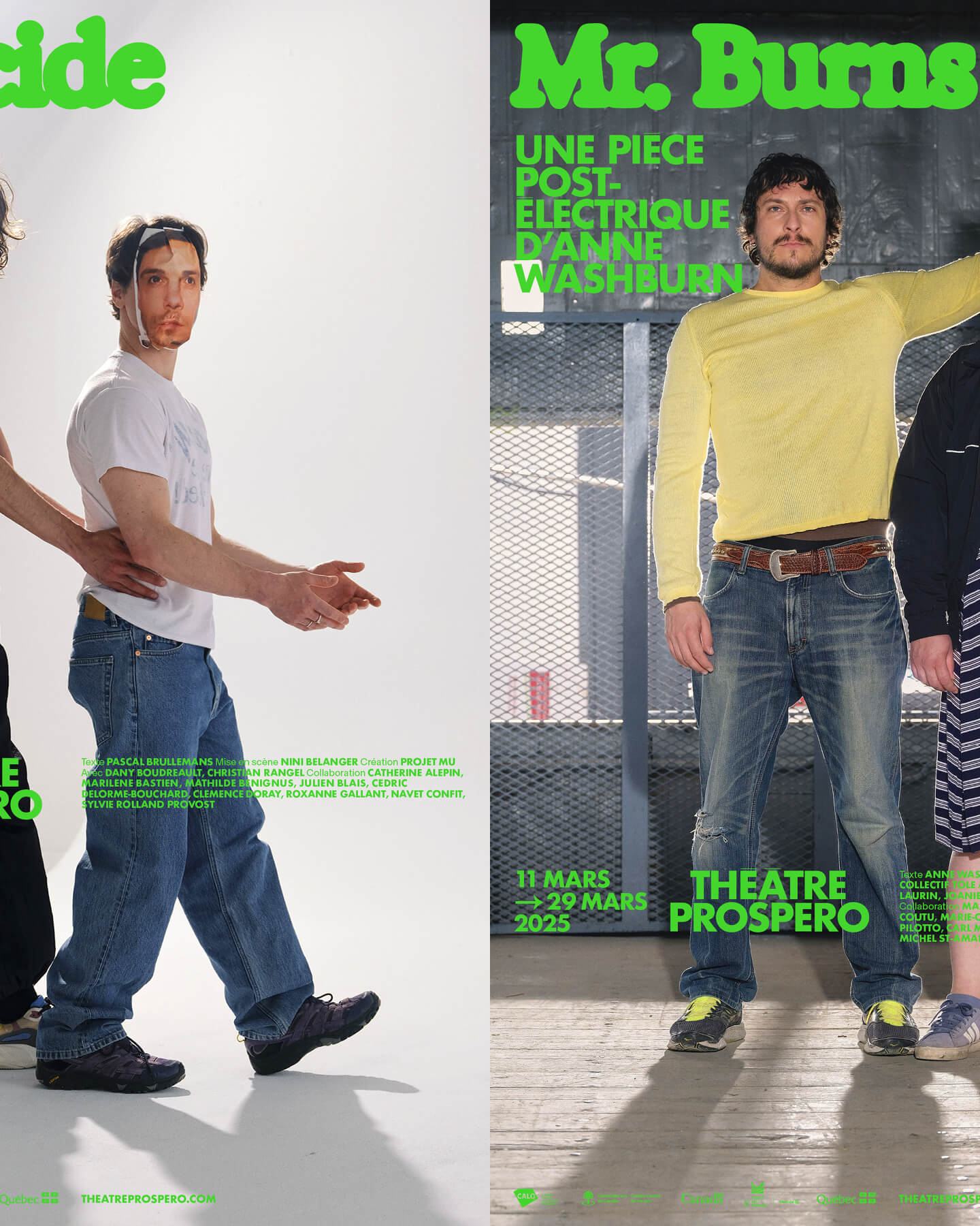
“After all, being together is revolutionary.” That was the main idea behind the 2024-2025 season campaign for Théâtre Prospero, directed and designed by Principal Estudio using Exposure.