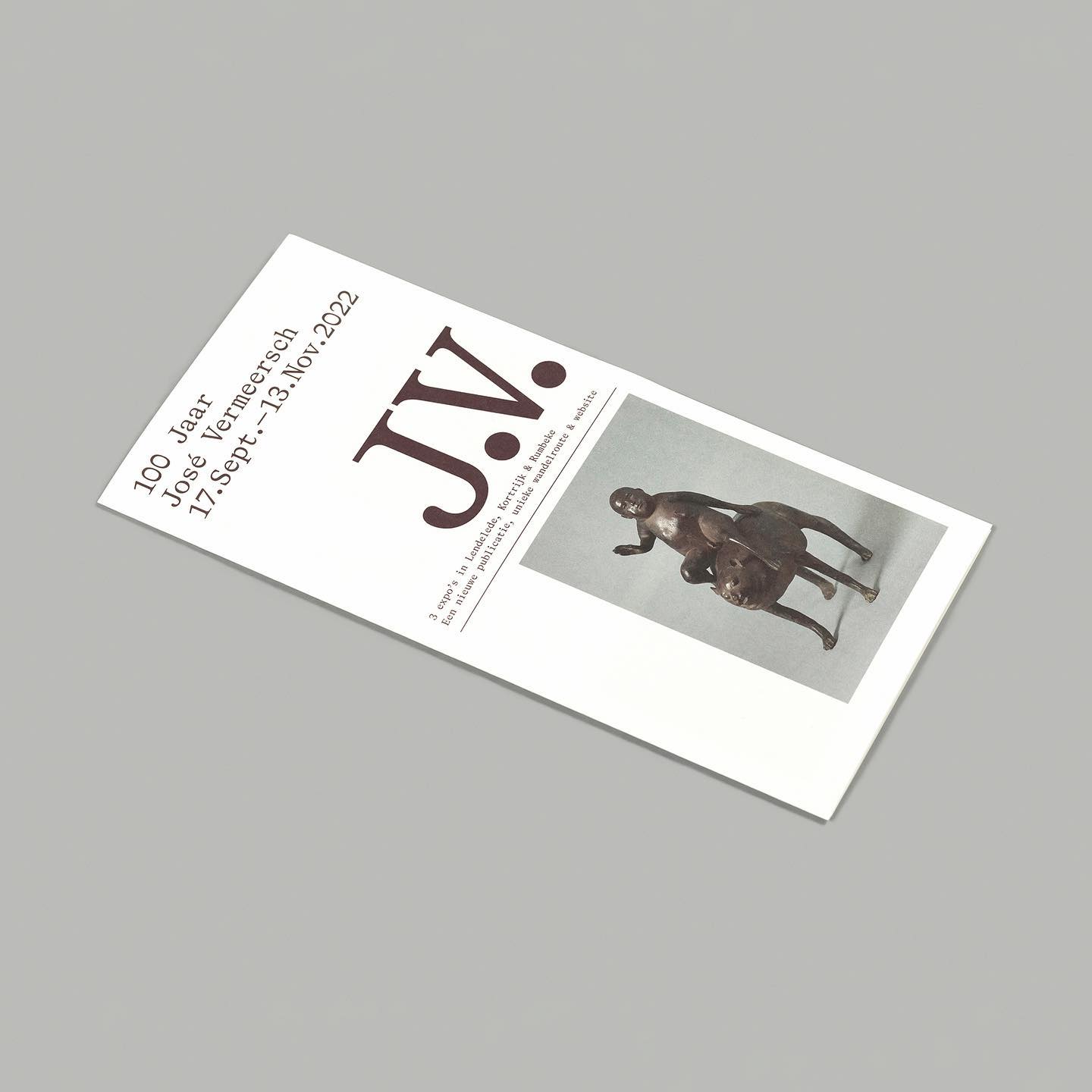
On the 100th birthday of artist José Vermeersch, an exhibition was held to celebrate his work, where the Bradford Mono typeface played a crucial role.
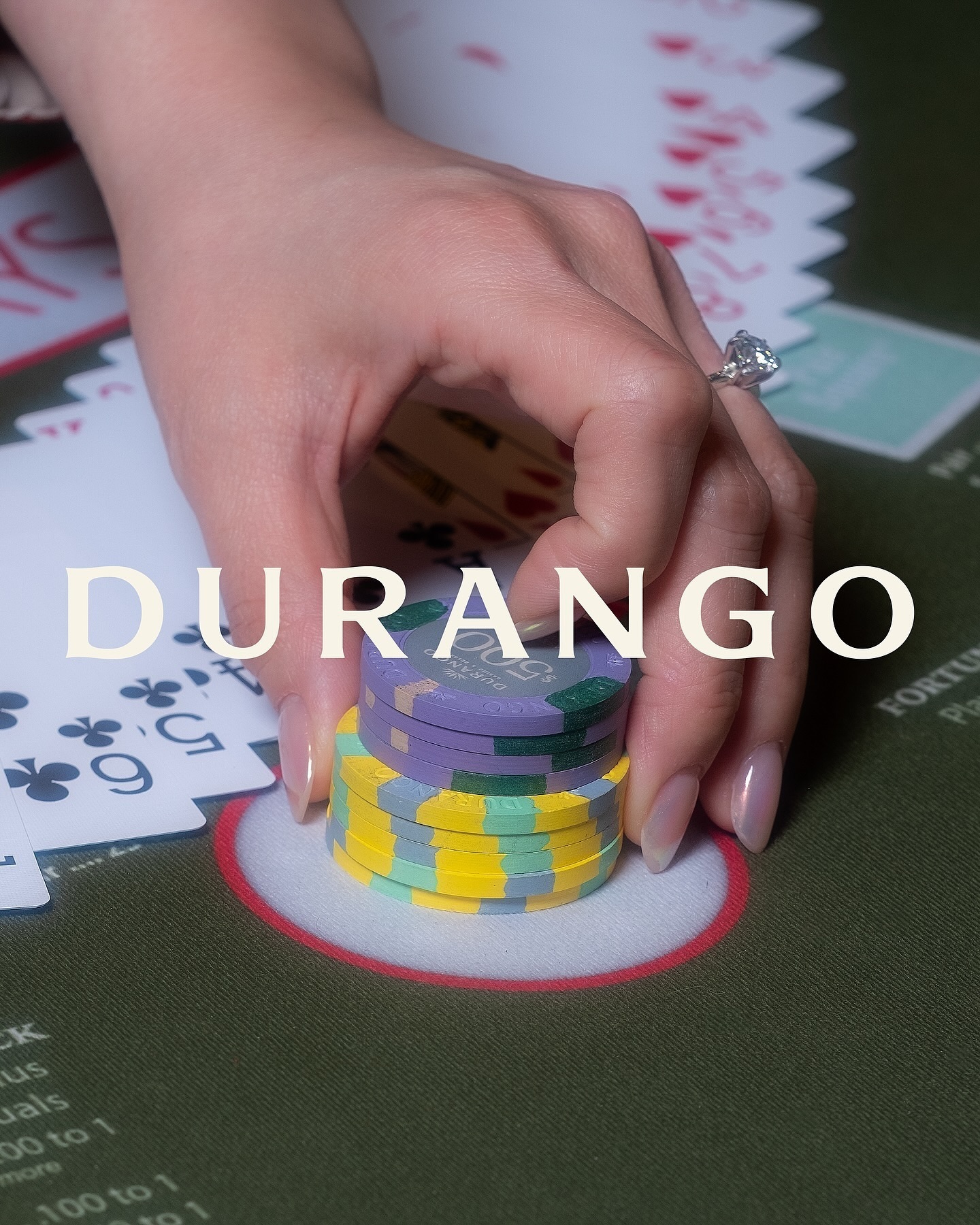
Inspired by its iconic location—Las Vegas—this hotel embraces warm, sun-faded colors, a custom sober logo with subtle serif hints, and uses National and Nib as its typefaces.
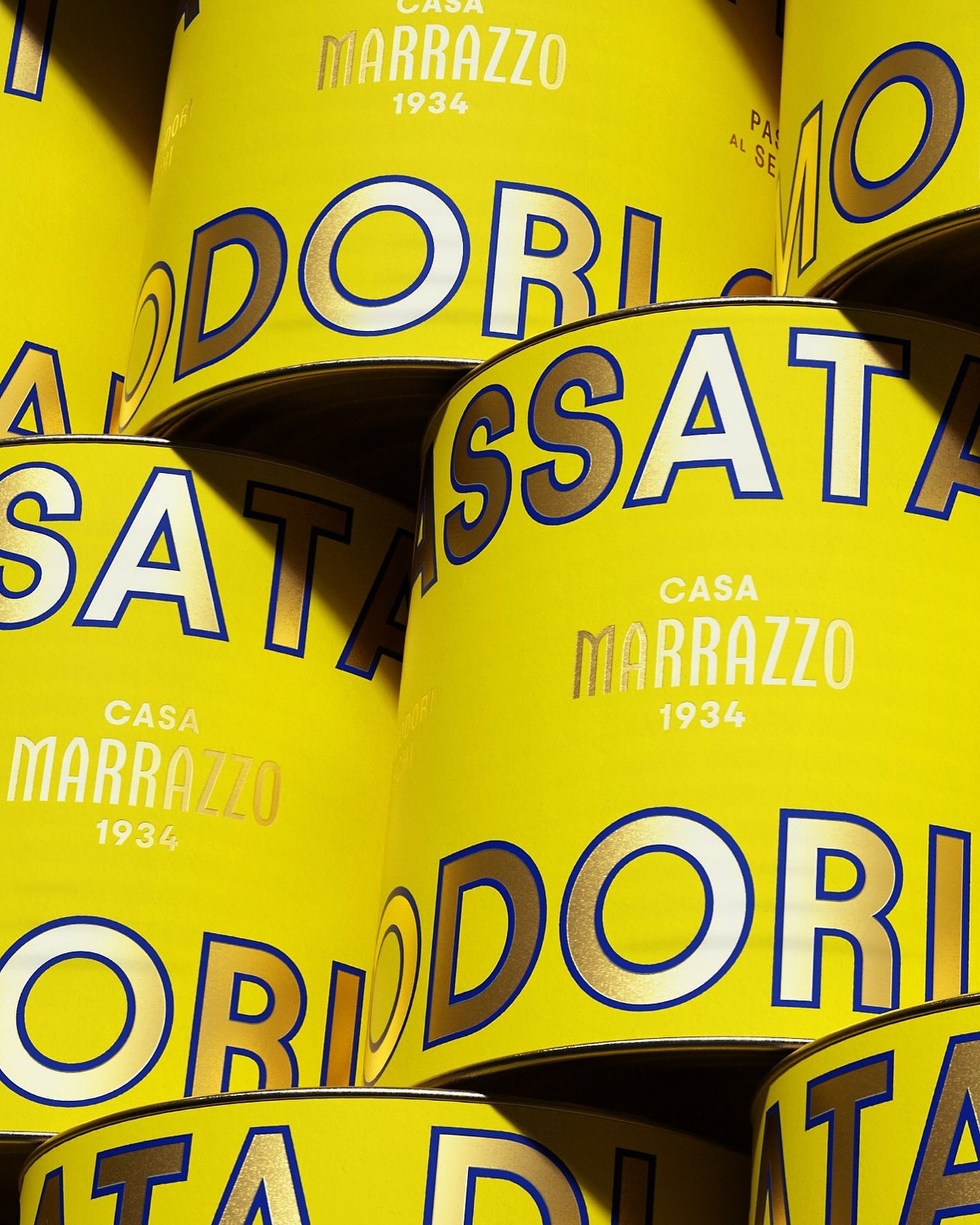
A clean layout, lots of gold, and the Avantt typeface were the elements that the Italian agency Auge Design used for these canned foods full of tradition and flavor.
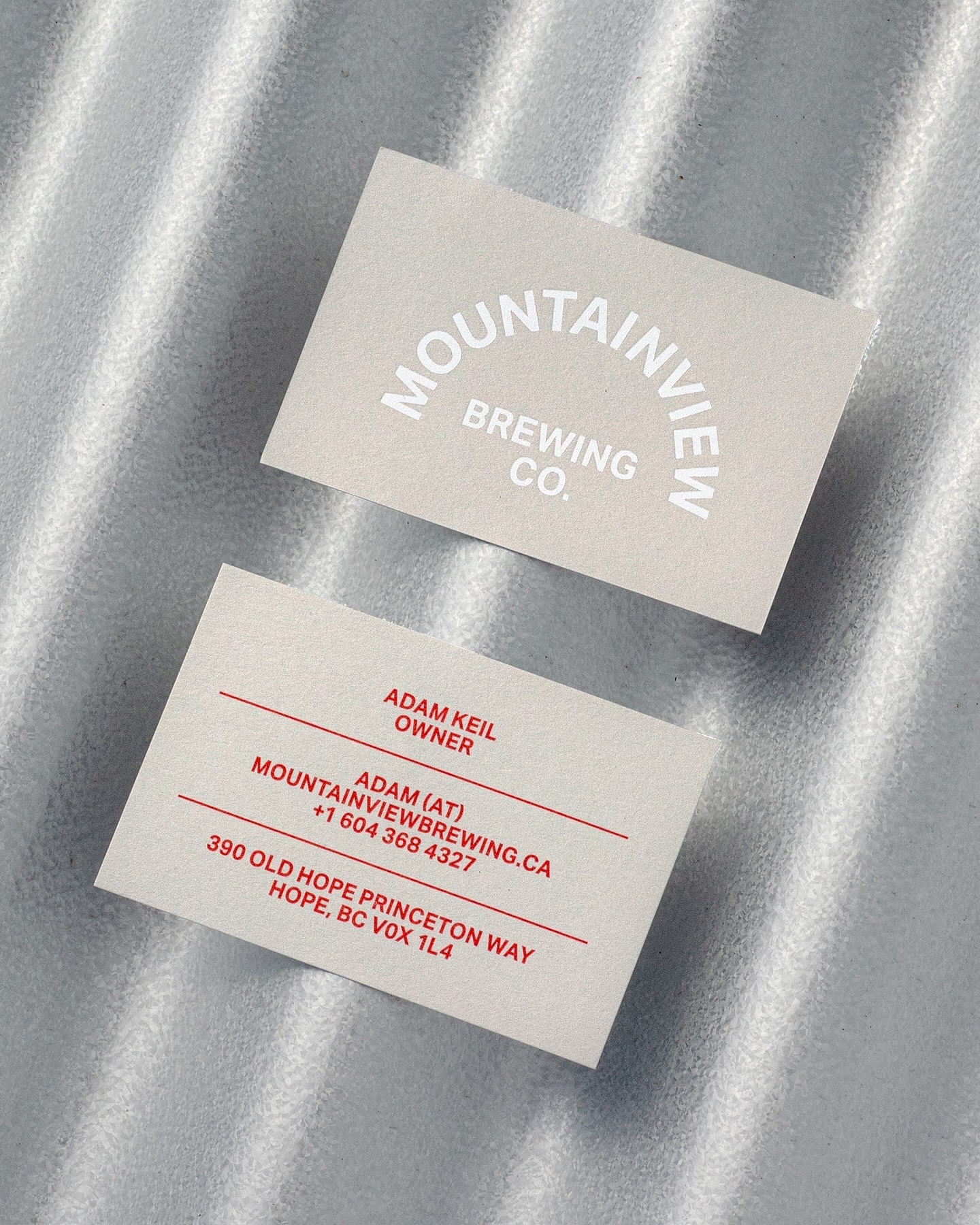
Memory Studio was inspired by vintage elements, like old book covers, and used Aktiv Grotesk to create the identity for this craft brewery.
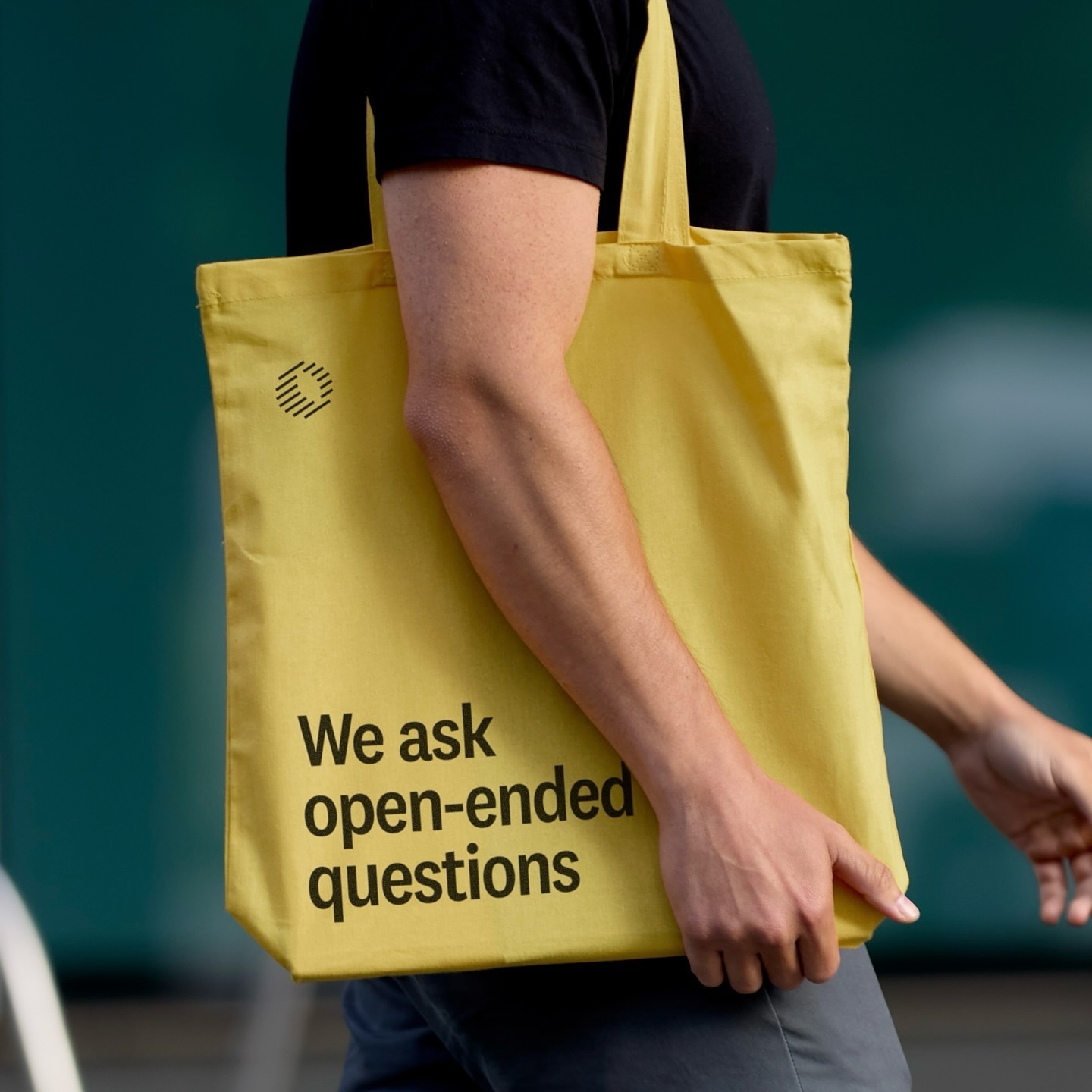
Classics with a modern twist; National 2, Atlas Grotesk, and Atlas Typewriter, were used by Play for the identity they created for Open Research.
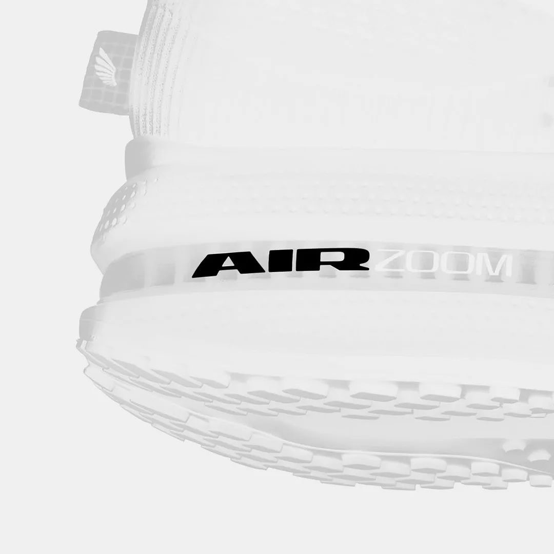
Win on Air is the name of the new Nike Air identity, where David Gobber and Hoang Nguyen were part of this project, designing the typography used in the logo, which is a custom version of Generation Mono, another typeface of their own creation.
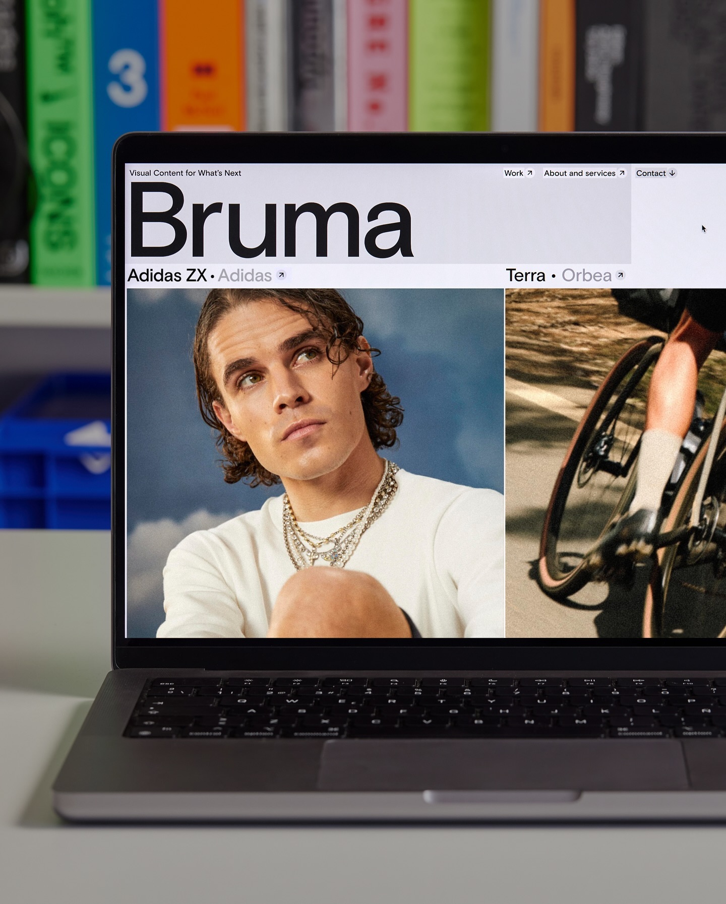
Basis Grotesque is the only typeface used in the identity and website of Studio Bruma, a creative production company to forward-thinking people and brands.
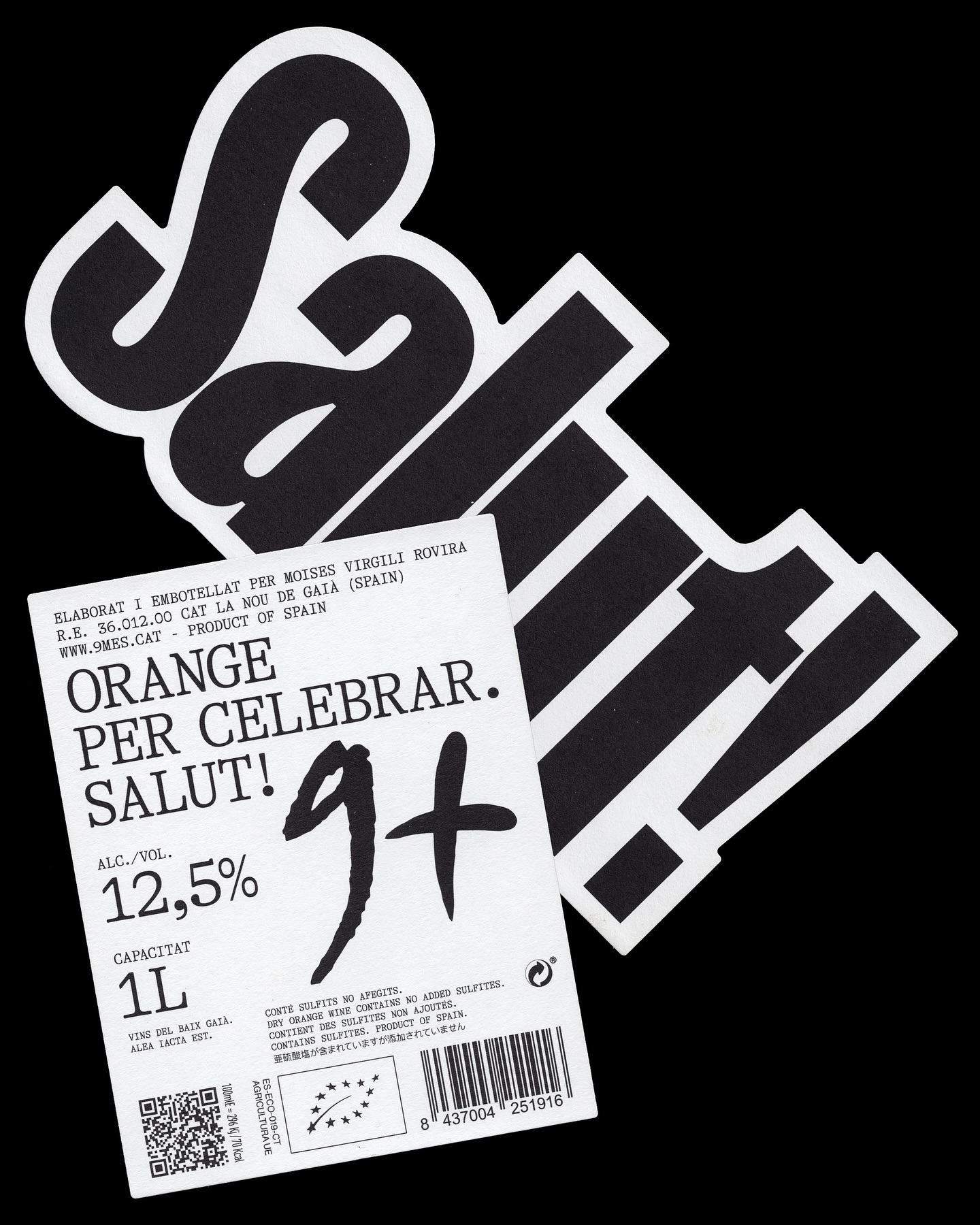
A simple and powerful label for a wine made to celebrate. Principi Studi used FK Screamer for the logo and GT Alpina for the complementary typography.
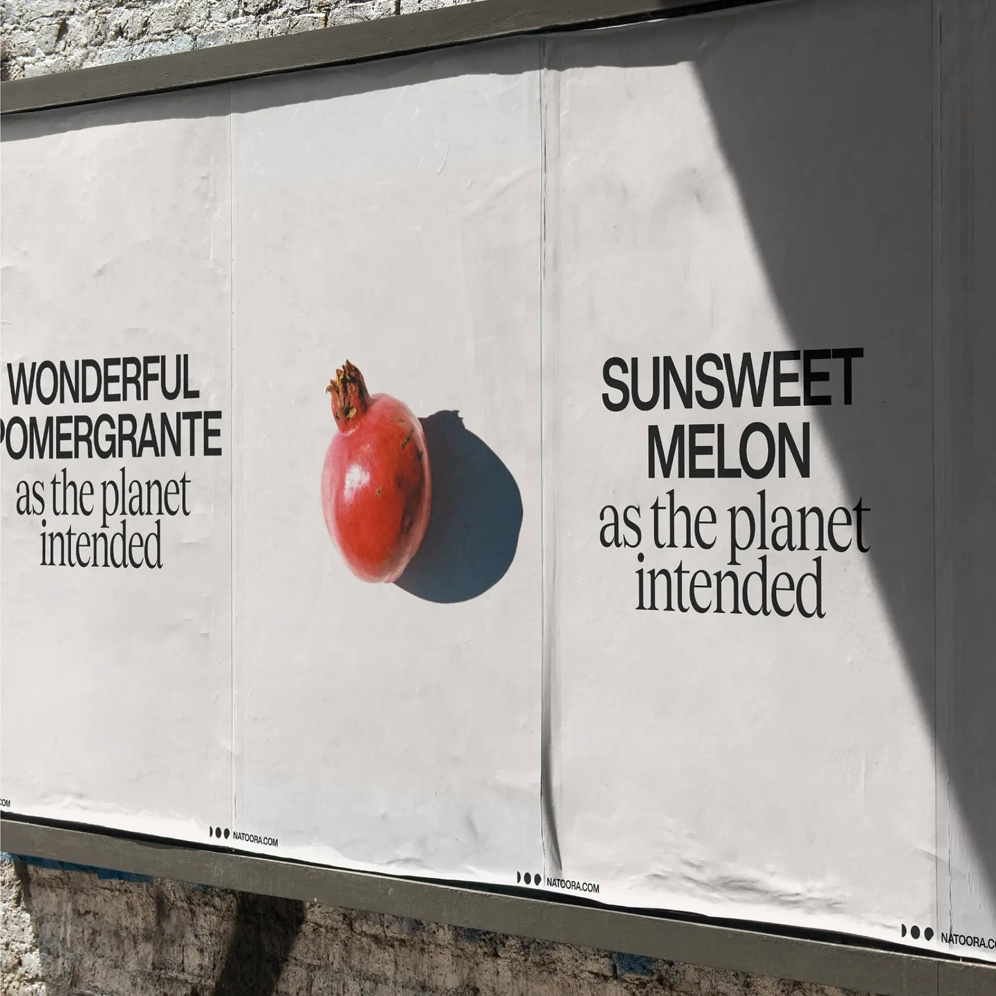
As authentic as nature can be, Justified Studio chose these two typefaces to be part of a sober yet sophisticated identity for the organic food producer Natoora.
Asfalt will have its first edition featuring an identity filled with color blocks, sports images, a vertical logo using a customized version of Generation Mono, and texts using ABC Diatype.