Moser Crystal launched an autumn collection, and Studio Marvil designed its image using the Atlantic typeface from Heavyweight.
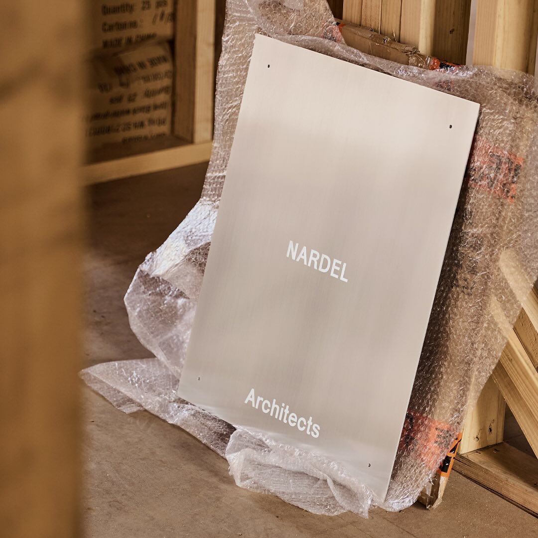
Simple and subtle; Both Studio created a brand identity that aligns with the proposal of Nardel Architects.
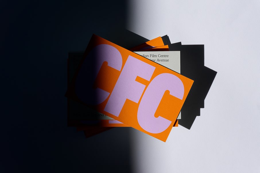
Helping to create a bold and inclusive visual identity, Quentin Coulombier’s Buzz and the well-known Cooper were selected by Underline Studio to represent the Canadian Film Centre (CFC)
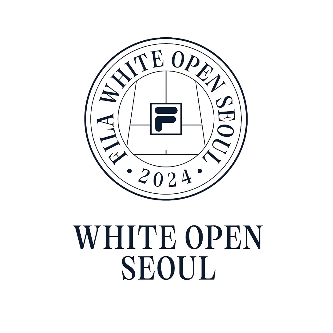
Tartuffo by Bouk Ra for Lift Type in the identity created by Fila Korea for the 2024 White Open Seoul; a tennis open where everyone can participate.
New typefaces for the new identity of the production company L’Éloi; Principal Studio chose Review by Commercial Type and Skandia by Store Norske Skriftkompani.
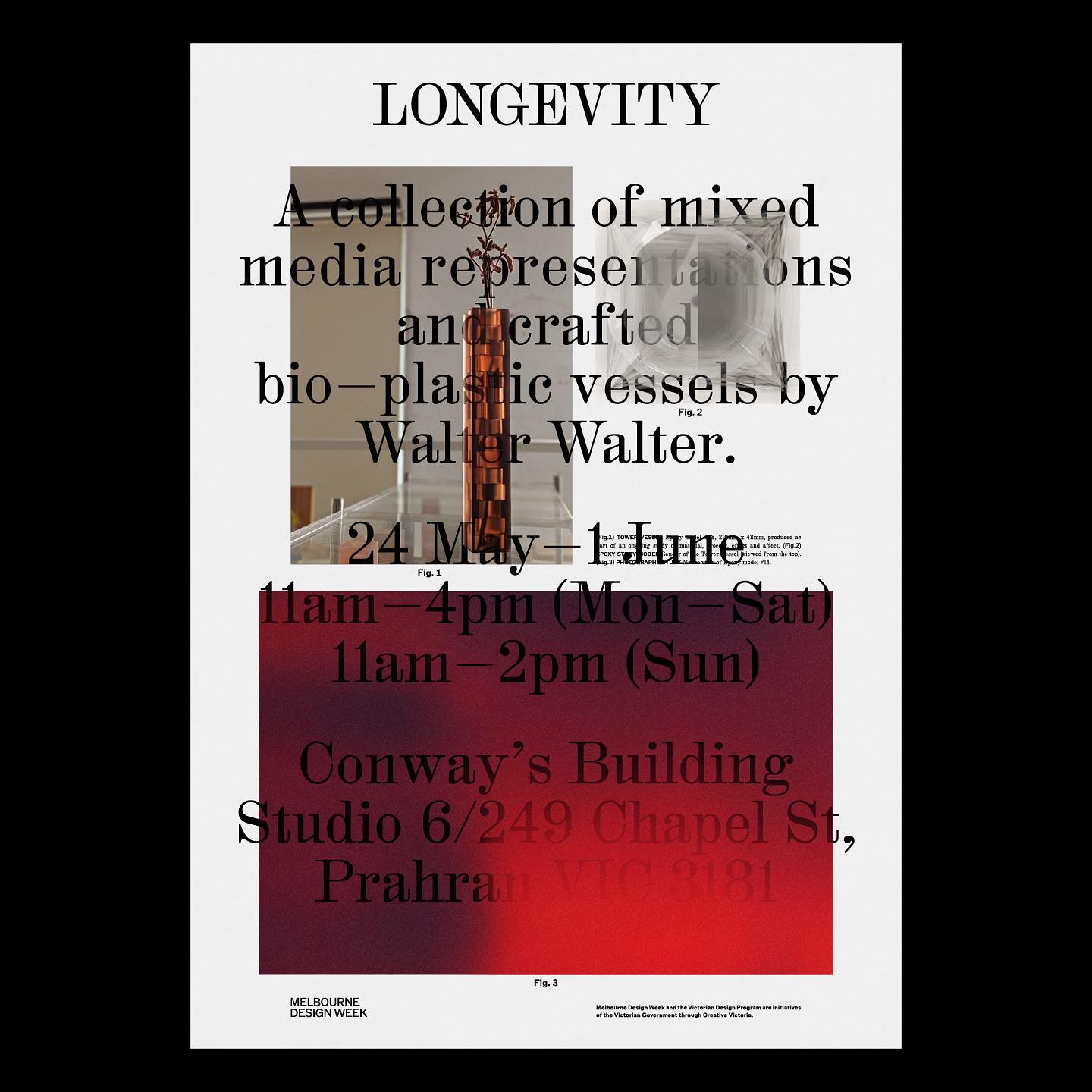
M. Geisser used HAL Colant from HAL Typefaces and ROM from Dinamo for the poster and invitation for the Walter Walter Longevity exhibition.
Low key Design Company used Boris by Giulia Boggio to complement this identity for a friendly, relaxed, and gentle café, just like a wandering sheep.
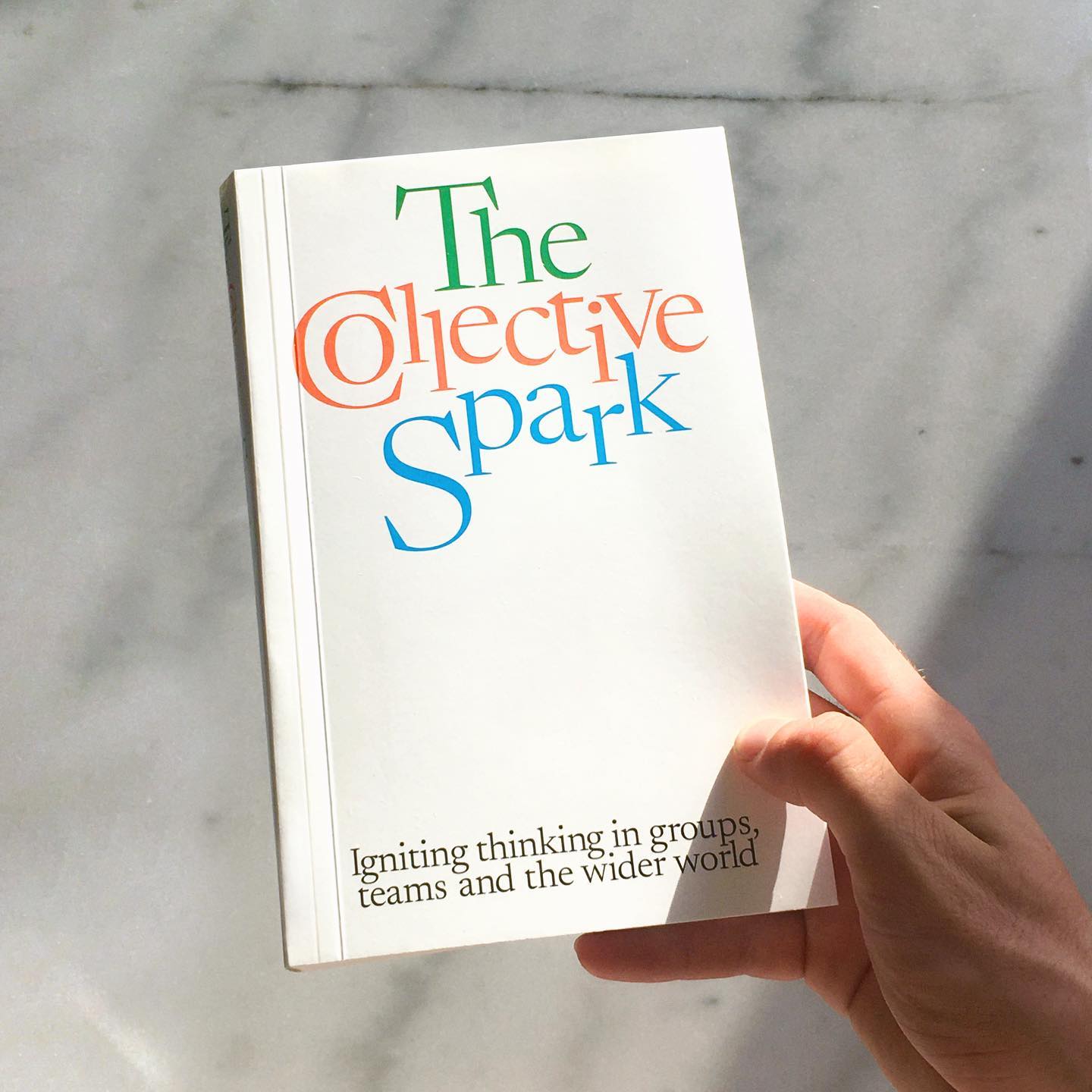
Newsreader by Production Type on the cover of this book addresses collaborations and how to coexist with other ideas.
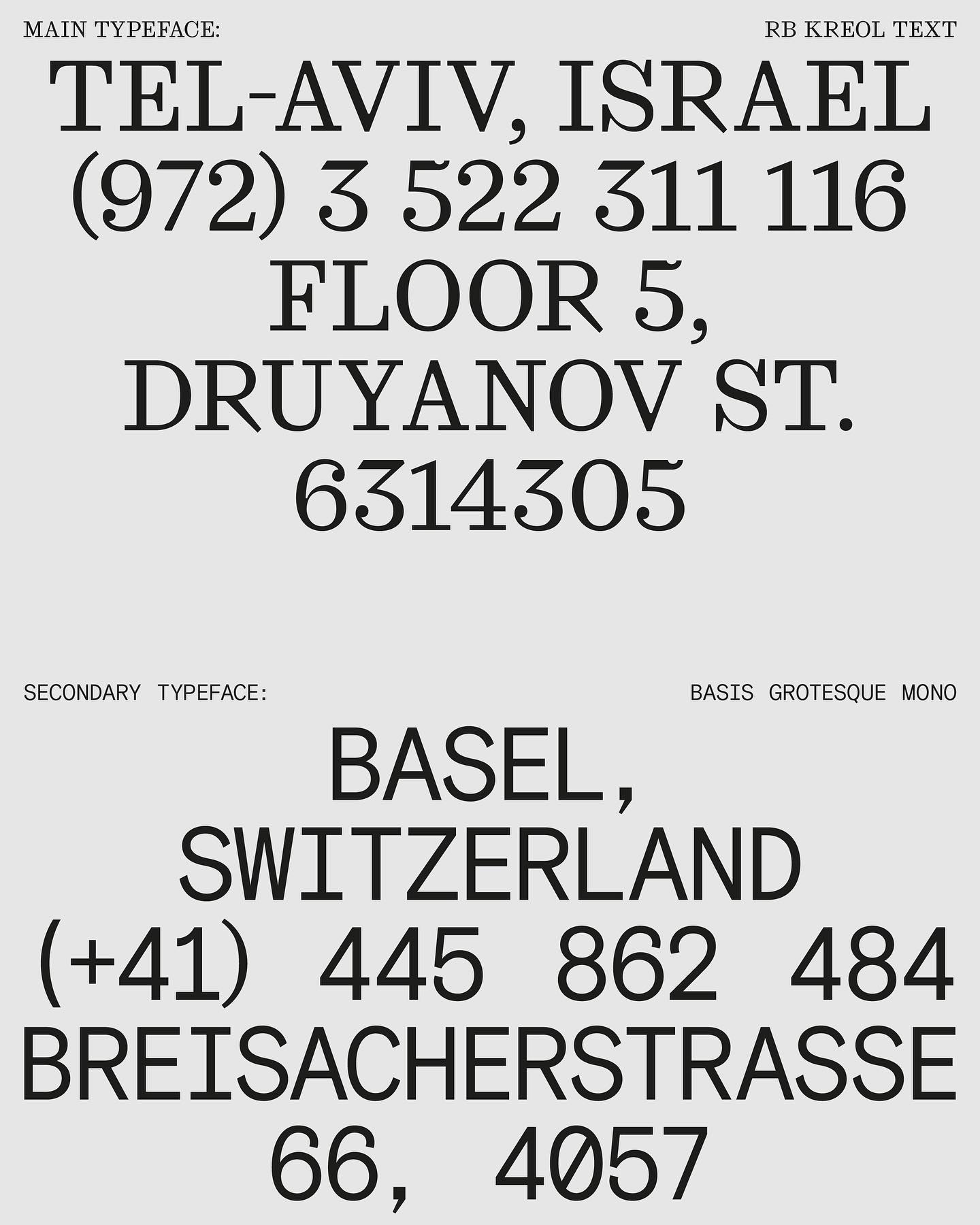
In this website with two main columns constantly changing size, Atipus Studio used RB Kreol Text from Studio René Bieder.
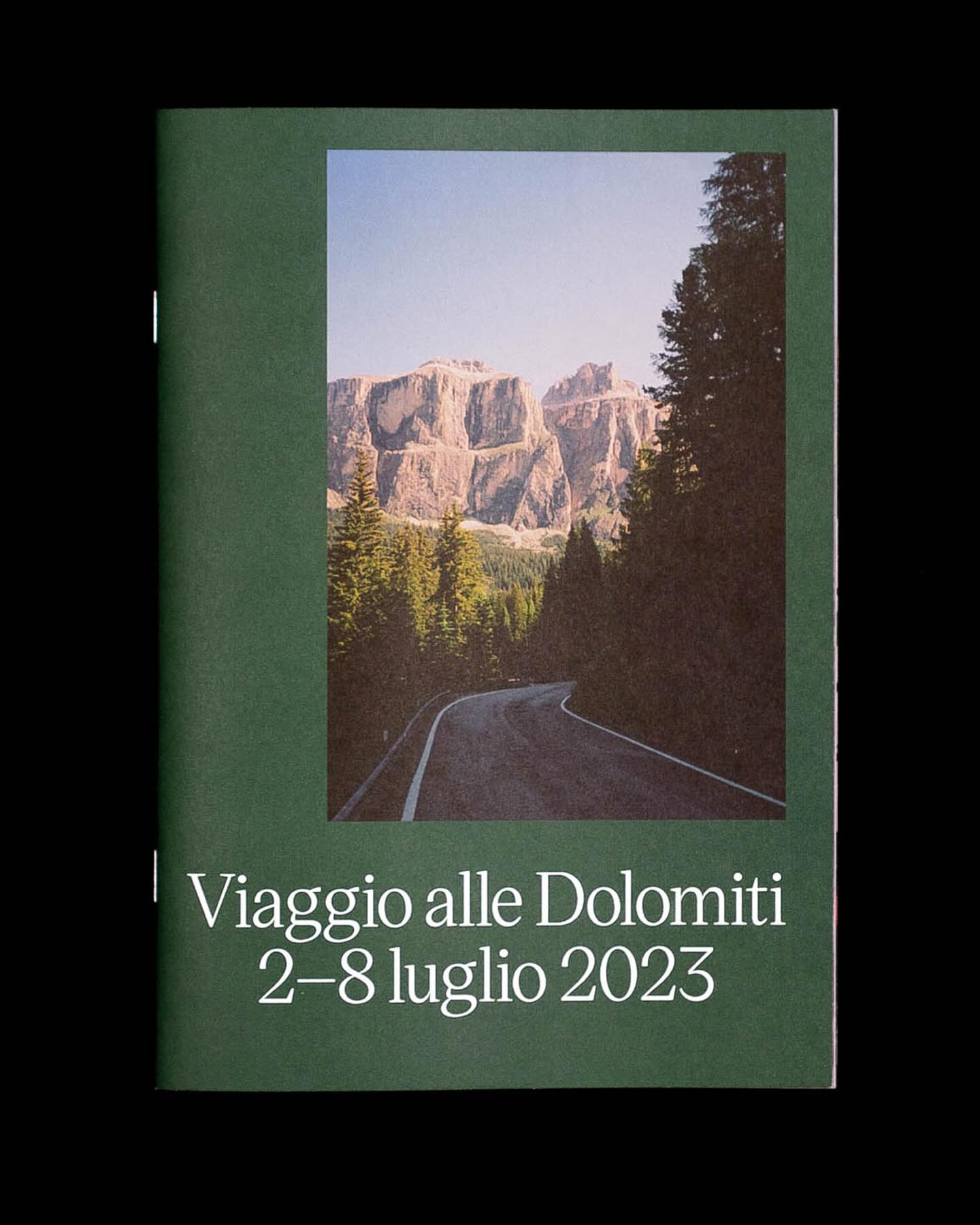
Victor Serif by KOMETA accompanies the photographs taken on a cycling trip with friends in this booklet designed by Familia.