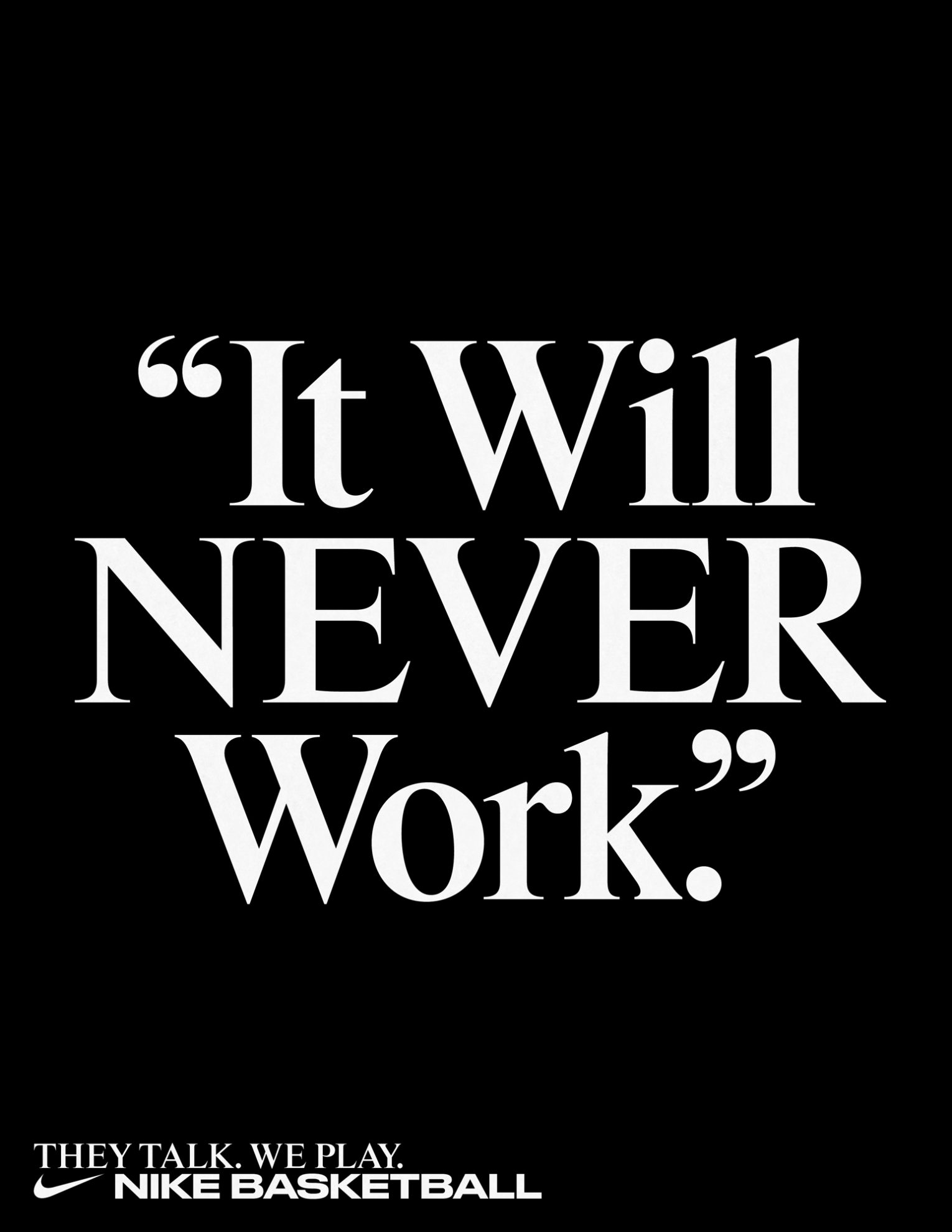
Rhymes by Maxitype in the 2017 campaign for the NBA Finals “They Talk We Play”. Design by Hort and Tim+Tim.
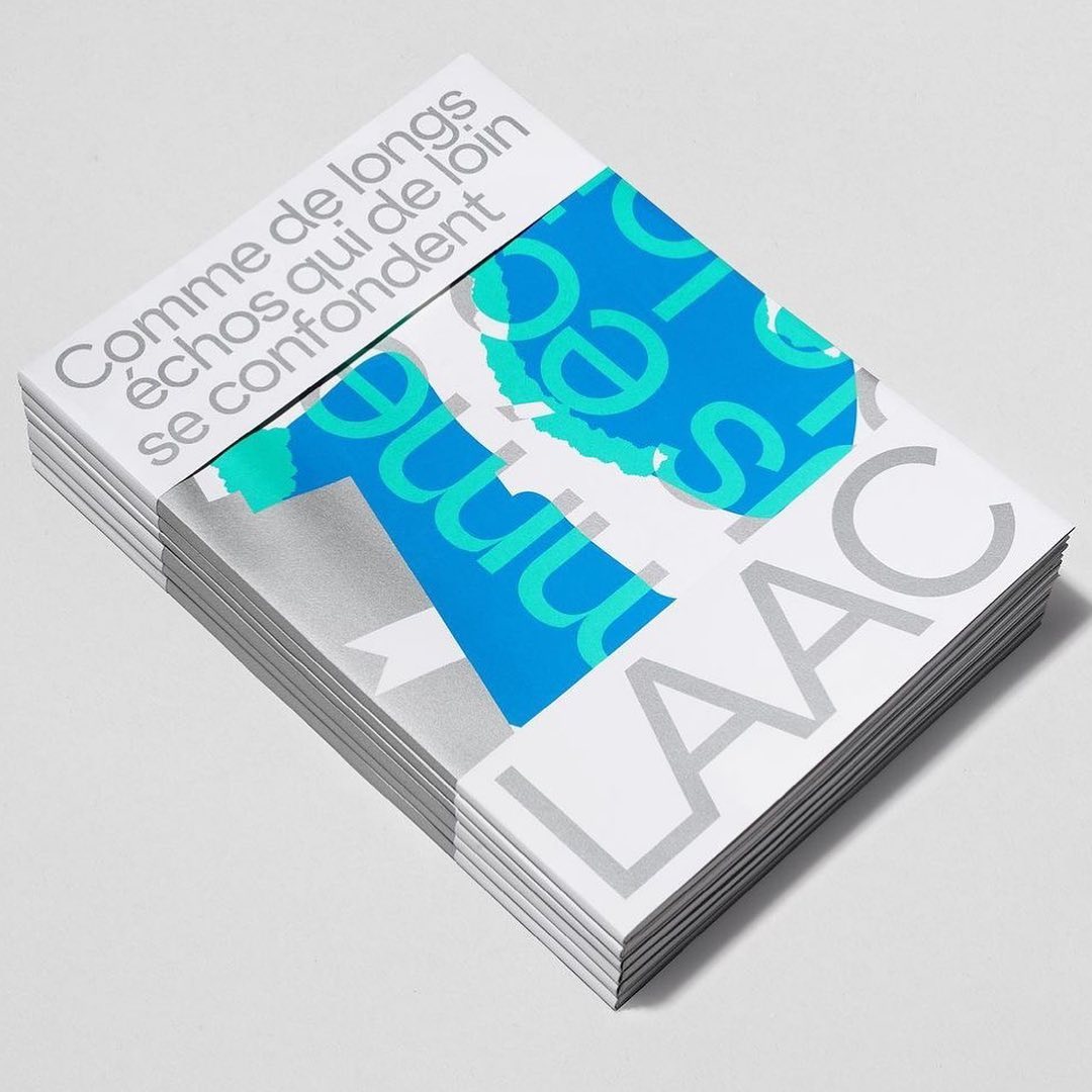
Studio Hudson Catty and Atelier Baudelaire used ES Klarheit Kurrent to design a set of three books celebrating the 40th anniversary of LAAC in Dunkirk.
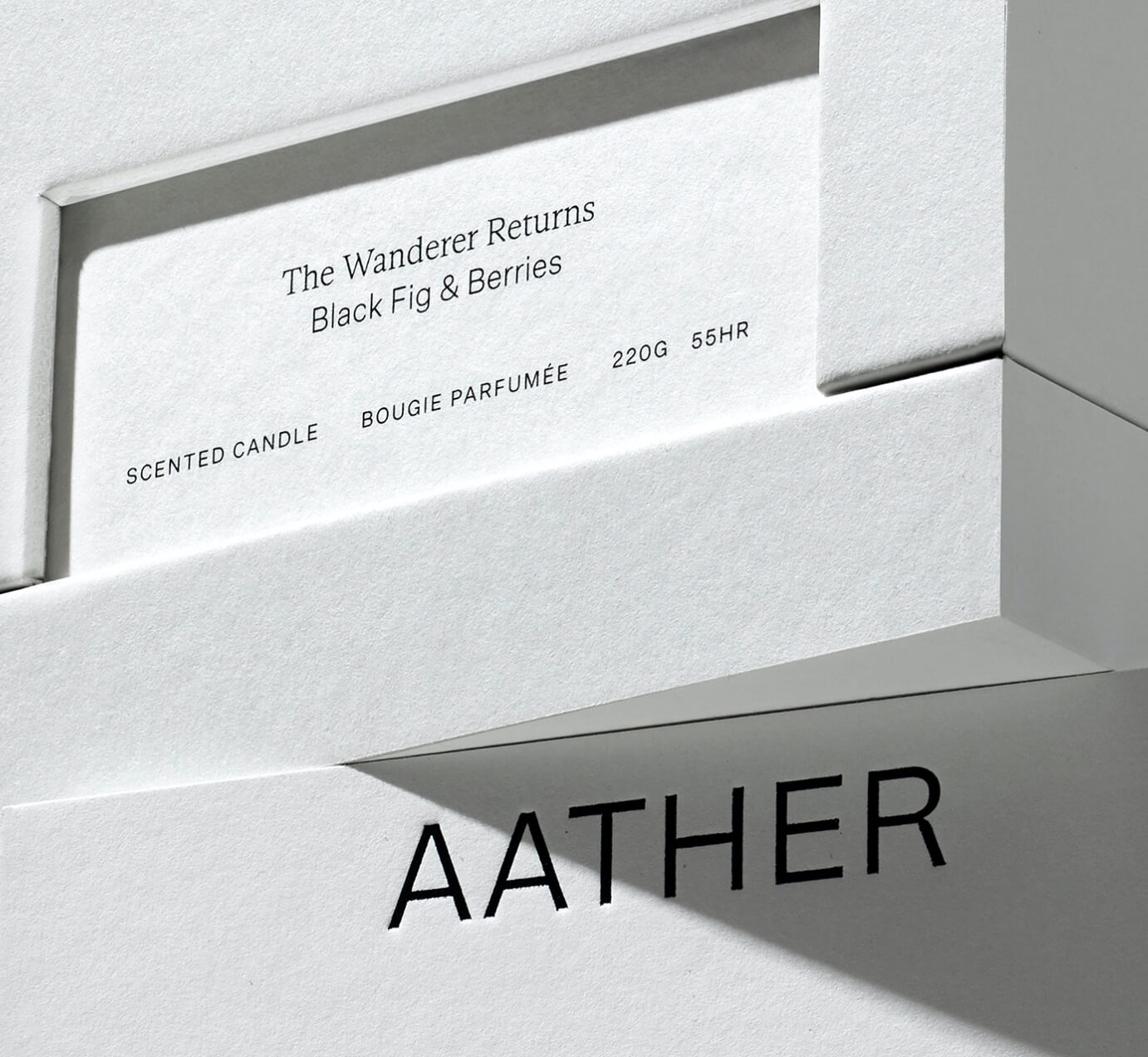
SOCIO Design used Untitled Sans from Klim Type Foundry and Gestura from Socio Type Foundry to complement the visual identity of AATHER’s high-quality candles.
Editorial New, ITC Franklin Gothic, and Antique No.6 were brought together by The Office of Ordinary Things to create contemporary compositions in the identity of Mad, a agriculture organization.
Studio Ard was commissioned to design 15 publications and the signage for the graduation exhibition of the RCA School of Architecture. All is typeset in Prisma Text by Lineto.
Pastiche Grotesque by Order Type Foundry was customized by Benjamin Tuttle to become the bespoke typeface for the First Choice brand, a new generation of travel lovers. Design by Ragged Edge.
Typeset in Rhymes by Maxitype in the book of photographer Werner Amann capturing the nightlife rave scene of the early 1990s. Design by Lamm & Kirch with Caspar Reuss
Giacomo Bastianelli designed in AL Linea by Alex Lescieux, the posters that showcase the outcomes of the workshop week at ECAL for first and second-year Master Photography students.
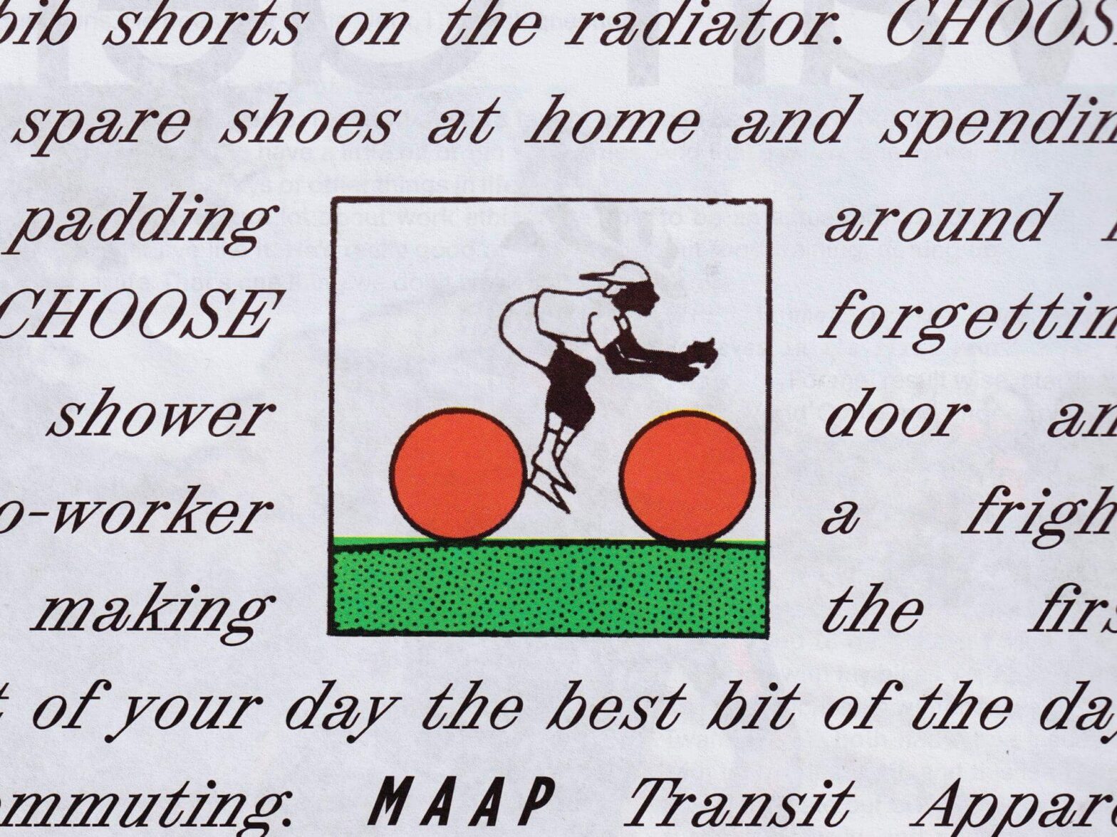
Tric Studio in charge of the design and art direction of second issue of the MAAP publication, Off The Front. The fonts used are ABC Synt and ABC Oracle by Dinamo, and Base Monospace by Emigre.
LL Catalogue by Lineto at the Grand Prix suisse d’art/Prix Meret Oppenheim, a event recognizing cultural creators in Switzerland.