Maximage designed this book with great attention to detail. A custom version of Selecta developed by Maxitype.
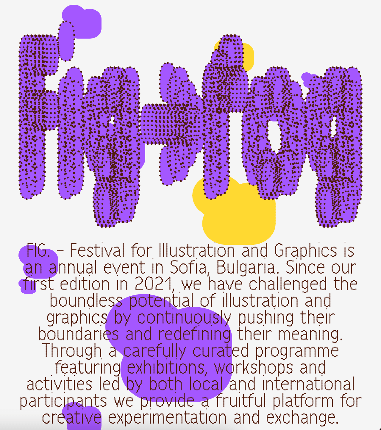
A festival that explores visual creativity to the point of blurring the lines between illustration and graphics; Miroslav Zhivkov created the identity of FIG (Festival for Illustration and Graphics) using Harber.
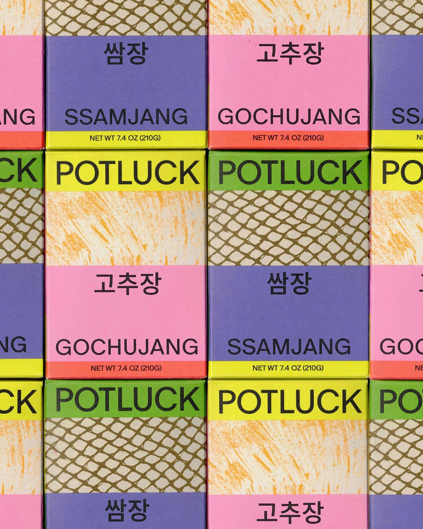
Regrets Only created a visual identity just like Potluck works; bringing together various elements to create something from scratch. Oracle is used as the primary typeface and Source Han Sans as the secondary.
Address Arts leveraged the possibilities of Exposure by 205TF, a variable typeface whose weight was modified to achieve a solid and heavy logo.
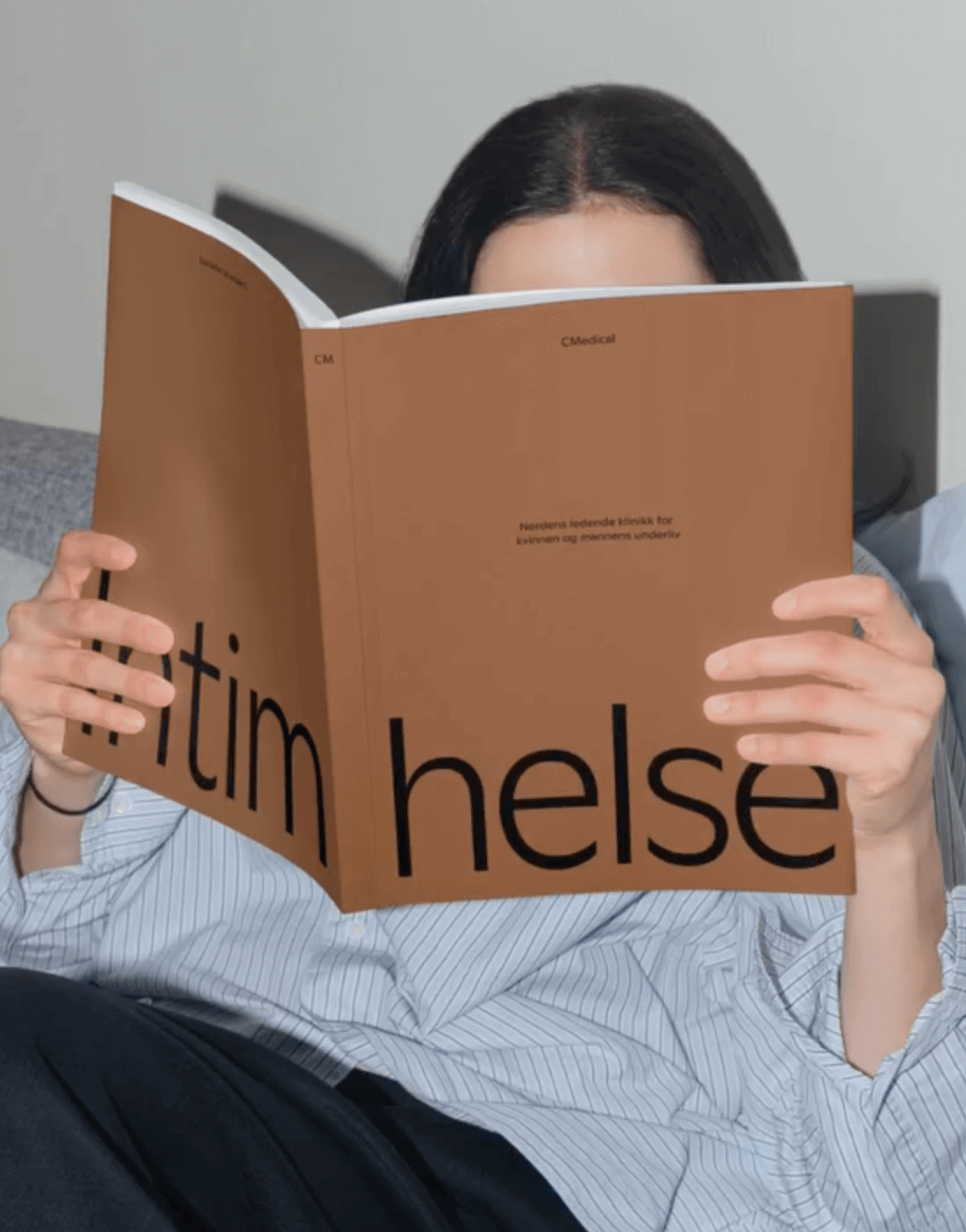
EY Doberman used Ginto from ABC Dinamo in different weights to achieve a consistent stroke throughout the visual identity for CMedical.
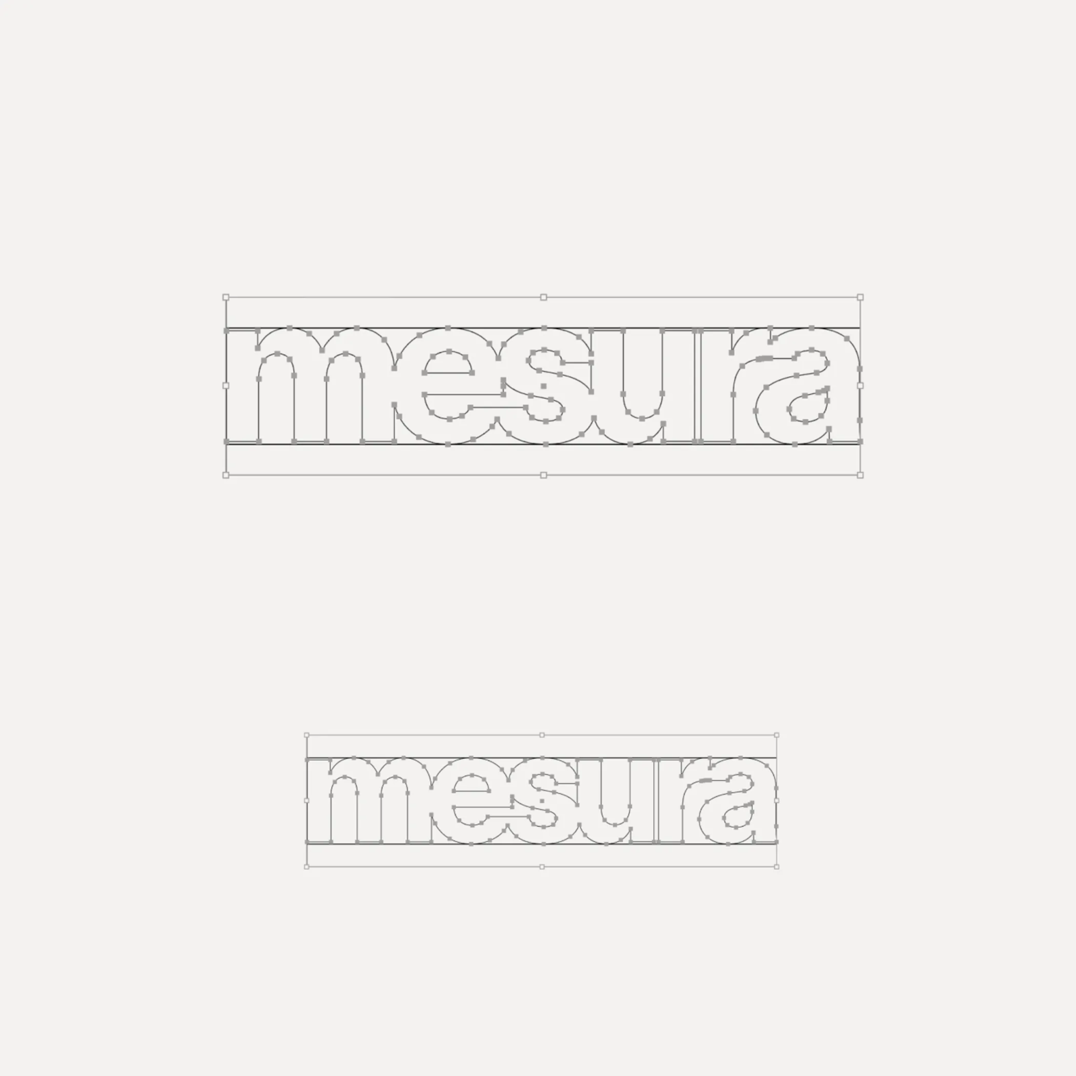
Flexibility was what Mouthwash studio aimed for with the typographic selection they made for the Messura . Kimera’s Waldenburg and Times LT were chosen to give solidity to the brand and possibilities to evolve.
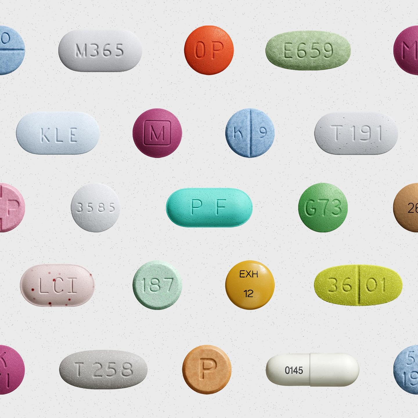
Waldenburg from Kimera Corp was customized to be part of the visual identity for a new line of assistance for people with opioid addiction issues. Designed by Raw Materials and Service Plan
Hiro builds developer tools that bring Web3 to Bitcoin. In its identity, Porto Rocha chose several fonts from the Aeonik family – Mono, Fono, and Bold –