

TypeHelper 2022® All rights reserved.
Images copyright to their respective owners. This site was made with Suisse Int’l Light from Swiss Typefaces.
Contrasts are everywhere, at all times, and in every place. They’re part of our daily lives and, consequently, part of the creative process. It seems they’re embedded in human nature and in our constant search for something new and different, as we know that, deep down, we aren’t made for absolute monotony. This might explain why, at some point in history, design drew inspiration from nature, with ornamentation incorporating elements like flowers and plants, as well as typographic combinations. This approach followed its natural course, leading to a point where the very concept of “design” transformed, questioning the value of all those ornaments on objects, ultimately leading to their elimination in subsequent years.
Wim Crouwel was a brutalist, someone who viewed design in its most practical and simple form, with communication as the primary goal. After studying art, he became fascinated with poster design. Influenced by the Swiss design school, he considered the grid as the most important element, a principle he applied not only to graphic compositions in posters but also to type design. This led to the creation of New Alphabet, a typeface from the 1960s built on a dot system designed to adapt to the CRT monitors of emerging computers.
On the other hand, there’s René Bazaine, who studied sculpture and stained-glass design before finding his greatest success and passion in painting. Facing the paradigm of his time between abstract and figurative, he published his thoughts in “Notes on Today’s Painting.” Later, he organized the event “Twenty Young Painters of French Tradition” as a manifesto against the rejection of “degenerate art” and the imposition of a highly dogmatic and traditional art style.
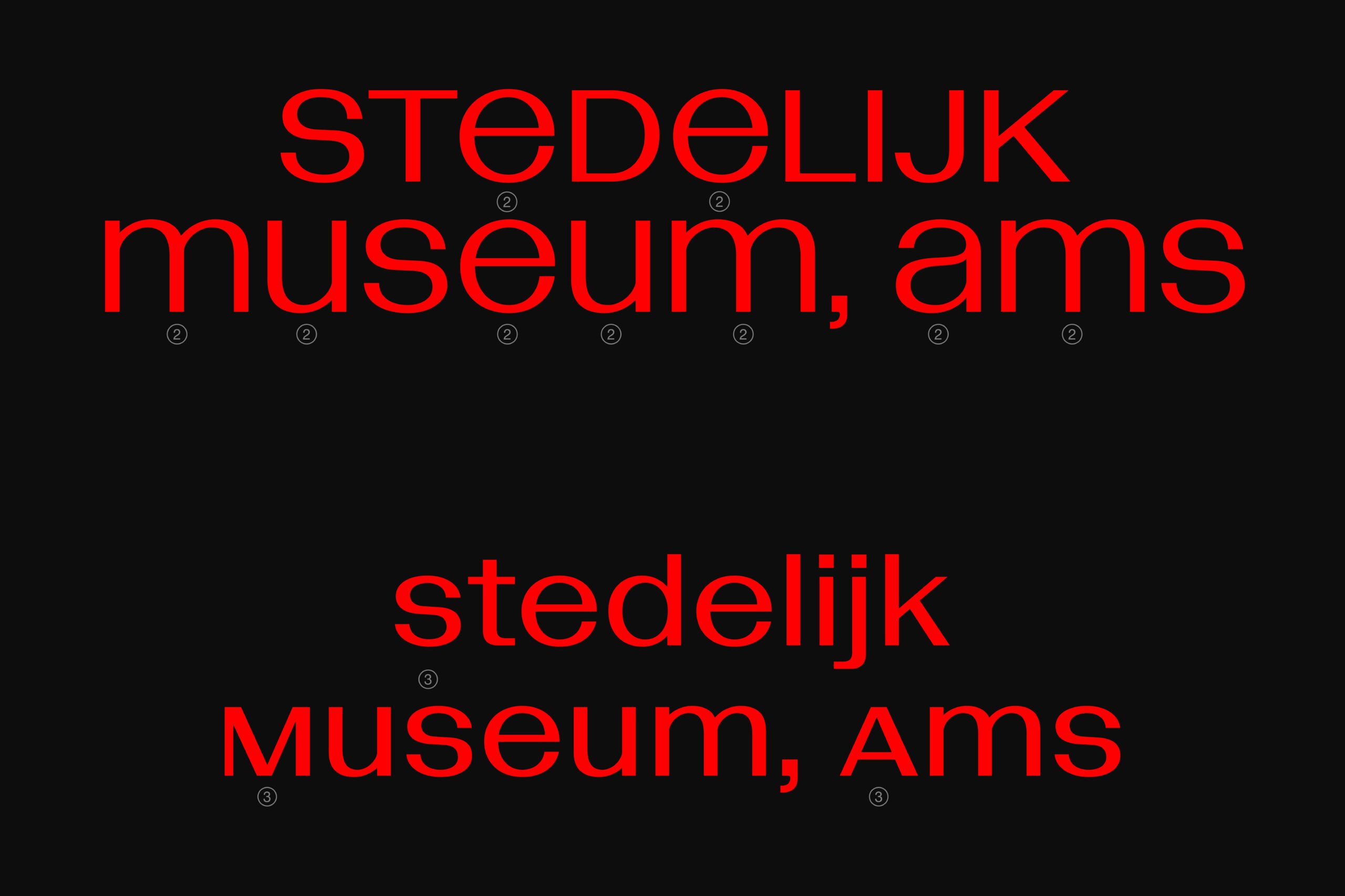
Seventy years later, Matthew Fenton and Haakon Spencer from British Standard Type combined these two talents to create a new typeface: Bazaine, named after they found inspiration in the letters on the poster that Wim Crouwel designed for a Jean René Bazaine exhibition in 1959.
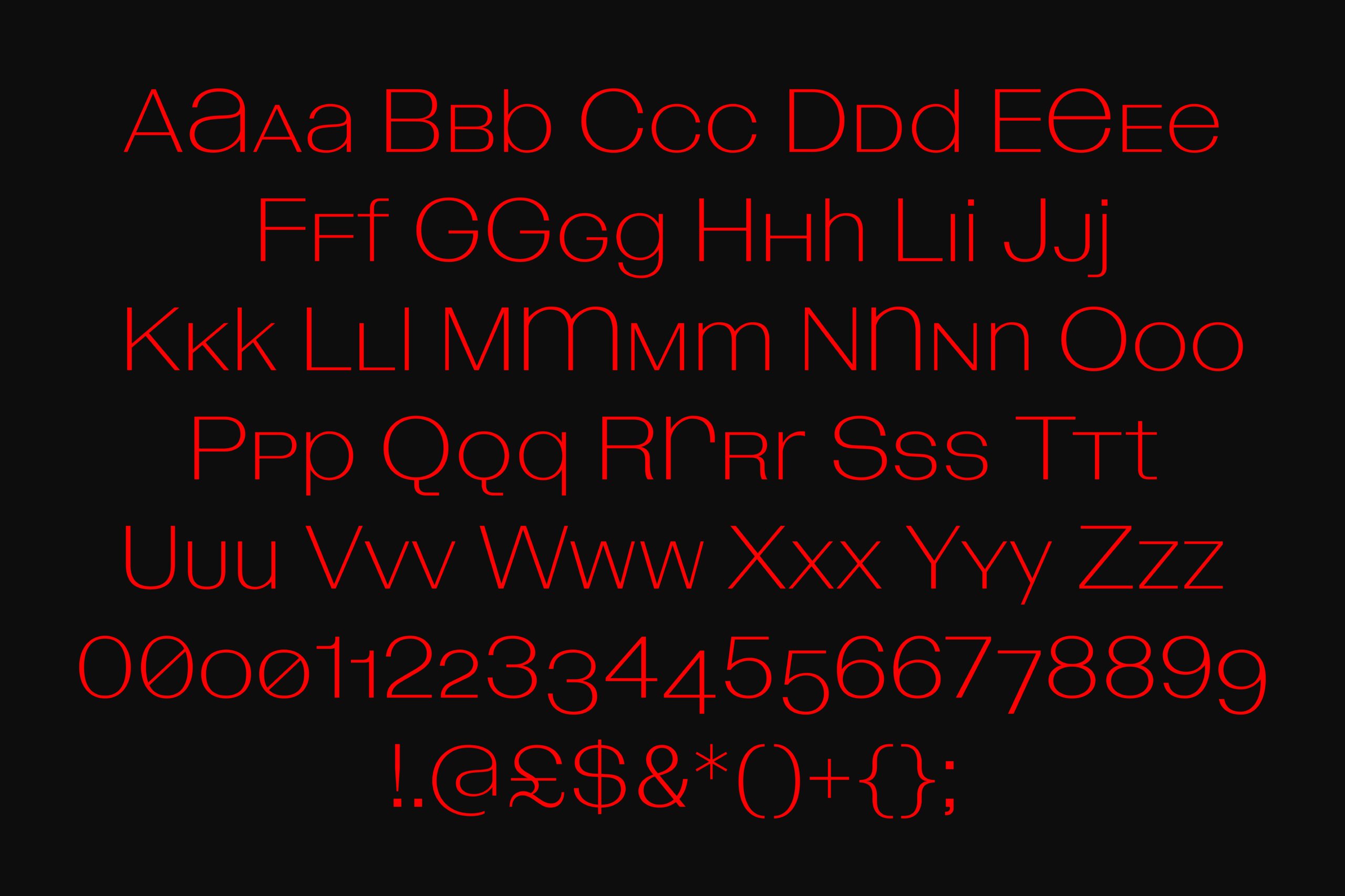
The structure of Bazaine is built on the foundation of a grotesque typeface but with unique characteristics, such as the wide and sometimes square shapes due to its high x-height. It’s interesting to see the wide width of round characters like “c” and “o,” contrasting with narrower ones like “h” and “u,” and the meticulous kerning throughout the entire typeface. There’s also an organic and dynamic flow when observing its silhouette, created by subtle asymmetric contrasts in the connections and terminations of its characters, visible even in the lighter weights. The small-cap version they’ve developed adds versatility to its usage. Bazaine, therefore, shows that it’s more than just a typeface designed to be a transparent communication medium like Helvetica; it invites us to observe the modulation in its forms and glimpse its aesthetic intentions.
The final thought after analyzing Bazaine suggests a romantic tone in the creative process when we consider how two people, with their personal contrasts and with the contrasts of different times and professions, can meet on the path of design to inspire a product—in this case, a typeface—that will endure like them in history, allowing this product to inspire something new that we can’t yet imagine.