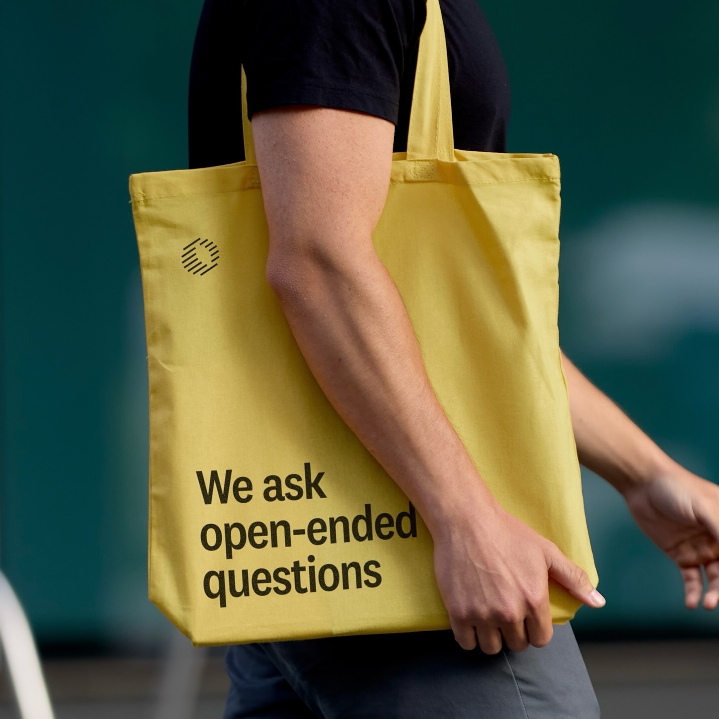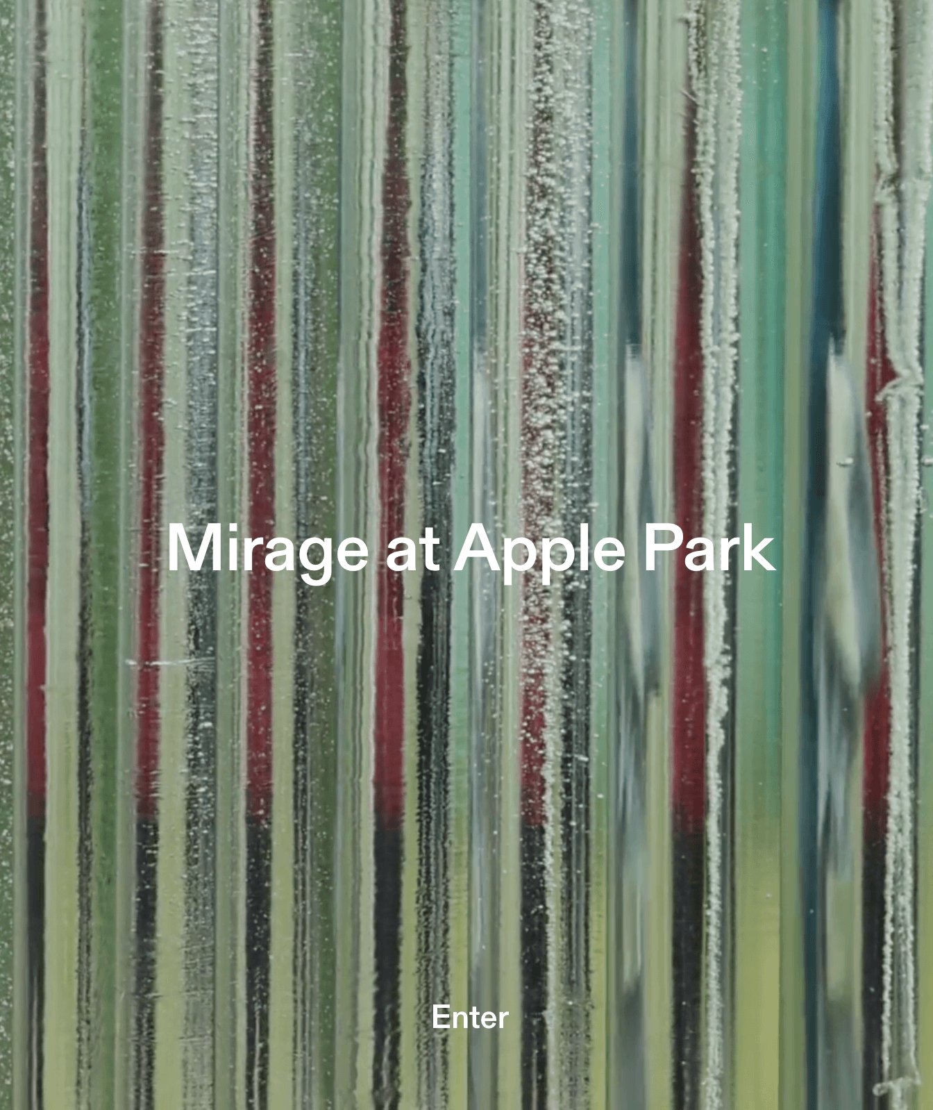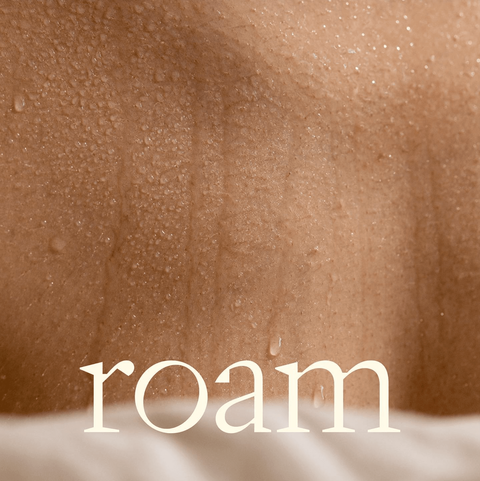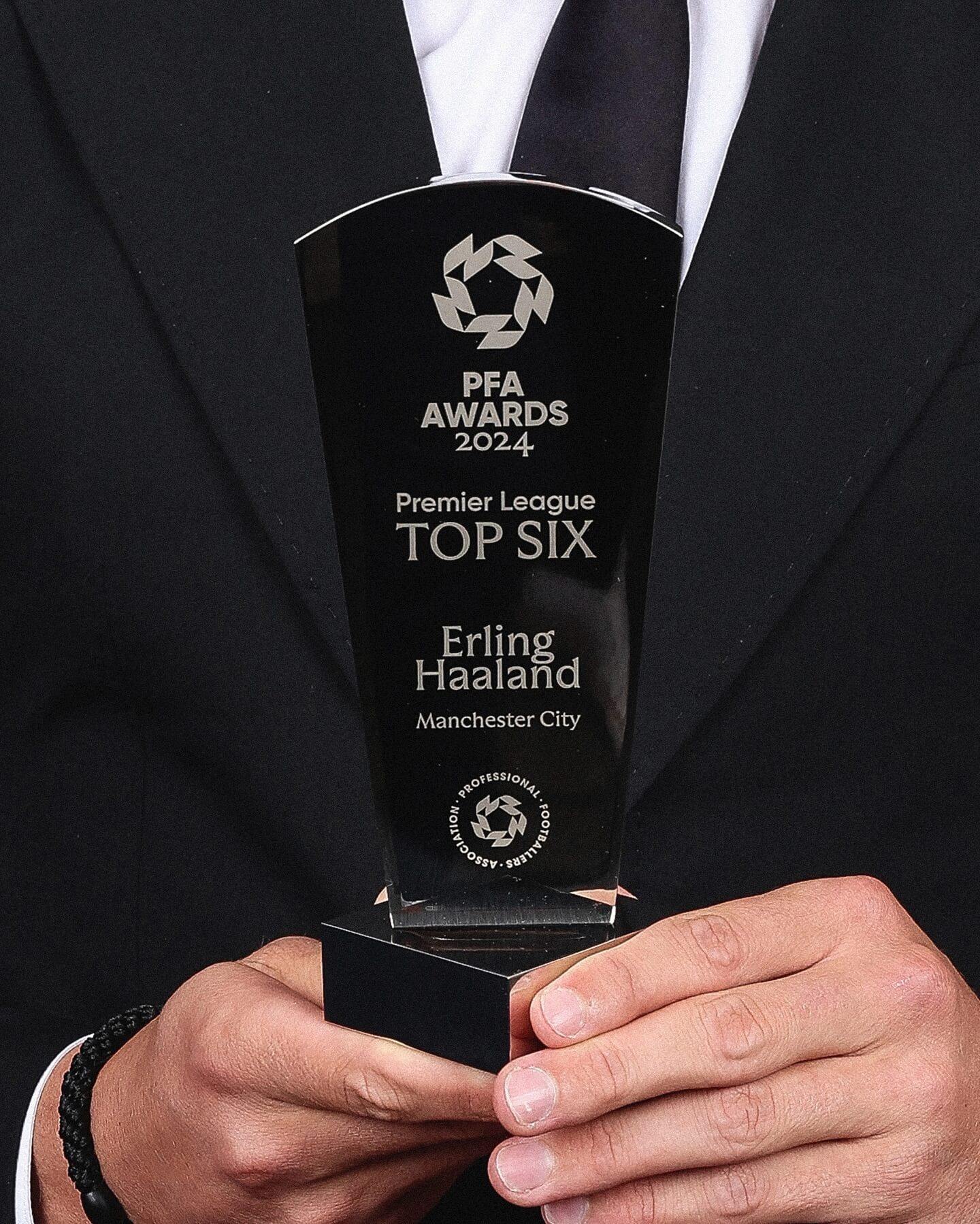
Realm by Approximate Type being used in this annual award ceremony for the best player of the year in the English league.
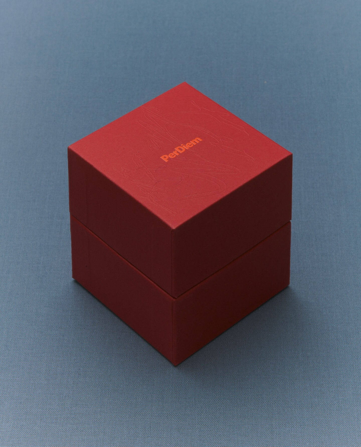
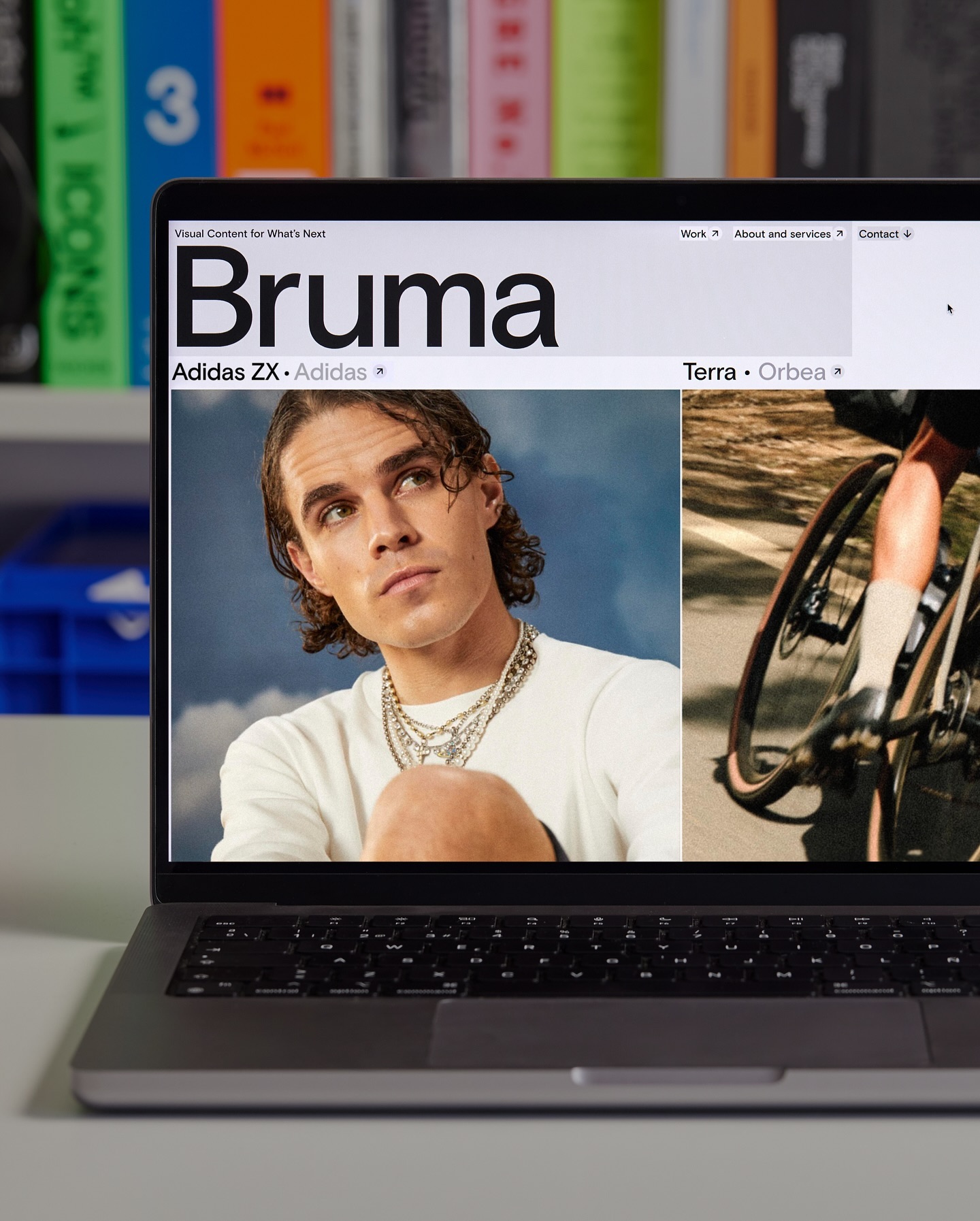
Foundry: Approximate Type Design: The Lift Agency
Foundry: Approximate Type Design: The Lift Agency
Foundry: Maxitype Design: Pauline Esguerra
Foundry: Pangram Pangram, Schick Toikka Design: Casa Bien
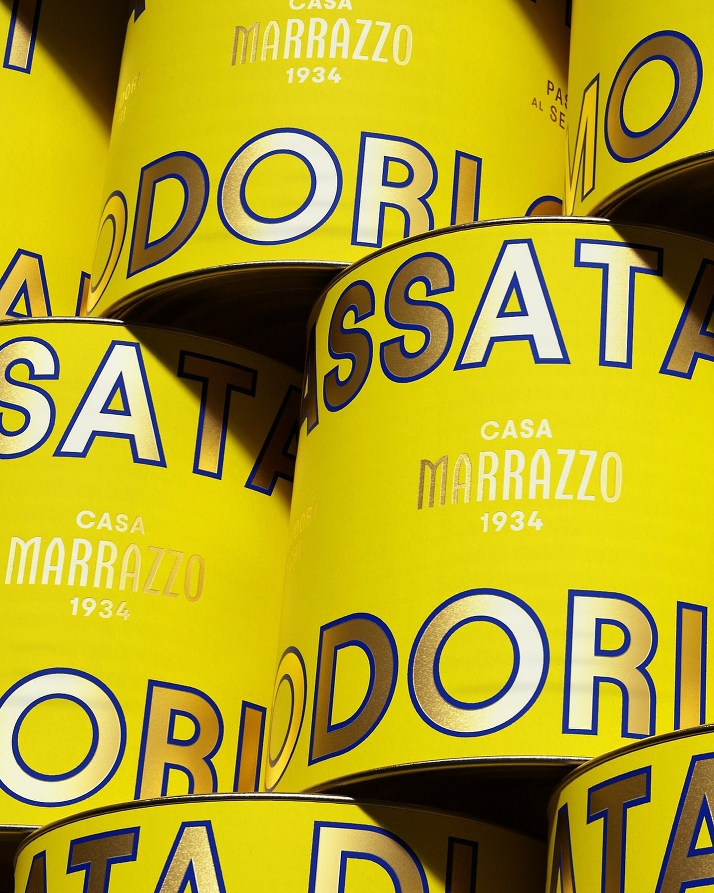
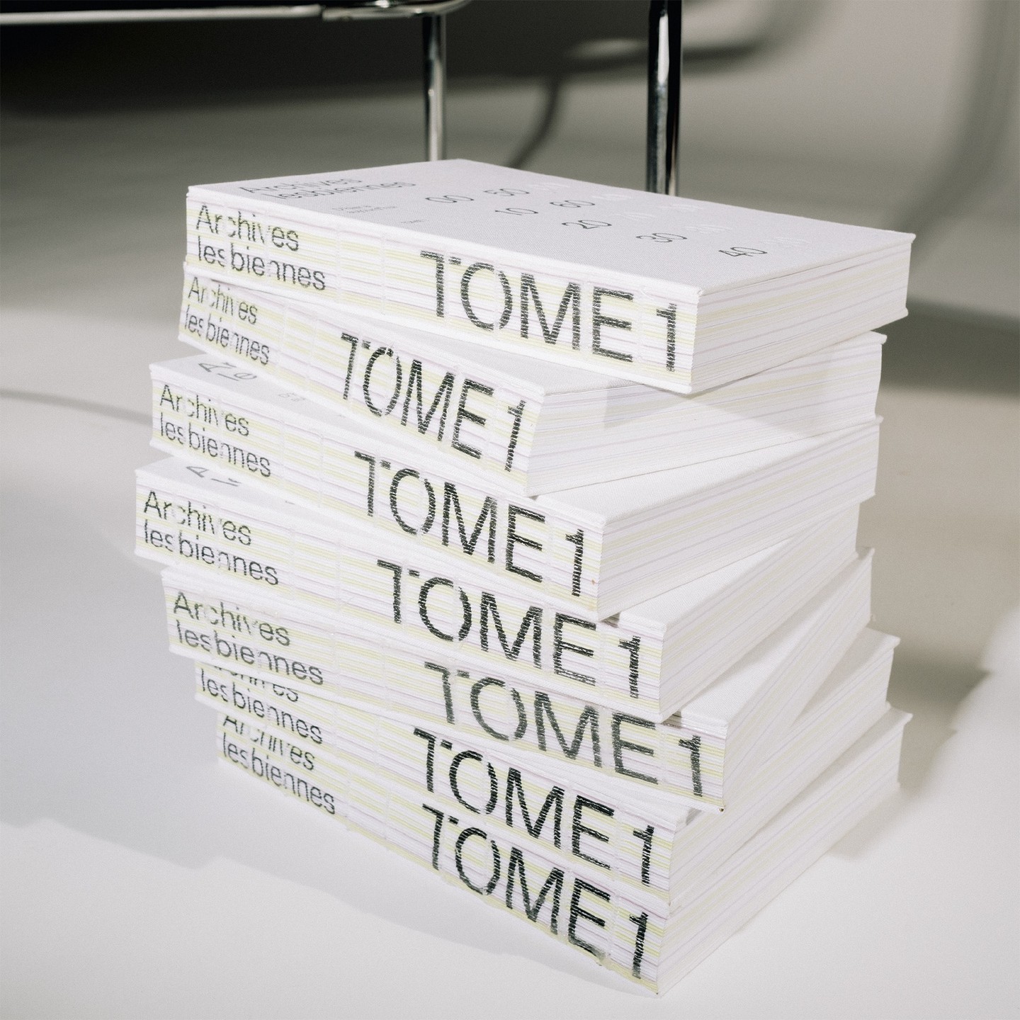
Foundry: Production Type, Dinamo, Commercial Type Design: ZAINA
Foundry: Family type Design: Polar Ltda
Foundry: Lineto Design: Hort Berlin
Foundry: SOCIOTYPE, 205TF, Grilli Type Design: Tino Nyman
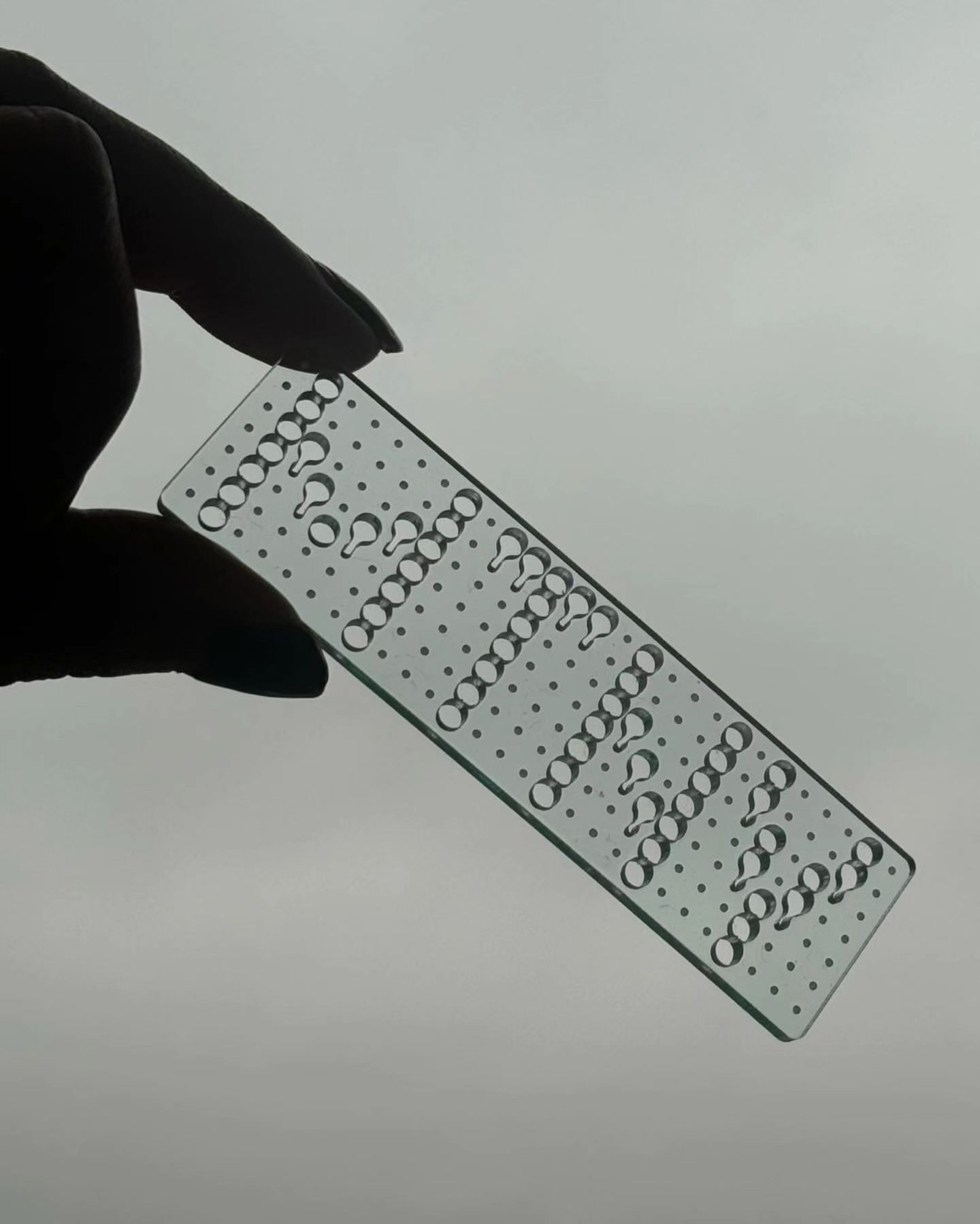
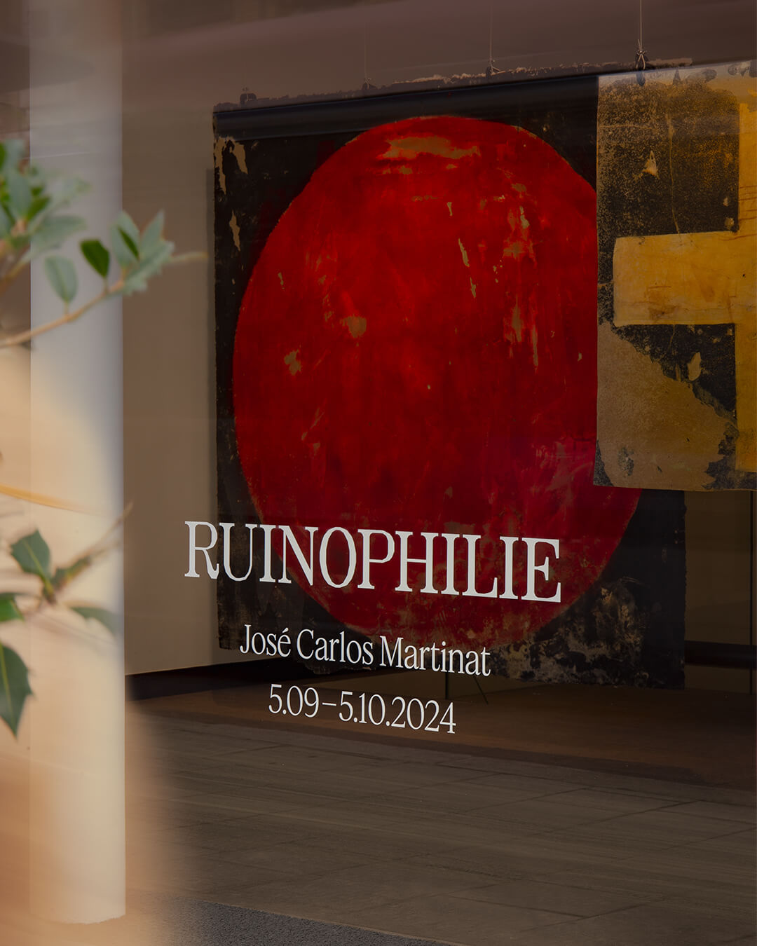
Foundry: Federcio Parra Barrios Design: Principal
Foundry: Lineto Design: Studio Corbin Mahieu
Foundry: Colophon Foundry Design: The New Company
Foundry: Displaay Foundry Design: Auge Design
Foundry: Dalton Maag Design: Memory Studio
Foundry: Klim, Commercial Type Design: Play
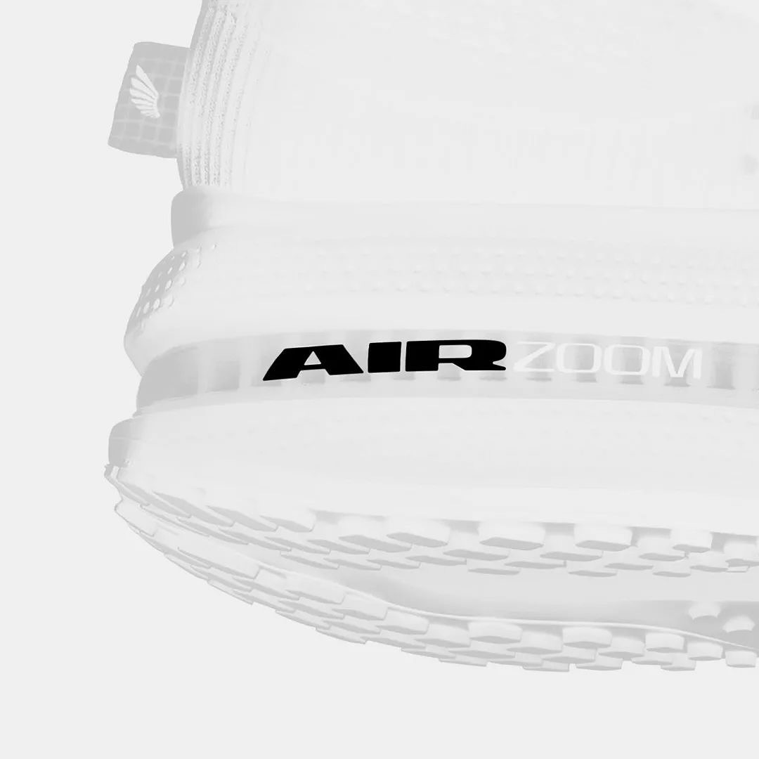
Foundry: Nguyen Gobber Design: Nike Design Team
Foundry: Colophon Foundry Design: Leon Romero
Foundry: Florian Karsten, Grilli Type Design: Principi Studi
Foundry: Displaay Design: Justified Studio
Foundry: Nguyen Gobber, Dinamo Typefaces Design: Toykyo
Foundry: HAL Typefaces Design: Distaff Studio
Foundry: Lineto, Displaay Foundry Design: Porto Rocha
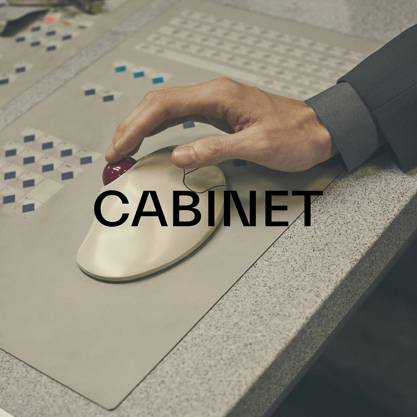
Foundry: Commercial Type Design: Estudio República
Foundry: Extraset Design: Quatrième Étage
Foundry: Kimera Corp Design: newkid
Foundry: Benoît Bodhuin Design: Miroslav Zhivkov
Foundry: Displaay Typefaces Design: Maison Standard
Foundry: ABC Dinamo, Adobe Fonts Design: Regrets Only
Foundry: Swiss Typefaces Design: Due Studio
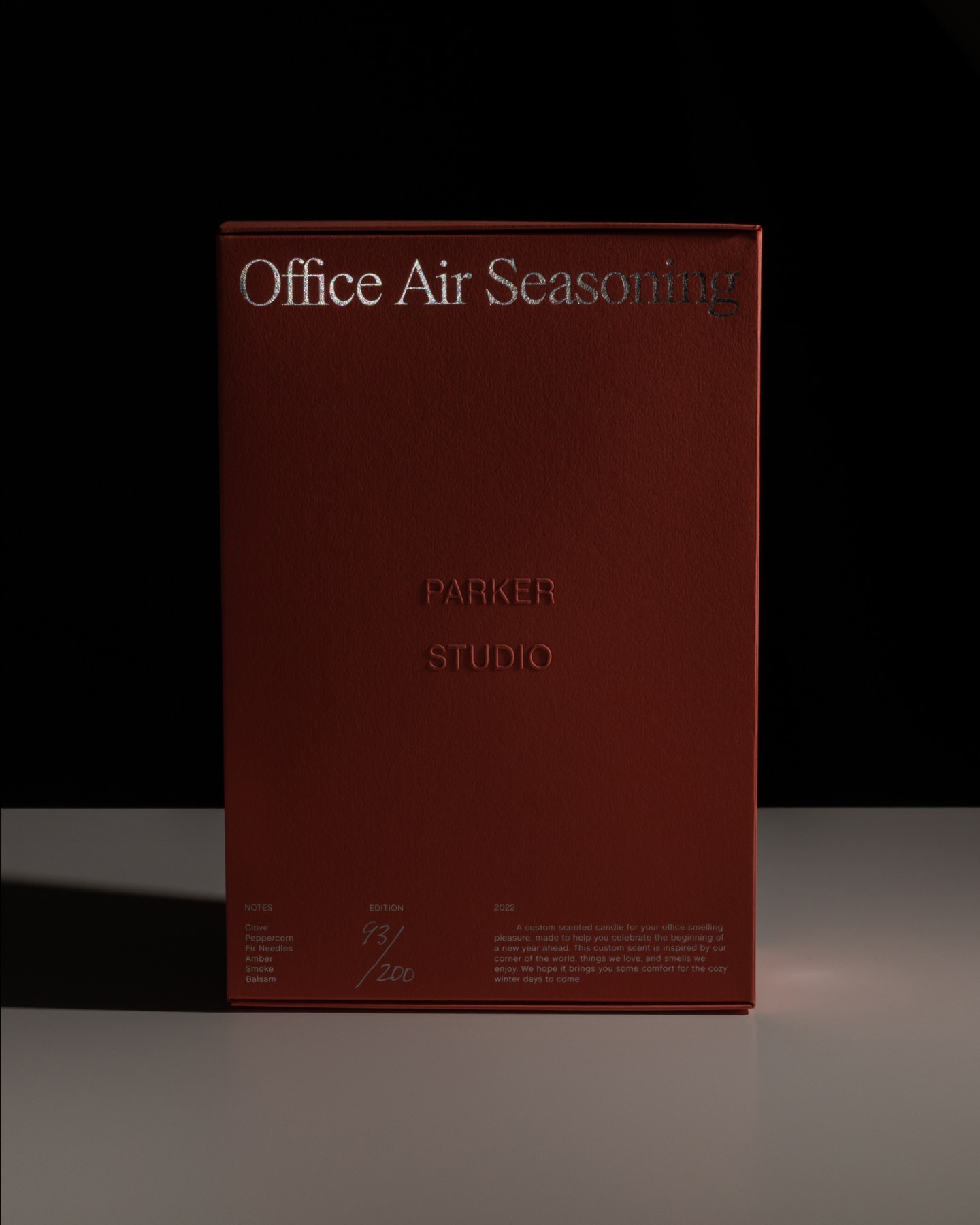
Foundry: Parker Studio, House Industries Design: Parker Studio
Foundry: Heavyweight Design: Studio Marvil
Foundry: Velvetyne Design: Both Studio
Type Designer: Quentin Coulombier Graphic Design: Underline Studio
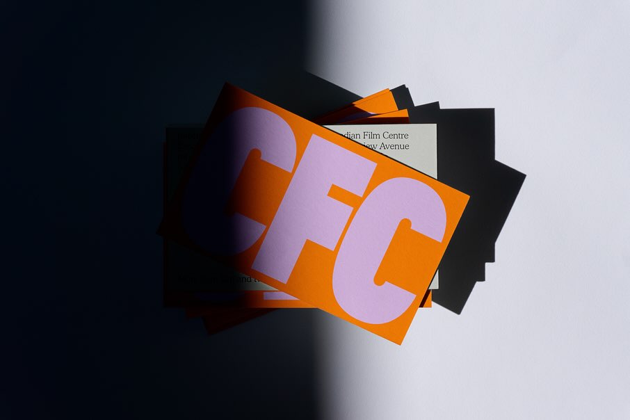
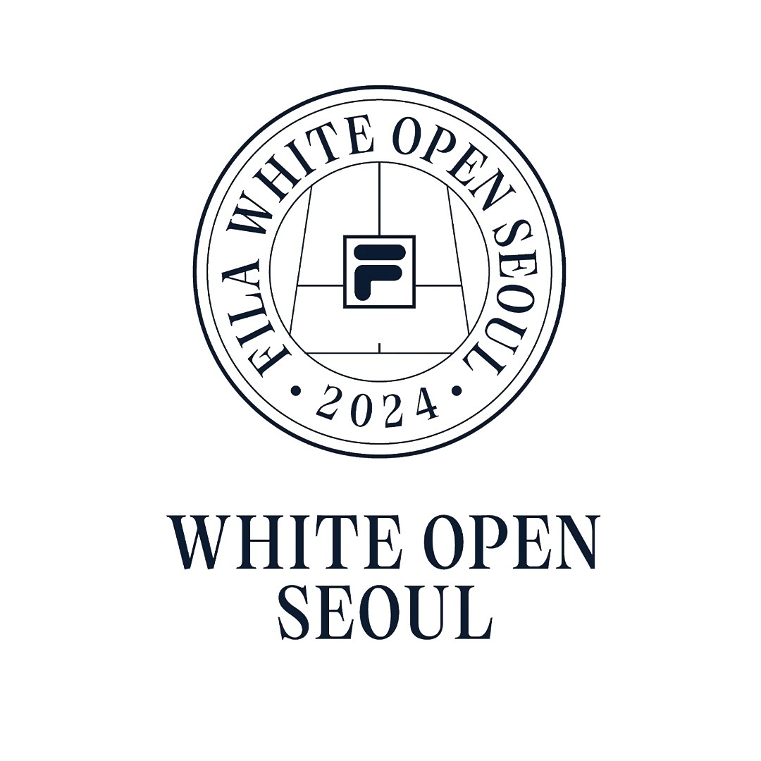
Foundry: Lift Type, Bouk Ra Design: Fila Korea
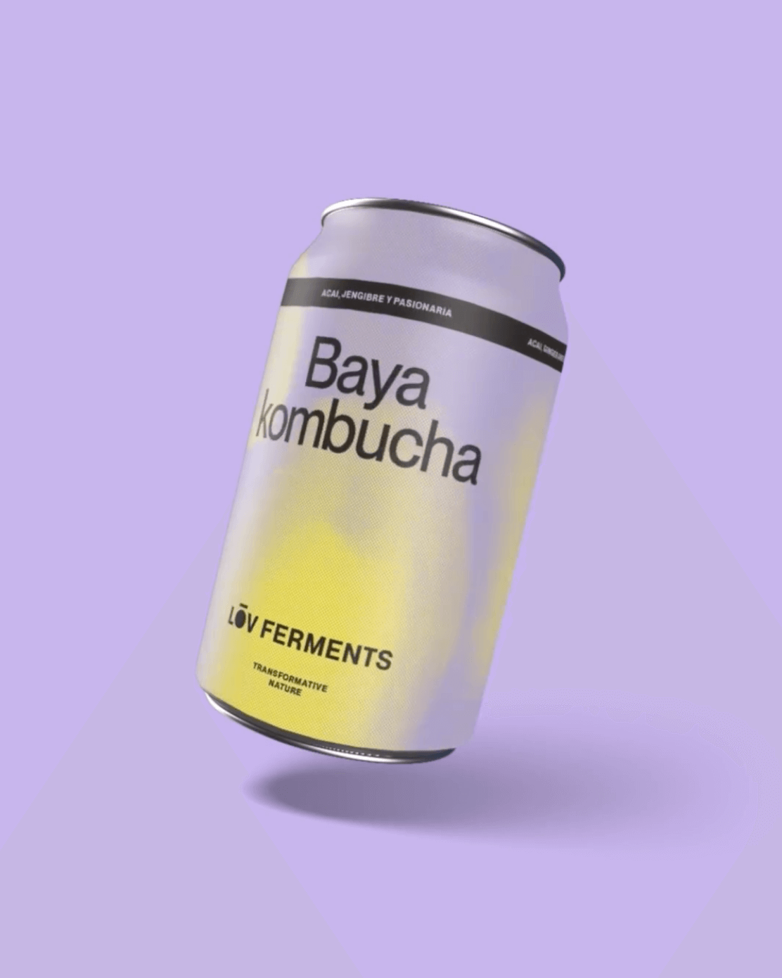
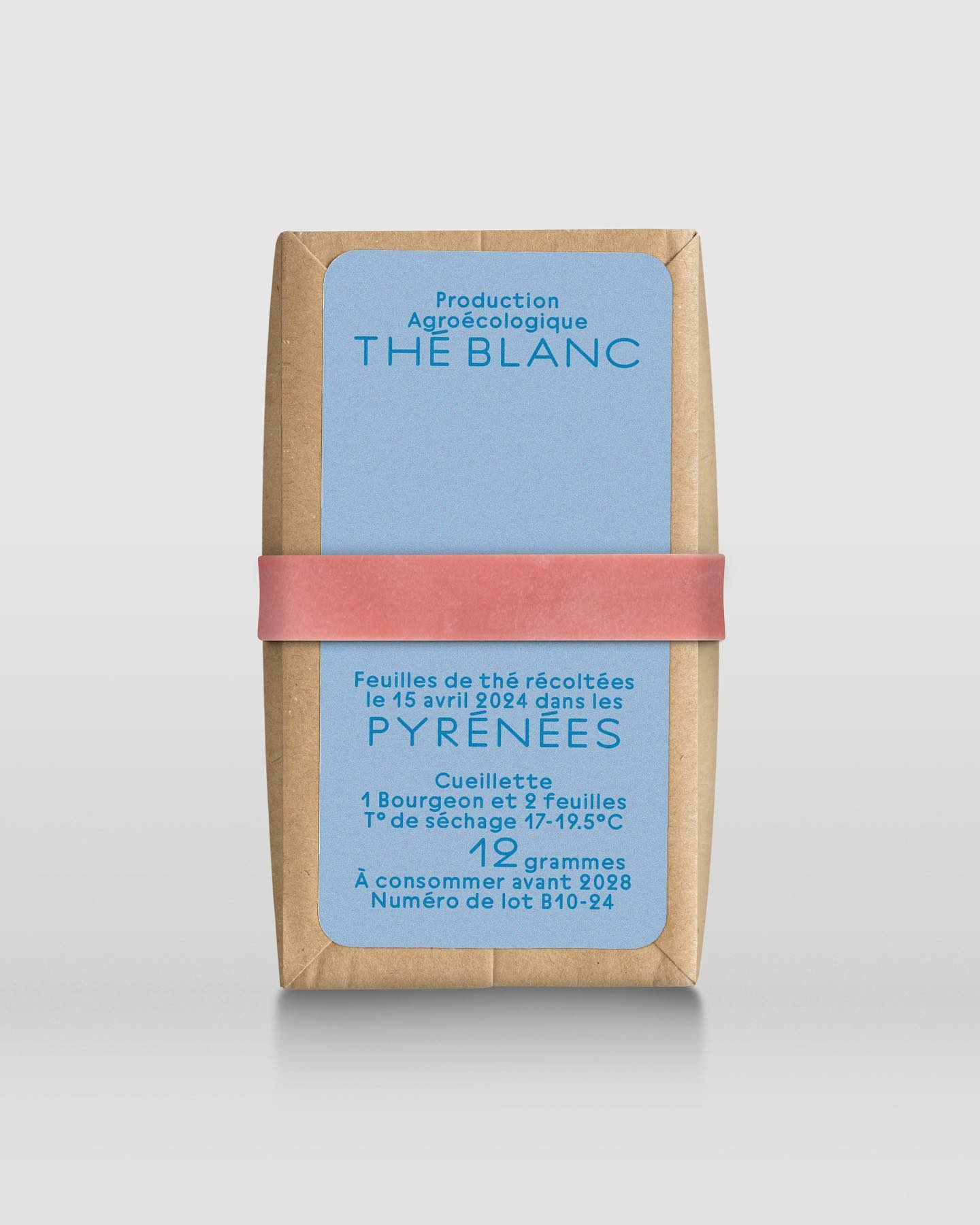
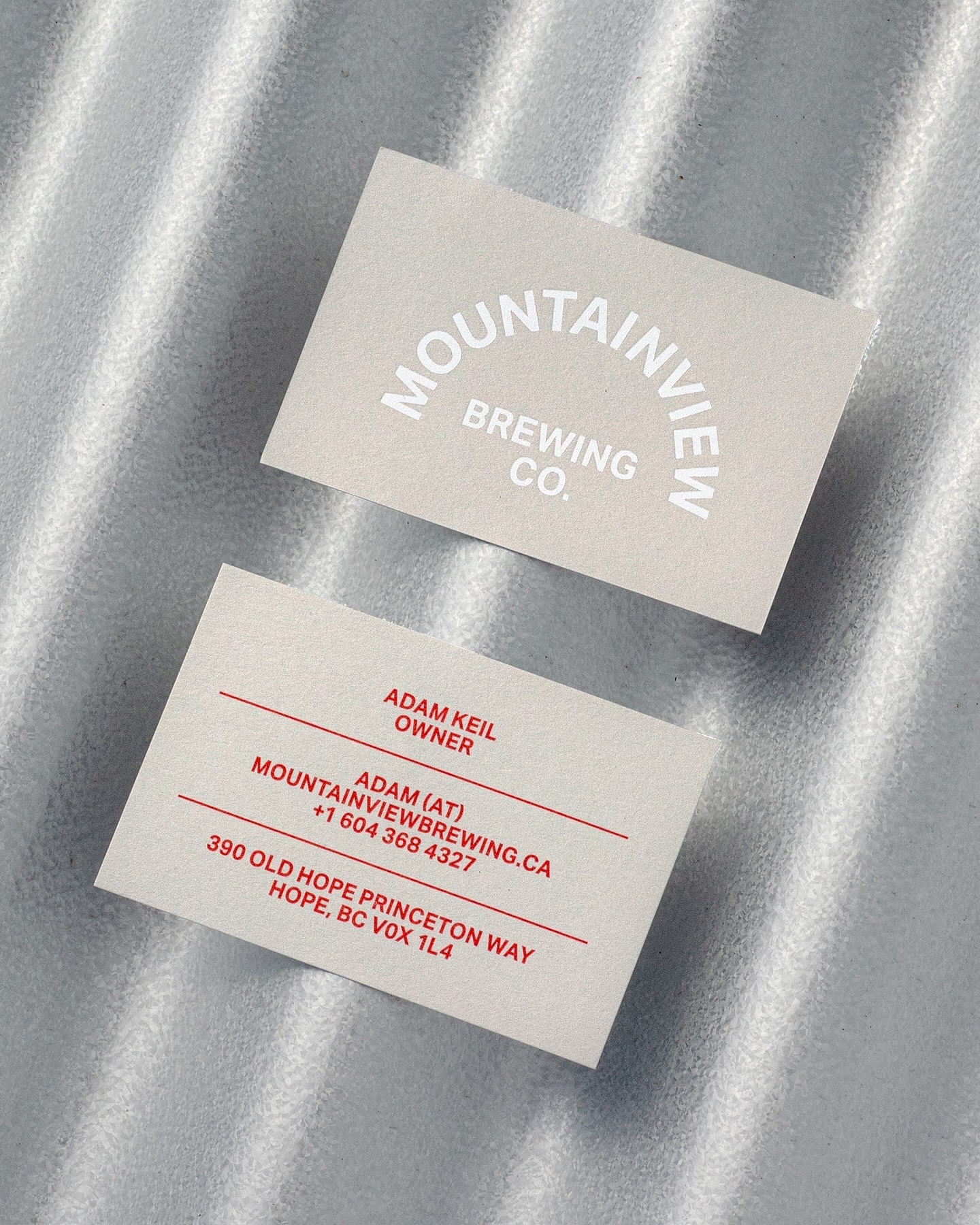
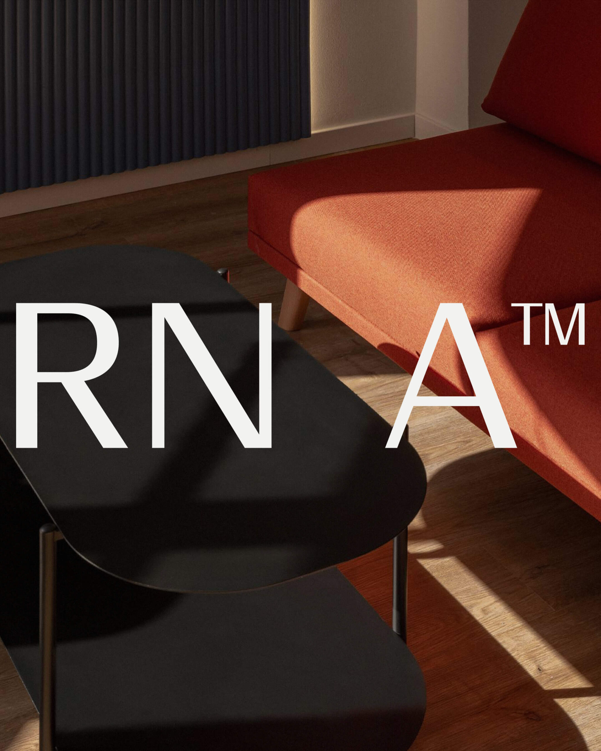
Foundry: Store Norske Skriftkompani, Commercial Type Design: Principal Studio
Foundry: HAL Typefaces, Dinamo Typefaces Design: M. Geisser
Foundry: Giulia Boggio, KOMETA Design: low key Design Company
Foundry: Production Type, Design: Sam Corijn
Foundry: Studio René Bieder Design: Atipus Studio
Foundry: 205 TF Design: Address Arts
Foundry: Dum Dum Studio Design: Chejo Studio
Type Designers: Matthew Fenton, Haakon Spencer, Jack Niblett
Mastering: Christoph Koeberlin
Foundry: British Standard Type
Foundry: Dinamo, Out of the Dark Design: Hannes Brischke
Foundry: Bretagne Type Foundry, Pangram Pangram Design: Tiquismiquis
Foundry: Forgotten Shapes, Set Sail Studios Design: Harrison Fun Studio
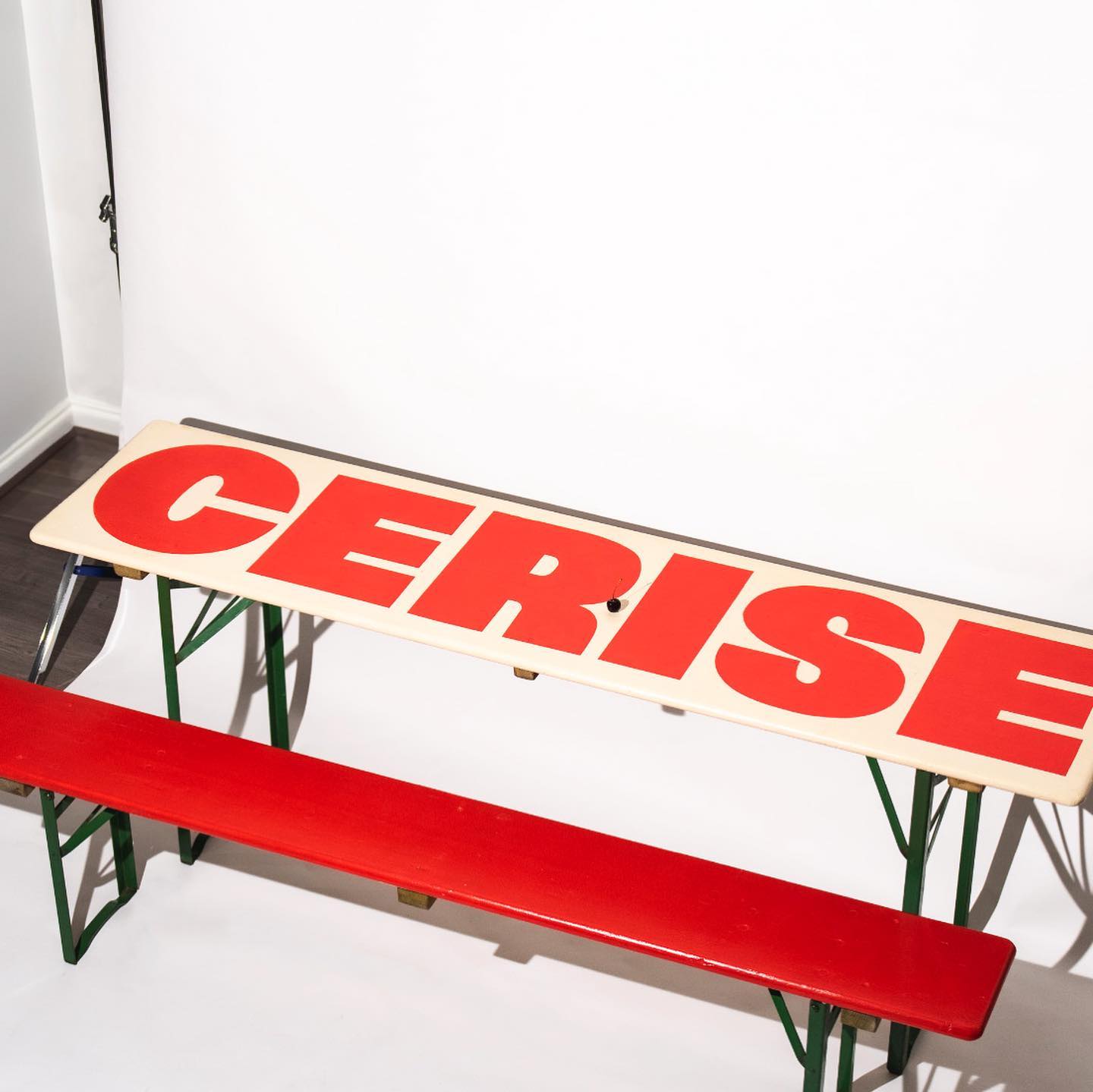
Foundry: Nouvelle Noir Design: Studio Cerise
Foundry: Optimo Type, Google Fonts Design: Estudio República
Foundry: Type Weltkern
Foundry: AllCaps Design: Apartamento
Foundry: Commercial Type Design: Principal Studio
Foundry: Or Type Design: Olsson Barbieri
Foundry: Family Type Design: Studio Sly
Foundry: ABC Dinamo Design: EY Doberman
Foundry: Commercial Type, Schick Toikka Design: Christopher Doyle & Co.
Type Designer: Elliot Grunewald Design: Other Office
Foundry: Kimera Corp Design: Raw Materials, Service Plan
Foundry: ABC Dinamo Design: Ortner etc.
Foundries: Grilli Type, ABC Dinamo Design: Ania et Lucie
Foundry: Extraset Design: Studio Hudson Catty, Camille Baudelaire & Olivia Grandperrin
Foundry: Klim Type Foundry, SOCIO Type Foundry Design: Socio Design
Foundry: Pangram Pangram, ITC, Commercial Type Design: The Office of Ordinary Things
Foundry: Lineto Design: Studio Ard
Foundry: Order Type Foundry Design: Ragged Edge
Foundry: Maxitype Design: Lamm & Kirch / Caspar Reuss
Type Designer: Alex Lescieux Design: Giacomo Bastianelli
Foundry: ABC Dinamo, Emigre Design: Tric
Foundry: Lineto Design: Adeline Mollard
Foundry: Commercial Type Design: Studio Abraham
Foundry: Gerstner-Programm Web Design: Rafa Cobiella UX: Seriousandly
Foundry: Hal Typefaces Design: Studio Hanli
Foundry: AllCaps Design: Autostrada Studio
Foundry: Sharp Type Design: Simon Merz
Foundry: Wise Type Design: Mount Agency
Foundry: Cofo Cinema Design: Nikita Sapozhkov
Foundry: Cotype Foundry Design: Porto Rocha
Foundry: Hal Typefaces Design: Hanzer Liccini
Foundry: The Northern Block Designer: Jonathan Hill
Foundry: Extraset Design: Glasfurd & Walker
Foundry: Heavyweight Design: Bastien Forato
Foundry: Warsaw Types Design: Daniel Gremme
Foundry: Sharp Type Design: Basora
Foundry: All Purpose Fonts Design: Friend Editions, Oliver Shaw
Foundry: Eliott Grunewald Design: Monozygote
Foundry: Dinamo Design: Actual Source
Foundry: Wise Type Design: Juliette Duhé
Foundry: Omnigroup Type Designer: Dávid Molnár
Foundry: Omni Type Design: Leonardo Pellegrino
Design: Dorothee Dähler Foundry: All Caps
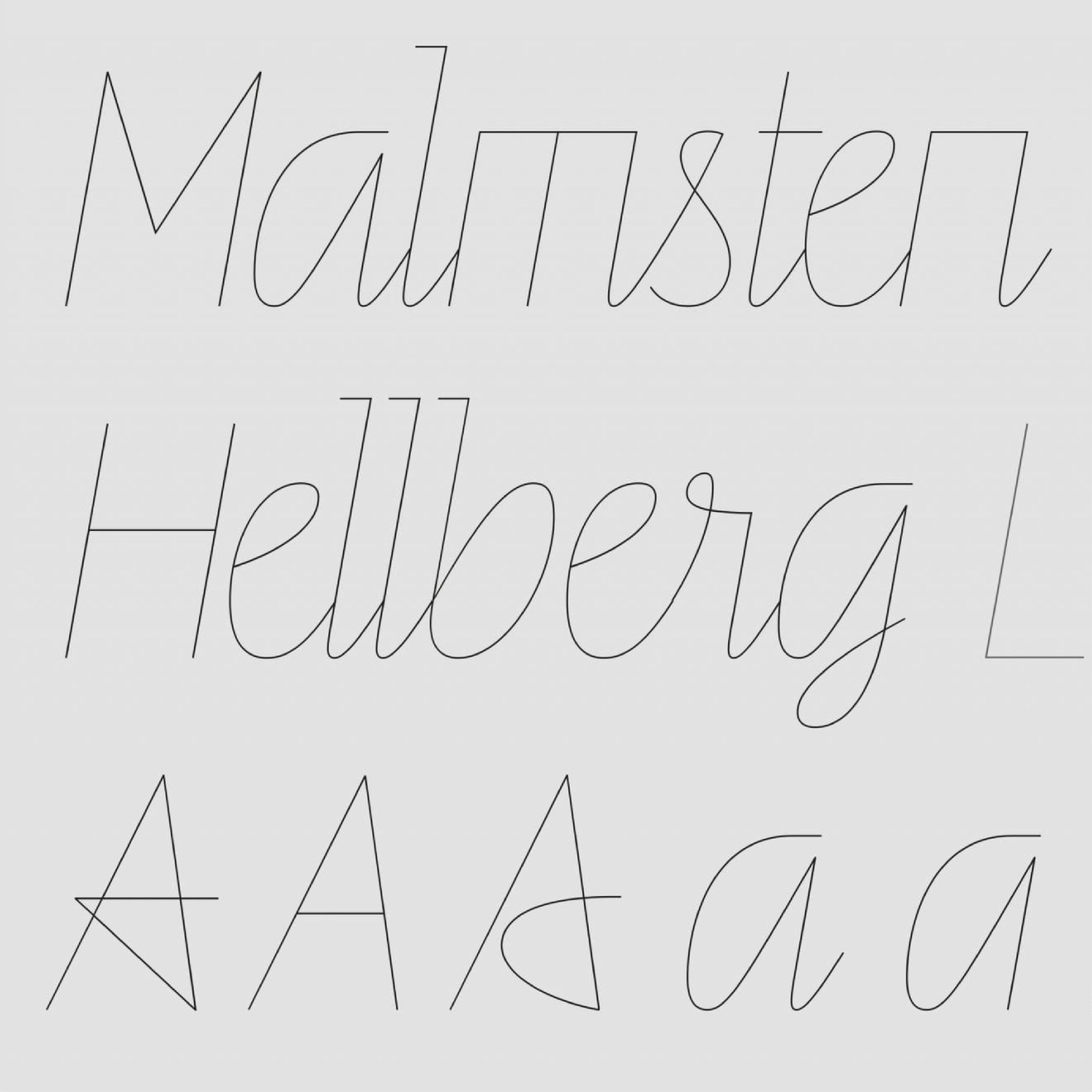
Foundry: Letters From Sweden Design: Malmsten Hellberg,
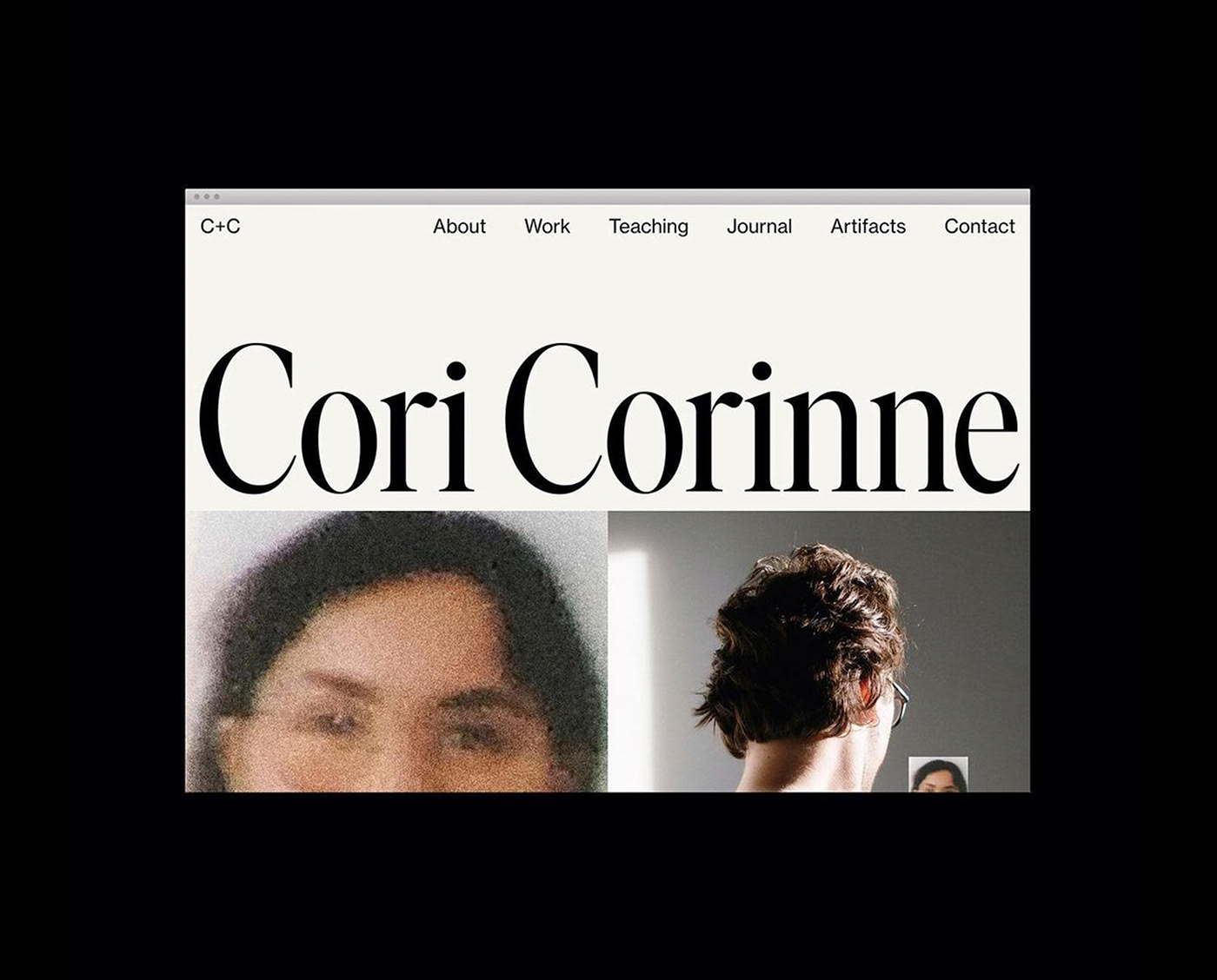
Design: Cori Corinne Foundry: Letters From Sweden
Typography: Emmanuel Besse, Production Type Design: Leon Romero
Type Design: Ines Davodeau Design: Jiating Shi
Foundry: SM Design: PFP Disseny
Foundry: Klim Type Foundry Design: Jeremy Matthews
Type: Laurenz Brunner, Source Type. Design: Anne Büttner
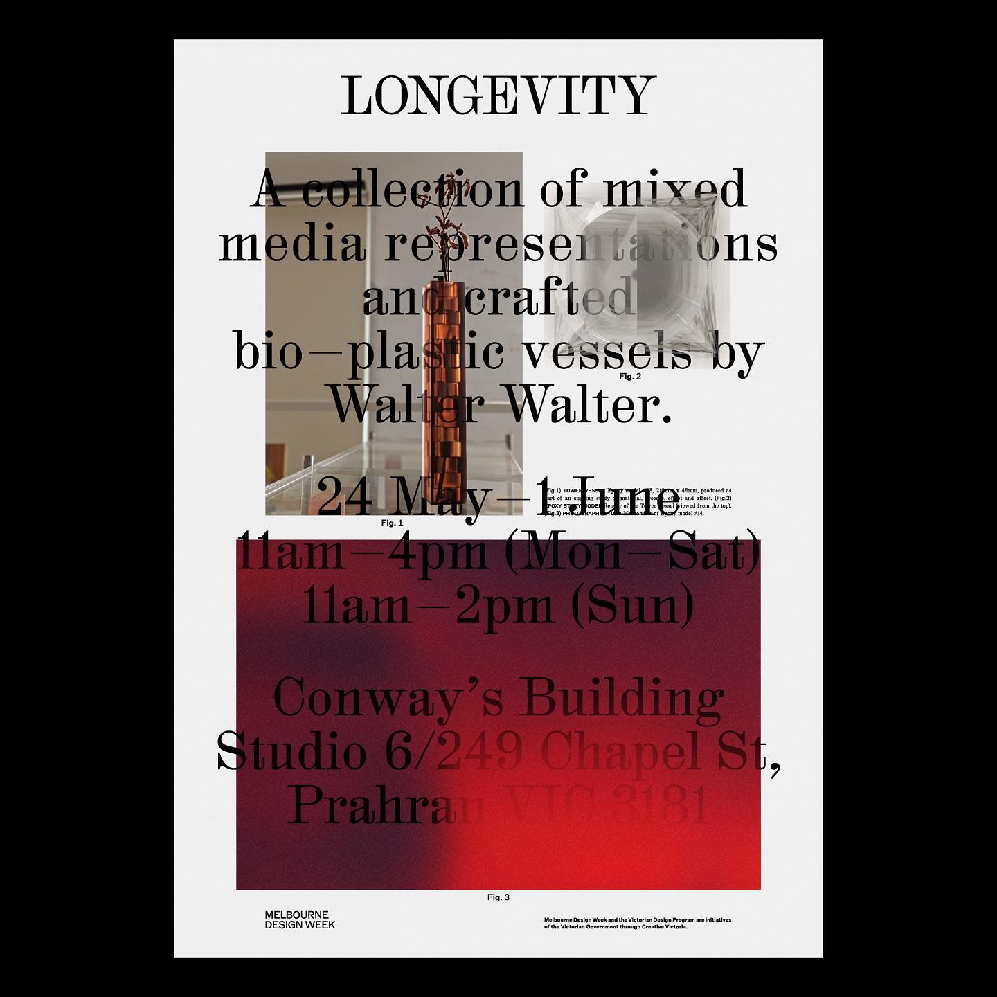
Foundries: Counter Forms, Maxitype Design: Principal Studio
Fonts: Francesco, Trabis Design: Maison Solide
Foundry: Frost Type
Foundry: Commercial Type Type designer: Miguel Reyes Design: Elizabeth Goodspeed
Foundries: https://klim.co.nz/ Design: https://fieldofplay.studio/
Foundry: Lineto Design: Zoo Designers Graphiques
Foundry: Pangram Pangram Design: Andrés Higueros
Foundries: Radim Pesko, Paul Renner, Lineto Design: Wedge
Foundry: Colophon Foundry Design: Porto Rocha
Foundry Razzia Type, Design Base
Foundry Dinamo, Design Flavious Augustin.