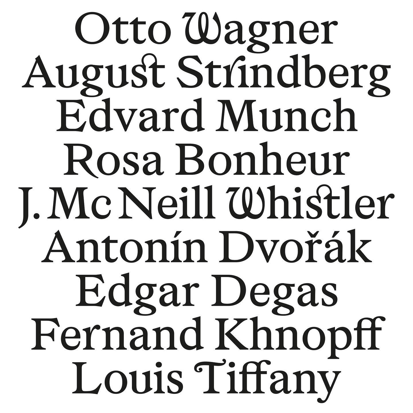
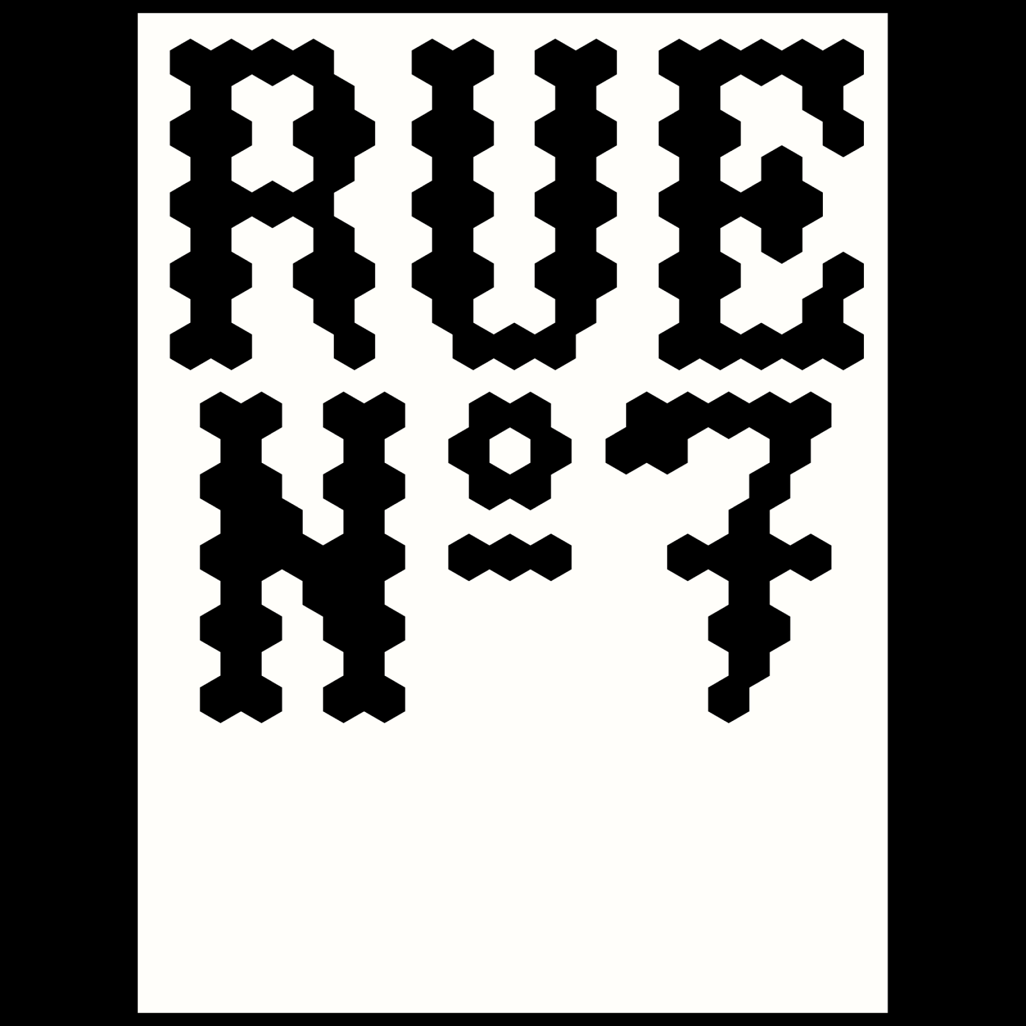
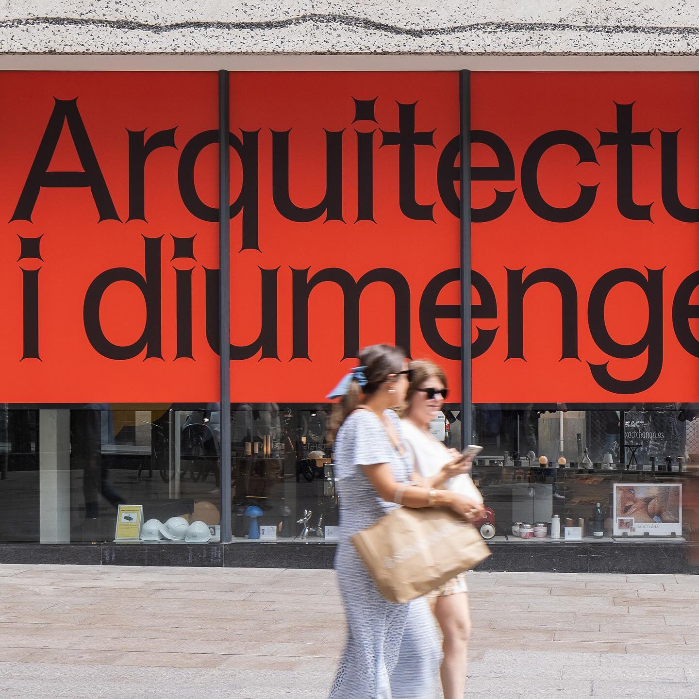
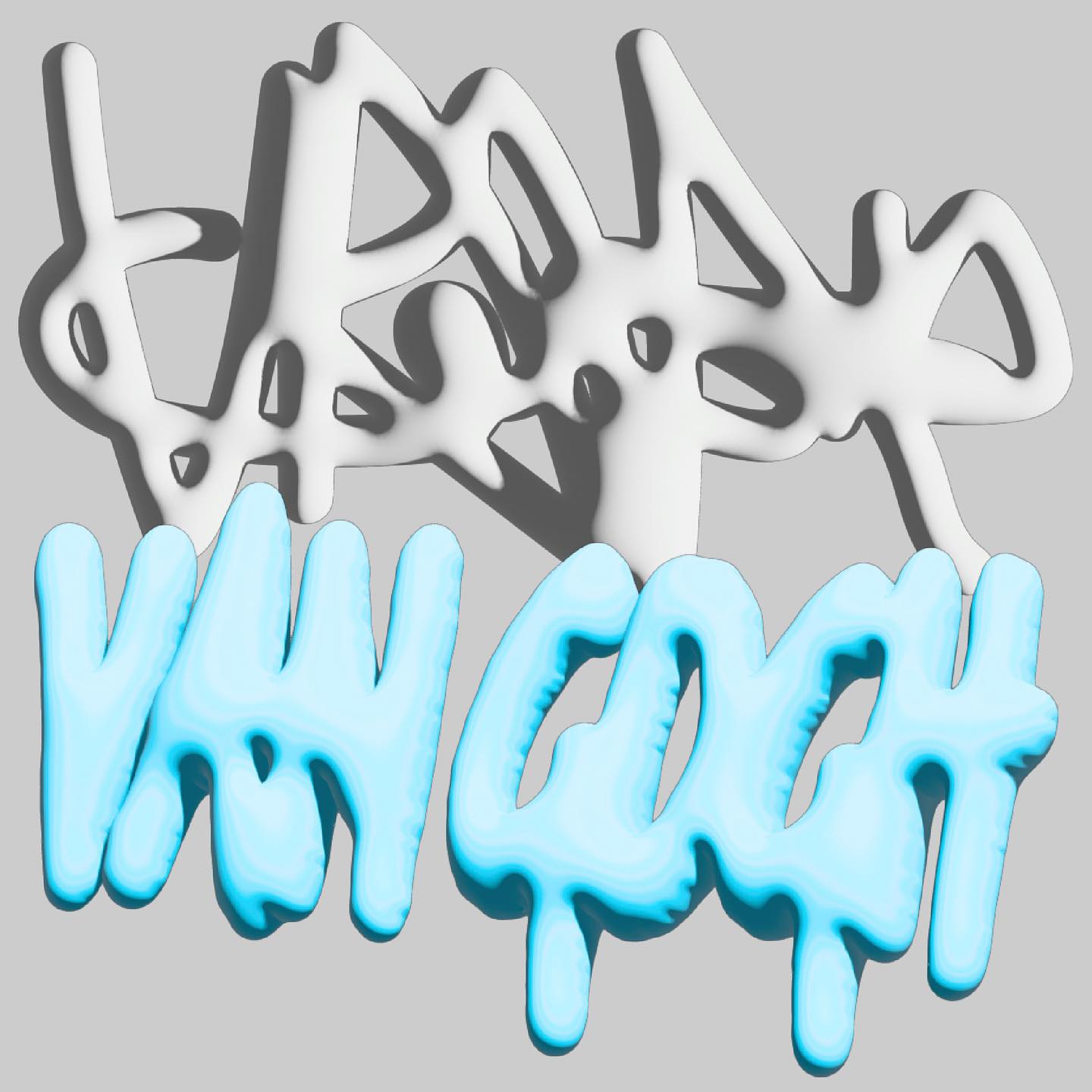
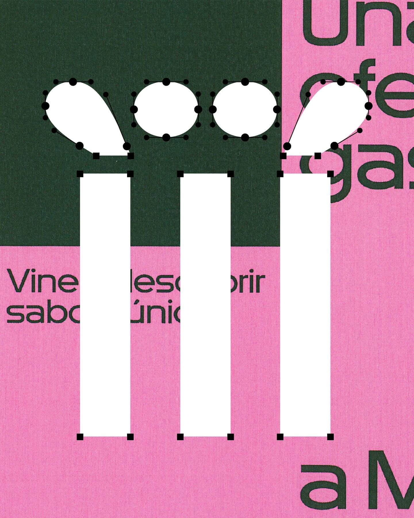
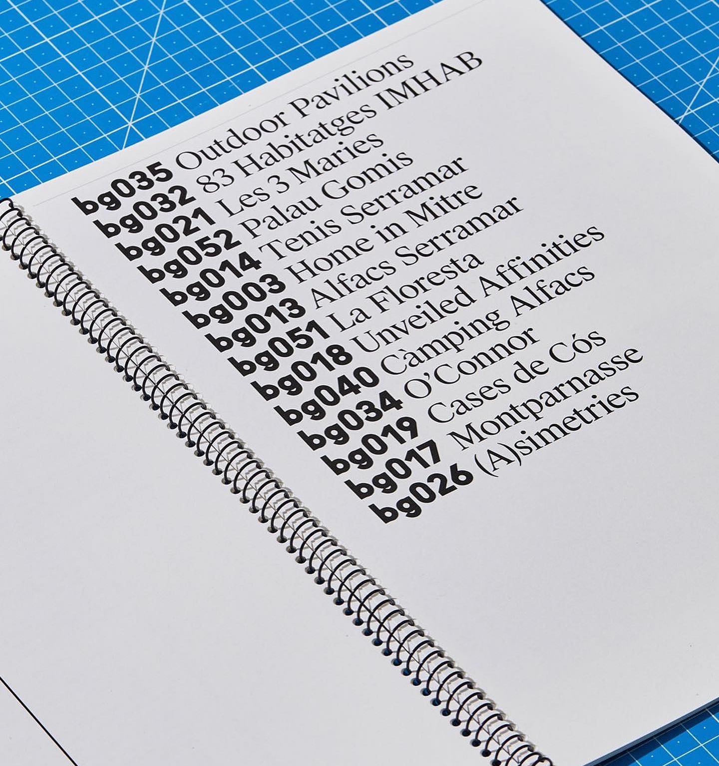
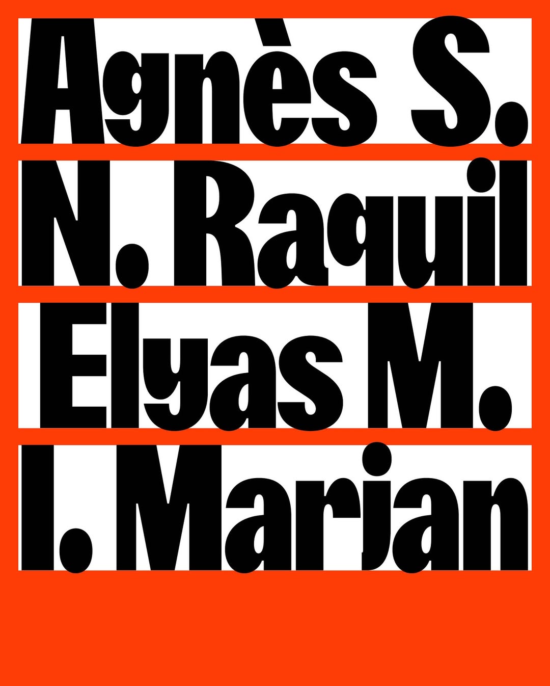
Address Arts leveraged the possibilities of Exposure by 205TF, a variable typeface whose weight was modified to achieve a solid and heavy logo.
Foundry: 205 TF Design: Address Arts
Just like its proposal, OAD (Open Architecture Design) has a strong and impactful lettering as a logo, complemented by Neue Haas Grotesk in its regular weight.
Foundry: Commercial Type Design: Asketic
For the past 3 years, Chejo and SHDW studios have been sharing lunch, and in this book, they compile the recipes they’ve made. Serial A from DumDum fonts is used as the main typography.
Foundry: Dum Dum Studio Design: Chejo Studio
WaterPolo Display by @dontnotdon was used in this series of posters portraying the ordinary and extraordinary aspects of Renens.
Foundry: RongyinotRongyi, ECAL Master Type Design: ECAL Photography
For a constantly moving entity like the PAC (Performing Arts Centre), Porto Rocha, together with AllCaps, created this strong and timeless typography as part of its new visual identity.
Foundry: Porto Rocha, All Caps Design: Porto Rocha
Workbyworks Studio created a dynamic 3D logo for the NFT trading platform, Convertible Van Gogh.
Design: Workbyworks Studio
Studio Cerise, a colorful creative studio from East London, used Swinton by Nouvelle Noir for its logo.
Foundry: Nouvelle Noir Design: Studio Cerise
This fresh and fun poster design for the Teatro Prospero uses Review Condensed from Commercial Type, a Principal Studio project
Foundry: Commercial Type Design: Principal Studio
A story of friendship between agriculture and its natural habitat, between the design by Olsson Barbieri and the Or Lemmen typography proposed by them for the image of an organic orchard in Hardanger, Norway.
Foundry: Or Type Design: Olsson Barbieri
Rauschen B Regular and JHA Times Now Light filled the visual arts program of the Norbergfestival 2023 with personality. Designed by Agga Stage and Alexander Söder.
Foundry: Out Of The Dark, JHA Design: Agga Stage, Alexander Söder
Neue Haas Grotesk is a common typeface on the blog, it works well in many scenarios, for example alongside Marfield in the fourth edition of Hot Potato magazine.
Type Designer: Elliot Grunewald Design: Other Office
Diatype Rounded from ABC Dinamo is used in Healthy Boy Band, a cultural magazine that is a tribute to graphic design
Foundry: ABC Dinamo Design: Ortner etc.
For being the first to create ocular accessories, the Inuit people and their syllabic writing system inspired a custom typeface and a new brand image for Mr Boho eyewear.
Type Design: Laura Meseguer Design: Buenaventura
Rhymes by Maxitype in the 2017 campaign for the NBA Finals “They Talk We Play”. Design by Hort and Tim+Tim.
Get RhymesThe Belgian design studio Vrints-Kolsteren collaborated with the jewelry brand Fleerackers to create ATOM, a collection of 16 different earrings.
Design: Vrints-Kolsteren
Trekking Sans is a lowercase typeface designed by Bureau Bernklau, for the research project Cultural Turn in Swiss Graphic Design (1980–2020).
Type Design: Bureau Bernklau Design: Frederik Mahler-Andersen, Clio Ha
The foundry From A+, built a wordmark, an alternate script version, and two monograms based on art deco letterforms, for the seafood Californian tavern, Bar Le Côte.
Foundry: A+
Runners and coffee lovers community, The Coffee Run, asked Dum Dum Studio to create their identity through a bespoke typeface full of dynamism.
Foundry and design: Dum Dum Studio
Supply stencil is the custom typeface Tric Studio inspired by streetwear, metal zines, tapes and the history of stencil, made as part of the identity system for Supply.
Design: Tric Studio
Studio Ard was commissioned to design 15 publications and the signage for the graduation exhibition of the RCA School of Architecture. All is typeset in Prisma Text by Lineto.
Foundry: Lineto Design: Studio Ard
Pastiche Grotesque by Order Type Foundry was customized by Benjamin Tuttle to become the bespoke typeface for the First Choice brand, a new generation of travel lovers. Design by Ragged Edge.
Foundry: Order Type Foundry Design: Ragged Edge
Typeset in Rhymes by Maxitype in the book of photographer Werner Amann capturing the nightlife rave scene of the early 1990s. Design by Lamm & Kirch with Caspar Reuss
Foundry: Maxitype Design: Lamm & Kirch / Caspar Reuss
Rafael Ribas & Zoo designers graphiques teamed up to design a heavy and solid wordmark for Respect magazine.
Foundry: Rafael Ribas Design: Zoo designers graphiques
A expressive custom Hardwear font by Supercontinente, under the creative direction of Gretel NYC, for the branding of Mountain Hardwear.
Foundry: Supercontinente Design: Gretel NYC
Experimentation and creativity in this unselected proposal for JoJo logotype, a London-based design practice.
Foundry: Corbin Mahieu Design: Corbin Mahieu
Contrasting an organic-shaped logo within a structured layout, Principal Studio was responsible for creating the 7th campaign for The International Garden Festival.
Design: Principal Studio
FFF Flea is a custom typeface designed by FFF for Mercantic, a Farmer Market. As the secondary typeface, and to create a balance with the geometry of Flea, Affairs by SM Foundry was used.
Foundry: Fonts From Folch Design: Folch Studio
Hal Colant 2.0 (coming soon) on the website with a mirror effect for Am Seegarten, a temporary exhibition in Kirchmöser, Germany.
Foundry: Hal Typefaces Design: Studio Hanli
Leon Romero using Alias Ano by Alias and Suisse Works by Swiss Typefaces in the identity created for the Architecture office Bajet Giramé.
The New York Times Magazine team, with a typographic cover displaying NYTM Slab, a custom font developed by A2 Type.
Foundry: A2 Type Design: NYT Magazine
Cofo Cinema 1909 by Contrast Foundry and a display logo designed by Nikita Sapozhkov for Linen Texture, a clothing and textiles shop with a custom tailoring.
Foundry: Cofo Cinema Design: Nikita Sapozhkov
TWK Burns (WIP) by Nolan Paparelli and Alberto Malossi for the identity of Polpo World, a design object entirely made with recycled plastic.
Foundry: Type Weltkern Web Design: Matière Vive Renders: Synthetic Aspect
The identity of Ro Bags, featuring a custom logo by Laura Csocsán and Karl Mono from Source Type.
Logo design: Laura Csocsán Foundry: Source Type
Expressiveness and experimentation in a typeface inspired by urban art and physical tools.
Foundry: The Northern Block Designer: Jonathan Hill
A bespoke headline typeface designed by Regular Practice for the identity of EAUSO VERT, a sustainable fragrance house.
Design: Regular Practice
Customizing Klarheit Kurrent Book for its logotype, Glasfurd & Walker created a very minimalist and balanced identity for CBD-forward brand, Nowadays.
Foundry: Extraset Design: Glasfurd & Walker
With clean and neutral lines, Ana Mirats Studio creates a custom logo for Vezavena, a brand specialized in knitwear.
Design: Ana Mirats
Atlantic by Heavyweight in “De Chlore et de Rosé”, photographer Christopher Barraja first book.
Foundry: Heavyweight Design: Bastien Forato
Studio Bruch, with a custom made lettering and type design, developed the identity of the 1951 established carpentry company, Hea.
Type Design: Studio Bruch Type Studio: Hungarumlaut
An autumn break party of students at KABK, using Margiel in their posters, a geometrical display font by Warsaw Types.
Foundry: Warsaw Types Design: Daniel Gremme
With a playful and minimalist approach, Friss Kombucha utilizes Herbus Bold to set itself apart from competitors.
Foundry: Eliott Grunewald Design: Monozygote
Geometric and heavy, Skrappa appears as a contrast in the visual identity of Arts Broadcasting Studio at Anteism.
Foundry: Wise Type Design: Juliette Duhé
OMSE and Family Type collaborated to give live to China’s first craft gin with a custom logo and typeface.
Design: Omse Foundry: Family Type
Monaako Script by Altiplano featured in Rapha’s film “Queens of the Classic”.
Foundry: Altiplano
Jose Houdini & Adrián Zorzano designed a custom typography, logotype and cover artworks for the record label Intermission.
Design: Jose Houdini, Adrián Zorzano
Some years ago, H5 Studio developed the visual identity including a custom font for iconic Kanye’s Yeezy brand.
Type and design: H5
Rebranding led by a custom-designed logo for consulting agency EIXO, developed by Sao Paolo-based Studio Tempo.
More about Studio TempoTen years ago, a unique script typeface, Line, was designed by Göran Söderström and Stefania Malmsten for Rodeo Magazine.
Foundry: Letters From Sweden Design: Malmsten Hellberg,
Ivar Display Condensed and Neue Haas Grotesk used in the web portfolio of designer Cori Corinne
Design: Cori Corinne Foundry: Letters From Sweden
Signal Compressed by Emmanuel Besse as part of Production Type catalogue, in Levi’s Performance Denim, a hand-stitched, limited edition publication designed by Leon Romero.
Typography: Emmanuel Besse, Production Type Design: Leon Romero
Keeps Sans is a bespoke display typeface Parker Studio designed as part of the visual identity of Keeps, sustainable furniture.
More of Parker StudioSchick Toikka’s Krana Fat for nostalgic, cartoon-inspired chips brand, Miett.
Foundry: Schick Toikka Design: Deux Huit Huit
Holise, Neue Helvetica and Ryumin in The Suitcase book design by Jiating Shi.
Type Design: Ines Davodeau Design: Jiating Shi
Custom wordmark created by Alex Hunting Studio for Wool (new scandinavian classics). Complementary typefaces GT America by Grilly Type and Noe by Schick Toikka.
Wordmark: Alex Hunting Studio Foundries: Grilly Type, Schick Toikka.
Murs à fleurs identity reunites two generations of type designers by using Trabis and Francesco fonts, designed by student and teacher.
Fonts: Francesco, Trabis Design: Maison Solide
Gill Sans Ultra Bold Condensed as a contrast to heavy serif wordmark for giant sandwich shop. By TRiC Studio
Type Designer: Eric Gill Design: Tric Studio
Radion, a typeface family that showcases the ongoing practice of reinterpretations and revivals that enhance fonts from the past century.
Naranjo Etxeberria in charge of the identity and custom font “Rise” for Stine Goya fashion brand.
Type design and identity: Naranjo Etxeberria
For Inka.world, Ayer deck by Miguel Reyes, part of Commercial Type’s catalog. Elizabeth Goodspeed behind the design.
Foundry: Commercial Type Type designer: Miguel Reyes Design: Elizabeth Goodspeed
Global rebranding for Théâtre national de la Danse, by Zoo Designers Graphiques, using Lineto’s Supreme Display.
Foundry: Lineto Design: Zoo Designers Graphiques
Midnight by Colophon Foundry, perfectly fitting in the identity Porto Rocha conceived for the comedy event “Netflix is a Joke”.
Foundry: Colophon Foundry Design: Porto Rocha
Rounded and groovy characters by Fonts from Folch in the logotype made for a decentralized contemporary art collection, Salon.
Foundry: Fonts from Folch Design: Folch
Bodigarmascarenas’ WIP preview of Ager font, inspired in cnc machine and heavy machinery.
Type designer: Bodigar Mascareñas
On Running capsule collection in Animo typeface by Heavyweight.
Foundry Heavyweight Design ActualSource