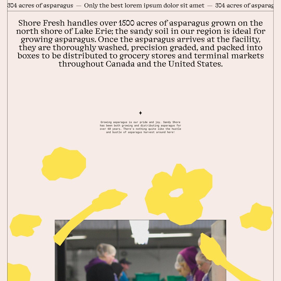
Inspired by Chicago’s sign painting, the packaging of Foxtrot’s potato chips captures the essence of the iconic Maxwell Street Market hot dog.
Foundry: Colophon Foundry, House Industries
Design: Perky Bros
Foundry: Colophon Foundry, House Industries
Design: Perky Bros
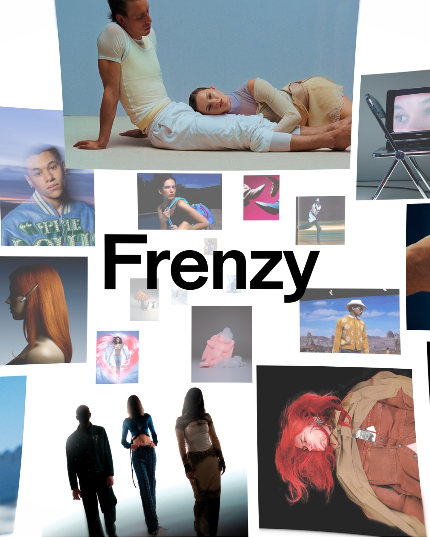
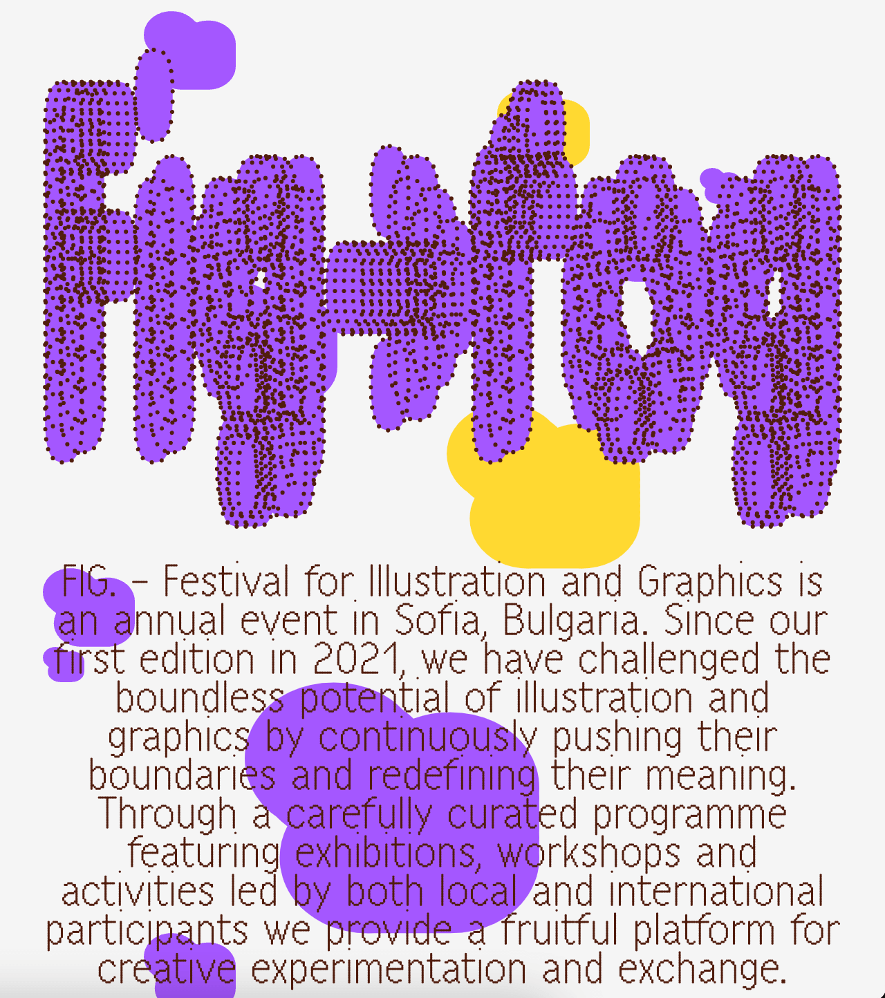
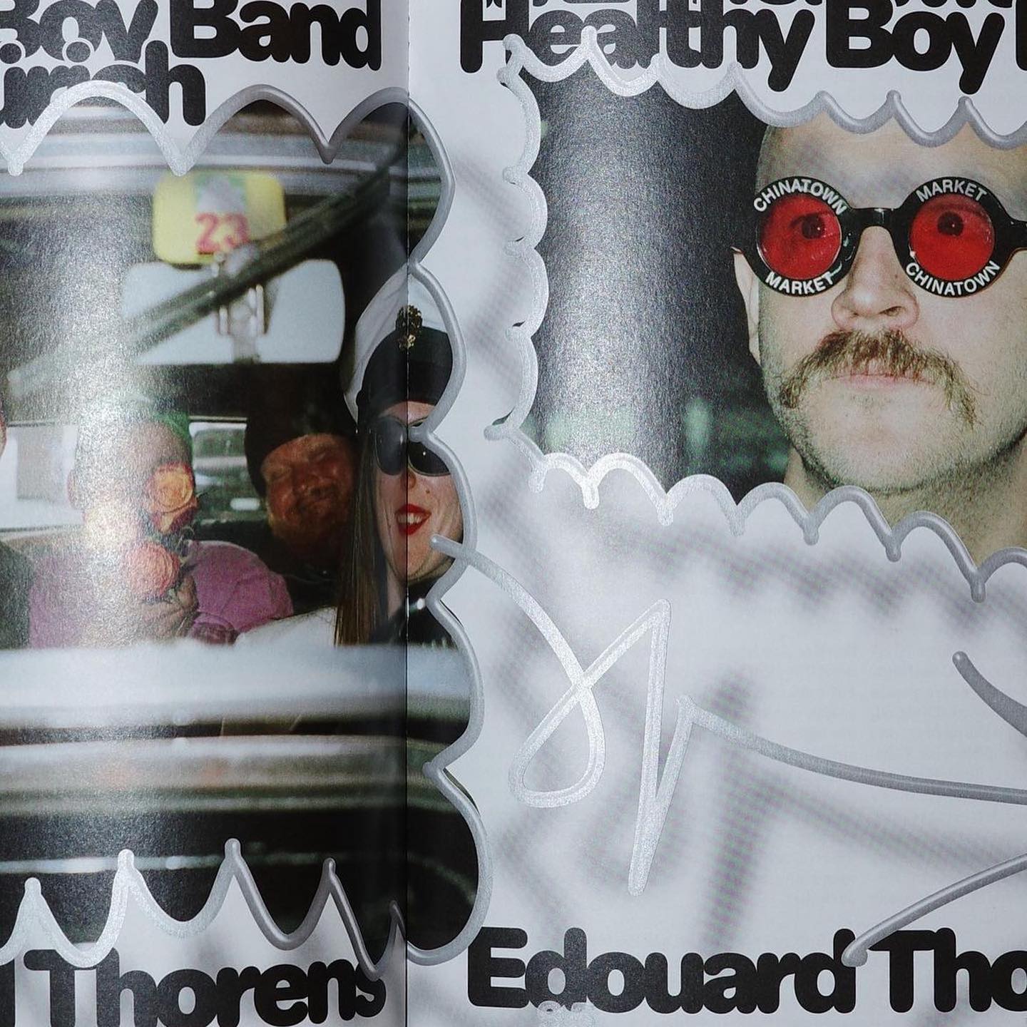
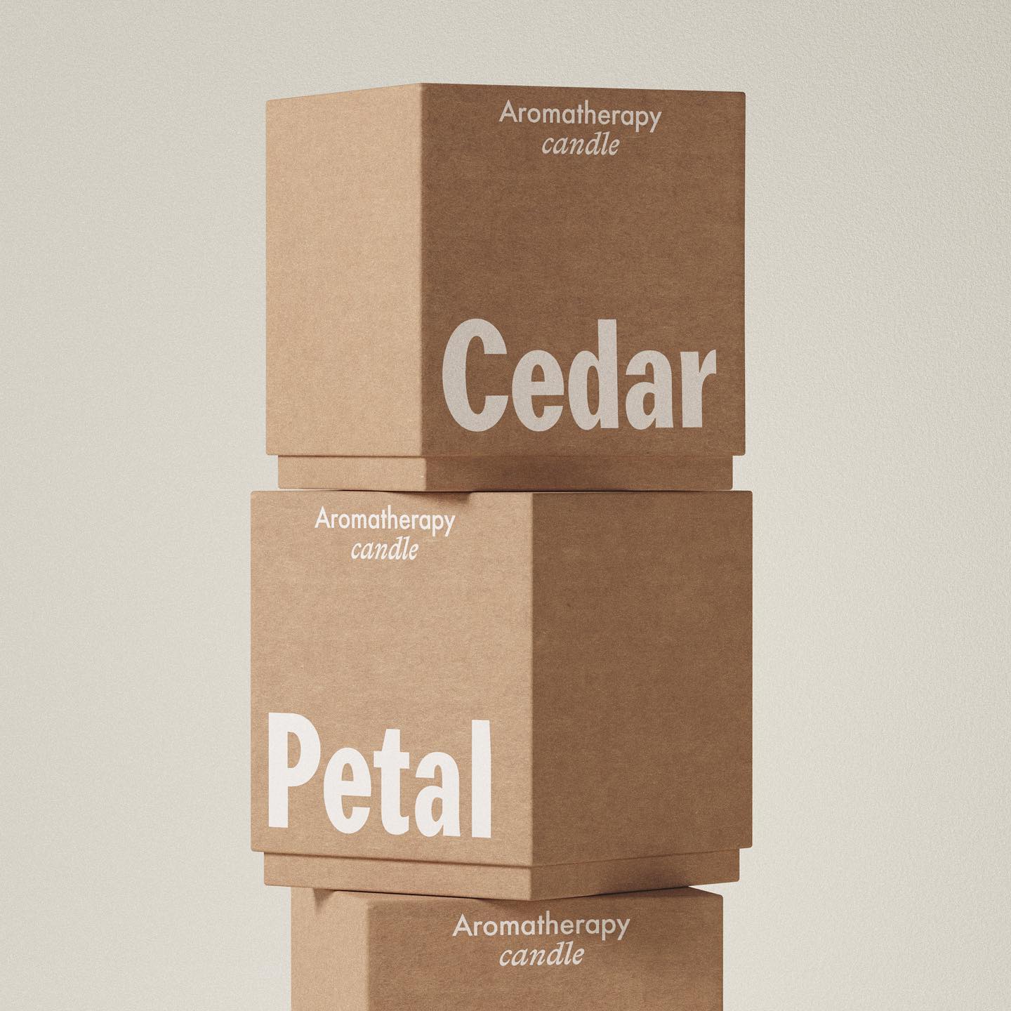
Foundry: Elias Hanzer Design: Somekind
Type Design: ABC Dinamo, Luuse, Adrien Vasquez Design: AM Stockholm
Foundry: Faire Type Design: Baptiste Gerbelot Barillon
Foundry: HAL Typefaces Design: AG Grafik
Foundry: Dinamo Design: Plus Mûrs
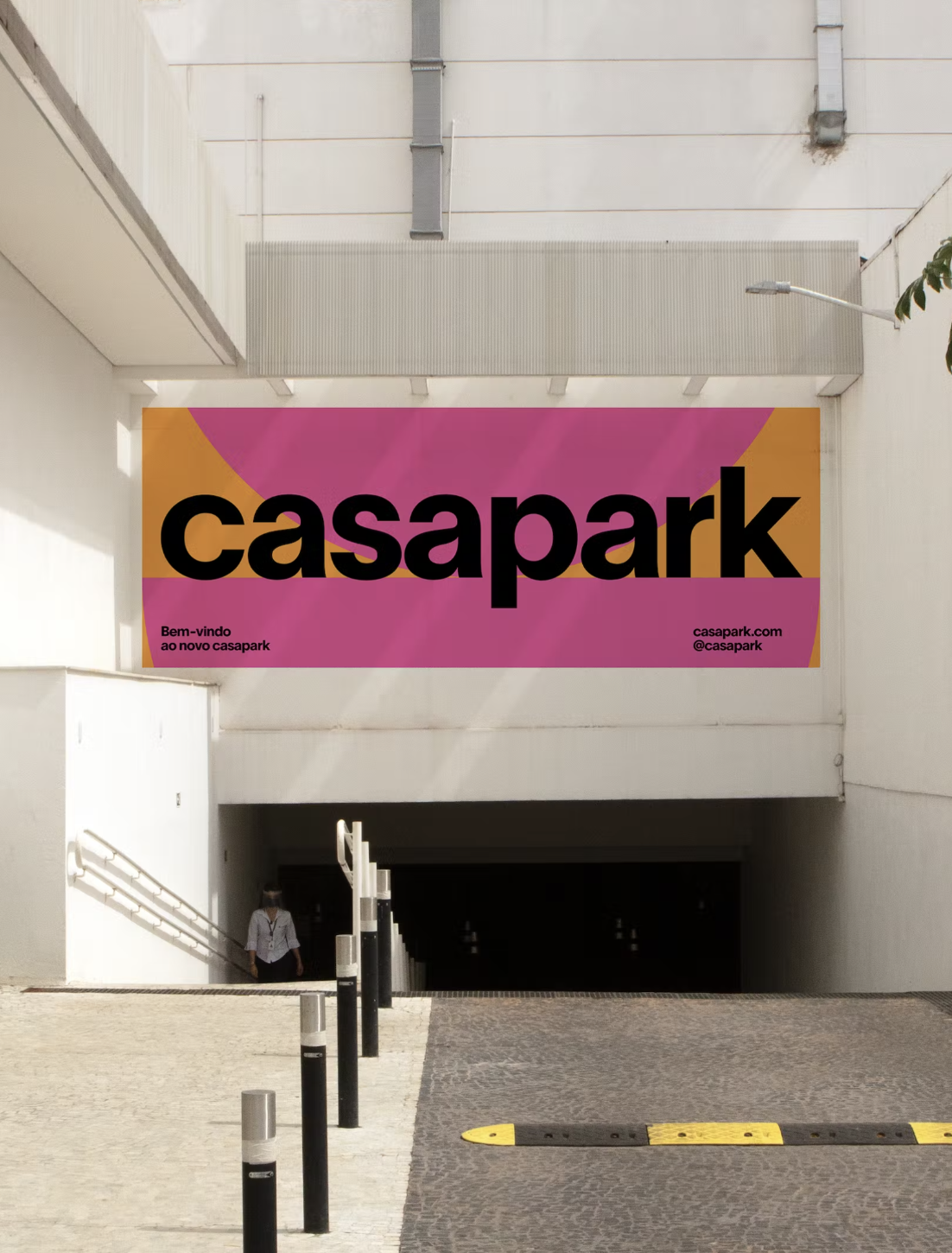
Foundry & Design: Zoo
Foundry: Production Type, Dinamo, Commercial Type Design: ZAINA
Type Designer: Otis Verhoeve Foundry: Wise Type Design: Louise Verstraete
Foundry: Lineto Design: Hort Berlin
Foundry: SOCIOTYPE, 205TF, Grilli Type Design: Tino Nyman
Foundry: Scott Vander Zee, Google Fonts Design: Tux
Foundry: Federcio Parra Barrios Design: Principal
Foundry: Colophon Foundry Design: The New Company
Foundry: Klim, Commercial Type Design: Play
Foundry: Colophon Foundry Design: Leon Romero
Foundry: Optimo Type Foundry Design: Mike Tully
Foundry: HAL Typefaces Design: Distaff Studio
Foundry: Commercial Type Design: Estudio República
Foundry: Benoît Bodhuin Design: Miroslav Zhivkov
Foundry: Lift Type, Bouk Ra Design: Fila Korea
Foundry: HAL Typefaces, Dinamo Typefaces Design: M. Geisser
Foundry: Production Type, Design: Sam Corijn
Foundry: Studio René Bieder Design: Atipus Studio
Foundry: 205 TF Design: Address Arts
Foundry: AllCaps Design: Apartamento
Foundry: Family Type Design: Studio Sly
Foundry: Commercial Type, Schick Toikka Design: Christopher Doyle & Co.
Foundry: ABC Dinamo Design: Ortner etc.
Foundries: Grilli Type, ABC Dinamo Design: Ania et Lucie
Foundry: Klim Type Foundry, SOCIO Type Foundry Design: Socio Design
Foundry: Maxitype Design: Lamm & Kirch / Caspar Reuss
Foundry: Lineto Design: Adeline Mollard
Foundry: Hal Typefaces Design: Studio Hanli
Foundry: Wise Type Design: Mount Agency
Foundry: Hal Typefaces Design: Hanzer Liccini
Design: Dorothee Dähler Foundry: All Caps
Foundry: Bitstream Design: Olssøn Barbieri
Fonts: Francesco, Trabis Design: Maison Solide
Type Designer: Eric Gill Design: Tric Studio
Foundry: Commercial Type Type designer: Miguel Reyes Design: Elizabeth Goodspeed
Foundries: https://klim.co.nz/ Design: https://fieldofplay.studio/
Foundry: Lineto Design: Zoo Designers Graphiques
Foundry: Pangram Pangram Design: Andrés Higueros
Foundries: Radim Pesko, Paul Renner, Lineto Design: Wedge
Foundry Razzia Type, Design Base
Foundry Dinamo, Design Flavious Augustin.