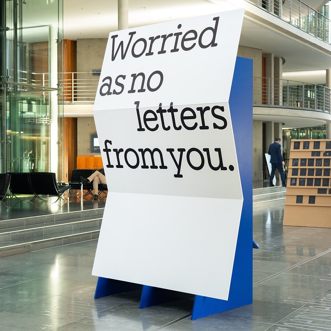
Animo Typeface by Heavyweight shapes the identity of Grande Paolo, a pop-up sports bar in Prague for the Euro Championship.
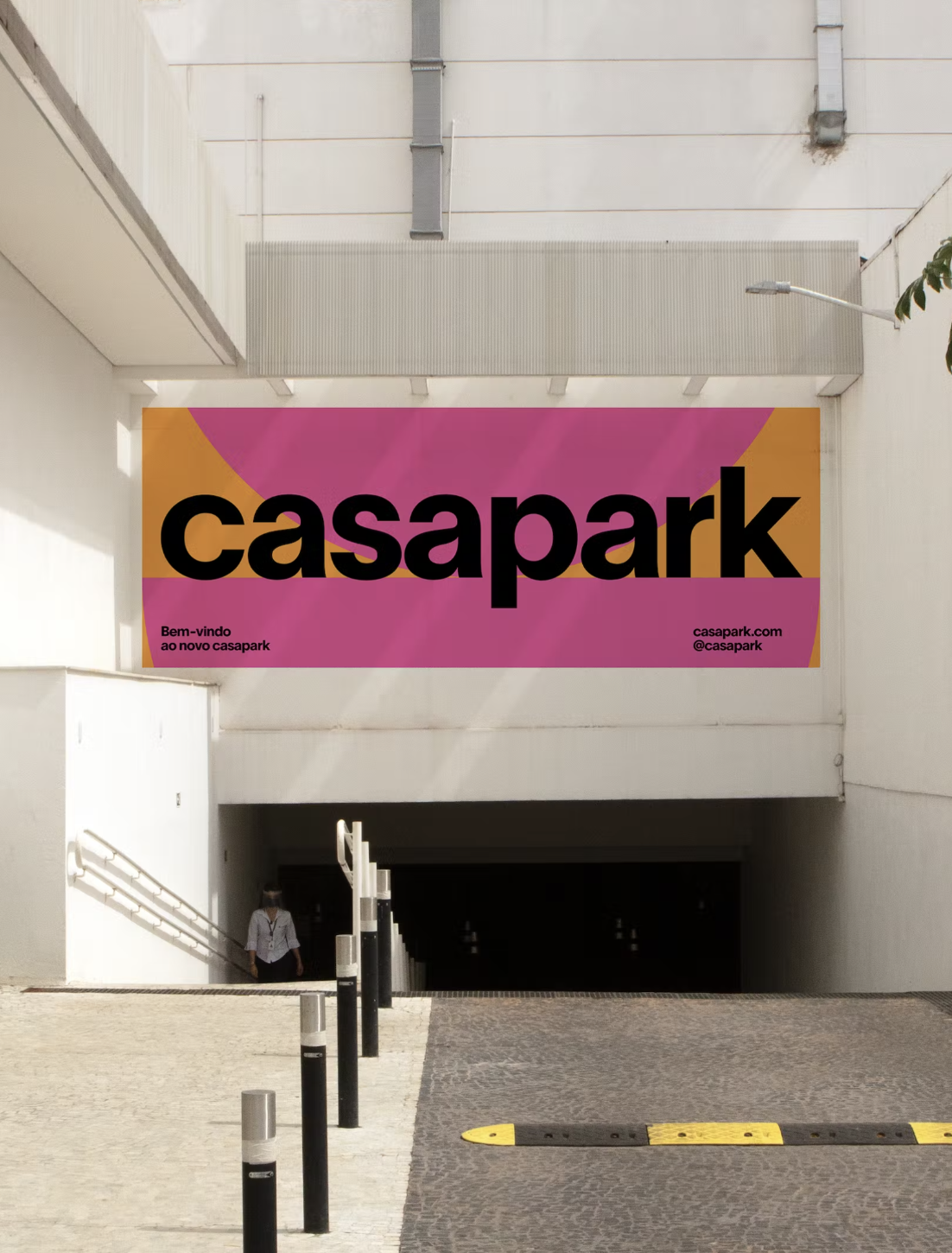
Foundry & Design: Heavyweight
Foundry & Design: Heavyweight
Foundry: Linotype Design: Serviceplan
Foundry: Elias Hanzer Design: Somekind
Foundry: Mark van Leeuwen Design: Copyright/Reserved
Type Design: ABC Dinamo, Luuse, Adrien Vasquez Design: AM Stockholm
Foundry: British Standard Type Design: OK-RM
Foundry: Displaay Design: Motion Sickness Design Office
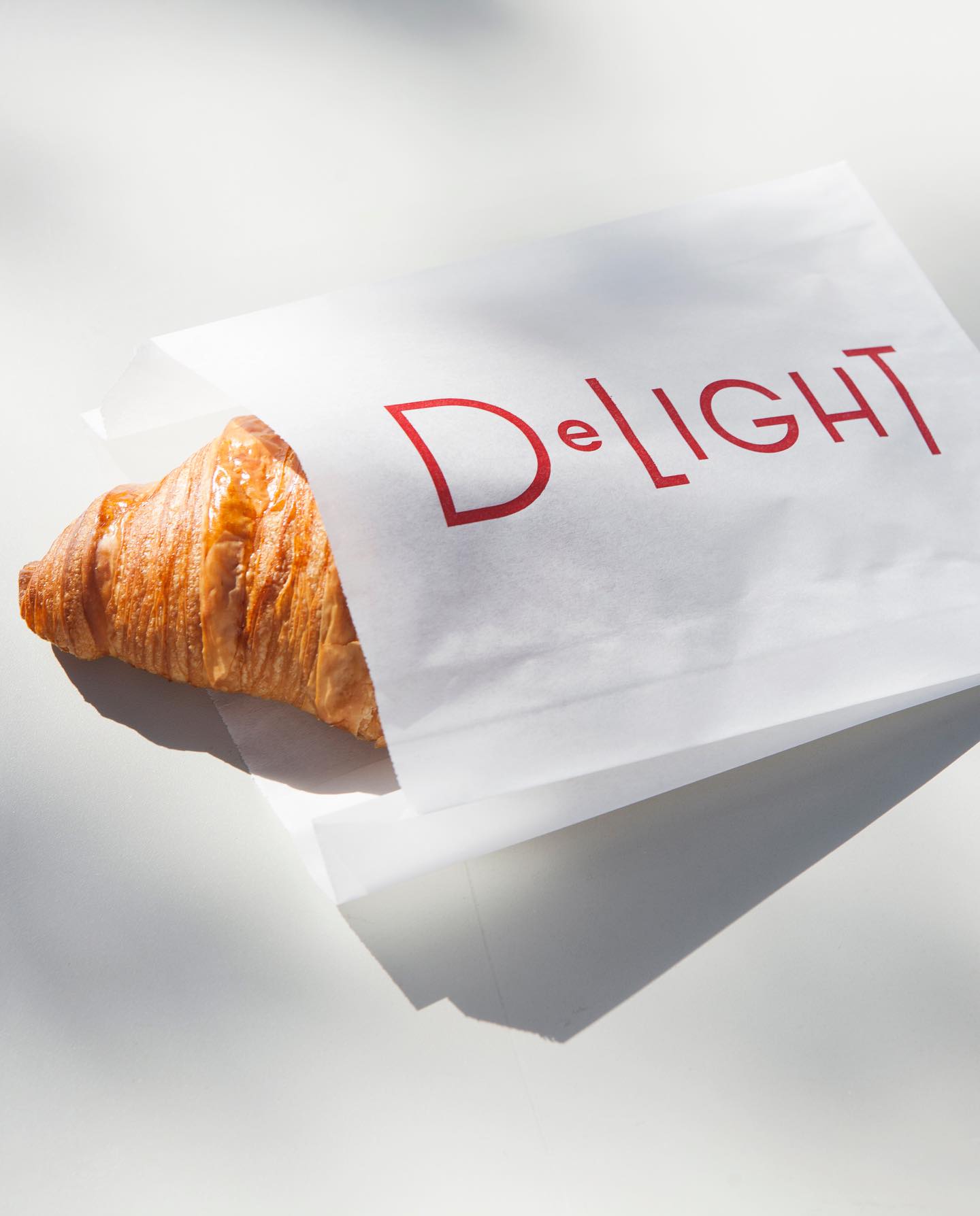
Foundry: Fonts from Folch Design: Folch
Foundry: Image Format for Lift Type Design: Atelier Tout va bien
Foundry: Pizza Typefaces Design: 2×4
Foundry: Dinamo Design: Plus Mûrs
Foundry: Lineto Design: Porto Rocha
Design: BonTemps
Foundry: Pizza Typefaces
Foundry: Linotype Design: Bonjour Garçon
Foundry & Design: Zak Group
Foundry: Eliott Grunewald Design: Jordi Ng, Elana Schlenker
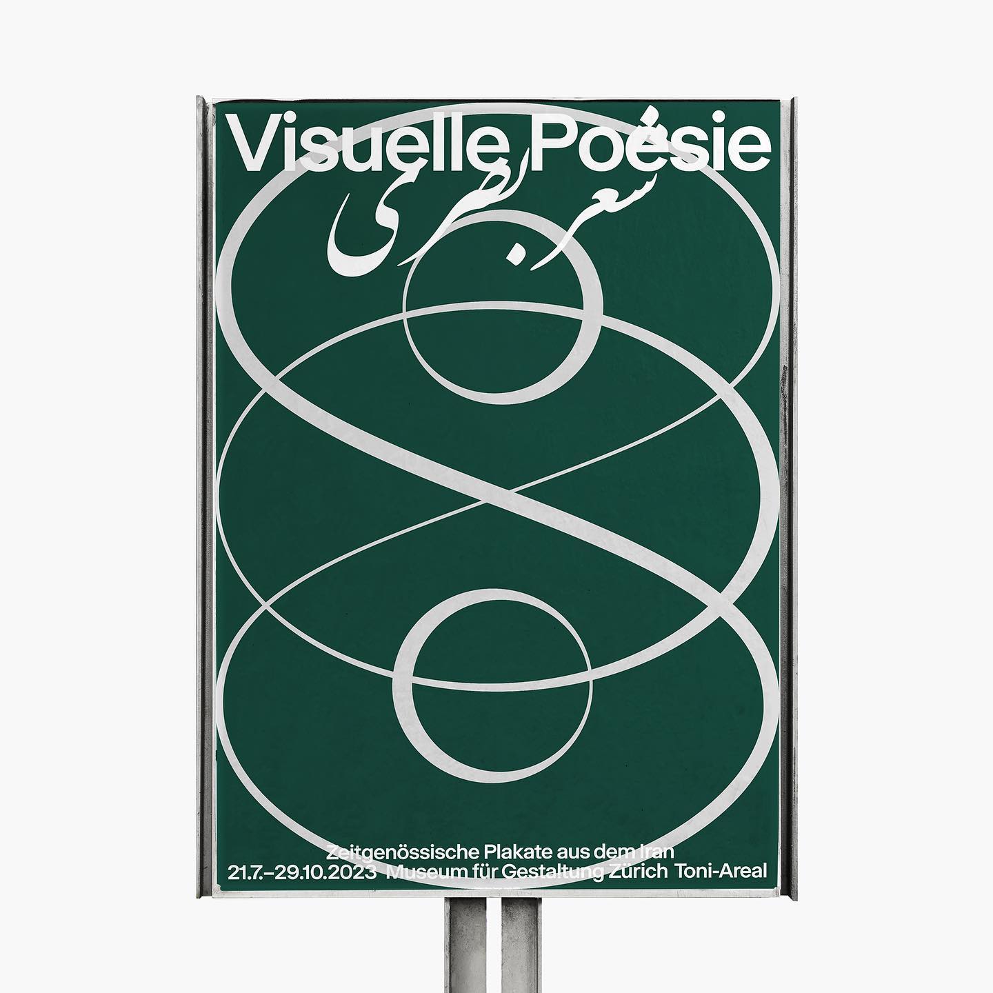
Type and Graphic Design: Spassky Fischer
Foundry: Pangram Pangram, Schick Toikka Design: Casa Bien
Foundry: Production Type, Dinamo, Commercial Type Design: ZAINA
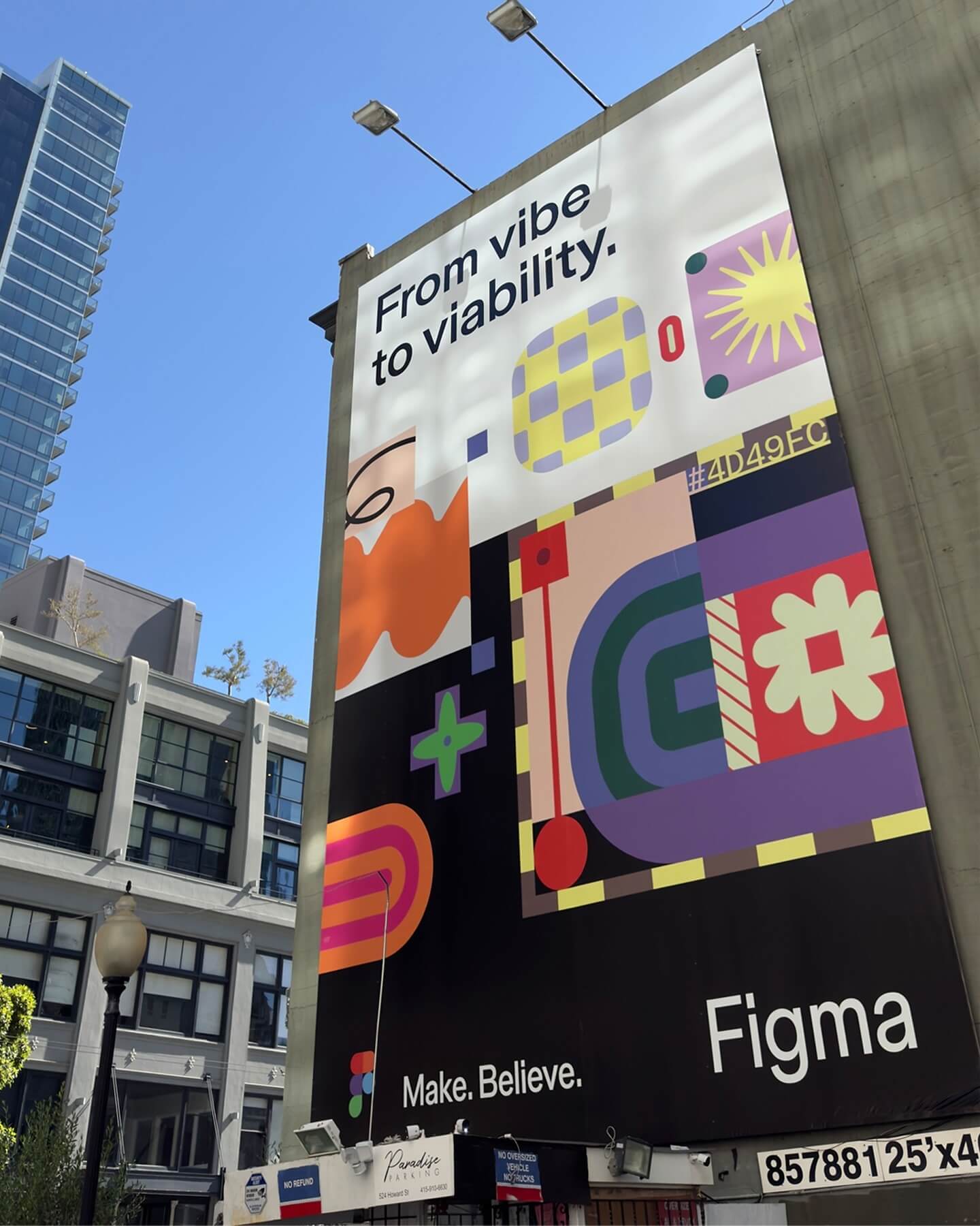
Foundry: Grilli Type Design: Figma
Type Design: Tobias Frere-Jones, Nina Stössinger Design: Gretel
Foundry: Family type Design: Polar Ltda
Foundry: Sharp Type Design: COLLINS
Foundry: SOCIOTYPE, 205TF, Grilli Type Design: Tino Nyman
Foundry: Displaay Foundry Design: Auge Design
Foundry: Dalton Maag Design: Memory Studio
Foundry: Klim, Commercial Type Design: Play
Foundry: DumDum Studio Design: Distaff Studio
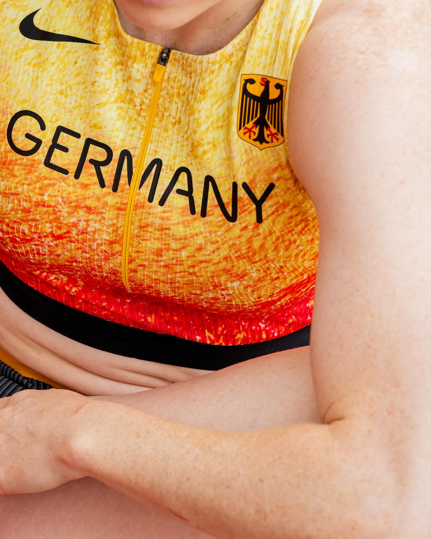
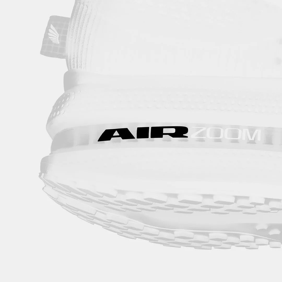
Foundry: Nguyen Gobber Design: Nike Design Team
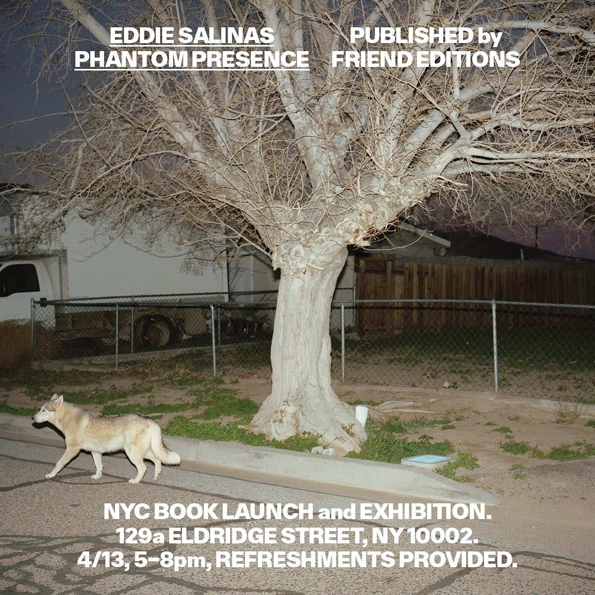
Foundry: All Purpose Fonts Design: Friend Editions
Foundry: Colophon Foundry Design: Leon Romero
Foundry: Florian Karsten, Grilli Type Design: Principi Studi
Foundry: Optimo Type Foundry Design: Mike Tully
Foundry: Nguyen Gobber, Dinamo Typefaces Design: Toykyo
Foundry: HAL Typefaces Design: Distaff Studio
Foundry: Lineto, Displaay Foundry Design: Porto Rocha
Foundry: Commercial Type Design: Estudio República
Foundry: Kyiv Type Foundry Design: Dual Room
Foundry: Dinamo Design: pfp disseny
Foundry: Kimera Corp Design: newkid
Type & Graphic Design: Socker Studio
Foundry: Displaay Typefaces Design: Maison Standard
Foundry: ABC Dinamo, Adobe Fonts Design: Regrets Only
Foundry: Monotype, ABC Dinamo Design: Special Offer Inc.
Foundry: Swiss Typefaces Design: Due Studio
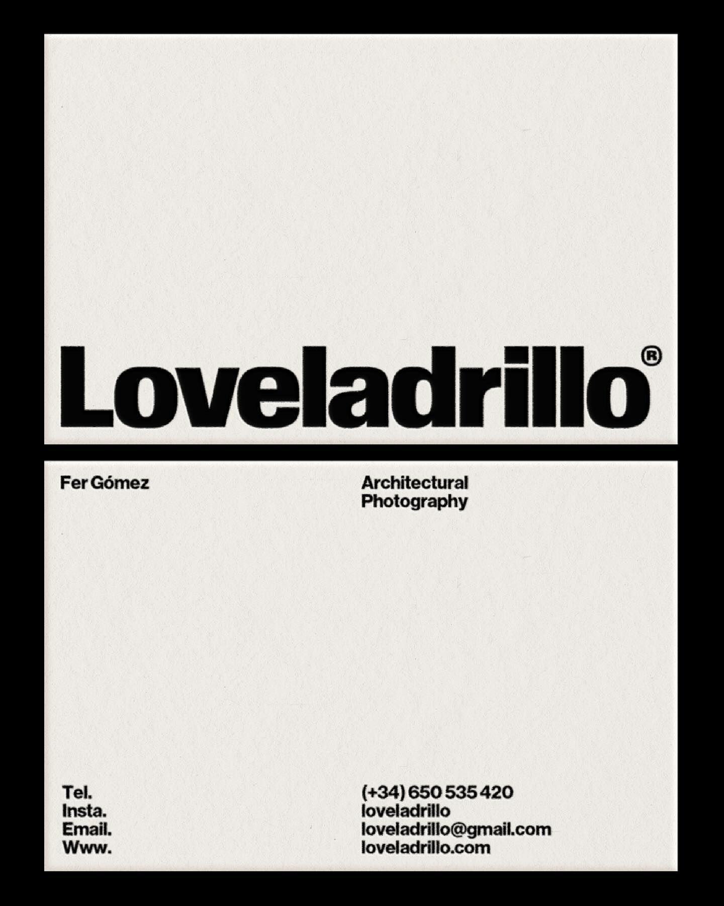
Foundry: Heavyweight Design: Studio Marvil
Foundry: Velvetyne Design: Both Studio
Type Designer: Quentin Coulombier Graphic Design: Underline Studio
Foundry: Store Norske Skriftkompani, Commercial Type Design: Principal Studio
Foundry: Studio René Bieder Design: Atipus Studio
Foundry: 205 TF Design: Address Arts
Foundry: Matthew Carter Design: Jessi Brattengeier, CC Studio
Design: Clase BCN
Type and graphic design: Eric Wrenn
Foundry: Commercial Type Design: Asketic
Foundry: Dum Dum Studio Design: Chejo Studio
Foundry: RongyinotRongyi, ECAL Master Type Design: ECAL Photography
Type Designers: Matthew Fenton, Haakon Spencer, Jack Niblett
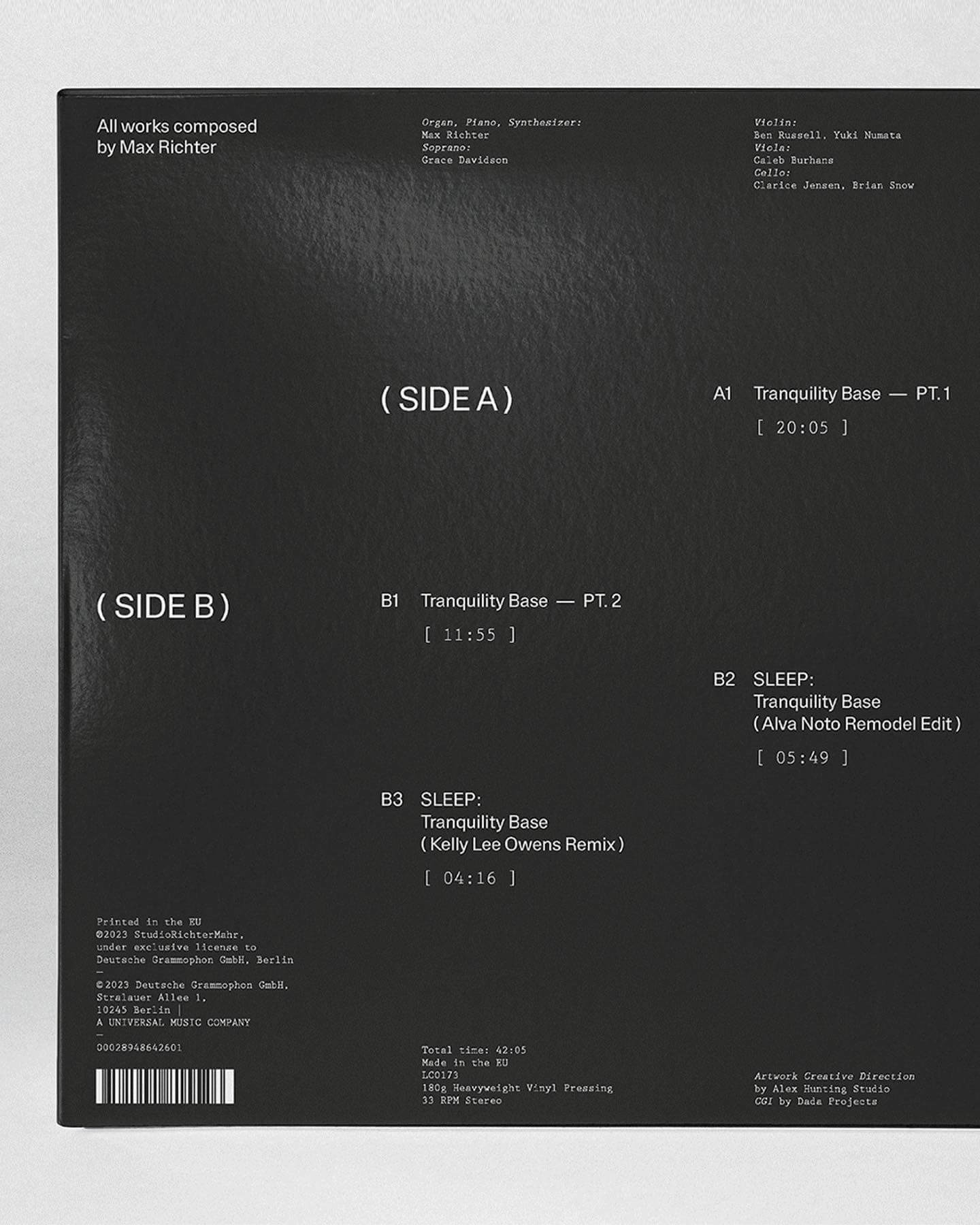
Mastering: Christoph Koeberlin
Foundry: British Standard Type
Foundry: Porto Rocha, All Caps Design: Porto Rocha
Foundry: Dinamo, Out of the Dark Design: Hannes Brischke
Foundry: Forgotten Shapes, Set Sail Studios Design: Harrison Fun Studio
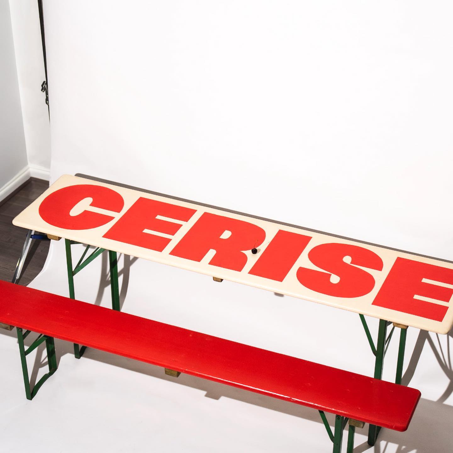
Foundry: Nouvelle Noir Design: Studio Cerise
Foundry: Optimo Type, Google Fonts Design: Estudio República
Foundry: Type Weltkern
Foundry: AllCaps Design: Apartamento
Foundry: Commercial Type Design: Principal Studio
Foundry: Family Type Design: Studio Sly
Foundry: Out Of The Dark, JHA Design: Agga Stage, Alexander Söder
Foundry: ABC Dinamo Design: EY Doberman
Foundry: Commercial Type, Schick Toikka Design: Christopher Doyle & Co.
Foundry: Linotype Design: Kurppa Hosk
Foundry: Kimera Corp Design: Raw Materials, Service Plan
Foundry: Frere-Jones Design: Gretel NY
Foundry: ABC Dinamo Design: Ortner etc.
Type Design: Laura Meseguer Design: Buenaventura
Foundry: Extraset Design: Studio Hudson Catty, Camille Baudelaire & Olivia Grandperrin
Design: Paula de Álvaro
Type Design: Bureau Bernklau Design: Frederik Mahler-Andersen, Clio Ha
Foundry: Klim Type Foundry, SOCIO Type Foundry Design: Socio Design
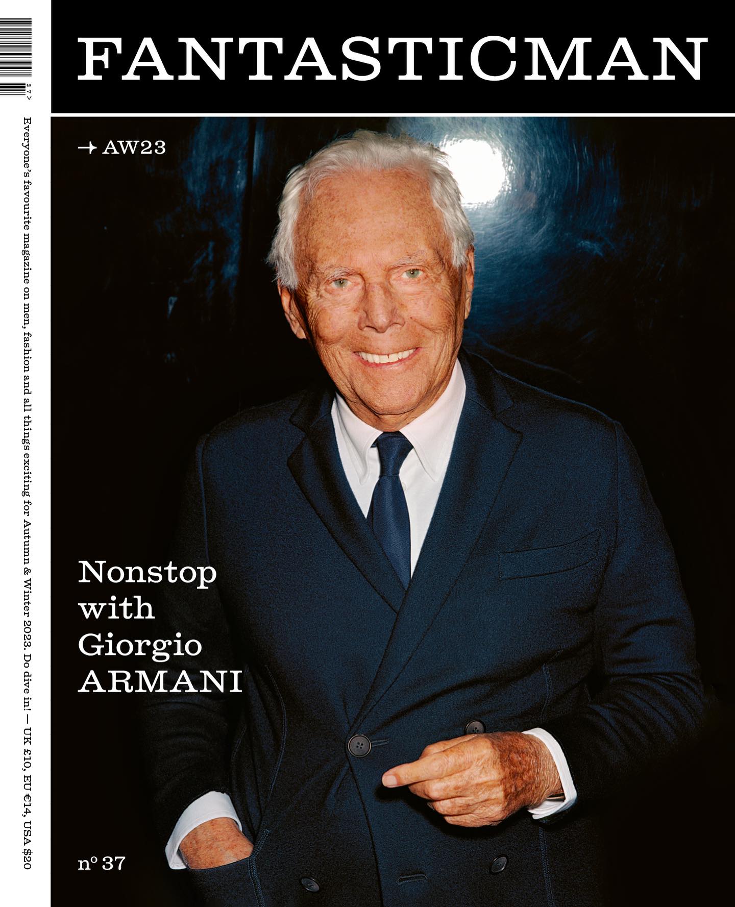
Foundry: Laurenz Brunner Design: Fantastic Man
Foundry: ABC Dinamo Design: Commission Studio
Foundry: Pangram Pangram, ITC, Commercial Type Design: The Office of Ordinary Things
Foundry: A+
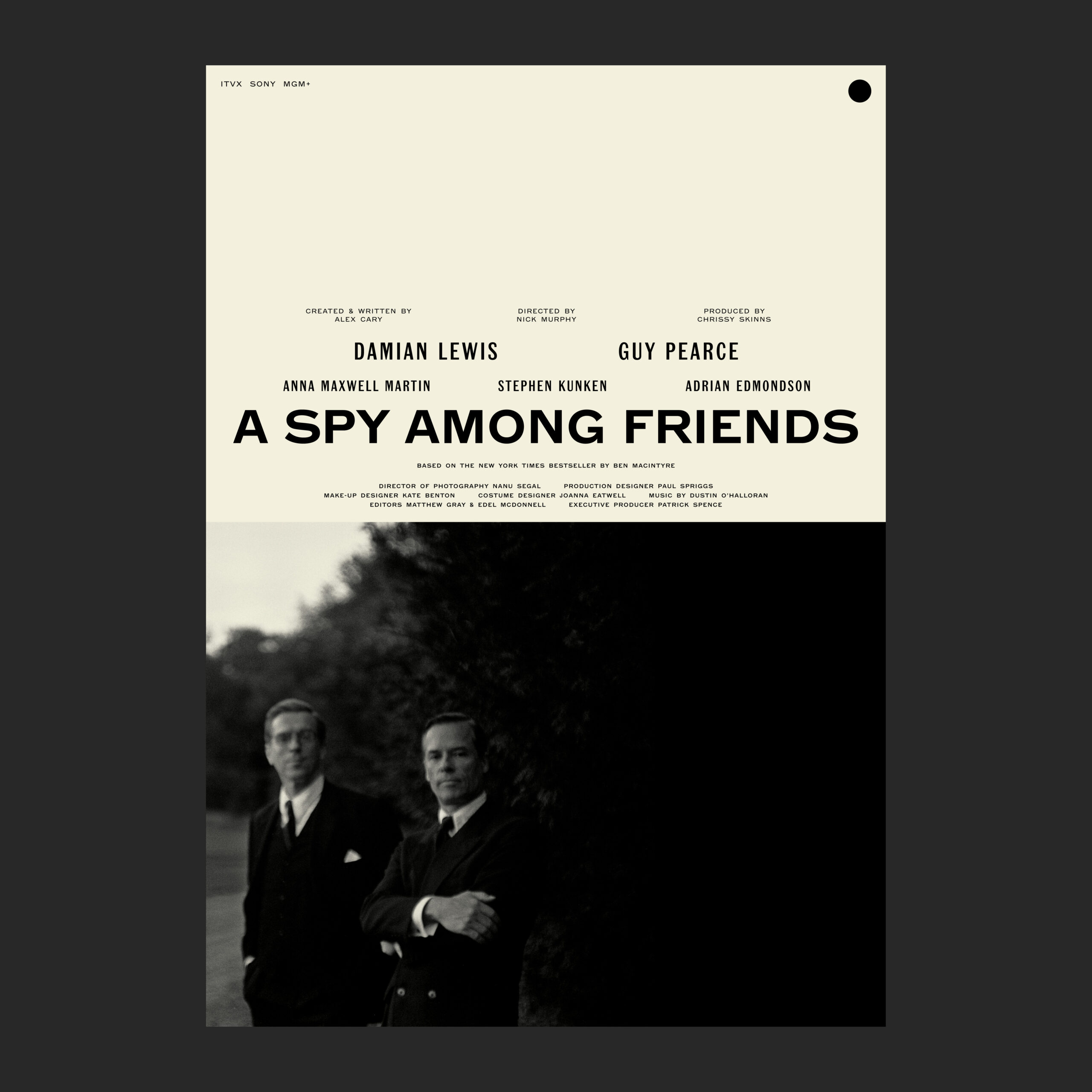
Type Designer: Julien Hébert Design: Principal Studio Foundry: Commercial Type
Foundry and design: Dum Dum Studio
Foundry: Lineto Design: Studio Ard
Foundry: Order Type Foundry Design: Ragged Edge
Type Designer: Alex Lescieux Design: Giacomo Bastianelli
Foundry: Rafael Ribas Design: Zoo designers graphiques
Foundry: Commercial Type Design: Studio Abraham
Foundry: Gerstner-Programm Web Design: Rafa Cobiella UX: Seriousandly
Foundry: Fonts From Folch Design: Folch Studio
Foundry: AllCaps Design: Autostrada Studio
Studio: Hugo Blanzat
Foundry: Schick Toikka
Foundry: Schick Toikka Design: Alex Hunting
Design: The New Company Foundry: 205TF
Foundry: Cotype Foundry Design: Porto Rocha
Foundry: Type Weltkern Web Design: Matière Vive Renders: Synthetic Aspect
Logo design: Laura Csocsán Foundry: Source Type
Foundry: The Northern Block Designer: Jonathan Hill
Design: Regular Practice
Design: Aranda Agency
Foundry: Extraset Design: Glasfurd & Walker
Design: Ana Mirats
Foundry: Heavyweight Design: Bastien Forato
Type Design: Studio Bruch Type Studio: Hungarumlaut
Foundry: Warsaw Types Design: Daniel Gremme
Foundry: Sharp Type Design: Basora
Foundry: All Purpose Fonts Design: Friend Editions, Oliver Shaw
Foundry: Bogidar Mascarenas Design: Hagar Erez, Ark Visual
Foundry: Eliott Grunewald Design: Monozygote
Foundry: 26a1 Type Designer: Daniel Wenzel
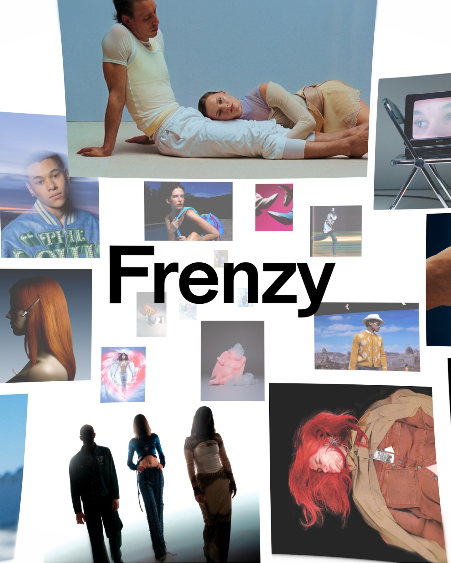
Foundry: Dinamo Design: Actual Source
Foundry: Wise Type Design: Juliette Duhé
Design: Studio Lotta Nieminen Foundry: Colophon
Type Designer: Israel Hernández
Foundry: Colophon Foundry Design: Gentle Forces
Design: Omse Foundry: Family Type
Design: Jose Houdini, Adrián Zorzano
Design: Guillaume Sbalchiero
Foundry: Fonts.gr Design: Marlon Tate
Design: Dorothee Dähler Foundry: All Caps
Type Designers: Michael Clasen, Marcel Saidov Foundry: Kimera
Type and design: H5
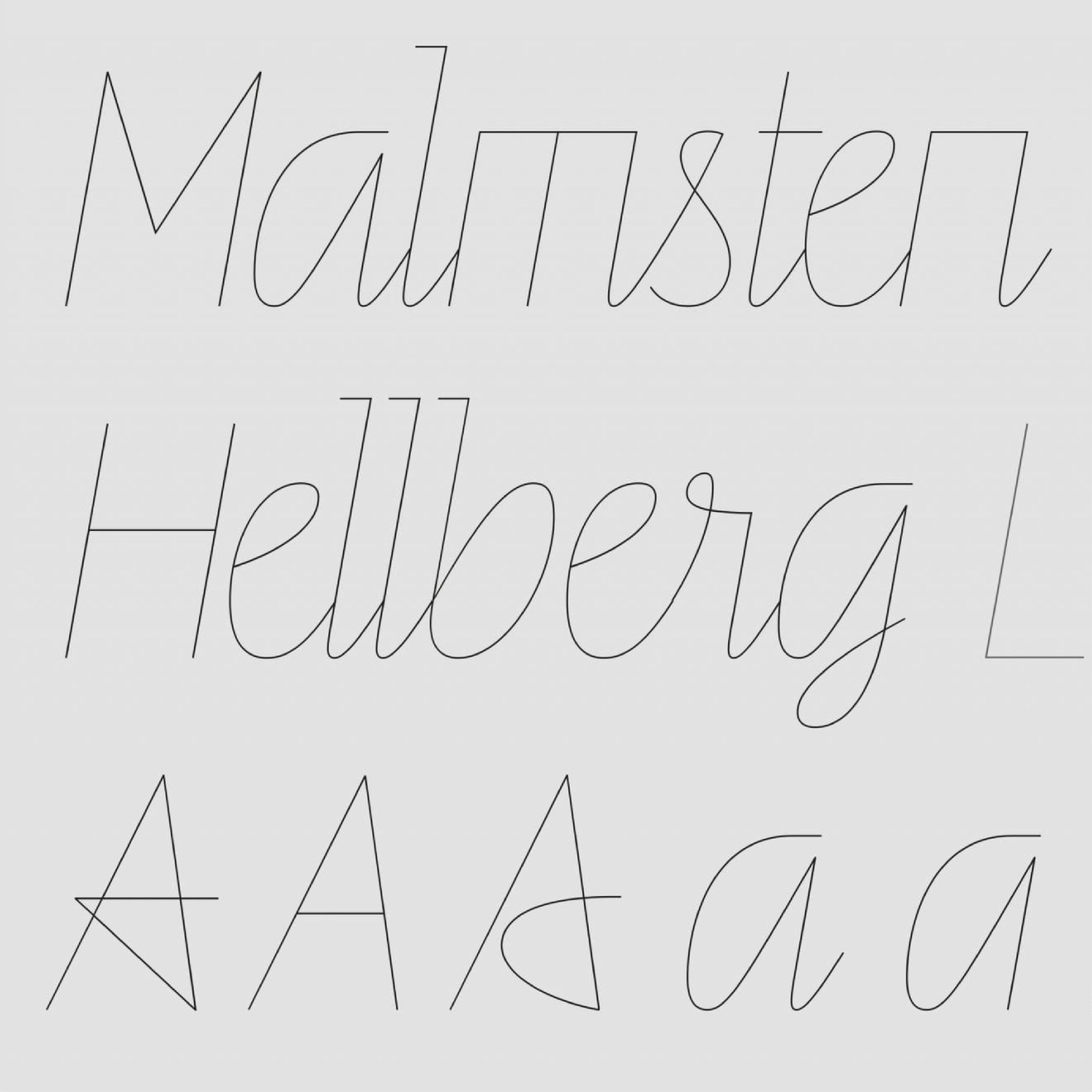
Foundry: Letters From Sweden Design: Malmsten Hellberg,
Foundry: Schick Toikka Design: Deux Huit Huit
Foundry: SM Design: PFP Disseny
Foundry: Klim Type Foundry Design: Jeremy Matthews
Foundry: A2-TYPE Design: Matt Willey
Type: Laurenz Brunner, Source Type. Design: Anne Büttner
Foundry: Frost Type
Foundry: Letterjuice Studio: Decimal
Type Designer: Ana Moliz Design: Buenaventura
Foundry: Lineto Design: Zoo Designers Graphiques
Foundry: Pangram Pangram Design: Andrés Higueros
Foundries: Radim Pesko, Paul Renner, Lineto Design: Wedge
Foundry: Colophon Foundry Design: Porto Rocha
Typeface and identity: Leon Romero
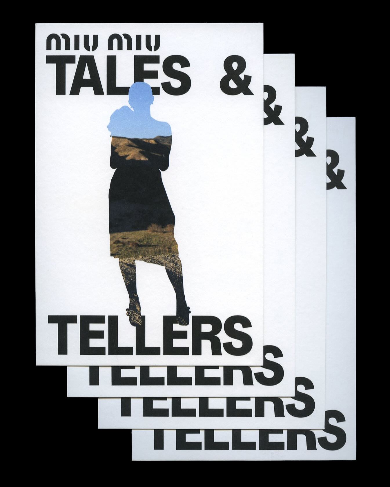
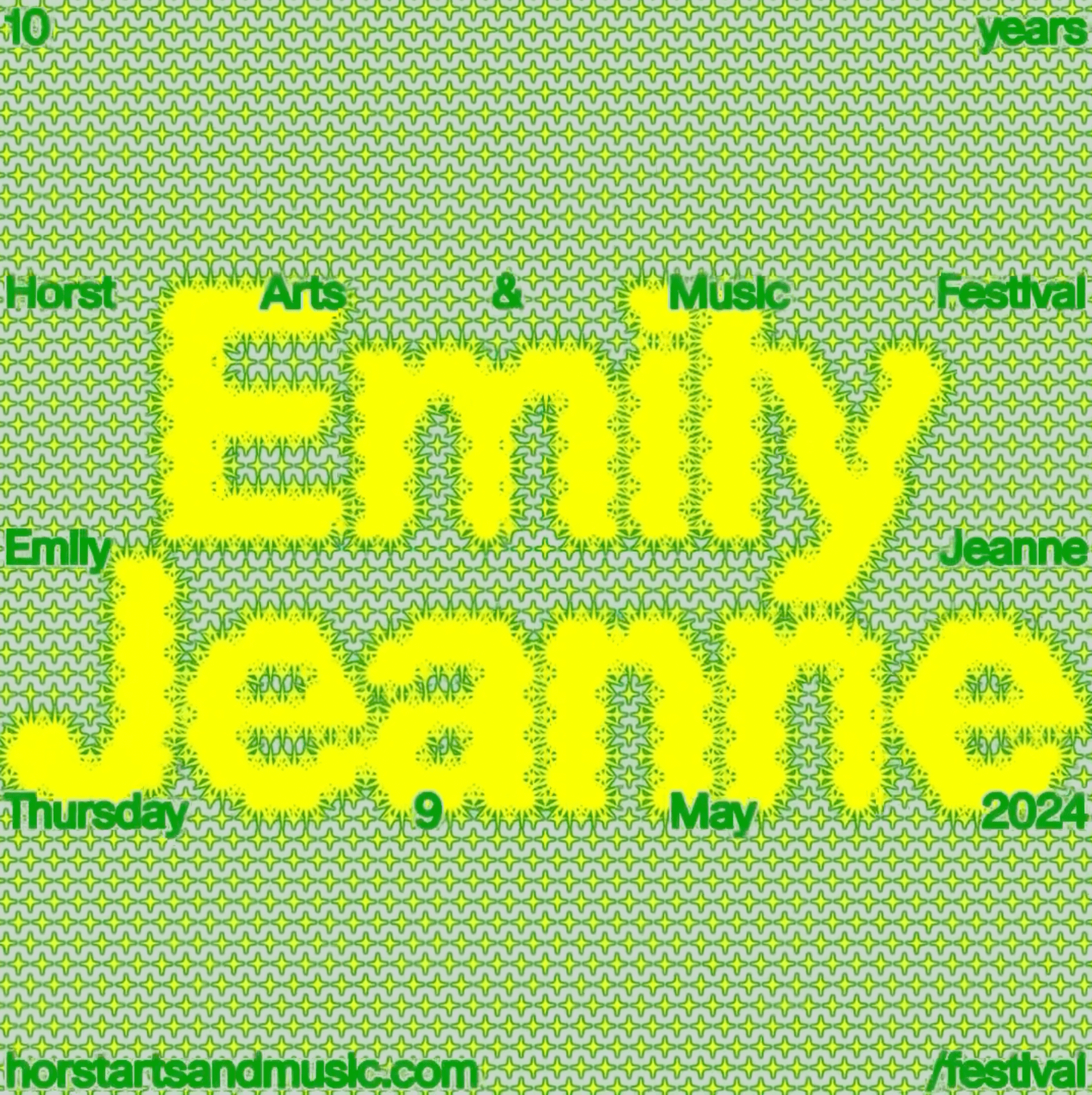
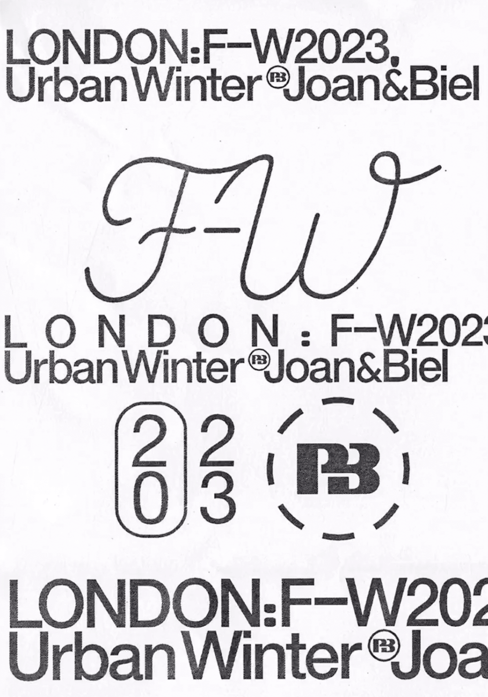
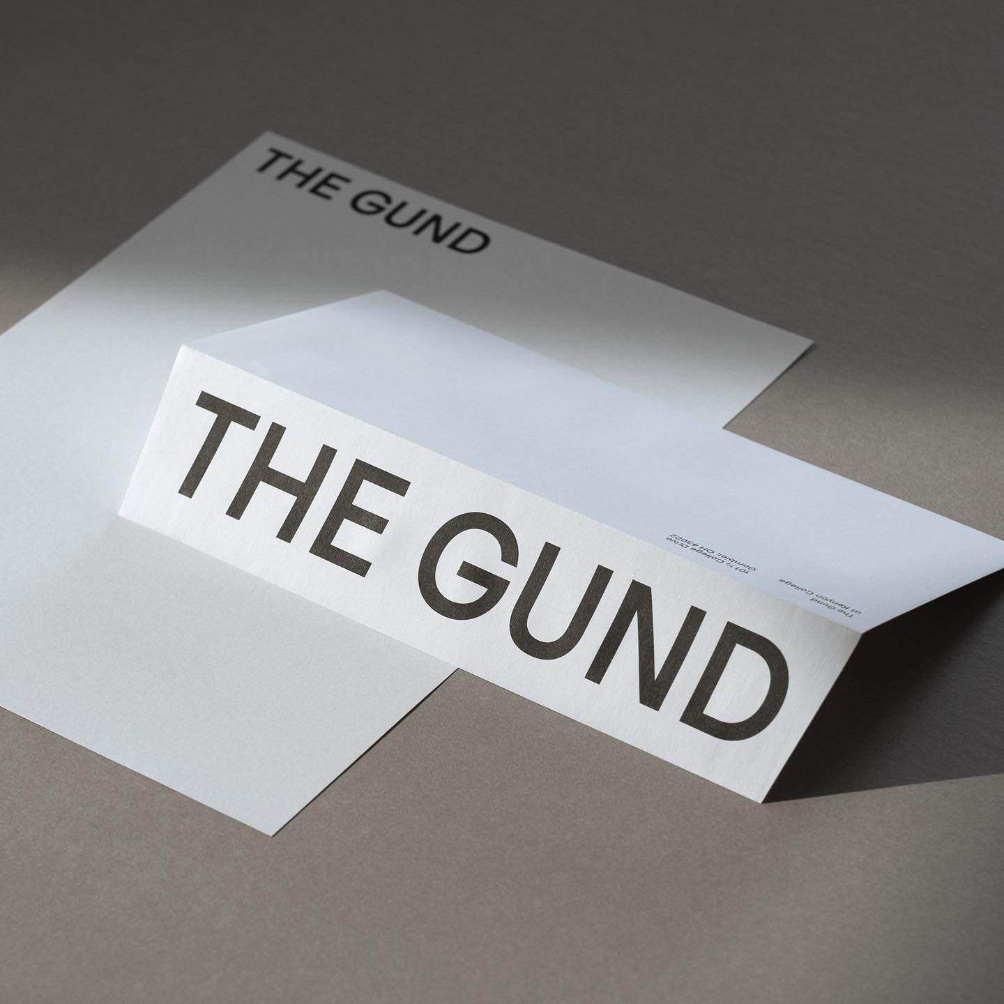
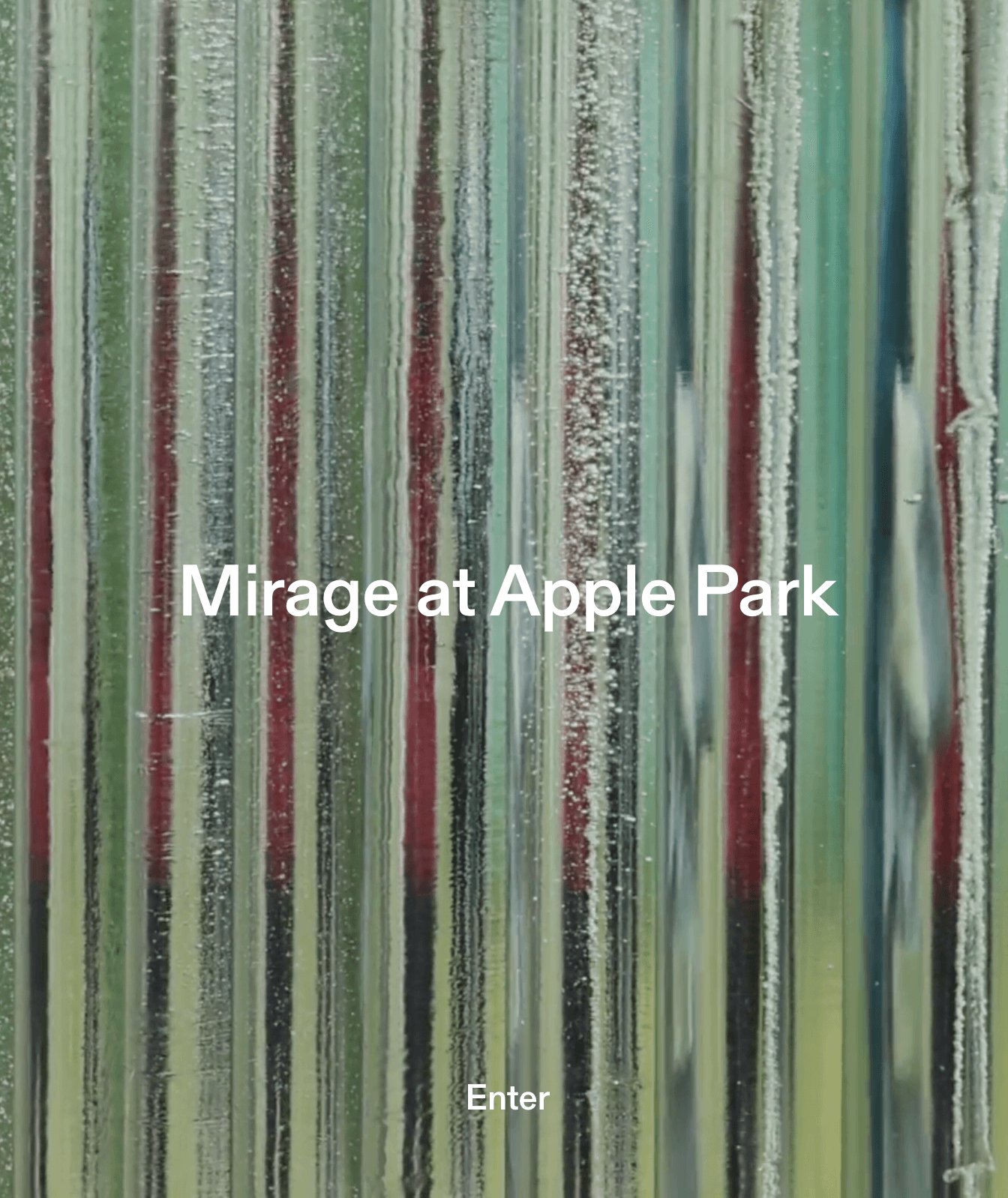
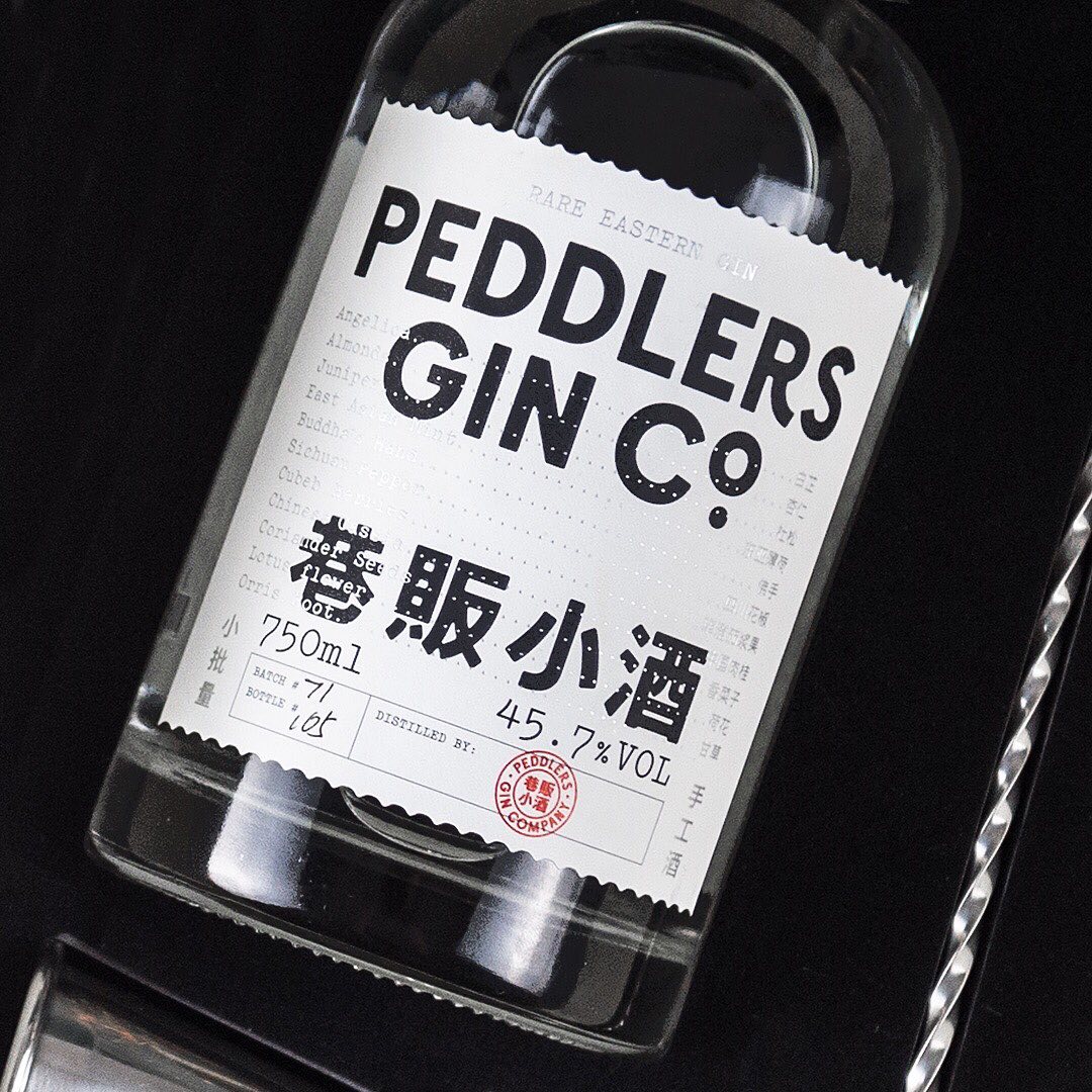
Foundry Heavyweight Design ActualSource
Foundry Razzia Type, Design Base
Foundry Dinamo, Design Flavious Augustin.