

TypeHelper 2022® All rights reserved.
Images copyright to their respective owners. This site was made with Suisse Int’l Light from Swiss Typefaces.
It is common to find in our typographic catalogs two or more versions of the same character. For example, in the Illustrator menu, you can choose between Adobe Garamond, Garamond Premier Pro, ITC Garamond, or simply Garamond.
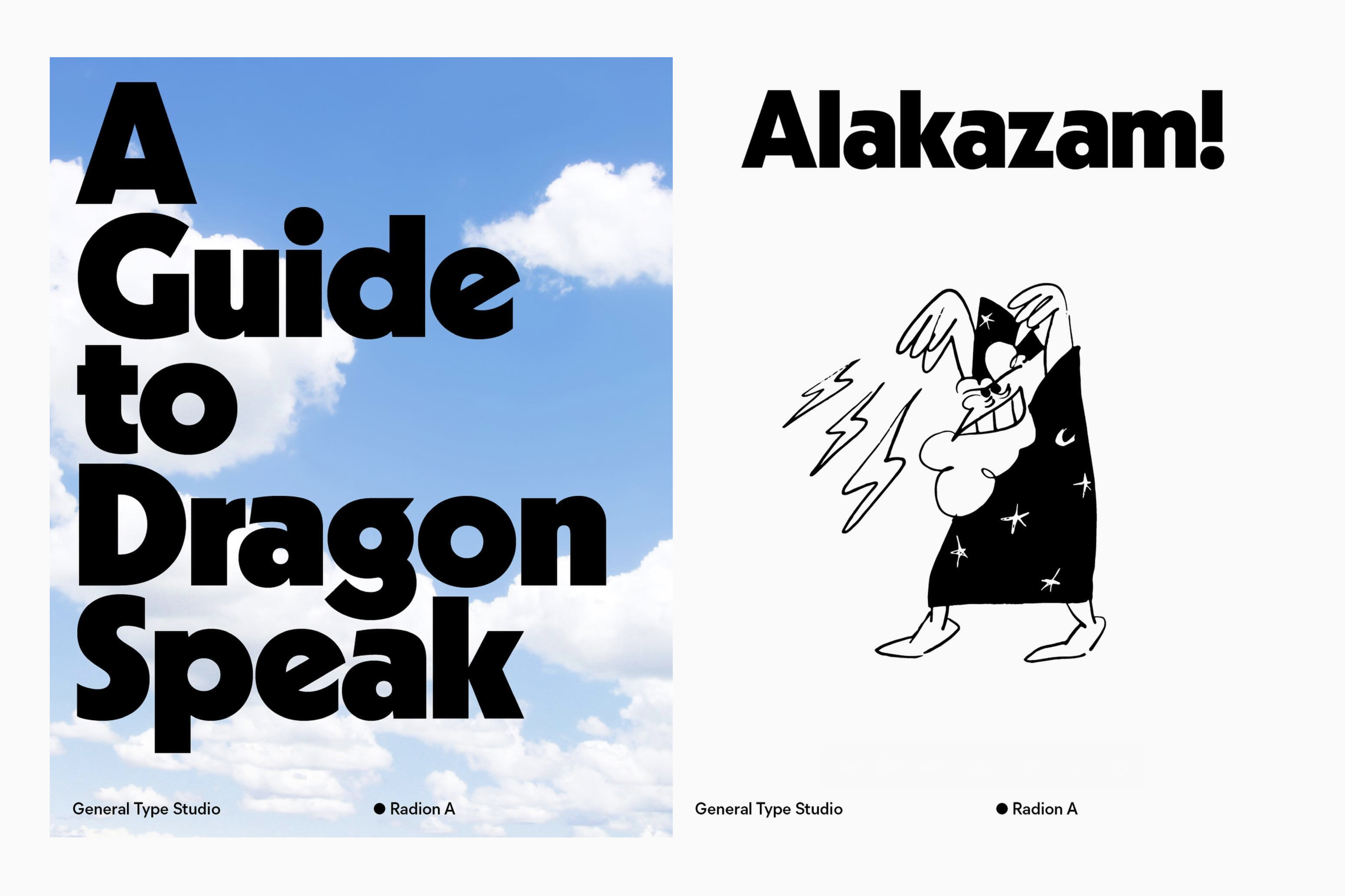
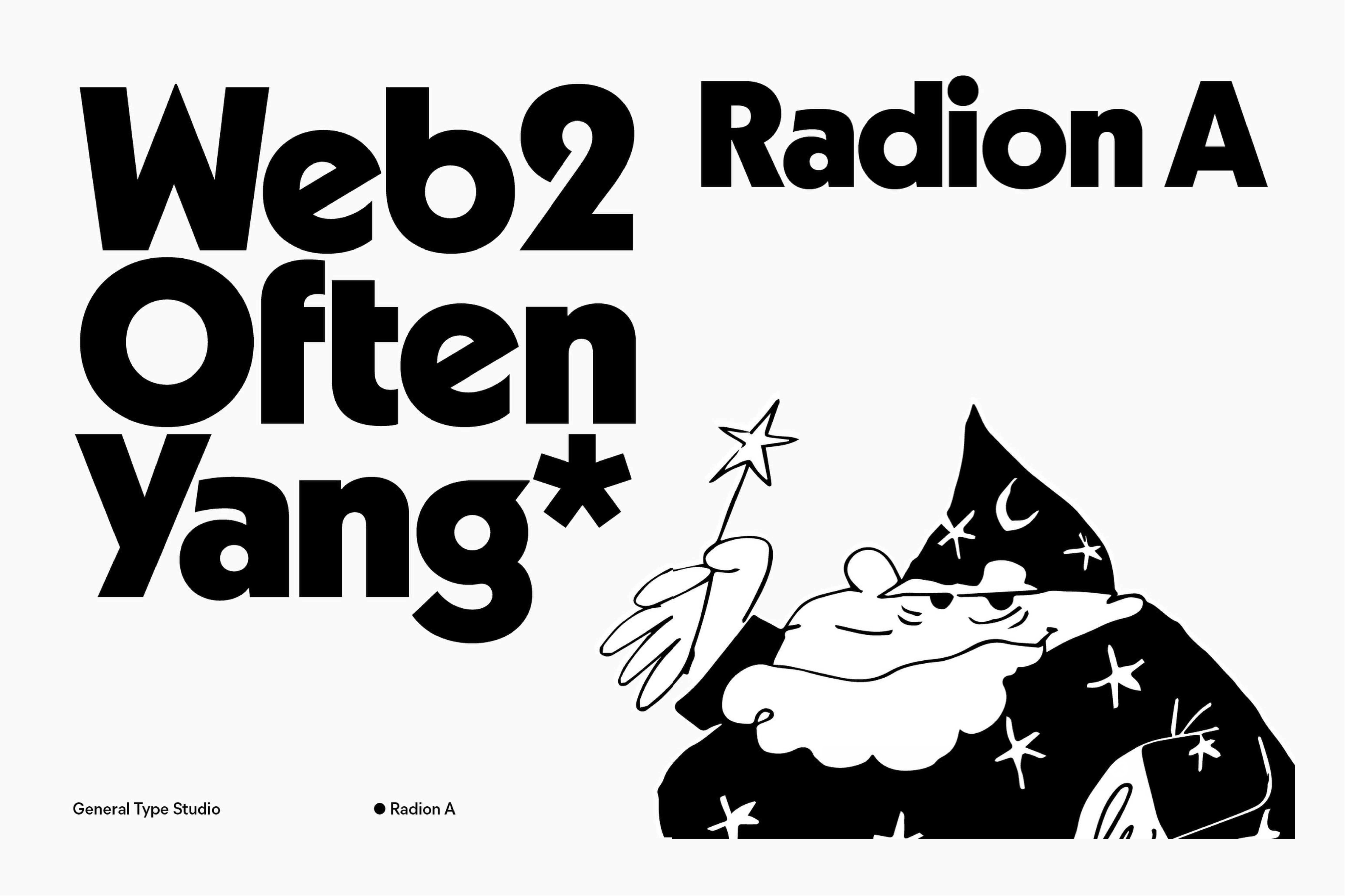
What is the variation among them? It should be mentioned that all of these are reinterpretations of the original Garamond, which was carved in metal type in the 16th century. A similar situation occurs with Radion, a typeface launched in 2021 by General Type Studio, led by Stéphane Elbaz, who is also the designer of this font.
In 1927, German typographer Rudolf Koch released Kabel, a geometric Sans Serif typeface in a linotype format—a method of printing letters at that time—which achieved great success despite direct competition with giants like Futura or Johnston. Years later, linotype fell into disuse as technological advancements brought new forms of printing. This led to the emergence of phototypesetting, a faster and cheaper method to which Kabel adapted fortunately when, in 1976, Victor Caruso designed ITC Kabel. Notice how the history of typography is filled with reinterpretations, adaptations, and revivals.
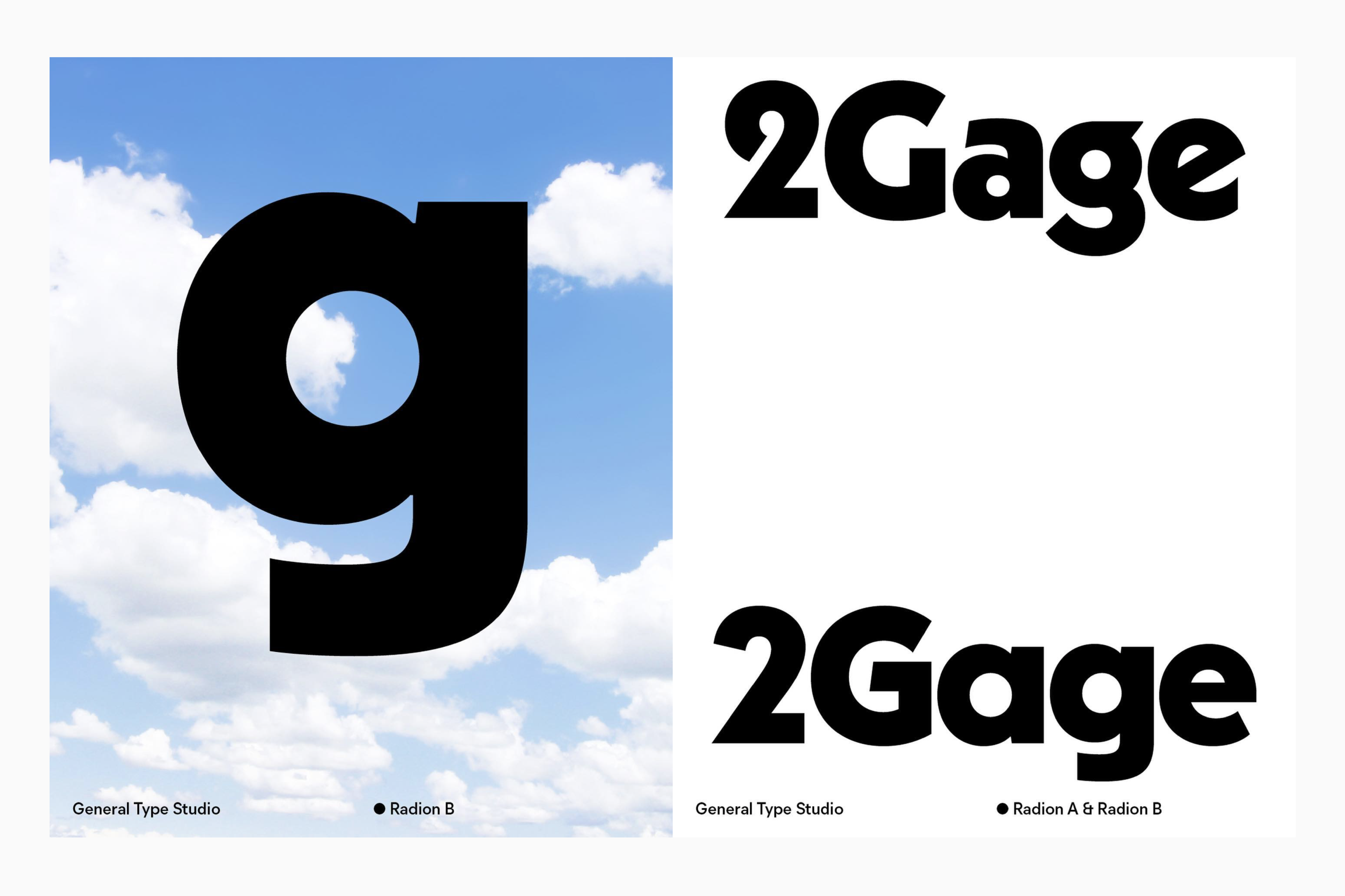
Radion is an example of this phenomenon, as it is a classic typeface adapted to the digital format, making the most of it by including various OpenType options, as well as two versions of the same family.
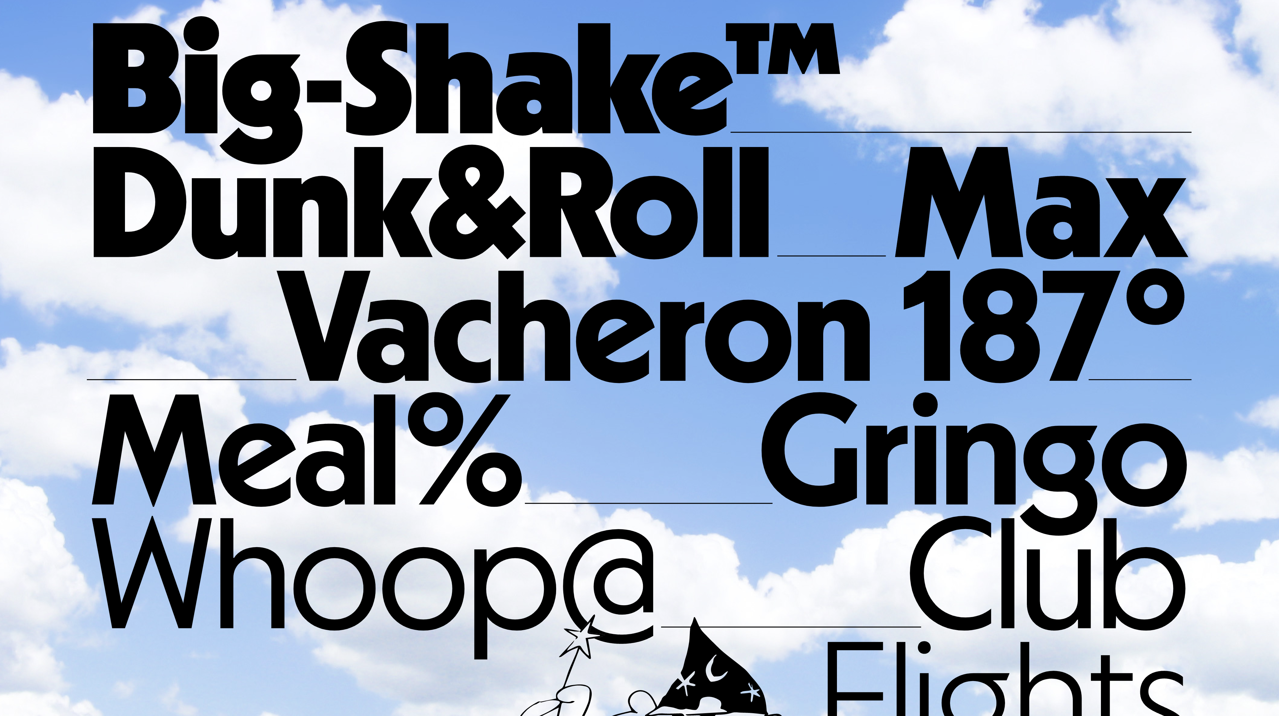
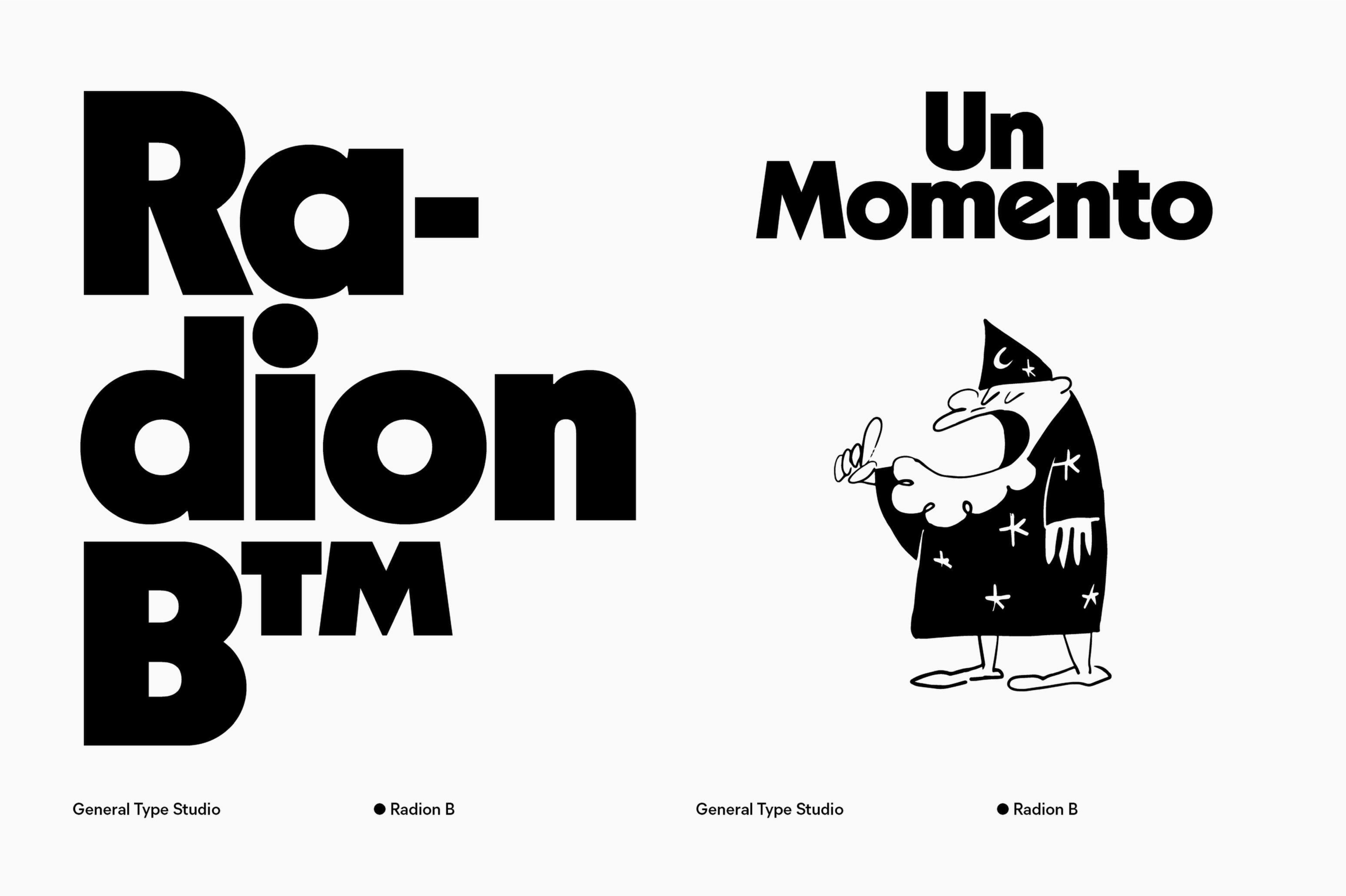
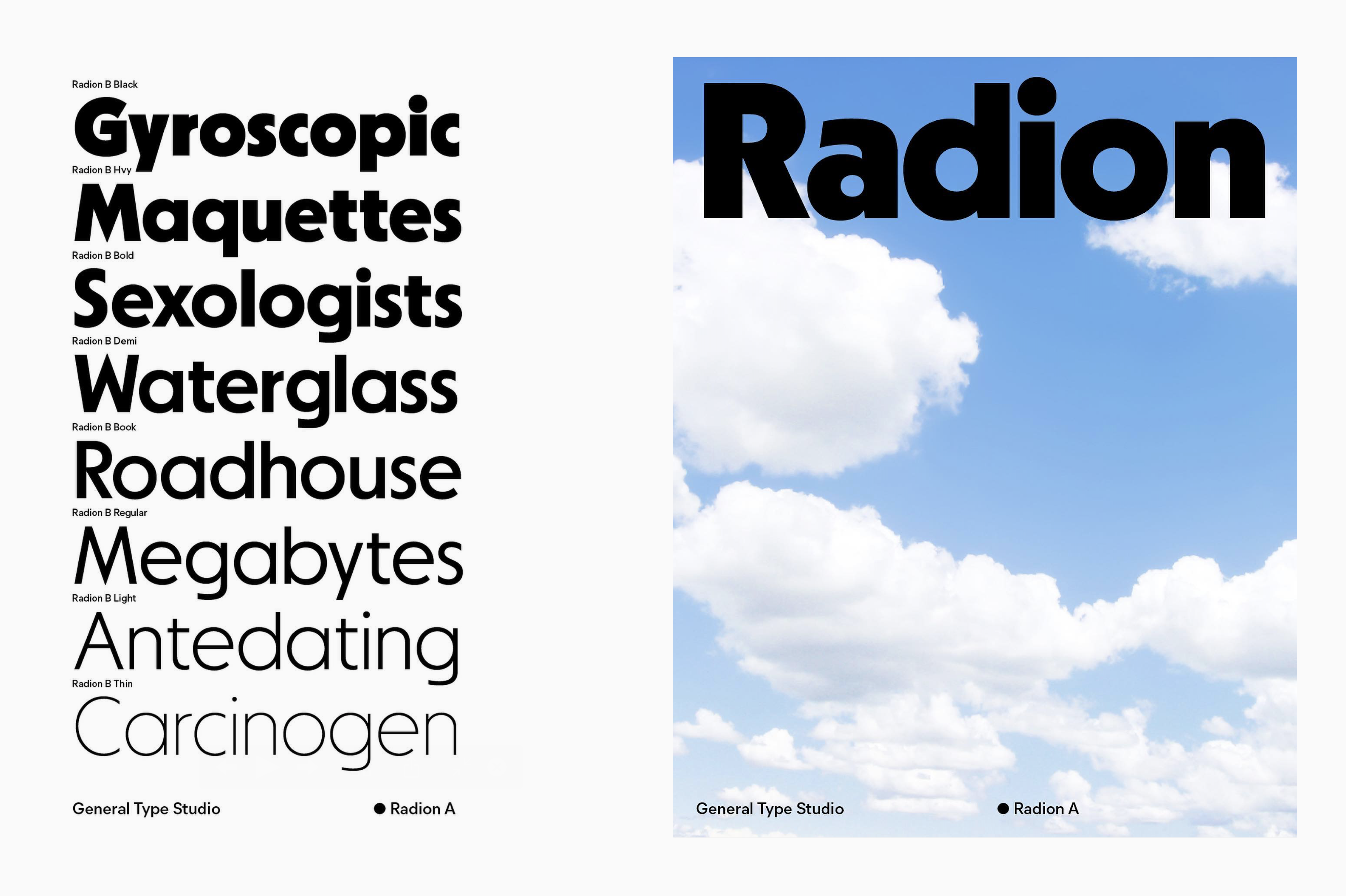
With a total of 32 styles ranging from thin to black, including the italic version for each, Version A presents the original forms of Kabel, featuring a distinctive “a” with a wide and round bowl, a “g” with a circular double-height, as well as the “e,” “w,” “G,” and “2.” In Version B, the shapes of the aforementioned letters become more geometric and regular. The few changes between versions are made to expand the range of this typeface.
As mentioned earlier, Radion falls into the category of geometric Sans Serifs, with certain liberties taken in relation to the original model. There is evident refinement in the shapes, making them smooth while preserving the original spirit. For example, in the “g,” the connection between the tail and the loop used to have a peak on the left side, which has been adjusted. Similarly, the arc of the “a” was too short, but now extends to the right, creating greater balance in the character.
Nostalgia has become a constant in the narratives of both new and existing brands. It is in this context where Radion stands out as an ideal alternative to evoke the forms of Kabel in a contemporary and relevant format. Anyone who has visited Six Flags or played Monopoly will notice the use of this typeface in the composition of their logos.
This release, thanks to meticulous craftsmanship, also allows it to be used in body text at sizes smaller than 10 points, providing another reason to appreciate the outstanding work of General Type Studio in this release.