“The cultural importance of the written language will always be there, there will be no technology to replace it in the near future.”…”The popularity and accessibility of type design has increased greatly in the last 5 to 10 years and I think this trend will continue.”
Hi, Marinus, how is this year going for you so far?
This year has been great for me so far. With many new projects and experiences. Excited to see what the rest of the year will bring.
We are aware that you work not only in developing fonts, but also in web, editorial and motion, so what do you consider that type design brings to your daily practice as a designer?
Type design and graphic design are mutually dependent in my work. I like to integrate my skills as a type designer into graphic design projects, be it logo design or custom fonts as part of a Corporate Identity or some kind of illustration. In return, my typeface ideas almost always come from my graphic design practice. Learning type design has also given me a deep understanding of how written language works and how we read. Decisions such as choosing the right font for a project or determining the optimal sizes and fitting. On another level, I also enjoy the activity of type design itself. There is something very meditative about spending hours working on Bezier curves. It gives me a balance to my work on client projects. Even though I really like client projects and collaborations, they can sometimes be stressful and restrictive. In type design, as long as you work on your own typeface, you set the pace yourself and have the ultimate creative freedom. Every decision is your decision, I enjoy that a lot.
Designing a typeface is always a very ambitious process, how do you conclude which are the ideas that are worth developing until they result in a font?
In general, they have to stand the test of time. That's why I never work on a single font, but always on several at the same time. I think I have about 10 fonts in various stages of development at the moment, but only 3 or 4 of them will have a public release at some point. It can be frustrating at times, because it's really hard to test ideas in type design. Sometimes you have to build the whole lowercase set and do a rough spacing to really see if an idea works in continuous text. Many ideas fail because they are not scalable, they no longer work in small point sizes. It is relatively easy to make a typeface look good in large sizes, it's a challenge to make it work in small sizes.
From a type designer point of view, what are the conditions that you believe would encourage more designers to get themselves into typography design?
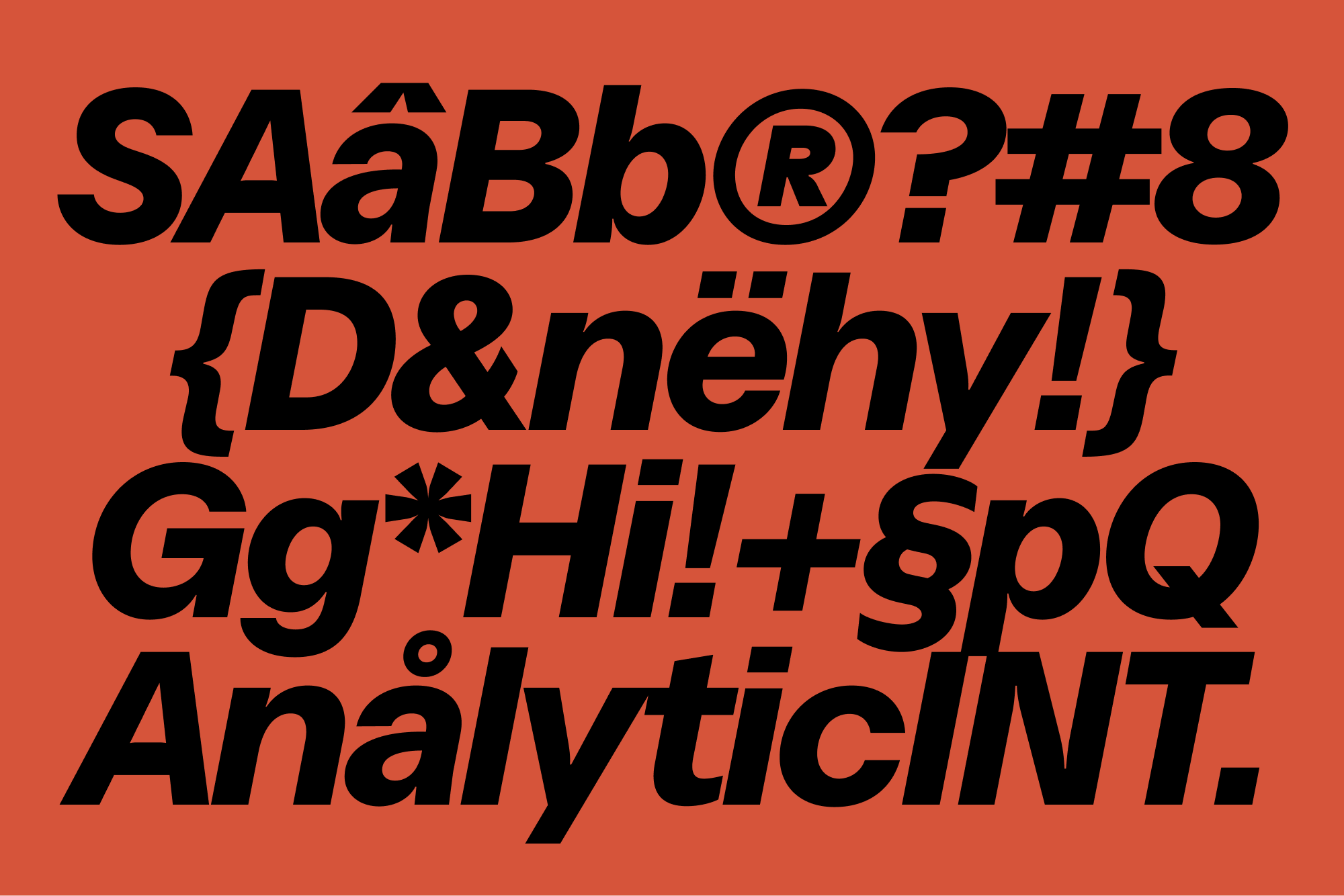
I have the impression that more and more designers are working on their own typefaces. But maybe this impression is biased by my typography focused Instagram algorithm. However the conditions to get into type design are really good these days. From a technical point of view, it is not really difficult to develop a typeface. If you know how to use Adobe Illustrator, you can find your way around the common font programs to some extent. The software have become very user-friendly and there is a lot of online material and books to help you get started. But of course, type design seems intimidating to many at first, especially when it comes to text fonts. It is definitely a craft that is hard to master, even I consider myself just starting out. Nevertheless, I would encourage every designer to get into type design to some degree, even if they know that type design is not their thing moving forward. It really helps you get a feel for typography. This might be a hot take, but if you look at fonts as a tools, understanding these tools, understanding their anatomy and their metrics, will lead to better design decisions and will ultimately make you a better designer.
Tell us how you got into type design.
I think it started with my interest in graffiti back when I was 16, 17 years old. It's amazing how often you get that answer from type designers. But yes, you often find yourself going back to the things that impressed and engaged you when you were younger. The culture behind graffiti, its expressive forms and strong colours really impressed me back then. That was the first time I kind of realised that typography can carry identity and emotions. But I didn't know that typedesign was a thing until I started studying graphic design in Munich. Munich didn't have a typedesign professor at the time, and there weren't many resources on the subject on the internet either, so I largely taught myself. I looked at other typefaces and tried to figure out why they were built the way they were and why my design didn't work. To create the font, someone gave me a relatively old version of Fontlab, which was really clunky, it looked and handled like a combination of Microsoft Paint and Exel. My first font was a mess, but it opened up the world of type design to me and showed me how much work and thought goes into it.
Do you use a specific software to design typefaces?
I use Glyphs to develop my fonts. But font software is only partially suitable for sketching or experimenting. It is usually the last step in my design phase. I am also increasingly using software for type design that is not actually intended for this use. Motion software like After Effects or 3D software like Blender for example are sometimes interesting ways to develop new visual ideas and concepts.
You previously told us that last year you did spend a great deal of time developing fonts, what is the part of the process that takes you the longest?
The thing that takes the longest to develop a typeface is not, as one might think, building the character set. It is testing the font in different sizes and environments and then making changes. It is a continuous loop of testing and adjusting that can drag on for a long time. To be honest, I have never found a font to be finished. But at some point you have to release it and move on for the sake of your own mental state. So in my opinion, the most important skill a type designer needs to learn is to identify errors and inconsistencies in weighting, proportions and spacing and then know how to compensate for them.
What are the trends that we will experience in typography on the upcoming years?
I think there is still a lot of untapped potential in the area of variable fonts. At the moment, this technology is limited by software, both from the developers and the users point of view. I also think the use of custom fonts will increase as more and more, as companies realise the potential of using typography to develop identity and communicate values. It will be interesting to see how generative AI will change the type design scene. Currently AI is really bad at generating or rendering fonts, but looking at the speed at which these tools are improving, we are only a few months away from them being able to do that too. One of the big players in the scene is going to develop some kind of AI tool to generate fonts in the future. I don't think it will make us type designers obsolete, but these tools will change the scene a lot, just like any other creative scene. For better or worse, we will see.
Some of your fonts were released after three years of work, taking this into account, how do you determine what is the value that they will have in the market?
That's a tough question, to be honest I don't know. I always find it hard to determine, because considering the development time, you would have to charge astronomical prices. Of course nobody would pay that and I understand why, I myself have difficulties with small budgets in my graphic design practice. In general, I don't want anyone to not buy my fonts because they can't afford it, or because their budget doesn't allow it. So I usually set the prices a bit below the international average. Designing a typeface is always an unpredictable time investment, because you never know if it will pay off in the end.
In this age of immediacy that we are living in, do you believe there will be fewer people willing to dedicate the necessary time to develop new fonts?
The cultural importance of the written language will always be there, there will be no technology to replace it in the near future. So I think there will always be people who dedicate their time to developing new fonts, and there will always be people who value that. The popularity and accessibility of type design has increased greatly in the last 5 to 10 years and I think this trend will continue.
Can you share with us some of the characteristics of the fonts that will soon come out?
This year is going to be big regarding my type design work. I am currently working on launching my own little foundry. The font catalog will include a remaster of the Raglan family, with new weights and true italics. As well as two completely new display fonts. Still a lot of work ahead of me, but hoping for a launch in early fall, fingers crossed.
Finally, could you share with us which would be the foundry or the type designer that inspires you the most?
When I think of type foundries, Grilly Type is the first name that comes to my mind. How much time and thought they put into each of their typefaces always breaks my brain. As for independent type designers, I admire Benoît Bodhuin (bb-bureau) and Jacob Wise. Radim Peško is also a name I have to mention, he inspired and influenced me the most during my studies.