“We prefer not to categorise our fonts by means of functionality. If the typeface follows a strong idea and tells a great story, its value is undeniable.”
Hi! Could you introduce yourself briefly?
Hi! We are Elias and Lucas and together we run our graphic design practice “studio hanli” as well as an independent type foundry by the name of “HAL Typefaces”.
Where did you meet each other and how did you realise you could work out as a team?
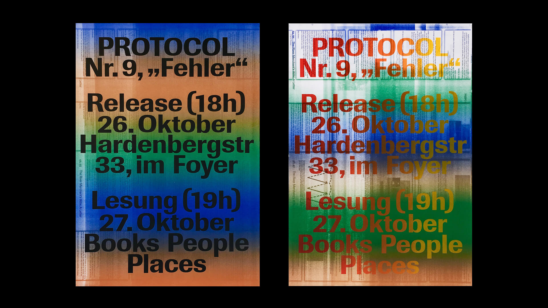
We met during our first year of our visual communication studies at the Berlin University of the Arts and some semesters later wound up designing two issues of “Protocol”, a magazine published by our fellow architecture students. It was a good collaboration and laid the foundation for many more joint projects.
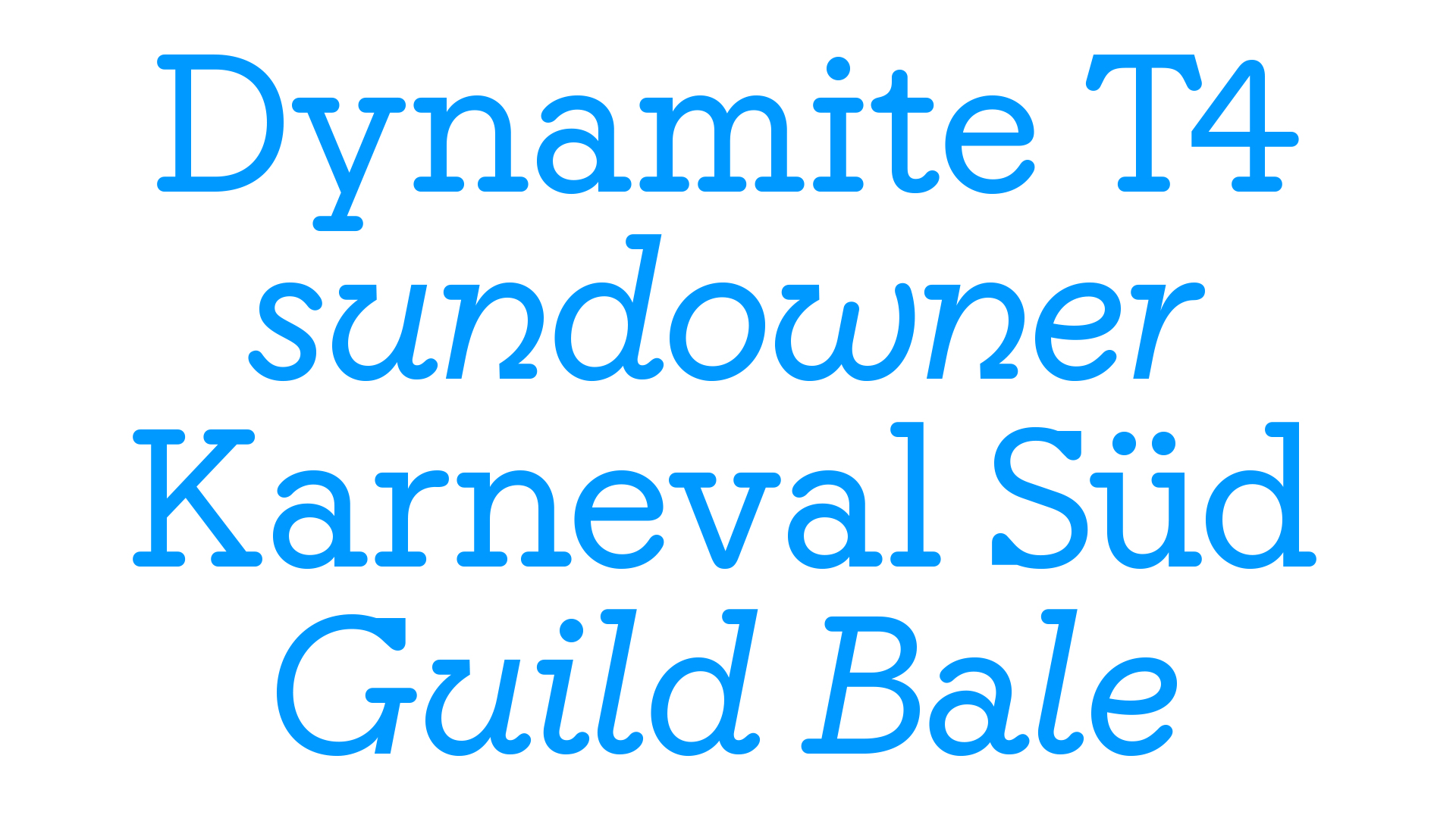
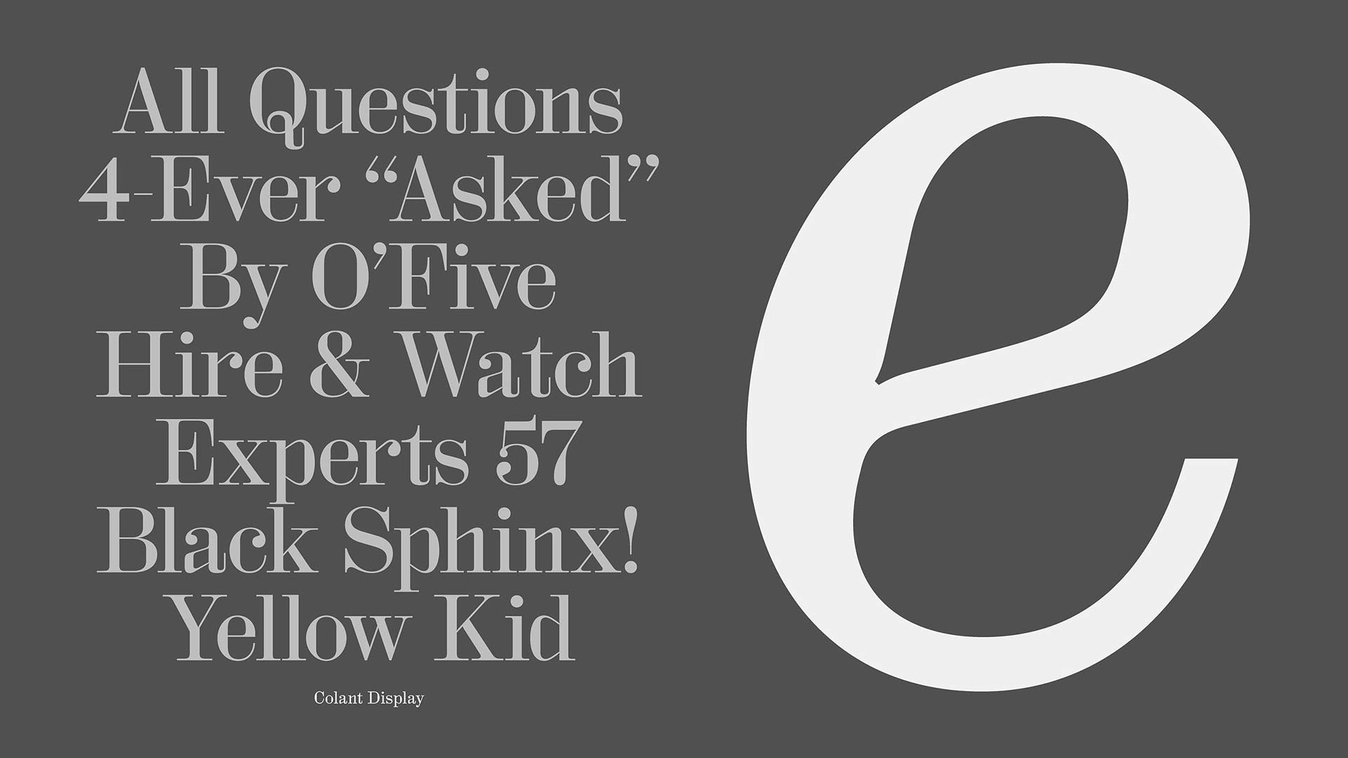
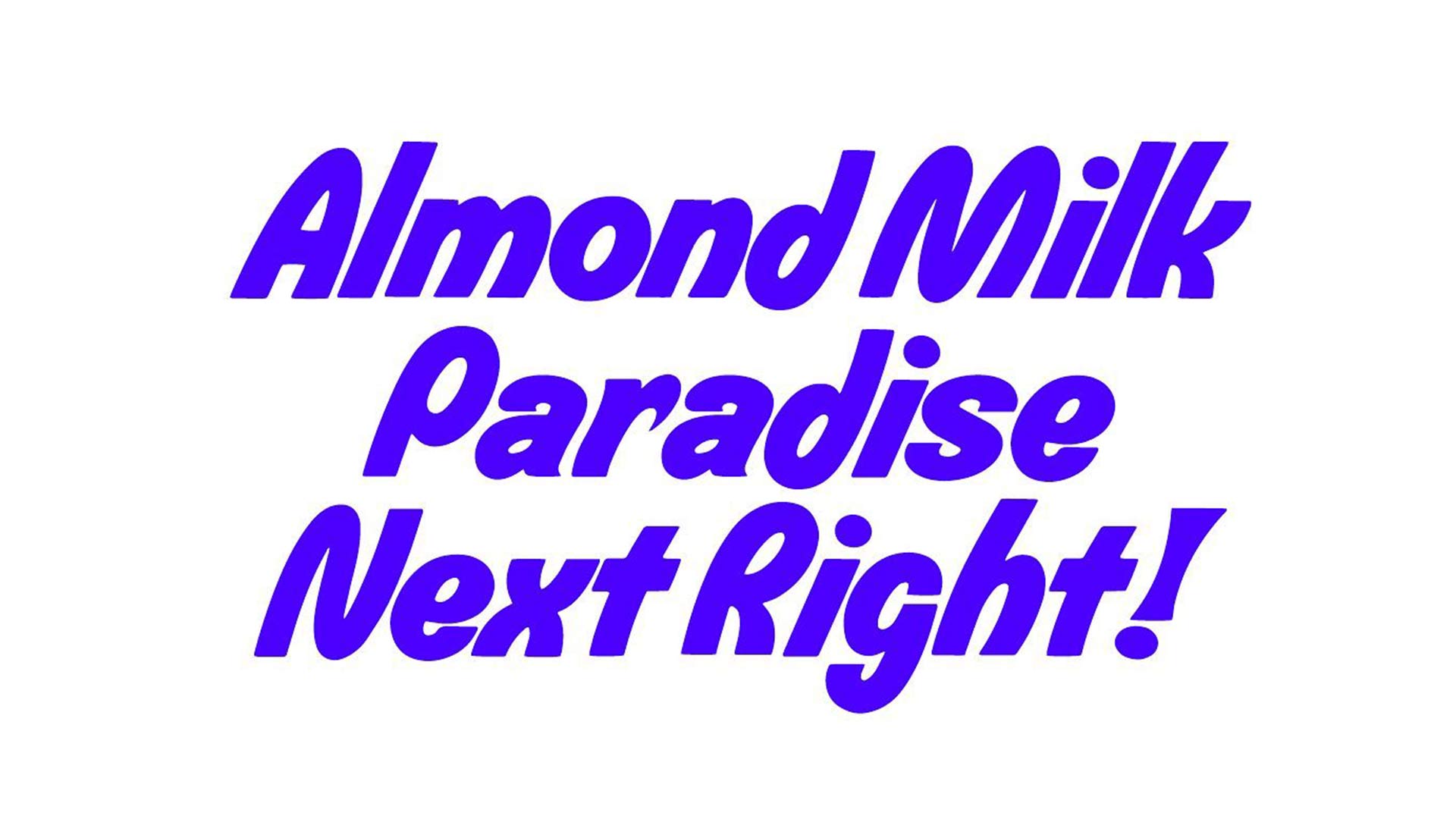
Correct us if we are wrong, but we would say because of your catalog, that your work is equally divided between display and text fonts, would you say both are equally valuable?
If you consider monetary value, we license text fonts more often as they are simply more usable and applicable in a broader sense. In terms of creative value, we prefer not to categorise our fonts by means of functionality. If the typeface follows a strong idea and tells a great story, its value is undeniable.
For example, HAL Twins was inspired by the typeface “Gemini”, the iconic 1960’s design by Franco Grignani. The variation in contrast between the horizontal and vertical stem weights, basically allows for each letter have the weight applied in the other direction, so vertical instead of horizontal and vice versa. Following this simple concept, the font variably shifts between its two binary states, resulting in 4 variants: light (00), semi-light (01), semi-bold (10) and bold (11). We speculate Grignani would have come to a similar conclusion if variable font technology had been available at the time.
Where do you get inspired from when starting to create a new font?
We often get inspired from our research in historic sources, such as historic type specimens.
We noticed that you recently adopted the licensing model from Dinamo Typefaces. Why do you think more and more foundries are using this approach? What specifically motivated your choice to implement it?
We believe Dinamo made a convincing argument to shift the evaluation of a font’s worth towards the entity (in most cases the commissioning body), which is attempting to gain value by implementing the font in their product or communication, i.e. the company which is using the font to sell goods, services or a message. The old model seemed outdated to us. Thanks to Dinamo for questioning it and trying to find more appropriate methods for the complex realm of licensing fonts.
Would you say designing typography is difficult?
Yes.
We know HAL is the type practice of Studio Hanli, could you tell us more about the work that is done in this last one?
We design all sorts of graphic media, from books and printed products to identities and websites. We try to find unique typographic solutions, for example, by using custom typefaces and lettering.
What's the thing you enjoy the most while designing a font?
The last glyph.
How much do the first steps in the design process differ between a bespoke and retail type?
We don’t really differentiate between the two, as our retail typefaces often originate as bespoke type for a project… and then another project. With each application the typeface becomes better and then eventually ends up in the retail catalog. That said, there are many typefaces which don’t make the cut.
How or why would you say a font gets popular?
Zeitgeist?
Do you think your fonts are useful, beautiful, both, or any of them?
All of the above ;-)
Is there something you’d like people who use fonts to tell?
Thank you!