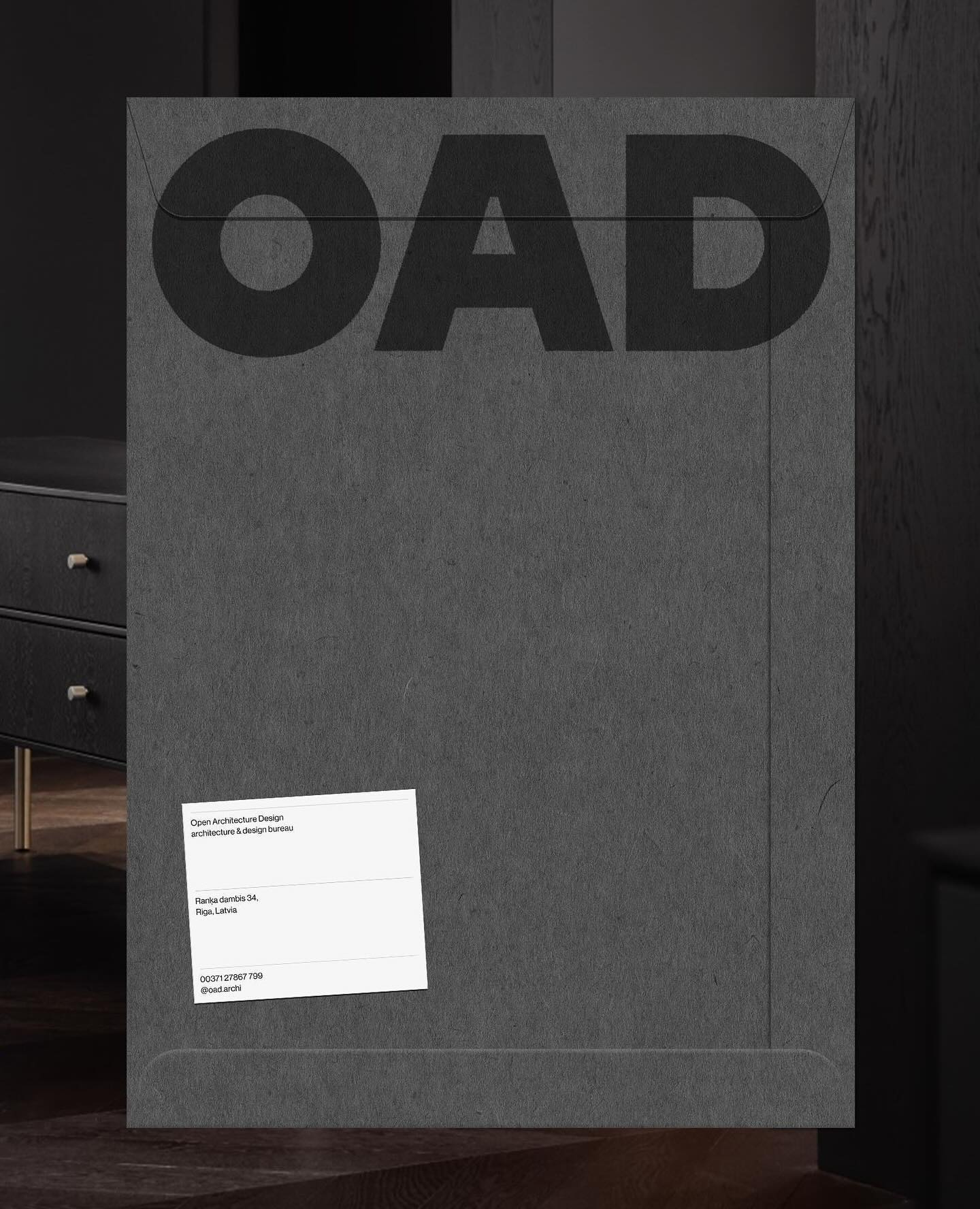
Just like its proposal, OAD (Open Architecture Design) has a strong and impactful lettering as a logo, complemented by Neue Haas Grotesk in its regular weight.
For the past 3 years, Chejo and SHDW studios have been sharing lunch, and in this book, they compile the recipes they’ve made. Serial A from DumDum fonts is used as the main typography.
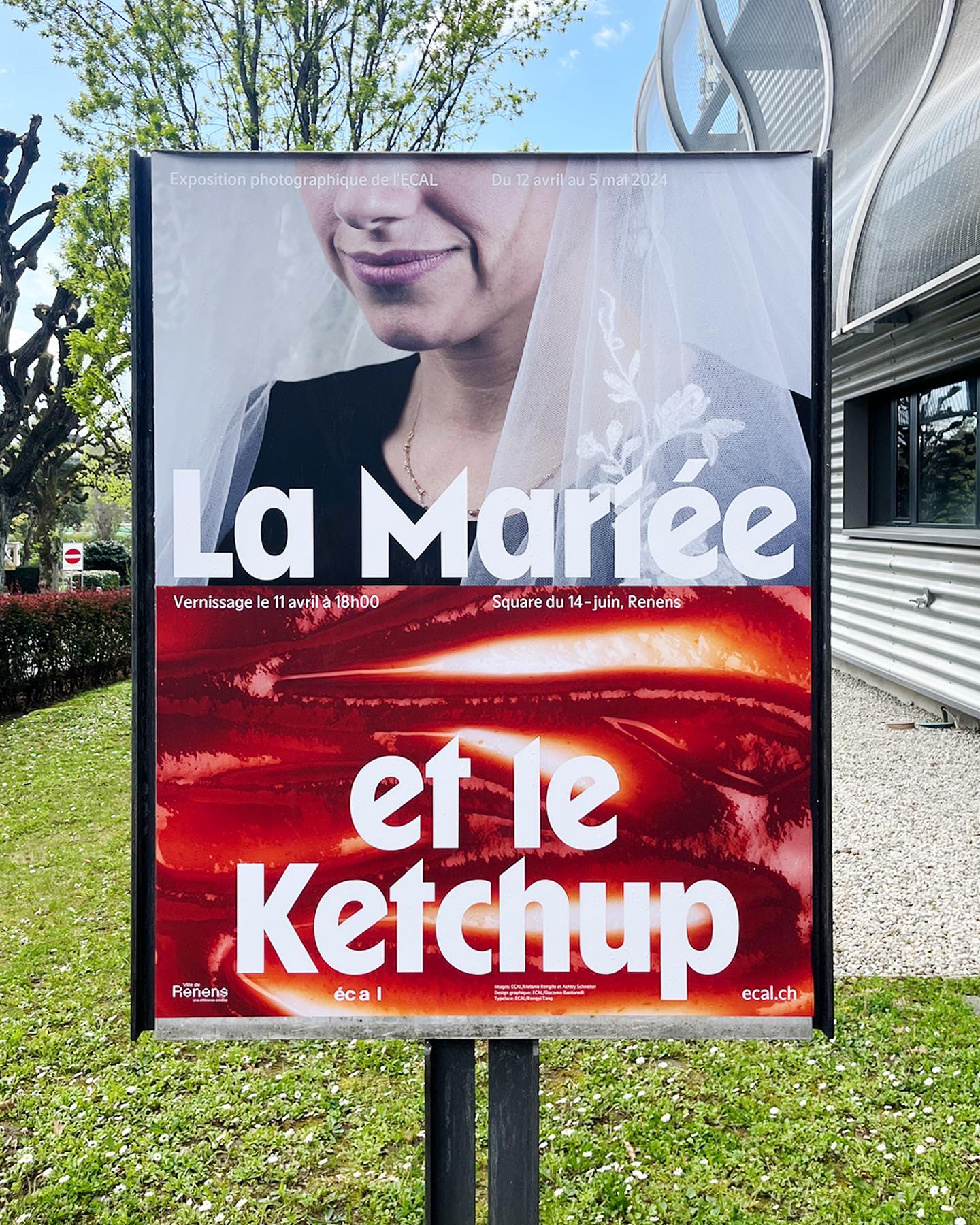
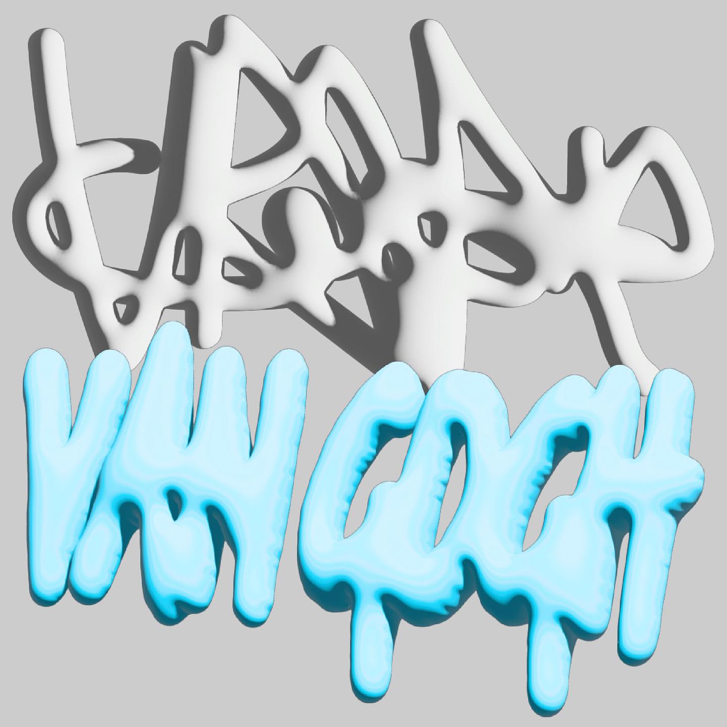
WaterPolo Display by @dontnotdon was used in this series of posters portraying the ordinary and extraordinary aspects of Renens.
For a constantly moving entity like the PAC (Performing Arts Centre), Porto Rocha, together with AllCaps, created this strong and timeless typography as part of its new visual identity.
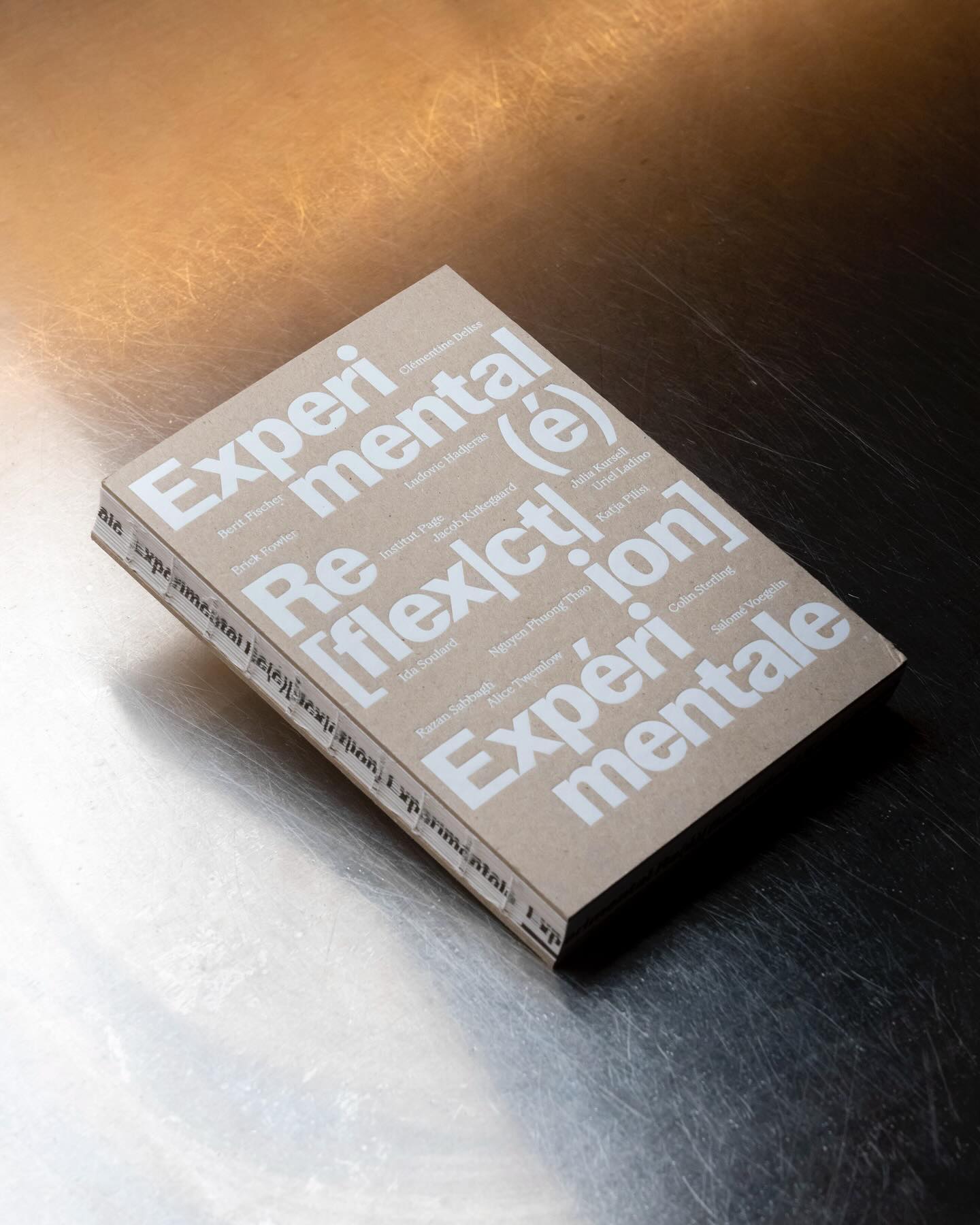
Experimental Re(é)[flex|ct|ion] is an editorial publication that explores concepts such as community, uncertainty, resistance, movement, among others, through explorations and discussions. Hannes Brischke uses ABC Walter Neue and Dark’s Remix A.
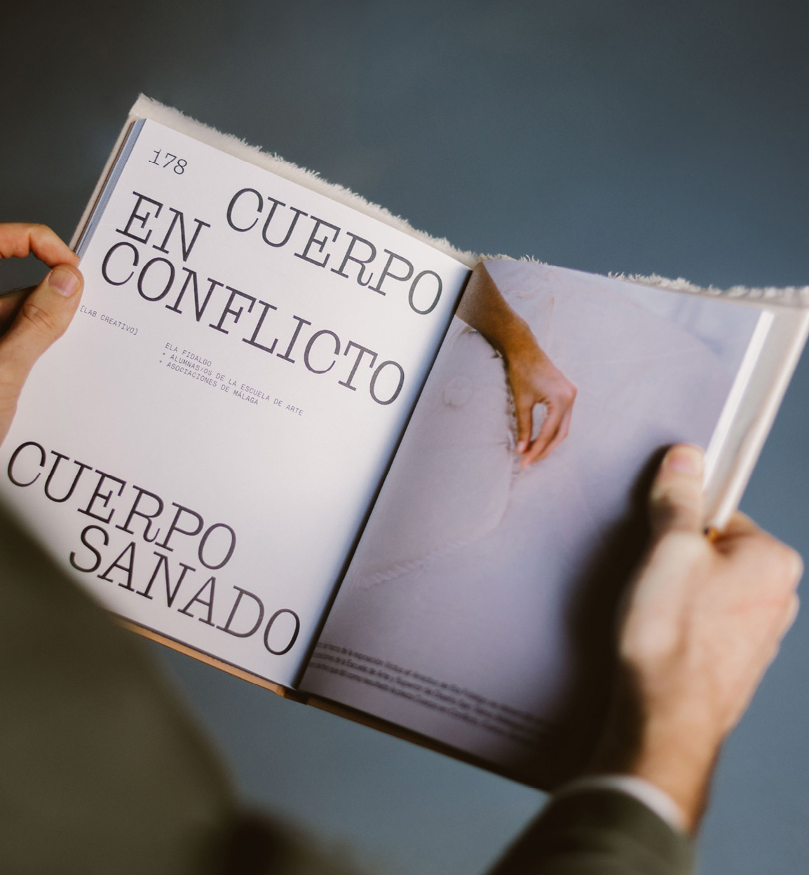
Mixture of materials, papers, and typefaces (Neue Montreal and Cucina); that’s how Tiquismiquis designed this editorial piece that covers Ela Fidalgo’s creative career.
In this book that compiles the lesbian legacy in Quebec, we find Gerstner-Programm FSL as the main typeface, along with “handwritten” numbers using Sebastian Bobby. Designed by Harrison Fun Studio.
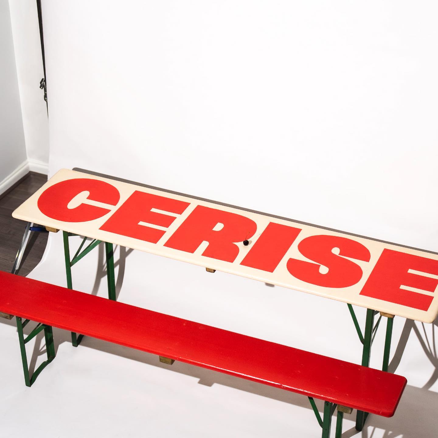
Studio Cerise, a colorful creative studio from East London, used Swinton by Nouvelle Noir for its logo.