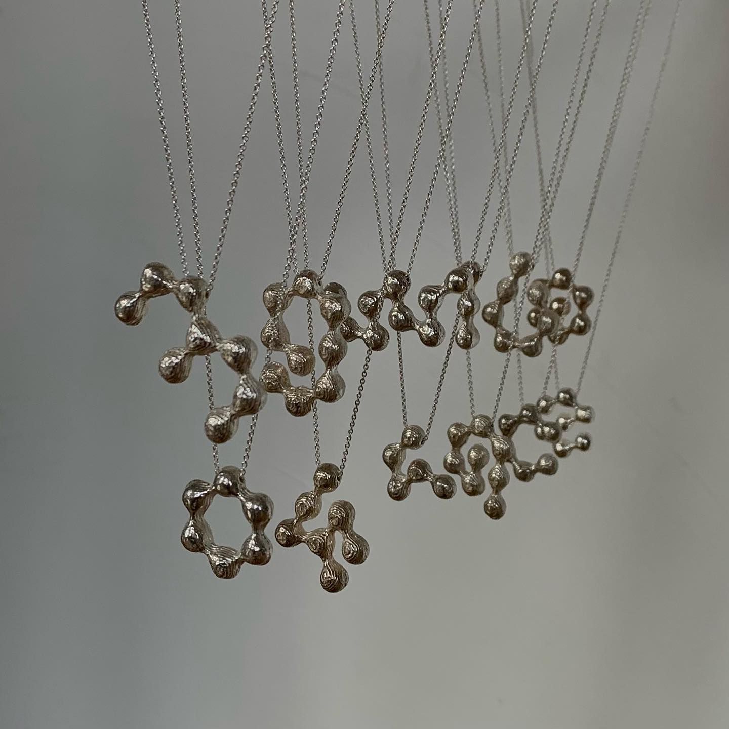
The Belgian design studio Vrints-Kolsteren collaborated with the jewelry brand Fleerackers to create ATOM, a collection of 16 different earrings.
The graphic and typographic practice of Elias Hanzer and Lucas Liccini in the daily search of different unique solutions. The INTERVIEW with HAL Typefaces.
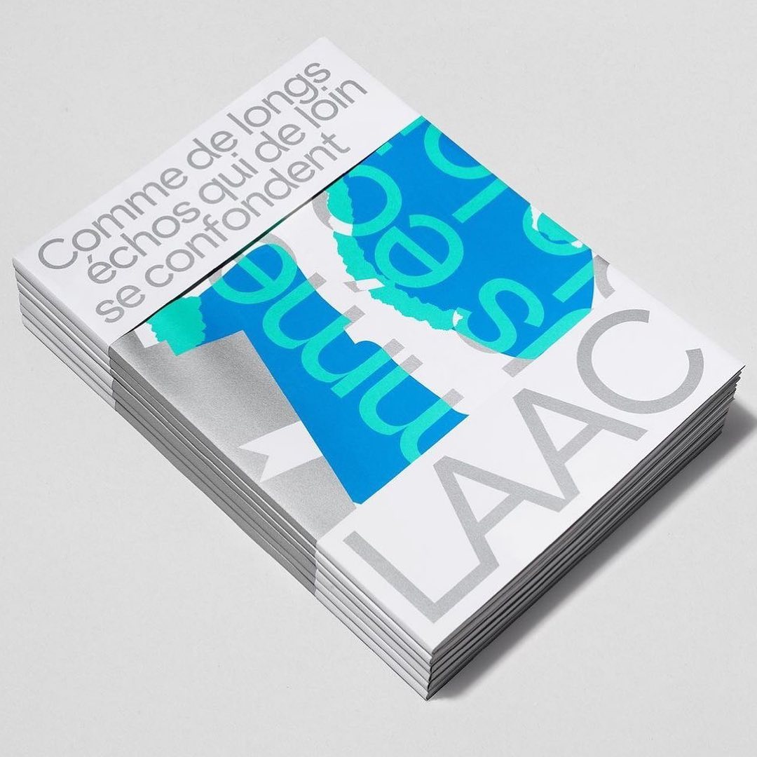
Studio Hudson Catty and Atelier Baudelaire used ES Klarheit Kurrent to design a set of three books celebrating the 40th anniversary of LAAC in Dunkirk.
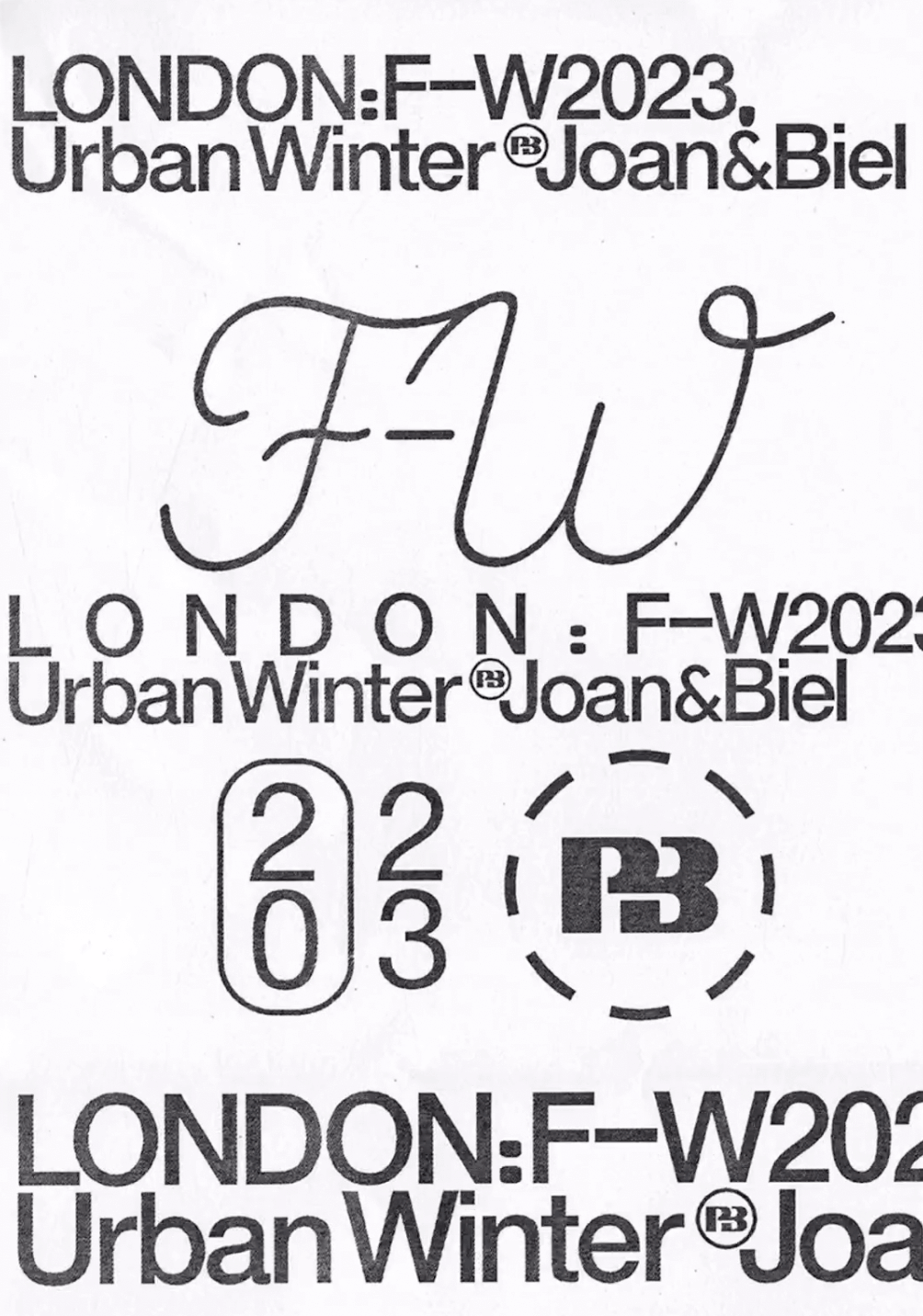
Simple and dynamic, these explorations by Paula de Álvaro use brand elements and basic information to present the Pull&Bear London AW 2023 collection.
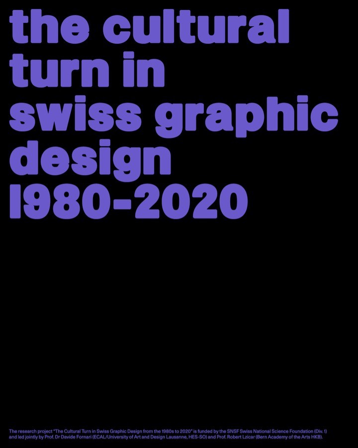
Trekking Sans is a lowercase typeface designed by Bureau Bernklau, for the research project Cultural Turn in Swiss Graphic Design (1980–2020).
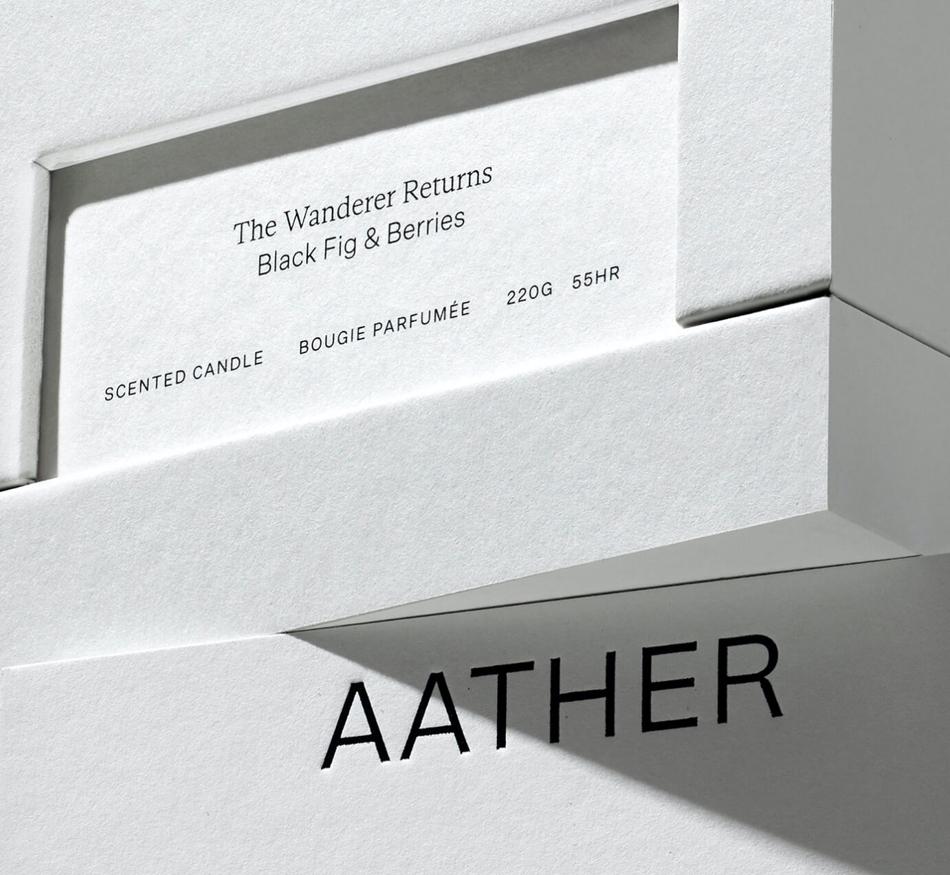
SOCIO Design used Untitled Sans from Klim Type Foundry and Gestura from Socio Type Foundry to complement the visual identity of AATHER’s high-quality candles.
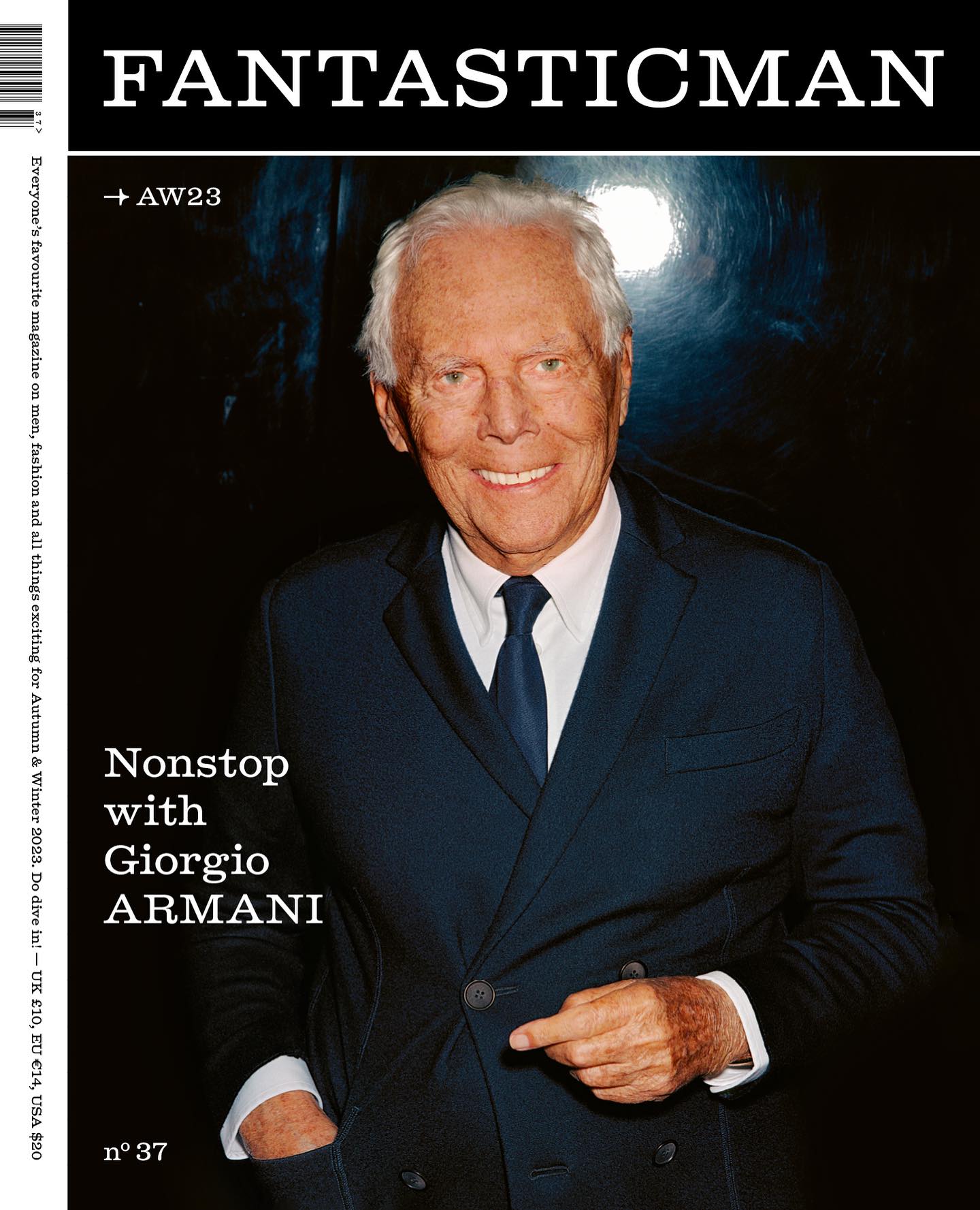
Men’s fashion magazine, Fantastic Man, releases issue 37 with an editorial redesign using Laurenz Brunner’s Diplomat typeface.
ABC Dinamo and Comission Studio collaborated to develop Rimowa’s custom typeface, building upon Bureau Borsche’s logo for the high-end luggage brand.
Editorial New, ITC Franklin Gothic, and Antique No.6 were brought together by The Office of Ordinary Things to create contemporary compositions in the identity of Mad, a agriculture organization.
The foundry From A+, built a wordmark, an alternate script version, and two monograms based on art deco letterforms, for the seafood Californian tavern, Bar Le Côte.