Can industrial design influence decisions in the typographic process? An interview with Romina Hernández.
Studio Bruch, with a custom made lettering and type design, developed the identity of the 1951 established carpentry company, Hea.
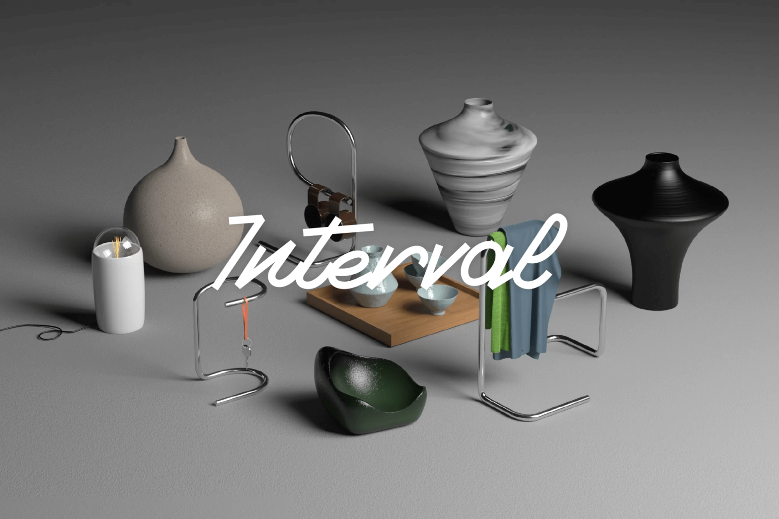
A custom monolineal, script wordmark by Federico Sanchez for Interval, a multidisciplinary creative space working across texture, shapes and concepts.
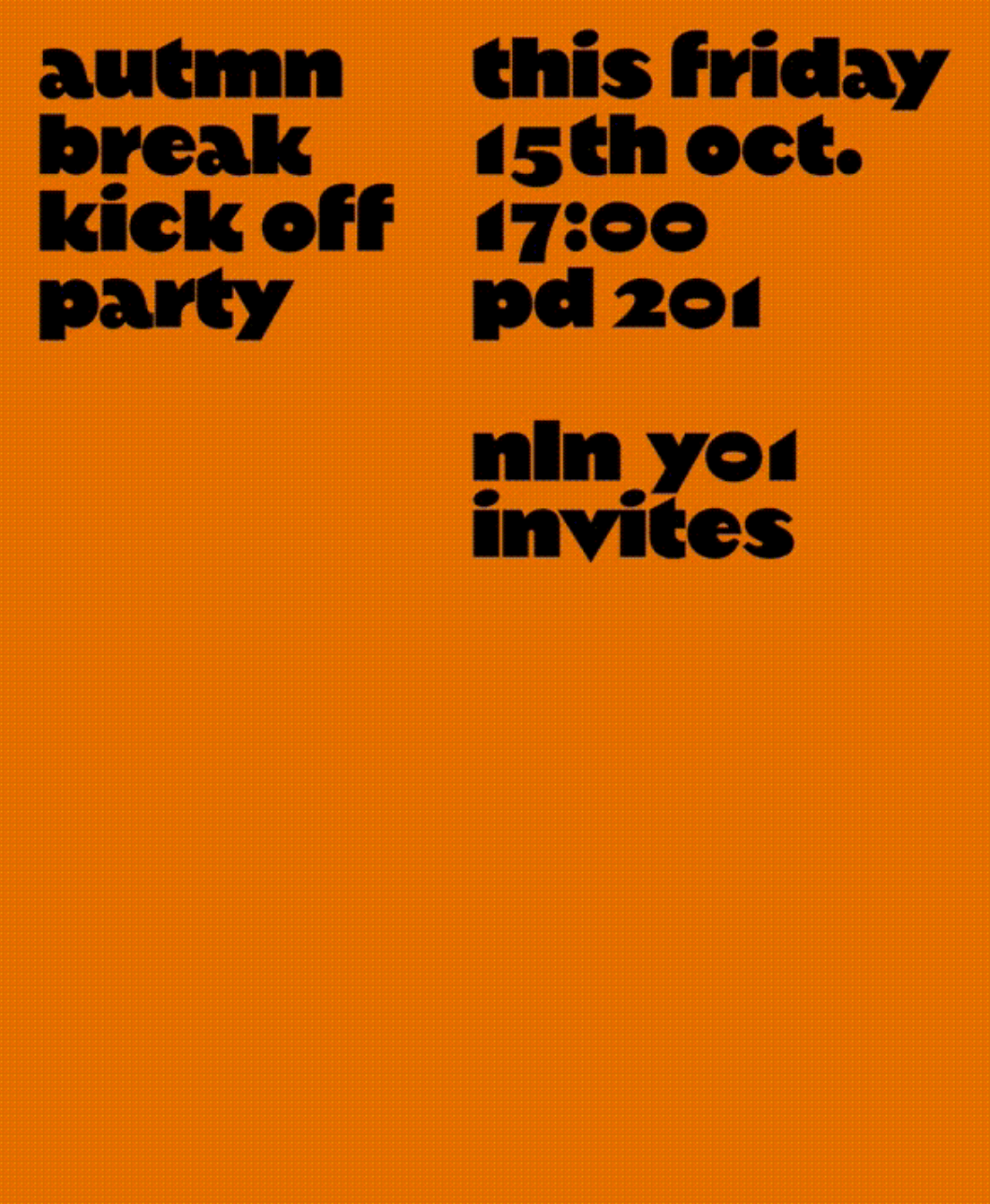
An autumn break party of students at KABK, using Margiel in their posters, a geometrical display font by Warsaw Types.
The humanist and geometric font Centra nº1 by Sharp Type in the full-service production, art buying & casting services company Yours.
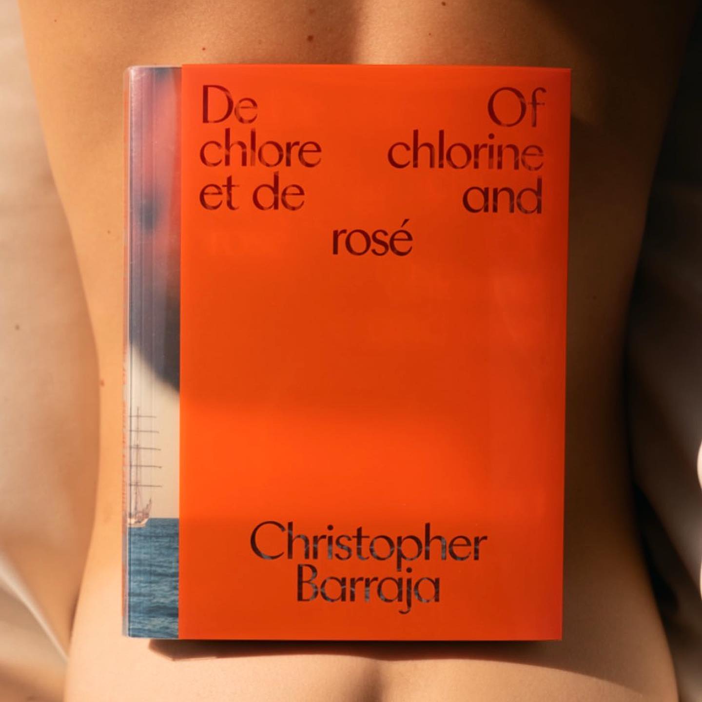
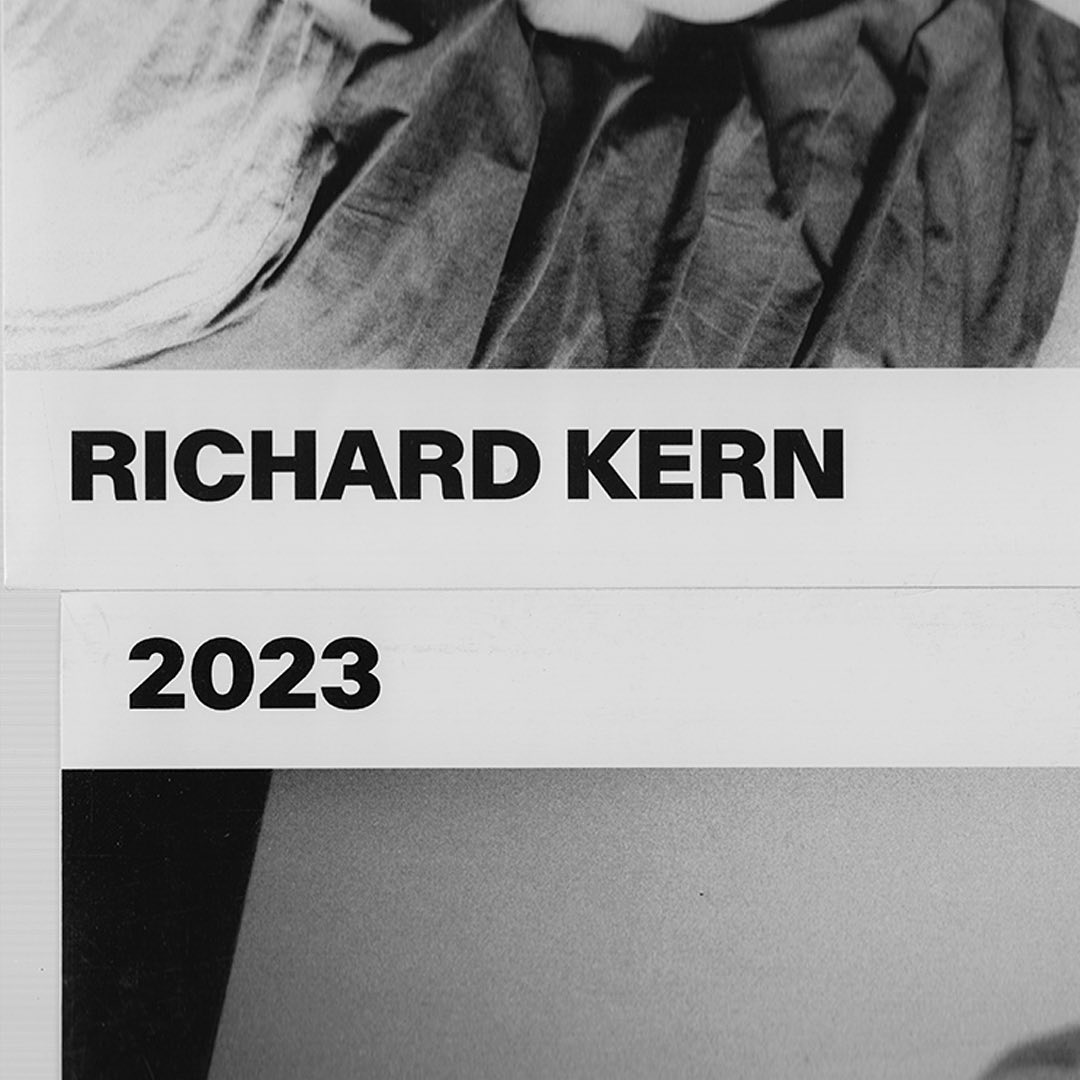
A gritty and beautiful array of Kern’s favorite unpublished photographs, using AP Grotesk by All Purpose Fonts in its editorial design.
ToTo Restaurant & Cafe rebranded with a custom typeface by a brilliant collaboration between Bogidar Mascarenas, Hagar Erez & Ark Visual.
With a playful and minimalist approach, Friss Kombucha utilizes Herbus Bold to set itself apart from competitors.