“Try out your ideas, all your ideas, as quickly and dirtily as possible. Even the ones that seem unintuitive or that sound dumb and destined to fail…”
Hello Ro, how are you doing?
I'm good, thanks!
Besides working on type design, are you currently working as a graphic designer?
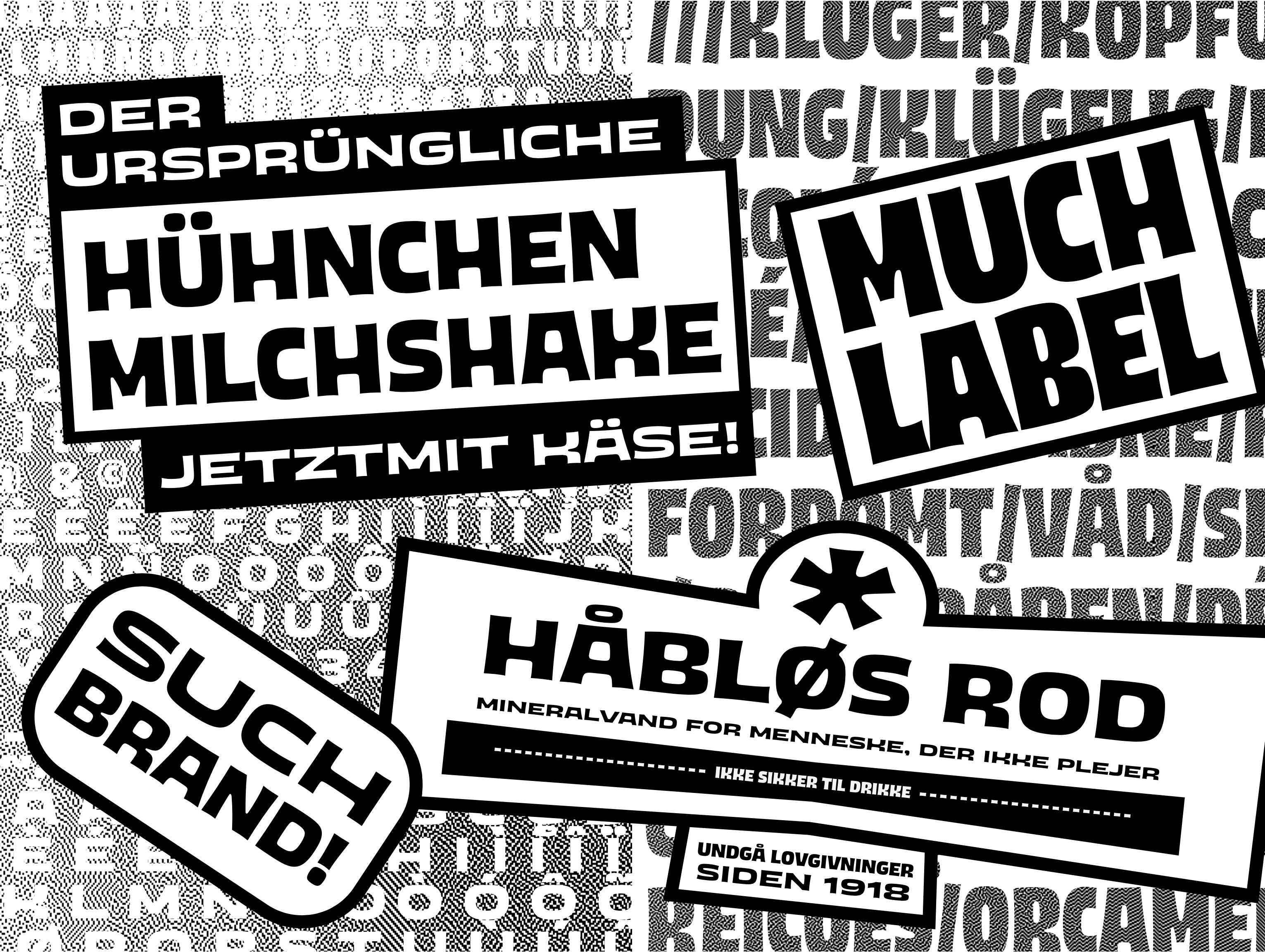
Yes. I didn't do much for a while, and what I did do was mostly materials for my own projects, but recently I've been doing identity projects for clients again and it’s been so refreshing to make this kind of stuff for someone else. I'm specially enjoying helping out with friends' projects and activist groups.
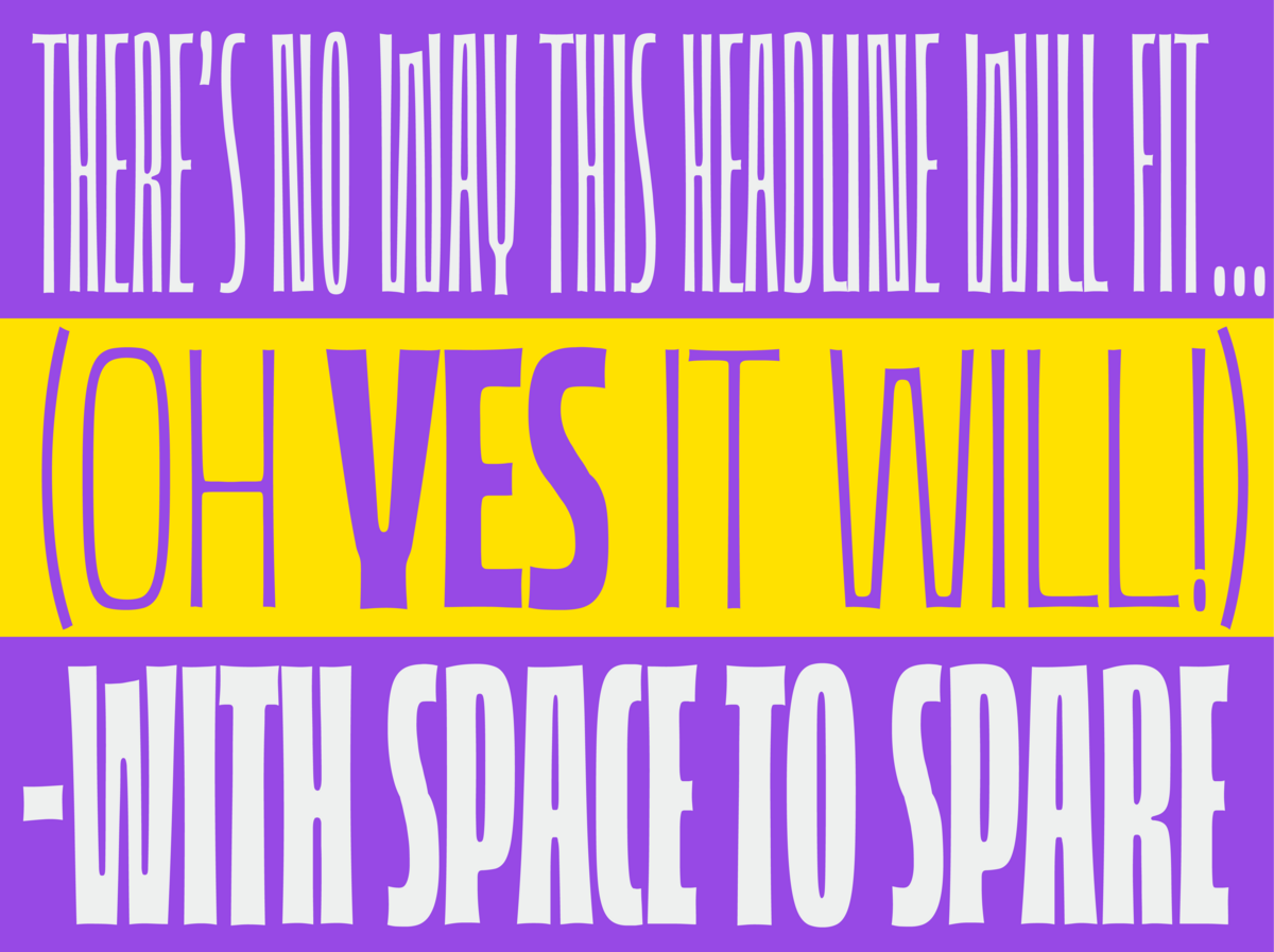
It's been a cool way to do a little bit of type, and put some personality into just a wordmark and maybe a tagline or two without having to flesh out an entire typeface with all its inner consistency and spacing etc…
Can you tell us about your initial approaches to typography?
Sure! I think I've been drawing letters since pretty much always. Just recently I was looking for a book in my parent's garage and I found an old whiteboard I used to have as a kid, maybe from when I was around ¿8? years old and it had an early lettering of the word "HOMEWORK" with cat ears and tails on some of the letters haha.
I came to type design in a more 'professional' way around the middle of college, when I saw a specimen exhibition from the graphic design department's Typography class and I was immediately intrigued, so next semester I convinced my class coordinator to let me sneak into the Type class, even though it wasn't in my curriculum.
In my first Type Design class, I had Armando Pineda (@typoster21), a fantastic teacher that guided me through my first time designing an entire font—in fontlab 5—seeing for the first time how form and spacing are related and how each glyph has to work along the rest.
That put me on track to take all the related electives I could at school (which were not that many) and seek out workshops, books, videos and other resources, which were way less easily available then than they are now.
How challenging was it to transition into type design after studying industrial design?
I'd say it was more fun than challenging.
As I said above, I found type design halfway through college, so I was at best half-baked as a product designer. That put me in an interesting place where I could apply the design skills I was learning from industrial design classes into type and calligraphy, where I wasn't getting graded, so it felt more fun and freeing than my 'for-real' classes.
And while I didn't have formal instruction on some specific graphic design stuff, Industrial design provided me with a great background on general design and hands on experience with physical materials and processes, which I think has helped me understand and approach type design more from the physical side of it than I maybe would've otherwise.
I was doing all this type stuff 'on the side'—which fellow type nerds will know is really on the main and everything else is on the side— so obviously all I could talk about was type and kerning, and classmates started calling me 'frustrated graphic designer'.
But the thing is I wasn't frustrated. I did miss on learning the "graphic design principles", but I also missed on being exposed to some of the vices and dogmas, so I think I got the best of both majors actually.
What was the biggest lesson you learned from the Type and Media Master's program at the Royal Academy of Art, The Hague?
The short version: D-r-a-w. A lot. Like… A LOT, a lot.
The longer one: Try out your ideas, ALL your ideas, as quickly and dirtily as possible. Even the ones that seem unintuitive or that sound dumb and destined to fail. Take a sharpie, some paper, and put your thoughts down.
Because when you materialize an idea it becomes a Real Thing® in the physical world that is tangible and tweakable and perfectible. You can also keep it for later and maybe show it to other people.
If an idea is left only in your brain though, it tends to just hang around there and bounce around collecting thought moss, which is not too useful —at least for type design and other artistic/communicative purposes—.
I like drawing ink on paper best because it's cheap, low stakes, and if you want to see what it looks like small, you can put it up on a wall and go to the other side of the room. If you want to see the details, hold it up close. If you drew a bit too thick, you can correct it with white paint. If you overcorrected, add some ink back. And if you made a mess with too much ink and paint, take a fresh blank paper and draw the thing over with what you learned during the mess-making.
If you just repeat this drawing thing over and over for a while, I guarantee, you'll become quite good at it. You can also do it on an iPad or on Photoshop or something, just don't get too lost on the flashy features and -draw- a lot of stuff.
There’s, of course, a lot more to Type Media. It’s very valuable to have many experienced instructors coaching you on your specific projects and challenges for a year; but honestly, the core of it all is about drawing as much as you can, looking at how it came out and slowly perfecting the cycle. Which is, incidentally, something pretty much anyone can practice at home for (almost) free.
Was there something specific you were looking for in international study programs that you knew you couldn't find in Mexico?
The minute my autistic brain found out there was a place in The Hague where you could hyperfocus intensely for a year on learning to draw typefaces, python programming and stone carving, there appeared a huge single to-do item in my head: I-MUST-GO-TO -THERE!
When I applied, I was finishing a postgraduate program in Mexico in type design: The Typography Innovation Specialty at Centro —which was great but sadly no longer exists— and while I loved my time there and learned a lot, I suspected there was a deeper level of nerdyness that I wanted to access.
Type and Media has been around for a while in it's current form; but also it comes from many previous incarnations on the KABK and it's rooted into a thriving graphic design / typography / publishing / technology development scene in The Hague and throughout the Netherland. They just have a whole type thing going that Mexico Cuty, and the whole of Mexico did not, and still doesn't—at least in *that* way.
Since coming back, and perhaps because I got to see a bit more the culture I was envious of from up close, I’ve come to see the design and visual landscape in Mexico for what it is, and instead of judging it for what it lacks and how it doesn’t measure up to colonial standards, learn to better appreciate its unique riches and opportunities. Turns out there’s a whole new world of graphic communication and mind blowing use of typography and language waiting in the streets for us snobs to let go of notions like, it’s anti-constitutional to stretch type, or that it’s a sin to mix a bunch of fonts and use automated 3d effects.
Do you think this experience has opened doors for you for further development in type design?
Totally. TypeMedia was a transformative experience for me in many levels. The most obvious one is kind of what I said above with the drawing: I practiced making type A LOT and got much better than I would've by myself.
But it was also invaluable because of my classmates: eleven other type nerds with just a strong obsession as me, but way different life experiences and personalities and visual cultures.
I learned so much by watching my friends draw and solve problems in ways that were totally opposite to mine, sometimes led me to embrace new ways of doing stuff and other times made me reconsider and strengthen my processes.
Also, and relating to the previous question, the alumni network is very supportive and there's a shared camaraderie that makes me feel like I have friends all over the world with whom I kind of shared a classroom, even though we were there years apart.
We know you actively participate in typography-related events. Could you tell us in detail what your role is and what motivates you?
It's something I'm drawn to. I'm lucky to have been invited to give talks and workshops at some great places, and I really like to do that, even if it takes me ages to always prepare my talks. I specially enjoy when there are students and new people who are type curious and want to enter the industry.
There's a big element of giving back to the community, specially the local one in Mexico, and sharing what I've learned in the great places i've been privileged to attend, but if i'm truly honest, type events are one of the few spaces where I get to share on my type special interest and that allows me to connect with people on a deeper level than usual.
I find over and over in events like Letrástica in Guadalajara, that most everyone in the Mexican and Latin American community are very warm, nice, empathetic people and that's been a great motivator for me to attend as many of these events as I can and make new spaces that foster learning and open communities—like the Typefobia conference I helped organize last year in Puebla—.
It’s all a personal conspiracy to ensure that my coworkers and colleagues are nice and friendly. Since I work remotely with a small team that means I actually have many cool people to talk to and ask questions of instead of just my cat.
Currently, two of your typefaces, Pigionette and Puffling, are available on Future Fonts. The first one even with a new update, can you share with us what's new about it?
We —I say we because this couldn't have happened without my wonderful team at tortillaStudio— just released the v0.3 update for Puffling, which adds a weight axis to the variable font and totally restructures the design space. It's become a huge versatile font and we're so excited to see it out there in use.
Pigeonette is way overdue for an update, but it's been hard to move that forward because it began as my master's project, and also I drew it while first coming out as trans so there's a lot of history and feelings wrapped up in those curves. We do have an update in the works, hopefully it’ll be done later this year, and will give some overdue love to the bold and italic.
We would like to learn about the ideas behind Pigionette and Puffling and how they are translated into a visual form.
Those two come from a very similar origin. It all started with Pigeonette, which was my final project at the Hague.
I wanted to explore the graphic language of wood and linoleum carving, particularly the work of Taller de Gráfica Popular, a political/artistic group from Mexico in the early to mid XX Century. They have very beautiful striking prints with expressive lettering that is what can traditionally be described as “rough”.
I found these forms very appealing and so the first Pigeonette —then called “Pigeon”— explorations came from trying to bring them to a digital form. Then the family morphed and focused more on being used for manuscripts and writings in progress, so it strayed a bit from woodcuts and took on a layer of typewriter monospaced aesthetic with a more nondescript but still textured finish.
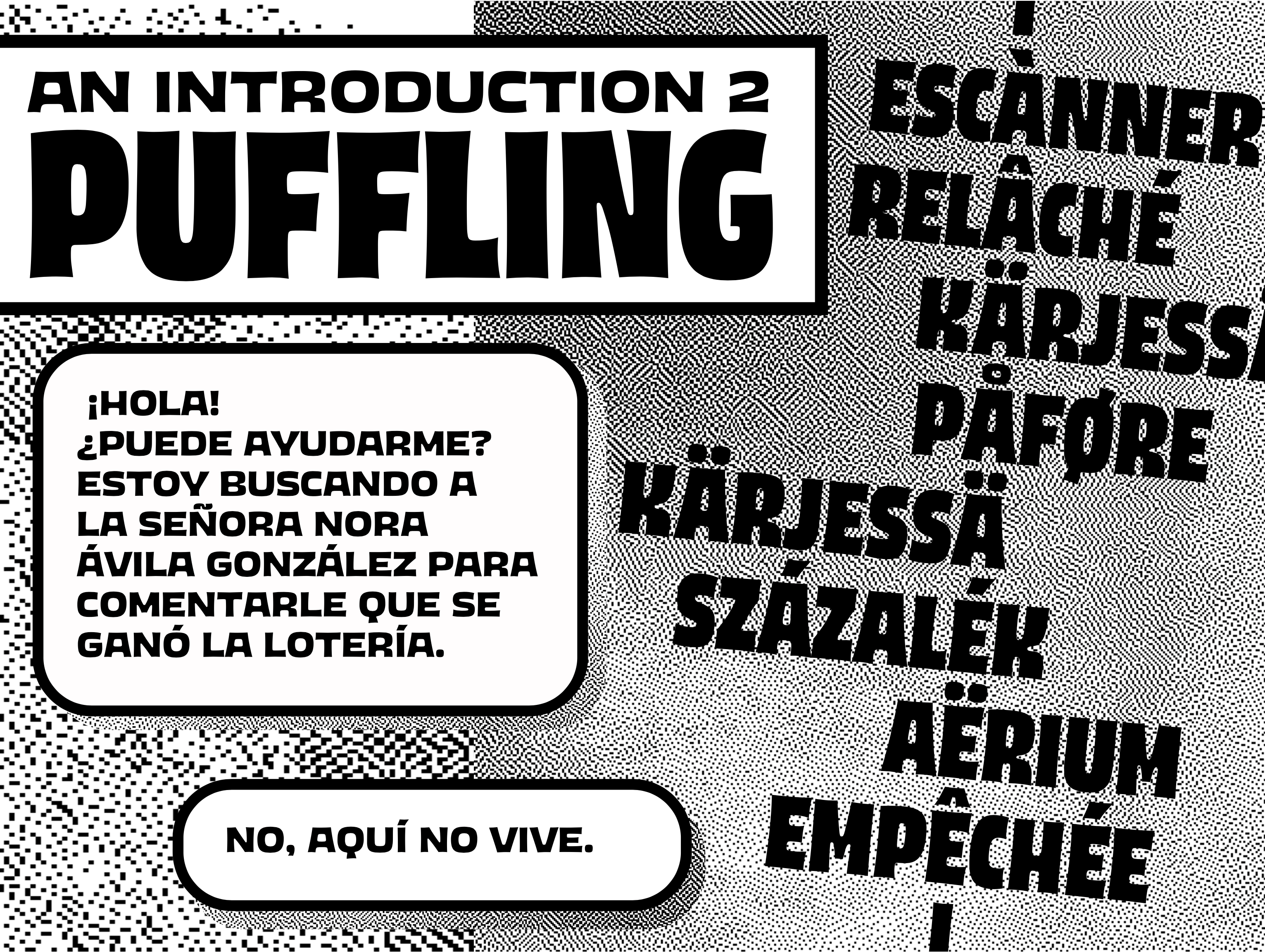
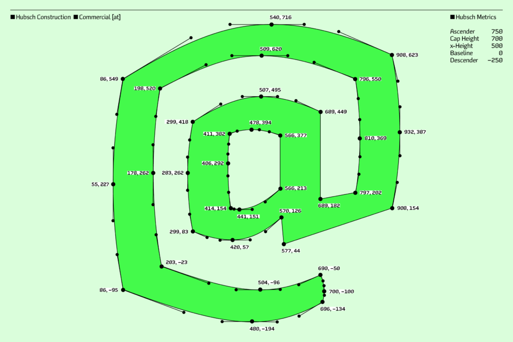
But all the roughness that Pigeonette lost stayed in my mind and a few years later materialized as Puffling, which is a more in depth exploration of building letterforms from the outside in, sculpting the counterspace as with engraving. It’s also the first type design that I consider truly my own, where I deliberately thought about and came up with all the rules of the design space.
The shapes are drawn simple and low resolution, with outlines that are ’“wonky” on purpose, they sometimes have dents and slight imperfections; the inside corners are rounded and the outside ones sharp, as they would be if the glyphs were carved out from a plate of real stuff.
Puffling spent a few years in its infancy, with only a small weight axes, but earlier this year I revisited it and found it’s true potential, as a font that goes to all extremes from super tight to extra slack and from super thin to extra thic, morphing itself in the process without compromise.
Those concepts developed very organically through the drawing and mastering process, and when it came time to make marketing materials, it was super clear to me and the whole team that Puffling is a queer non binary genderfluid font. Not a surprise, considering who drew it. Which canonically means Pigeonette is a trans font.
In your type design process, how much do you identify with the principle "form follows function"?
Not much. I think it’s a very catchy and poetic phrase, and that’s probably why it’s such a hit in design theory memes, but it’s also extremely vague and open to interpretation.
You could —and people do— justify pretty much anything questioning that dichotomy.
For me drawing type is an artistic process —among other things—, and therefore has form as an integral part of it. Whenever I’ve tried to isolate from away to focus on some other presumably separate factor I end up dislocating things, creating more problems than solutions and getting frustrated.
I don’t mean the “does it look pretty” interpretation of form, but the more deep how and what is it made of and how does that take form in the real world and its context.
As an example, I’m not sure if Pigeonette is a sans serif. I remember a time I sat down to work on it and answer a question, which for the sake of argument let’s phrase as: “Is Puffling a sans serif, and is that a good typographical form for a font meant to write manuscripts with?”
Well it mostly seems to be, because the strokes mostly end without a traditional serif. But then there’s the “i”. But it’s also a mono, so that’s to be forgiven right, so still sans? No, but what about the italic, that one has endings all of a sudden. But italics don’t count, right? and so therefore, maybe I could add some serifs and people would associate it more with text and what a text font is or should be.
And there it is, the clear conclusion: I just wasted an hour and a half on analytical formal procrastination, when I could’ve been using my hands to set the font on paper, using my eyes to see those proofs and asking my brain to do it’s thing and decide if the feel of reading it is close to where it should.
So for me, it’s the result of these processes of simultaneous making, perceiving and thinking—sometimes known as sketching—through the task at hand that make up or form, let’s say, the whole of a design.
Which Latin American type designers should we keep an eye on?
- Sebas and Jason over at Bastarda Type in Colombia are doing some great stuff.
- Mónica Munguía (@momutype) who's about to release some fonts if my chisme is right.
- Plus some I love the wild stuff Adriana Garcidueñas (@adriana.garciduenas) is doing some over in Morelia México, she’s studying at TypeWest currently.
- And Sandra Morales (@typeofshe) who just graduated from the maestría in Buenos Aires. And also Mauro (@microplásticos). I saw bits of their final projects and they look very interesting.
What can we expect to see first; new updates to your existing typefaces or a completely new release?
Hmm, since you asked, I'm going to go out on a limb and say there's a new release that's almost at the finish line and it'll be ready soon.
It's difficult because there's always client work that seems to take precedent over our own fonts at the studio, and even then we feel the responsibility to update the projects already in progress, but we want to start publishing more typefaces, not just my designs but also from the tortilla team.
This next one is my design though, and it’s an idea has been very patiently waiting in the drawer since 2018 and it deserves it's spotlight soon. So, yeah. Look out for it on Future Fonts.
We understand that type design is a complex endeavor with non-linear processes. In your case, what aspect of this profession satisfies you the most?
I think I love making digital type precisely the fact that it's non linear and spans so many areas, from drawing to researching language use to solving computer problems. It keeps my brain stimulated to jump around the many varied tasks and helps me focus long term on finishing projects, which is a very hard thing for me to do as my adhd brain would almost always rather go for ice cream and skating.
An aspect of my design practice I don’t talk about much is my interest in programming and tool making and how that's evolved my own designs as I work on typefaces for clients. Figuring out the technical aspects of designs that aren't mine, forces me to investigate unfamiliar sometimes obscure areas of engineering and has made me more comfortable with how fonts are made, which then makes the process of my own typefaces a lot more free. I can play with stuff I learned beforehand and not have to bang my head against the table for my own fonts.
There’s something magical about figuring out a complex programming problem that’s a very unique motivator, even when I have to wade through days of frustrating errors and feeling lost, when the thing finally runs and a bunch of text files I wrote become an automatic machine that does my work for me it all becomes worth it.