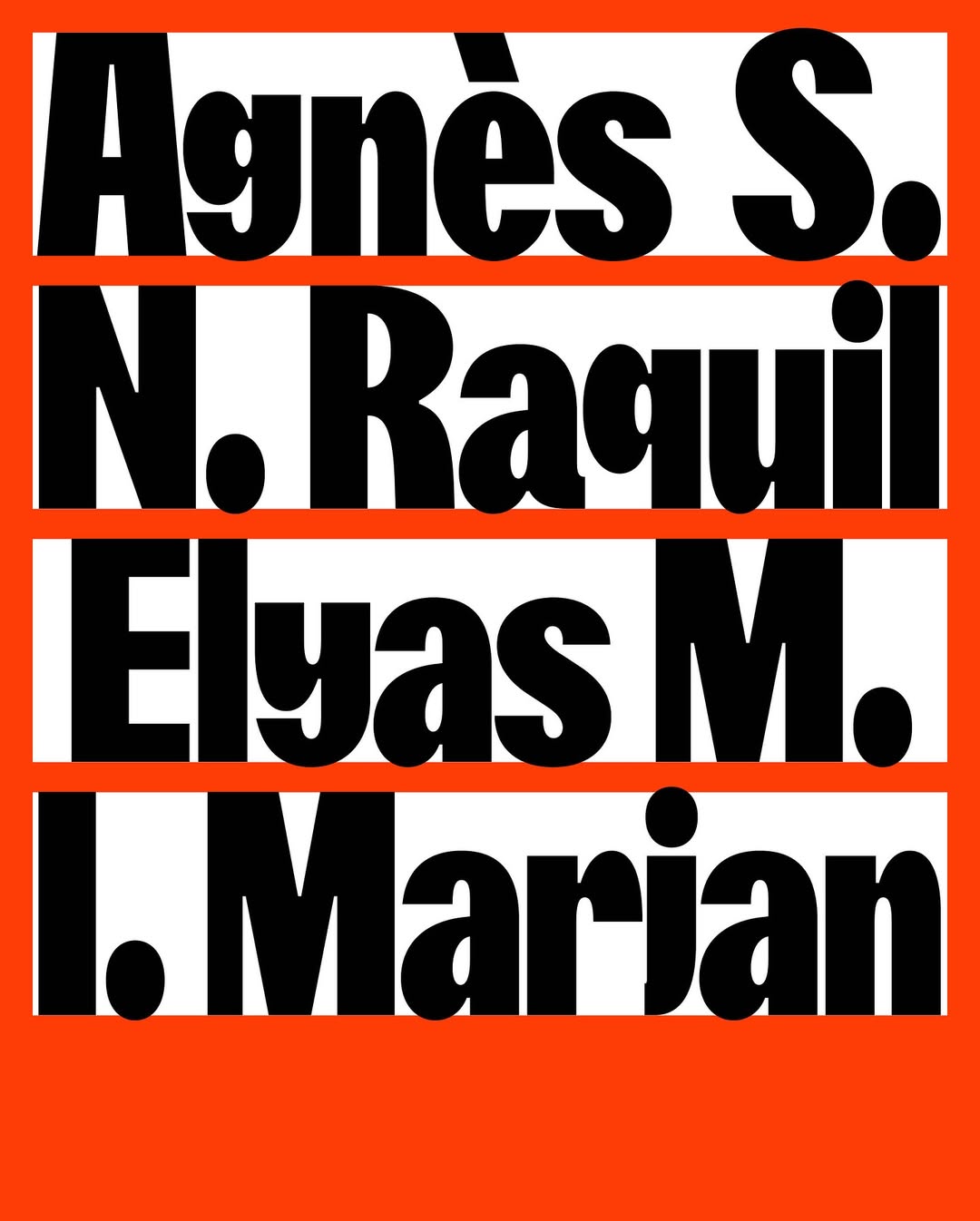
New custom typeface for La Fabra Centre d’Art designed by Fonts From Folch. A design that reflects the institution’s contemporary spirit, with refinements that ensure versatility, precision, and smooth composition.
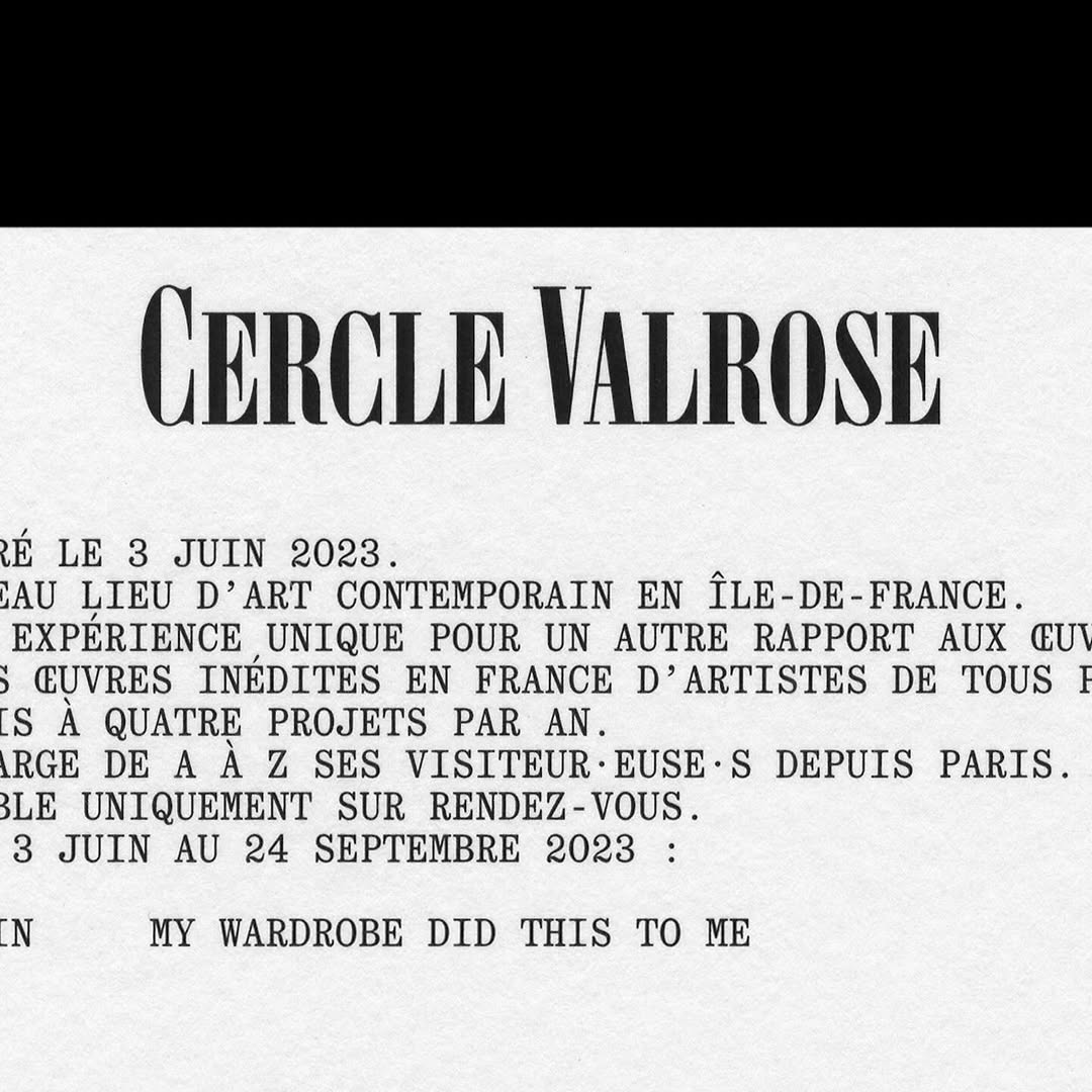
OTT Harker by Ornamental & Title Type is used in the logo for Cercle Valrose. The design is by Bizzarri-Rodriguez, who also created the typeface. Quadrant by Matter of Sorts is used for the supporting text.
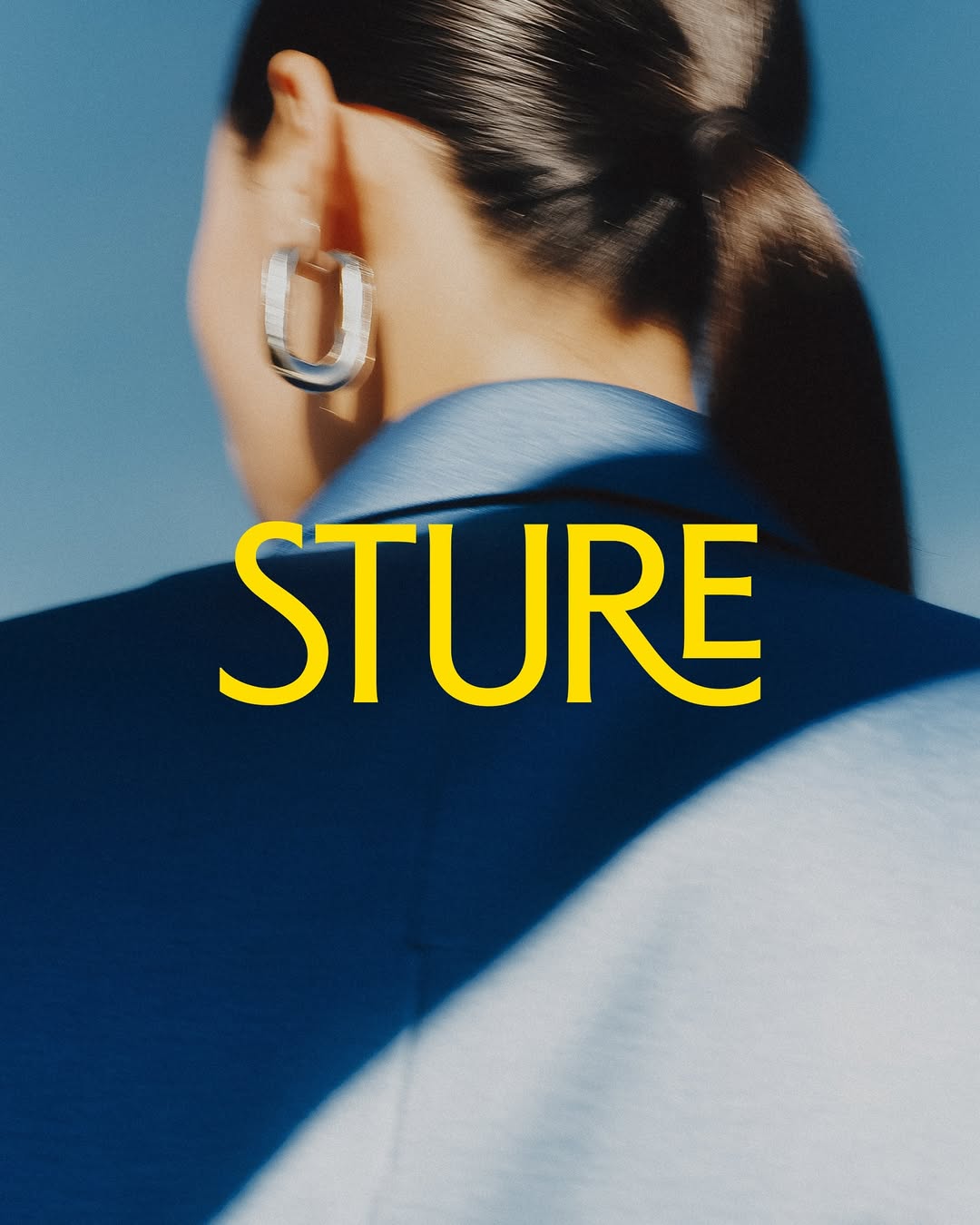
Stureplan was renewed, now becoming Sture with a design inspired by the block’s architecture. The typeface is custom, designed by Göran Söderström and Fredrik Gruber.
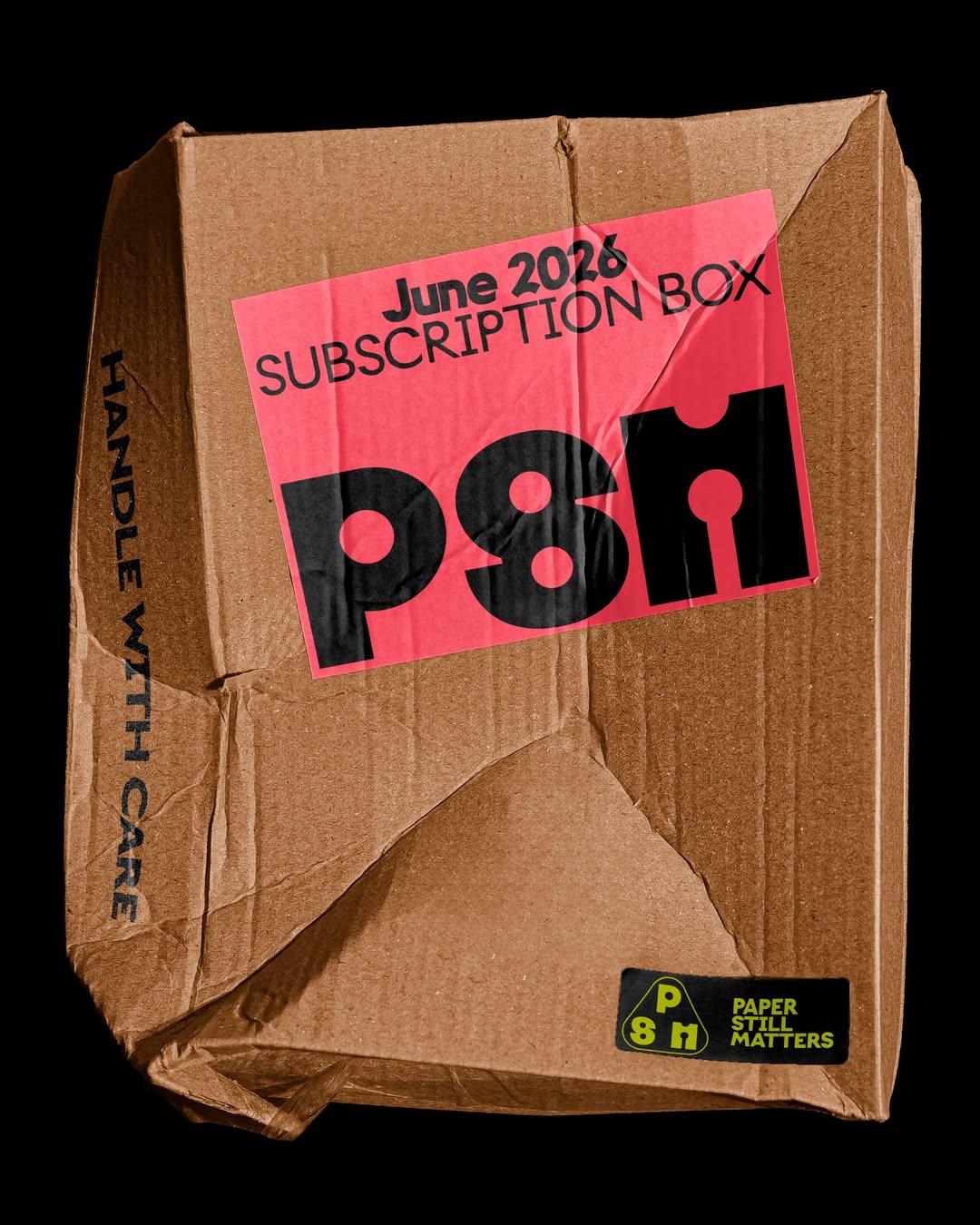
Giulia Boggio designed the identity for Paper Still Matters, a TYPE01 Studio shop aiming to connect with the creative community. The logotype features custom lettering and Onlysans by Daria Cohen, with ALT Riviera from ALT.tf as the supporting typeface.
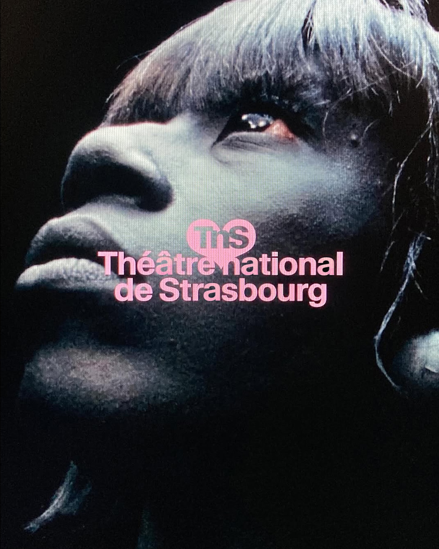
Different versions of the Waldenburg typeface by Kimera for the new identity of the Théâtre National de Strasbourg.
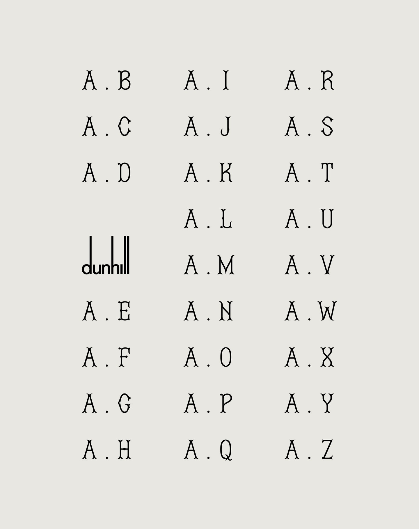
FROST and Dunhill collaborated on the creation of Dunhill Gothic, a typeface that transforms their hand-drawn calligraphy into a refined and bespoke typographic system.
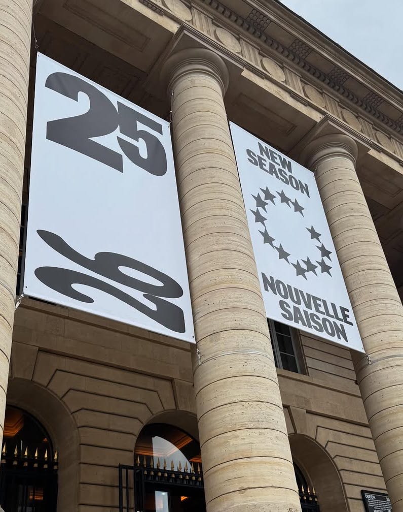
New visual identity for Théâtre de l’Odéon, designed by Atelier Choque Le Goff, featuring the large-scale Insitu typeface by Formagari.
In Arte Tracks and Arte Tracks East, typography breaks into lines and reconfigures into ever-evolving graphics. Logotype, visual identity, and generic system by H5paris.
NASK Studio chose Clarendon Graphic Light by Optimo Foundry to shape a refined typographic system that frames the photographic content of JB Books & Projects.
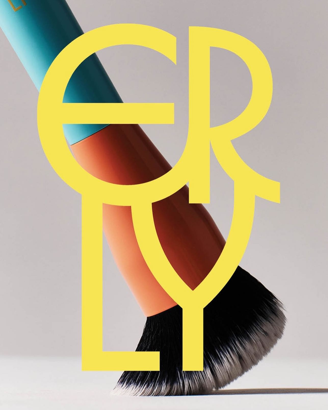
ERLY reinvents skincare with a fresh, typographic identity. Herbus Regular & Title Type, in the design by Studio Lotta Nieminen.