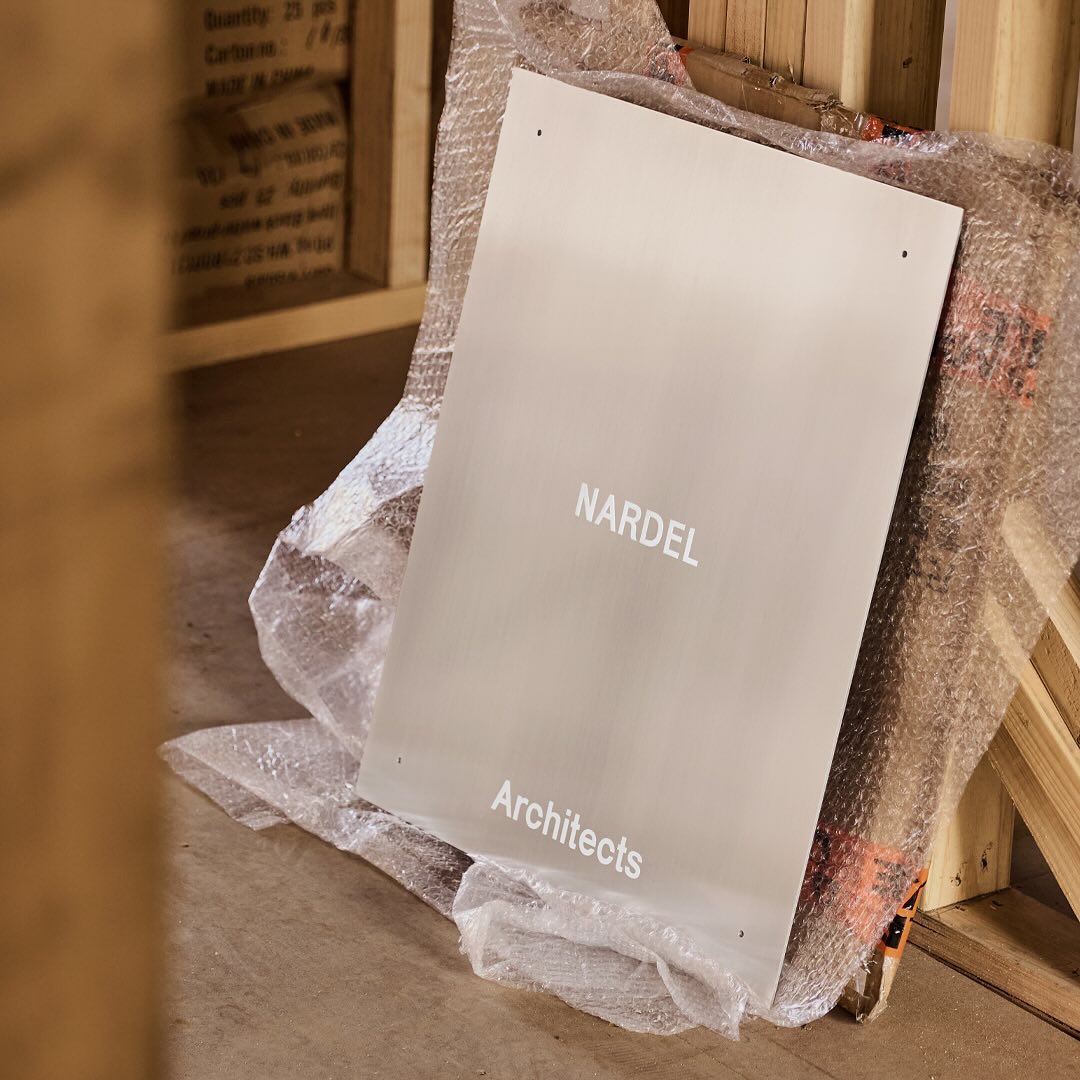
Simple and subtle; Both Studio created a brand identity that aligns with the proposal of Nardel Architects.
New typefaces for the new identity of the production company L’Éloi; Principal Studio chose Review by Commercial Type and Skandia by Store Norske Skriftkompani.
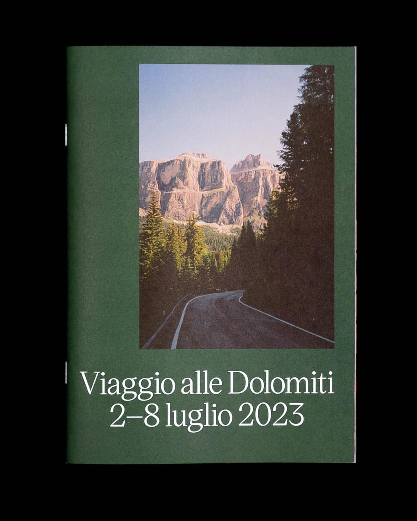
Victor Serif by KOMETA accompanies the photographs taken on a cycling trip with friends in this booklet designed by Familia.
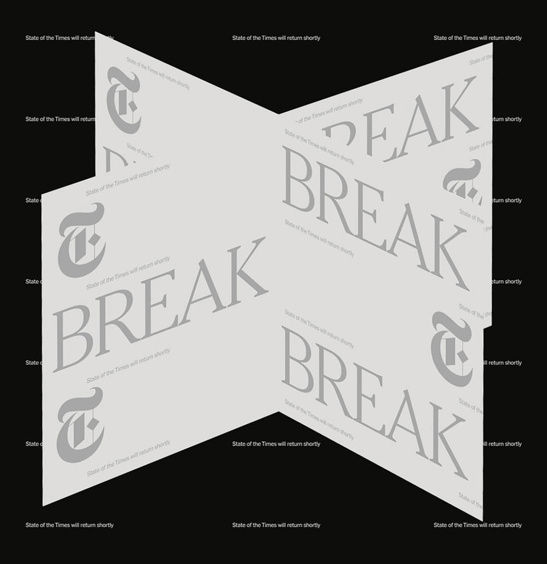
In the identity of this major NYT event, two of its typefaces were combined: NYT Franklin representing the business aspect, and NYT Cheltenham representing the newspaper and news.
For a constantly moving entity like the PAC (Performing Arts Centre), Porto Rocha, together with AllCaps, created this strong and timeless typography as part of its new visual identity.
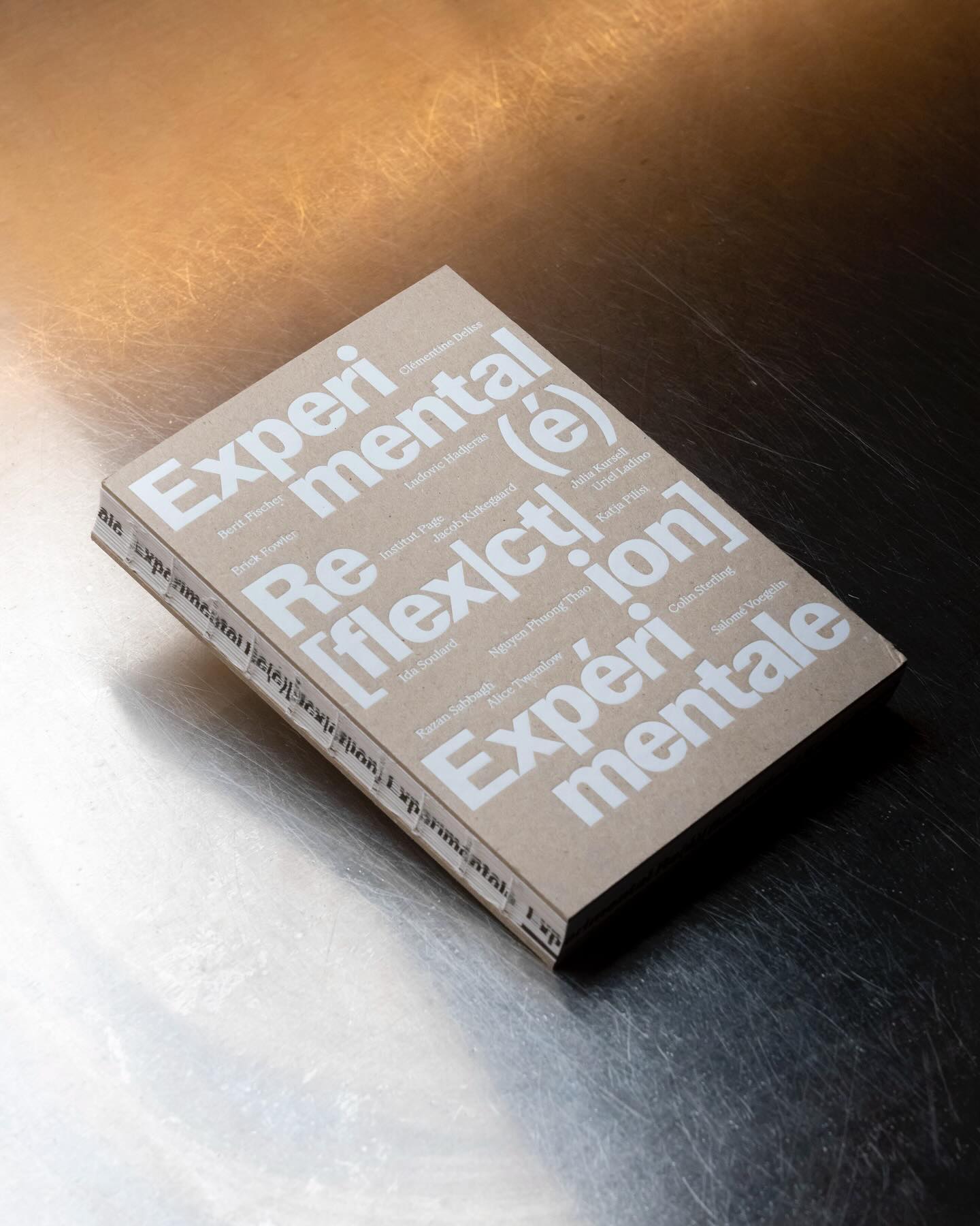
Experimental Re(é)[flex|ct|ion] is an editorial publication that explores concepts such as community, uncertainty, resistance, movement, among others, through explorations and discussions. Hannes Brischke uses ABC Walter Neue and Dark’s Remix A.
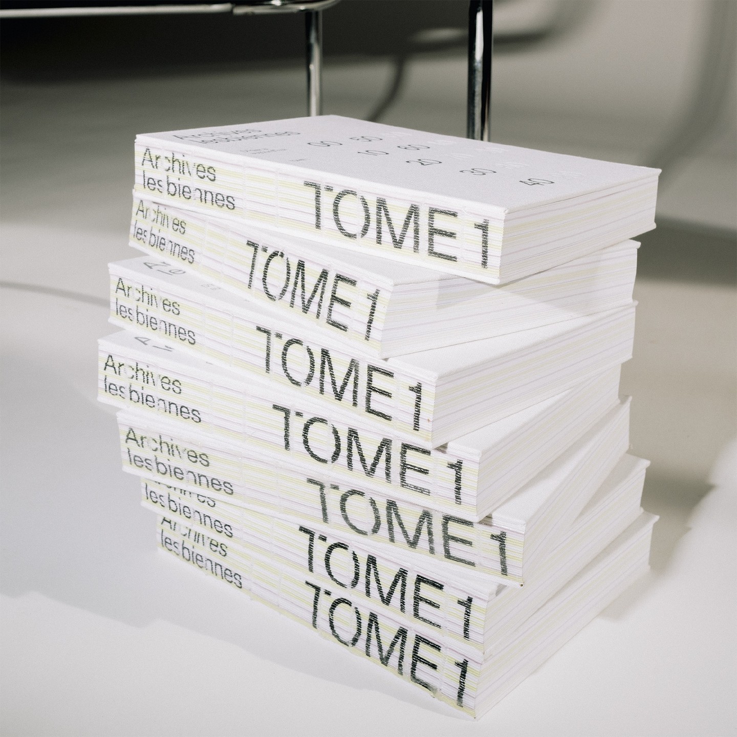
In this book that compiles the lesbian legacy in Quebec, we find Gerstner-Programm FSL as the main typeface, along with “handwritten” numbers using Sebastian Bobby. Designed by Harrison Fun Studio.
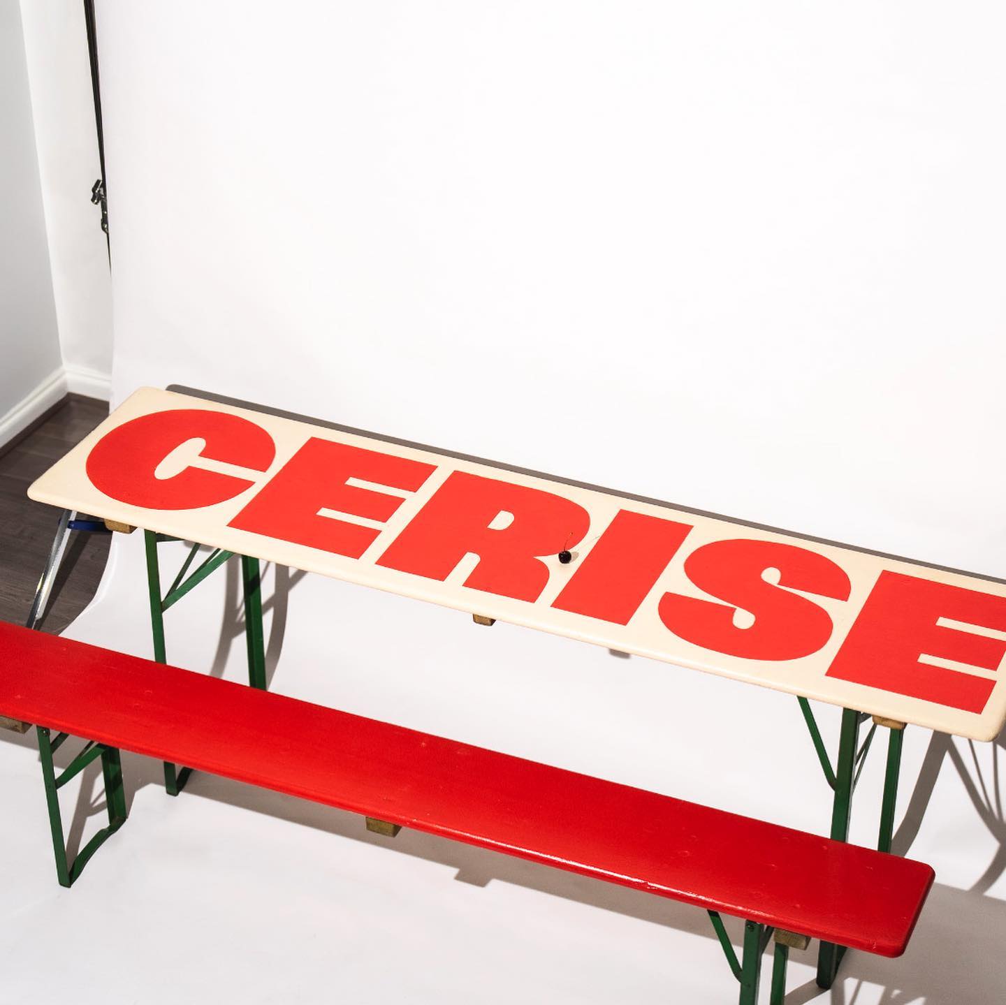
Studio Cerise, a colorful creative studio from East London, used Swinton by Nouvelle Noir for its logo.
Estudio República used a single weight of Basel Classic from Optimo Type and Courier Prime as complementary, to achieve a human and elegant identity for Rocio Navarro’s brand; RN Arquitectura™.