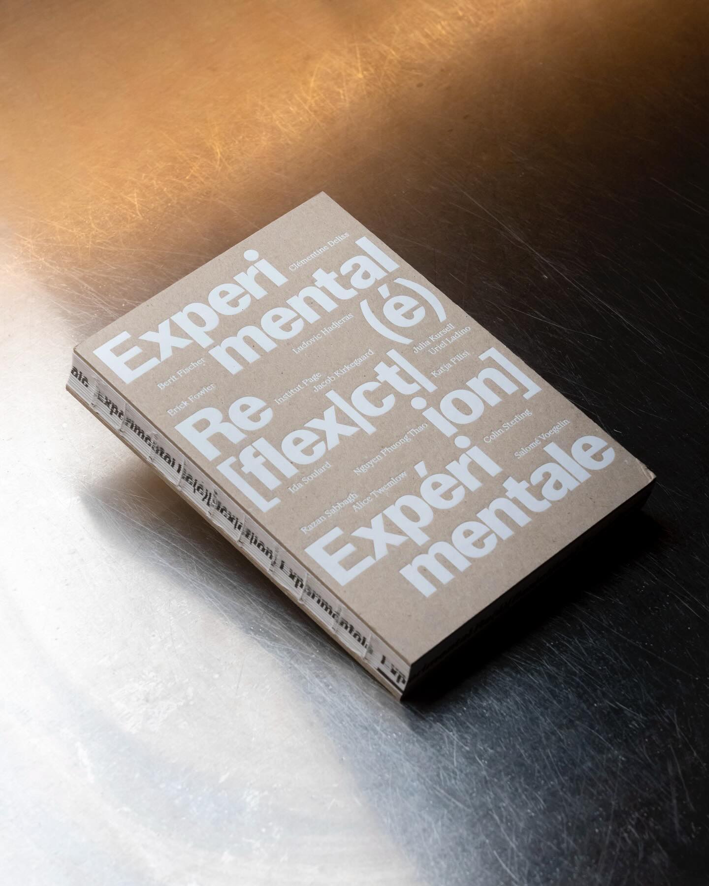
Experimental Re(é)[flex|ct|ion] is an editorial publication that explores concepts such as community, uncertainty, resistance, movement, among others, through explorations and discussions. Hannes Brischke uses ABC Walter Neue and Dark’s Remix A.
In this book that compiles the lesbian legacy in Quebec, we find Gerstner-Programm FSL as the main typeface, along with “handwritten” numbers using Sebastian Bobby. Designed by Harrison Fun Studio.
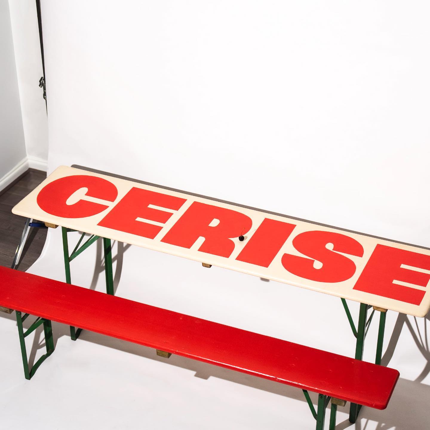
Studio Cerise, a colorful creative studio from East London, used Swinton by Nouvelle Noir for its logo.
Estudio República used a single weight of Basel Classic from Optimo Type and Courier Prime as complementary, to achieve a human and elegant identity for Rocio Navarro’s brand; RN Arquitectura™.
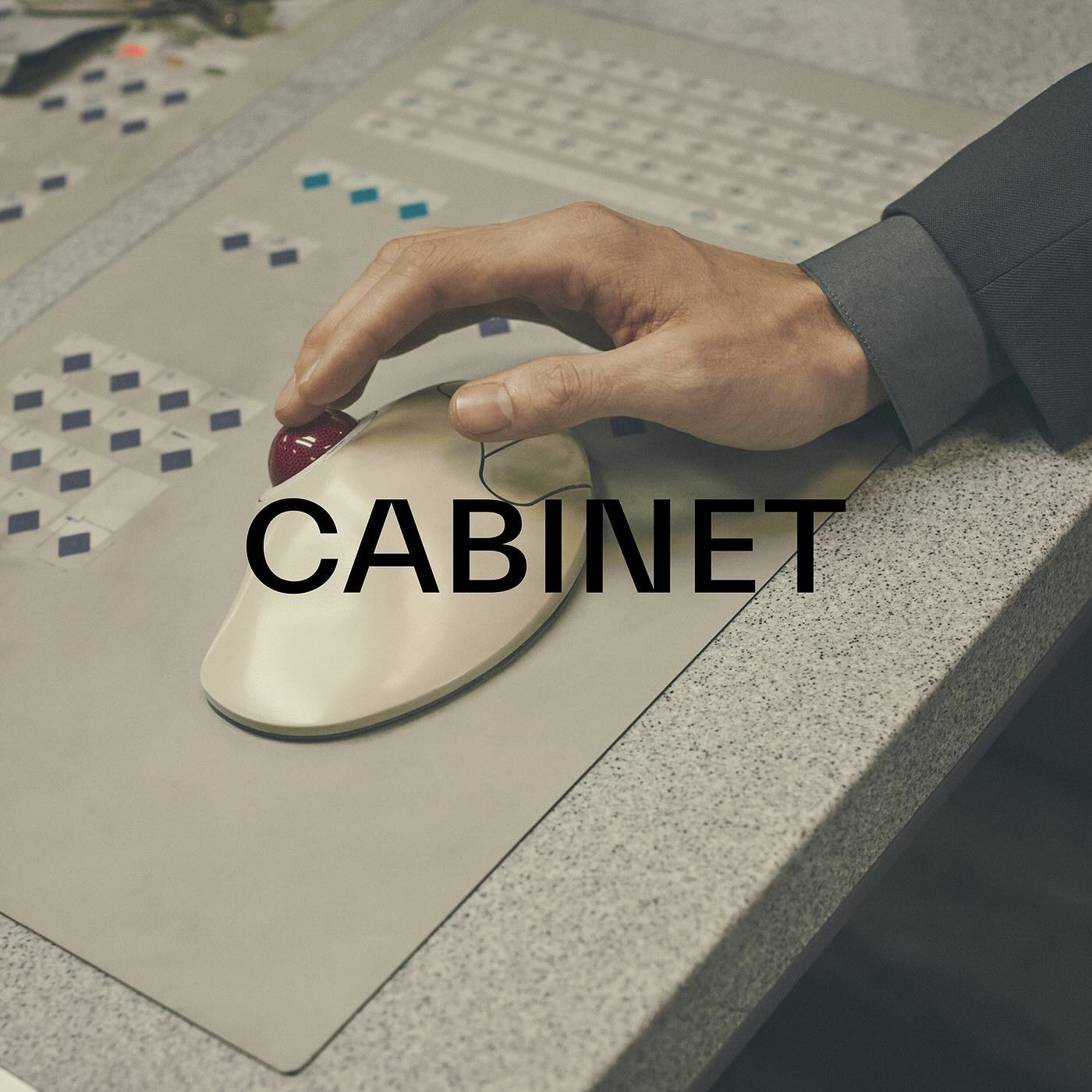
TWK Everett venturing into the fashion industry through the creative studio and fashion brand Cabinet Milano, led by Rossana Passalacqua and Francesco Valtolina.
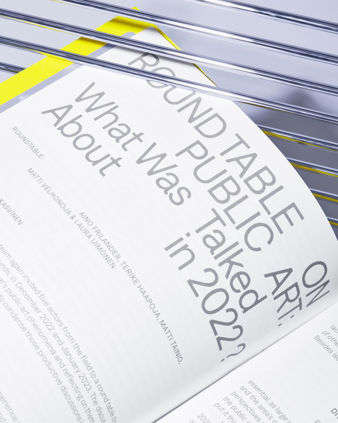
Denim performs admirably across various contexts, whether in small or large texts, as demonstrated in the publication Annual Review of Public Art 2023 for The Arts Promotion Centre Finland – Taike.
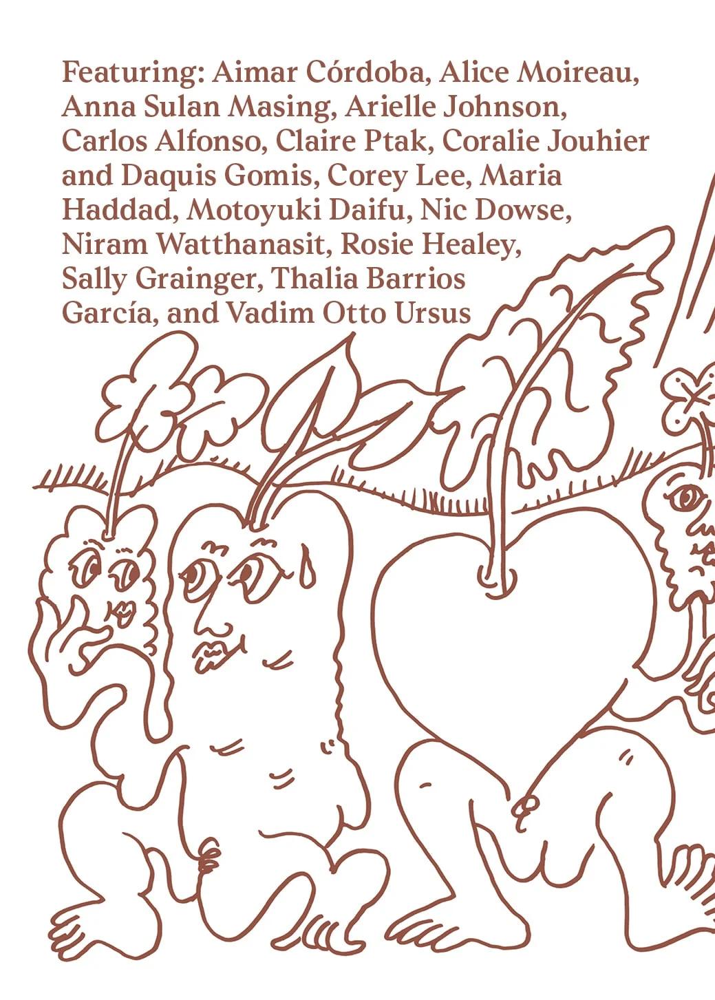
Last year, All Caps Type’s Rhetorik serif was featured in Apartamento’s annual cookbook edition #8, which gathers recipes based on tubers in a playful tone.
This fresh and fun poster design for the Teatro Prospero uses Review Condensed from Commercial Type, a Principal Studio project
How to design the extension of –a very well-known– brand, while also making it unique. Order solves this question with the identity of Journal House, a branch of WSJ dedicated to events.
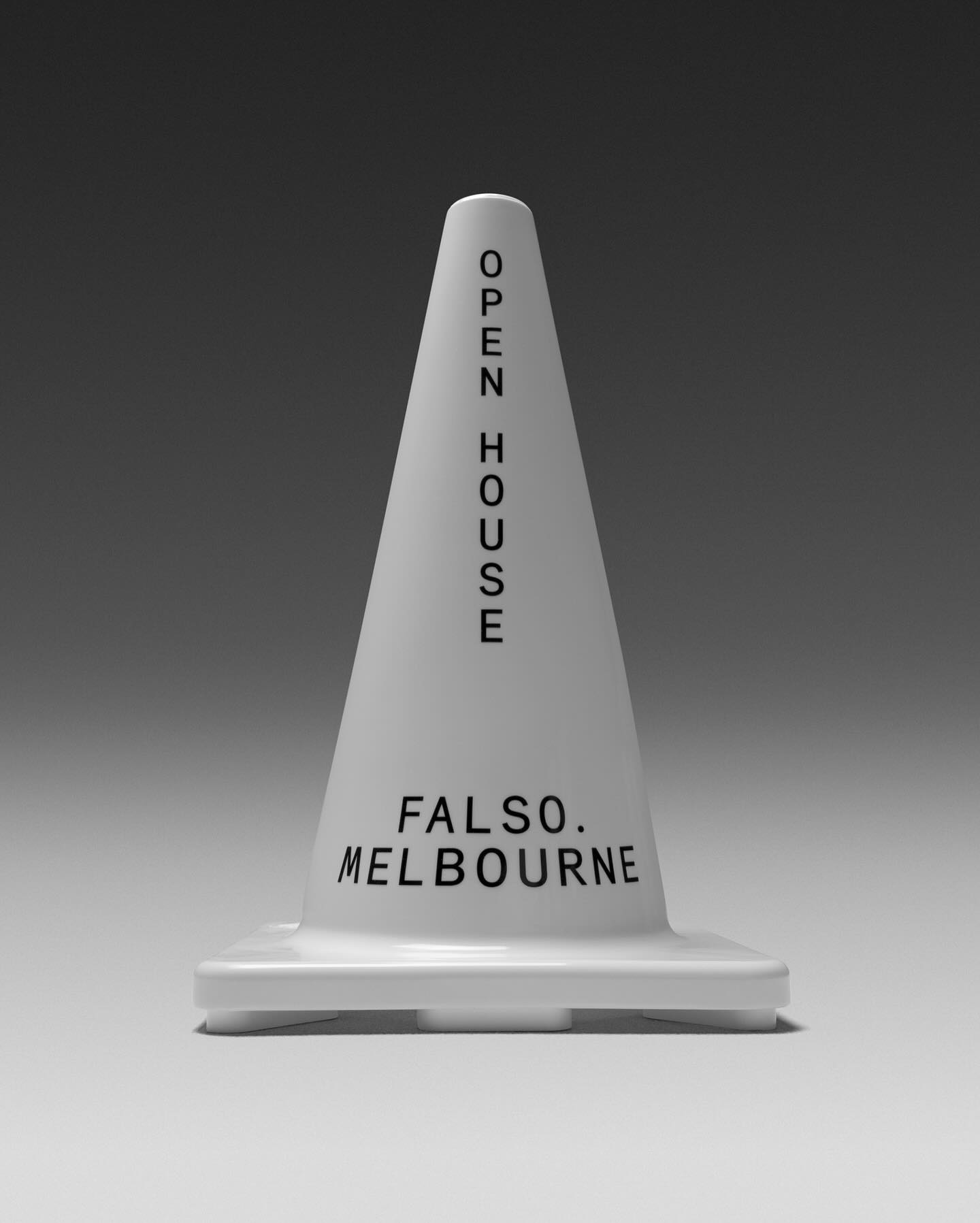
Studio Sly used Modern Era Mono to make Falso Melbourne stand out among all the other real estate agencies.