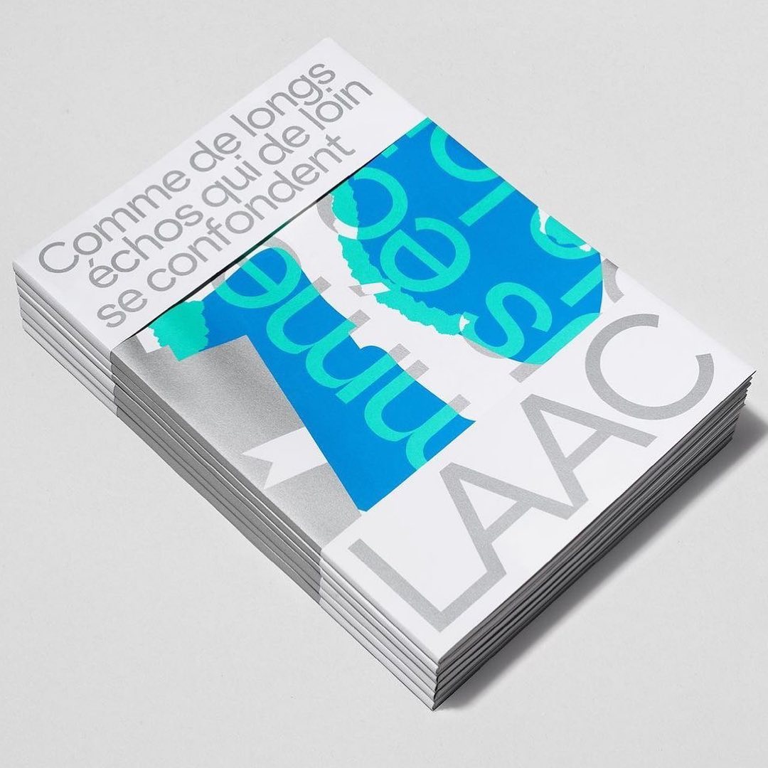
Studio Hudson Catty and Atelier Baudelaire used ES Klarheit Kurrent to design a set of three books celebrating the 40th anniversary of LAAC in Dunkirk.
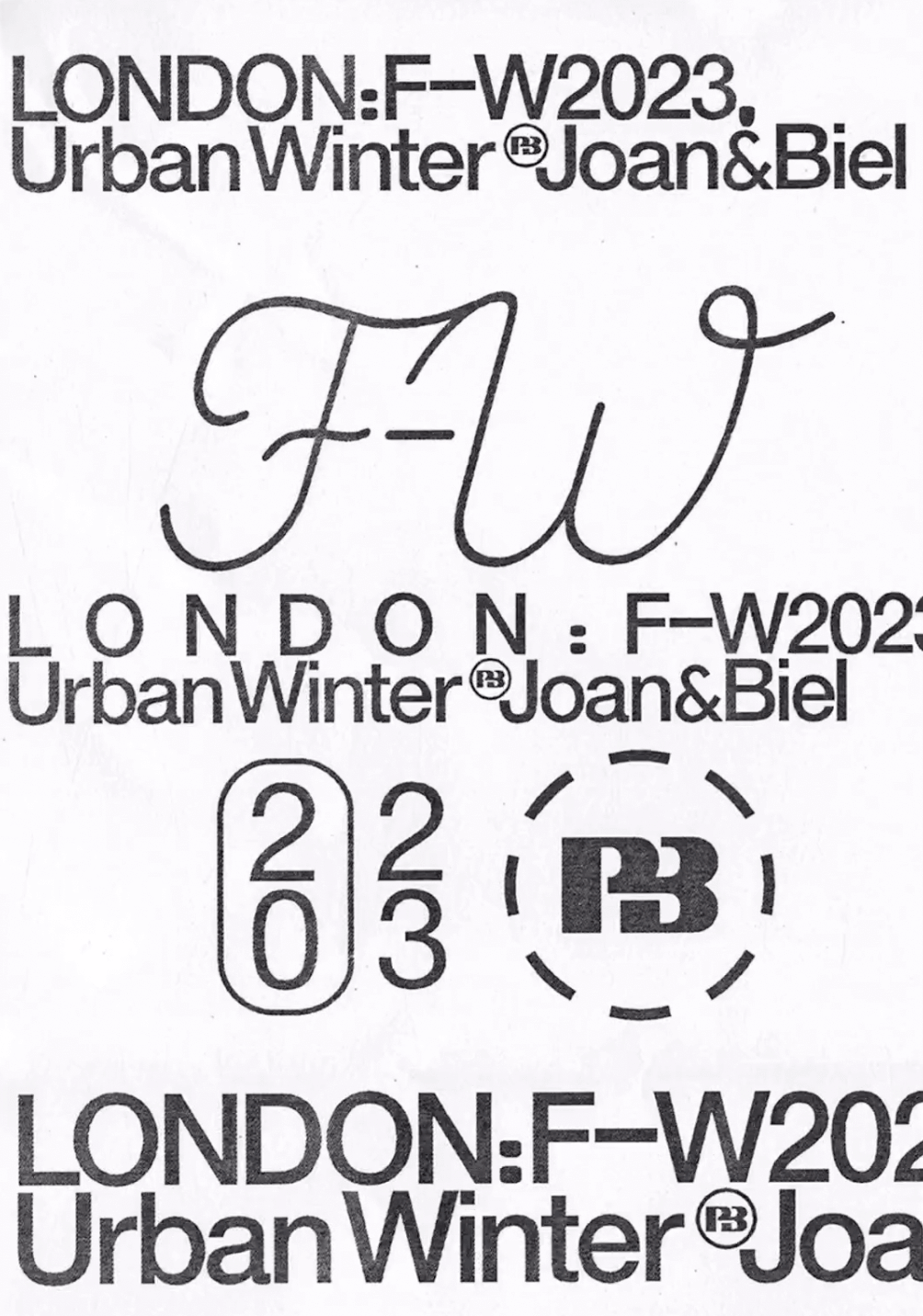
Simple and dynamic, these explorations by Paula de Álvaro use brand elements and basic information to present the Pull&Bear London AW 2023 collection.
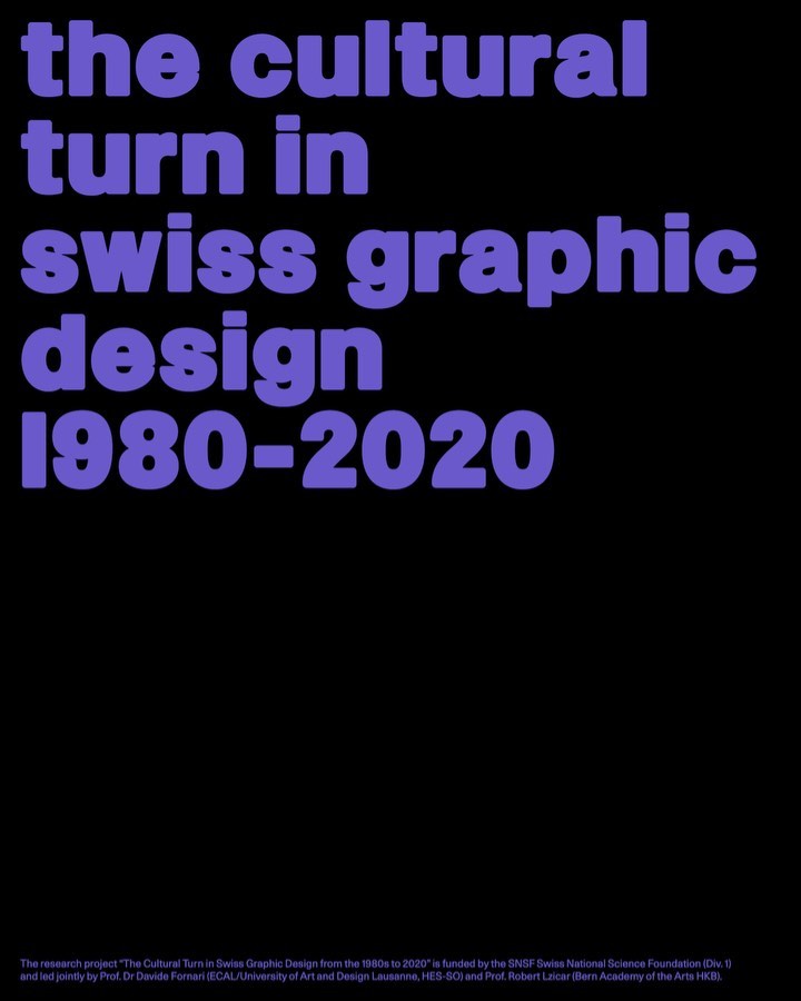
Trekking Sans is a lowercase typeface designed by Bureau Bernklau, for the research project Cultural Turn in Swiss Graphic Design (1980–2020).
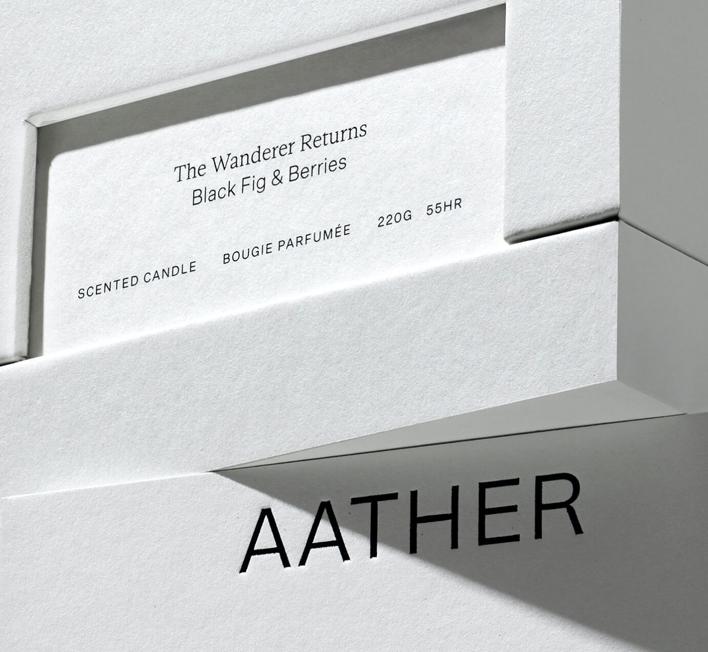
SOCIO Design used Untitled Sans from Klim Type Foundry and Gestura from Socio Type Foundry to complement the visual identity of AATHER’s high-quality candles.
ABC Dinamo and Comission Studio collaborated to develop Rimowa’s custom typeface, building upon Bureau Borsche’s logo for the high-end luggage brand.
Editorial New, ITC Franklin Gothic, and Antique No.6 were brought together by The Office of Ordinary Things to create contemporary compositions in the identity of Mad, a agriculture organization.
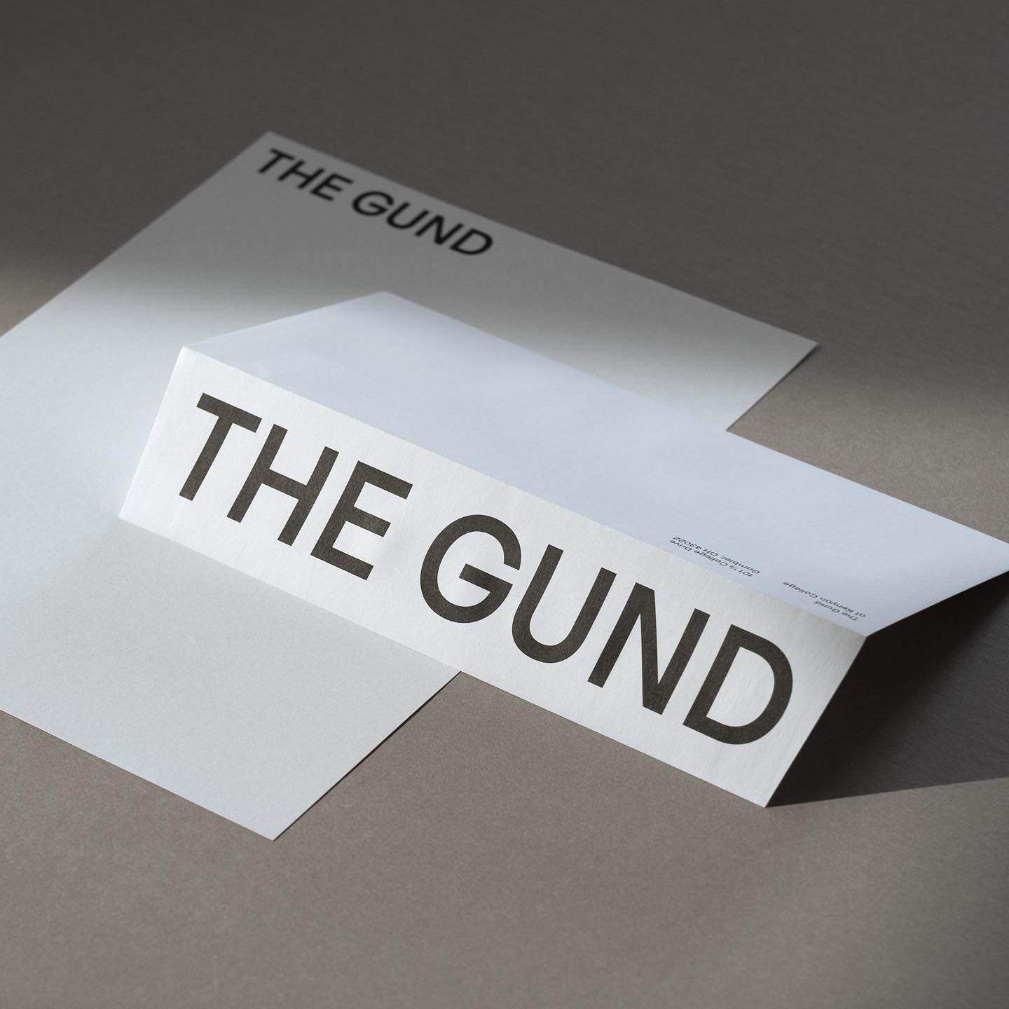
Julien Hébert and Principal Studio collaborated to craft a bespoke friendly typeface for The Gund, academic art museum. Caslon Ionic by Commercial Type as the complementary font.
Studio Ard was commissioned to design 15 publications and the signage for the graduation exhibition of the RCA School of Architecture. All is typeset in Prisma Text by Lineto.
Pastiche Grotesque by Order Type Foundry was customized by Benjamin Tuttle to become the bespoke typeface for the First Choice brand, a new generation of travel lovers. Design by Ragged Edge.
Handwritten sketches by Leandro Senna and The New Company made for the cultural center of gaming, 100 Thieves