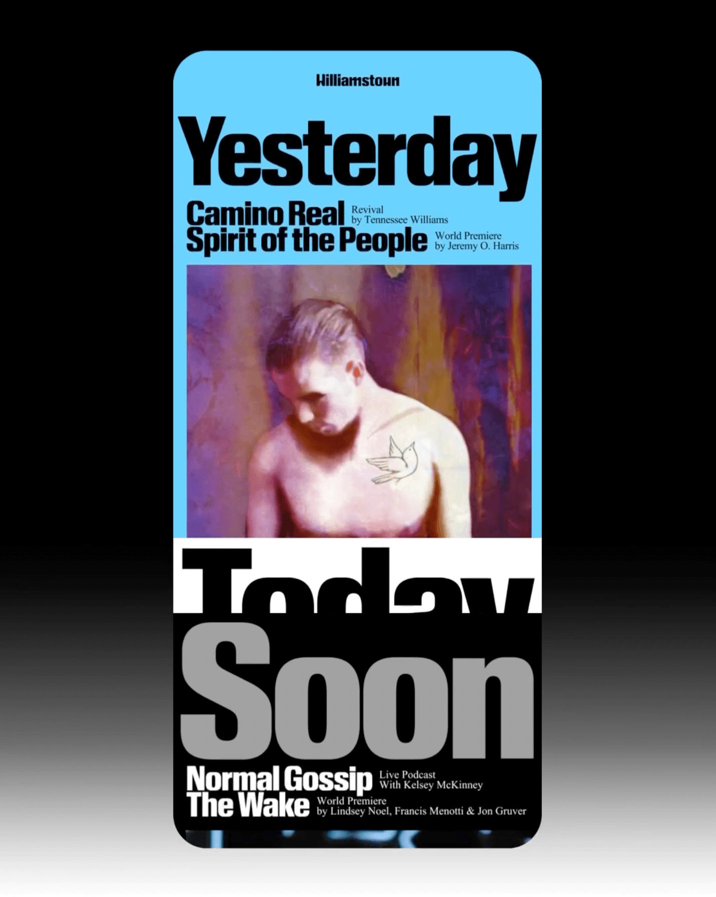
The identity that Pentagram created for the Williamstown Festival transforms the stage into a dynamic graphic system. A custom logo is complemented by Times New Roman and Review from Commercial Type.
Inspired by Chicago’s sign painting, the packaging of Foxtrot’s potato chips captures the essence of the iconic Maxwell Street Market hot dog.
Animo Typeface by Heavyweight shapes the identity of Grande Paolo, a pop-up sports bar in Prague for the Euro Championship.
Buenaventura designed IOC, a typeface that becomes the visual signature of Islands of Cocoplum, blending tradition, luxury, and modernity.
Ottimo celebrates the tradition of olive oil with an identity designed by Somekind Studio, the brand takes shape with Edition by Elias Hanzer, a monolinear typeface that brings a timeless feel.
Designed by Copyright/Reserved, this special publication by @extensive.publishing and @greedydust features Cortese and Cortese Sans by Mark van Leeuwen.
The redesign of ArkDes in Stockholm by AM Stockholm features custom typefaces where dots and dashes create a unique typographic system. Alongside Diatype, these fonts redefine the museum’s identity.
EXTRALESS, a Japanese clothing brand reflected its ethos in a custom typeface by British Standard Type embodying simplicity and shared humanity.
Elisava has a new visual identity inspired by its original logo, and Folch designed Elisava Sans, a variable typeface created to work in any context.