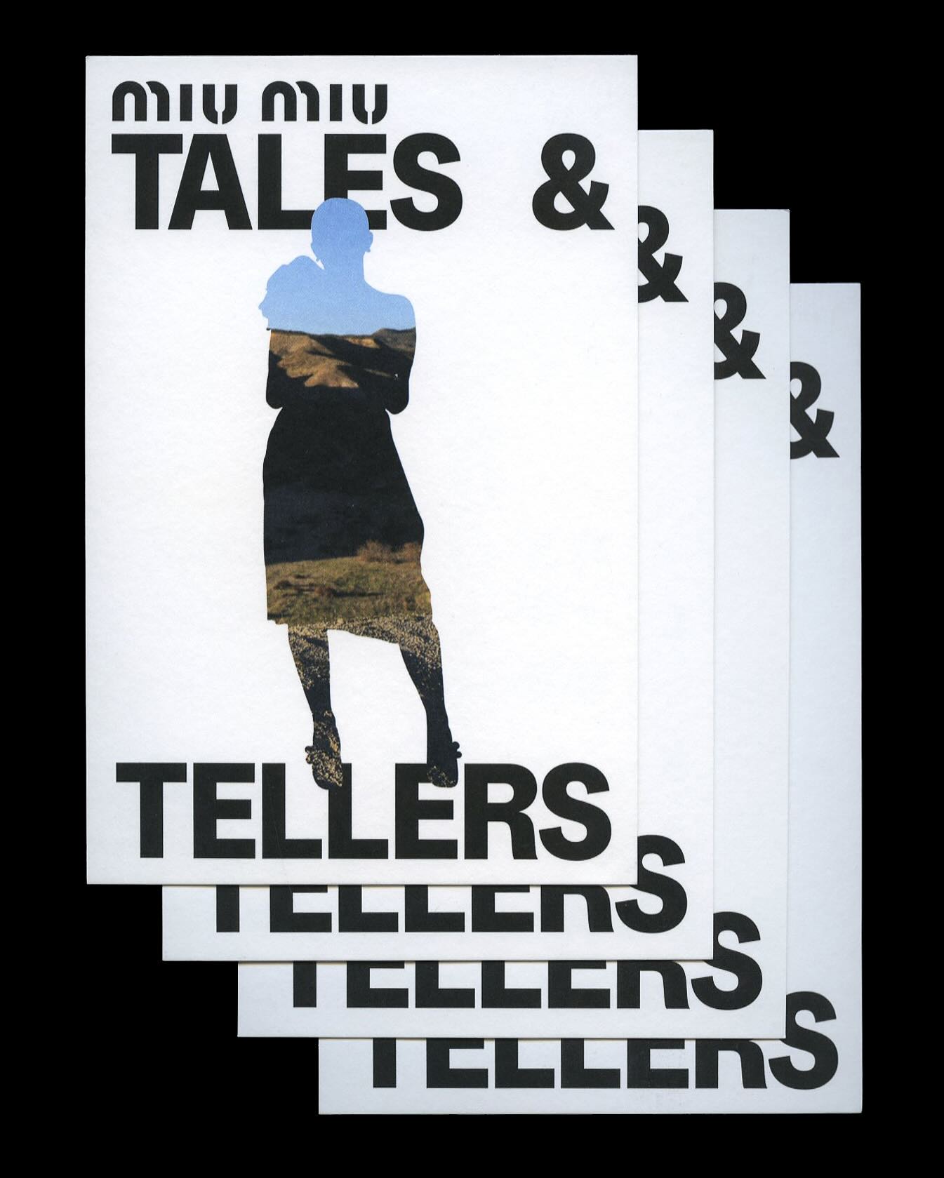
Kern typeface is featured in Tales & Tellers, a Miu Miu campaign that revisits various representations of femininity from past runway shows and short films.
AG Grafik created a brand identity for a poetry festival, blending experimental layouts with the classic elegance of Timezone.
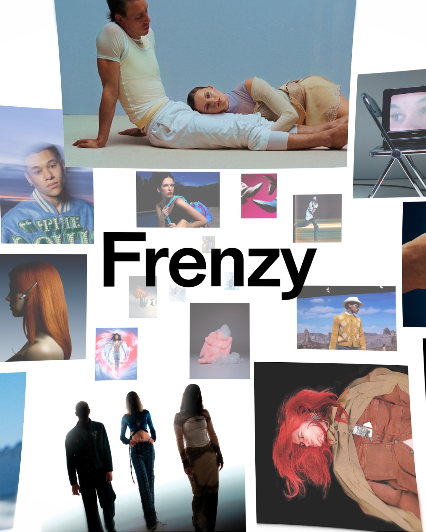
After more than a decade, the production company Frenzy has refreshed its image to show that its bold and contemporary vision remains as relevant as ever. Featuring Modale Antique by Formagari.
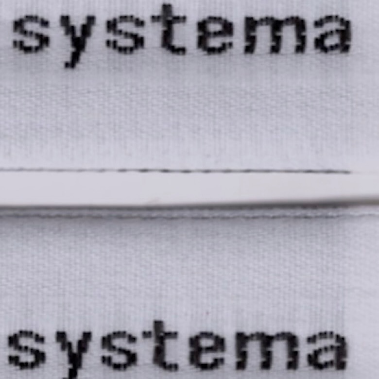
The French studio Plus Mûrs used Diatype Mono by Dinamo for the logo of the sophisticated sports brand, Counter Systema.
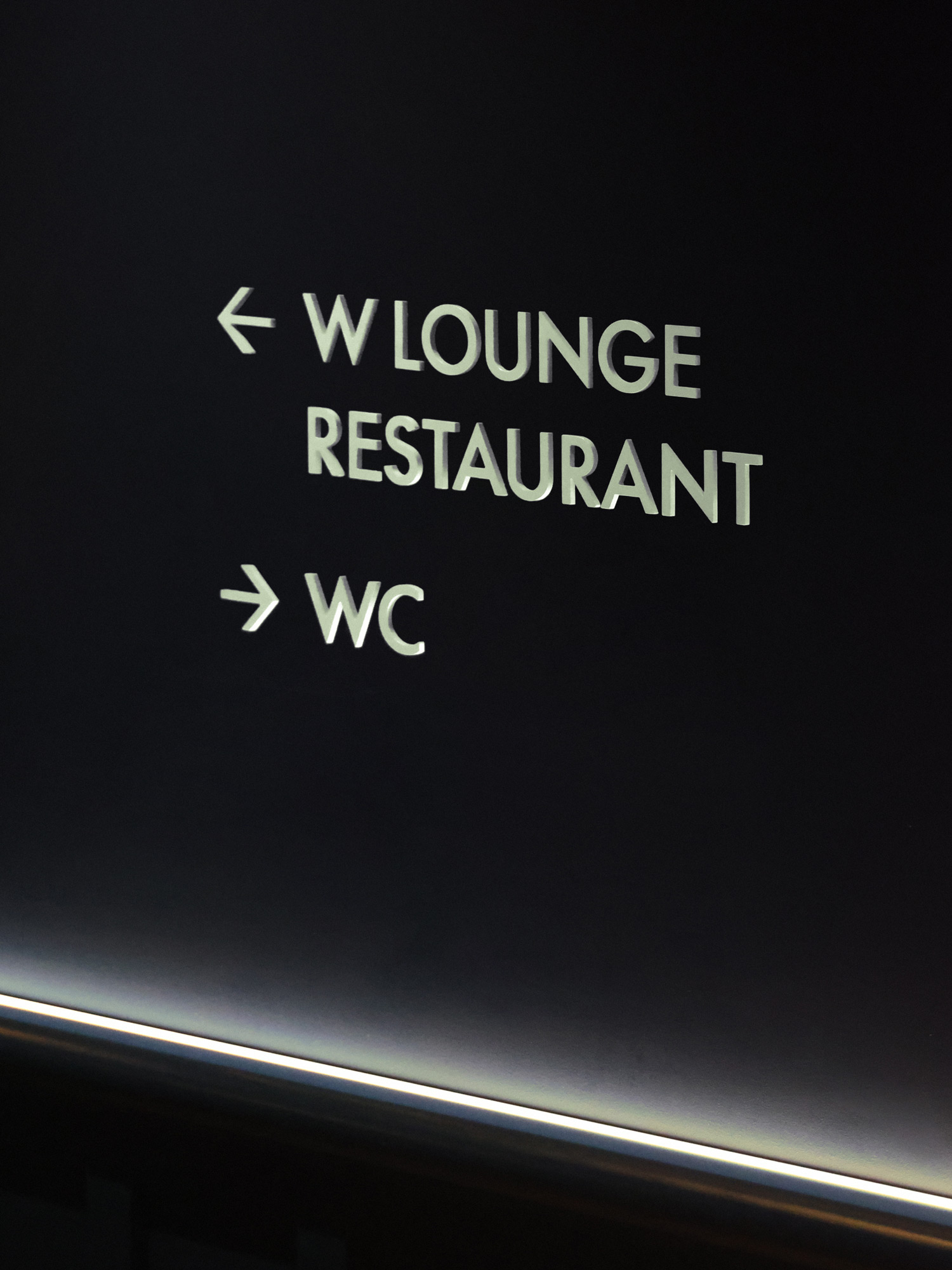
With the aim of redefining elegance, Porto Rocha developed a new brand identity for W Hotels, in collaboration with Lineto, created W Supreme.
Horst Arts & Music 2024 debuts with a visual identity that connects disciplines, emotions, and practices through a network of symbols, featuring Oracle by Dinamo.
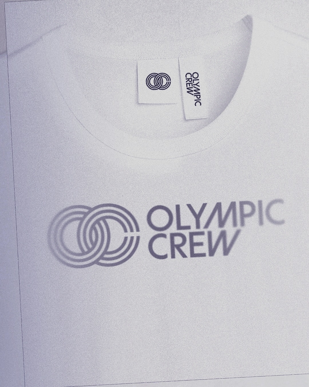
BonTemps studio designed the identity for Olympic Crew, combining the custom logotype and the iconic OC symbol to capture collaboration and modernity. They used the Univers Condensed Bold typeface.
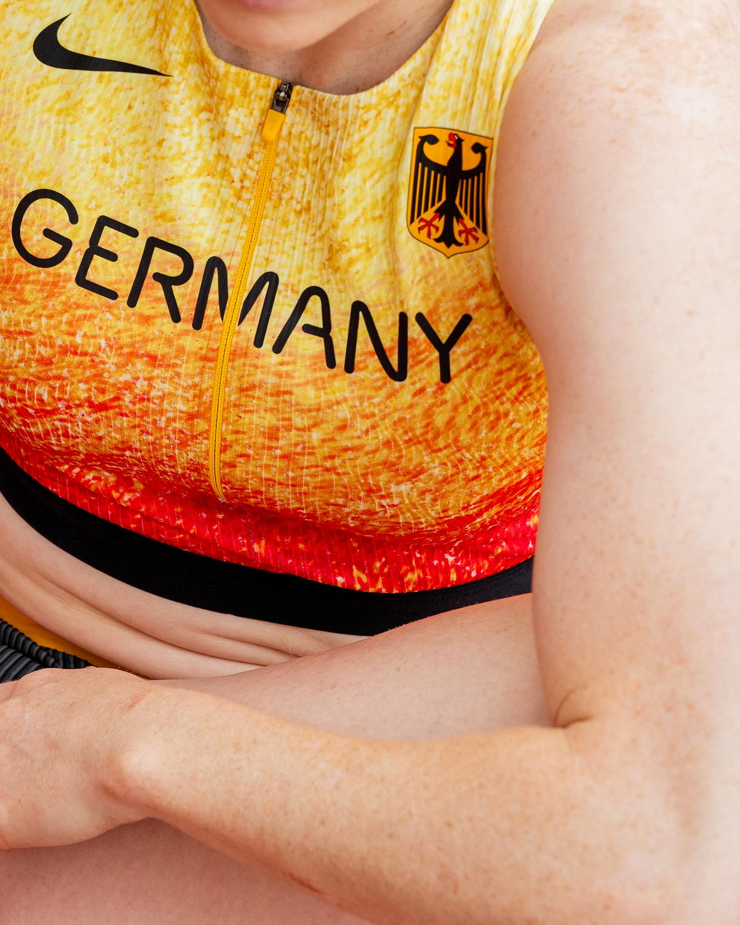
At the world’s largest sporting event, Nike embraced a modern, dynamic, and fluid typeface. In collaboration with Pizza Typefaces, they created the Nike Olympics fonts, a typeface inspired by twisting motion.
A classic typeface that reinvents itself by being interactive; Bonjour Garçon used Neue Haas Unica W1G Black, applying a negative effect in the web redesign they created for the art agency Pedro Booking.