Elephant magazine showcases the rustic and imperfect details of the ZG Elephant typeface through these graphic spreads. Type and editorial design by Zak Group.
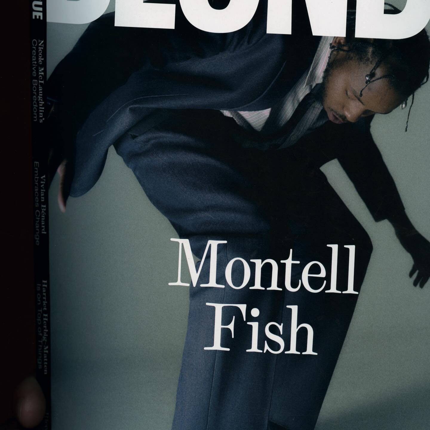
The type selection for Blonde Magazine’s redesign, managed by Hei Agenda, includes Contrast Foundry on the logo, Counter Forms for the serif (Eyla), and sans fonts by Lucas Liccini & Elias Hanzer (HAL Four Grotesk)
Logotype and lettering inspired by the baroque era of the internet, proposed by Muon Studio for Youhee’s visual identity.
Justin Sloane used this interesting mix of Gothic letters (Castilla by Sharptype) and sans serif (Octave by Josh Finklea) for a vinyl cover.
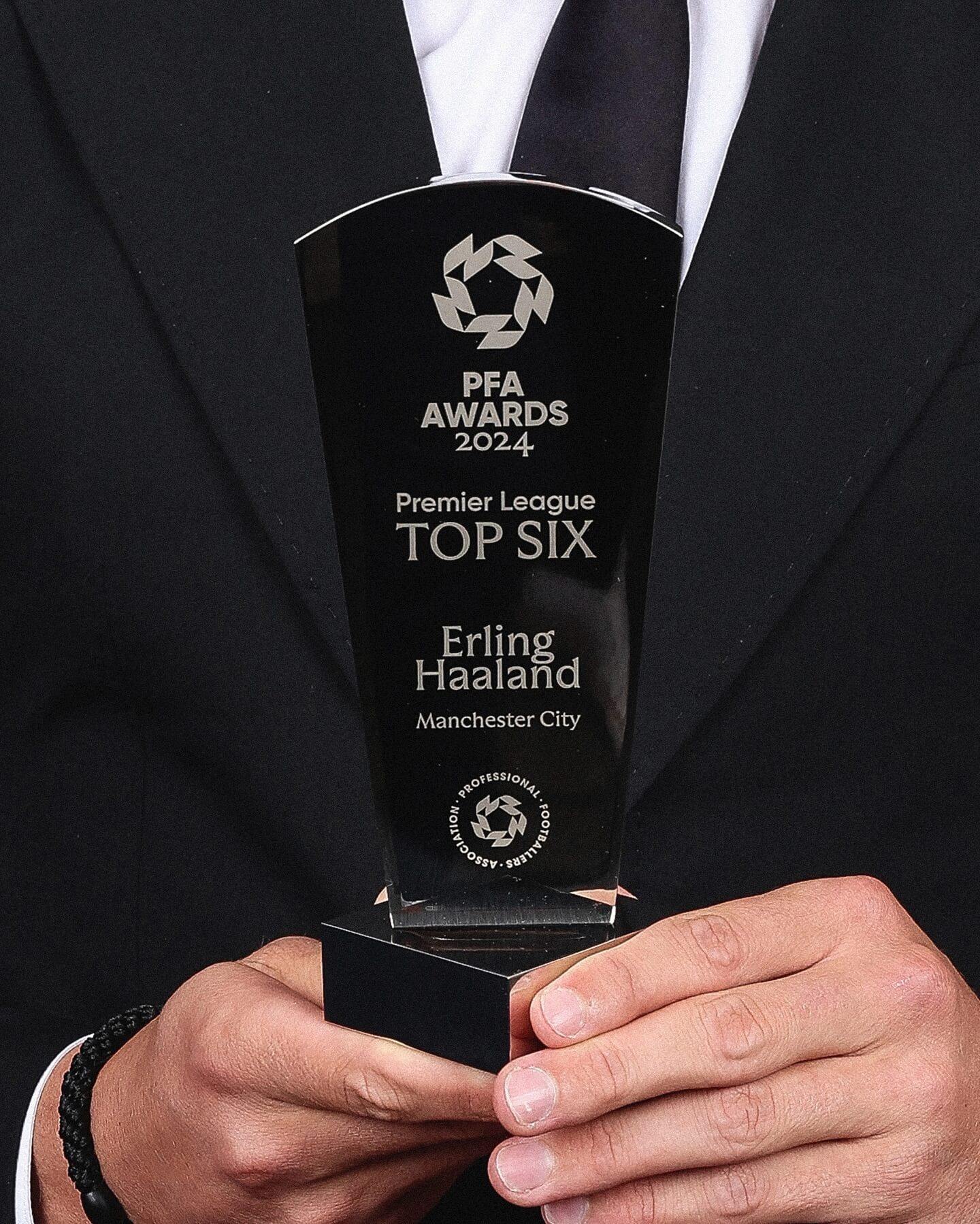
Realm by Approximate Type being used in this annual award ceremony for the best player of the year in the English league.
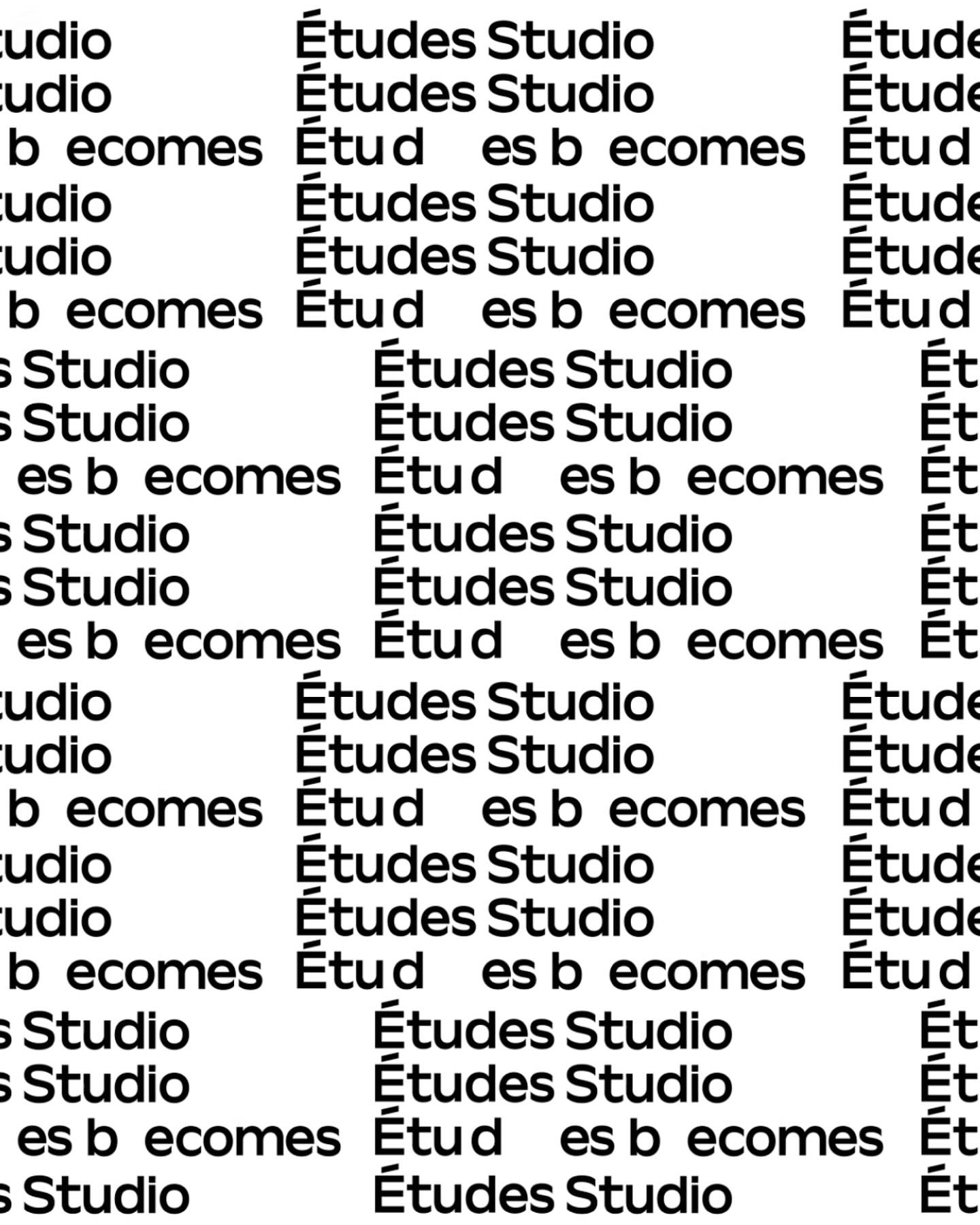
A geometric typeface with humanist features, crafted by Spassky Fischer, for the new identity of Études.
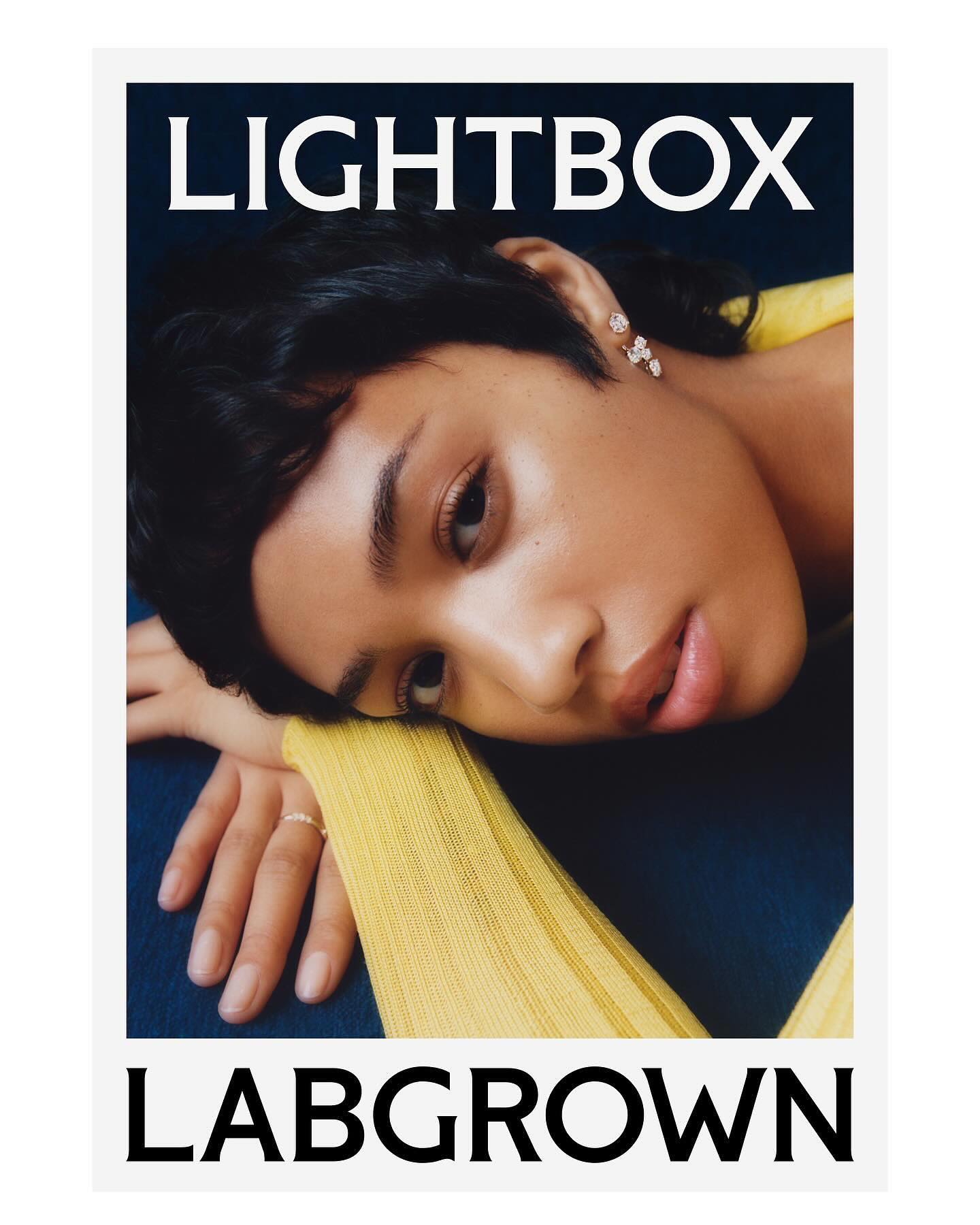
Decade created this visual identity to position an innovative lab-grown diamond brand, proposing a custom flare logo designed by Colophon Foundry.
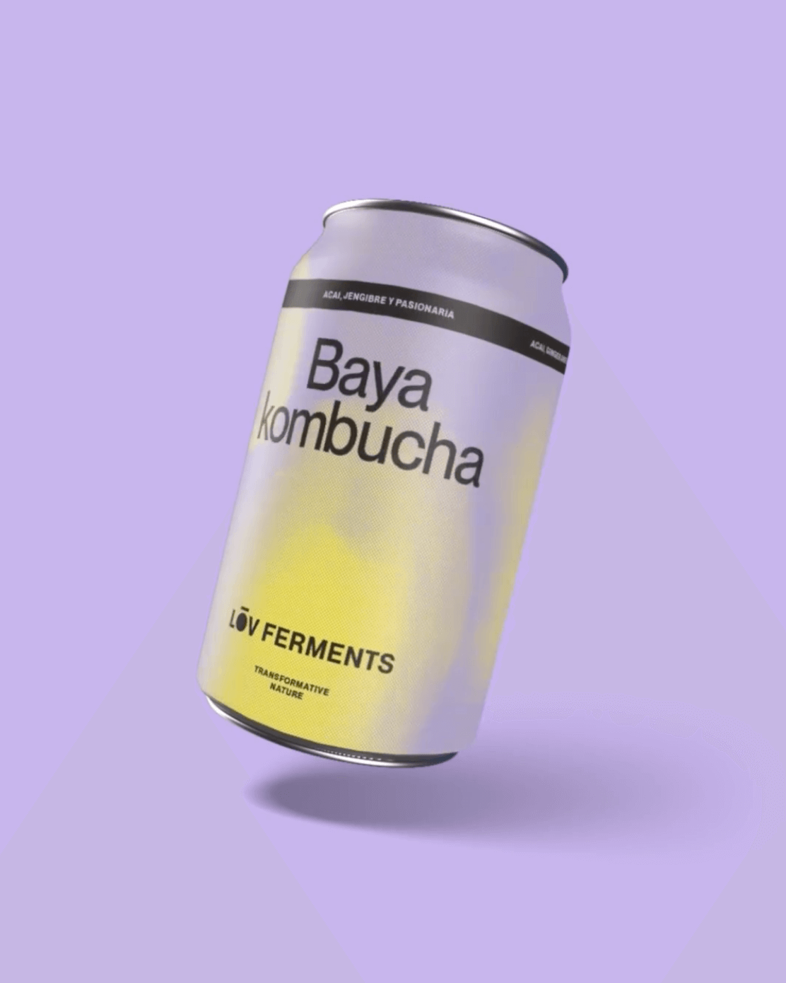
Casa Bien used Neue Montreal by Pangram Pangram and Items by Schick Toikka to build the visual identity for LOV Ferments, a brand set to change the beverage market.
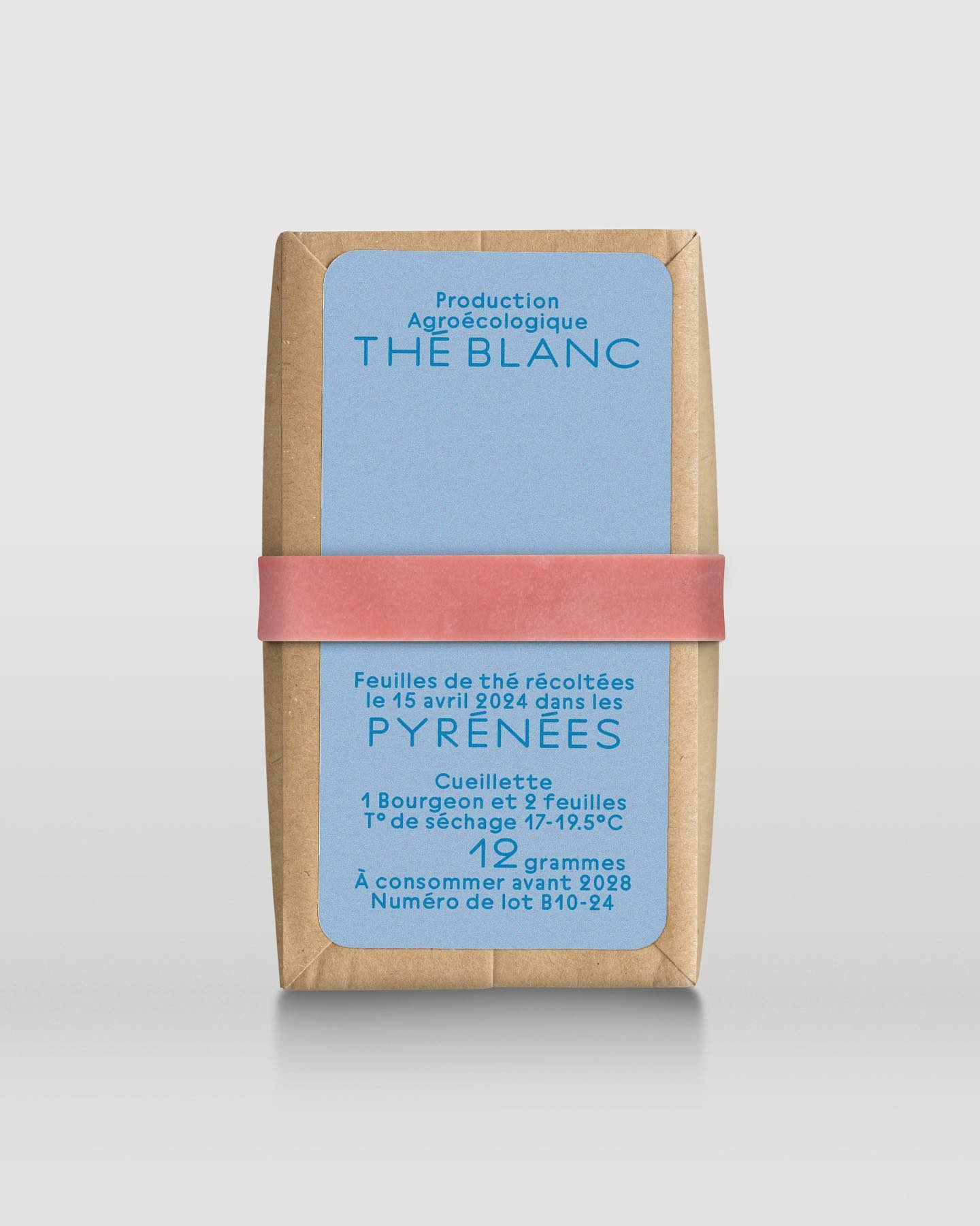
In a comprehensive project including handwriting, drawing, packaging conception, and global branding, Quentin gave @the.pyrenees an organic and approachable identity.