This historic Finnish newspaper refreshed its image with a new logo, using a custom typeface created by Schick Toikka, drawing inspiration from the newspaper’s earlier logos from the 1920s to 1940s.
A studio and shop at the same time, or a shop that also functions as a studio; Polar Ltda brings together various design professionals to offer a fresh creative approach.
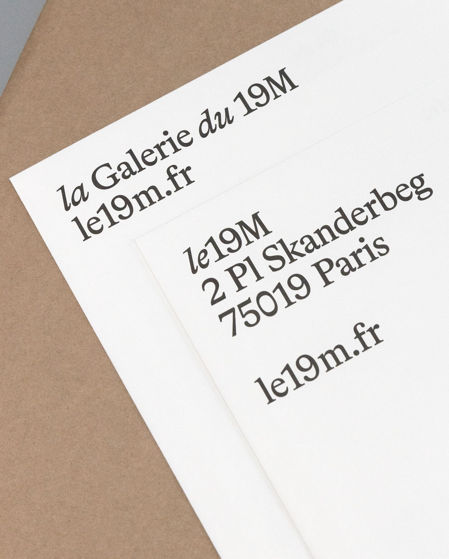
Hort Berlin used this serif typeface with classic and elegant forms (Bradford) for the visual identity they designed for the cultural center le 19M.
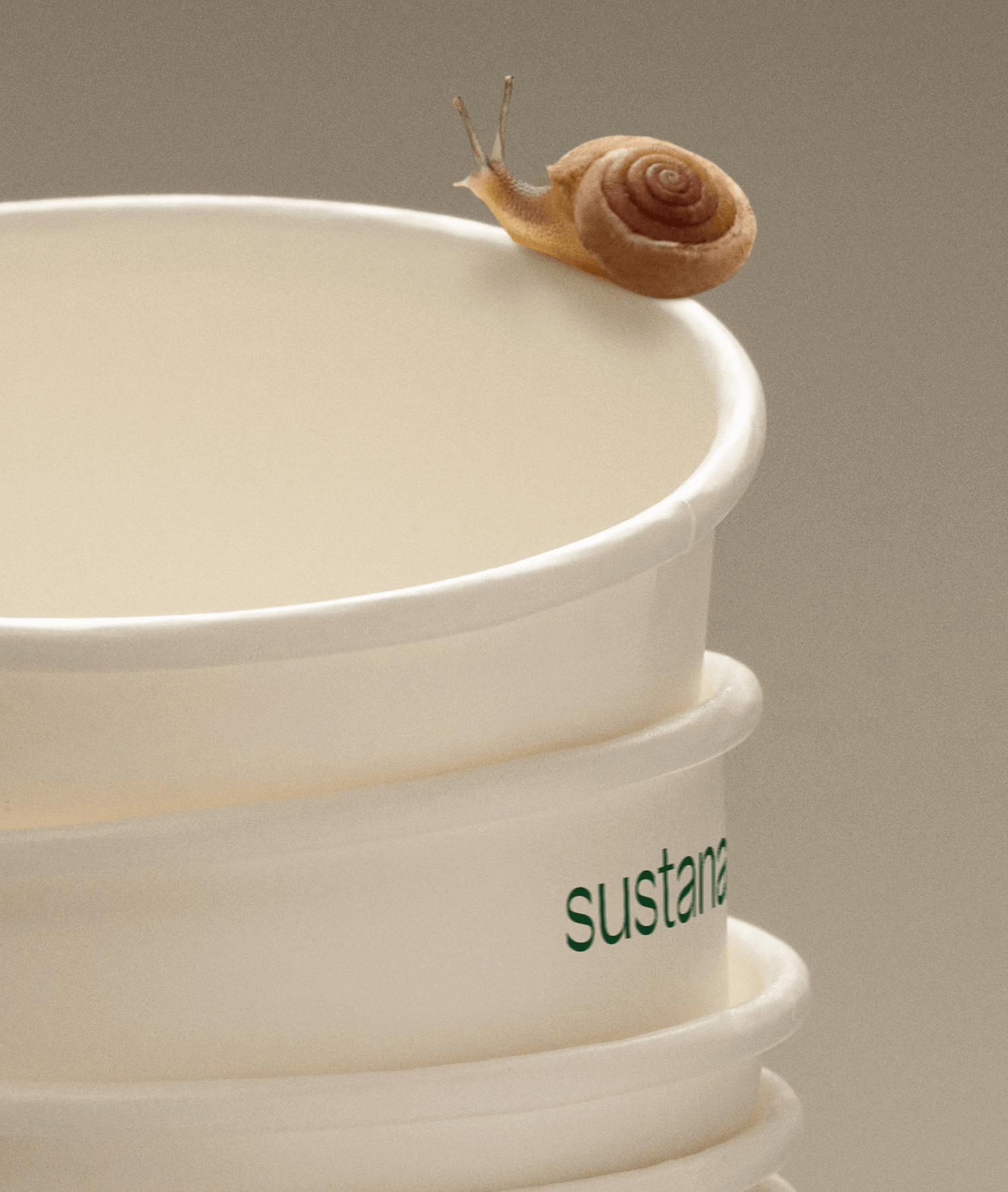
Paper made with clean materials; this was the twist COLLINS gave to this Canadian company, transforming it into Sustana. Custom typography by Sharp Type.
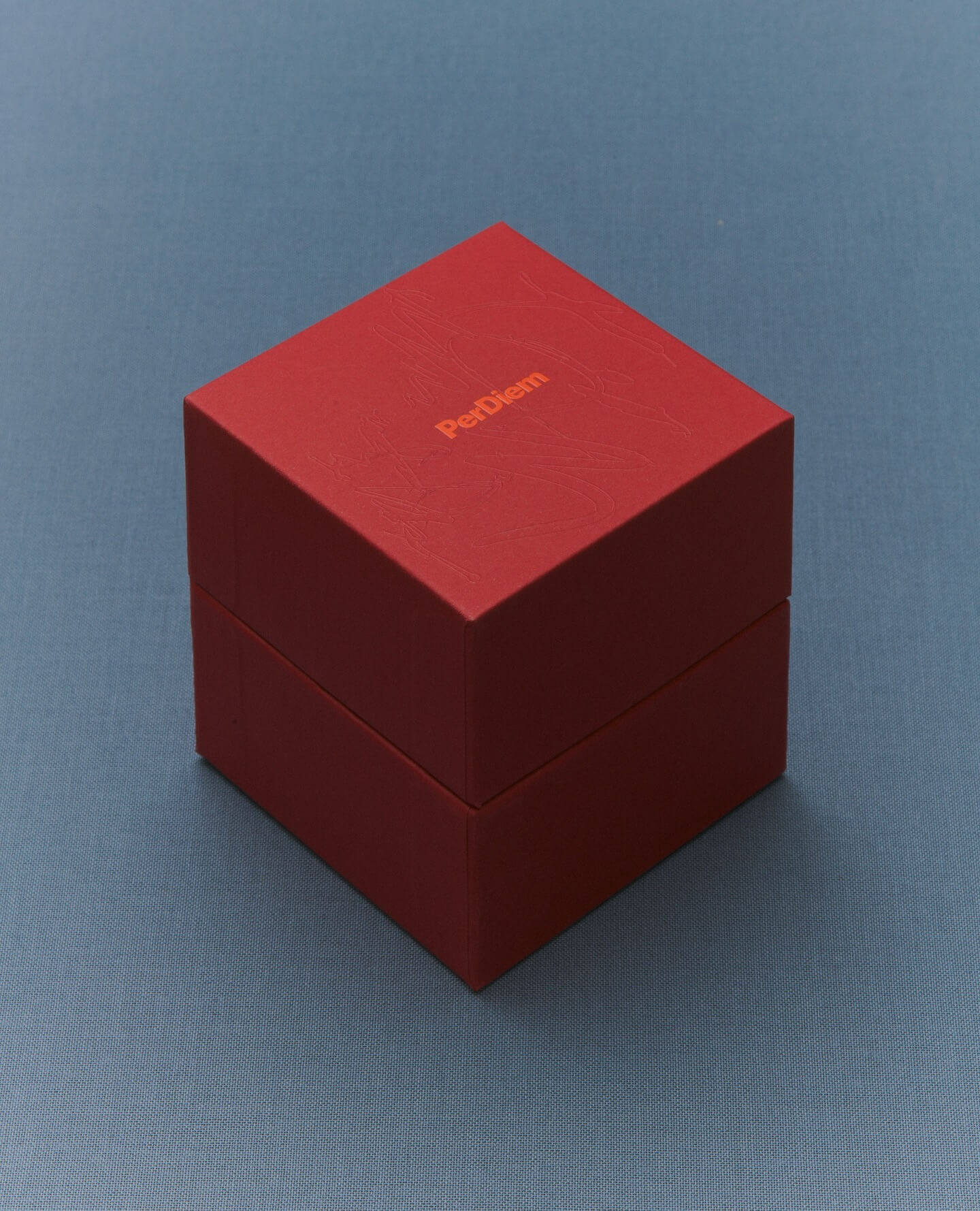
A jewelry brand that saves us from monotony and invites us to live creatively. Brand identity and art direction by Tino Nyman, featuring the typefaces Onsite, Exposure and GT Pressura.
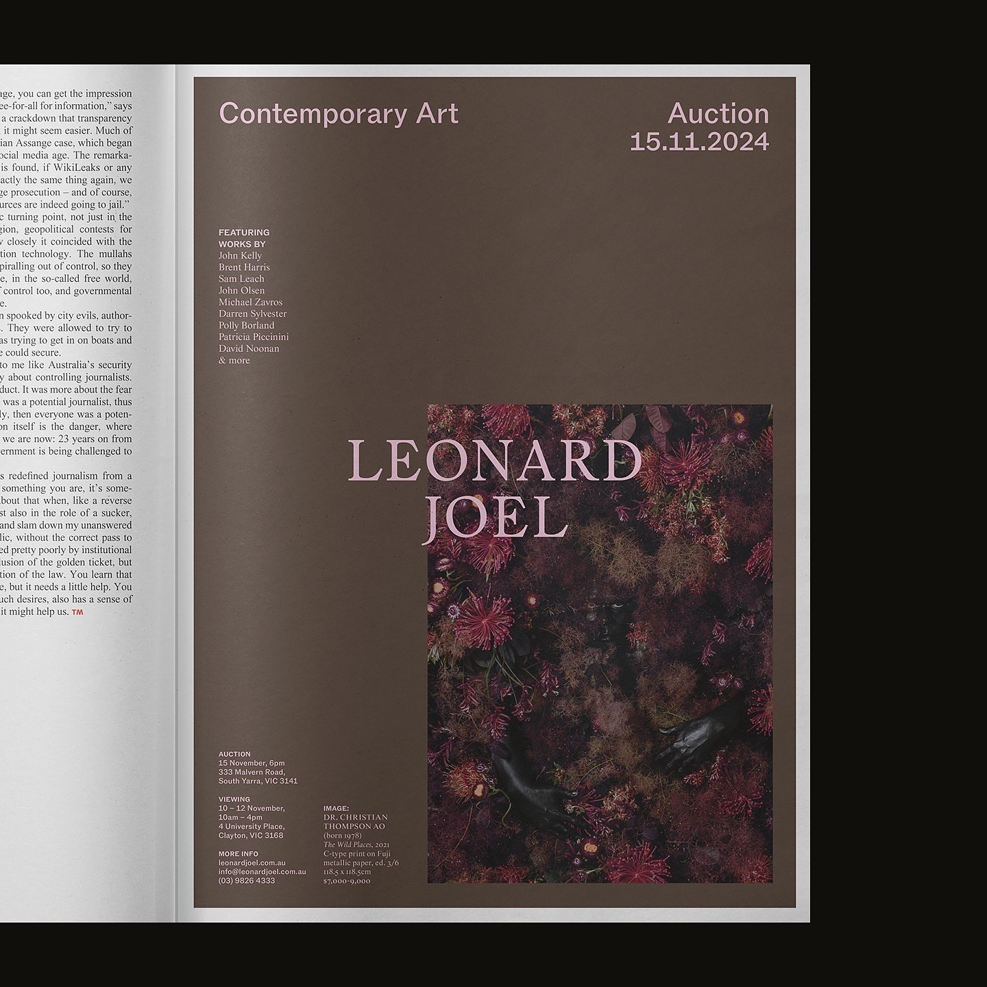
Leonard Joel, one of Australia’s top auction houses, refreshed its identity with Studio Doherty. The concept “Everything old is new again” blends heritage and modernity.
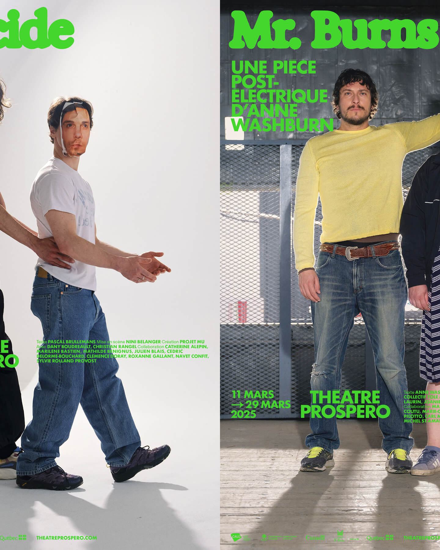
“After all, being together is revolutionary.” That was the main idea behind the 2024-2025 season campaign for Théâtre Prospero, directed and designed by Principal Estudio using Exposure.
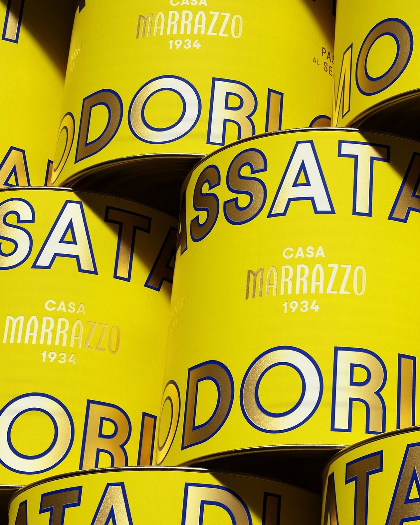
A clean layout, lots of gold, and the Avantt typeface were the elements that the Italian agency Auge Design used for these canned foods full of tradition and flavor.
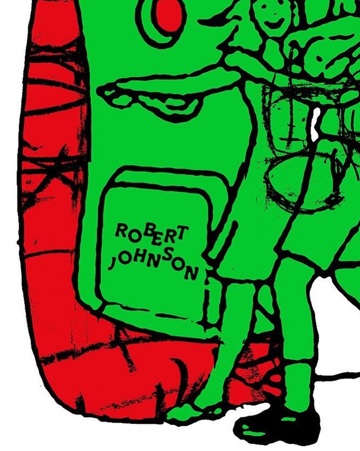
The Robert Johnson Club kicks off the 2024 season with these posters designed by Dominik Keller Studio. Typography used is Cosplay.
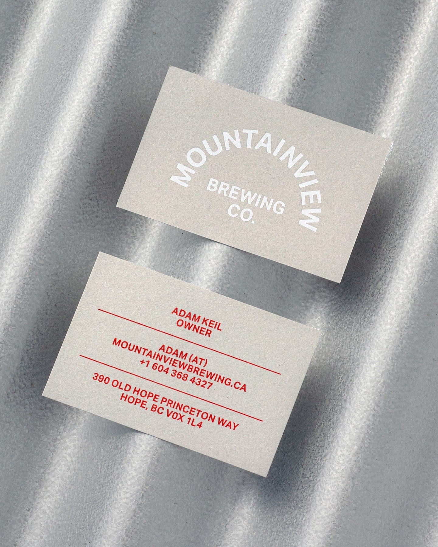
Memory Studio was inspired by vintage elements, like old book covers, and used Aktiv Grotesk to create the identity for this craft brewery.