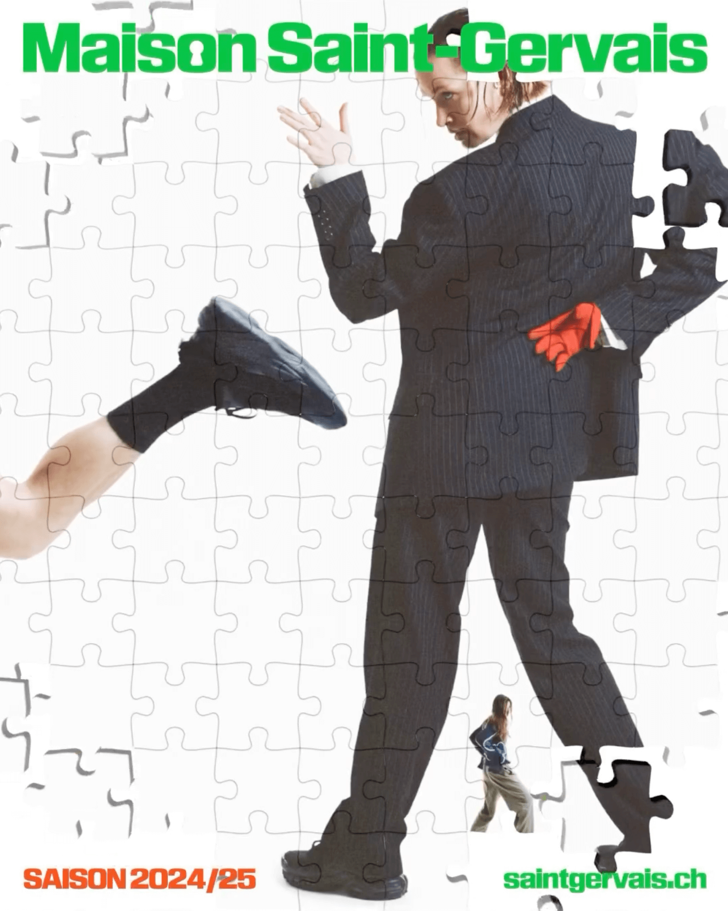
The Swiss graphic design studio Dual Room renewed the image of the Maison Saint-Gervais theater, using KTF Rublena Black.
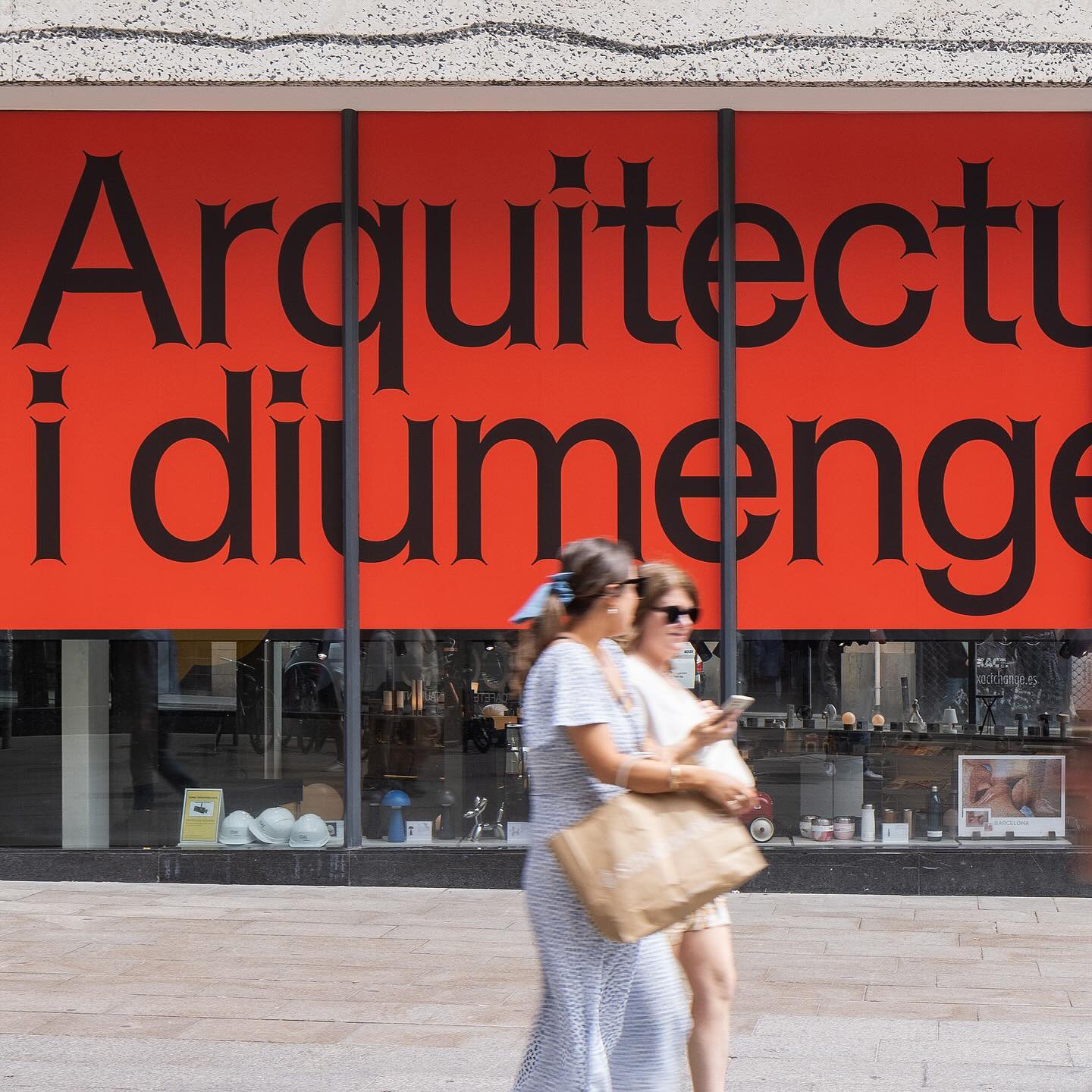
Graphic design for different spaces of this exhibition at the Architects’ Association of Catalonia, by PFP Disseny. Using Helveesti by Dinamo.
Workbyworks Studio designed this unconventional serif typeface and visual identity for Steffan Studio.
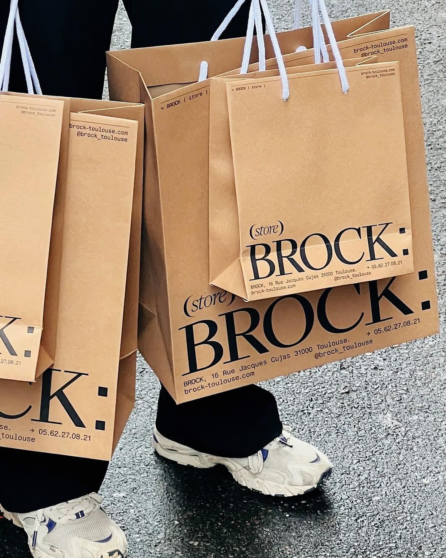
Quatrième Étage revamped the visual identity of the iconic Brock store, selecting the ES Face typeface for its logo, a 19th-century inspired serif with contemporary finishes.
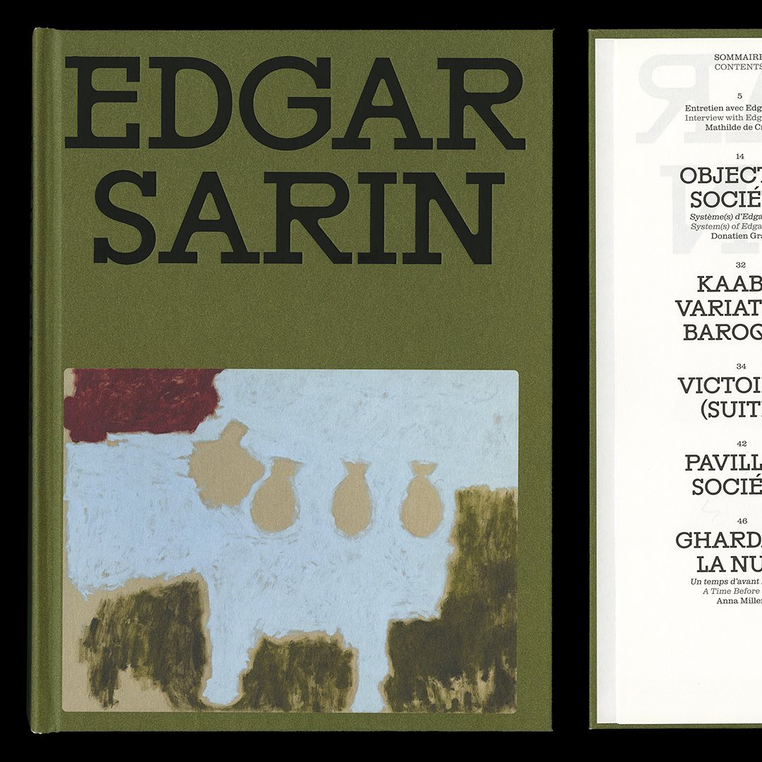
Resonanz B by Out of the Dark and Clarendon Graphic were the typefaces selected by Lisa Sturacci for the editorial design of this book about about Edgar Sarin’s work.
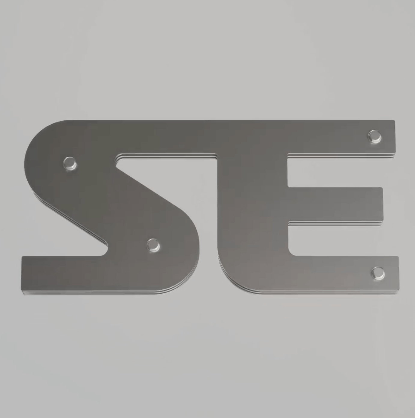
Apparat Bold + Buch Schmal, both from Kimera, were part of the update newkid made for Standard Equipment, a system of household objects.
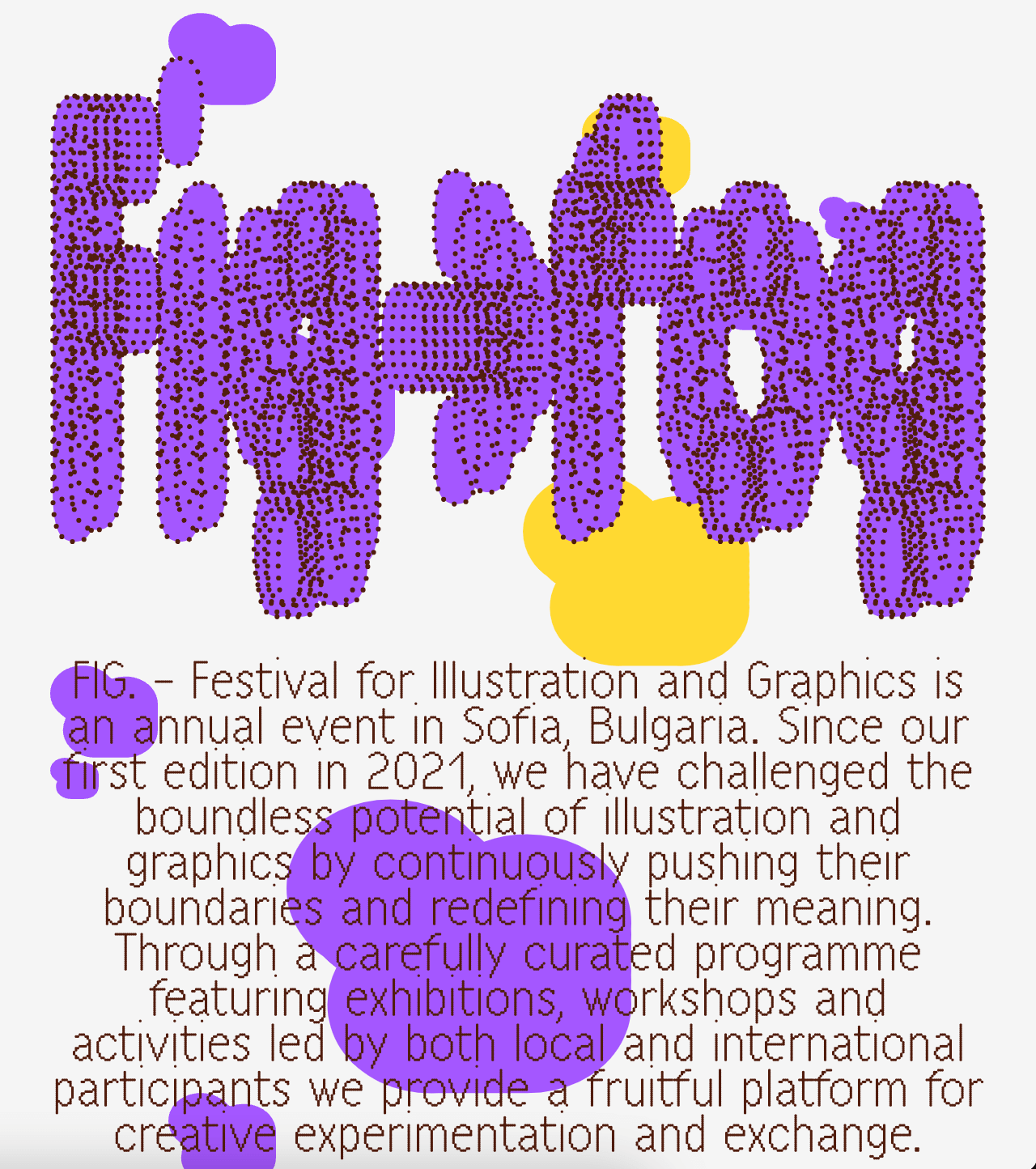
A festival that explores visual creativity to the point of blurring the lines between illustration and graphics; Miroslav Zhivkov created the identity of FIG (Festival for Illustration and Graphics) using Harber.
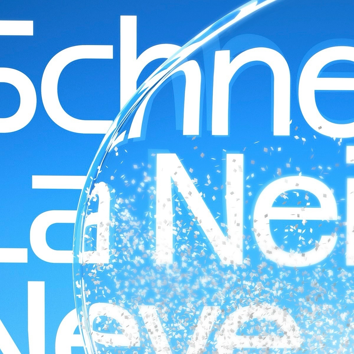
Maison Standard used Azeret from Displaay Typefaces for the identity of this exhibition at the National Library of Switzerland, which explains the impact of snow on our society.
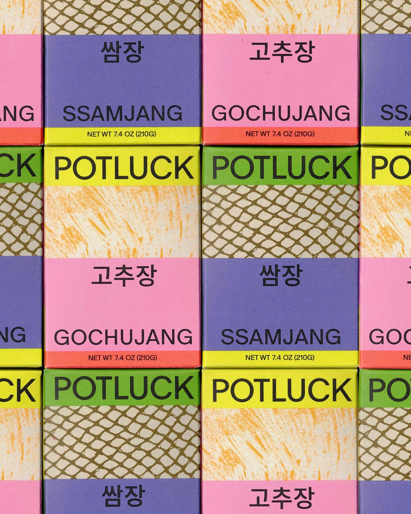
Regrets Only created a visual identity just like Potluck works; bringing together various elements to create something from scratch. Oracle is used as the primary typeface and Source Han Sans as the secondary.