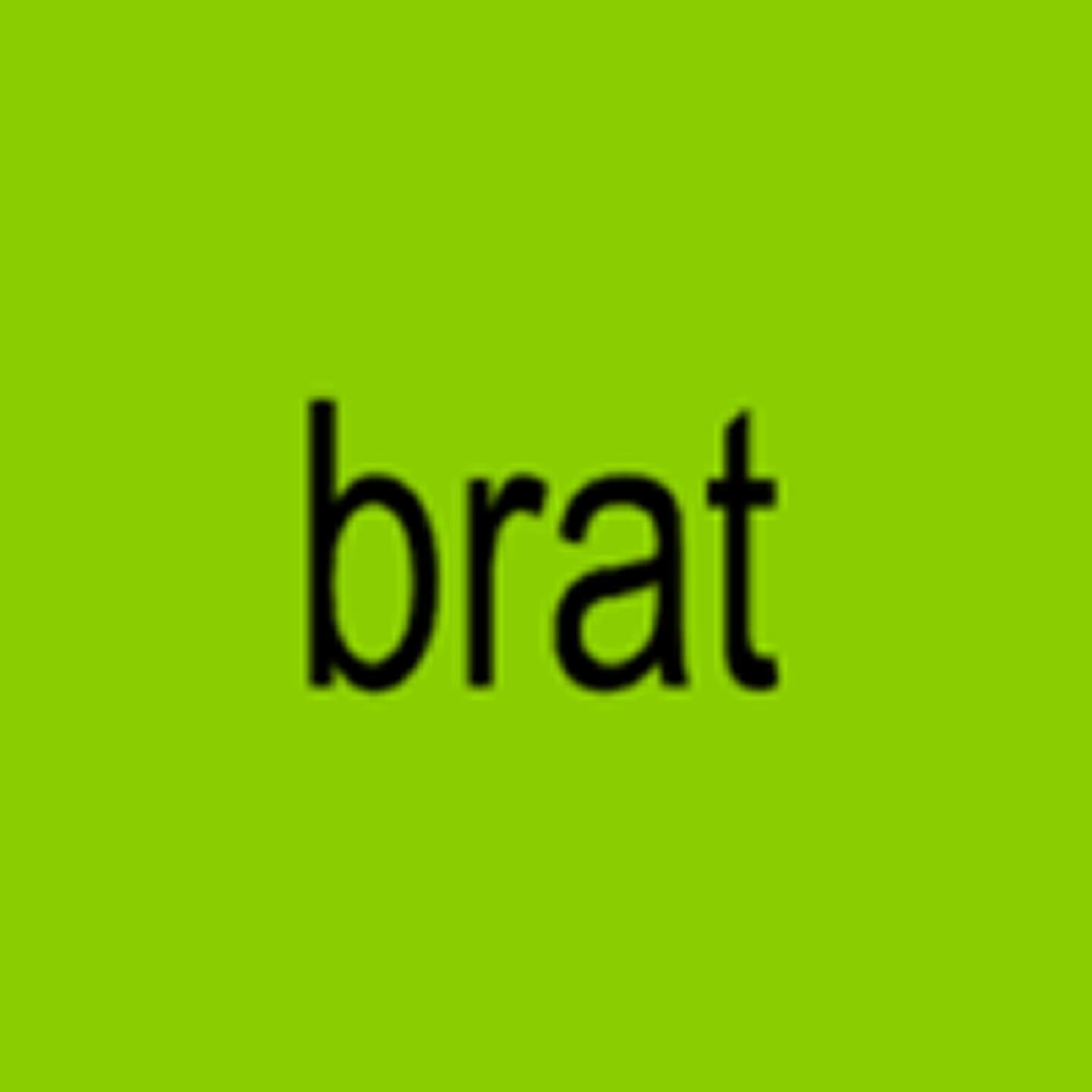
How should an album cover NOT look? Special Offer and Charli XCX decided to answer this question by stretching the word “brat” in Arial. ROM Mono by Dinamo and Neue Haas Unica by Linotype are used in the interior texts.
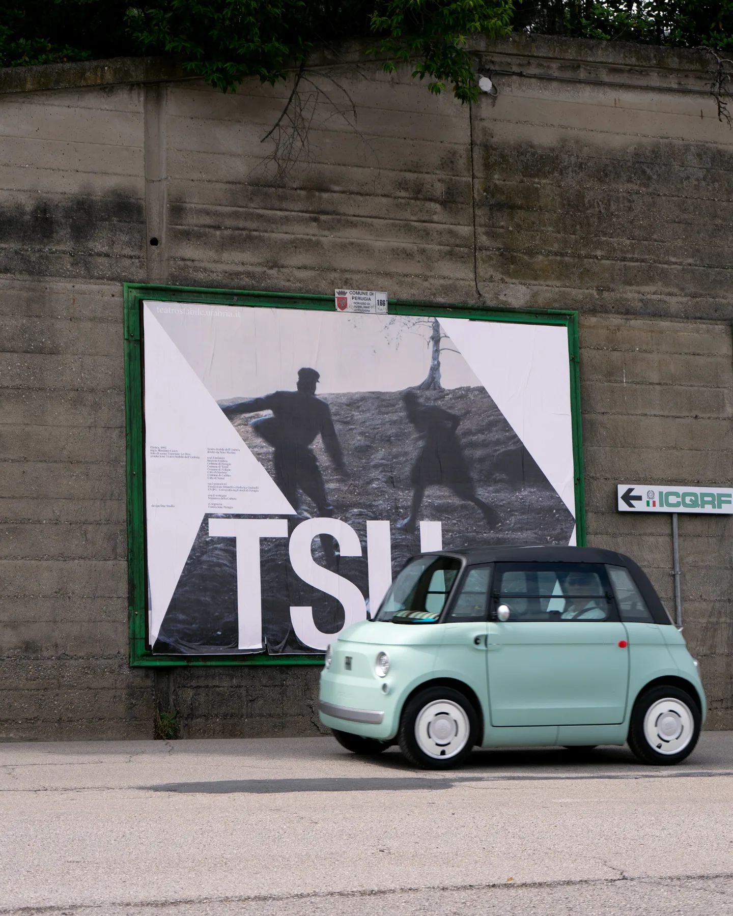
Suisse Int’l Condensed used for this strong and dramatic identity for the Teatro Stabile dell’Umbria. Designed by Due Studio.
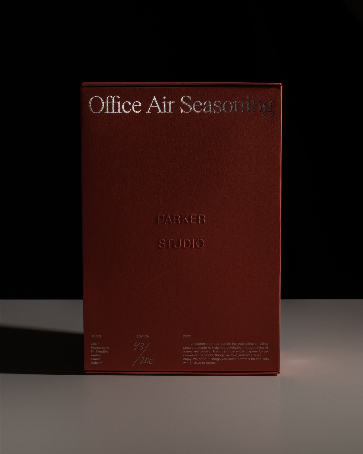
Parker Studio said goodbye to 2022 with this candle, made in collaboration with Imprimerie du Marais. The packaging uses Chalet Book, along with the first printed use of Parker’s PS Times.
Moser Crystal launched an autumn collection, and Studio Marvil designed its image using the Atlantic typeface from Heavyweight.
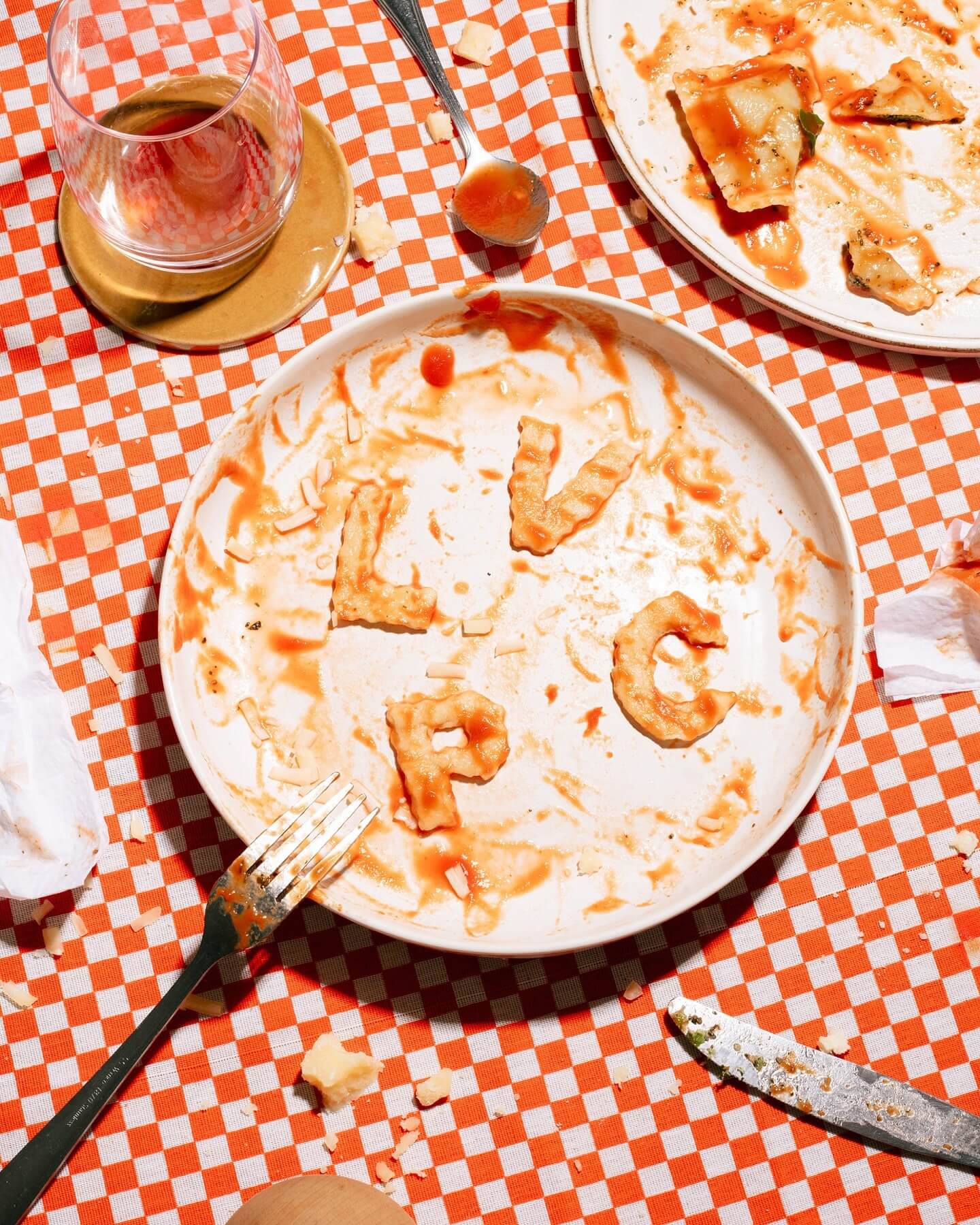
Andrés Higueros designed this custom typeface for the private dining experiences hosted by La Vera Pasta.
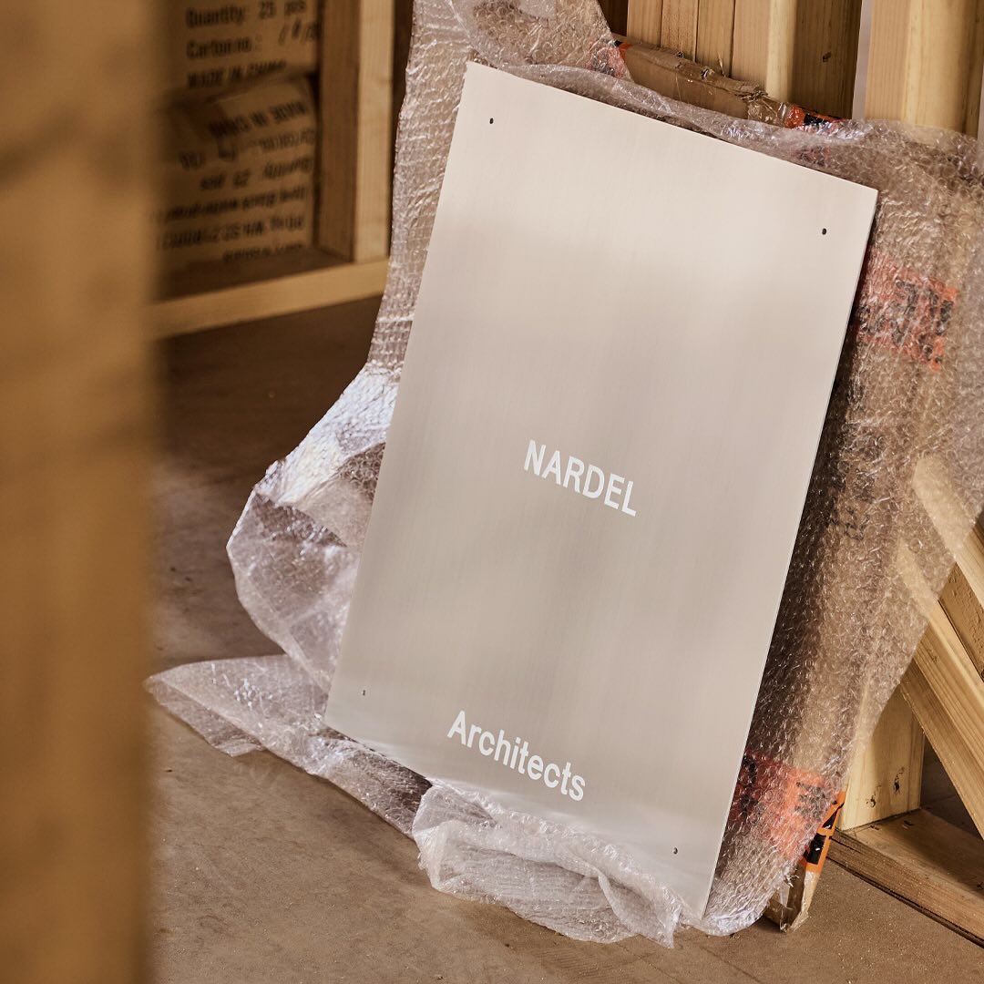
Simple and subtle; Both Studio created a brand identity that aligns with the proposal of Nardel Architects.
New typefaces for the new identity of the production company L’Éloi; Principal Studio chose Review by Commercial Type and Skandia by Store Norske Skriftkompani.
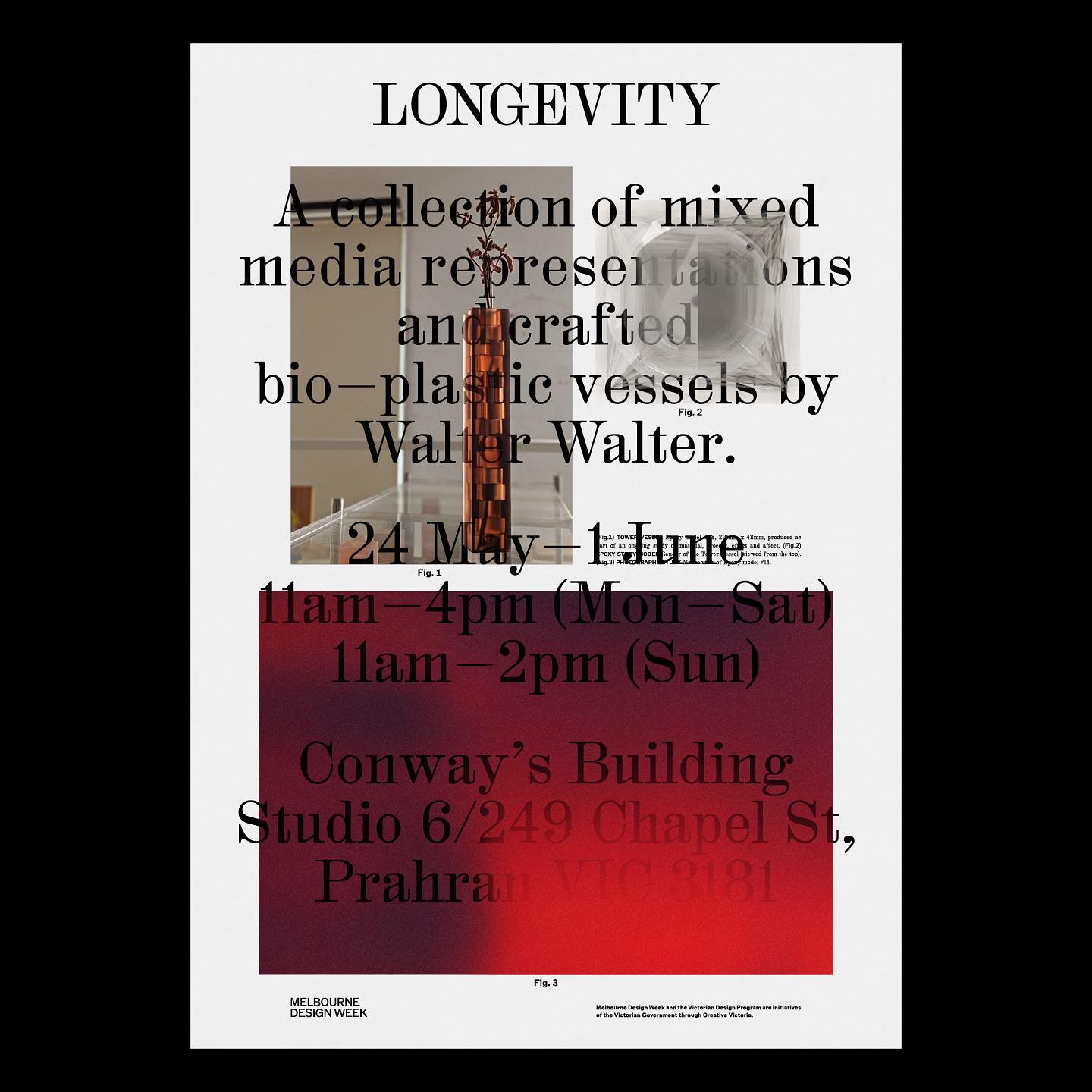
M. Geisser used HAL Colant from HAL Typefaces and ROM from Dinamo for the poster and invitation for the Walter Walter Longevity exhibition.
Vibrant and loud, just like the conversations after an excellent dinner in Italy, that’s how Grand Bacàn Sans is, a custom typeface created by Pentagram for the Italian restaurant in Brooklyn; Bacàn
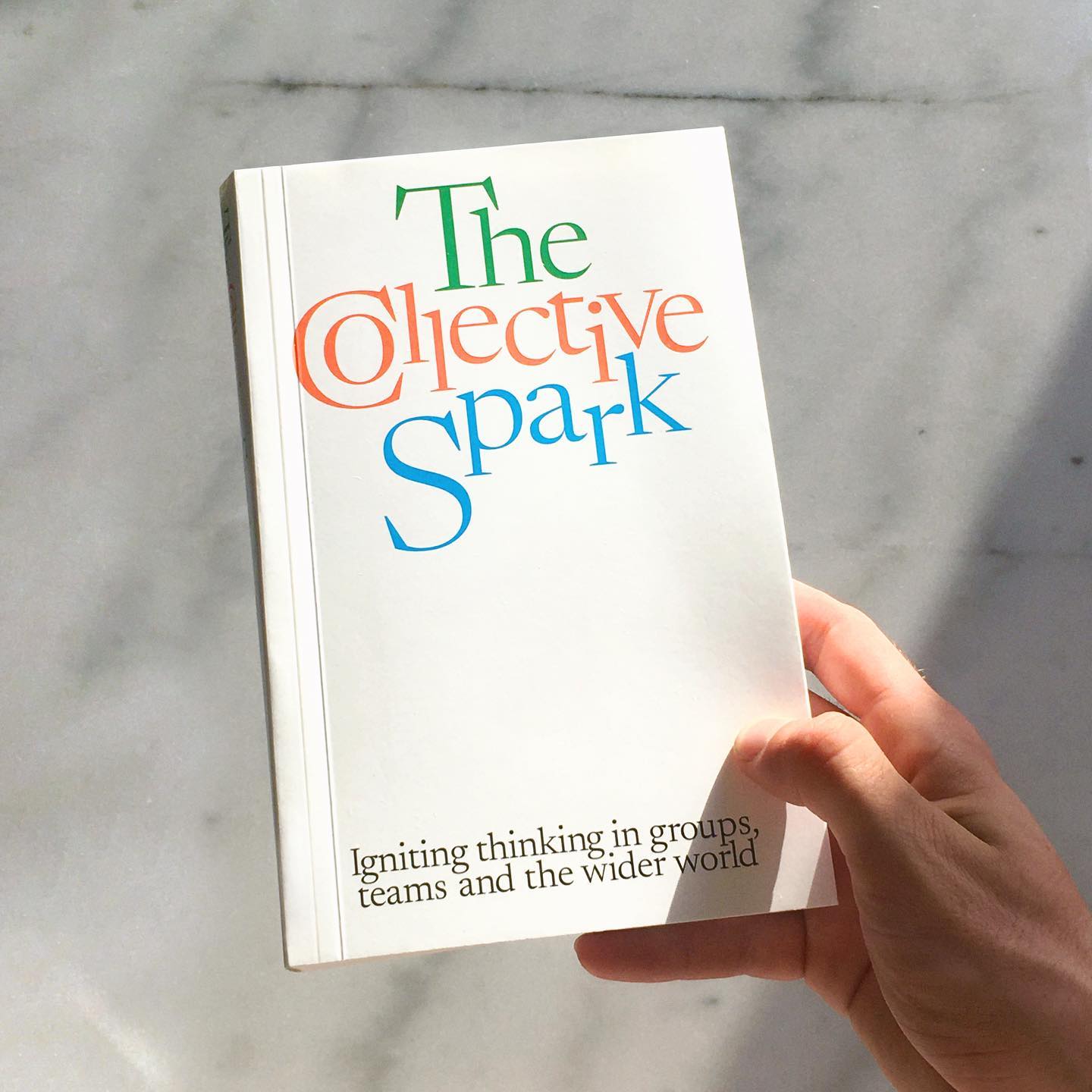
Newsreader by Production Type on the cover of this book addresses collaborations and how to coexist with other ideas.