Low key Design Company used Boris by Giulia Boggio to complement this identity for a friendly, relaxed, and gentle café, just like a wandering sheep.
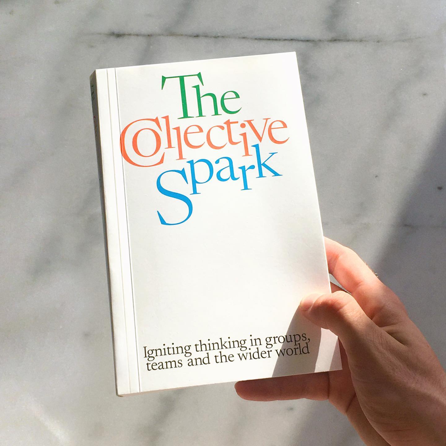
Newsreader by Production Type on the cover of this book addresses collaborations and how to coexist with other ideas.
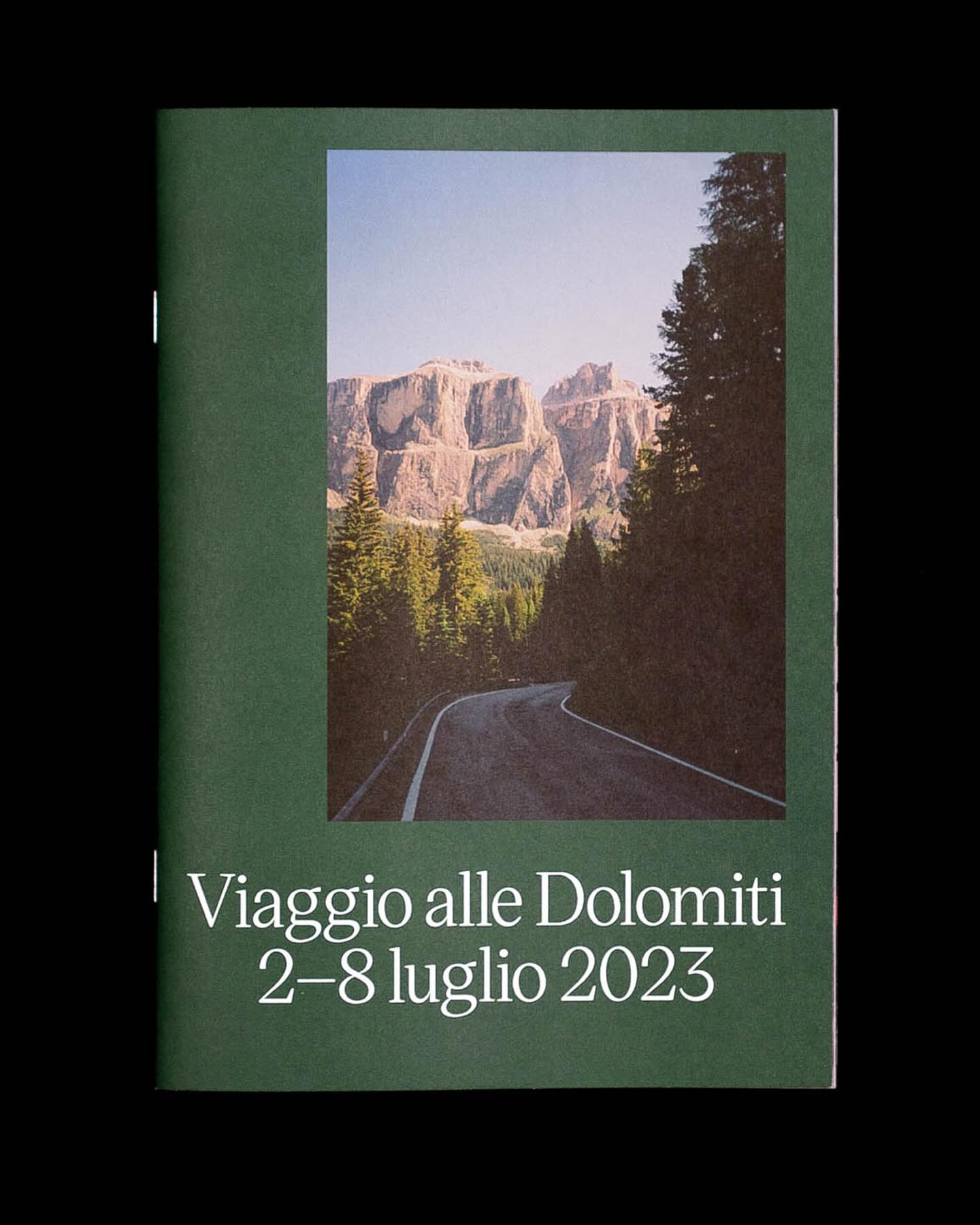
Victor Serif by KOMETA accompanies the photographs taken on a cycling trip with friends in this booklet designed by Familia.
Address Arts leveraged the possibilities of Exposure by 205TF, a variable typeface whose weight was modified to achieve a solid and heavy logo.
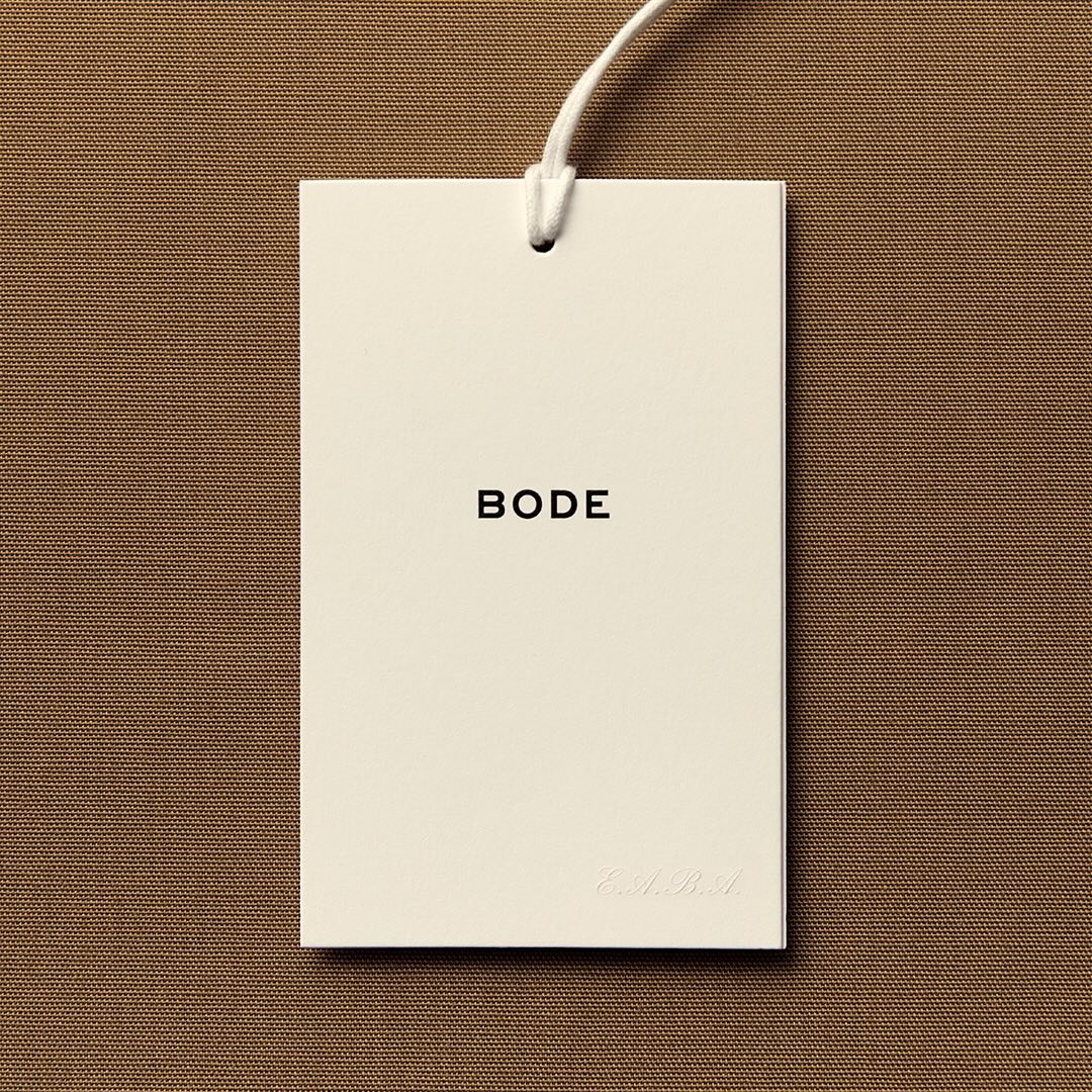
With the minimal amount of elements, Eric Wrenn designed the logo and visual identity for Bode, a New York-based clothing brand.
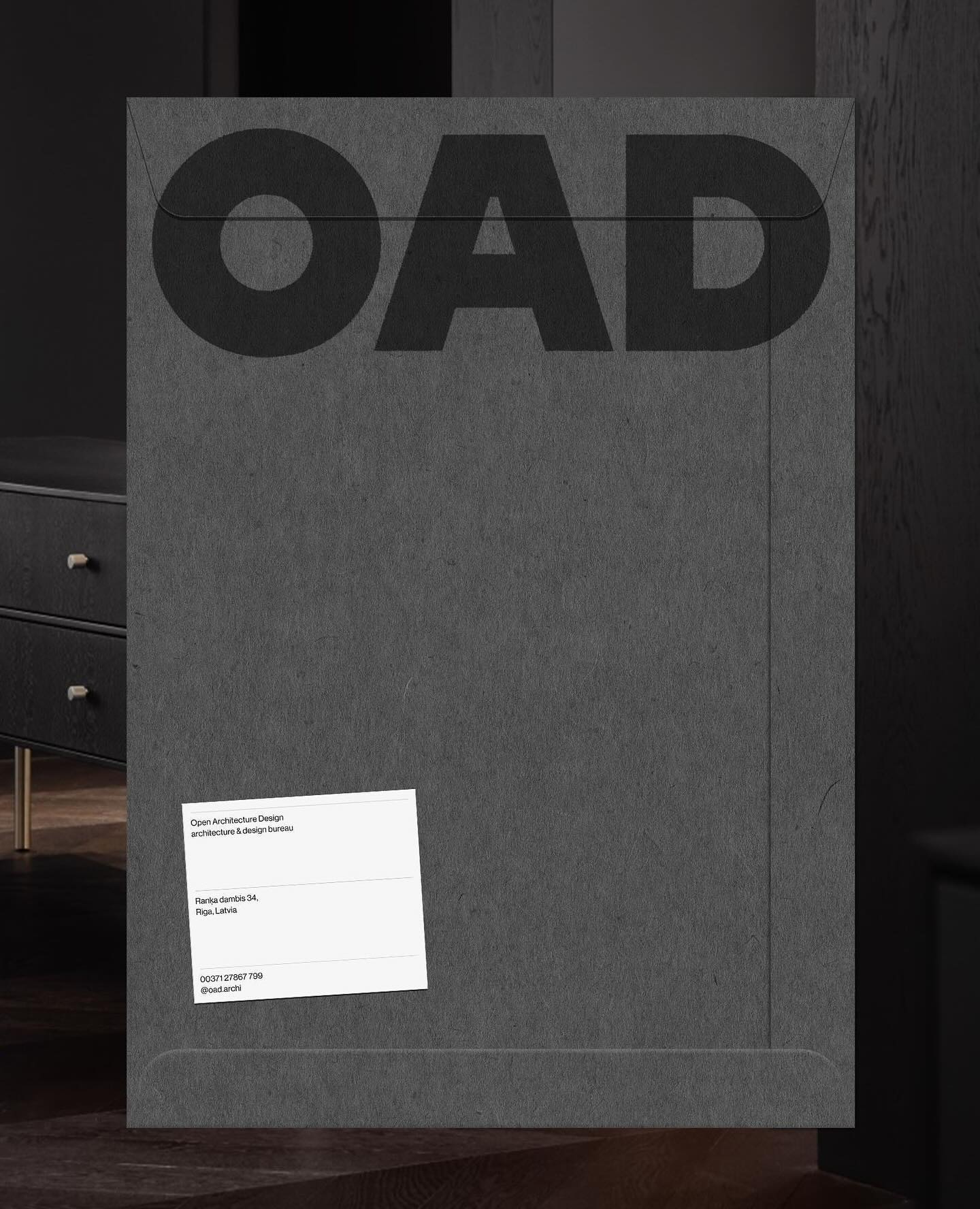
Just like its proposal, OAD (Open Architecture Design) has a strong and impactful lettering as a logo, complemented by Neue Haas Grotesk in its regular weight.
For the past 3 years, Chejo and SHDW studios have been sharing lunch, and in this book, they compile the recipes they’ve made. Serial A from DumDum fonts is used as the main typography.
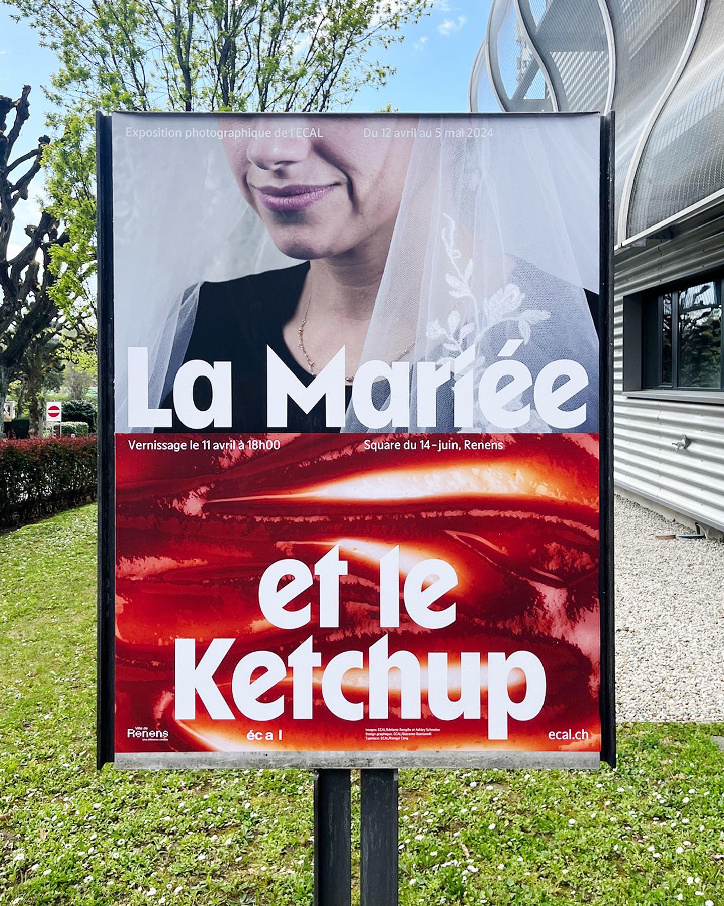
WaterPolo Display by @dontnotdon was used in this series of posters portraying the ordinary and extraordinary aspects of Renens.
For a constantly moving entity like the PAC (Performing Arts Centre), Porto Rocha, together with AllCaps, created this strong and timeless typography as part of its new visual identity.