“Typography has always been approached, as the journey or the way to get to it was through branding. That’s where everything started, and as you know, they are things that are closely related.”
How's it going Jonathan and Rodrigo, how has the first half of the year been for you?
Really great! With new opportunities, new experiences, a great deal of learning, and the chance to meet amazing people. Plus, there's a lot of work ahead! And with several changes that will help Non Foundry in a positive way.
Tell us a bit about your background before getting into typography.
"Actually, there has always been an approach to typography, as the path, or the way to get to typography was through branding. That's where everything started, and as you know, they are things that are closely related."
How did the idea of creating a foundry come about and what was the decision behind seeking a partnership?
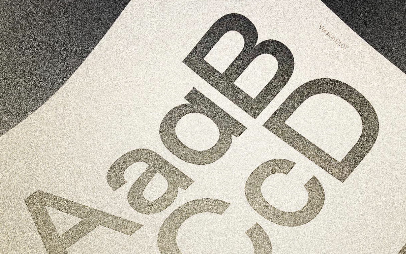
To be honest, having a Foundry wasn't an option, in fact that idea wasn't even on the table, it just happened. Originally, Non Foundry was going to be a graphic design studio "specialized" in branding with a completely typographic focus. But when I was working on the typography for Non's identity (Non Sans), I started to develop a love for typography, and I devoted all my time to it. I completely forgot about branding, hahaha. From then on, I delved deeper into typography, and started working on new families such as Non Sans, Non Ophélie. It's not the most beautiful or striking story, hahaha, but that's how Non Foundry started.
Are you currently fully focused on designing typefaces?
Not at the moment. It is shared with other jobs. These are jobs that complement each other well and still have a relationship with typography and design in general. I don't know, maybe this could change in the medium or short term, I'm not sure exactly.
What is the vision that NON FOUNDRY has for all its projects?
The functionality/aesthetics relationship. An important aspect of typography is its functionality, but this does not contradict its aesthetic component. After all, typography is a product.
Have you noticed a gradual increase in clients approaching NON FOUNDRY looking for a custom typography for their projects?
Yes, this year has been surprising! For example, we had the opportunity to collaborate with a very important company, which was a great challenge and was faced in a great way. It was truly a wonderful and enriching experience, full of learning!
What is the biggest problem you usually face as a type foundry? And what has been the way to solve it?
The biggest problem is to establish a solid foundation, but not only for a foundry, it is the main problem of any business. For Non, the way to solve it was through the philosophy of work and dedication. This philosophy has given everything that Non is so far, and there is no other way to keep moving forward, with a lot of work and dedication.
What expectations should students or new designers have when approaching typography?
With the expectation of learning. Typography is constantly updating, especially with all the digital aspects involved. There are many tools that help with typographic design, from theoretical to practical aspects. There are even tools that invite you to explore beyond, such as variable fonts, SVG color fonts, among others. I'm mentioning some simple things, but the world of typography is very surprising. Many enriching events occur in the community, which inspire you to continue researching and learning every day.
What's on the horizon for NON FOUNDRY?
There are many things coming up for NON FOUNDRY for the remainder of the year, for example, the launch of the new website along with a new Sans-serif typeface. In addition, a new update for Non Natural will include language support for Cyrillic, Vietnamese, and Greek for both versions, Inktrap and Plain. The re-launch of Non Ophélie Display with more weights, its text version, and its italic versions. It will be a strong and I think solid end of the year.