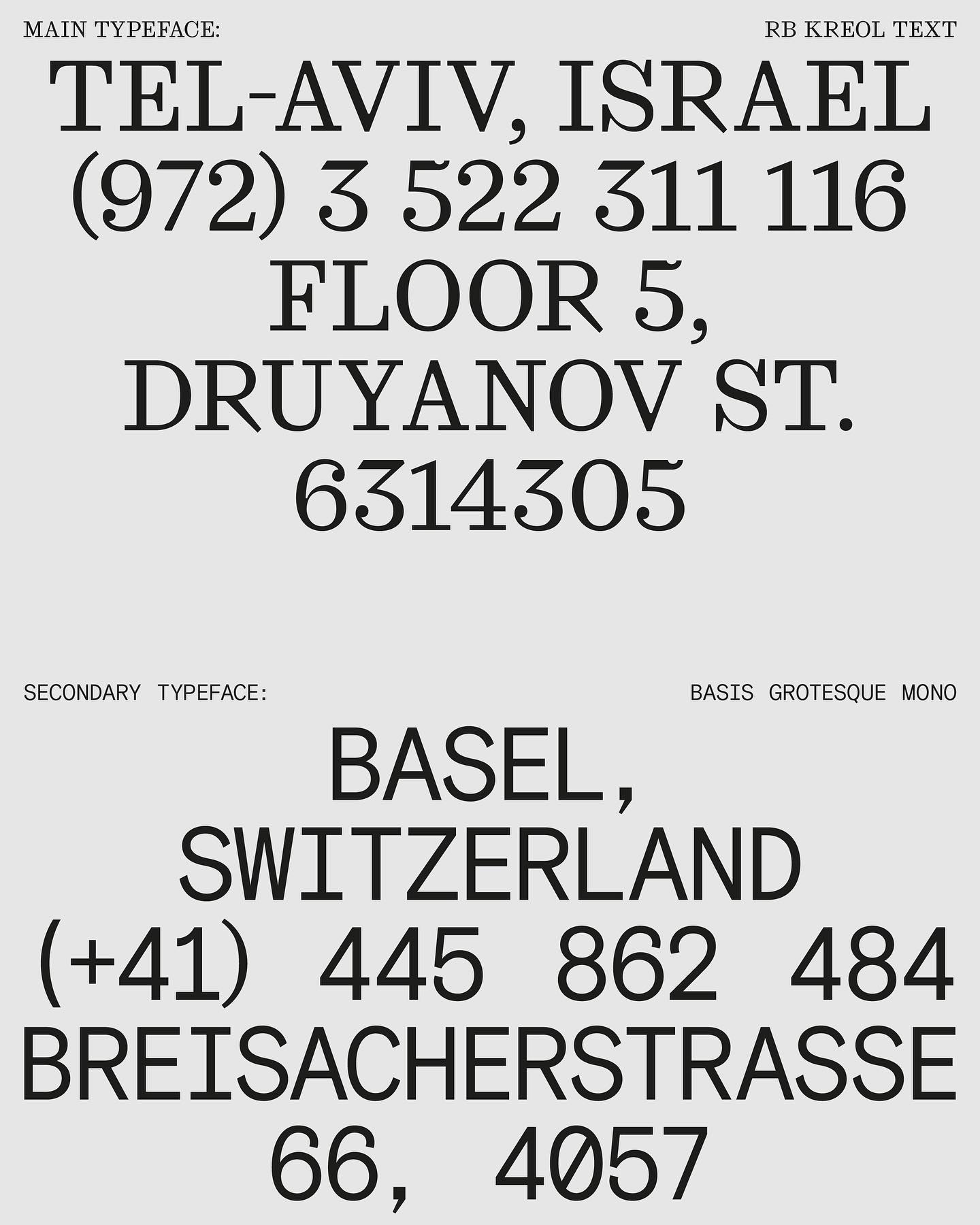
In this website with two main columns constantly changing size, Atipus Studio used RB Kreol Text from Studio René Bieder.
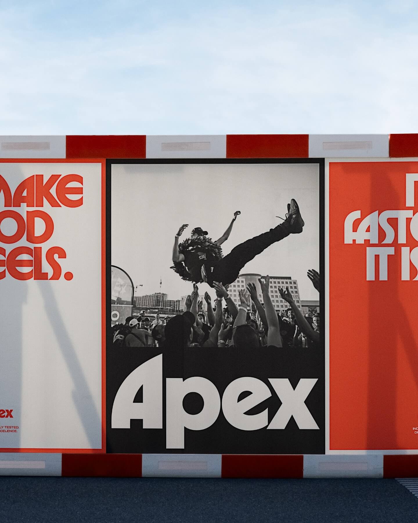
Seeking to stand out in the market, Gold Font created this custom logo for Apex, a premium tire brand, inspired by ITC typefaces.
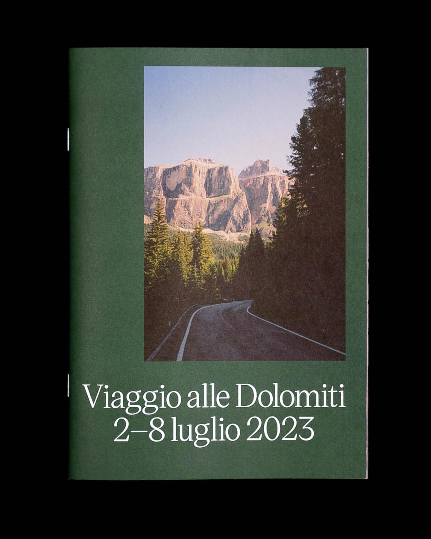
Victor Serif by KOMETA accompanies the photographs taken on a cycling trip with friends in this booklet designed by Familia.
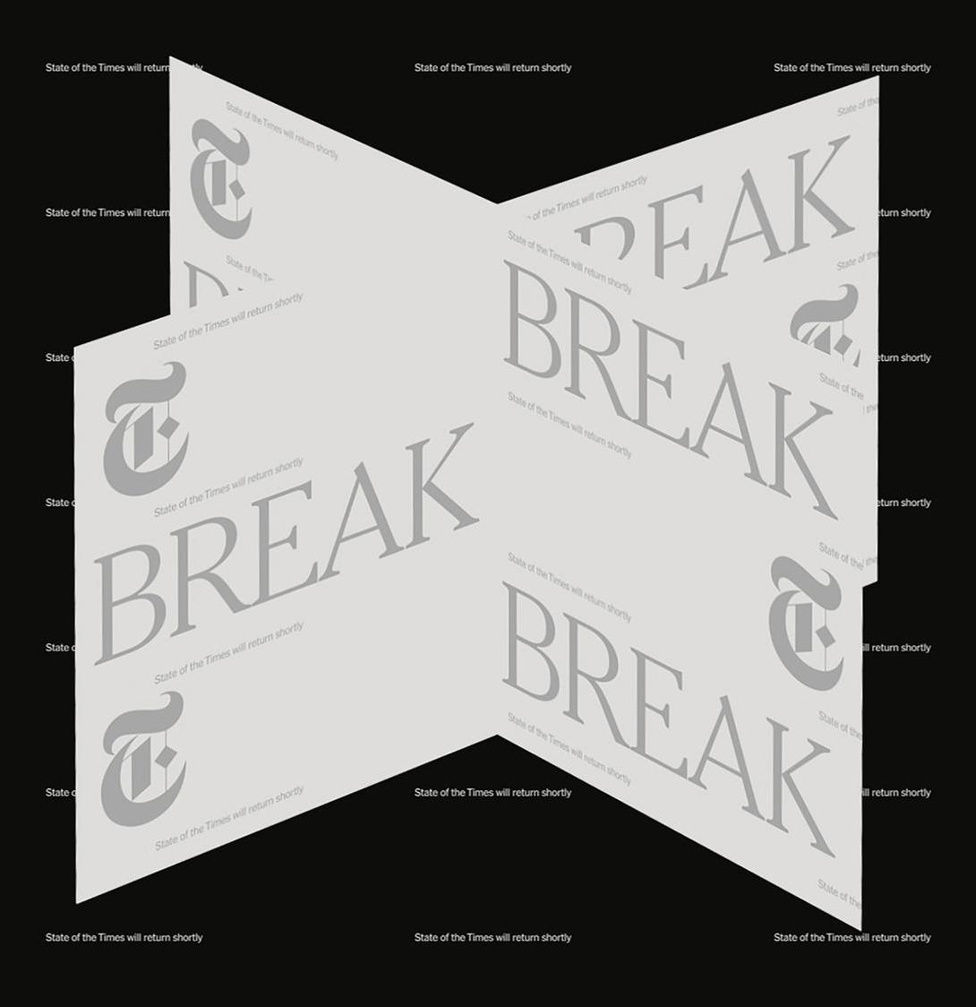
In the identity of this major NYT event, two of its typefaces were combined: NYT Franklin representing the business aspect, and NYT Cheltenham representing the newspaper and news.
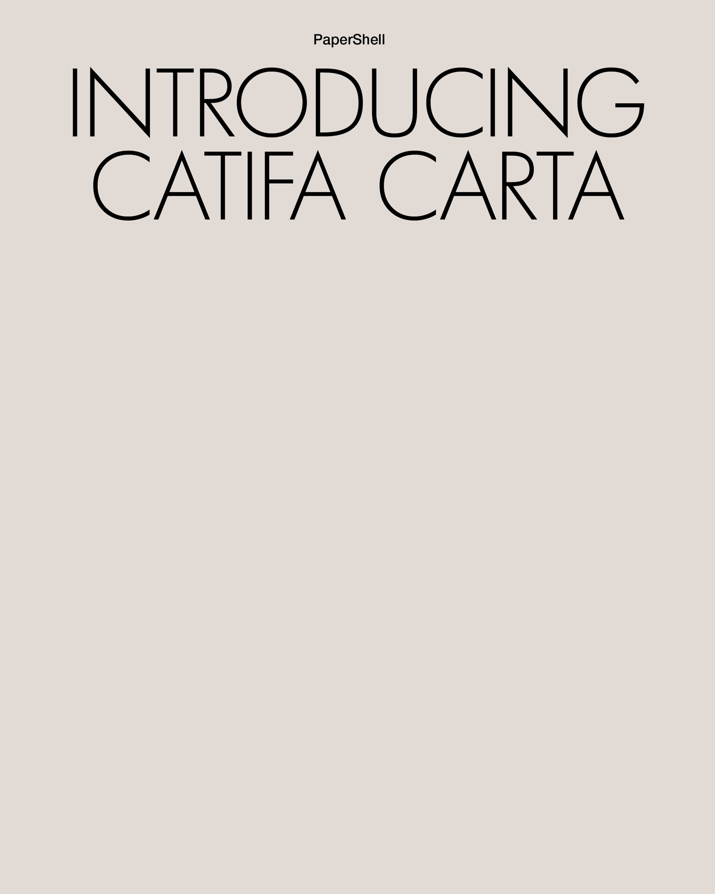
Lightweight like its structure and organic like its composition, Clase BCN proposes using Futura LT Light for headlines and Helvetica Neue for body text in the narrative of Carta Catifa, a chair made with biodegradable materials.
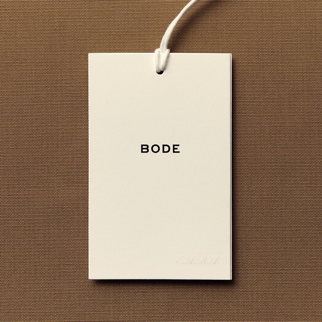
With the minimal amount of elements, Eric Wrenn designed the logo and visual identity for Bode, a New York-based clothing brand.
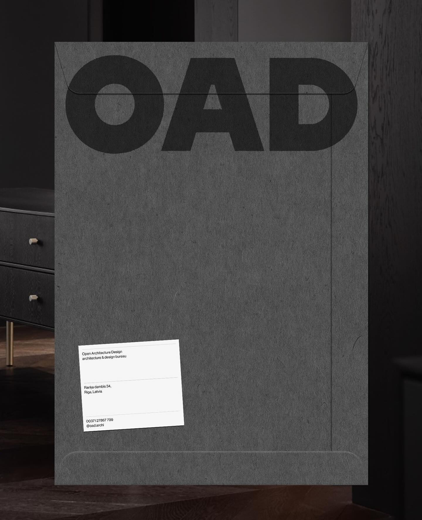
Just like its proposal, OAD (Open Architecture Design) has a strong and impactful lettering as a logo, complemented by Neue Haas Grotesk in its regular weight.
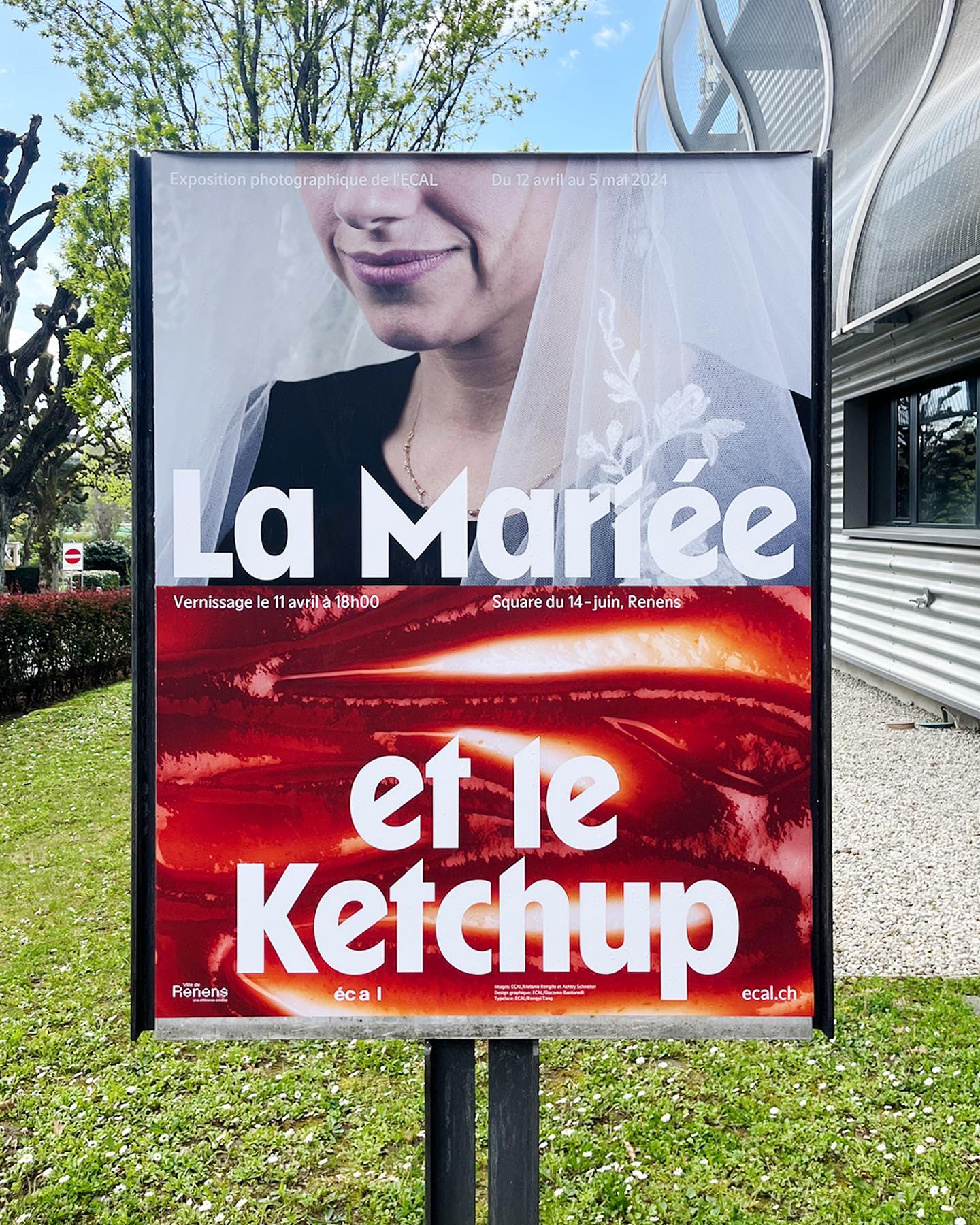
WaterPolo Display by @dontnotdon was used in this series of posters portraying the ordinary and extraordinary aspects of Renens.
For a constantly moving entity like the PAC (Performing Arts Centre), Porto Rocha, together with AllCaps, created this strong and timeless typography as part of its new visual identity.