In any field, but especially in the creative one, experimentation is one of the necessary tools and sources of inspiration to continue producing and achieving different new results. This is also the case in typography, where, although there are options to modify fonts and try drawing with digital tools, the expressiveness that comes from manipulating a physical tool by hand is hardly comparable to the sensation, process, and result that digital options provide.
This is subsequently reflected in the final design of a typeface, which is evident in Hubsch and the impact it conveys at first glance. This font is the latest typographic product from The Northern Block, the independent English foundry led by Jonathan Hill with several years of experience in type design and production.
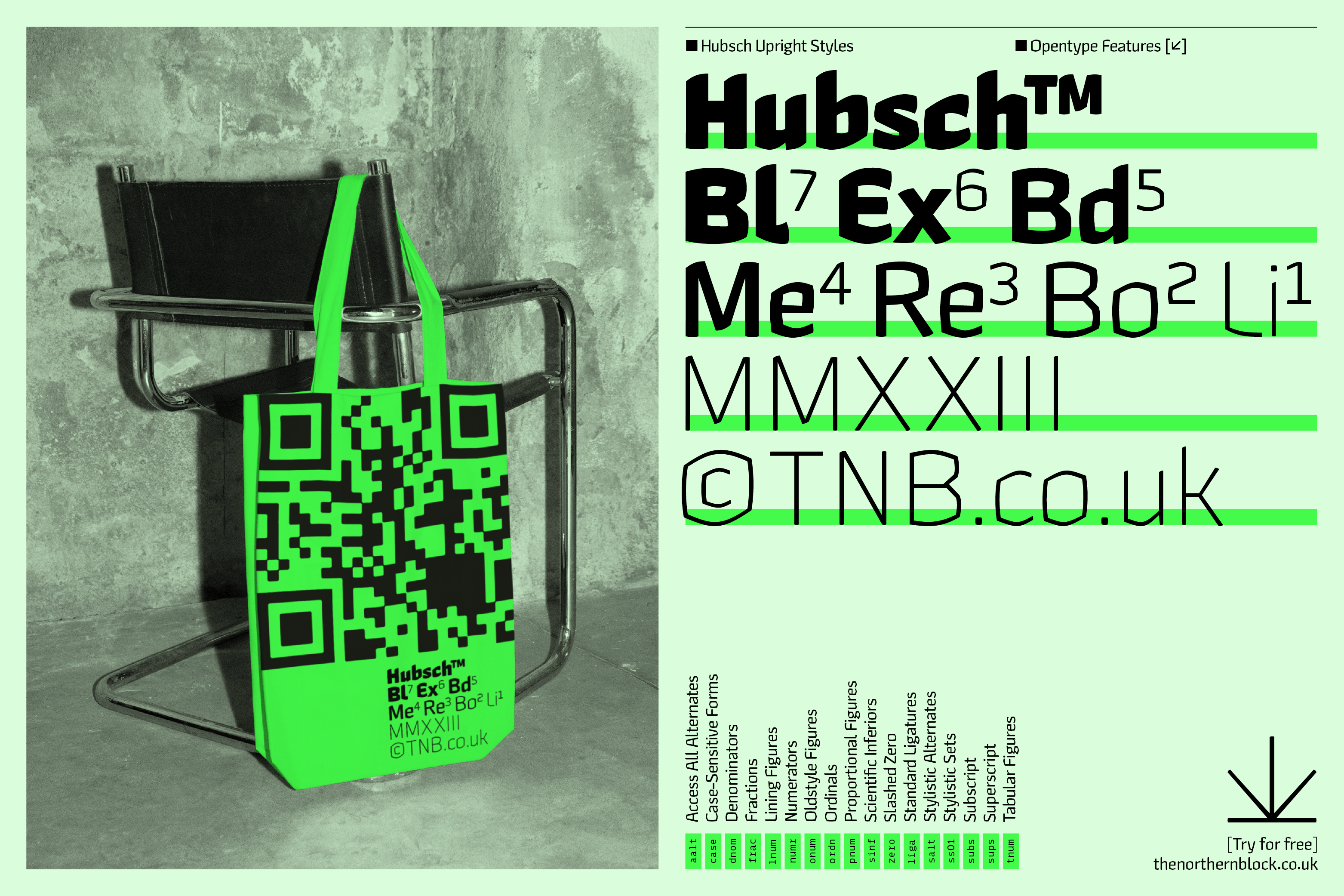
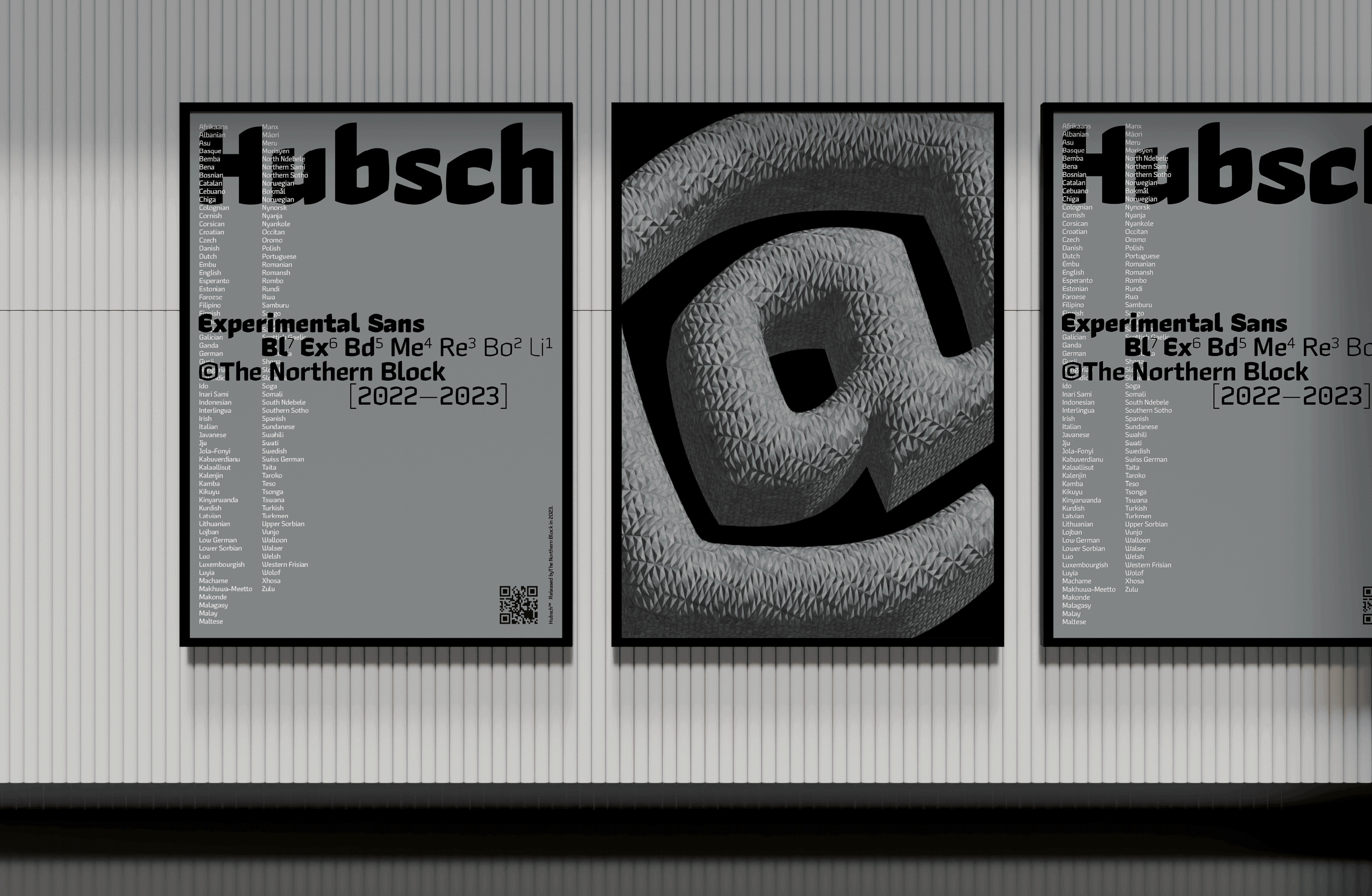
In its drafting, strokes were made with chisel-tip instruments; however, instead of the classic precision nibs or calligraphy pens, Jonathan used markers that essentially give us similar strokes but, being rudimentary tools, generate strokes of the same nature. This characteristic was used to obtain unique characters with personality.
The decision to use chisel-tipped markers is also rooted in admiration for artists who have used this tool to create their proposals. Hill specifically mentions Keith Haring and Banksy, two of the most influential artists in street art and the construction of social awareness.
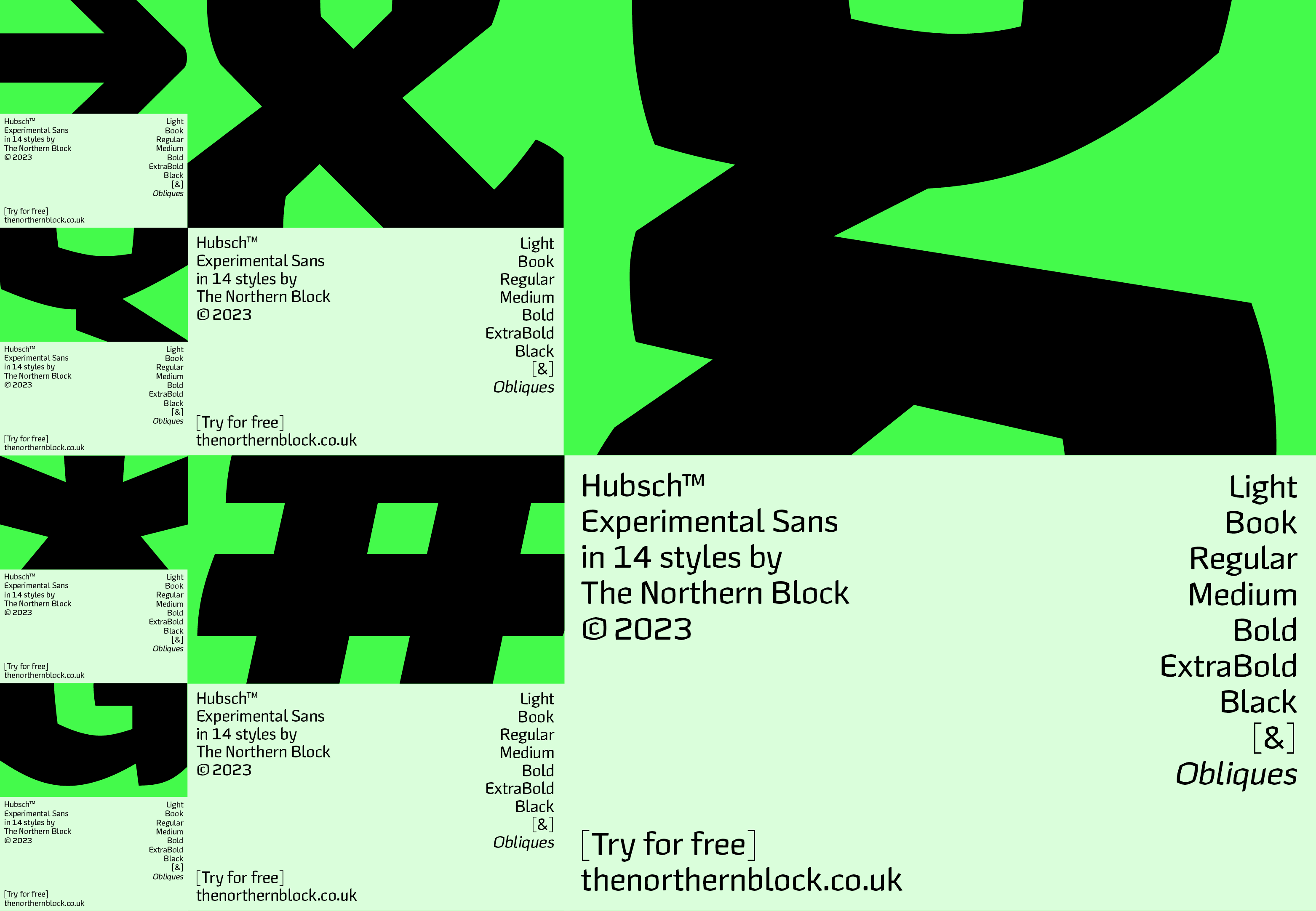
On the other hand, Hubsch is a typeface that stands out both graphically and sonically on its own. Its expressive name resonates as soon as you hear it. Hübsch is the German word for beautiful or pretty. Whether by chance or not, this typeface also recalls German Gothic letters due to its dense and black texture in its heavy versions: bold, extra bold, and black. In the light weights, it’s notable that it maintains the same vigorous spirit as the weights resulting from the movement and marks left by the markers. This can be attributed to the designer’s ability to interpret and understand the shape of the letters and then transfer it to a variable font.
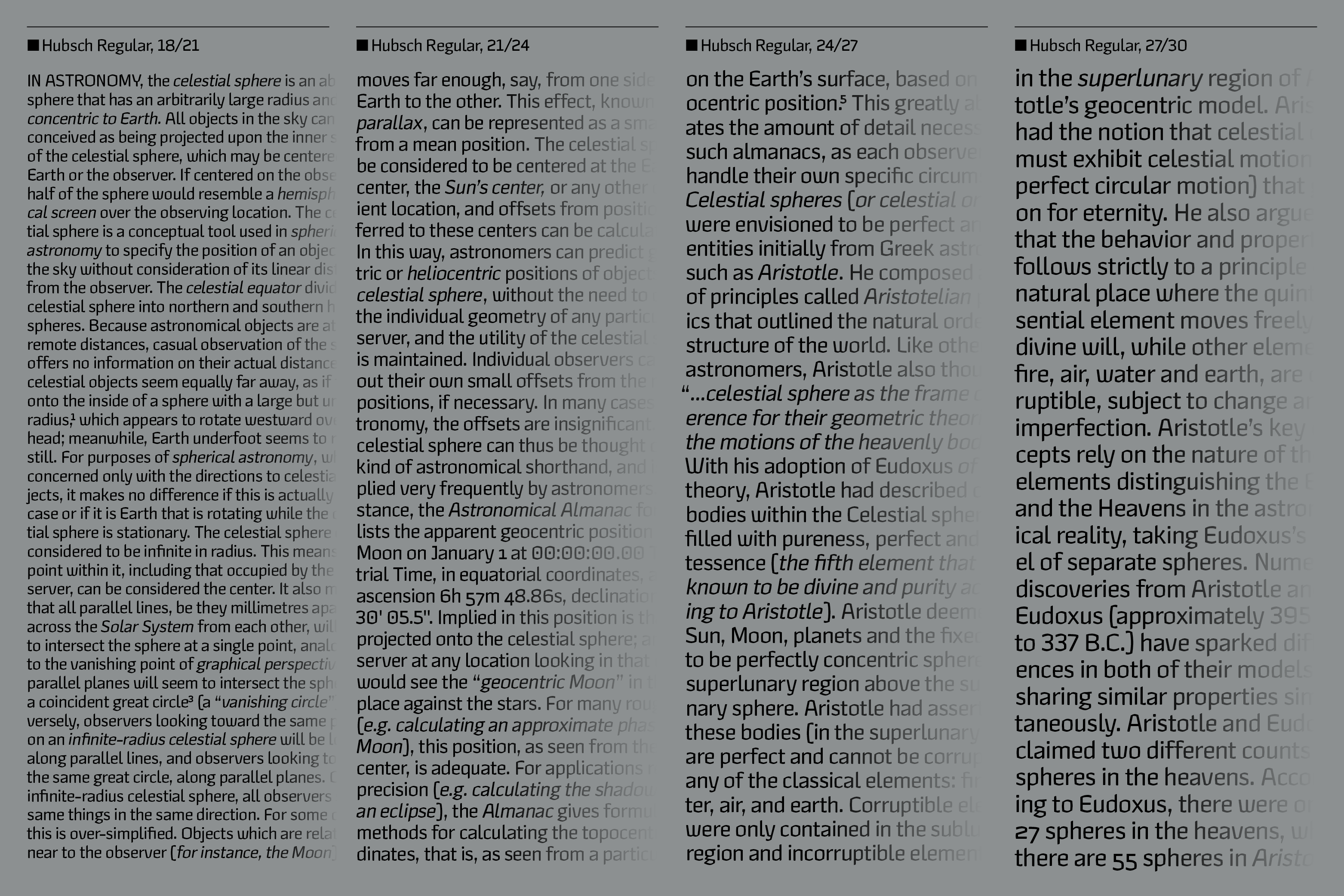
Due to its peculiar origin, Hubsch stands out among other typefaces and makes it difficult to classify, because as its author says, Hubsch plays by its own rules. At first glance, we could classify it as a decorative display type, but upon closer examination, we can individually appreciate how well each letter is resolved with its complex and abstract square shapes. Digging into the extensive repertoire of characters and styles it offers, it’s surprising how well this typeface reads in small to medium-sized text and long paragraphs.
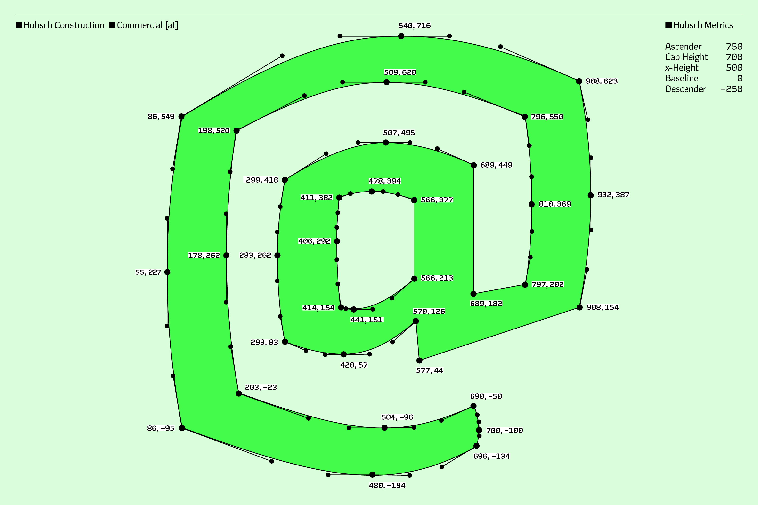
Throughout the alphabet, we observe sharp and forceful cuts at the letter’s vertices, with not much presence of fluid curves, giving it a strong and even brutalist personality. To this, we can add certain peculiarities, such as the distinctive tail present in letters like L, l, y, and t. As well as stylistic variants of e, o, and c, with energetic diagonal cuts.
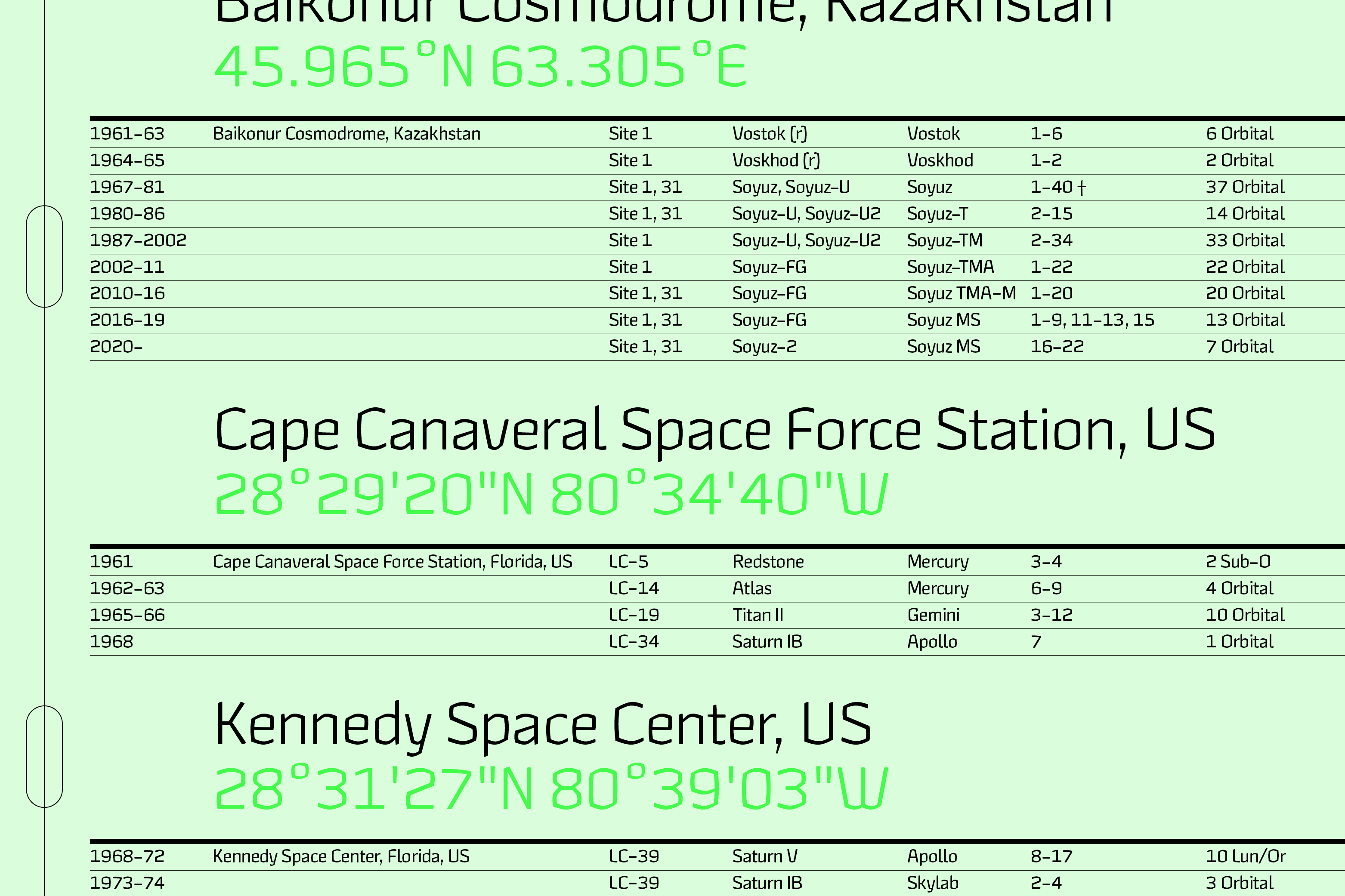
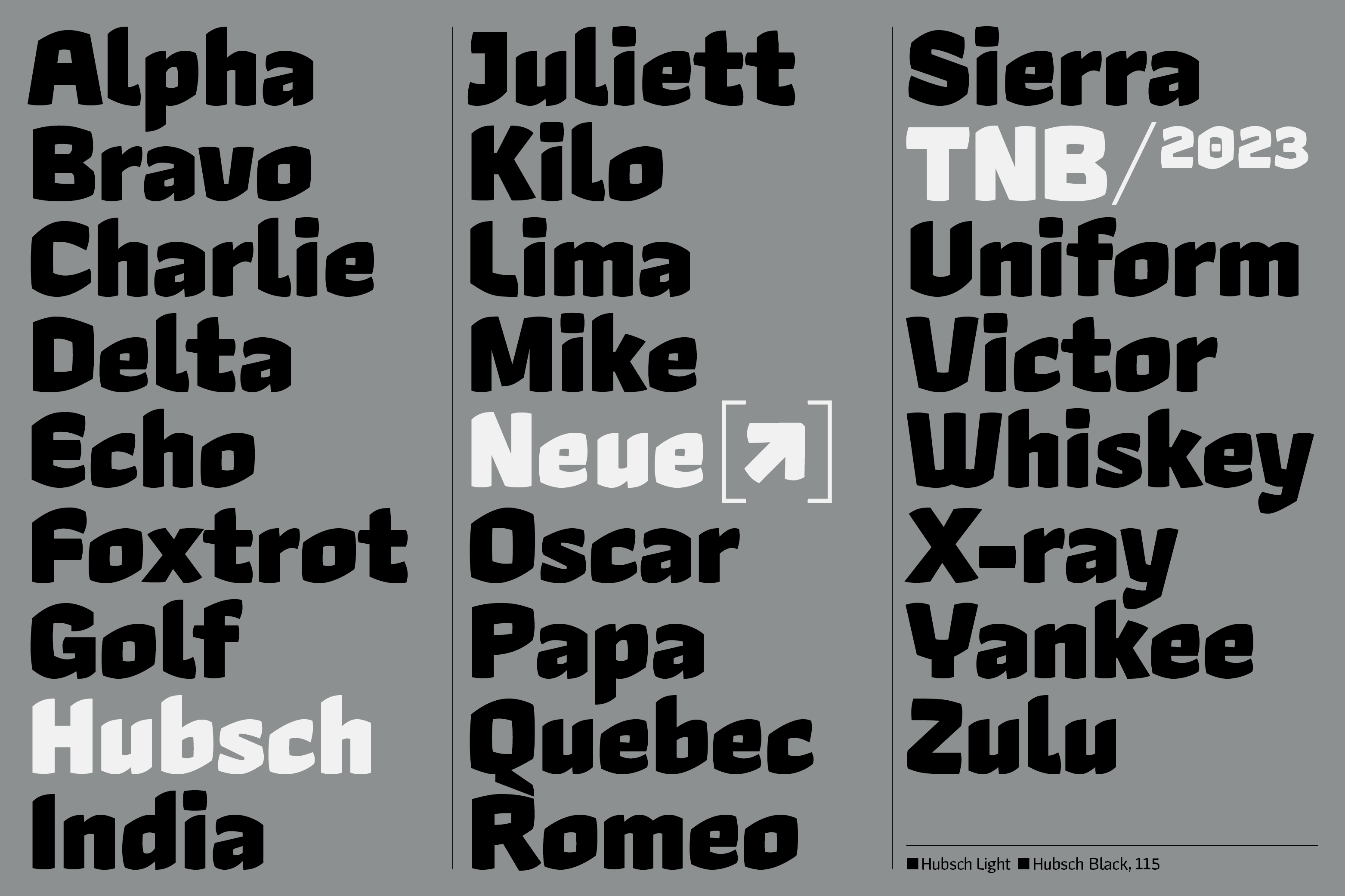
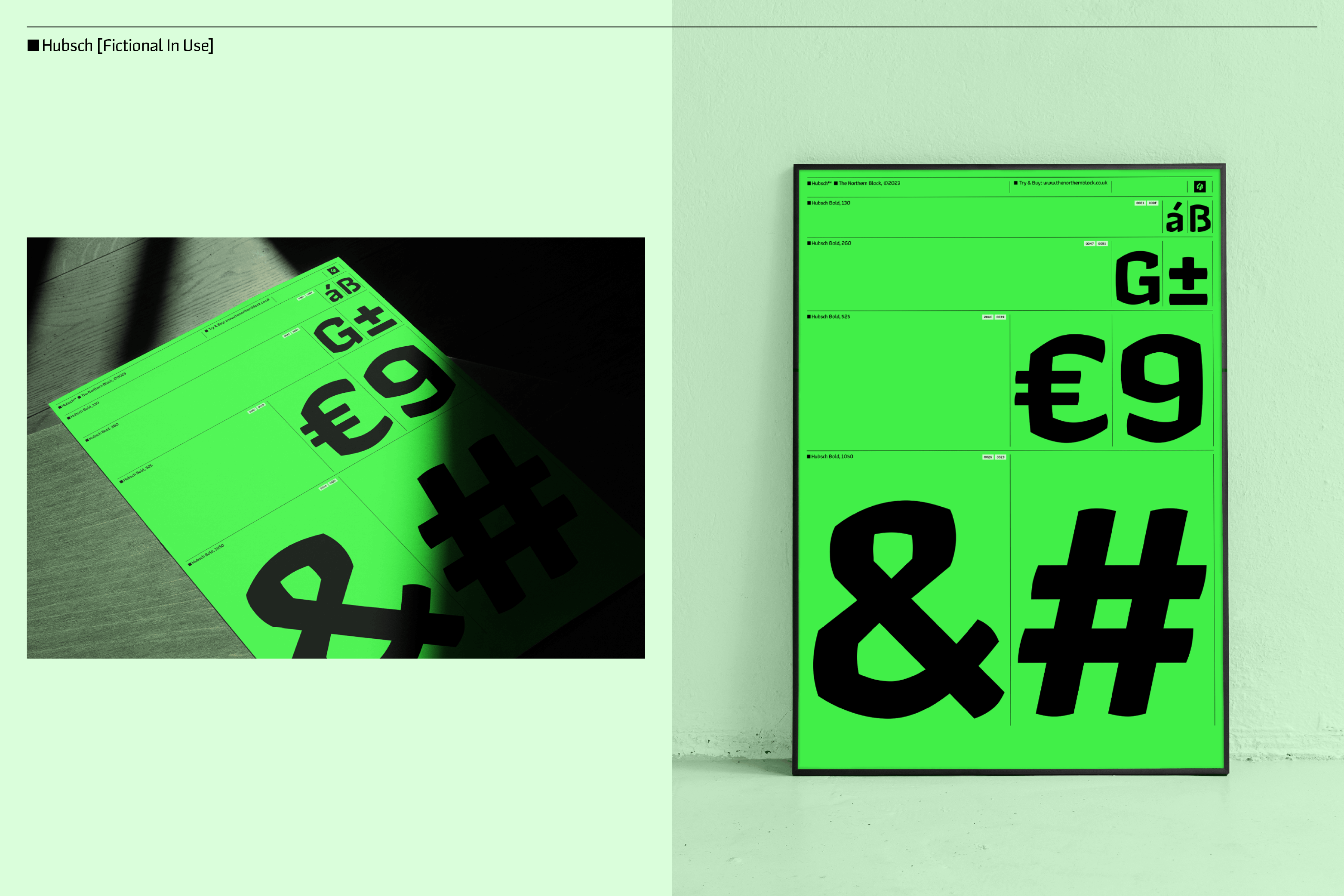
Hubsch is available in 14 versions, 7 regular and 7 italic, each with approximately 600 characters per version, making it suitable for a wide range of projects that require a lot of personality. They have also added a variable version that allows you to choose the ideal weight.

