“I would call myself a graphic designer first and type designer second, coming from that perspective I create fonts that present something I can’t find elsewhere. A especific look and character.” said Mark when discussing his motivations for designing a new font.
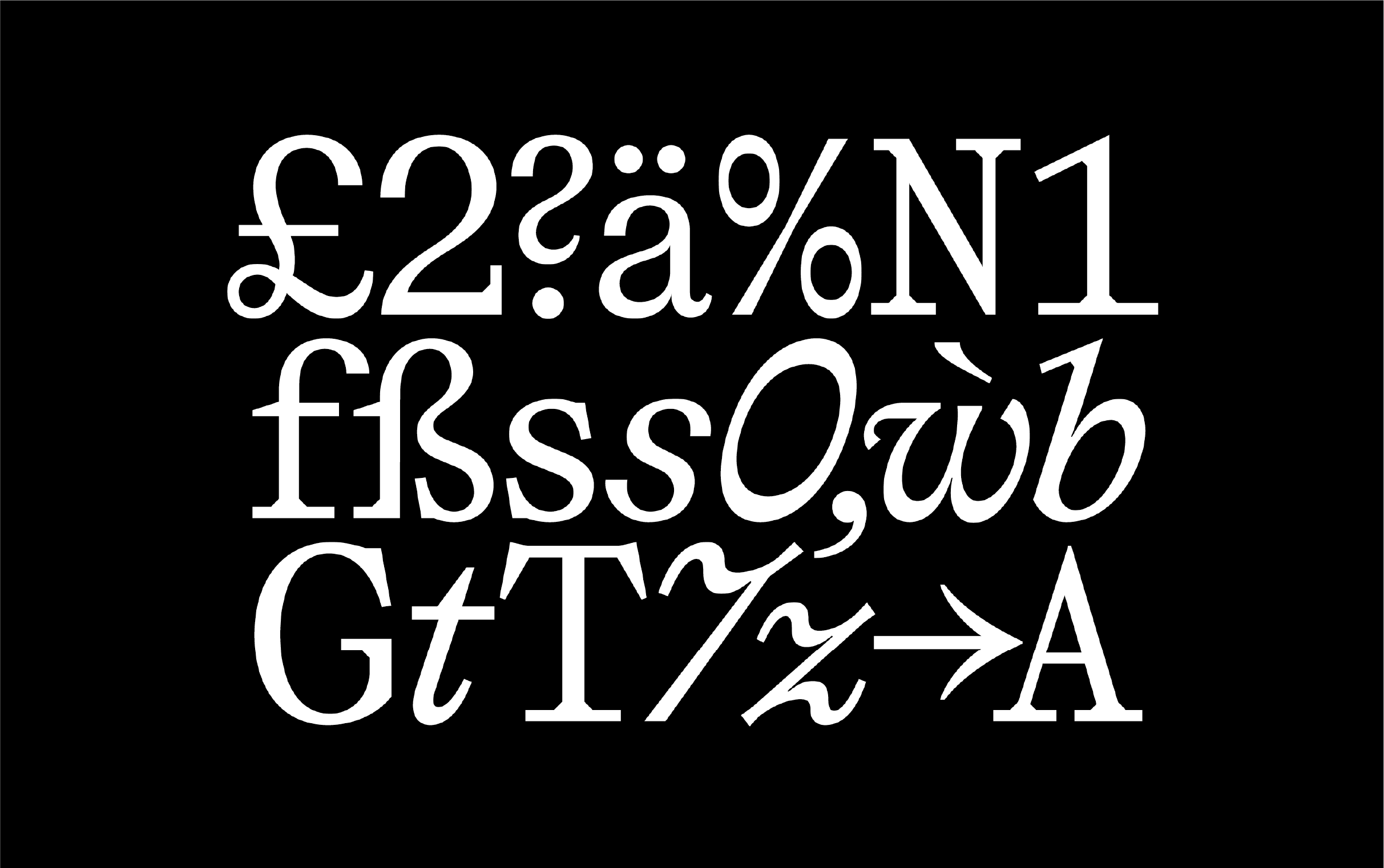
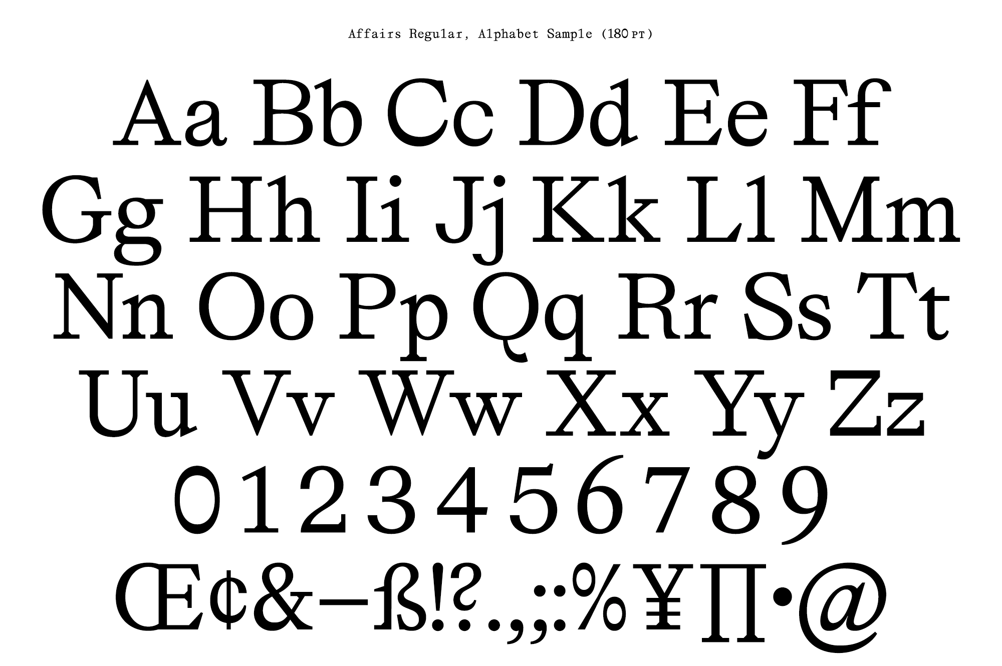
Affairs – a geometric serif typeface in three versions: regular, italic, and monospaced- is the most recent family created by the Netherlands foundry SM. It retains similar proportions to Helvetica or Neue Hass Grotesk since -as Mark arms- it follows the Dutch tradition of a simple, sober, and functional typeface.
Affair’s regular version is shocking for the combination of its unconventional shape: We can appreciate crisp straight cuts, usual in serifs, as well as curves. The straight cuts create solid support in the baseline, showing, in the meantime, personality and presence while the curve shapes soon lead to a constant.
This duality reminds us of classic transitional typefaces –present in the “a”; “e”; “c”; “g”- but also leans towards modernity, reminding us of a light Egyptian or slab serif.
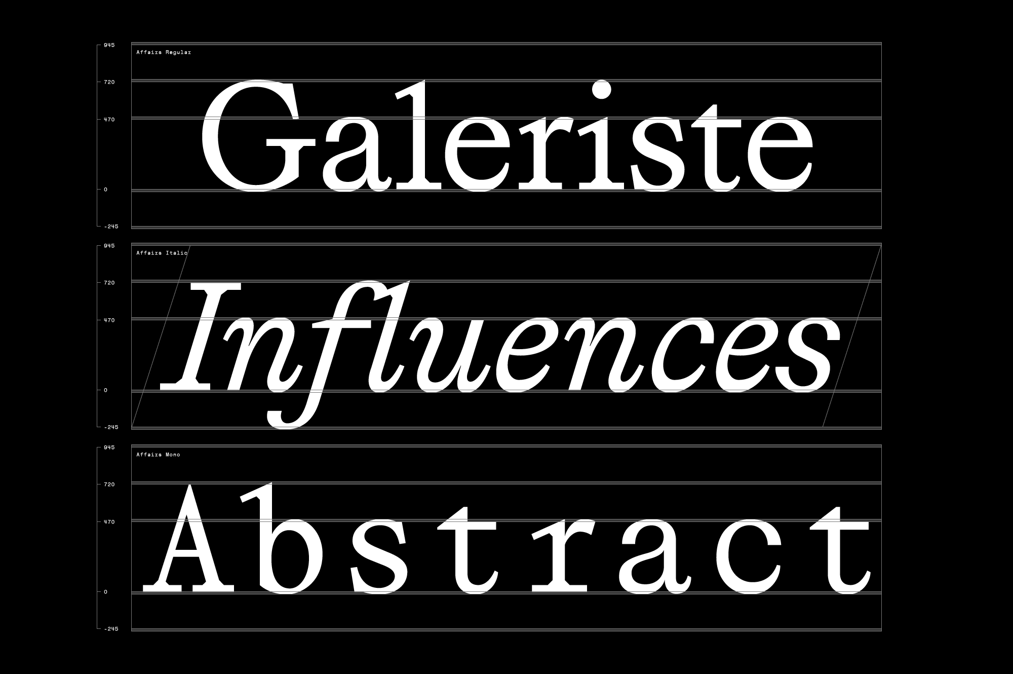
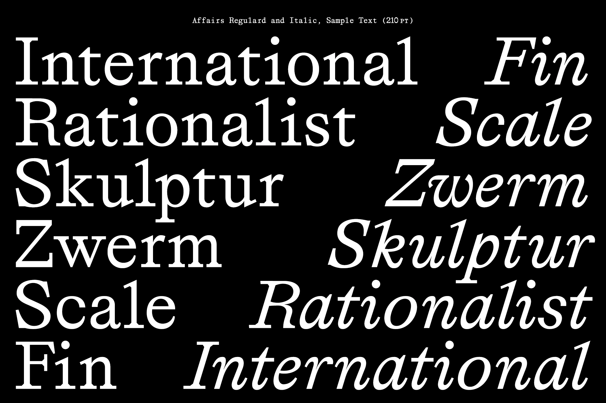
The italic is more accentuated without too risky shapes, a little baroque and chubby. Seen on the page, it makes a nice and regular stain of text with fluid rhythm achieved by its oval strokes.
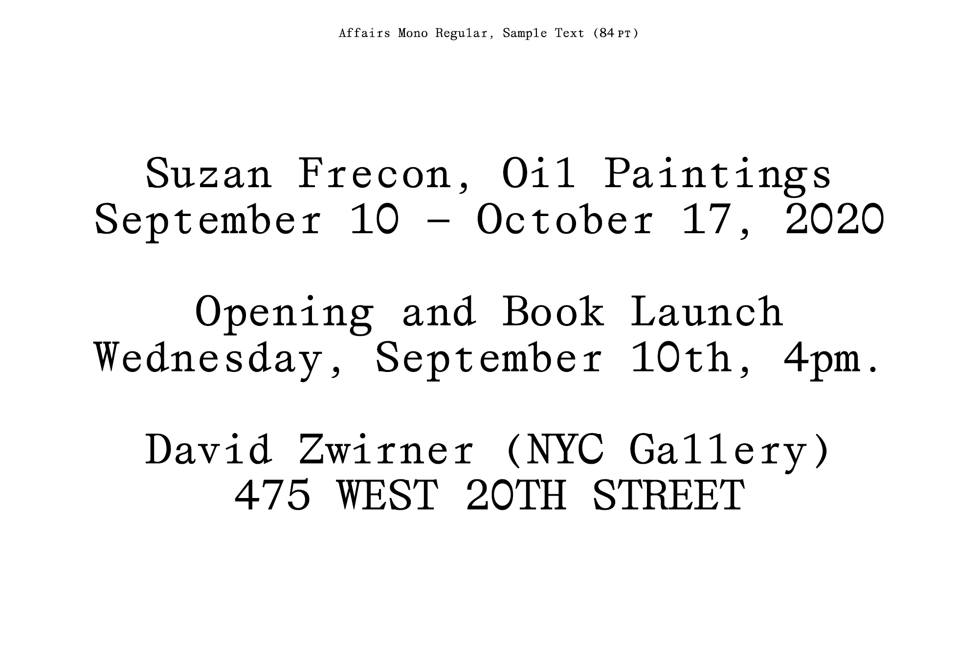
Affairs is great for projects looking for familiar shapes and proportions but with a new flair. It works well in both high-resolution screens and print and works marvels in short texts. The serif typeface follows the trend of sharp angles which give it a contemporary look. We appreciate the monospaced version, each day more popular and very relevant in digital settings.
“Running SM Foundry as a one-man band, typeface design is often the result of a personal necessity” said Nieyemer. And we are sincerely thankful he does since we find, not only in Affairs but in the whole catalog, innovative approaches for functionality and aesthetic context.


