After six years of work, and with the addition of Marcel Saidov to the team behind the construction of Apparat, Michael Clasen has released the second typeface distributed by Kimera Corp, a foundry created by Michael himself.
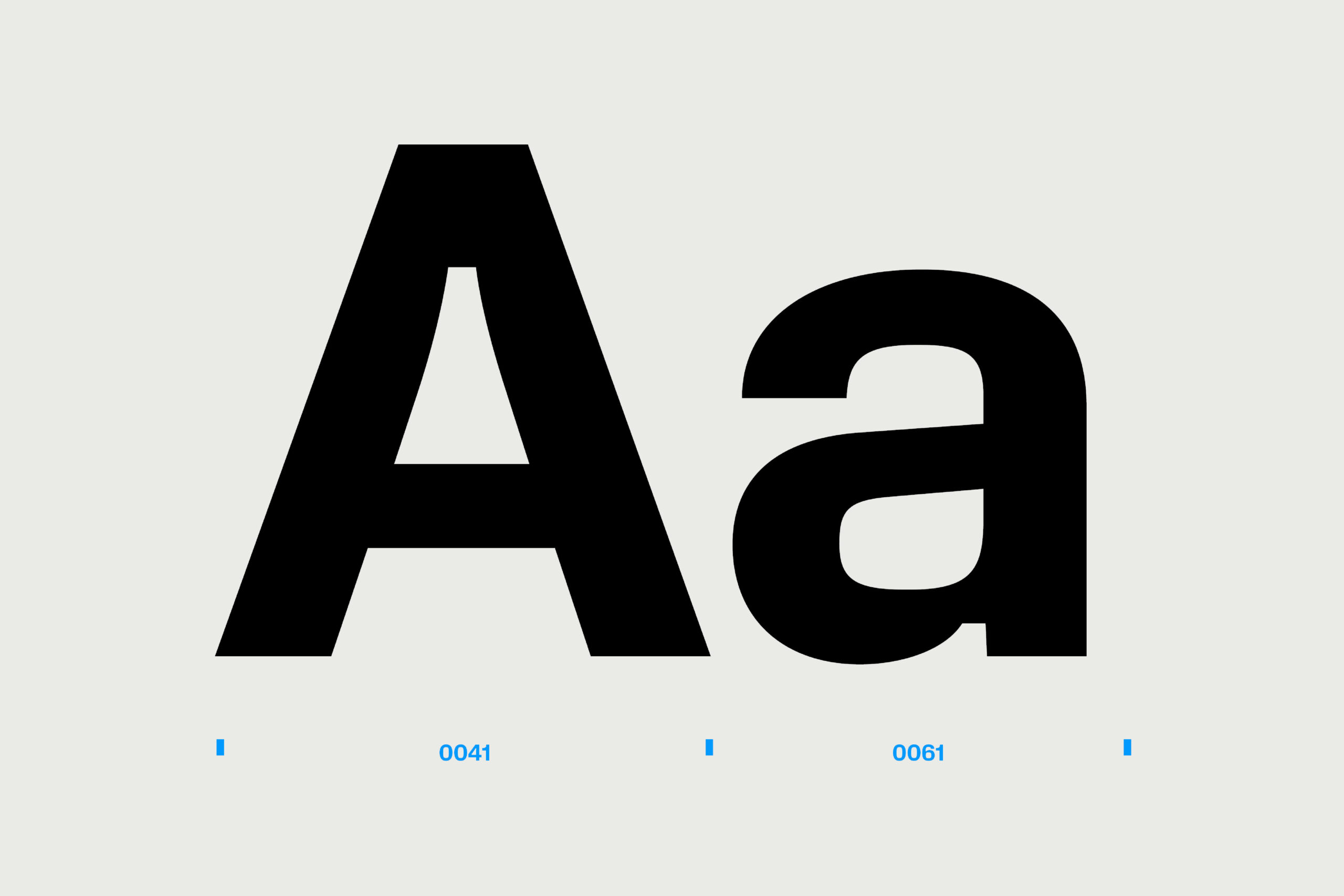
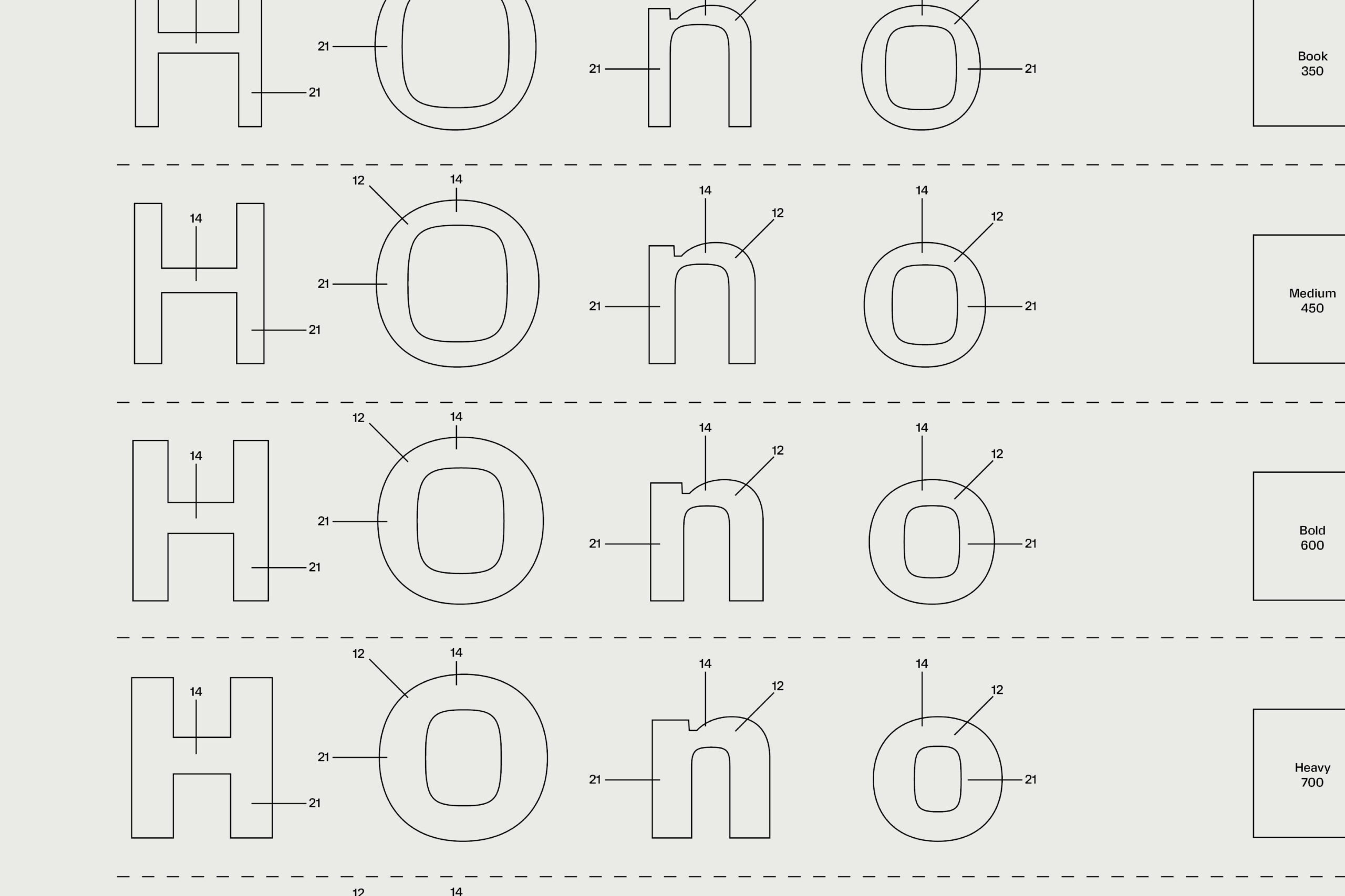
While Apparat shares some characteristics with neo-grotesque fonts like Helvetica, Universe, or Arial, it has distinctive features that make it easily recognizable. Its unique tension between form and counterform is most noticeable in the circular letters, where the negative space takes on a square appearance while the outer part retains a curved shape. The letter “o” is a clear example of this, but it can also be observed in “b,” “p,” “c,” and even “s.”
This tension results in extended-looking letters that showcase a blend of 70s and modern aesthetics. It may remind us at times of the well-known Eurostyle font, but without looking mechanical.
Another characteristic of Apparat lies in its eye-catching ink traps, which are not only functional but also decorative, shaping the form and sometimes becoming equally prominent as the curve tension. However, the primary function of the ink traps is to ensure that this typeface remains legible both on screen and in print surfaces, suitable for headlines or body text.
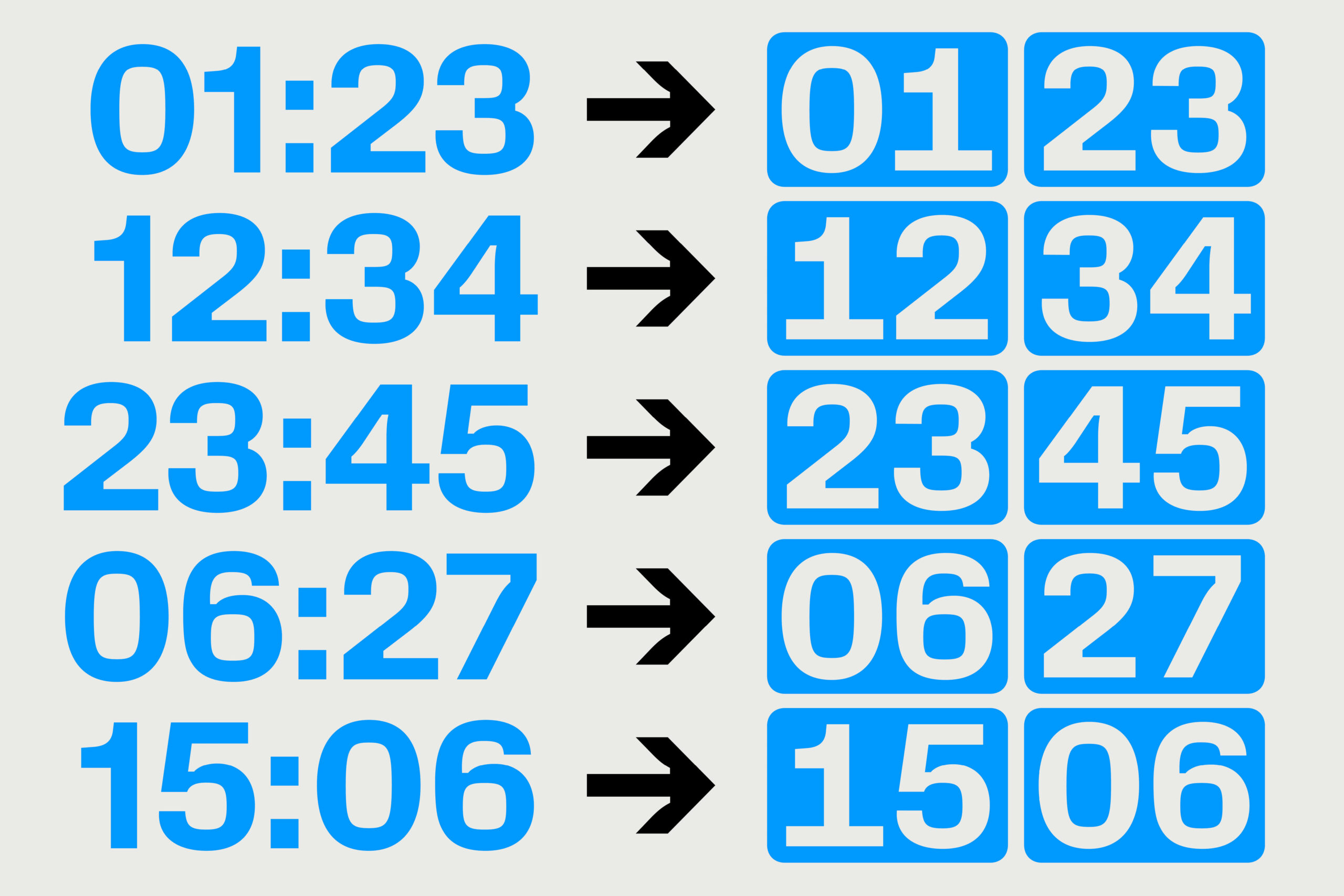
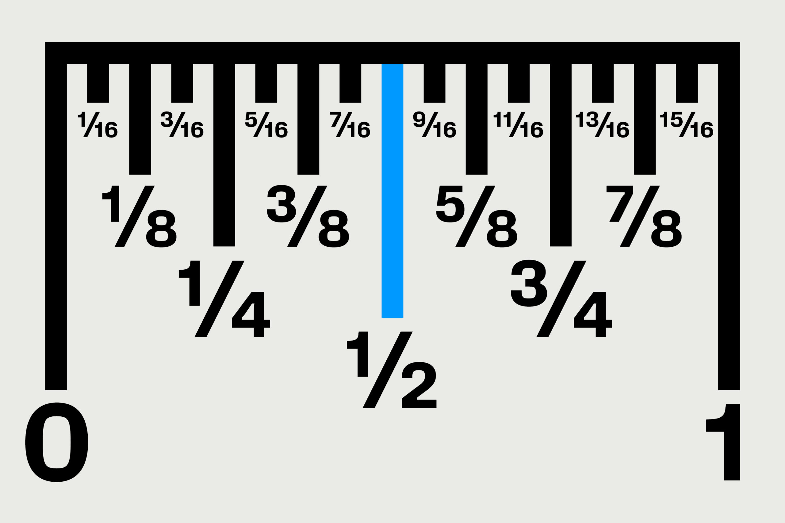
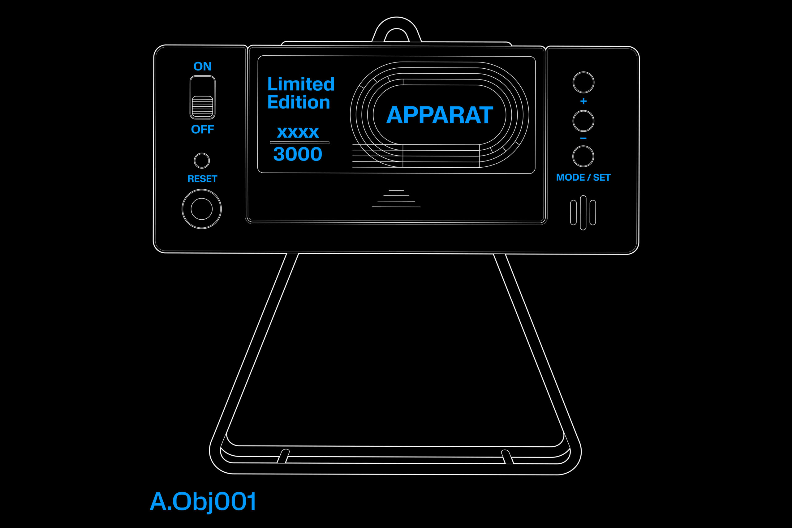
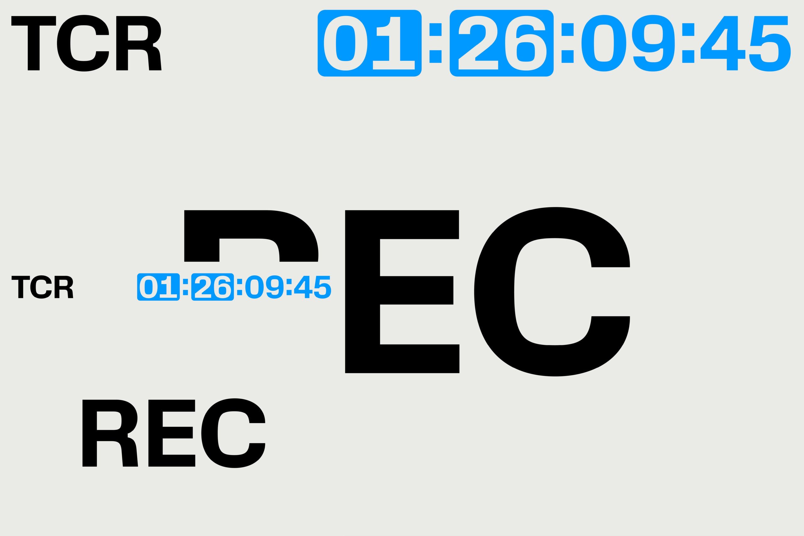
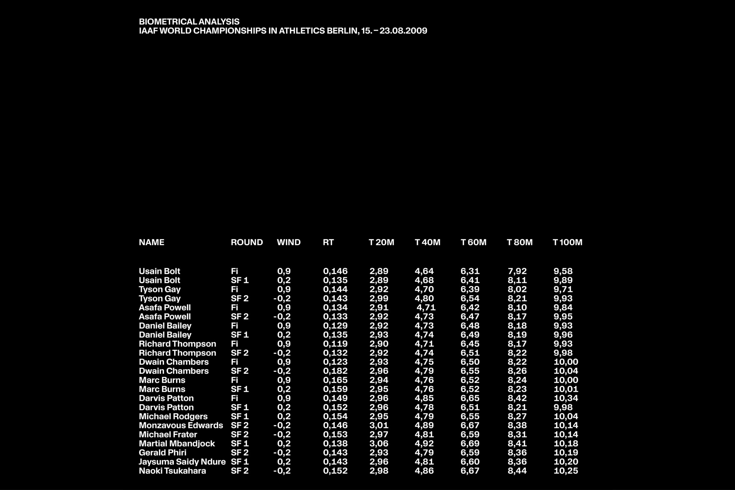
Apparat’s OpenType features include various numeral alternatives, including a set of framed numbers reminiscent of early digital clocks. Additionally, there are special symbols for time-related matters and other ornamental elements, making Apparat ideal for digital environments where numbers take center stage or when a combination of letters and numerals is required. It could be applied in transportation-related contexts such as airport signage, bus terminals, or taxi stands, or even in the visual communication of banks or financial institutions.
Returning to ink traps, which are notably flat, the hinting (pixel alignment for accurate rendering of the font on screens) feels more natural, as the letter junctions are mostly vertical and horizontal, allowing for excellent adaptation to digital spaces.
Apparat is available in seven weights, ranging from light to black, as previously mentioned, and it offers an extensive character set. It can be obtained through the Kimera foundry, currently by sending a message on Instagram, with plans to have a website up and running soon.
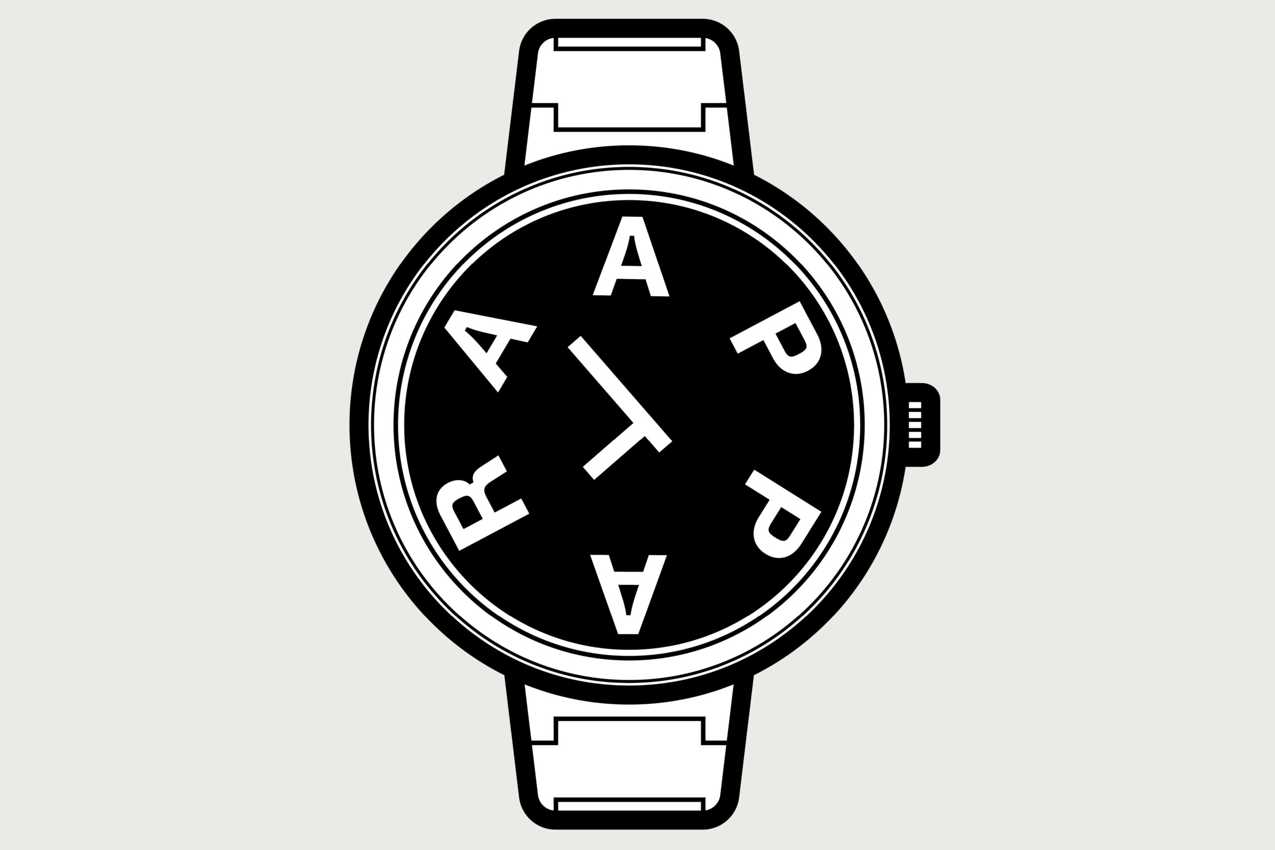
All these characteristics make Apparat a distinctive typographic choice in today’s market. With its nostalgic character, it serves as a reminder that technology, both in the 1970s and today, is constantly evolving.


