

In Arte Tracks and Arte Tracks East, typography breaks into lines and reconfigures into ever-evolving graphics. Logotype, visual identity, and generic system by H5paris.
Type Design: Simon Renaud Design: H5 Paris

Animo Typeface by Heavyweight shapes the identity of Grande Paolo, a pop-up sports bar in Prague for the Euro Championship.
Foundry & Design: Heavyweight

The redesign of ArkDes in Stockholm by AM Stockholm features custom typefaces where dots and dashes create a unique typographic system. Alongside Diatype, these fonts redefine the museum’s identity.
Type Design: ABC Dinamo, Luuse, Adrien Vasquez Design: AM Stockholm

Four Words rebrands with a bold red identity, using Greed and Teodor by Displaay.
Foundry: Displaay Design: Motion Sickness Design Office
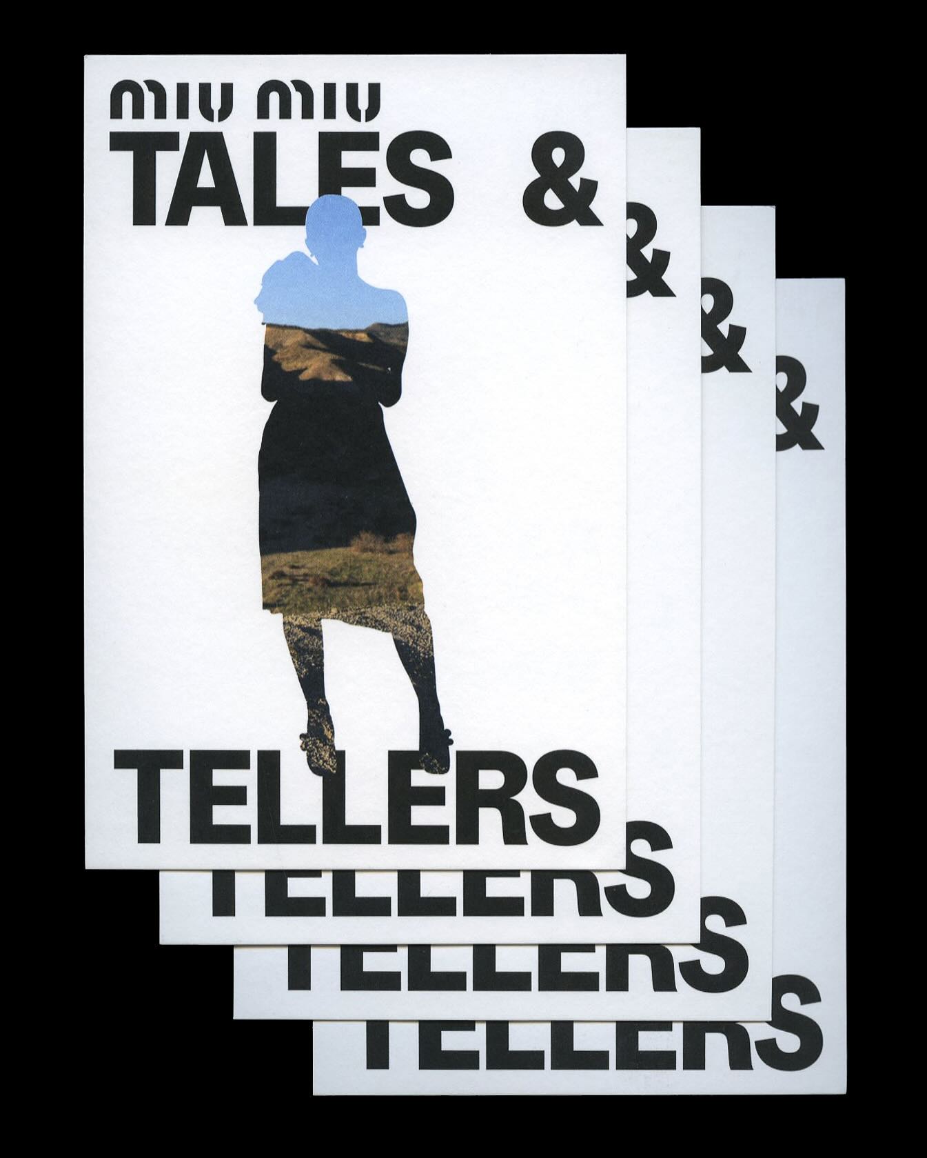
Kern typeface is featured in Tales & Tellers, a Miu Miu campaign that revisits various representations of femininity from past runway shows and short films.
Foundry: Pizza Typefaces Design: 2×4
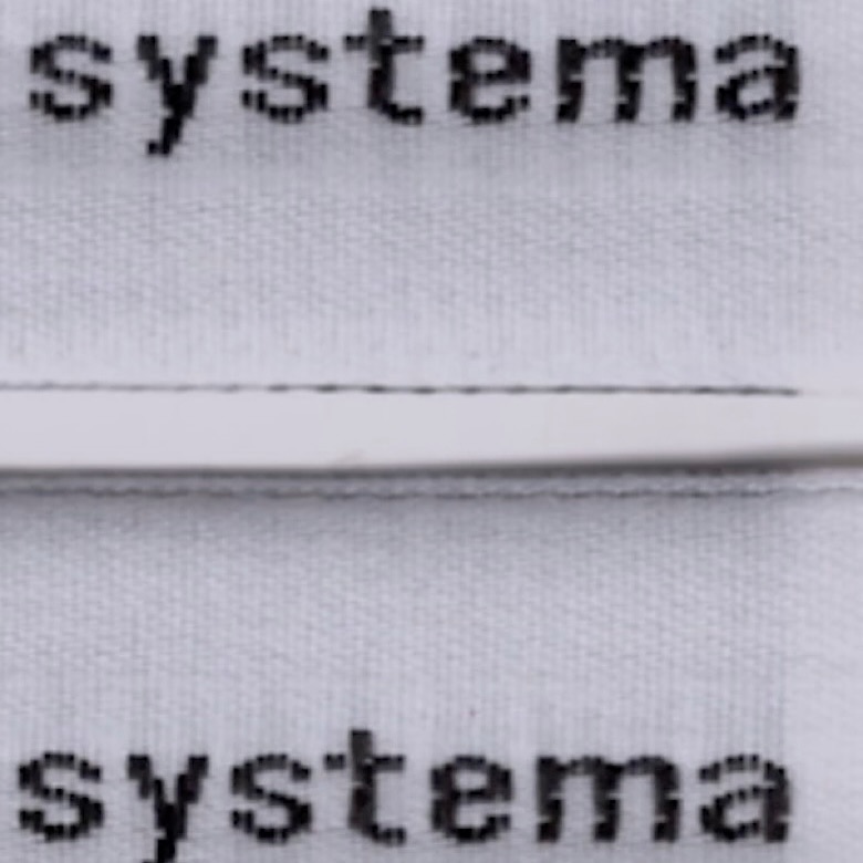
The French studio Plus Mûrs used Diatype Mono by Dinamo for the logo of the sophisticated sports brand, Counter Systema.
Foundry: Dinamo Design: Plus Mûrs
República Studio used Review from Commercial Type for this visual identity, aiming to communicate directly and consistently, while leaving the spotlight to the displayed photographs.
Foundry: Commercial Type Design: Estudio República
