
Three typefaces come together in this warm visual identity for an art exhibition in Paris: Minotaur by Production Type, Diatype by Dinamo, and Feature Deck by Commercial Type.
Foundry: Production Type, Dinamo, Commercial Type Design: ZAINA
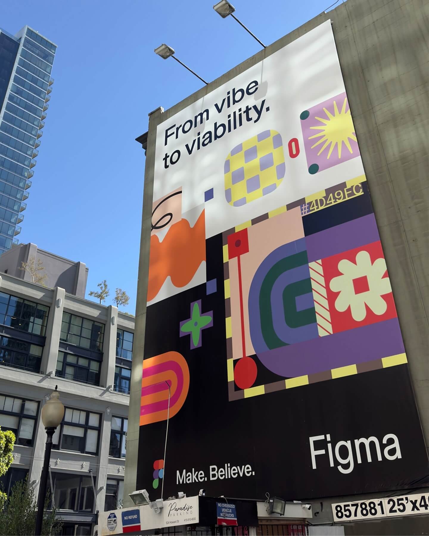
Grilli Type took on this ambitious project and proposed Figma Sans; a typeface with personality but practical, focused on efficiency, and free of unnecessary embellishments.
Foundry: Grilli Type Design: Figma
A jewelry brand that saves us from monotony and invites us to live creatively. Brand identity and art direction by Tino Nyman, featuring the typefaces Onsite, Exposure and GT Pressura.
Foundry: SOCIOTYPE, 205TF, Grilli Type Design: Tino Nyman
República Studio used Review from Commercial Type for this visual identity, aiming to communicate directly and consistently, while leaving the spotlight to the displayed photographs.
Foundry: Commercial Type Design: Estudio República
Newsreader by Production Type on the cover of this book addresses collaborations and how to coexist with other ideas.
Foundry: Production Type, Design: Sam Corijn

Studio Ard was commissioned to design 15 publications and the signage for the graduation exhibition of the RCA School of Architecture. All is typeset in Prisma Text by Lineto.
Foundry: Lineto Design: Studio Ard
Neue Haas Grotesk, available at Commercial Type, in the identity of (484) Creative Production House. Design by Studio Abraham.
Foundry: Commercial Type Design: Studio Abraham
