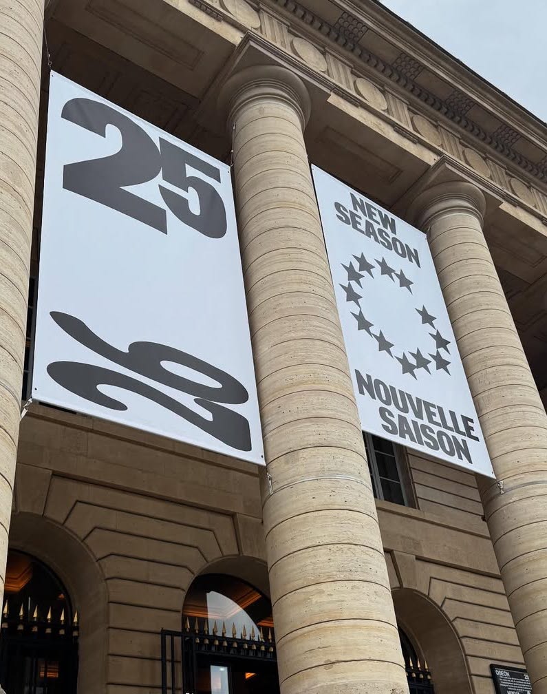
New visual identity for Théâtre de l’Odéon, designed by Atelier Choque Le Goff, featuring the large-scale Insitu typeface by Formagari.
Foundry: Formagari Design: Atelier Choque Le Goff
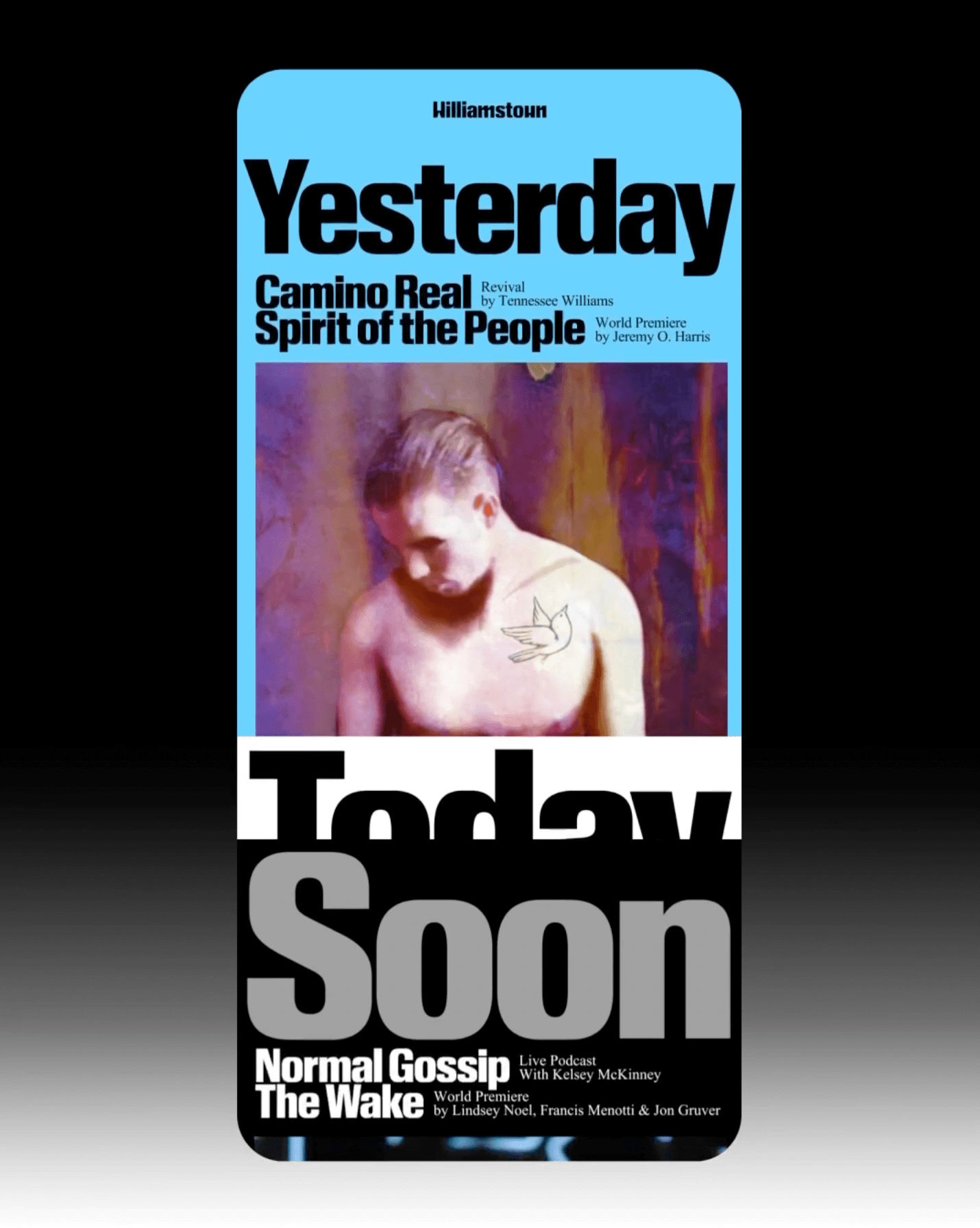
The identity that Pentagram created for the Williamstown Festival transforms the stage into a dynamic graphic system. A custom logo is complemented by Times New Roman and Review from Commercial Type.
Foundry: Monotype, Commercial Type
Design: Pentagram

In such a fluctuating economy, why not consider price as the most important element of packaging?
Foundry: Linotype Design: Serviceplan

The redesign of ArkDes in Stockholm by AM Stockholm features custom typefaces where dots and dashes create a unique typographic system. Alongside Diatype, these fonts redefine the museum’s identity.
Type Design: ABC Dinamo, Luuse, Adrien Vasquez Design: AM Stockholm

Four Words rebrands with a bold red identity, using Greed and Teodor by Displaay.
Foundry: Displaay Design: Motion Sickness Design Office
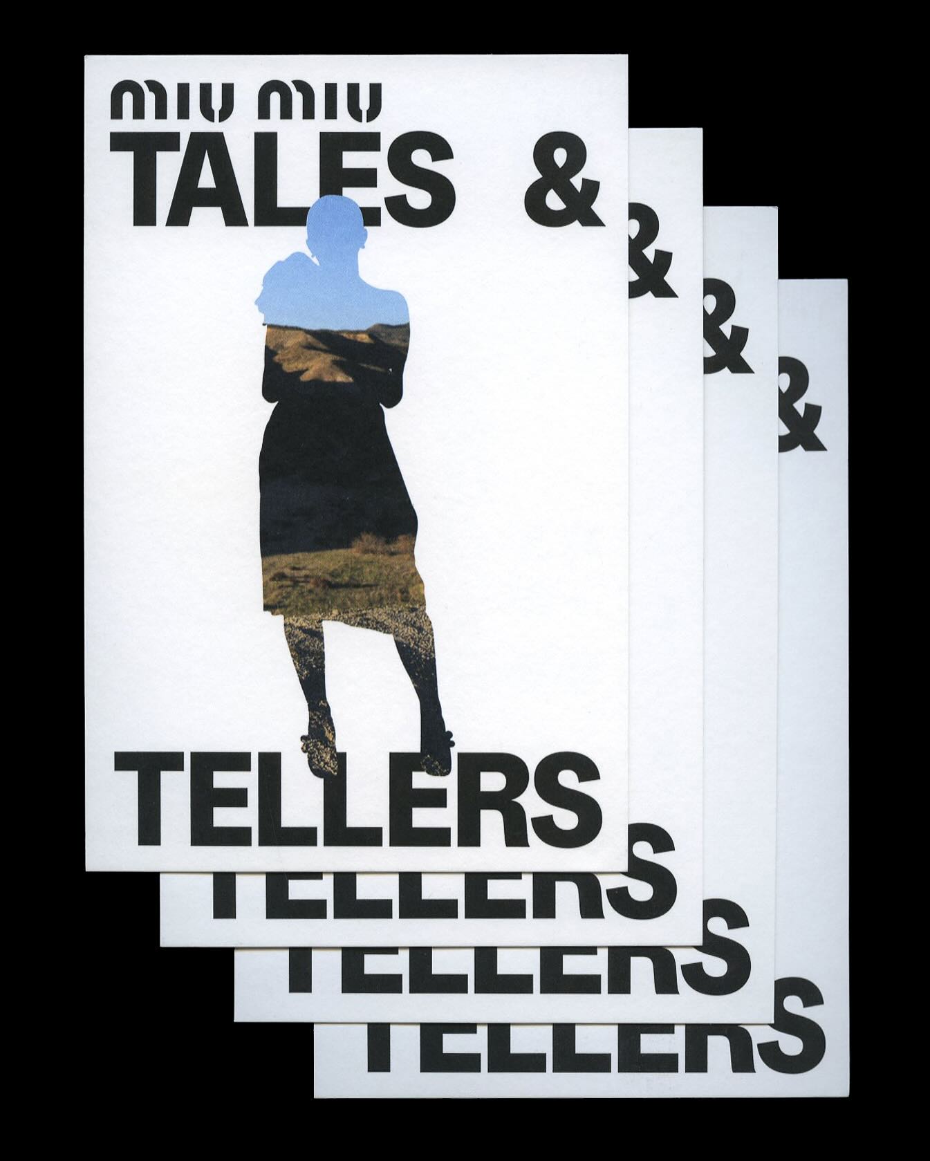
Kern typeface is featured in Tales & Tellers, a Miu Miu campaign that revisits various representations of femininity from past runway shows and short films.
Foundry: Pizza Typefaces Design: 2×4