
NASK Studio chose Clarendon Graphic Light by Optimo Foundry to shape a refined typographic system that frames the photographic content of JB Books & Projects.
Foundry: Optimo Foundry Design: NASK Studio
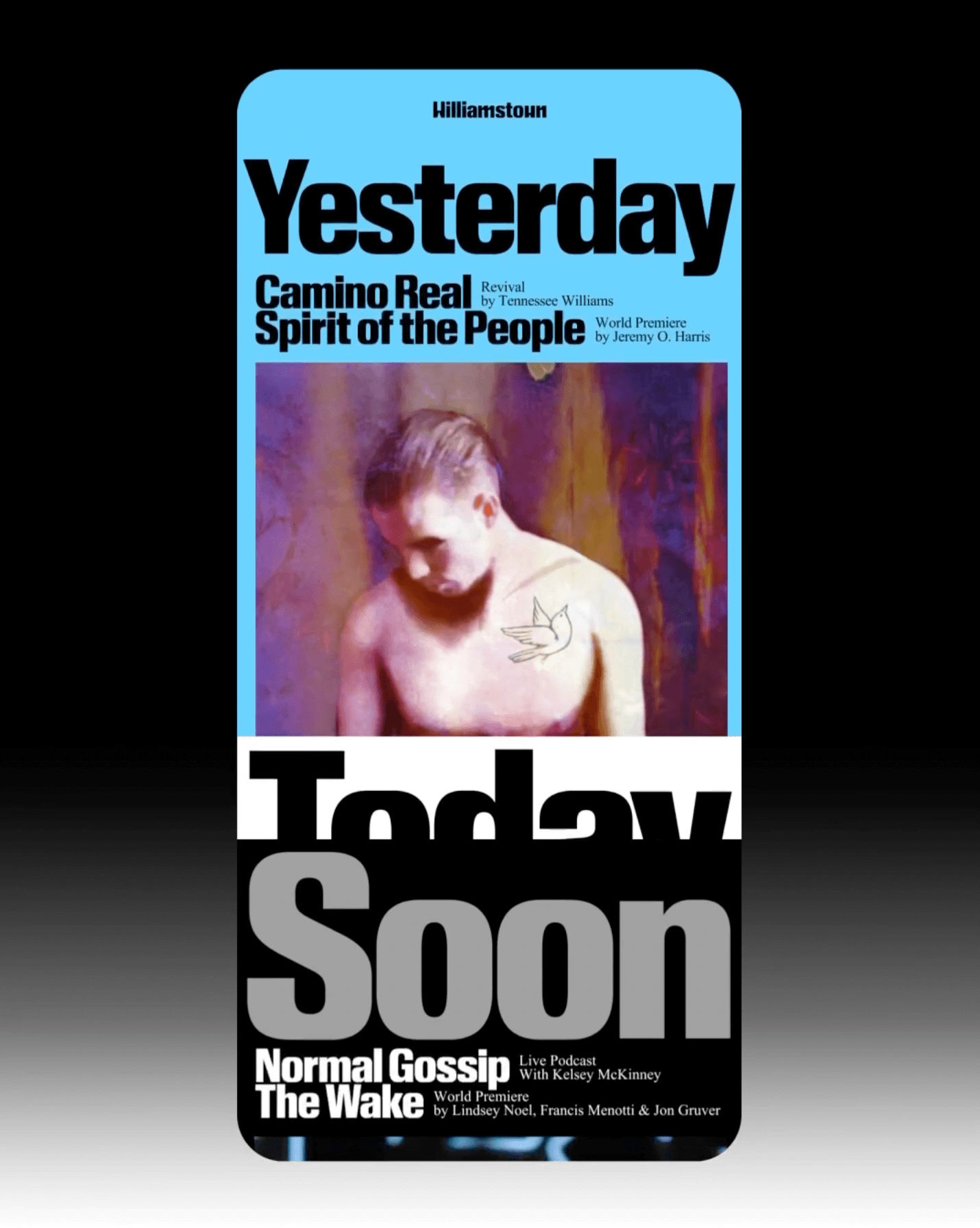
The identity that Pentagram created for the Williamstown Festival transforms the stage into a dynamic graphic system. A custom logo is complemented by Times New Roman and Review from Commercial Type.
Foundry: Monotype, Commercial Type
Design: Pentagram

The redesign of ArkDes in Stockholm by AM Stockholm features custom typefaces where dots and dashes create a unique typographic system. Alongside Diatype, these fonts redefine the museum’s identity.
Type Design: ABC Dinamo, Luuse, Adrien Vasquez Design: AM Stockholm

Tetier, the jewelry brand using recycled materials that recently collaborated with Asics, features Octave by Faire Type in its logo and texts.
Foundry: Faire Type Design: Baptiste Gerbelot Barillon

Four Words rebrands with a bold red identity, using Greed and Teodor by Displaay.
Foundry: Displaay Design: Motion Sickness Design Office
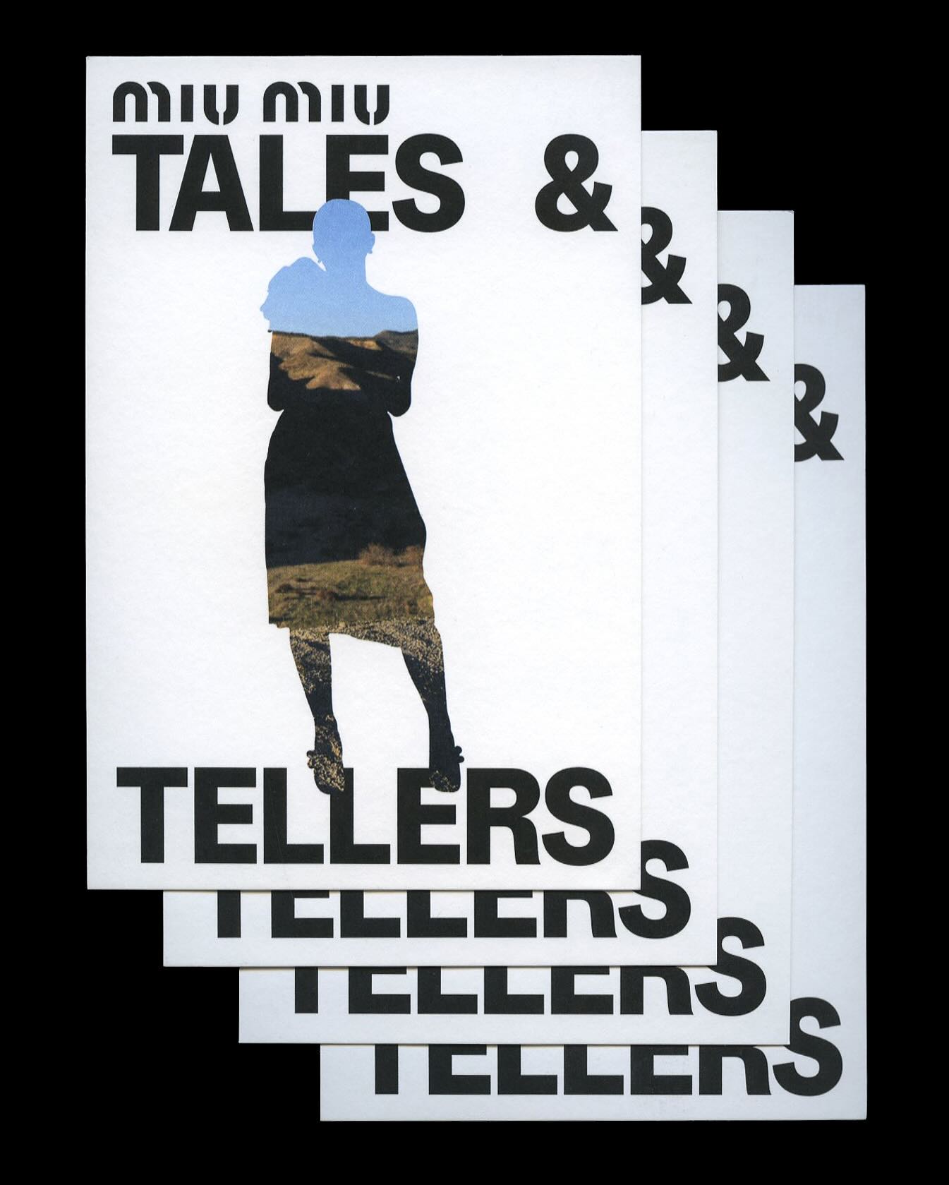
Kern typeface is featured in Tales & Tellers, a Miu Miu campaign that revisits various representations of femininity from past runway shows and short films.
Foundry: Pizza Typefaces Design: 2×4
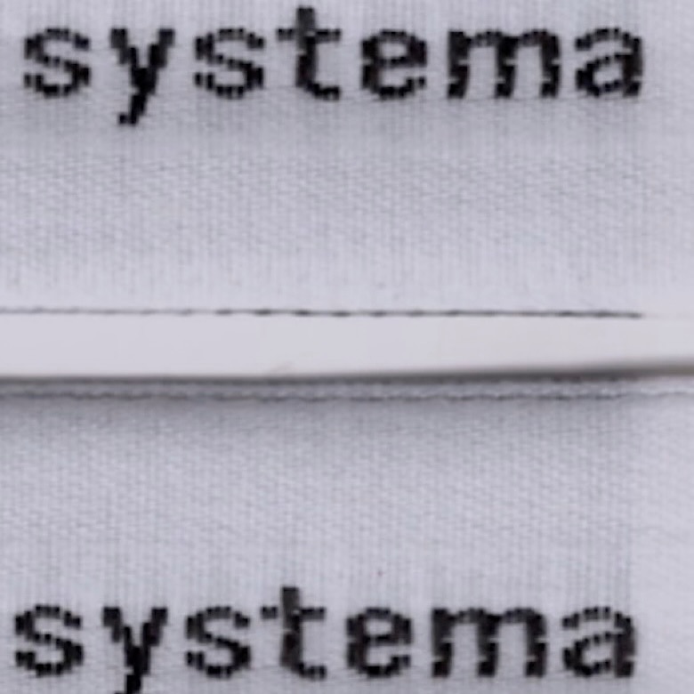
The French studio Plus Mûrs used Diatype Mono by Dinamo for the logo of the sophisticated sports brand, Counter Systema.
Foundry: Dinamo Design: Plus Mûrs
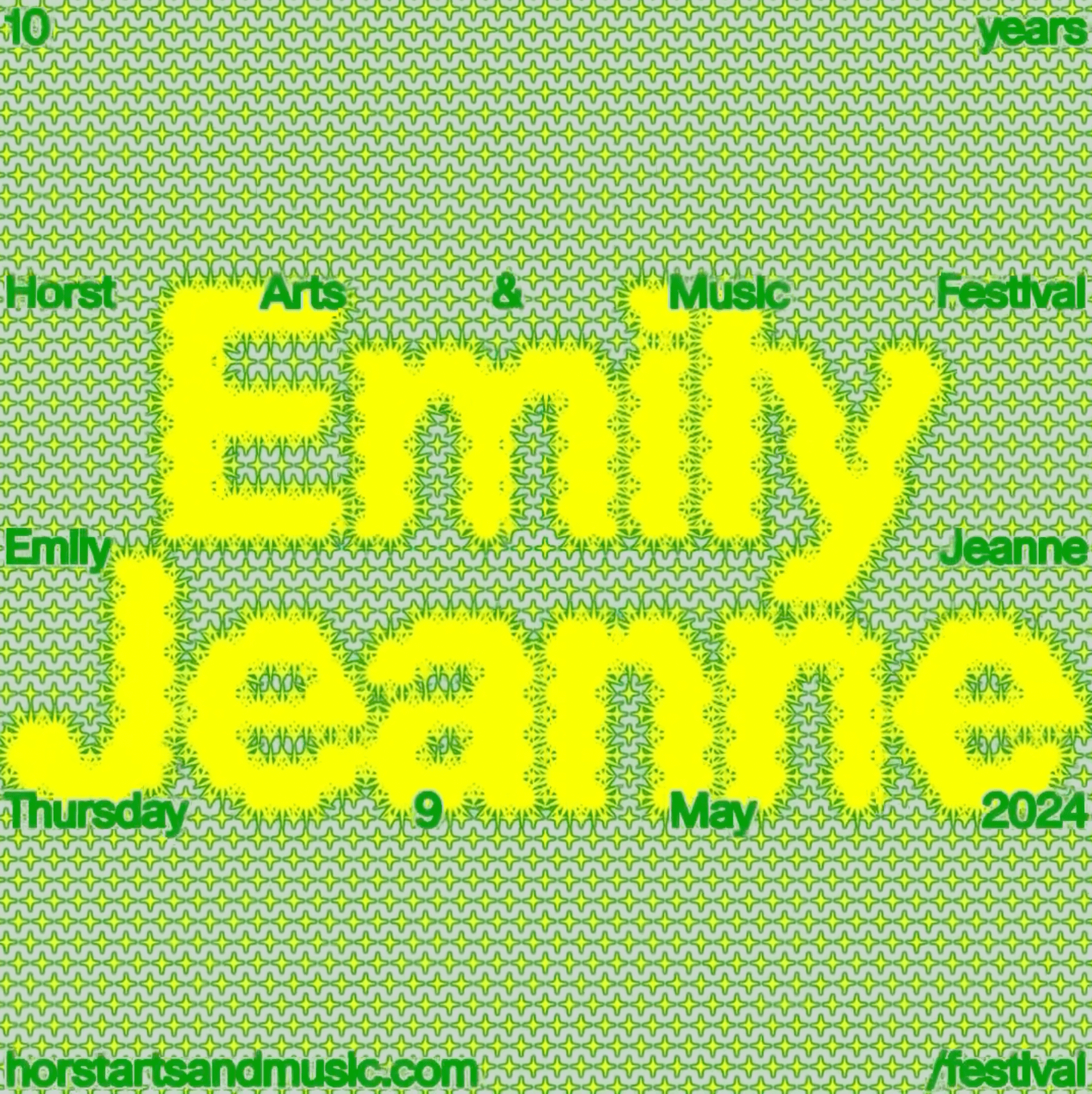
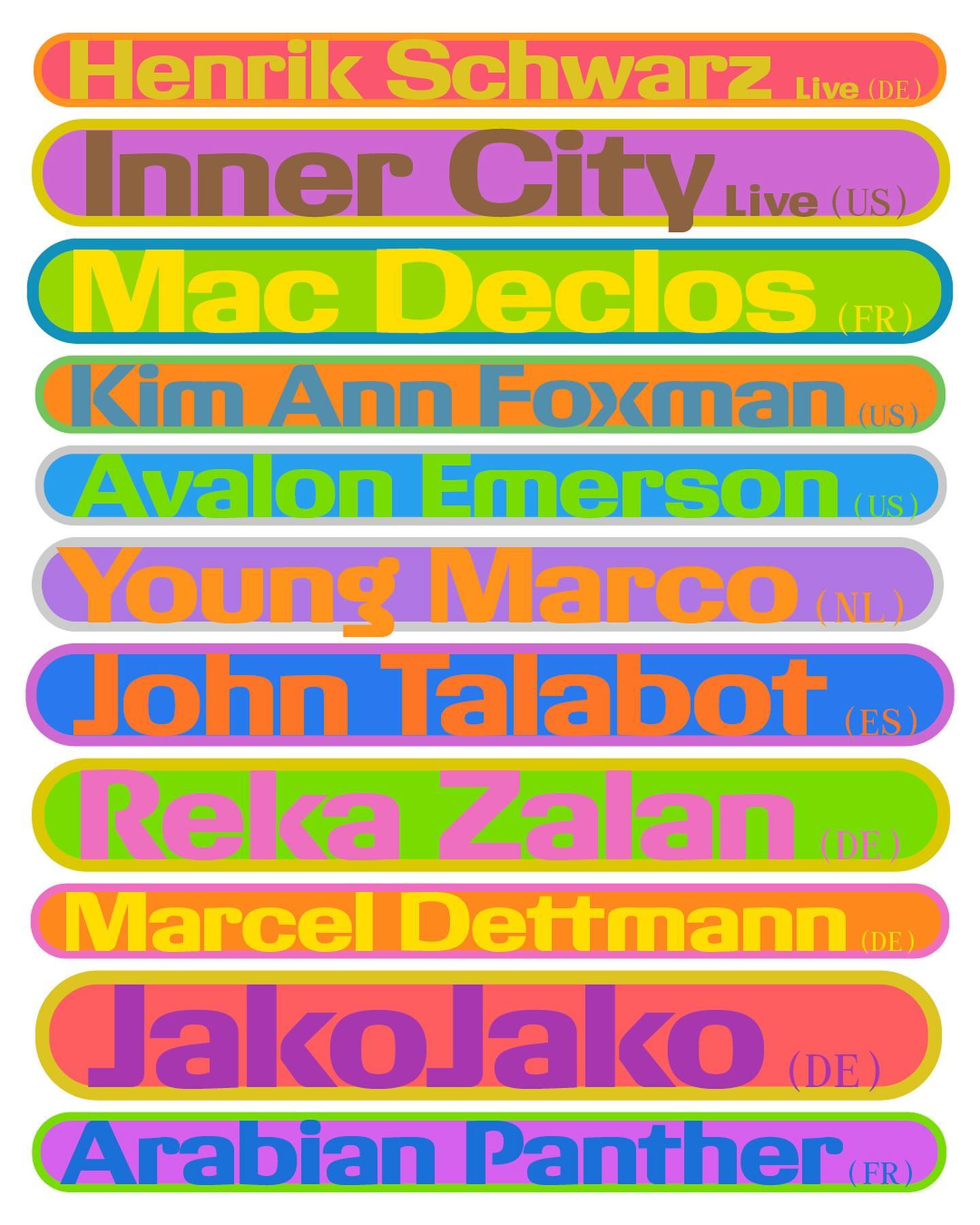
Horst Arts & Music 2024 debuts with a visual identity that connects disciplines, emotions, and practices through a network of symbols, featuring Oracle by Dinamo.
Get Oracle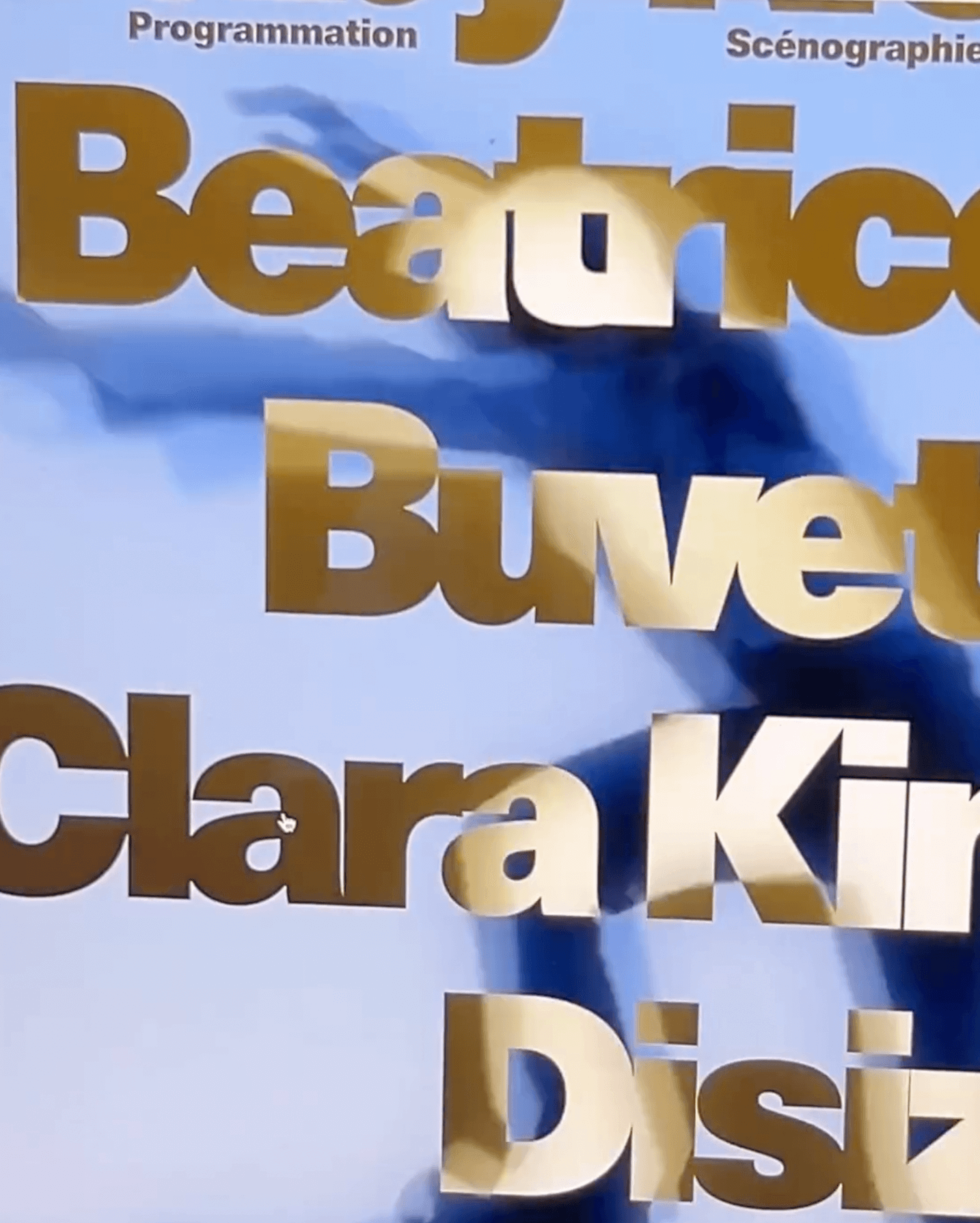
A classic typeface that reinvents itself by being interactive; Bonjour Garçon used Neue Haas Unica W1G Black, applying a negative effect in the web redesign they created for the art agency Pedro Booking.
Foundry: Linotype Design: Bonjour Garçon
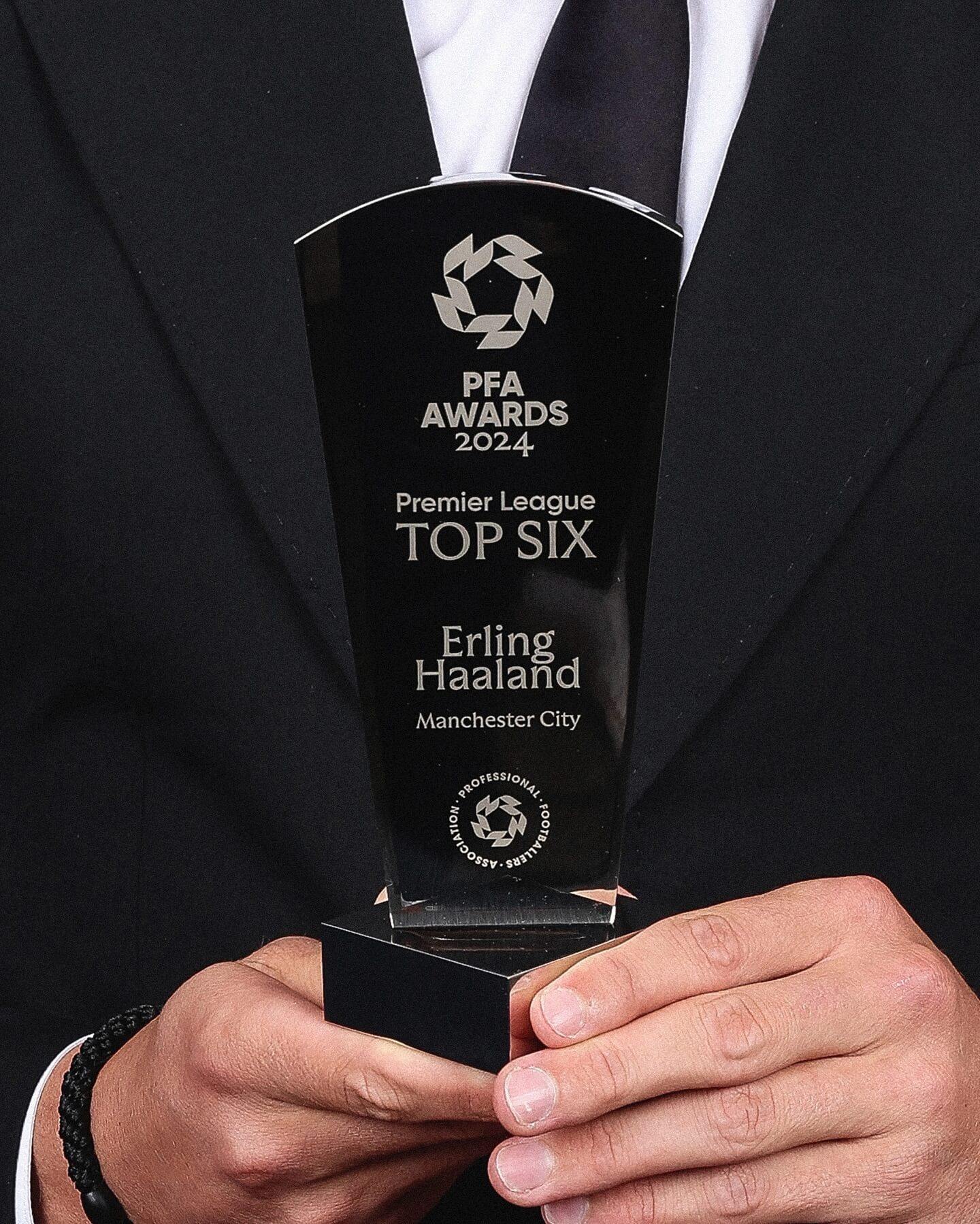
Realm by Approximate Type being used in this annual award ceremony for the best player of the year in the English league.
Foundry: Approximate Type Design: The Lift Agency
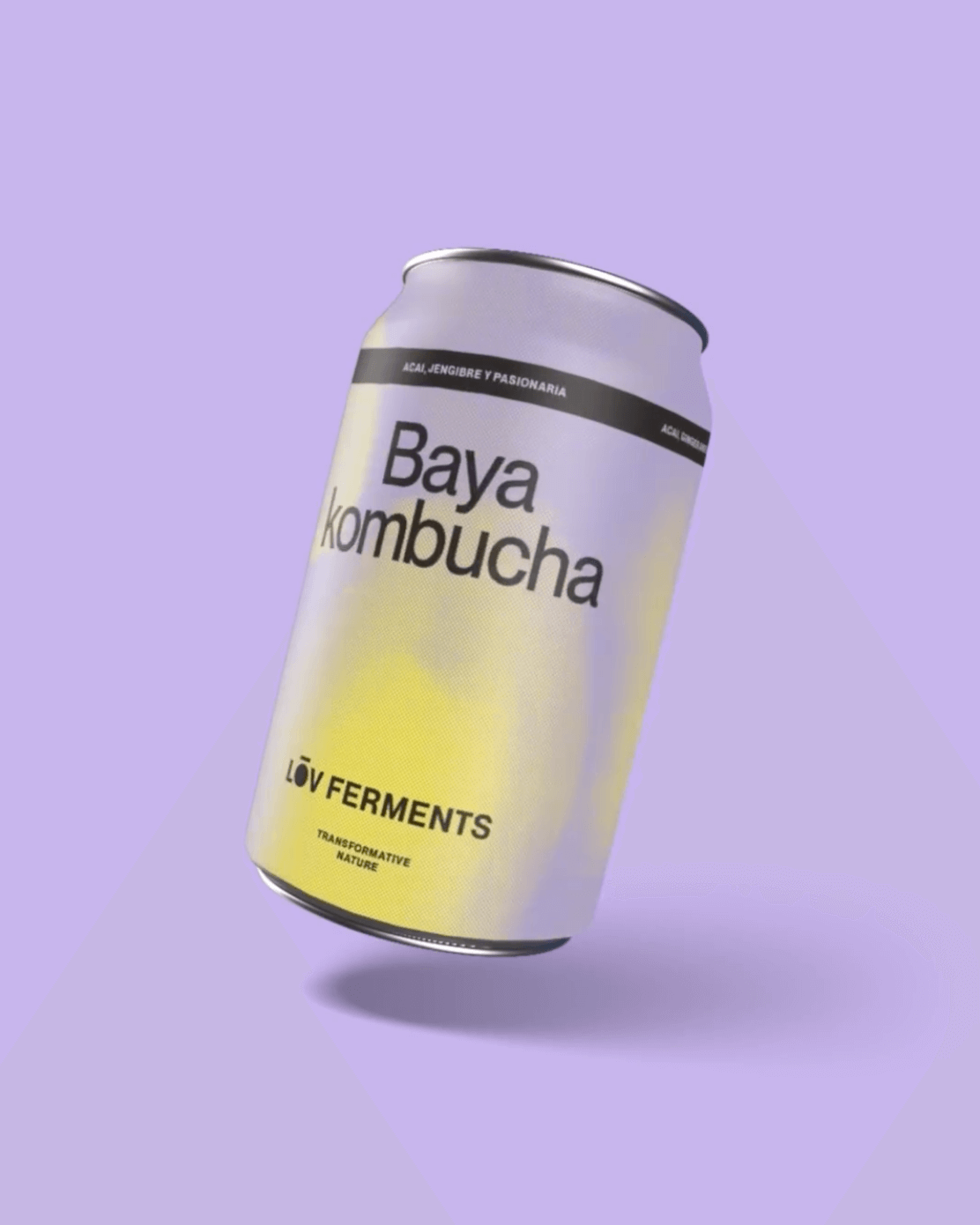
Casa Bien used Neue Montreal by Pangram Pangram and Items by Schick Toikka to build the visual identity for LOV Ferments, a brand set to change the beverage market.
Foundry: Pangram Pangram, Schick Toikka Design: Casa Bien
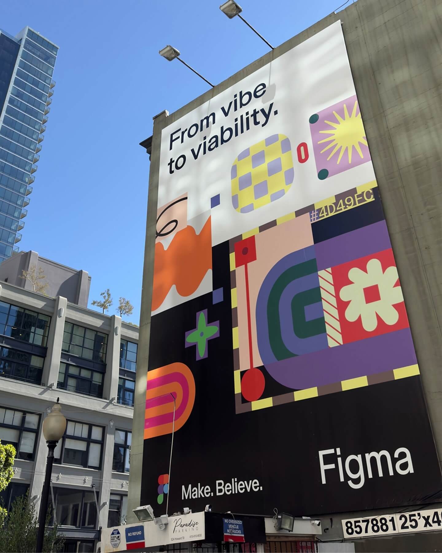
Grilli Type took on this ambitious project and proposed Figma Sans; a typeface with personality but practical, focused on efficiency, and free of unnecessary embellishments.
Foundry: Grilli Type Design: Figma
TSTO gave VUM—a series of Sunday music events—a psychedelic and youthful image.
Get Giigamax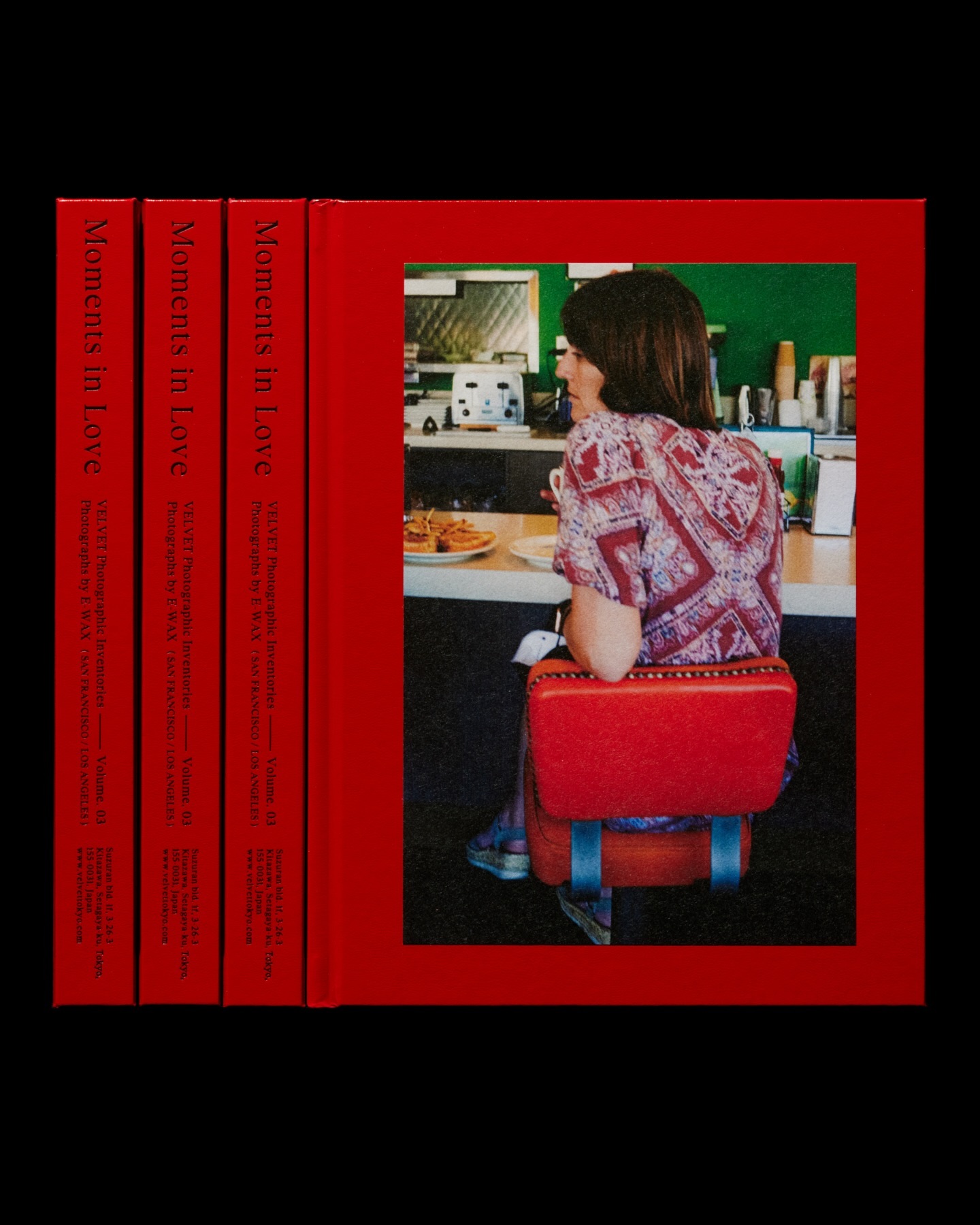
Moments in Love narrates a new way of portraying fashion, blending it with photos of passersby. Designed by the studio Siun, using FT Bureau.
Get FT Bureau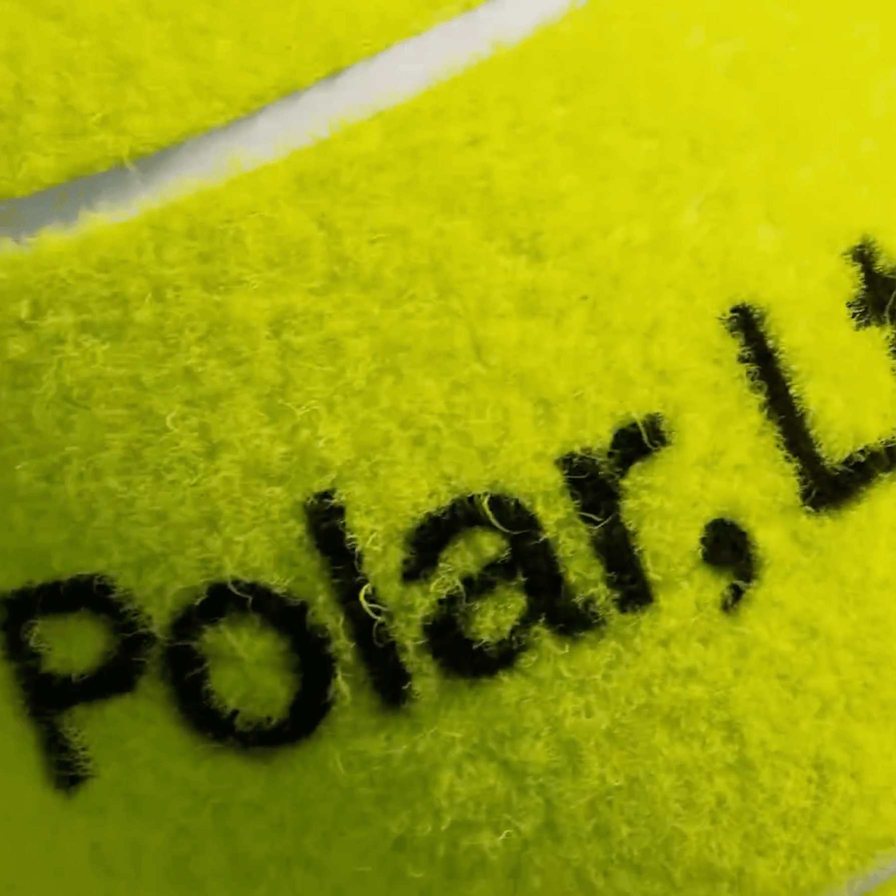
A studio and shop at the same time, or a shop that also functions as a studio; Polar Ltda brings together various design professionals to offer a fresh creative approach.
Foundry: Family type Design: Polar Ltda
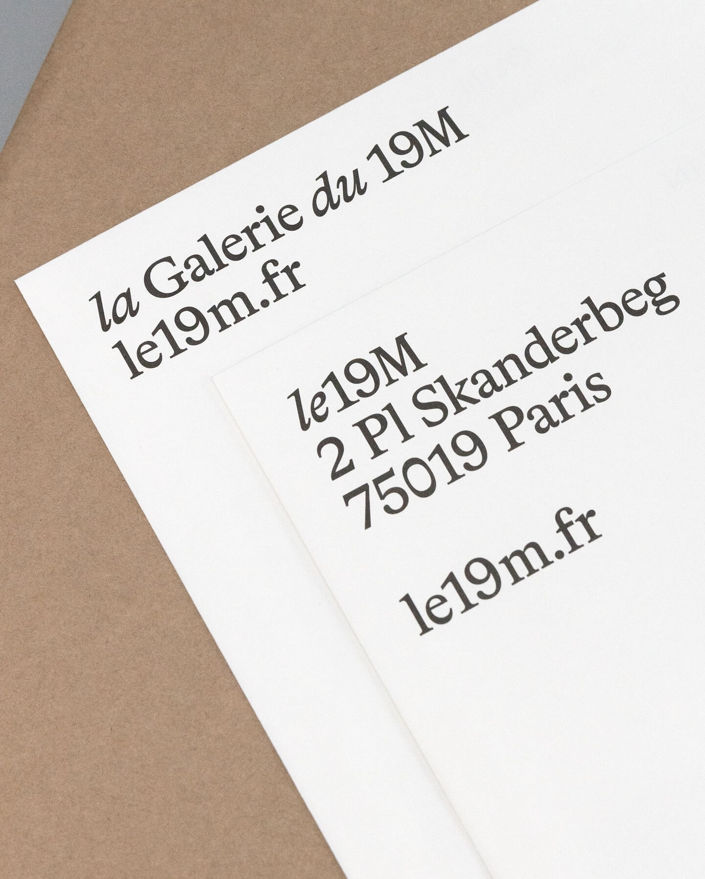
Hort Berlin used this serif typeface with classic and elegant forms (Bradford) for the visual identity they designed for the cultural center le 19M.
Foundry: Lineto Design: Hort Berlin
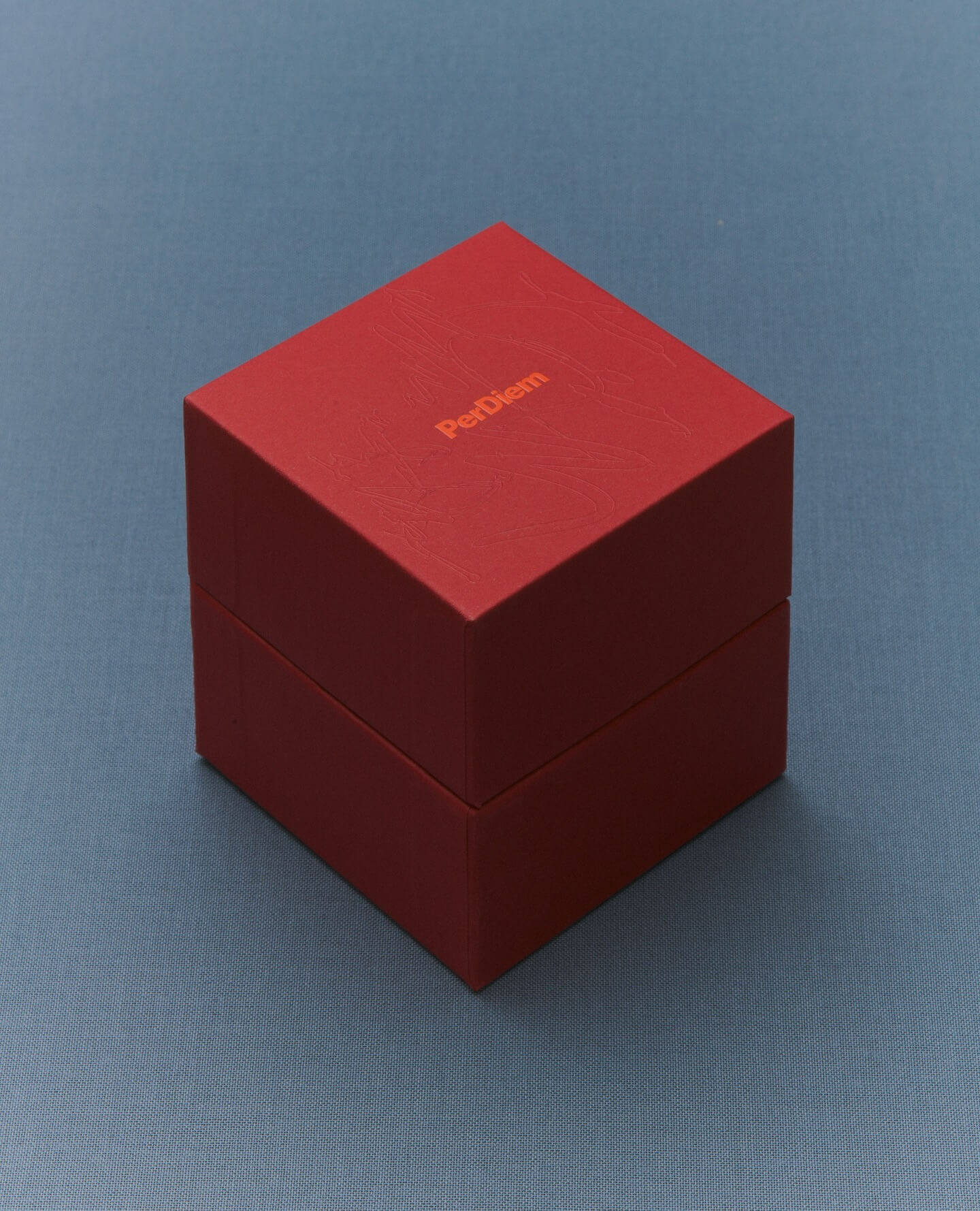
A jewelry brand that saves us from monotony and invites us to live creatively. Brand identity and art direction by Tino Nyman, featuring the typefaces Onsite, Exposure and GT Pressura.
Foundry: SOCIOTYPE, 205TF, Grilli Type Design: Tino Nyman
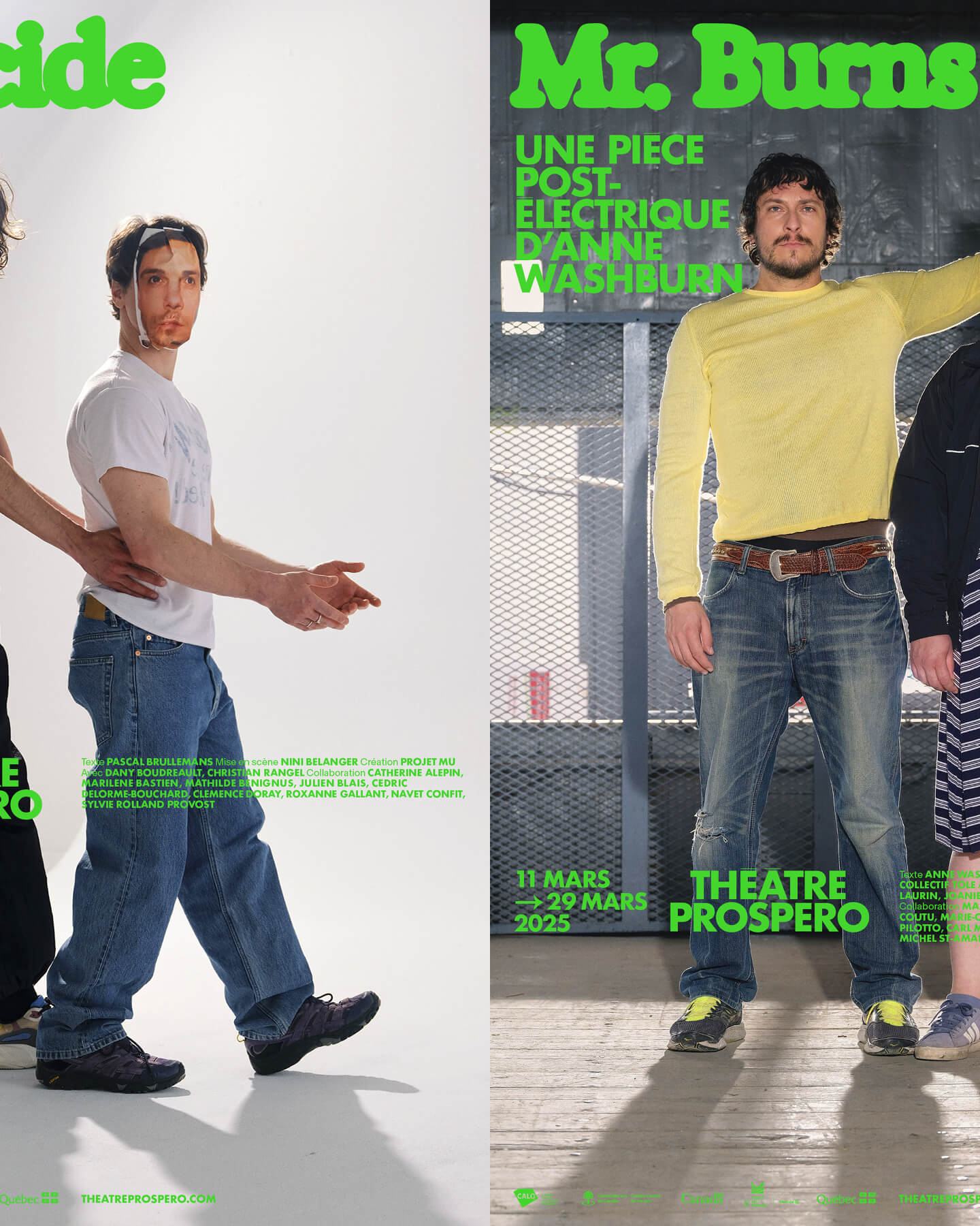
“After all, being together is revolutionary.” That was the main idea behind the 2024-2025 season campaign for Théâtre Prospero, directed and designed by Principal Estudio using Exposure.
Foundry: Federcio Parra Barrios Design: Principal
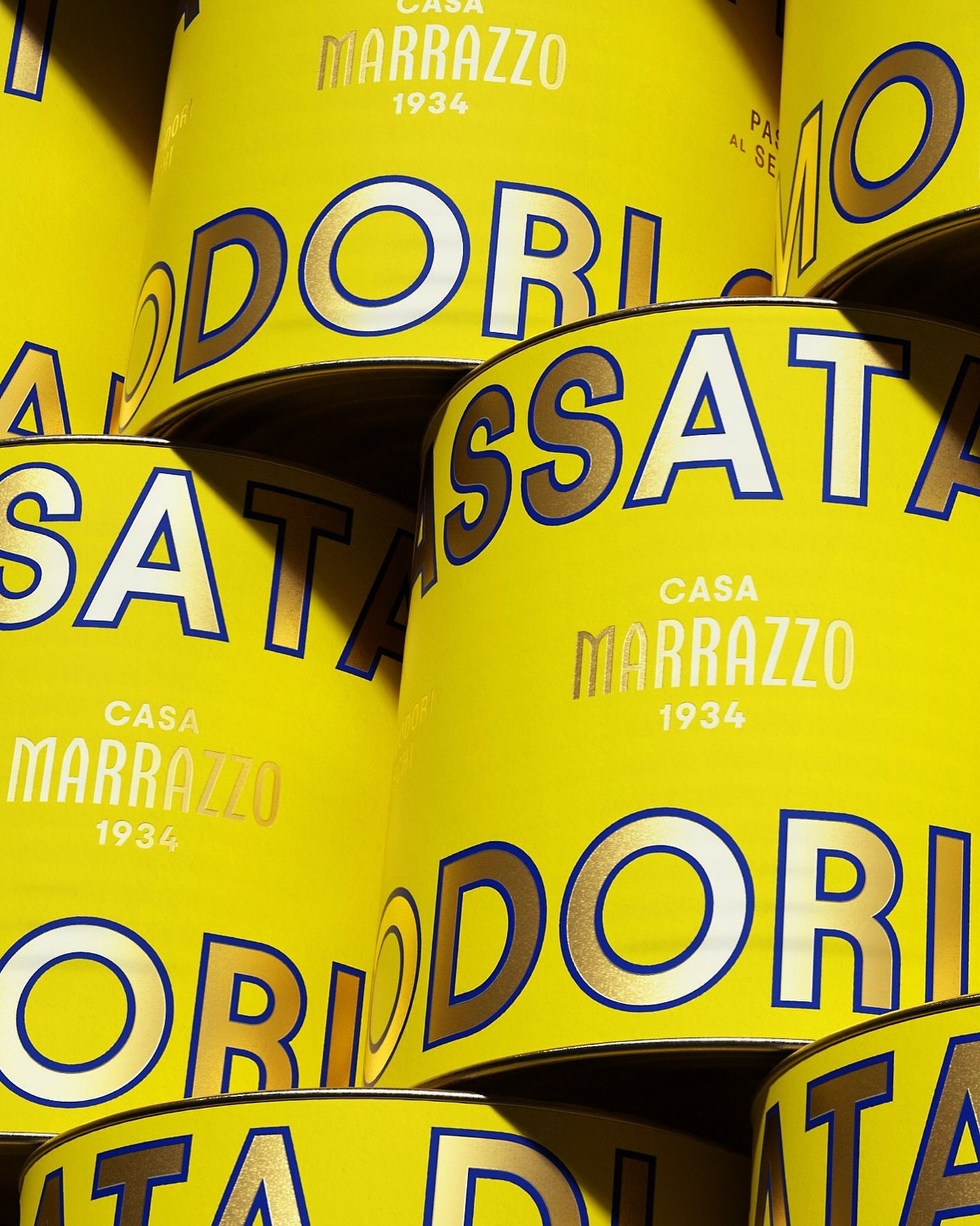
A clean layout, lots of gold, and the Avantt typeface were the elements that the Italian agency Auge Design used for these canned foods full of tradition and flavor.
Foundry: Displaay Foundry Design: Auge Design
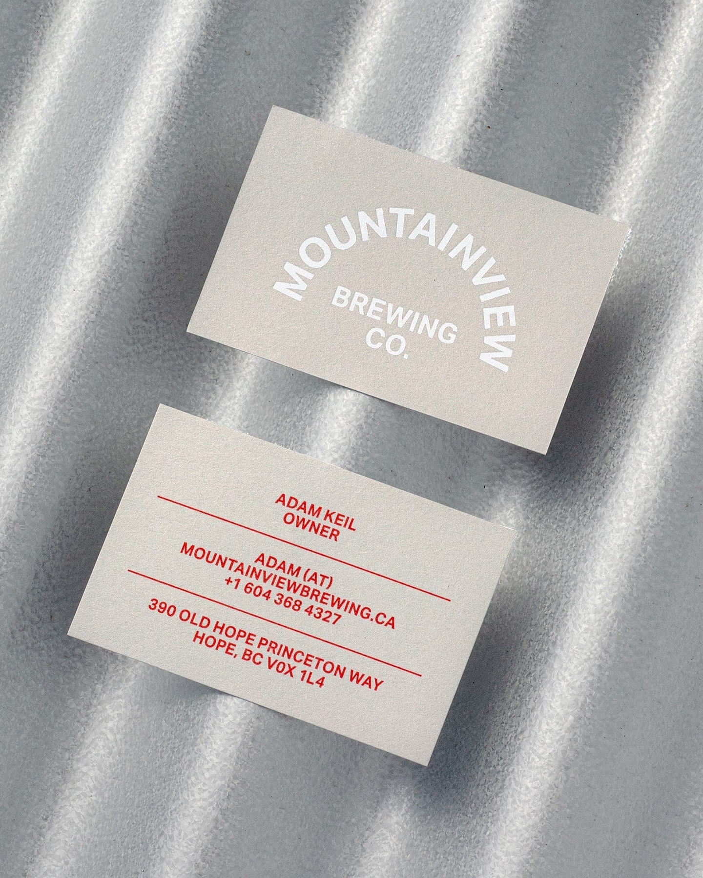
Memory Studio was inspired by vintage elements, like old book covers, and used Aktiv Grotesk to create the identity for this craft brewery.
Foundry: Dalton Maag Design: Memory Studio
Classics with a modern twist; National 2, Atlas Grotesk, and Atlas Typewriter, were used by Play for the identity they created for Open Research.
Foundry: Klim, Commercial Type Design: Play
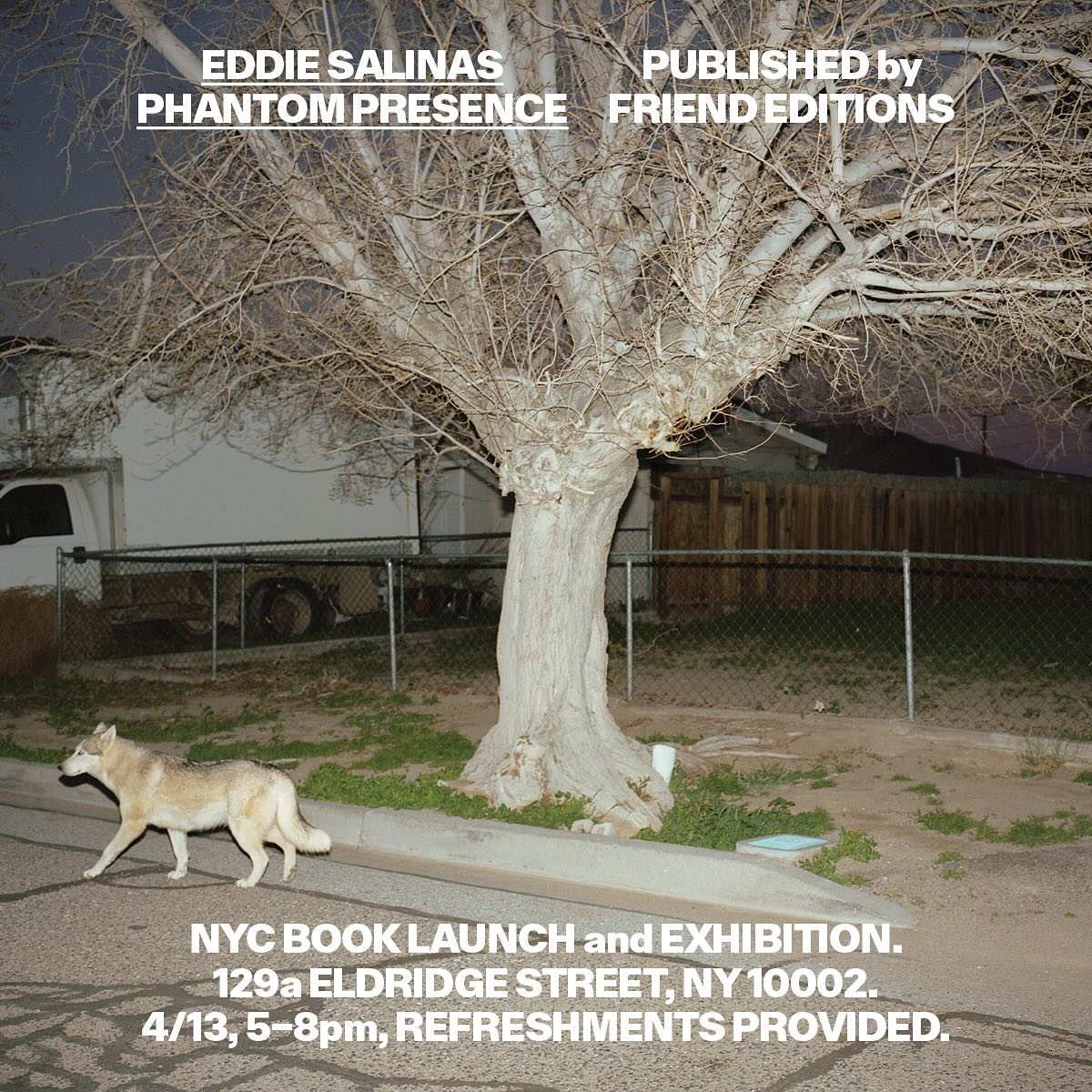
Made to showcase the dramatic and captivating work of Eddie Salinas, the book Phantom Presence was designed by Friend Editions, using All Purpose Grotesk for its interiors.
Foundry: All Purpose Fonts Design: Friend Editions
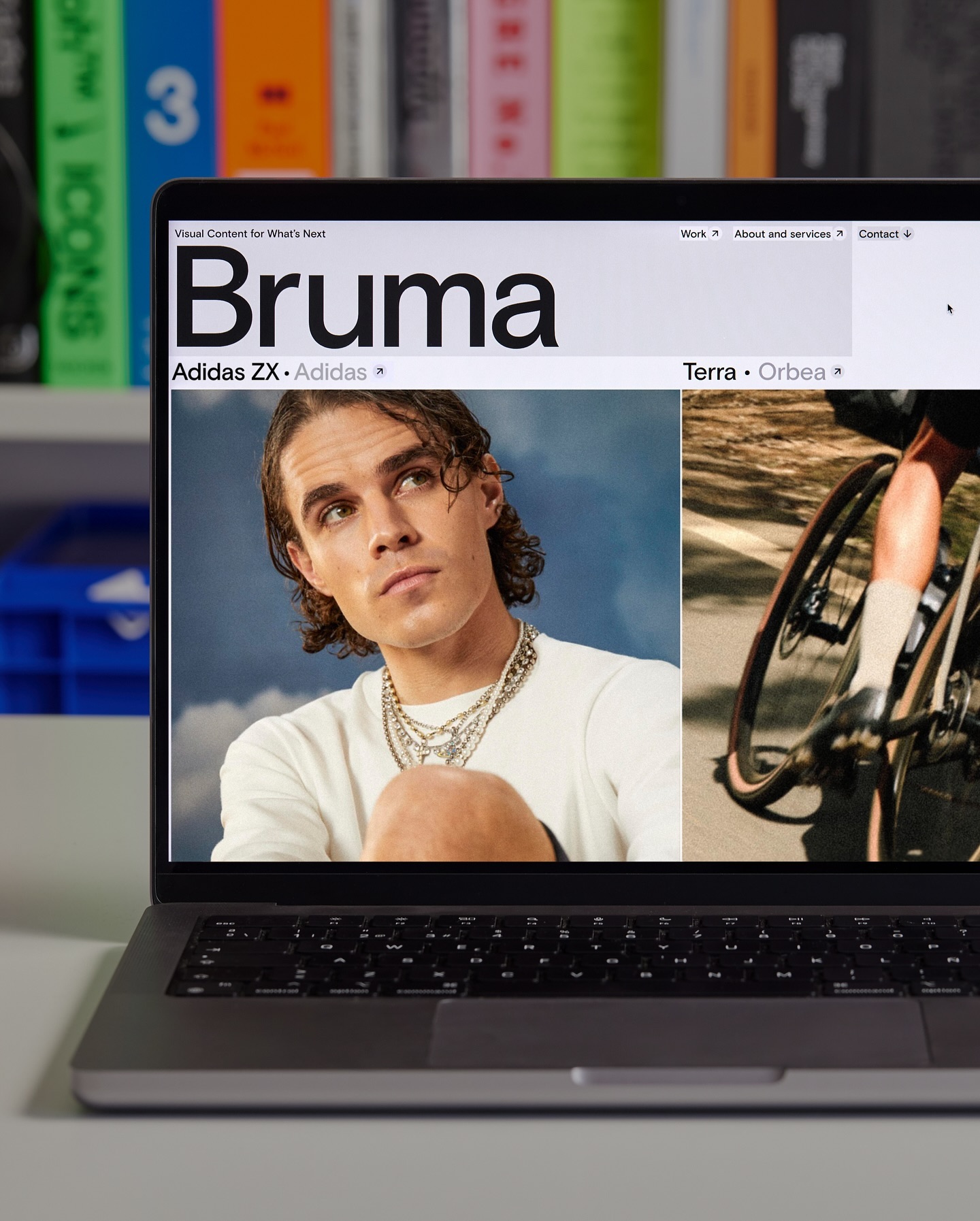
Basis Grotesque is the only typeface used in the identity and website of Studio Bruma, a creative production company to forward-thinking people and brands.
Foundry: Colophon Foundry Design: Leon Romero
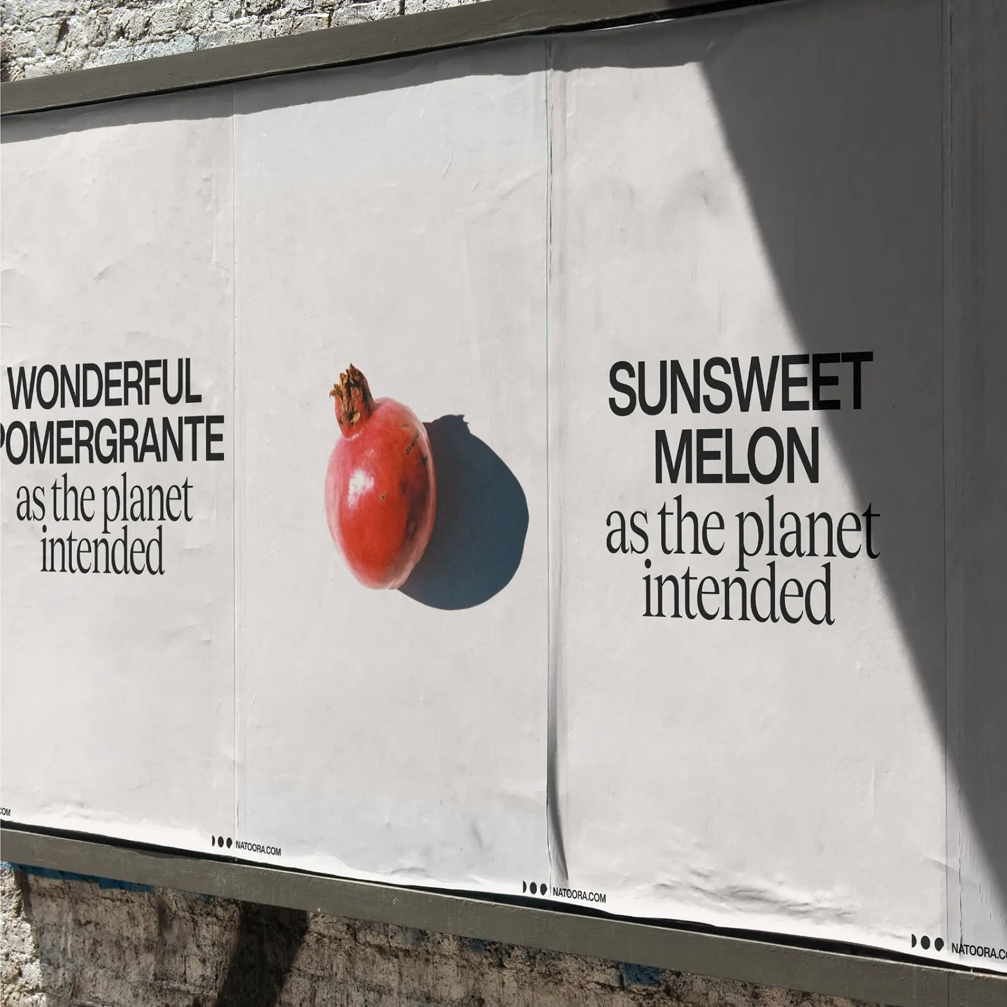
As authentic as nature can be, Justified Studio chose these two typefaces to be part of a sober yet sophisticated identity for the organic food producer Natoora.
Foundry: Displaay Design: Justified Studio
República Studio used Review from Commercial Type for this visual identity, aiming to communicate directly and consistently, while leaving the spotlight to the displayed photographs.
Foundry: Commercial Type Design: Estudio República
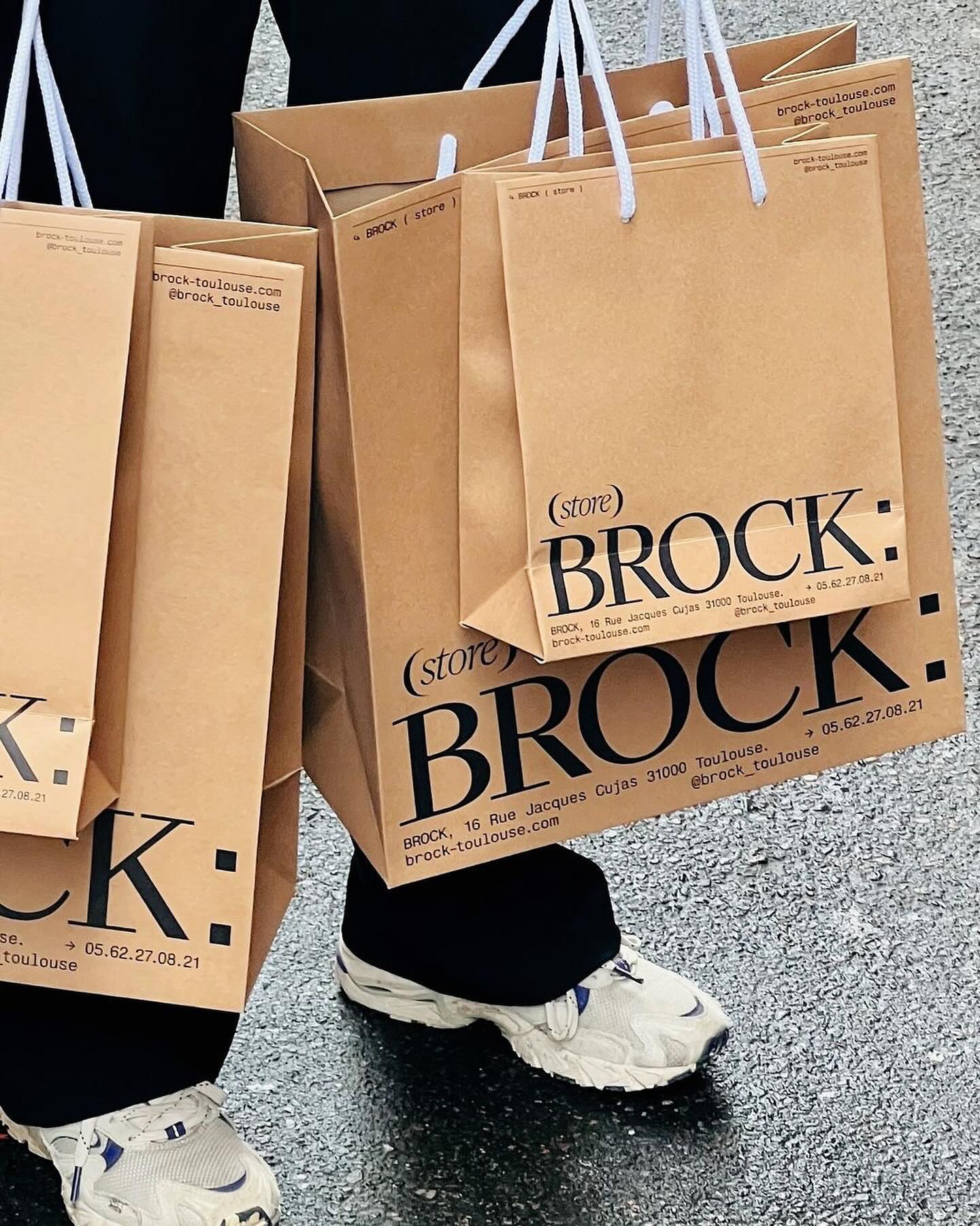
Quatrième Étage revamped the visual identity of the iconic Brock store, selecting the ES Face typeface for its logo, a 19th-century inspired serif with contemporary finishes.
Foundry: Extraset Design: Quatrième Étage
Apparat Bold + Buch Schmal, both from Kimera, were part of the update newkid made for Standard Equipment, a system of household objects.
Foundry: Kimera Corp Design: newkid
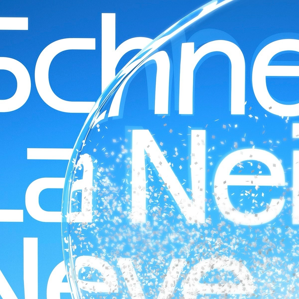
Maison Standard used Azeret from Displaay Typefaces for the identity of this exhibition at the National Library of Switzerland, which explains the impact of snow on our society.
Foundry: Displaay Typefaces Design: Maison Standard
Moser Crystal launched an autumn collection, and Studio Marvil designed its image using the Atlantic typeface from Heavyweight.
Foundry: Heavyweight Design: Studio Marvil
New typefaces for the new identity of the production company L’Éloi; Principal Studio chose Review by Commercial Type and Skandia by Store Norske Skriftkompani.
Foundry: Store Norske Skriftkompani, Commercial Type Design: Principal Studio
Newsreader by Production Type on the cover of this book addresses collaborations and how to coexist with other ideas.
Foundry: Production Type, Design: Sam Corijn
Victor Serif by KOMETA accompanies the photographs taken on a cycling trip with friends in this booklet designed by Familia.
Get Victor Serif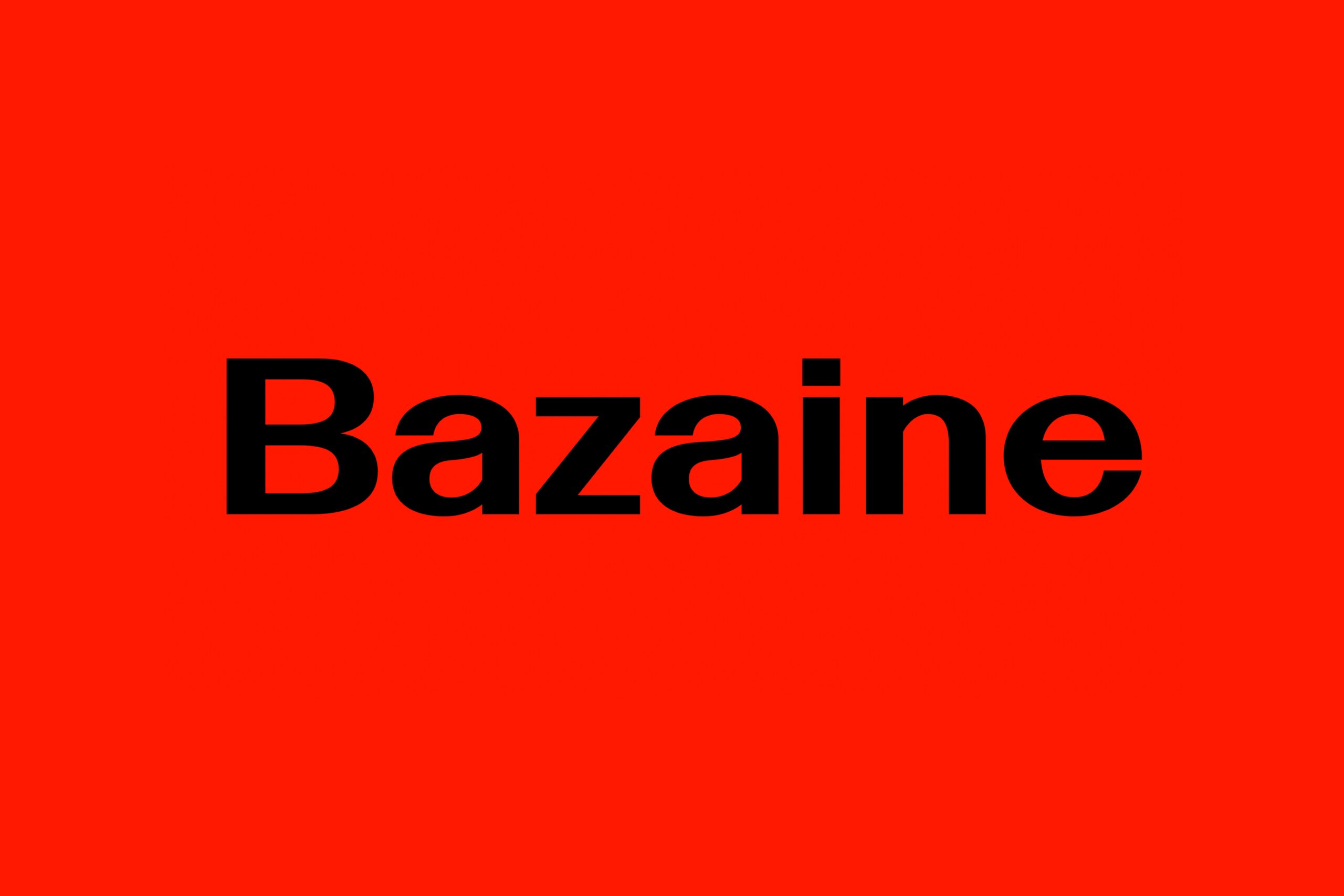
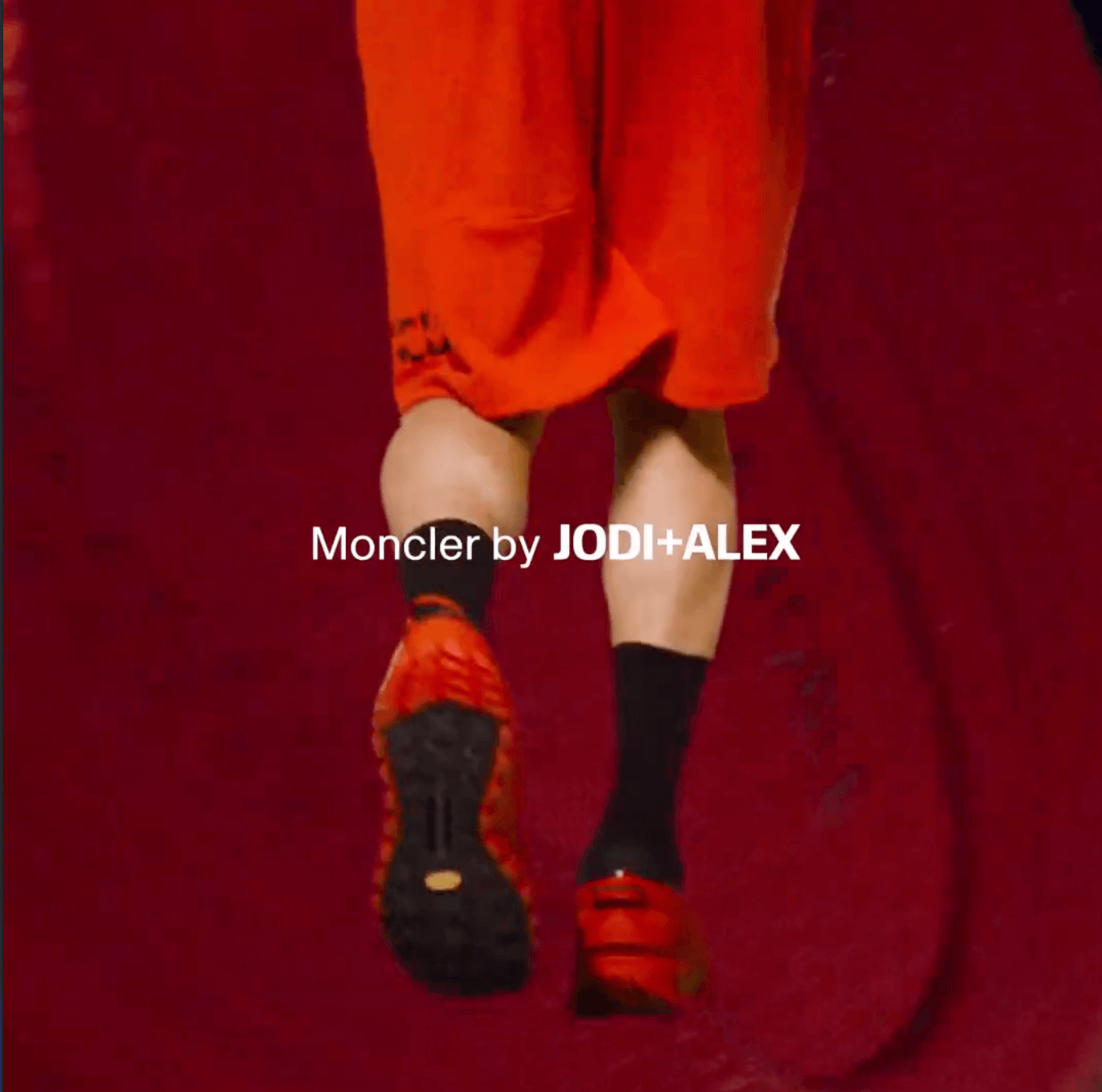
Bazaine and the Path of Ideas
Type Designers: Matthew Fenton, Haakon Spencer, Jack Niblett
Mastering: Christoph Koeberlin
Foundry: British Standard Type
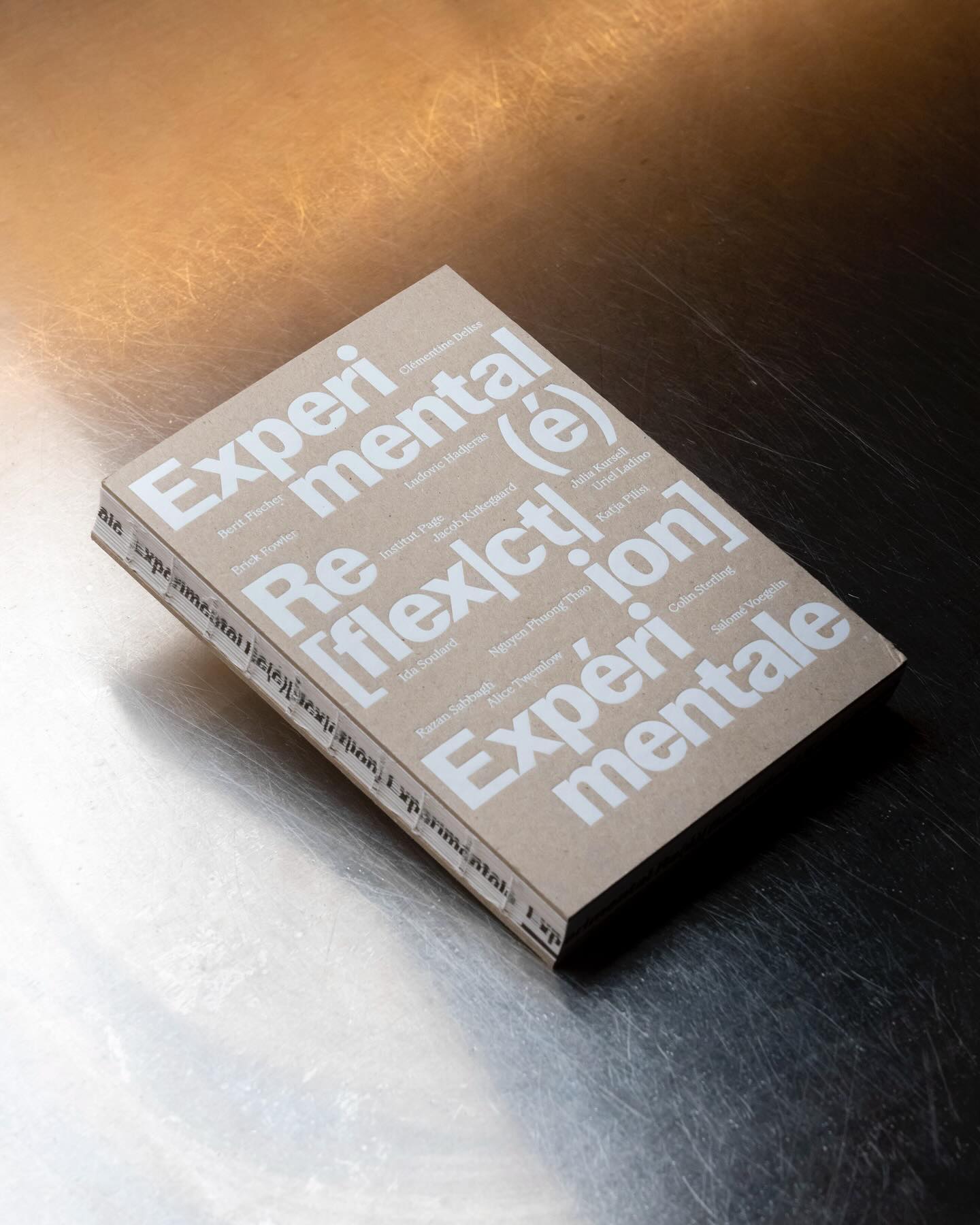
Experimental Re(é)[flex|ct|ion] is an editorial publication that explores concepts such as community, uncertainty, resistance, movement, among others, through explorations and discussions. Hannes Brischke uses ABC Walter Neue and Dark’s Remix A.
Foundry: Dinamo, Out of the Dark Design: Hannes Brischke
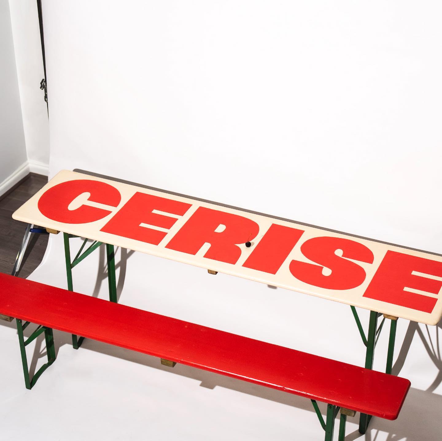
Studio Cerise, a colorful creative studio from East London, used Swinton by Nouvelle Noir for its logo.
Foundry: Nouvelle Noir Design: Studio Cerise
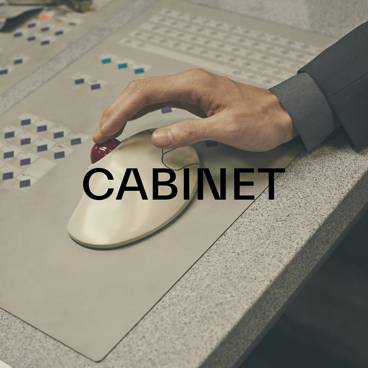
TWK Everett venturing into the fashion industry through the creative studio and fashion brand Cabinet Milano, led by Rossana Passalacqua and Francesco Valtolina.
Foundry: Type Weltkern
This fresh and fun poster design for the Teatro Prospero uses Review Condensed from Commercial Type, a Principal Studio project
Foundry: Commercial Type Design: Principal Studio
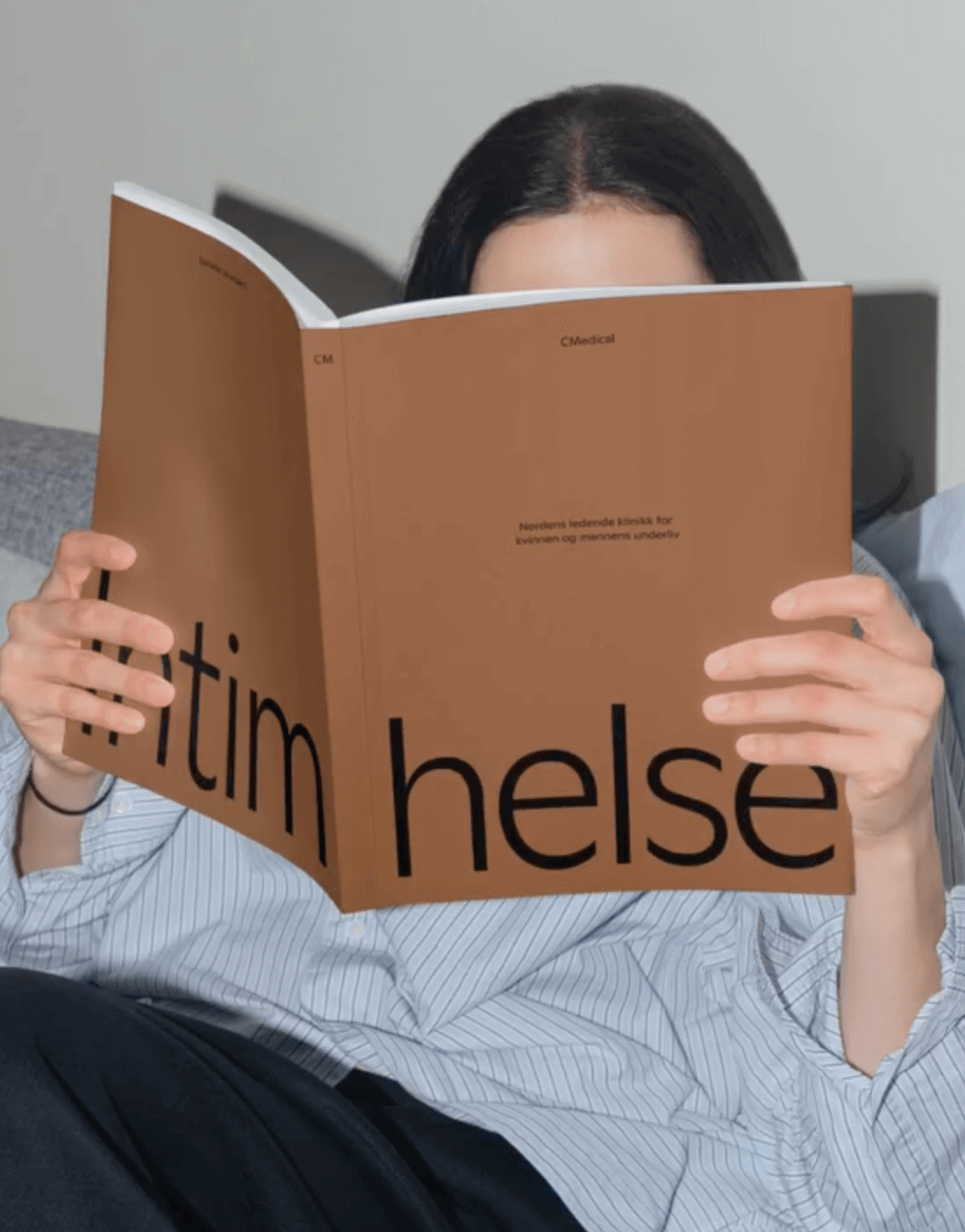
EY Doberman used Ginto from ABC Dinamo in different weights to achieve a consistent stroke throughout the visual identity for CMedical.
Foundry: ABC Dinamo Design: EY Doberman

As a collectible object decorating a space, Christopher Doyle & Co. used Moulin for its unique and attractive features, along with Scto Grotesk, to achieve the elegance and sophistication that the interior design brand, Tom Mark Henry, aimed to convey with its new identity.
Foundry: Commercial Type, Schick Toikka Design: Christopher Doyle & Co.
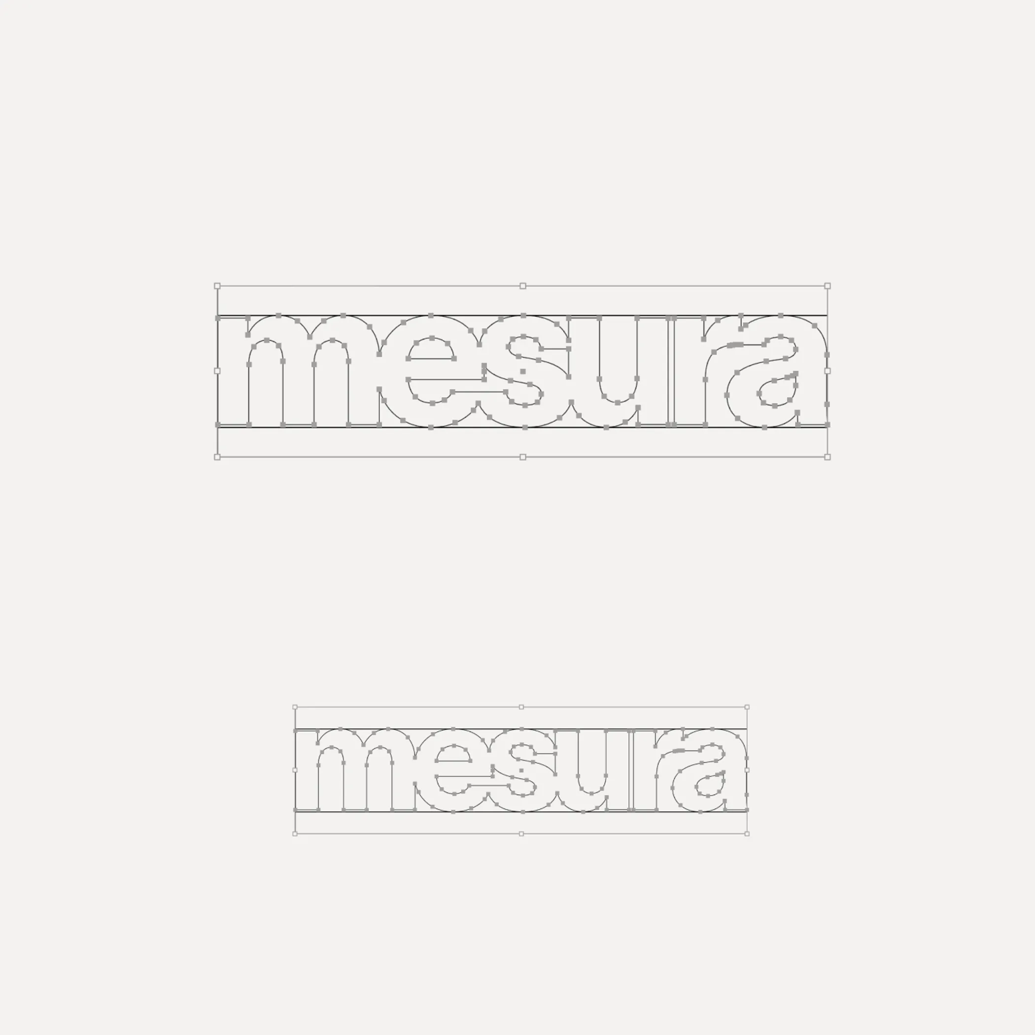
Flexibility was what Mouthwash studio aimed for with the typographic selection they made for the Messura . Kimera’s Waldenburg and Times LT were chosen to give solidity to the brand and possibilities to evolve.
Get Waldenburg
Waldenburg from Kimera Corp was customized to be part of the visual identity for a new line of assistance for people with opioid addiction issues. Designed by Raw Materials and Service Plan
Foundry: Kimera Corp Design: Raw Materials, Service Plan
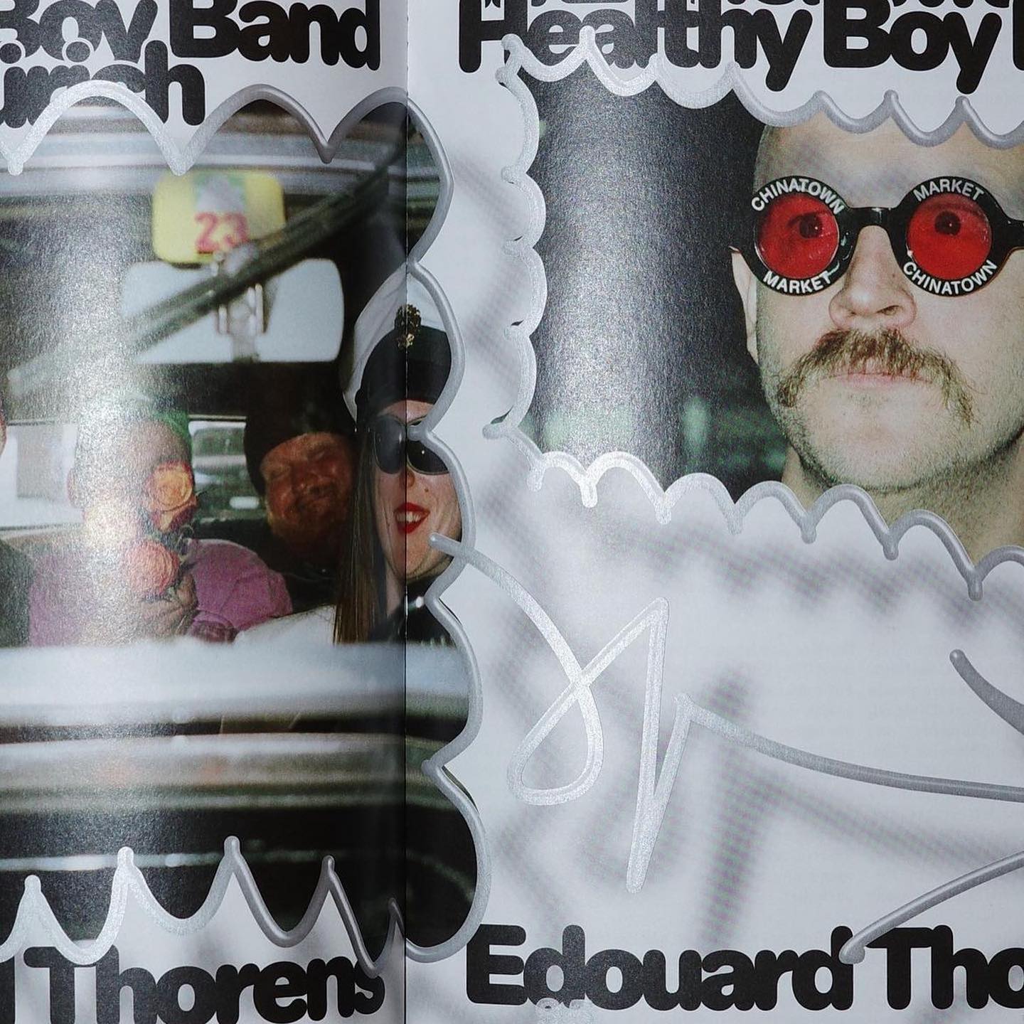
Diatype Rounded from ABC Dinamo is used in Healthy Boy Band, a cultural magazine that is a tribute to graphic design
Foundry: ABC Dinamo Design: Ortner etc.
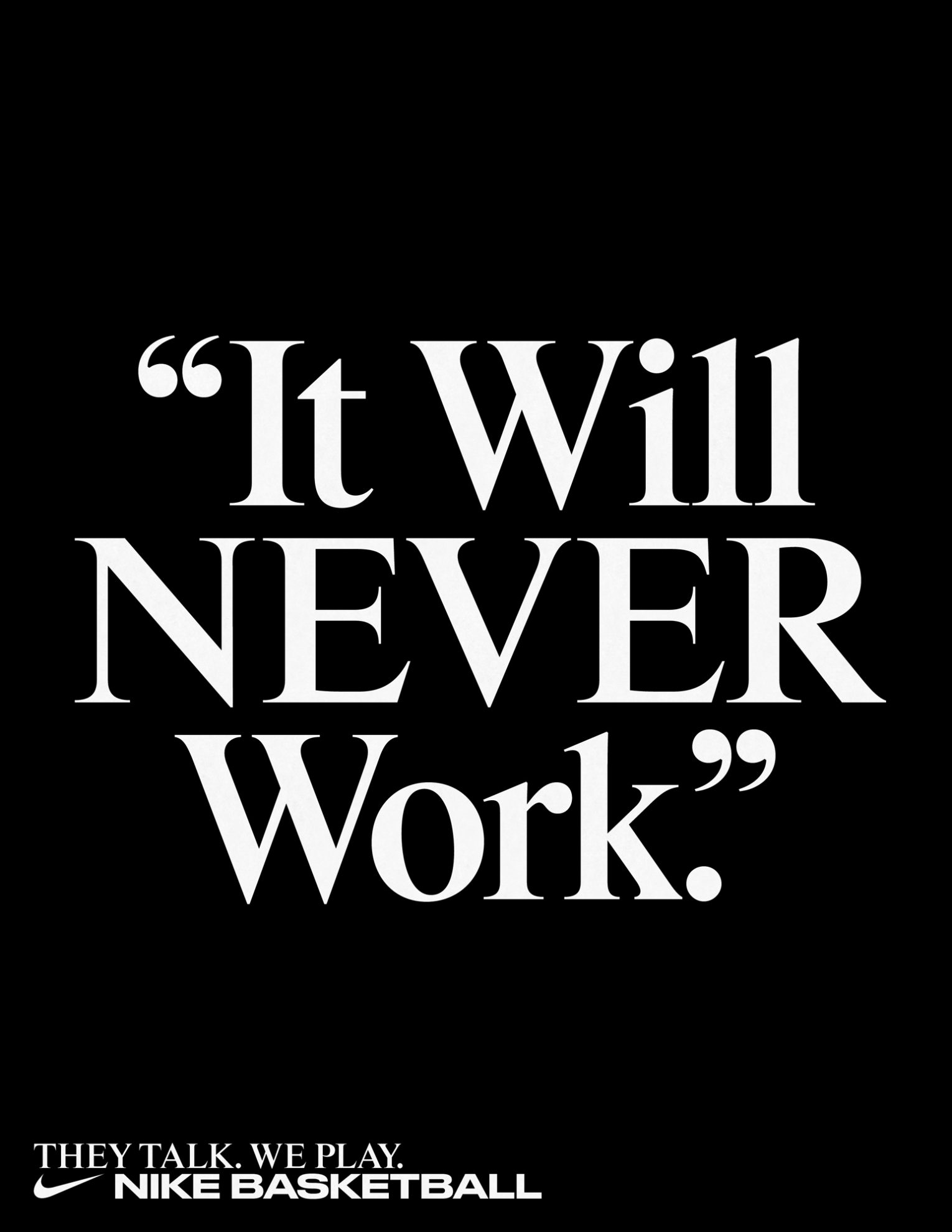
Rhymes by Maxitype in the 2017 campaign for the NBA Finals “They Talk We Play”. Design by Hort and Tim+Tim.
Get Rhymes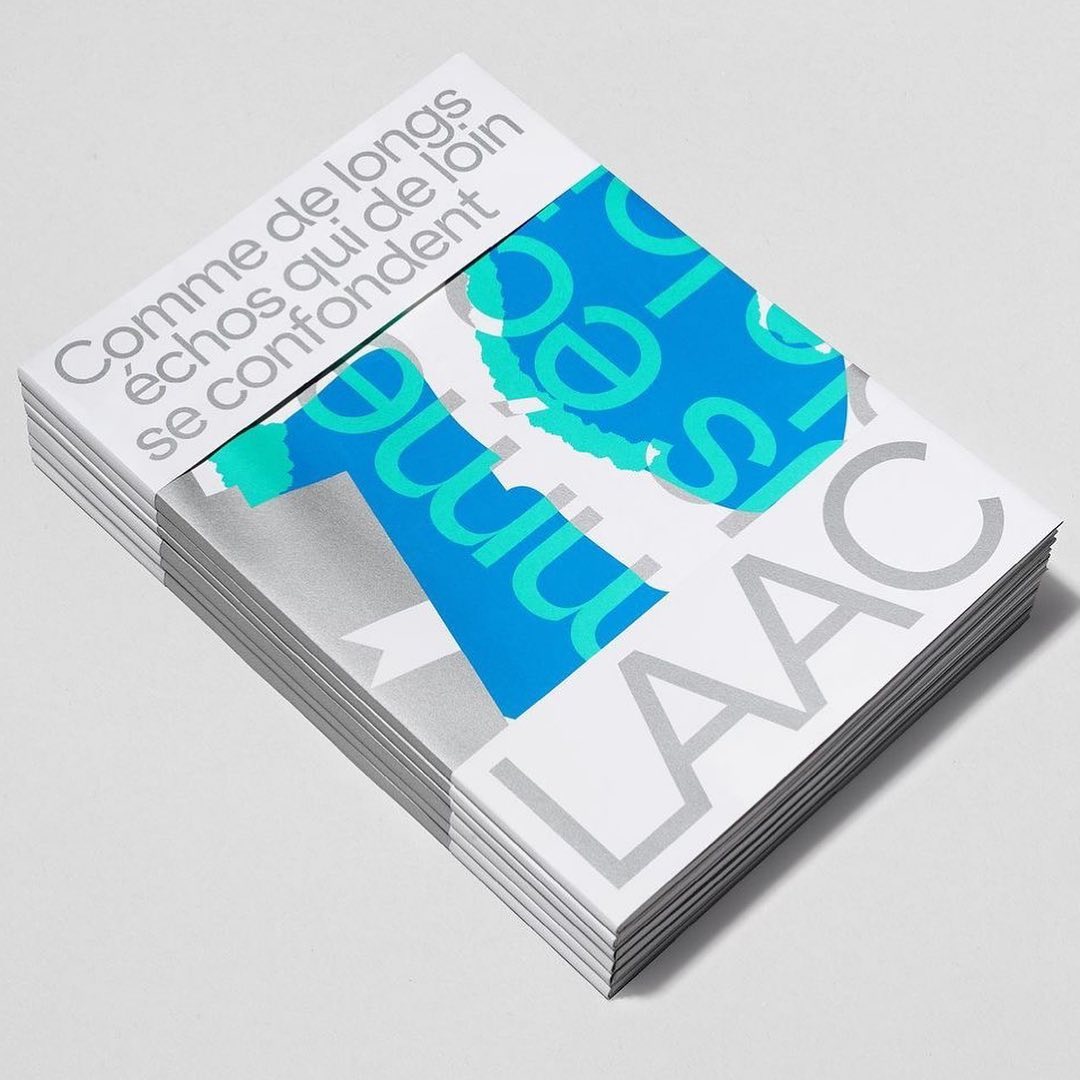
Studio Hudson Catty and Atelier Baudelaire used ES Klarheit Kurrent to design a set of three books celebrating the 40th anniversary of LAAC in Dunkirk.
Foundry: Extraset Design: Studio Hudson Catty, Camille Baudelaire & Olivia Grandperrin
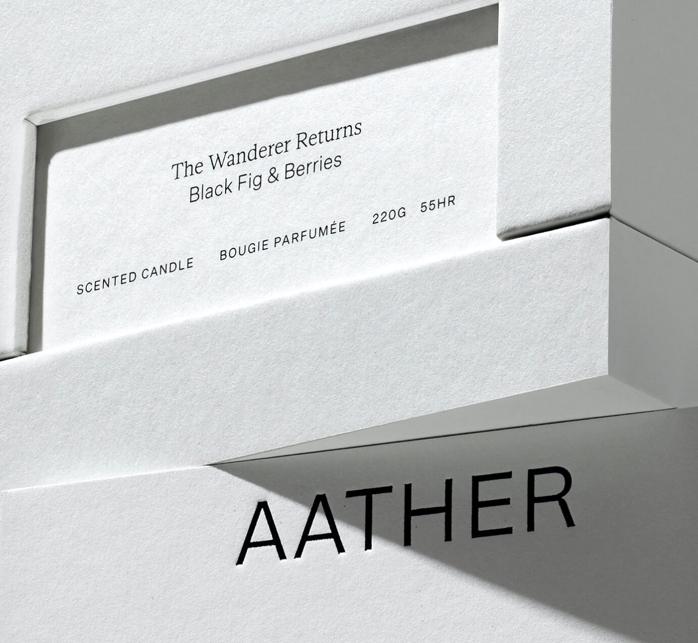
SOCIO Design used Untitled Sans from Klim Type Foundry and Gestura from Socio Type Foundry to complement the visual identity of AATHER’s high-quality candles.
Foundry: Klim Type Foundry, SOCIO Type Foundry Design: Socio Design

Typeset in Rhymes by Maxitype in the book of photographer Werner Amann capturing the nightlife rave scene of the early 1990s. Design by Lamm & Kirch with Caspar Reuss
Foundry: Maxitype Design: Lamm & Kirch / Caspar Reuss
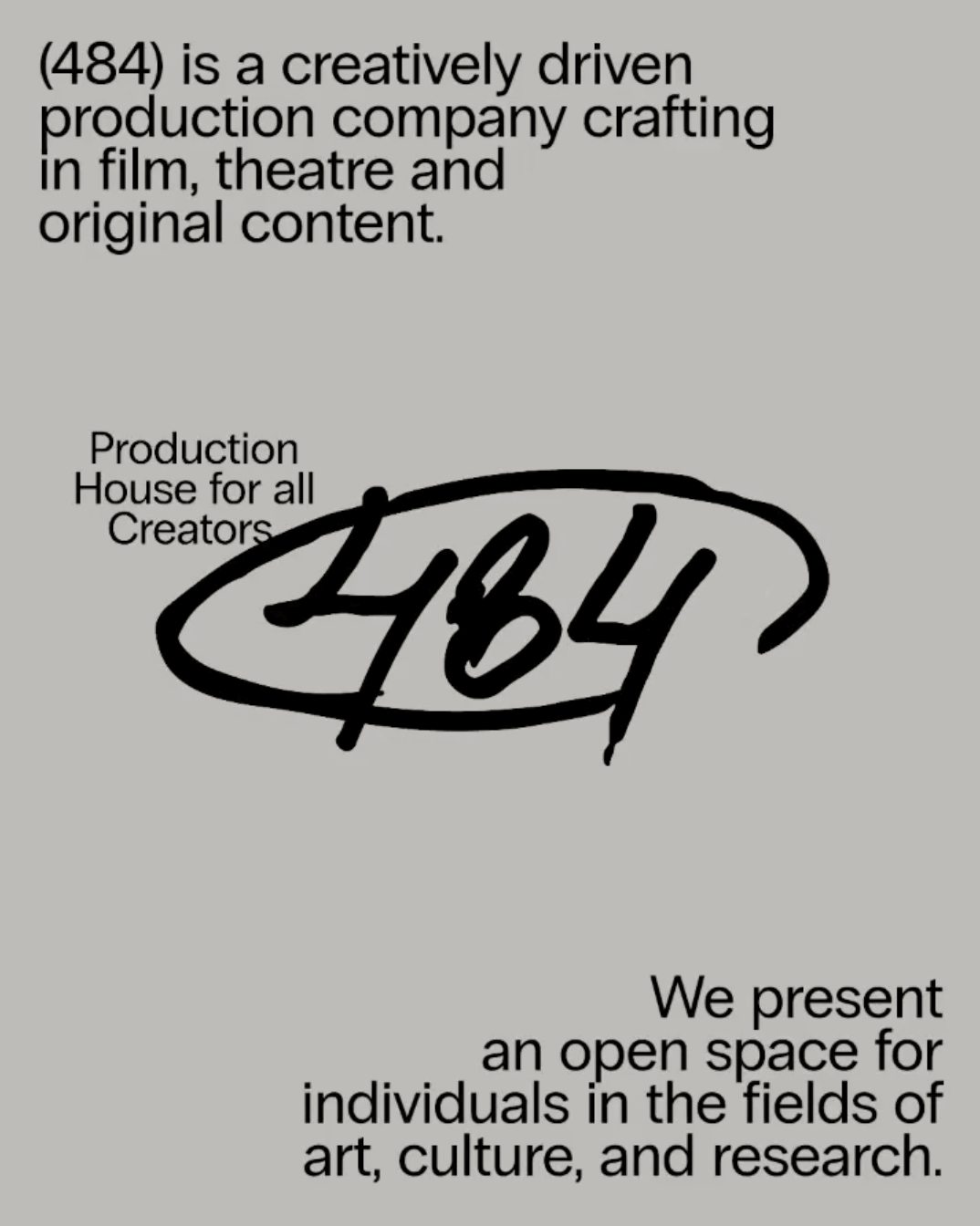
Neue Haas Grotesk, available at Commercial Type, in the identity of (484) Creative Production House. Design by Studio Abraham.
Foundry: Commercial Type Design: Studio Abraham
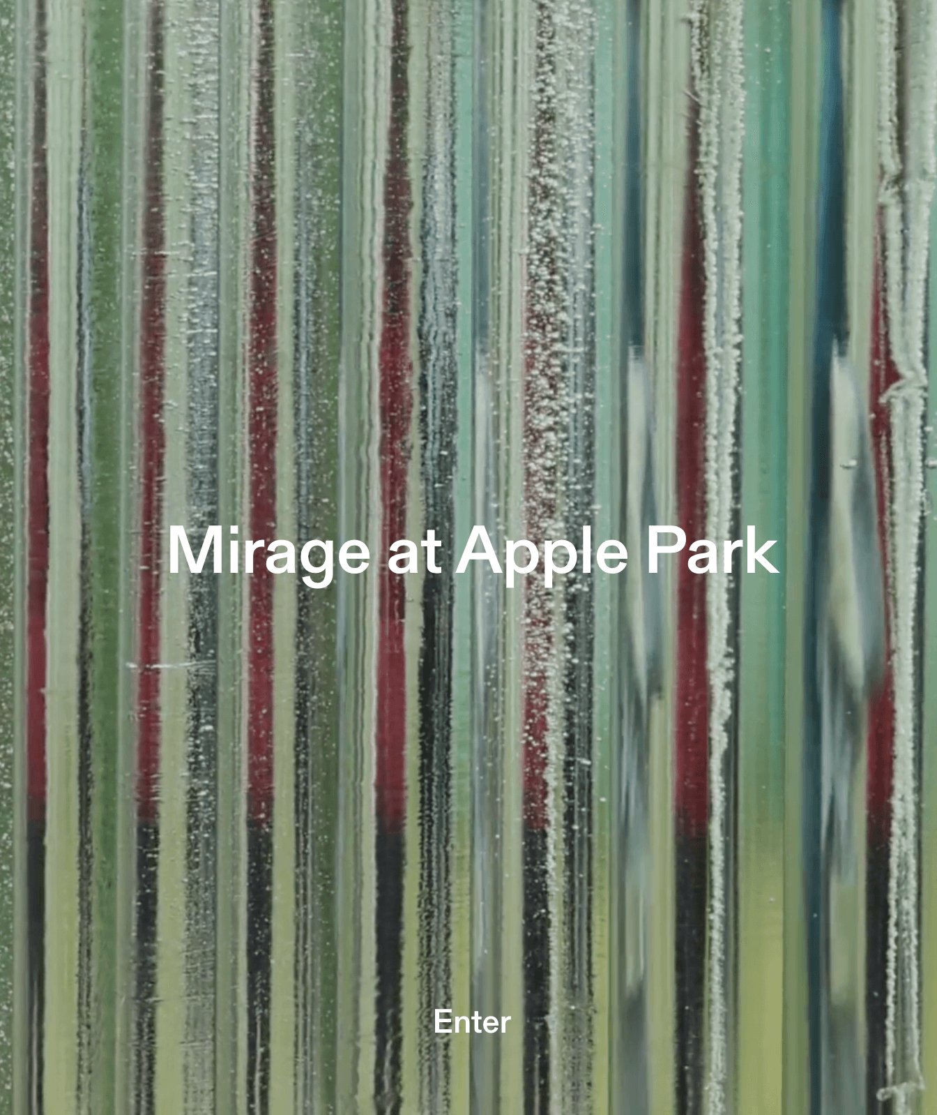
Gerstner-Programm by Forgotten Shapes on the website for Mirage, a sculpture made by artist Katie Paterson and architectural studio Zeller & Moye for Apple Park.
Foundry: Gerstner-Programm Web Design: Rafa Cobiella UX: Seriousandly
Leon Romero using Alias Ano by Alias and Suisse Works by Swiss Typefaces in the identity created for the Architecture office Bajet Giramé.
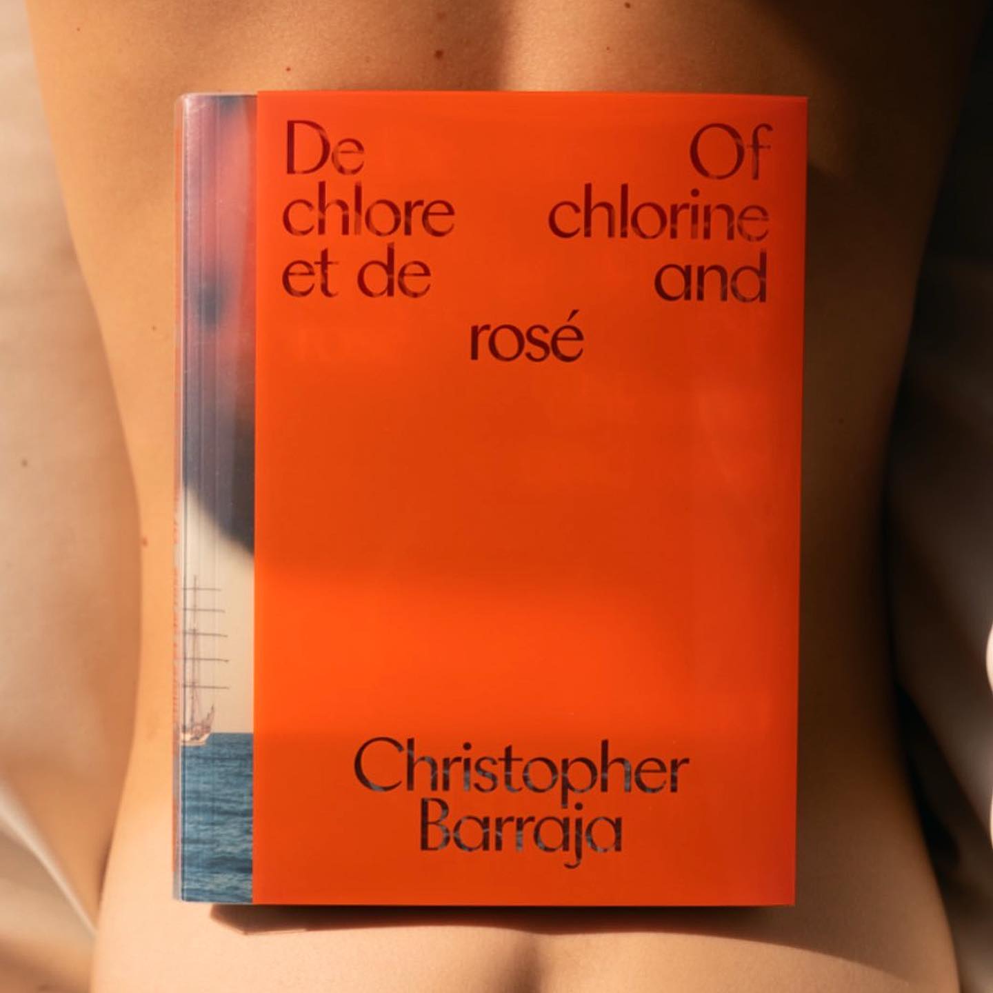
Atlantic by Heavyweight in “De Chlore et de Rosé”, photographer Christopher Barraja first book.
Foundry: Heavyweight Design: Bastien Forato

The humanist and geometric font Centra nº1 by Sharp Type in the full-service production, art buying & casting services company Yours.
Foundry: Sharp Type Design: Basora

A winning combination of fonts from ABC Dinamo, Walter Neue and Simon Mono for Satisfy Running x Oakley.
Foundry: Dinamo Design: Actual Source
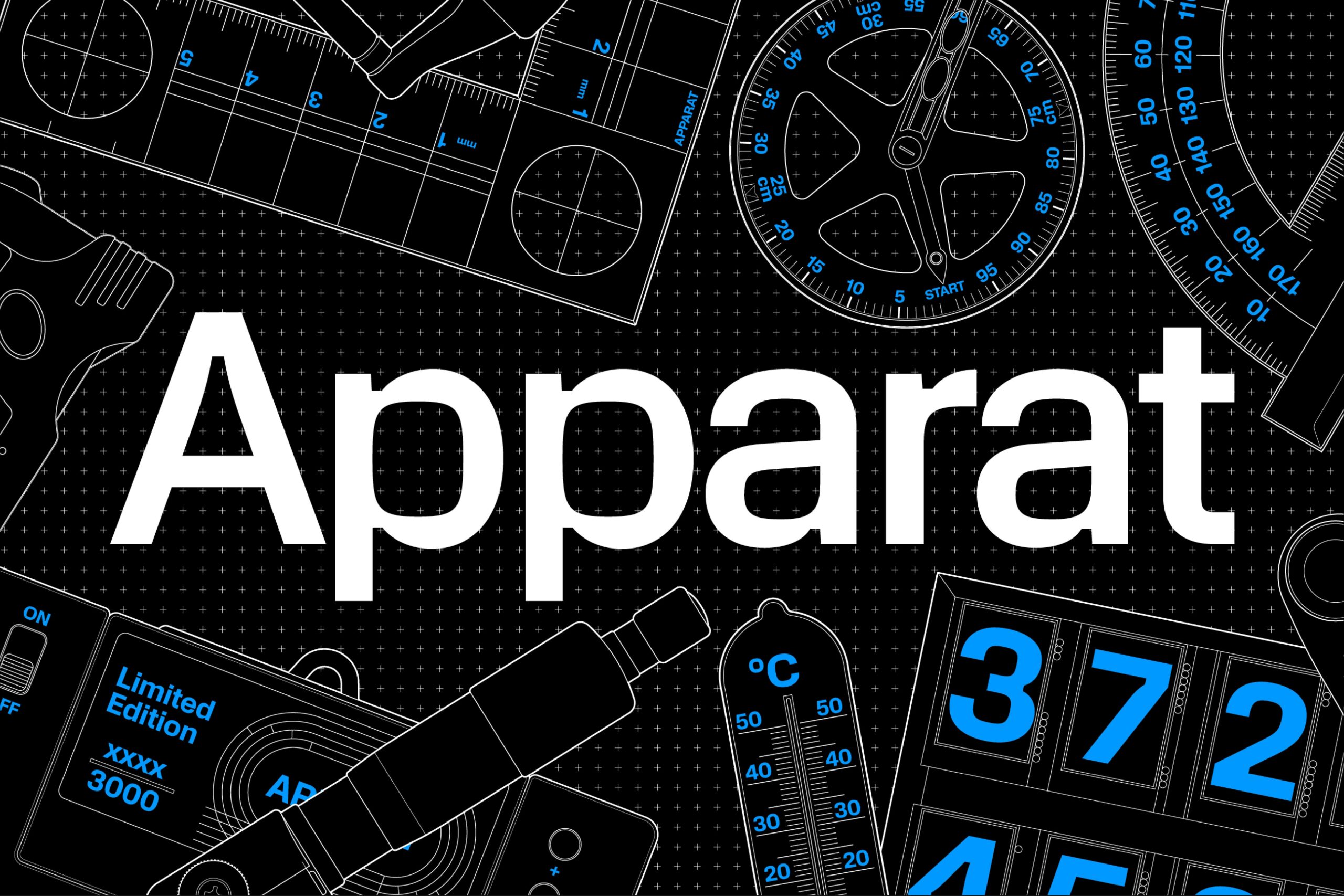
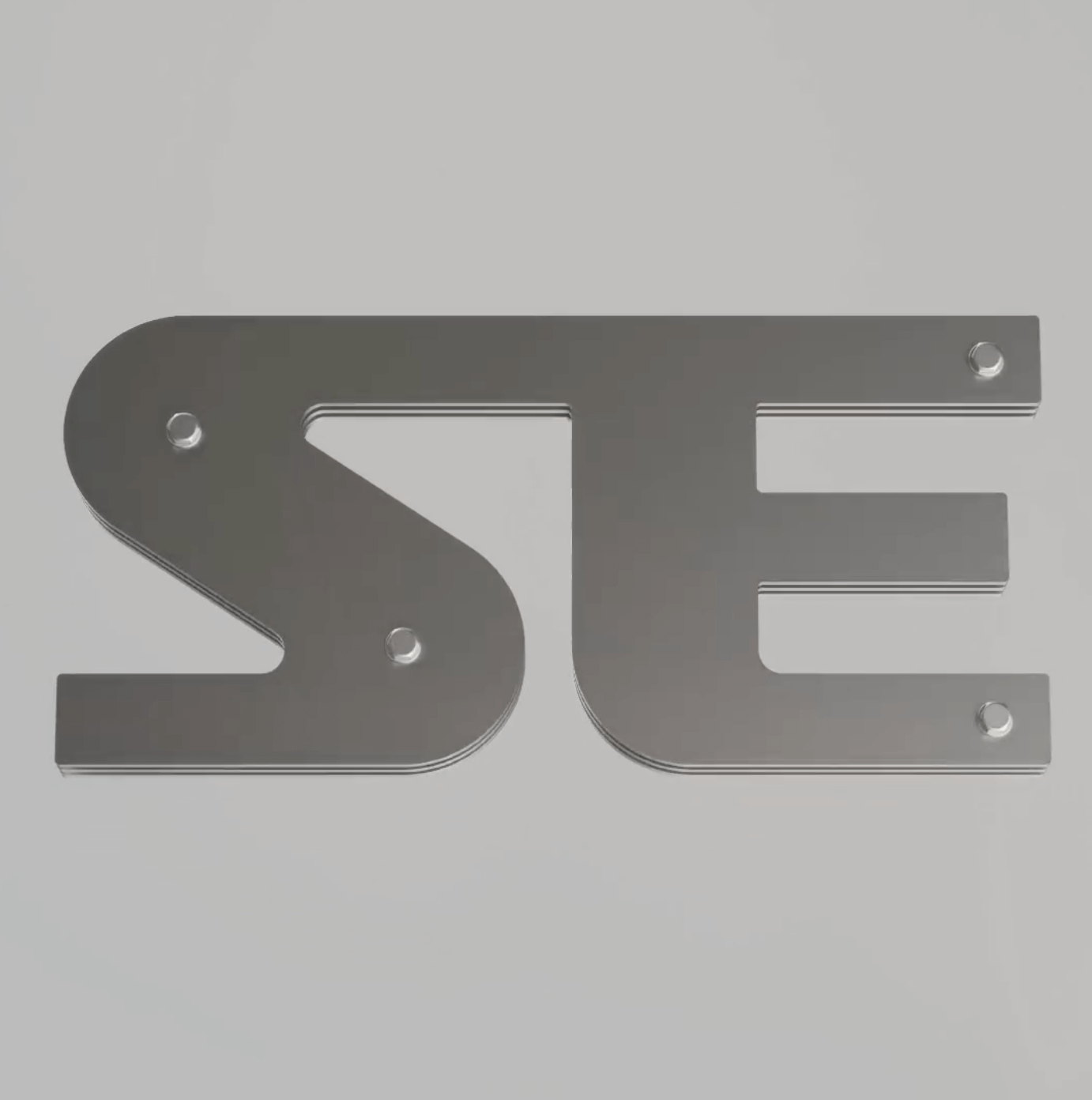
Square or rounded? Maybe both. Apparat is a typeface with an interesting interplay between its shapes and counters, inspired by the fonts of 1970s television.
Type Designers: Michael Clasen, Marcel Saidov Foundry: Kimera
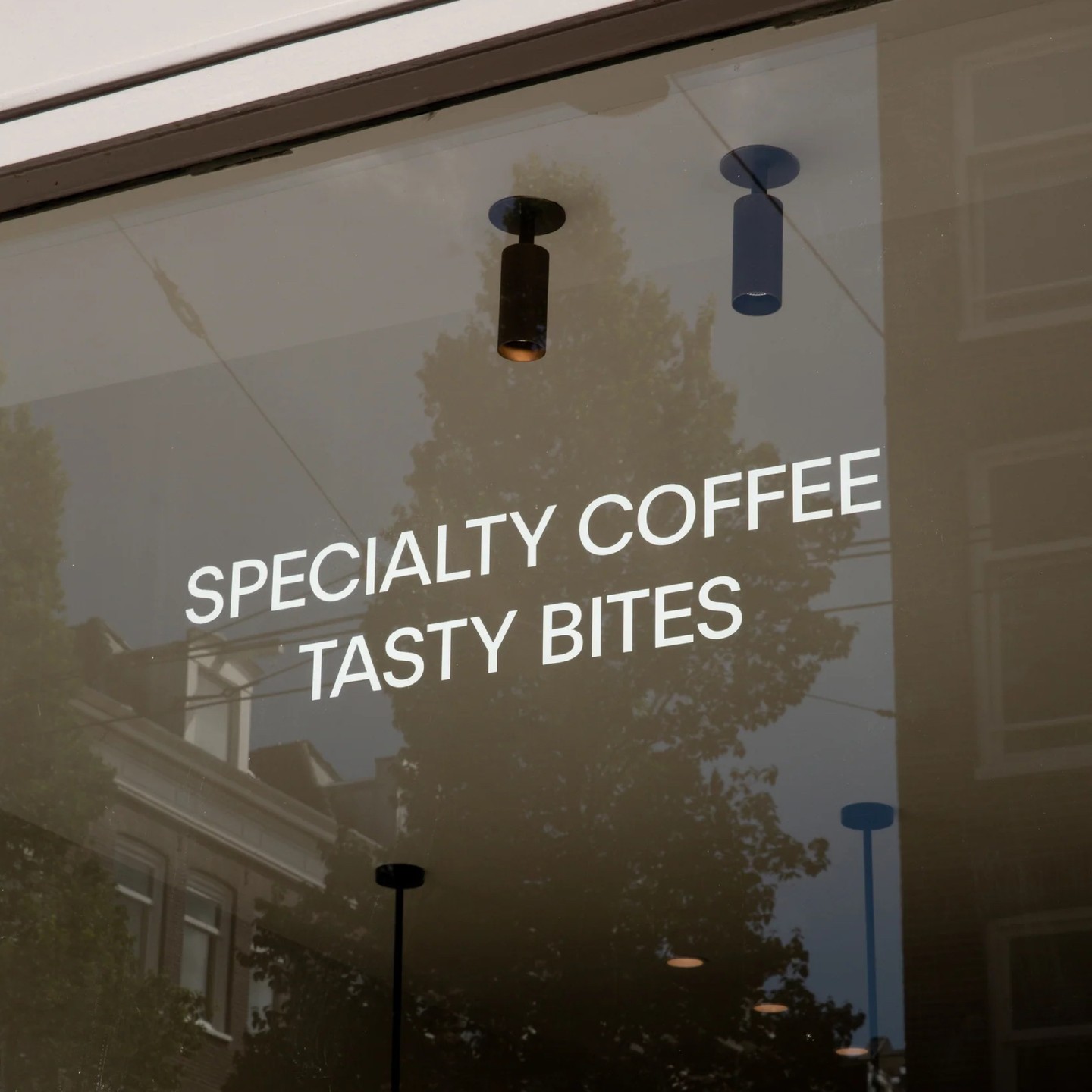
Locals, a cozy coffeeshop located in Amsterdam, using System Blank by Frost Type.
Foundry: Frost Type

Dinamo’s Favorit announcing CDG showcase at Berlin.
Foundry Dinamo, Design Flavious Augustin.