

The redesign of ArkDes in Stockholm by AM Stockholm features custom typefaces where dots and dashes create a unique typographic system. Alongside Diatype, these fonts redefine the museum’s identity.
Type Design: ABC Dinamo, Luuse, Adrien Vasquez Design: AM Stockholm

Tetier, the jewelry brand using recycled materials that recently collaborated with Asics, features Octave by Faire Type in its logo and texts.
Foundry: Faire Type Design: Baptiste Gerbelot Barillon
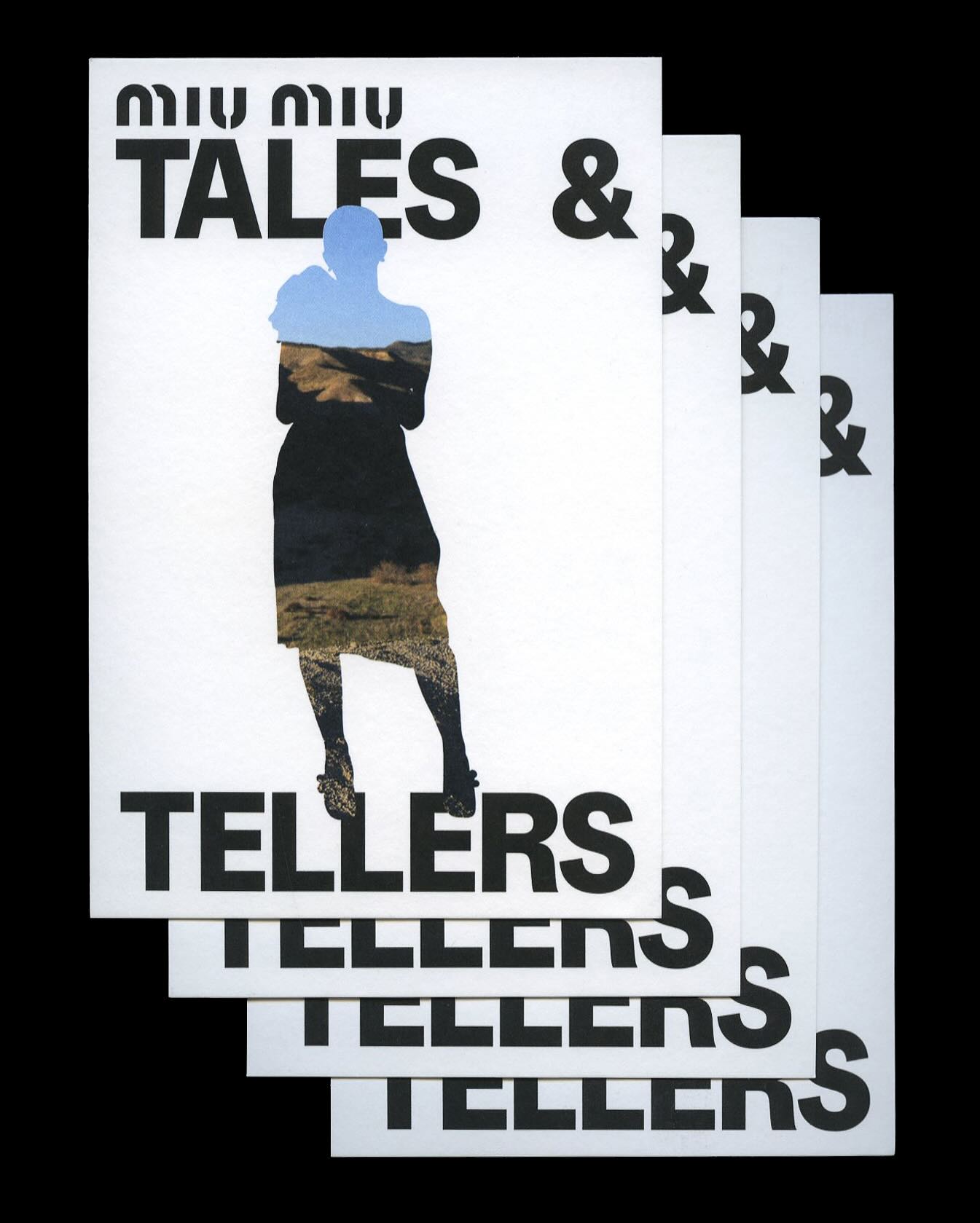
Kern typeface is featured in Tales & Tellers, a Miu Miu campaign that revisits various representations of femininity from past runway shows and short films.
Foundry: Pizza Typefaces Design: 2×4
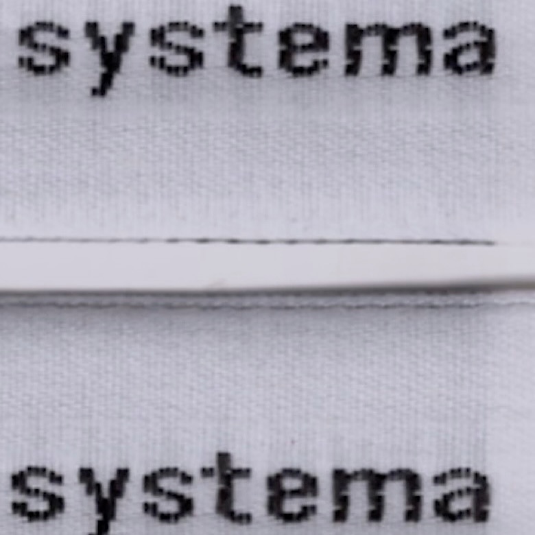
The French studio Plus Mûrs used Diatype Mono by Dinamo for the logo of the sophisticated sports brand, Counter Systema.
Foundry: Dinamo Design: Plus Mûrs
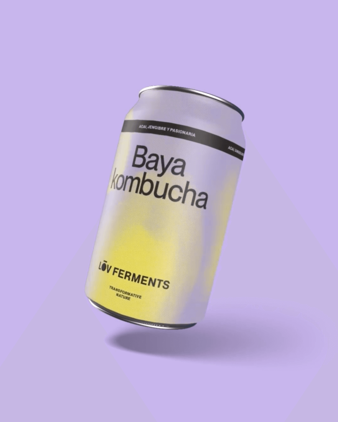
Casa Bien used Neue Montreal by Pangram Pangram and Items by Schick Toikka to build the visual identity for LOV Ferments, a brand set to change the beverage market.
Foundry: Pangram Pangram, Schick Toikka Design: Casa Bien
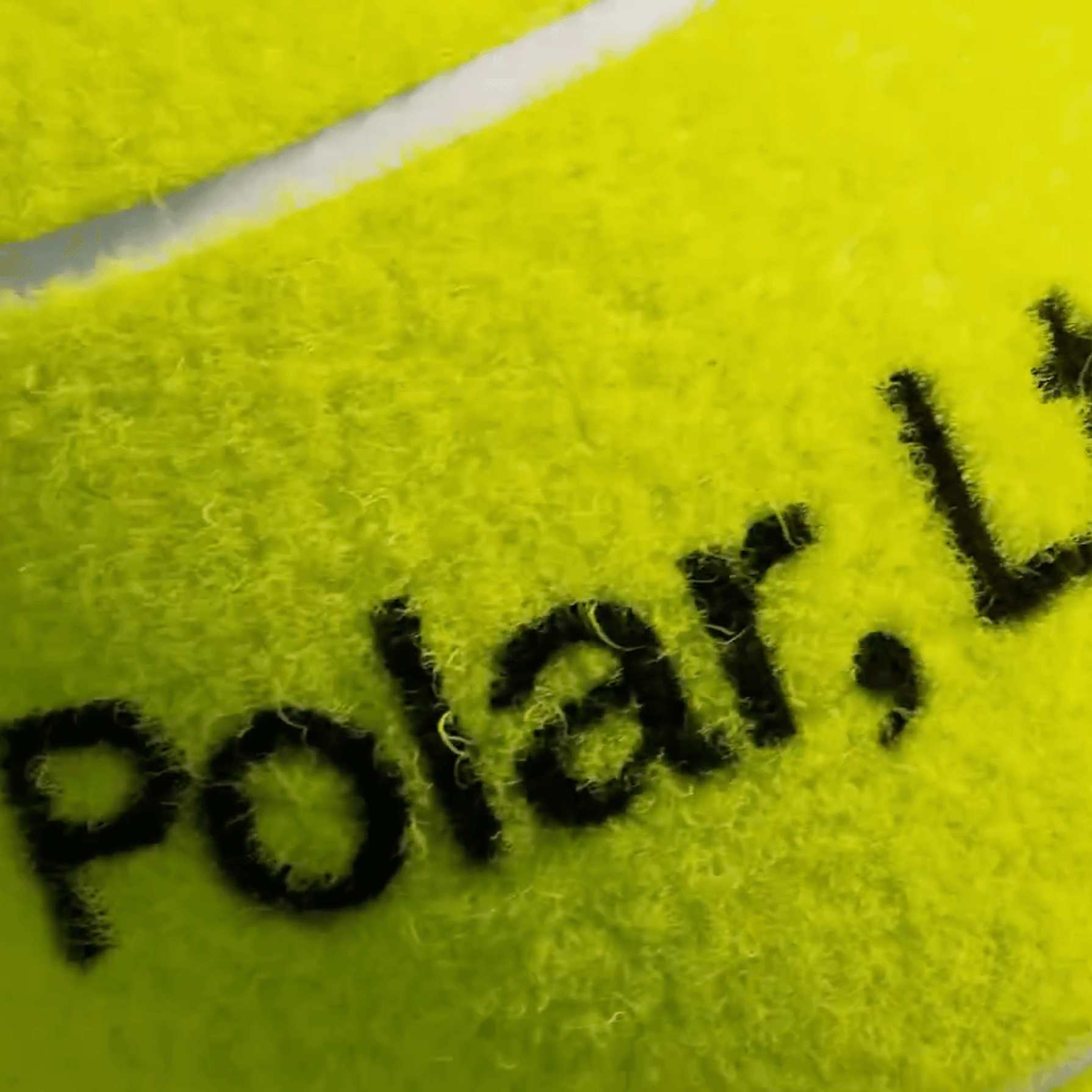
A studio and shop at the same time, or a shop that also functions as a studio; Polar Ltda brings together various design professionals to offer a fresh creative approach.
Foundry: Family type Design: Polar Ltda
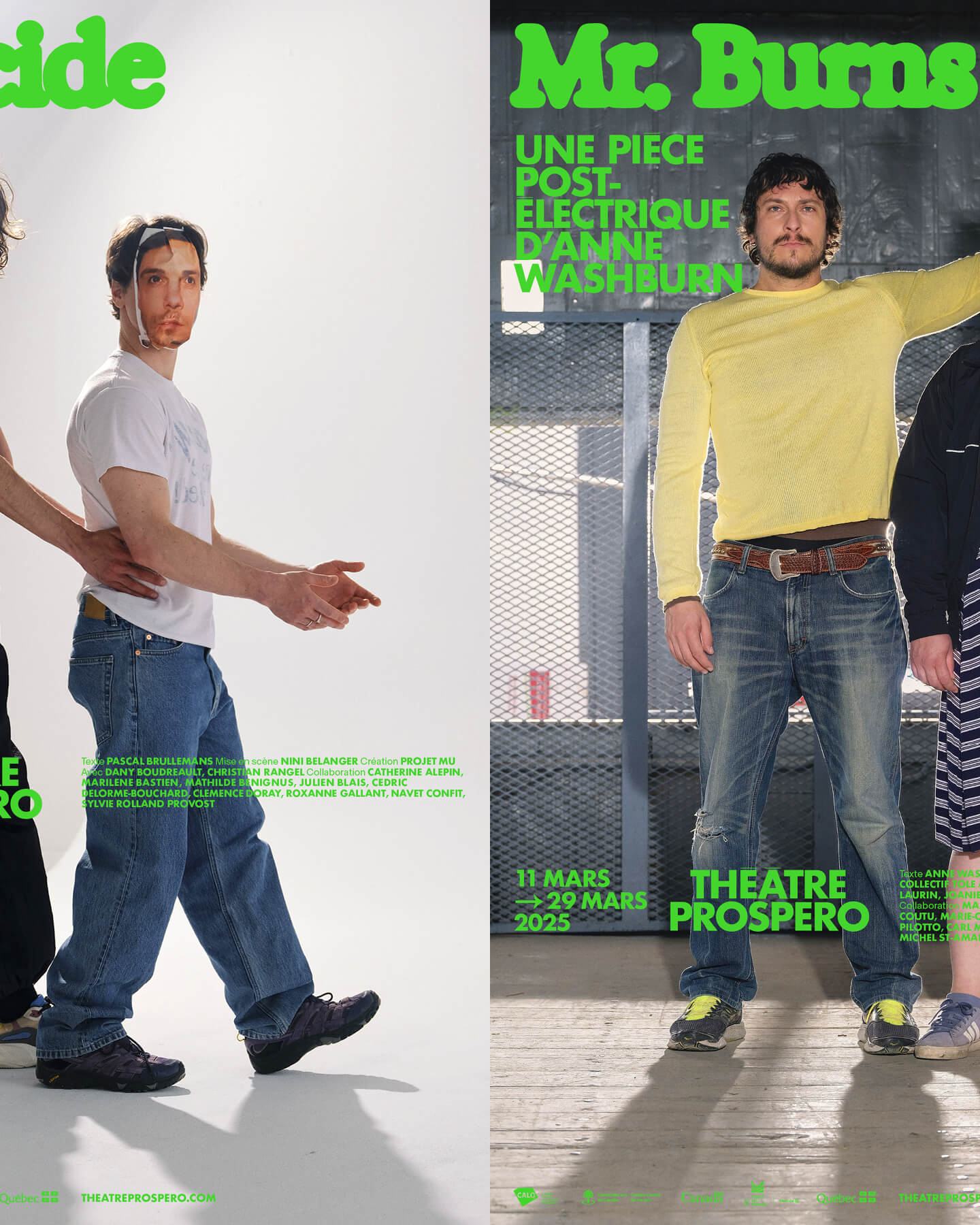
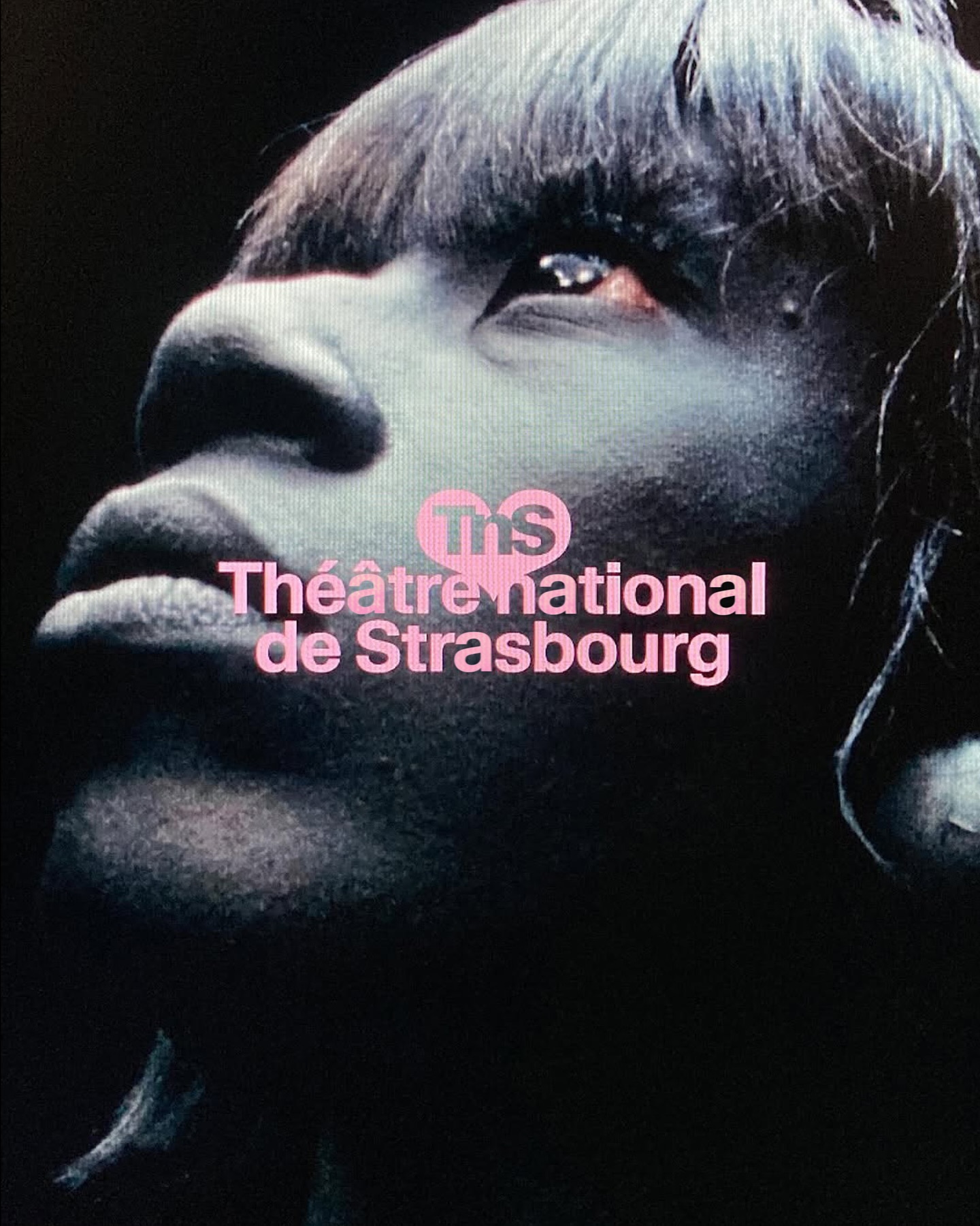
“After all, being together is revolutionary.” That was the main idea behind the 2024-2025 season campaign for Théâtre Prospero, directed and designed by Principal Estudio using Exposure.
Foundry: Federcio Parra Barrios Design: Principal
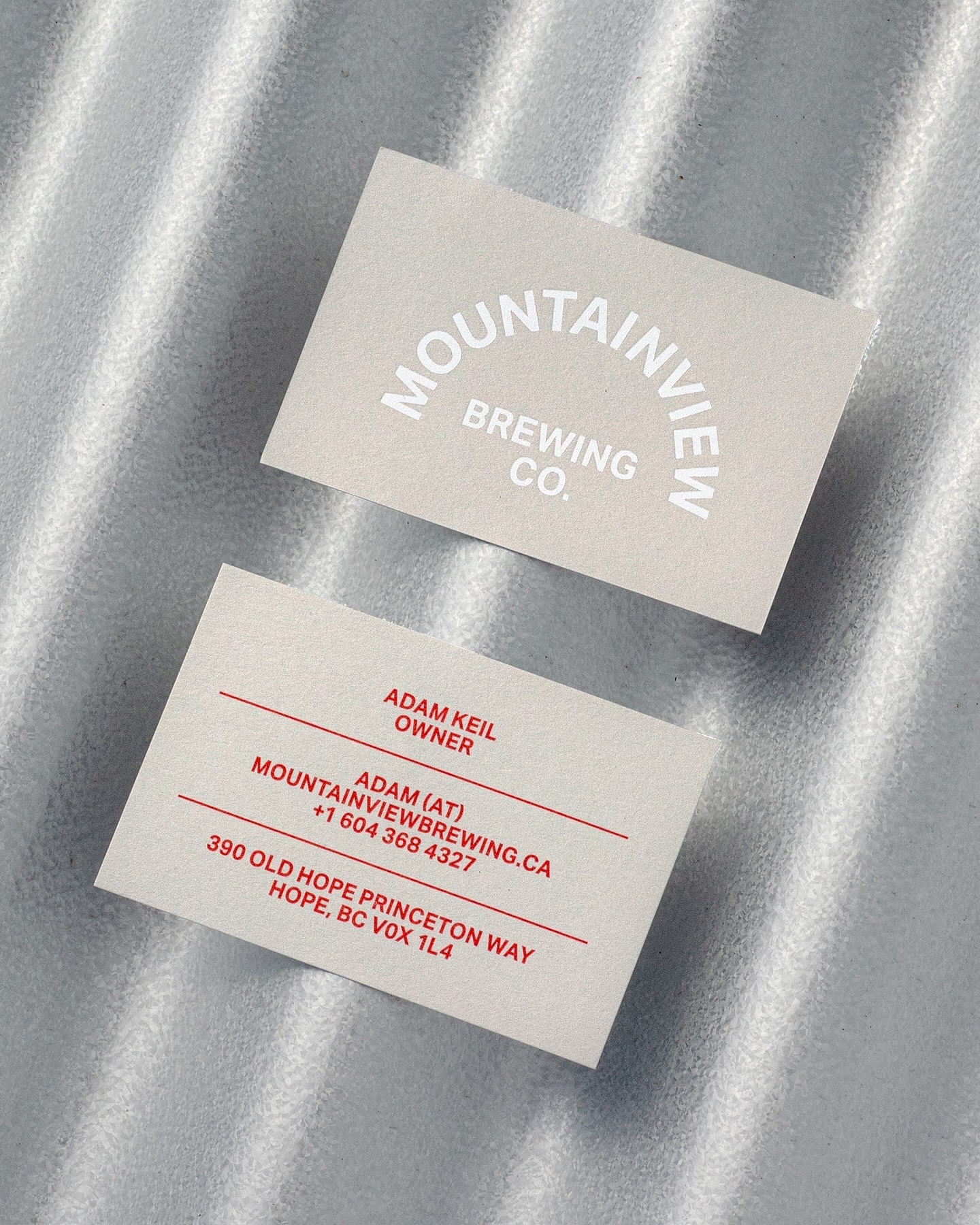
Memory Studio was inspired by vintage elements, like old book covers, and used Aktiv Grotesk to create the identity for this craft brewery.
Foundry: Dalton Maag Design: Memory Studio
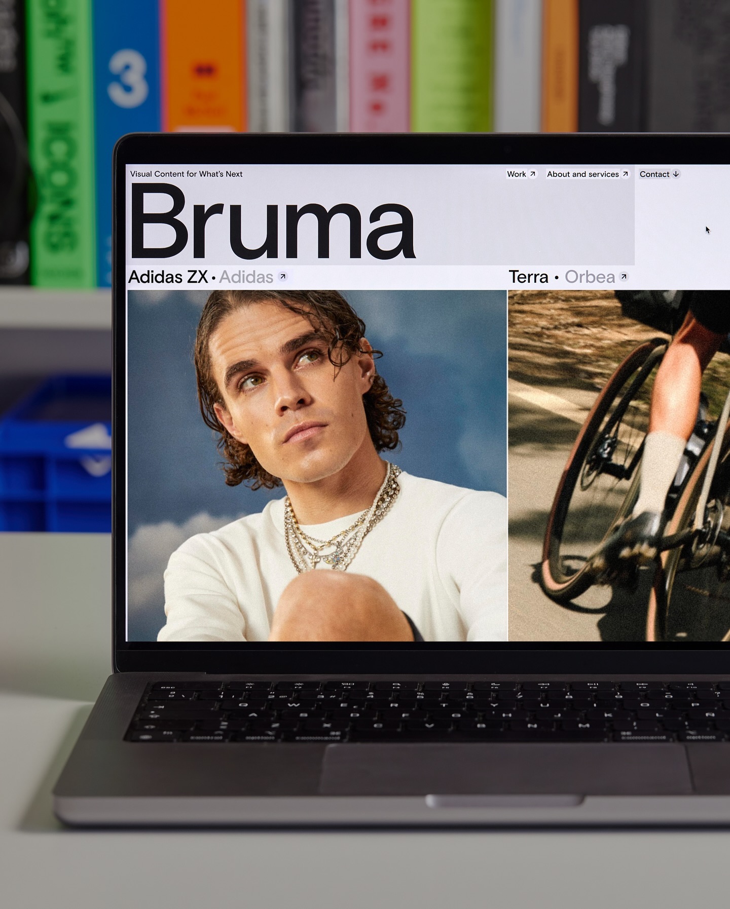
Basis Grotesque is the only typeface used in the identity and website of Studio Bruma, a creative production company to forward-thinking people and brands.
Foundry: Colophon Foundry Design: Leon Romero
Maximage designed this book with great attention to detail. A custom version of Selecta developed by Maxitype.
Get Selecta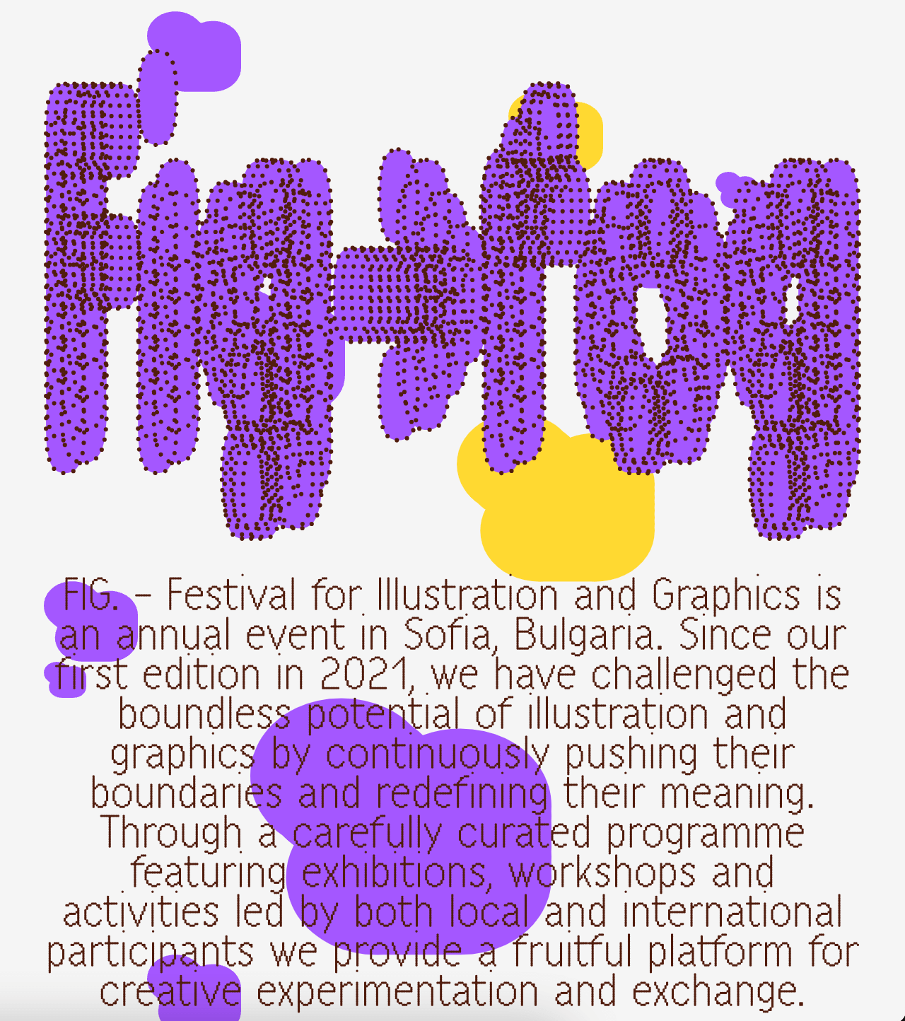
A festival that explores visual creativity to the point of blurring the lines between illustration and graphics; Miroslav Zhivkov created the identity of FIG (Festival for Illustration and Graphics) using Harber.
Foundry: Benoît Bodhuin Design: Miroslav Zhivkov
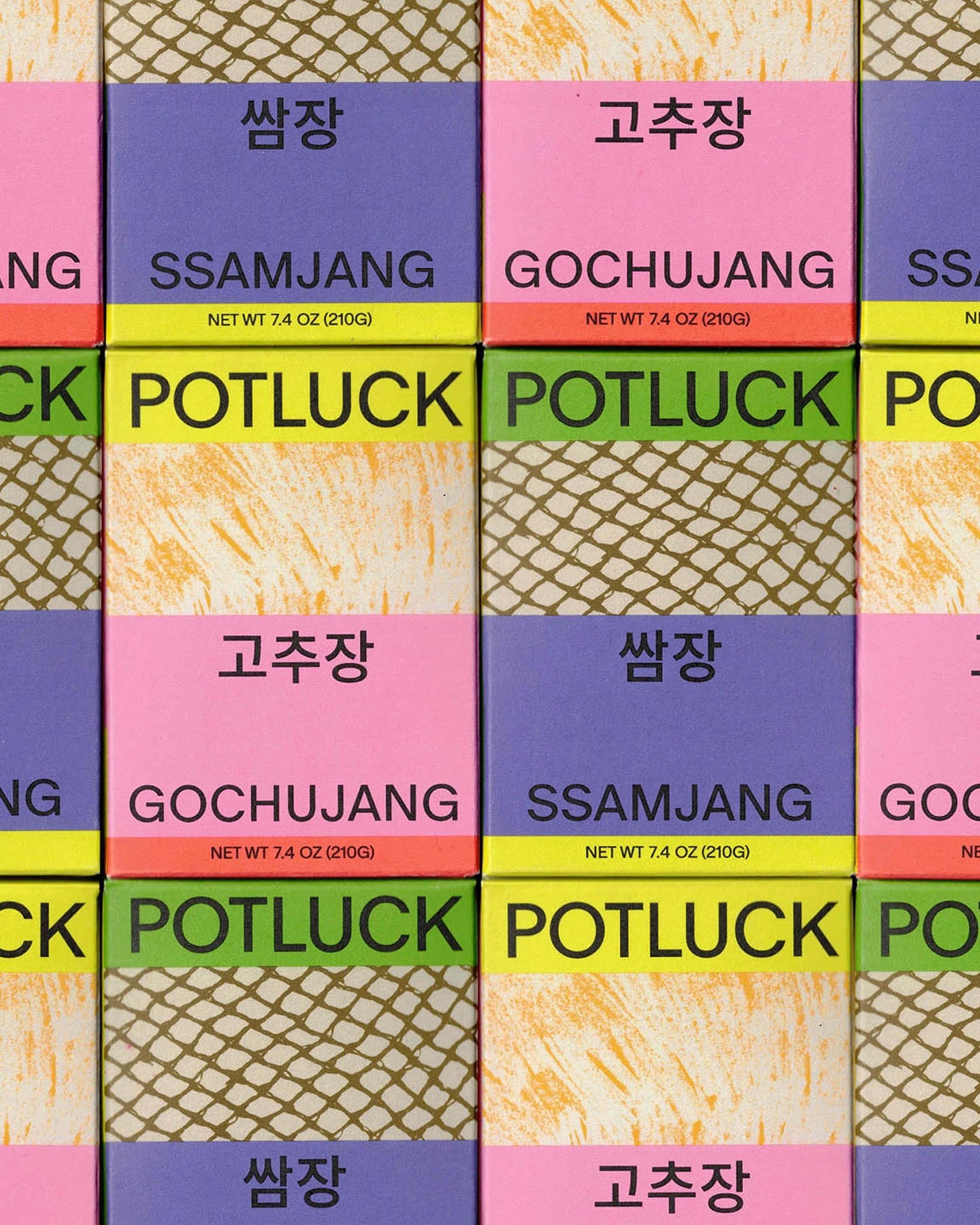
Regrets Only created a visual identity just like Potluck works; bringing together various elements to create something from scratch. Oracle is used as the primary typeface and Source Han Sans as the secondary.
Foundry: ABC Dinamo, Adobe Fonts Design: Regrets Only
Address Arts leveraged the possibilities of Exposure by 205TF, a variable typeface whose weight was modified to achieve a solid and heavy logo.
Foundry: 205 TF Design: Address Arts
Bazaine and the Path of Ideas
Type Designers: Matthew Fenton, Haakon Spencer, Jack Niblett
Mastering: Christoph Koeberlin
Foundry: British Standard Type
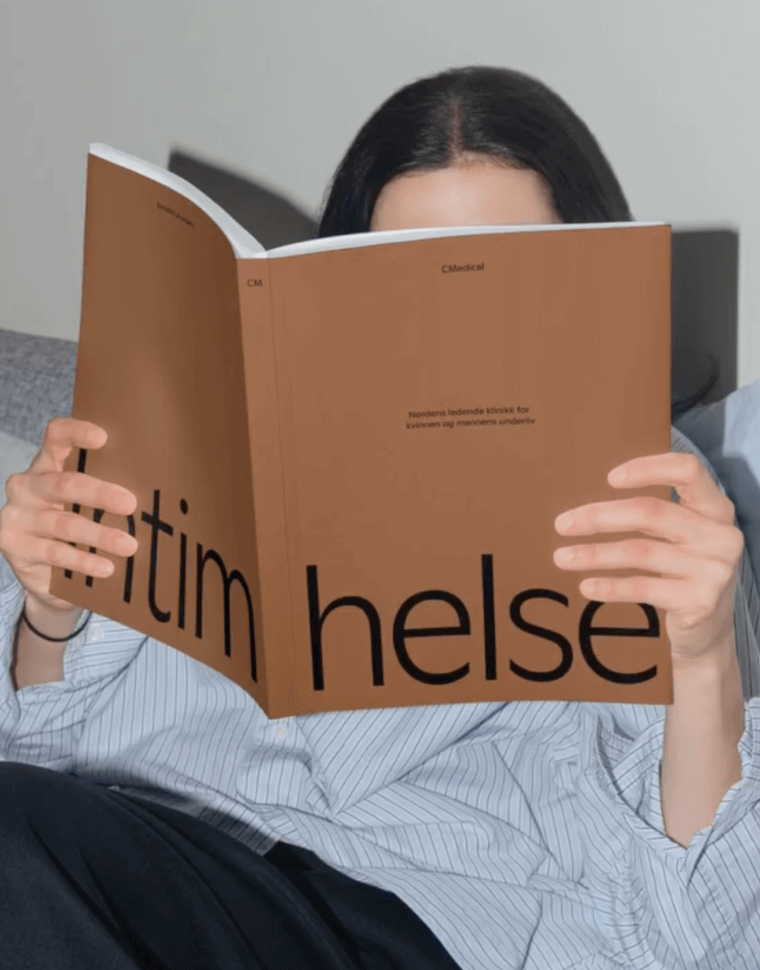
EY Doberman used Ginto from ABC Dinamo in different weights to achieve a consistent stroke throughout the visual identity for CMedical.
Foundry: ABC Dinamo Design: EY Doberman
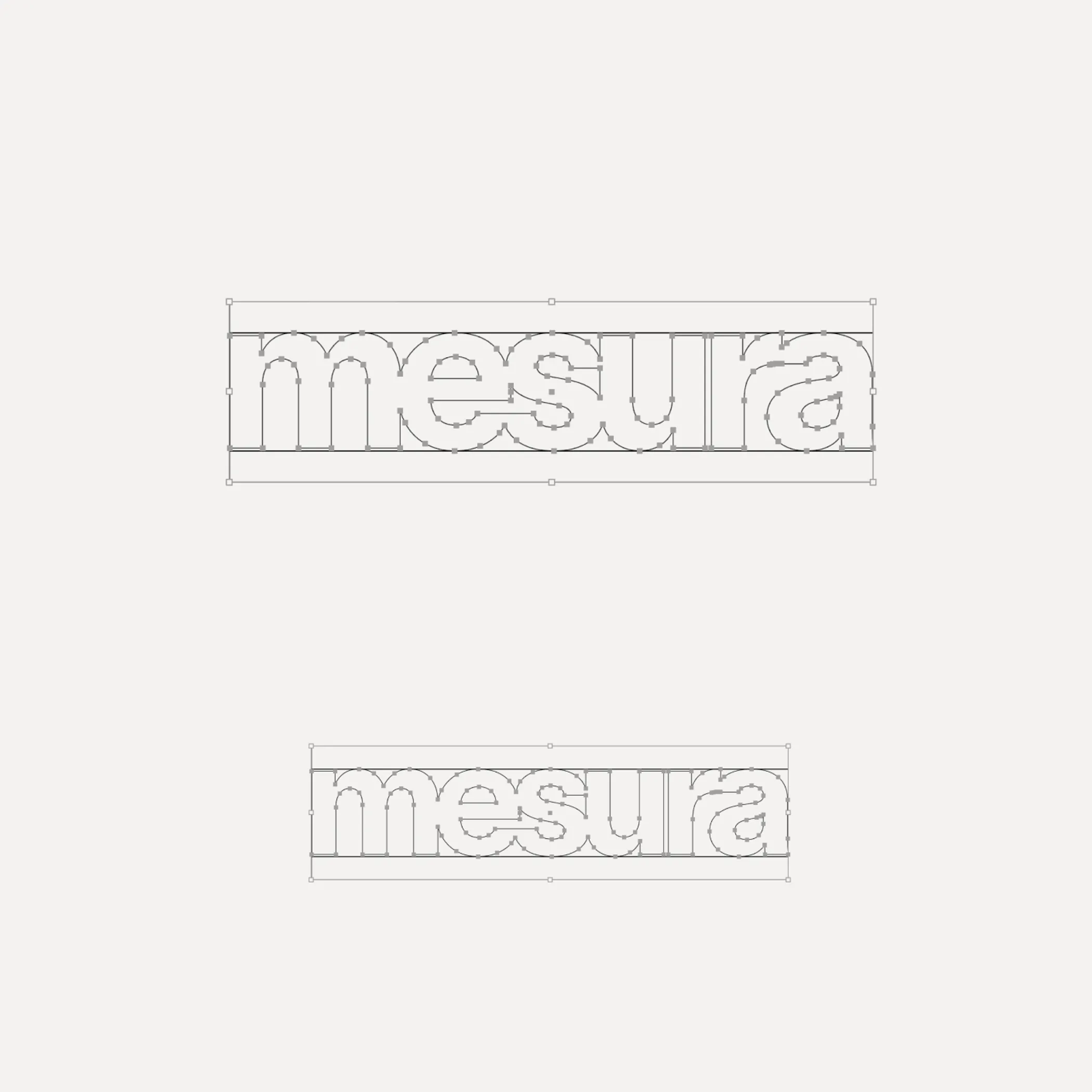
Flexibility was what Mouthwash studio aimed for with the typographic selection they made for the Messura . Kimera’s Waldenburg and Times LT were chosen to give solidity to the brand and possibilities to evolve.
Get Waldenburg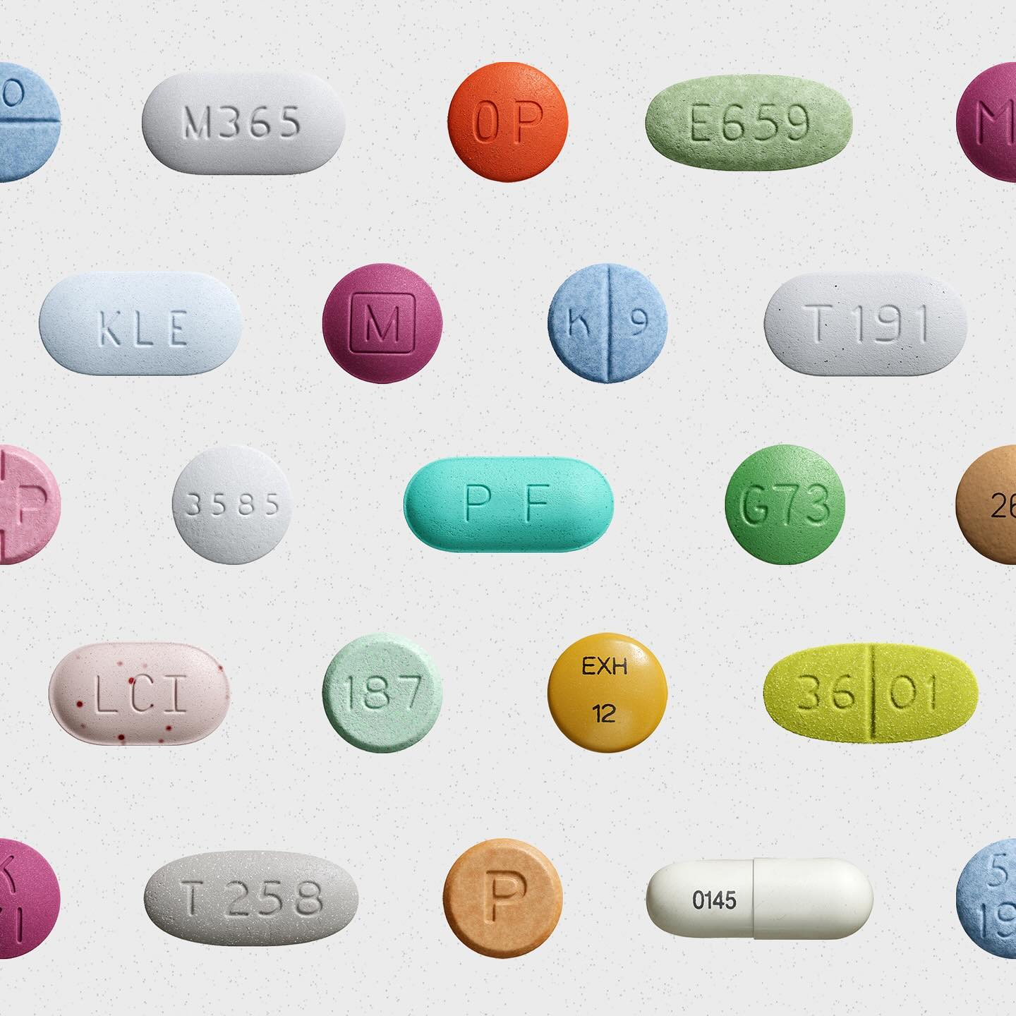
Waldenburg from Kimera Corp was customized to be part of the visual identity for a new line of assistance for people with opioid addiction issues. Designed by Raw Materials and Service Plan
Foundry: Kimera Corp Design: Raw Materials, Service Plan
Hiro builds developer tools that bring Web3 to Bitcoin. In its identity, Porto Rocha chose several fonts from the Aeonik family – Mono, Fono, and Bold –
Foundry: Cotype Foundry Design: Porto Rocha
Expressiveness and experimentation in a typeface inspired by urban art and physical tools.
Foundry: The Northern Block Designer: Jonathan Hill

The Octagon is a multi-use building for spiritual practice and growth using a custom typeface developed by 26a1 and Daniel Wenzel.
Foundry: 26a1 Type Designer: Daniel Wenzel

Sylvan Lanz designed a custom variable font, for soccer Swiss team FC Basel, based on the typographic heritage of the city.
Type Designer: Sylvan Lanz

Mesobis, a cannabis-loving creatives community using Right Grotesk by Pangram Pangram.
Foundry: Pangram Pangram Design: Andrés Higueros

Midnight by Colophon Foundry, perfectly fitting in the identity Porto Rocha conceived for the comedy event “Netflix is a Joke”.
Foundry: Colophon Foundry Design: Porto Rocha

Dinamo’s Favorit announcing CDG showcase at Berlin.
Foundry Dinamo, Design Flavious Augustin.
