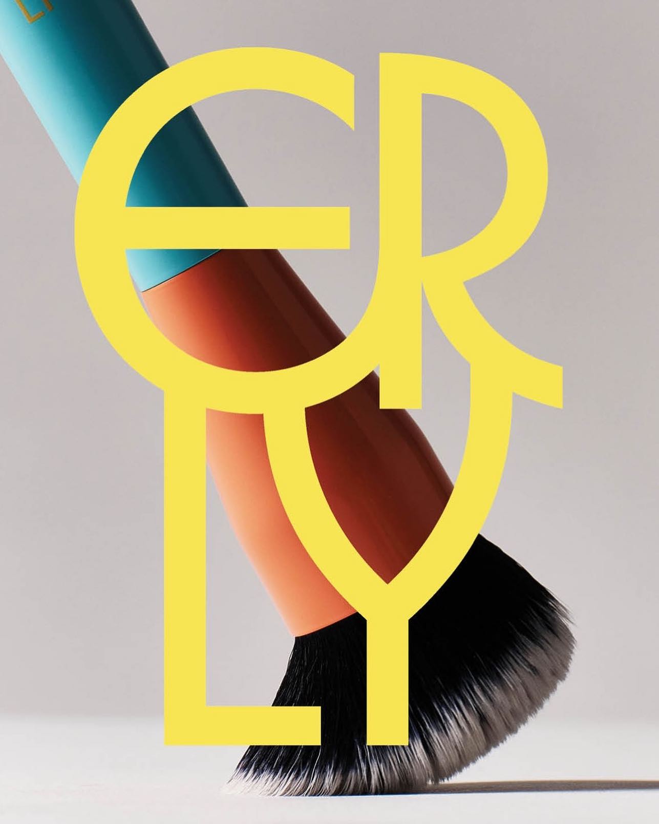
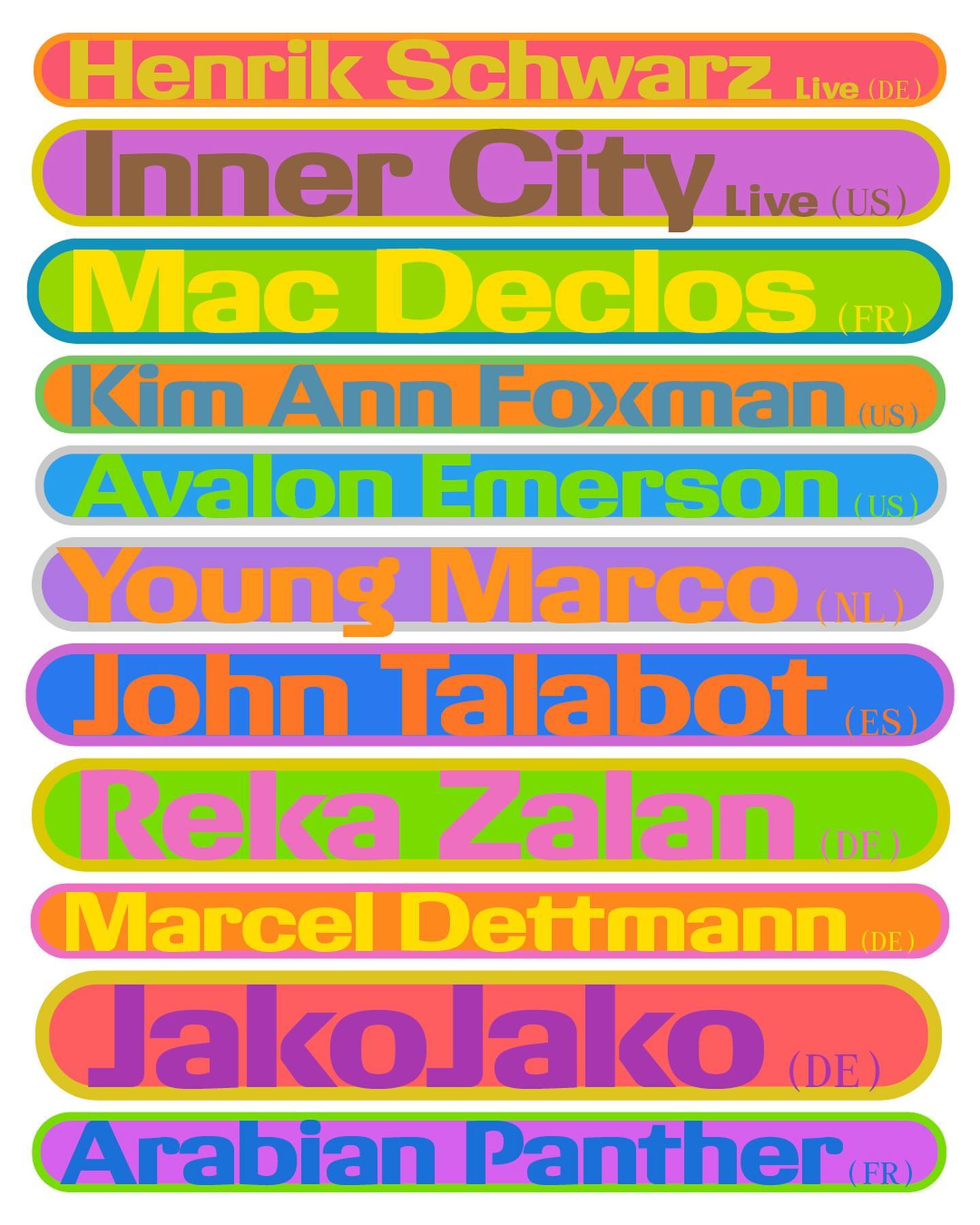
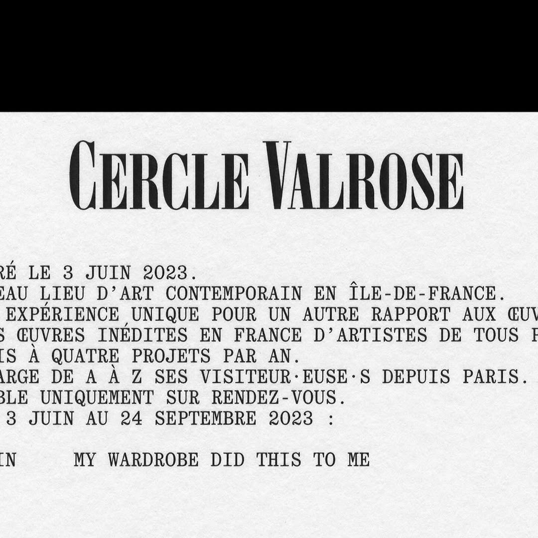
All your favorite fonts, gathered here, no matter the foundry.

Thank you!

Now you have your own profile. Enjoy it!


TH®

Asfalt will have its first edition featuring an identity filled with color blocks, sports images, a vertical logo using a customized version of Generation Mono, and texts using ABC Diatype.

Get Generation Mono

Display | Sans | Black | Extended | Geometric | Decorative | Free trial

I said, ‘Auf Wiedersehen’ (I said ‘Goodbye’) displays the letters exchanged by five families separated during World War II, hoping to reunite one day. The texts are set in Repost, with supplementary texts in HAL Four Grotesk.

Foundry: HAL Typefaces Design: Distaff Studio

Get Repost

Monospaced | Sans | Regular | Low contrast | Italic | Free trial

Maximage designed this book with great attention to detail. A custom version of Selecta developed by Maxitype.

Foundry: Maxitype, Lineto Design: Maximage

Get Selecta

Sans | Grotesk | Variable font | Free trial

An identity that balances between distinctive and sober is composed of a bold uppercase logo, vibrant colors, and two specially customized typefaces; Saans from Displaay Foundry and LL Ruder Plakat from Lineto. Designed by Porto Rocha.

Foundry: Lineto, Displaay Foundry Design: Porto Rocha

Get LL Ruder Plakat

Sans | Bold | Condensed | Grotesk | Narrow | Free trial

República Studio used Review from Commercial Type for this visual identity, aiming to communicate directly and consistently, while leaving the spotlight to the displayed photographs.

Get Review

Sans | +6 Weights | +4 Widths | Grotesk | Italic | Super family | Free trial

Quatrième Étage revamped the visual identity of the iconic Brock store, selecting the ES Face typeface for its logo, a 19th-century inspired serif with contemporary finishes.

Foundry: Extraset Design: Quatrième Étage

Get ES Face

Serif | +6 Weights | Grotesk | Free trial

Apparat Bold + Buch Schmal, both from Kimera, were part of the update newkid made for Standard Equipment, a system of household objects.

Foundry: Kimera Corp Design: newkid

Get the fonts

Display | Sans | +6 Weights | Standard | Condensed | Grotesk | Decorative | Free trial

A festival that explores visual creativity to the point of blurring the lines between illustration and graphics; Miroslav Zhivkov created the identity of FIG (Festival for Illustration and Graphics) using Harber.

Foundry: Benoît Bodhuin Design: Miroslav Zhivkov

Get Harber

Display | Geometric | Decorative | Italic | Variable font | Modular | Free trial

Maison Standard used Azeret from Displaay Typefaces for the identity of this exhibition at the National Library of Switzerland, which explains the impact of snow on our society.

Get Azeret

Sans | +6 Weights | Grotesk | Geometric | Free trial

Regrets Only created a visual identity just like Potluck works; bringing together various elements to create something from scratch. Oracle is used as the primary typeface and Source Han Sans as the secondary.

Foundry: ABC Dinamo, Adobe Fonts Design: Regrets Only

Get Oracle

Sans | Grotesk | Variable font | Free trial

Suisse Int’l Condensed used for this strong and dramatic identity for the Teatro Stabile dell’Umbria. Designed by Due Studio.

Foundry: Swiss Typefaces Design: Due Studio

Get Suisse Int’l Condensed

Sans | Condensed | Grotesk | Free trial

Parker Studio said goodbye to 2022 with this candle, made in collaboration with Imprimerie du Marais. The packaging uses Chalet Book, along with the first printed use of Parker’s PS Times.

Get PS Times

Serif | Grotesk | Free trial

Moser Crystal launched an autumn collection, and Studio Marvil designed its image using the Atlantic typeface from Heavyweight.

Foundry: Heavyweight Design: Studio Marvil

Get Atlantic

Sans | +6 Weights | Humanist | High contrast | Free trial

Simple and subtle; Both Studio created a brand identity that aligns with the proposal of Nardel Architects.

Foundry: Velvetyne Design: Both Studio

Get Karrik

Sans | Regular | Standard | Grotesk | Free trial

Helping to create a bold and inclusive visual identity, Quentin Coulombier’s Buzz and the well-known Cooper were selected by Underline Studio to represent the Canadian Film Centre (CFC)

Type Designer: Quentin Coulombier Graphic Design: Underline Studio

Get Buzz

Display | Sans | Black | Narrow | Decorative | Free trial

Tartuffo by Bouk Ra for Lift Type in the identity created by Fila Korea for the 2024 White Open Seoul; a tennis open where everyone can participate.

Foundry: Lift Type, Bouk Ra Design: Fila Korea

Get Tartuffo

Serif | Display | Standard | High contrast | Italic | Free trial

New typefaces for the new identity of the production company L’Éloi; Principal Studio chose Review by Commercial Type and Skandia by Store Norske Skriftkompani.

Get Skandia

Sans | +6 Weights | Grotesk | Free trial

M. Geisser used HAL Colant from HAL Typefaces and ROM from Dinamo for the poster and invitation for the Walter Walter Longevity exhibition.

Foundry: HAL Typefaces, Dinamo Typefaces Design: M. Geisser


Get Colant

Serif | Didone | Italic | Free trial

Low key Design Company used Boris by Giulia Boggio to complement this identity for a friendly, relaxed, and gentle café, just like a wandering sheep.

Get Boris

Display | Regular | Monoline | Free trial

Newsreader by Production Type on the cover of this book addresses collaborations and how to coexist with other ideas.

Foundry: Production Type, Design: Sam Corijn

Get Newsreader

Serif | Display | +6 Weights | Text | Italic | Super family | Free trial

In this website with two main columns constantly changing size, Atipus Studio used RB Kreol Text from Studio René Bieder.

Get Kreol Text

Sans | Didone | High contrast | Italic | Free trial

Victor Serif by KOMETA accompanies the photographs taken on a cycling trip with friends in this booklet designed by Familia.

Foundry: KOMETA Design: Familia

Get Victor Serif

Serif | +6 Weights | Grotesk | Italic | Free trial

Address Arts leveraged the possibilities of Exposure by 205TF, a variable typeface whose weight was modified to achieve a solid and heavy logo.

Foundry: 205 TF Design: Address Arts

Get Exposure

Display | Sans | Medium | Bold | Thin | Low contrast | High contrast | Decorative | Italic | Variable font | Free trial

For the past 3 years, Chejo and SHDW studios have been sharing lunch, and in this book, they compile the recipes they’ve made. Serial A from DumDum fonts is used as the main typography.

Foundry: Dum Dum Studio Design: Chejo Studio

Get Serial A

Display | Sans | Bold | Condensed | Low contrast | Free trial

Bazaine and the Path of Ideas

Type Designers: Matthew Fenton, Haakon Spencer, Jack Niblett

Mastering: Christoph Koeberlin

Foundry: British Standard Type

Sans | +6 Weights | Grotesk | High contrast | Variable font | Free trial

Experimental Re(é)[flex|ct|ion] is an editorial publication that explores concepts such as community, uncertainty, resistance, movement, among others, through explorations and discussions. Hannes Brischke uses ABC Walter Neue and Dark’s Remix A.

Get ABC Walter

Sans | +6 Weights | Grotesk | Free trial

Mixture of materials, papers, and typefaces (Neue Montreal and Cucina); that’s how Tiquismiquis designed this editorial piece that covers Ela Fidalgo’s creative career.

Get Cucina

Serif | Slab | Bold | High contrast | Decorative | Free trial

In this book that compiles the lesbian legacy in Quebec, we find Gerstner-Programm FSL as the main typeface, along with “handwritten” numbers using Sebastian Bobby. Designed by Harrison Fun Studio.

Get Gerstner-Programm FSL

Sans | Bold | Light | Regular | Grotesk | Free trial

Studio Cerise, a colorful creative studio from East London, used Swinton by Nouvelle Noir for its logo.

Foundry: Nouvelle Noir Design: Studio Cerise

Get Swinton

Display | Sans | +6 Weights | Grotesk | High contrast | Free trial

Estudio República used a single weight of Basel Classic from Optimo Type and Courier Prime as complementary, to achieve a human and elegant identity for Rocio Navarro’s brand; RN Arquitectura™.

Get Basel

Sans | Grotesk | High contrast | Free trial

TWK Everett venturing into the fashion industry through the creative studio and fashion brand Cabinet Milano, led by Rossana Passalacqua and Francesco Valtolina.

Foundry: Type Weltkern

Get Everett

Sans | +6 Weights | Grotesk | Free trial

Denim performs admirably across various contexts, whether in small or large texts, as demonstrated in the publication Annual Review of Public Art 2023 for The Arts Promotion Centre Finland – Taike.

Foundry: Displaay Design: Veziko

Get Denim

Sans | Grotesk | Decorative | Free trial

Last year, All Caps Type’s Rhetorik serif was featured in Apartamento’s annual cookbook edition #8, which gathers recipes based on tubers in a playful tone.

Foundry: AllCaps Design: Apartamento

Get Rhetorik

Sans | Humanist | Italic | Free trial

This fresh and fun poster design for the Teatro Prospero uses Review Condensed from Commercial Type, a Principal Studio project

Get Review Condensed

Display | Sans | +6 Weights | Standard | Extended | Condensed | Grotesk | Free trial

A story of friendship between agriculture and its natural habitat, between the design by Olsson Barbieri and the Or Lemmen typography proposed by them for the image of an organic orchard in Hardanger, Norway.

Foundry: Or Type Design: Olsson Barbieri

Get Or Lemmen

Monospaced | Serif | Display | Standard | Condensed | Decorative | Free trial

Studio Sly used Modern Era Mono to make Falso Melbourne stand out among all the other real estate agencies.

Foundry: Family Type Design: Studio Sly

Get Modern Era

Monospaced | Sans | Geometric | Italic | Free trial

EY Doberman used Ginto from ABC Dinamo in different weights to achieve a consistent stroke throughout the visual identity for CMedical.

Foundry: ABC Dinamo Design: EY Doberman

Get Ginto

Sans | +6 Weights | Standard | Condensed | Humanist | Variable font | Free trial

As a collectible object decorating a space, Christopher Doyle & Co. used Moulin for its unique and attractive features, along with Scto Grotesk, to achieve the elegance and sophistication that the interior design brand, Tom Mark Henry, aimed to convey with its new identity.

Get Moulin

Serif | Sans | +6 Weights | Standard | Humanist | Italic | Free trial

Neue Haas Grotesk is a common typeface on the blog, it works well in many scenarios, for example alongside Marfield in the fourth edition of Hot Potato magazine.

Type Designer: Elliot Grunewald Design: Other Office

Get Marfield

Serif | Display | Bold | Condensed | Didone | High contrast | Decorative | Free trial

Flexibility was what Mouthwash studio aimed for with the typographic selection they made for the Messura . Kimera’s Waldenburg and Times LT were chosen to give solidity to the brand and possibilities to evolve.

Foundry: Kimera Design: Mouthwash

Get Waldenburg

Sans | +6 Weights | Standard | Grotesk | Variable font | Free trial

Waldenburg from Kimera Corp was customized to be part of the visual identity for a new line of assistance for people with opioid addiction issues. Designed by Raw Materials and Service Plan

Get Waldenburg

Sans | +6 Weights | Extended | Condensed | Grotesk | Variable font | Free trial

Diatype Rounded from ABC Dinamo is used in Healthy Boy Band, a cultural magazine that is a tribute to graphic design

Foundry: ABC Dinamo Design: Ortner etc.

Get Diatype Rounded

Display | Sans | +6 Weights | Grotesk | Low contrast | Italic | Free trial

GT Alpina and Monument Grotesk are part of this packaging system that the creative studio Ania et Lucie devised for the glass bottle brand Kindred Black

Get GT Alpina

Serif | Standard | Extended | Condensed | High contrast | Italic | Free trial

Rhymes by Maxitype in the 2017 campaign for the NBA Finals “They Talk We Play”. Design by Hort and Tim+Tim.

Foundry: Maxitype Design: Hort, Tim+Tim

Get Rhymes

Serif | Display | +6 Weights | Text | Italic | Free trial

Studio Hudson Catty and Atelier Baudelaire used ES Klarheit Kurrent to design a set of three books celebrating the 40th anniversary of LAAC in Dunkirk.

Get ES Klarheit Kurrent

Sans | +6 Weights | Geometric | Free trial | Print

SOCIO Design used Untitled Sans from Klim Type Foundry and Gestura from Socio Type Foundry to complement the visual identity of AATHER’s high-quality candles.

Get Gestura

Serif | Sans | +6 Weights | Grotesk | Italic | Free trial

Editorial New, ITC Franklin Gothic, and Antique No.6 were brought together by The Office of Ordinary Things to create contemporary compositions in the identity of Mad, a agriculture organization.

Get ITC Franklin

Serif | Sans | Slab | Grotesk | Narrow | Free trial

Studio Ard was commissioned to design 15 publications and the signage for the graduation exhibition of the RCA School of Architecture. All is typeset in Prisma Text by Lineto.

Foundry: Lineto Design: Studio Ard

Get LL Prisma Text

Display | Sans | Geometric | Humanist | Low contrast | Super family | Free trial

Pastiche Grotesque by Order Type Foundry was customized by Benjamin Tuttle to become the bespoke typeface for the First Choice brand, a new generation of travel lovers. Design by Ragged Edge.

Foundry: Order Type Foundry Design: Ragged Edge

Get Pastiche Grotesque

Display | Sans | Grotesk | High contrast | Free trial

Typeset in Rhymes by Maxitype in the book of photographer Werner Amann capturing the nightlife rave scene of the early 1990s. Design by Lamm & Kirch with Caspar Reuss

Foundry: Maxitype Design: Lamm & Kirch / Caspar Reuss

Get Rhymes

Serif | Display | +6 Weights | Grotesk | Text | Italic | Free trial

Giacomo Bastianelli designed in AL Linea by Alex Lescieux, the posters that showcase the outcomes of the workshop week at ECAL for first and second-year Master Photography students.

Type Designer: Alex Lescieux Design: Giacomo Bastianelli

More of Alex Lescieux

Sans | Grotesk | Free trial

Tric Studio in charge of the design and art direction of second issue of the MAAP publication, Off The Front. The fonts used are ABC Synt and ABC Oracle by Dinamo, and Base Monospace by Emigre.

Foundry: ABC Dinamo, Emigre Design: Tric

Get ABC Synt

Monospaced | Serif | Didone | Free trial

LL Catalogue by Lineto at the Grand Prix suisse d’art/Prix Meret Oppenheim, a event recognizing cultural creators in Switzerland.

Foundry: Lineto Design: Adeline Mollard

Get LL Catalogue

Serif | Standard | Text | Italic | Free trial

Some Days proposed a combination of the Farmacia and Kommuna typefaces for the new scents brand, Ourside.

Get Farmacia

Monospaced | Serif | Sans | Condensed | Grotesk | Free trial

Neue Haas Grotesk, available at Commercial Type, in the identity of (484) Creative Production House. Design by Studio Abraham.

Foundry: Commercial Type Design: Studio Abraham

Get Neue Haas Grotesk

Sans | +6 Weights | Grotesk | Super family | Free trial

Gerstner-Programm by Forgotten Shapes on the website for Mirage, a sculpture made by artist Katie Paterson and architectural studio Zeller & Moye for Apple Park.

Foundry: Gerstner-Programm Web Design: Rafa Cobiella UX: Seriousandly

Get Gerstner-Programm

Sans | +6 Weights | Grotesk | Free trial

Basile Fournier worked on the identity for Zien, a Web3 platform for contemporary art. The fonts chosen were Unica 77 by Lineto and JHA Times Now by Jan-Hendrik Arnold.

Get Unica 77

Serif | Sans | Grotesk | Text | Free trial

Hal Colant 2.0 (coming soon) on the website with a mirror effect for Am Seegarten, a temporary exhibition in Kirchmöser, Germany.

Foundry: Hal Typefaces Design: Studio Hanli

Get Hal Colant

Serif | Display | Italic | Free trial

Leon Romero using Alias Ano by Alias and Suisse Works by Swiss Typefaces in the identity created for the Architecture office Bajet Giramé.

Get Ano

Serif | Display | +6 Weights | Grotesk | Geometric | Decorative | Italic | Free trial

Modern Gothic by AllCaps in the identity of Pascal Hien, a studio that offers expertise within the field of industrial, exhibition and conceptual design.

Foundry: AllCaps Design: Autostrada Studio

Get Mothern Gothic

Sans | Standard | Grotesk | Free trial

The zine “Portrait of a Friend (Rest Your Ears, Filous)” of the Vienna-based musician Filous, using Carta Nueva by Sharp Type.

Foundry: Sharp Type Design: Simon Merz

Get Carta Nueva

Handwritten | Light | Decorative | Free trial

Mount Agency designed the identity and e-commerce for the clothing brand Flid, using WT Kormelink from Wise Type in the logo and communication.

Foundry: Wise Type Design: Mount Agency

More of Wise Type

Serif | Regular | Italic | Free trial

Cofo Cinema 1909 by Contrast Foundry and a display logo designed by Nikita Sapozhkov for Linen Texture, a clothing and textiles shop with a custom tailoring.

Foundry: Cofo Cinema Design: Nikita Sapozhkov

Get Cofo Cinema 1909

Serif | Display | Regular | Condensed | Decorative | Free trial

Hiro builds developer tools that bring Web3 to Bitcoin. In its identity, Porto Rocha chose several fonts from the Aeonik family – Mono, Fono, and Bold –

Foundry: Cotype Foundry Design: Porto Rocha

Get Aeonik

Sans | Grotesk | Variable font | Multiscript | Free trial

HAL Timezone by Hal Typefaces in the typographic selection used for the book Pocket Call by Paul Spengemann, designed by Hanzer Liccini.

Foundry: Hal Typefaces Design: Hanzer Liccini

Get Hal Timezone

Monospaced | Serif | Italic | Free trial

Expressiveness and experimentation in a typeface inspired by urban art and physical tools.

Foundry: The Northern Block Designer: Jonathan Hill

Display | Sans | Variable font | Free trial

Customizing Klarheit Kurrent Book for its logotype, Glasfurd & Walker created a very minimalist and balanced identity for CBD-forward brand, Nowadays.

Foundry: Extraset Design: Glasfurd & Walker

Get Klarheit Kurrent Book

Display | Sans | Standard | Geometric | Free trial

Atlantic by Heavyweight in “De Chlore et de Rosé”, photographer Christopher Barraja first book.

Foundry: Heavyweight Design: Bastien Forato

Get Atlantic

Display | Sans | +6 Weights | High contrast | Free trial

An autumn break party of students at KABK, using Margiel in their posters, a geometrical display font by Warsaw Types.

Foundry: Warsaw Types Design: Daniel Gremme

Get Magiel

Display | Sans | Black | Geometric | Decorative | Free trial

The humanist and geometric font Centra nº1 by Sharp Type in the full-service production, art buying & casting services company Yours.

Foundry: Sharp Type Design: Basora

Get Centra nº1

Sans | +6 Weights | Geometric | Humanist | Free trial

A gritty and beautiful array of Kern’s favorite unpublished photographs, using AP Grotesk by All Purpose Fonts in its editorial design.

Get AP Grotesk

Sans | Grotesk | Free trial

An Iranian graphic design exhibition uses Selecta from Maxitype for its visual identity.

Foundry: Maxitype Design: Skala

Get Selecta

Sans | Grotesk | Free trial

With a playful and minimalist approach, Friss Kombucha utilizes Herbus Bold to set itself apart from competitors.

Foundry: Eliott Grunewald Design: Monozygote

Get Herbus

Serif | Display | Sans | Bold | Regular | Geometric | Free trial

Arizona Flare by Dinamo in the identity of Guild, a new corporate that serves as a bridge between education and employment.

Foundry: Dinamo Design: Athletics

Get Arizona

Serif | Sans | Humanist | Italic | Free trial

A winning combination of fonts from ABC Dinamo, Walter Neue and Simon Mono for Satisfy Running x Oakley.

Foundry: Dinamo Design: Actual Source

Get Dinamo Fonts

Sans | +6 Weights | Grotesk | Free trial

Geometric and heavy, Skrappa appears as a contrast in the visual identity of Arts Broadcasting Studio at Anteism.

Foundry: Wise Type Design: Juliette Duhé

Get Skrappa

Display | Display | Sans | Sans | Regular | Regular | Low contrast | Low contrast | Free trial | Free trial

Omnigroup and Dávid Molnár teamed up in the creation of a custom serif typeface for Swiss literature foundation Jan Michalski.

Foundry: Omnigroup Type Designer: Dávid Molnár

More of Omnigroup

Serif | Grotesk | Free trial

Magister from Omni Type, in the latest Covers of the issue Sali e Tabacchi. Designed by Leonardo Pellegrino.

Foundry: Omni Type Design: Leonardo Pellegrino

Get Magister

Serif | Grotesk | Free trial | Print

Rhetorik by All Caps in the issue n.27 of Swiss magazine Zweikommasieben

Design: Dorothee Dähler Foundry: All Caps

Get Rhetorik

Serif | Sans | Italic | Free trial | Branding

Ten years ago, a unique script typeface, Line, was designed by Göran Söderström and Stefania Malmsten for Rodeo Magazine.

Get Line

Display | Sans | Monoline | Decorative | Free trial

Ivar Display Condensed and Neue Haas Grotesk used in the web portfolio of designer Cori Corinne

Get Ivar Display

Serif | Display | Condensed | Free trial

Signal Compressed by Emmanuel Besse as part of Production Type catalogue, in Levi’s Performance Denim, a hand-stitched, limited edition publication designed by Leon Romero.

Get Signal Compressed

Display | Decorative | Free trial

Holise, Neue Helvetica and Ryumin in The Suitcase book design by Jiating Shi.

Type Design: Ines Davodeau Design: Jiating Shi

Get Holise

Serif | Display | Light | Free trial

Museu del Disseny used Maxeville from SM Foundry in the exhibition Objetos comunes. Designed by PFP Disseny.

Foundry: SM Design: PFP Disseny

Get Maxeville

Monospaced | Sans | Stencil | Free trial

Jeremy Matthews designed the identity for the furniture, lighting and object design studio Refractory, using Founders Grotesk by Klim Type Foundry.

Get Founders Grotesk

Monospaced | Sans | Grotesk | Free trial

Karl, a typeface designed by Laurenz Brunner used in the artists’ network Hot Little Pool. Graphics by Anne Büttner. Karl is part of the Source Type catalog.

Get Karl

Sans | Low contrast | Decorative | Free trial

Contemporary Art Fair, Plural, designed by Principal Studio, using Pantasia by Wei Huang, and Rhymes by Jakub Samek for Maxitype, on their website and communications.

Get Pantasia

Monospaced | Serif | Free trial

Murs à fleurs identity reunites two generations of type designers by using Trabis and Francesco fonts, designed by student and teacher.

Fonts: Francesco, Trabis Design: Maison Solide

Get Francesco

Display | Regular | Italic | Free trial

Locals, a cozy coffeeshop located in Amsterdam, using System Blank by Frost Type.

Foundry: Frost Type

Get System Blank

Sans | +6 Weights | Grotesk | Free trial

For Inka.world, Ayer deck by Miguel Reyes, part of Commercial Type’s catalog. Elizabeth Goodspeed behind the design.

Foundry: Commercial Type Type designer: Miguel Reyes Design: Elizabeth Goodspeed

Get Ayer

Display | Condensed | Italic | Free trial

Tiempos by Klim Type Foundry, the world’s first range of natural products for drug-tested athletes, Puresport. Designed by Field of Play.

Get Tiempos

Serif | Italic | Free trial | Branding | Print

Global rebranding for Théâtre national de la Danse, by Zoo Designers Graphiques, using Lineto’s Supreme Display.

Foundry: Lineto Design: Zoo Designers Graphiques

Get Supreme Display

Sans | Geometric | Italic | Free trial

Mesobis, a cannabis-loving creatives community using Right Grotesk by Pangram Pangram.

Get Right Grotesk

Sans | Grotesk | Italic | Variable font | Free trial

Agipo, Futura and Bradford in the new brand platform designed by Wedge for famous Canadian store, Indigo.

Foundries: Radim Pesko, Paul Renner, Lineto Design: Wedge

Get Agipo

Serif | Sans | Italic | Free trial

Midnight by Colophon Foundry, perfectly fitting in the identity Porto Rocha conceived for the comedy event “Netflix is a Joke”.

Foundry: Colophon Foundry Design: Porto Rocha

Get Midnight

Display | Sans | Variable font | Free trial | Branding

For Terravinyada, Atipus created a logo using Reckless by Displaay Type Foundry.

Foundry: Displaay Design: Atipus

Get Reckless

Serif | Grotesk | Free trial

HC Grotesk as a customized version of RT Alias Grotesk for THC NYC cannabis experience.

Foundry Razzia Type, Design Base

Get RT Alias Grotesk

Sans | Geometric | Decorative | Italic | Free trial | Branding

Dinamo’s Favorit announcing CDG showcase at Berlin.

Foundry Dinamo, Design Flavious Augustin.

Get Favorit

Monospaced | Sans | +6 Weights | Grotesk | Italic | Variable font | Free trial | Branding

SM Foundry’s Mark Niemeyer was searching in Affairs for a battle horse that would work in both formal and informal settings.

Monospaced | Serif | Grotesk | Italic | Free trial

Signifier on Two Times Elliot’s identity for Roam

Get Signifier

Serif | Display | +6 Weights | Italic | Free trial | Branding

Two chose TWK Lausanne to create casa park identity.

Get TKW Lausanne

Sans | +6 Weights | Grotesk | Italic | Free trial

Mabry by Colophon Foundry for London’s Design District

Get Mabry

Sans | Grotesk | Italic | Free trial

Metro Sans and Moret modified for Manukora Botanicals

Get Moret

Display | Humanist | Decorative | Free trial | Branding