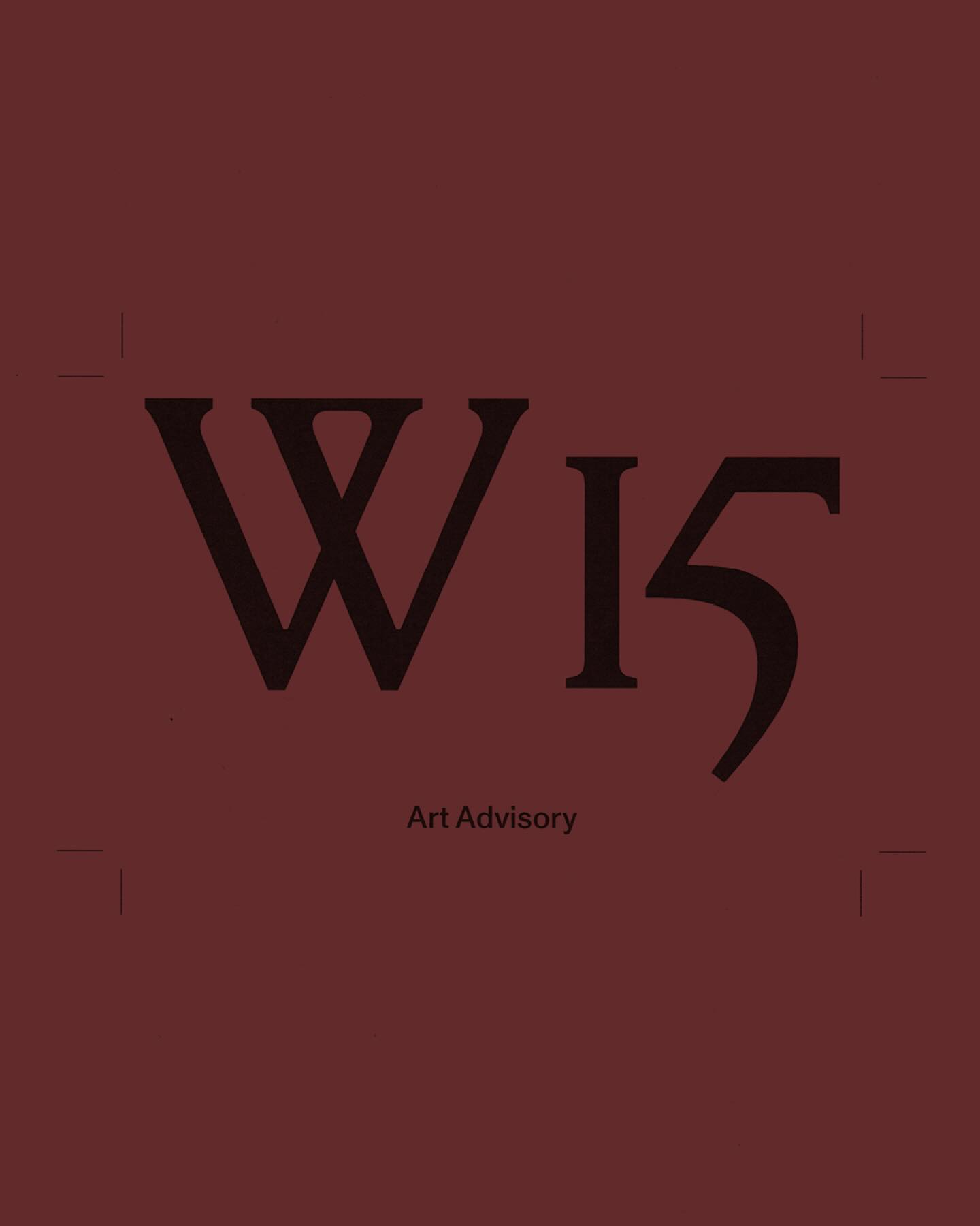
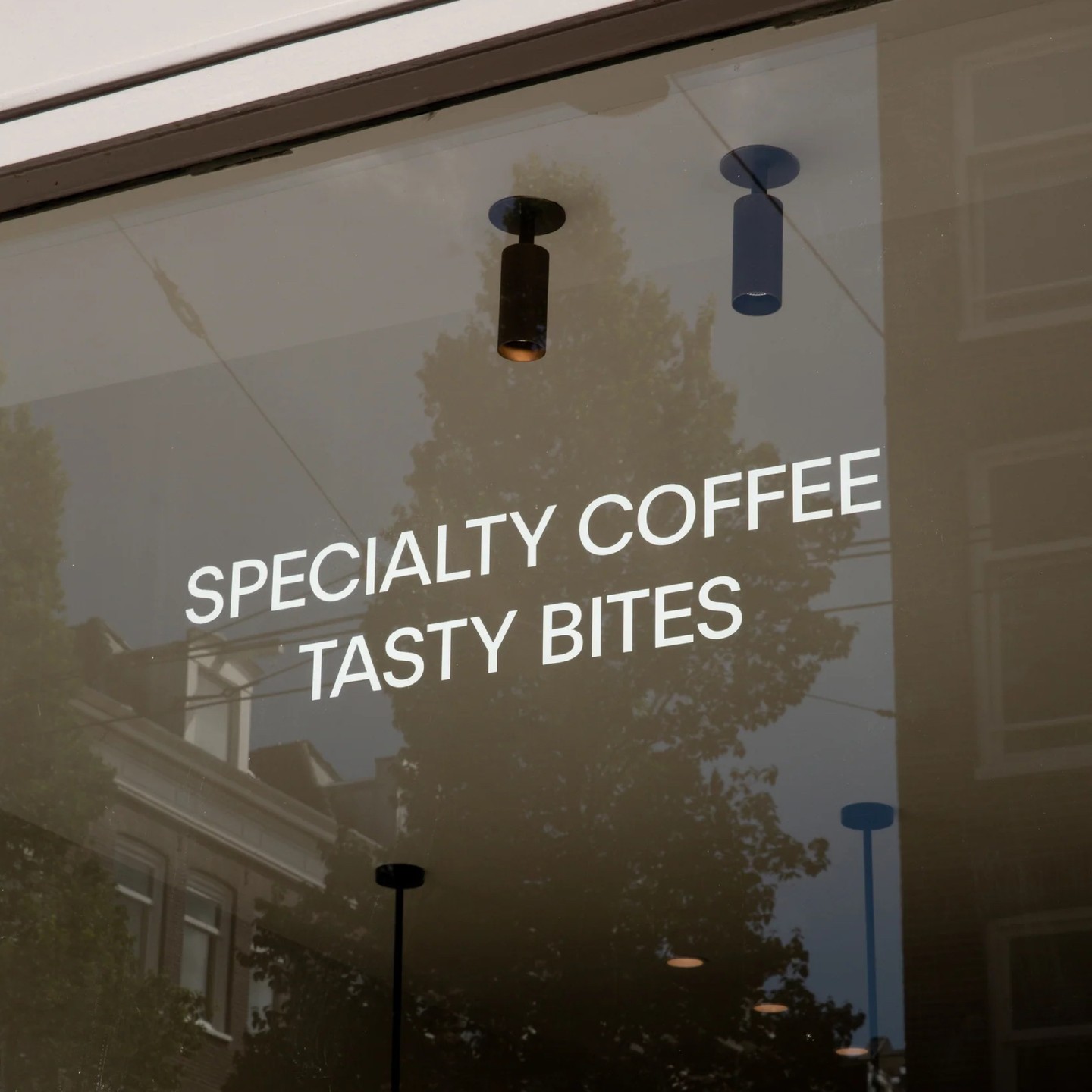
New custom typeface for La Fabra Centre d’Art designed by Fonts From Folch. A design that reflects the institution’s contemporary spirit, with refinements that ensure versatility, precision, and smooth composition.
Foundry: Fonts From Folch Design: Folch Studio
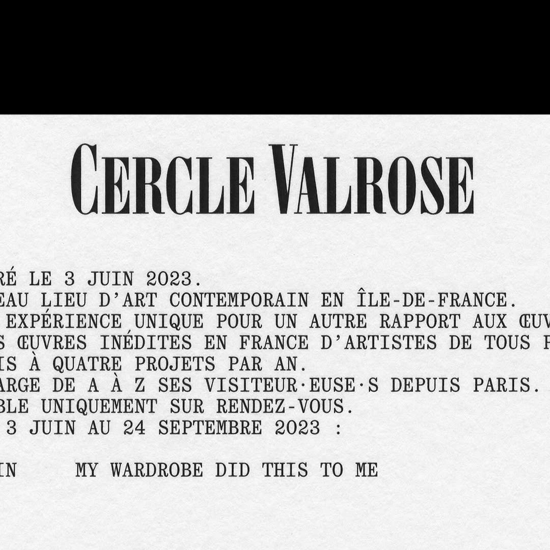
OTT Harker by Ornamental & Title Type is used in the logo for Cercle Valrose. The design is by Bizzarri-Rodriguez, who also created the typeface. Quadrant by Matter of Sorts is used for the supporting text.
Foundry: Ornamental & Title Type Design: Bizzarri-Rodriguez
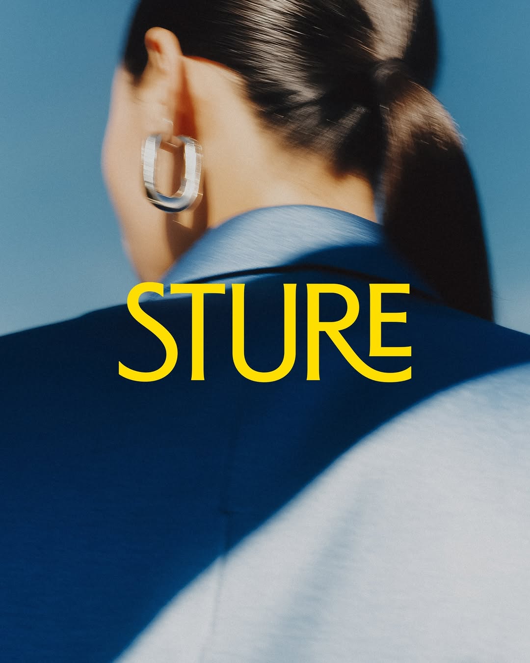
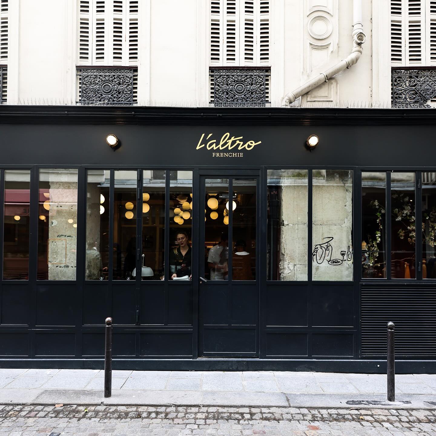
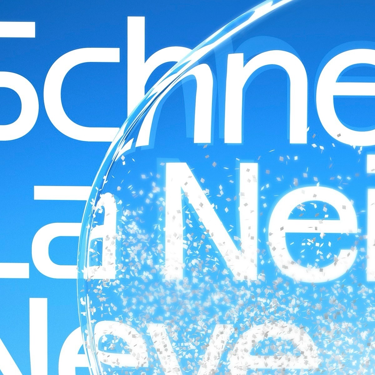
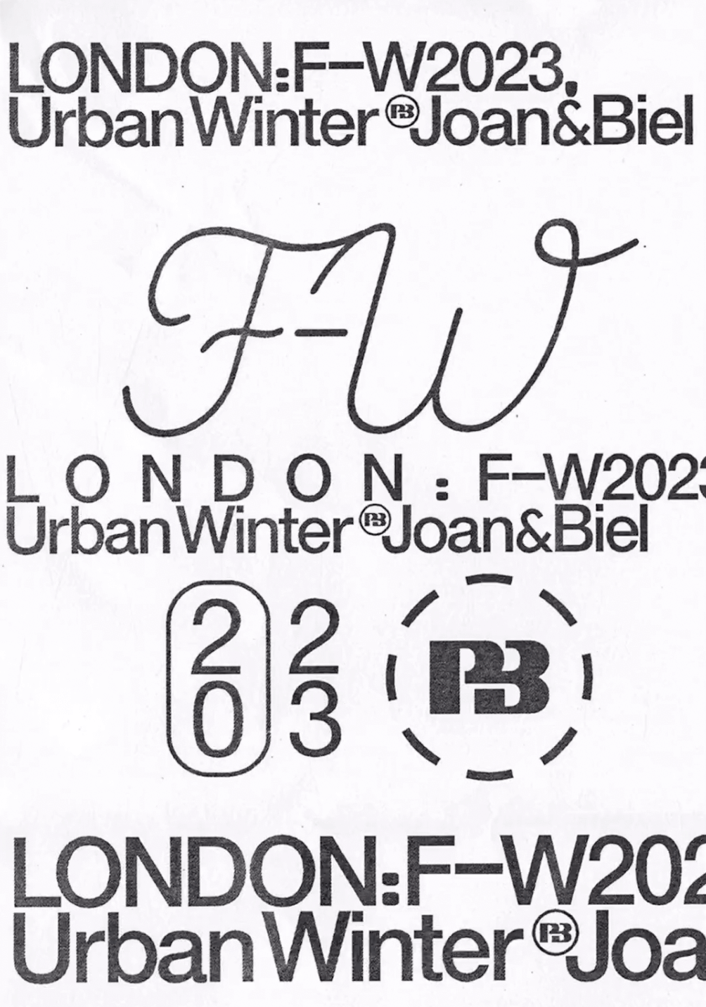
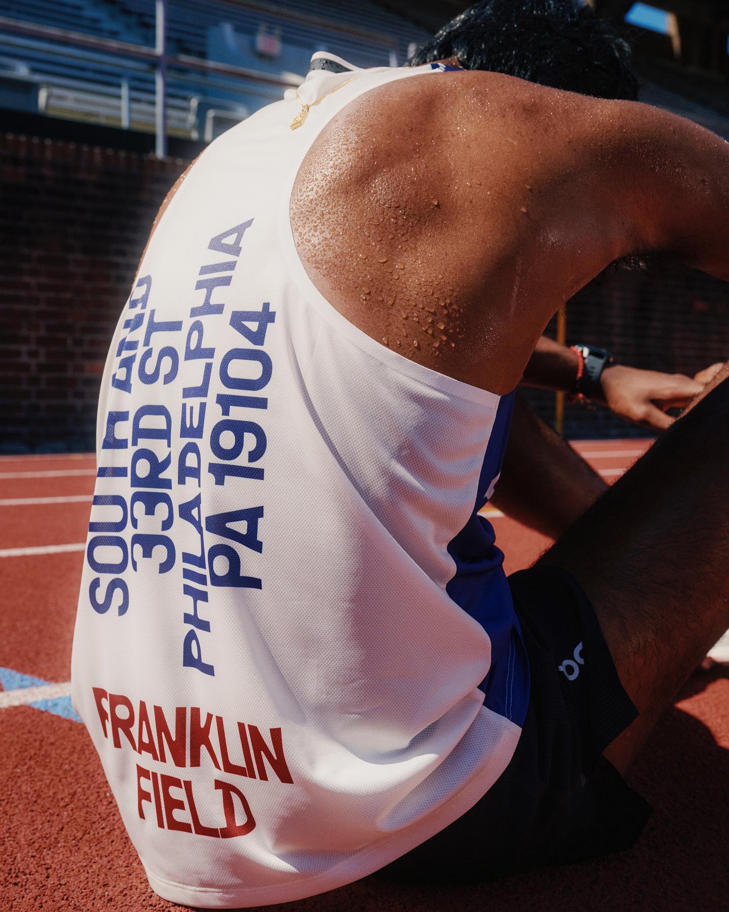
Stureplan was renewed, now becoming Sture with a design inspired by the block’s architecture. The typeface is custom, designed by Göran Söderström and Fredrik Gruber.
Foundry: BAS ID (Göran Söderström & Fredrik Gruber) Design: BAS ID
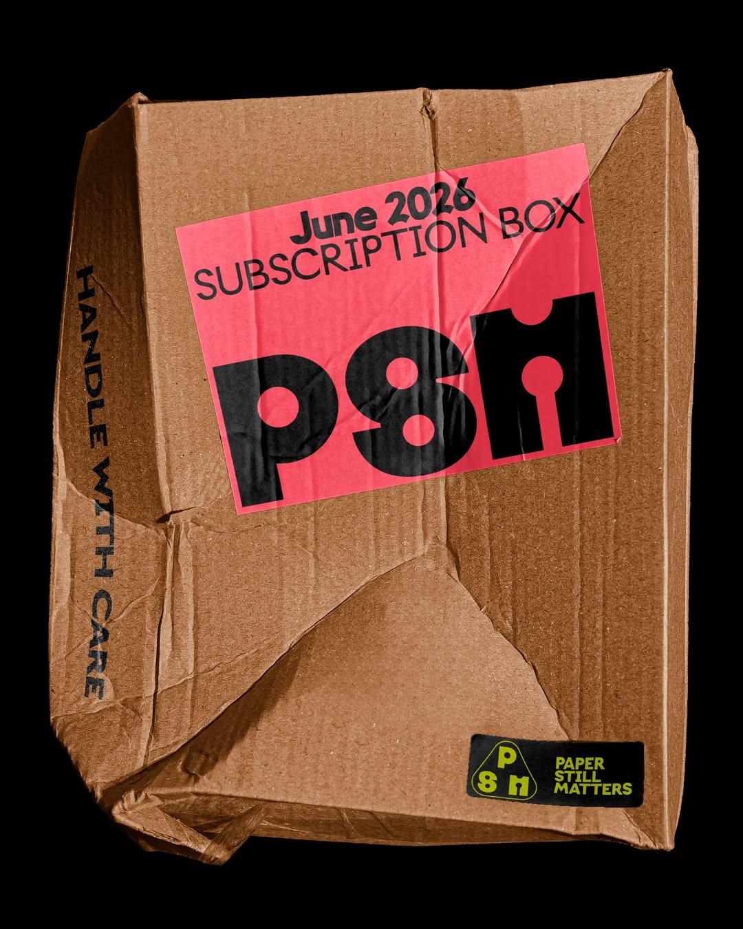
Giulia Boggio designed the identity for Paper Still Matters, a TYPE01 Studio shop aiming to connect with the creative community. The logotype features custom lettering and Onlysans by Daria Cohen, with ALT Riviera from ALT.tf as the supporting typeface.
Foundry: Daria Cohen Design: Giulia Boggio
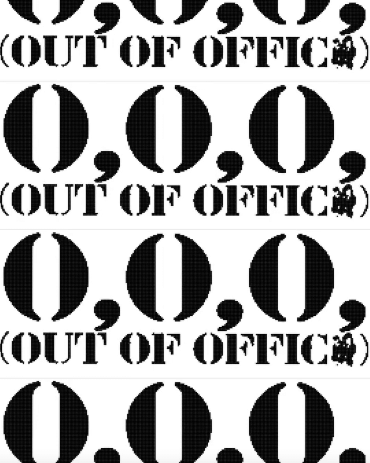
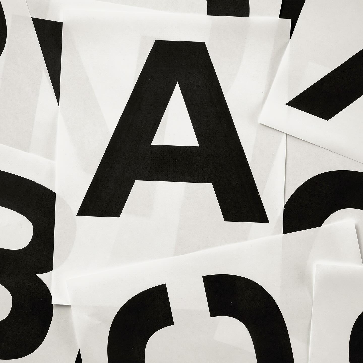
Typographic explorations by ErrorError Studio, using EE Parking®, a typeface they created inspired by stencils found in parking lots.
Design & Foundry: ErrorError Studio
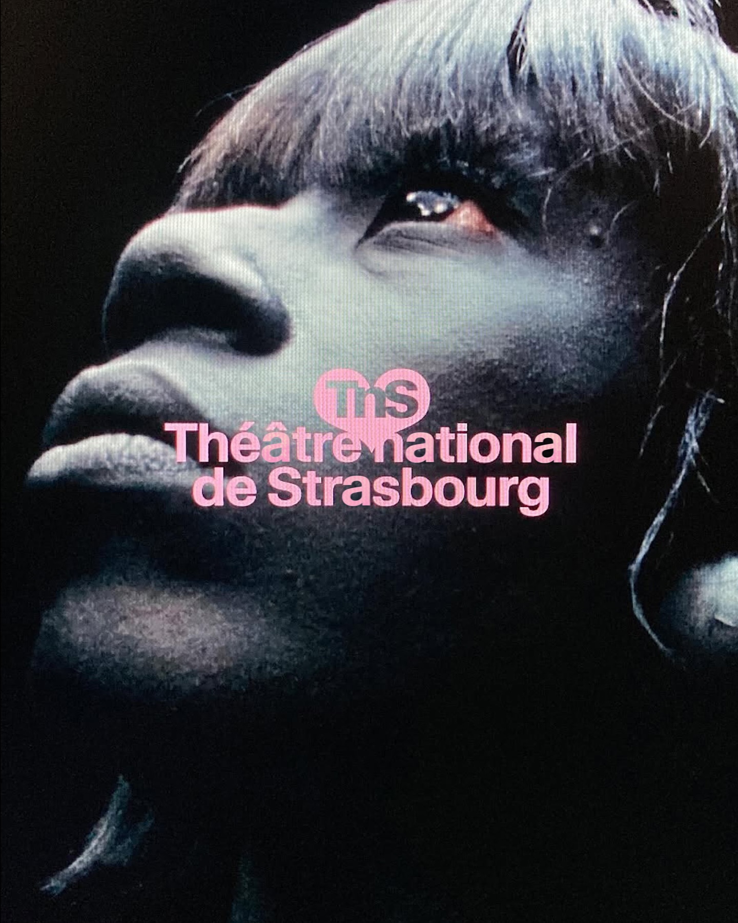
Different versions of the Waldenburg typeface by Kimera for the new identity of the Théâtre National de Strasbourg.
Get Waldenburg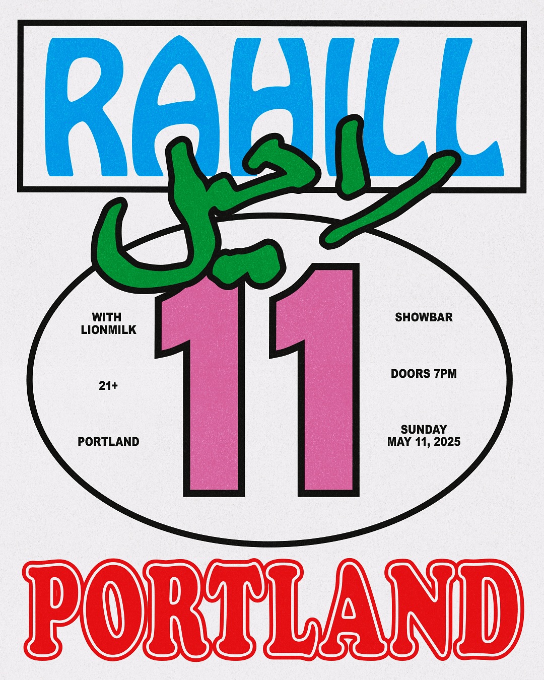
Flyer explorations by Bijan Herami, featuring lettering by his mother, Hobo, and a condensed version of Cooper Black, for Rahill Jamalifard’s show.
Foundry: Morris Fuller Benton Design: Fisk
This custom typeface was part of the identity design that Bureau Bernklau created for the production company BWGTBLD—extended and bold, just like its cinematic vision.
Graphic & type design: Bureau Bernklau

Seoul-based studio FWB designed a custom logotype for Motley Stuff, inspired by objects like keys, keyholes, and handles, supporting the brand’s expansion into fabric and knitting products.
Graphic & Type Design: FWB
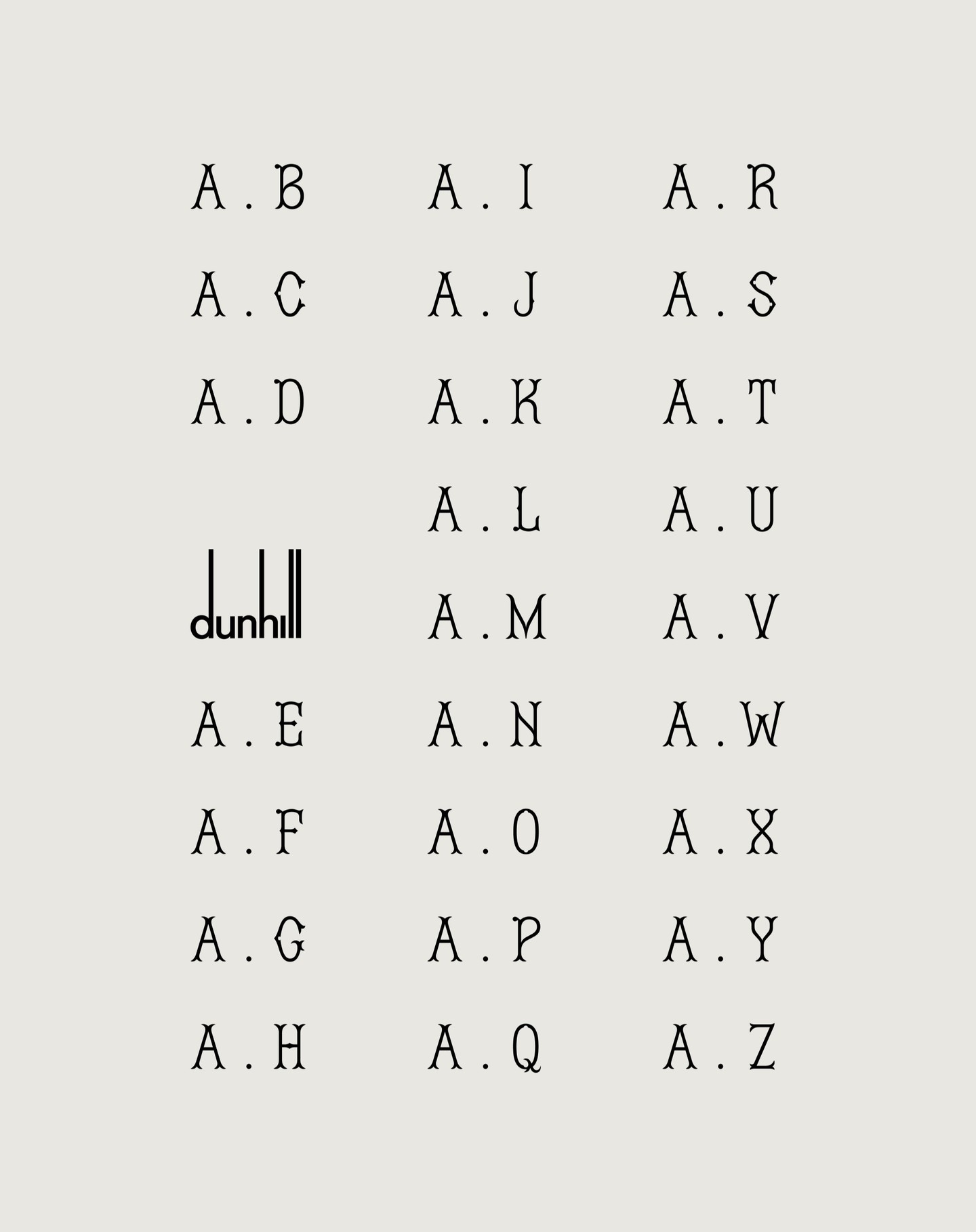
FROST and Dunhill collaborated on the creation of Dunhill Gothic, a typeface that transforms their hand-drawn calligraphy into a refined and bespoke typographic system.
Graphic & Type Design: FROST
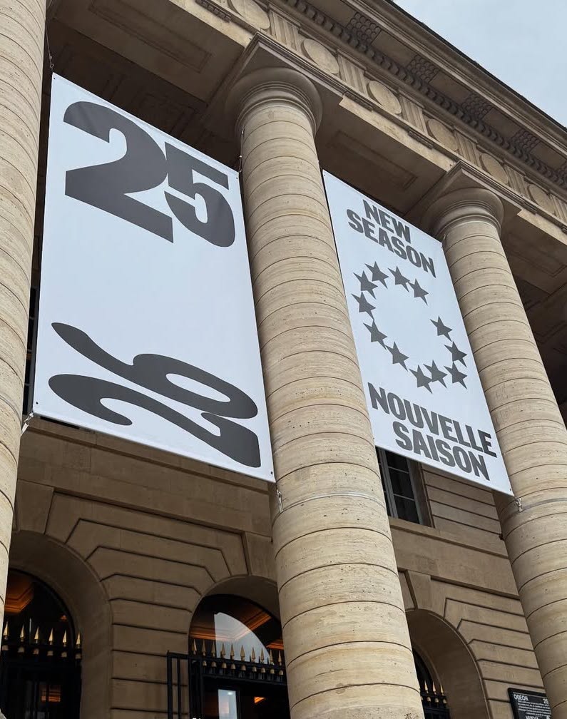
New visual identity for Théâtre de l’Odéon, designed by Atelier Choque Le Goff, featuring the large-scale Insitu typeface by Formagari.
Foundry: Formagari Design: Atelier Choque Le Goff

In Arte Tracks and Arte Tracks East, typography breaks into lines and reconfigures into ever-evolving graphics. Logotype, visual identity, and generic system by H5paris.
Type Design: Simon Renaud Design: H5 Paris

NASK Studio chose Clarendon Graphic Light by Optimo Foundry to shape a refined typographic system that frames the photographic content of JB Books & Projects.
Foundry: Optimo Foundry Design: NASK Studio
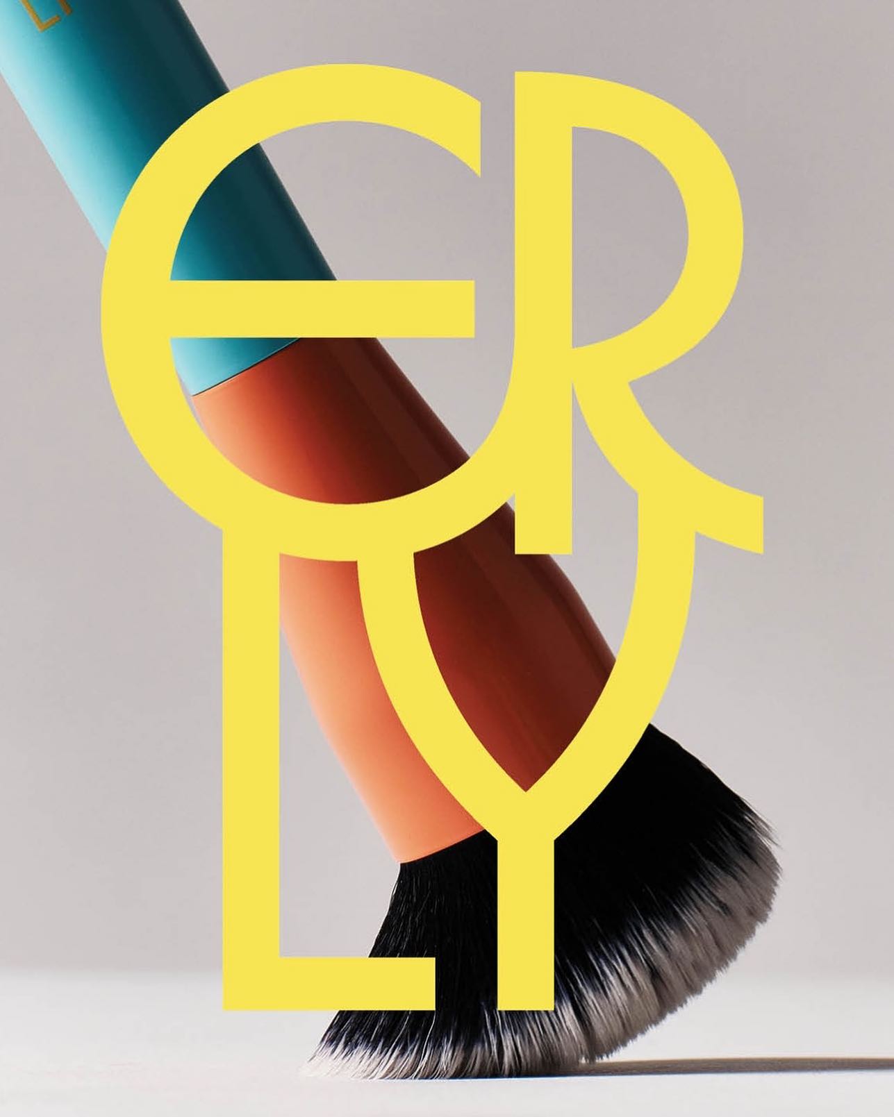
ERLY reinvents skincare with a fresh, typographic identity. Herbus Regular & Title Type, in the design by Studio Lotta Nieminen.
Foundry: Ornamental & Title Type Design: Studio Lotta Nieminen
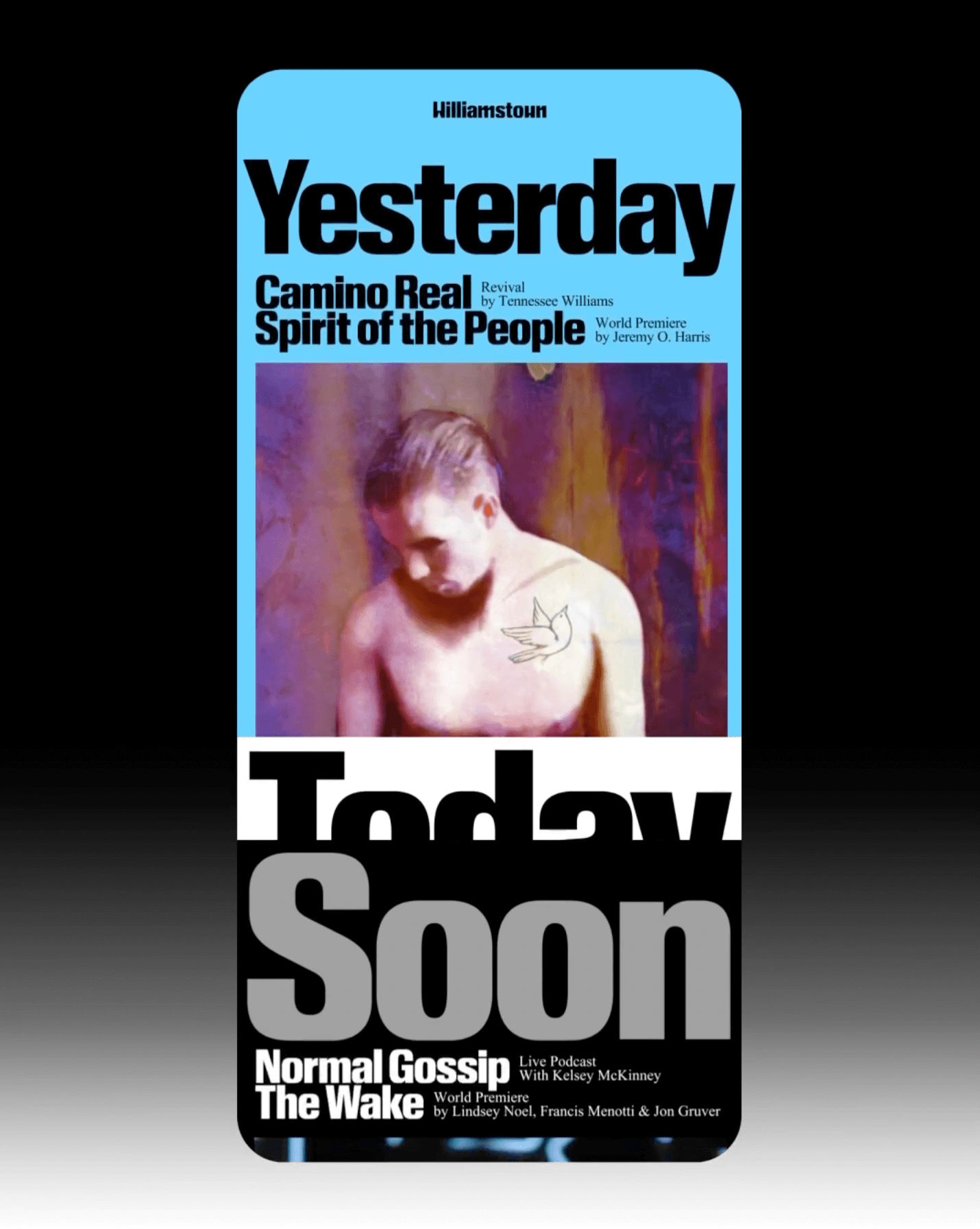
The identity that Pentagram created for the Williamstown Festival transforms the stage into a dynamic graphic system. A custom logo is complemented by Times New Roman and Review from Commercial Type.
Foundry: Monotype, Commercial Type
Design: Pentagram

Inspired by Chicago’s sign painting, the packaging of Foxtrot’s potato chips captures the essence of the iconic Maxwell Street Market hot dog.
Foundry: Colophon Foundry, House Industries
Design: Perky Bros

Animo Typeface by Heavyweight shapes the identity of Grande Paolo, a pop-up sports bar in Prague for the Euro Championship.
Foundry & Design: Heavyweight

In such a fluctuating economy, why not consider price as the most important element of packaging?
Foundry: Linotype Design: Serviceplan

Buenaventura designed IOC, a typeface that becomes the visual signature of Islands of Cocoplum, blending tradition, luxury, and modernity.
Foundry: Buenaventura Studio, Ana Moliz Design: Buenaventura Studio

Ottimo celebrates the tradition of olive oil with an identity designed by Somekind Studio, the brand takes shape with Edition by Elias Hanzer, a monolinear typeface that brings a timeless feel.
Foundry: Elias Hanzer Design: Somekind

Designed by Copyright/Reserved, this special publication by @extensive.publishing and @greedydust features Cortese and Cortese Sans by Mark van Leeuwen.
Foundry: Mark van Leeuwen Design: Copyright/Reserved

The redesign of ArkDes in Stockholm by AM Stockholm features custom typefaces where dots and dashes create a unique typographic system. Alongside Diatype, these fonts redefine the museum’s identity.
Type Design: ABC Dinamo, Luuse, Adrien Vasquez Design: AM Stockholm

Storefronts have served as stages for performances, for experimentation, and part of the art itself. Fresh Window at Museum Tinguely explores this connection with an identity using Stabilo Boss.
Foundry: Sourcetype Design: Sylvan Lanz

Tetier, the jewelry brand using recycled materials that recently collaborated with Asics, features Octave by Faire Type in its logo and texts.
Foundry: Faire Type Design: Baptiste Gerbelot Barillon

EXTRALESS, a Japanese clothing brand reflected its ethos in a custom typeface by British Standard Type embodying simplicity and shared humanity.
Foundry: British Standard Type Design: OK-RM

Four Words rebrands with a bold red identity, using Greed and Teodor by Displaay.
Foundry: Displaay Design: Motion Sickness Design Office

Elisava has a new visual identity inspired by its original logo, and Folch designed Elisava Sans, a variable typeface created to work in any context.
Foundry: Fonts from Folch Design: Folch

OFFSHORE created these materials using a display typeface with spiral shapes, designed for the public programs of the Harvard Graduate School of Design in 2024.
Foundry & Design: OFFSHORE

With dots inviting the creation of interconnected forms, the design by Atelier Tout va bien features Baste in The MV Festival 2024.
Foundry: Image Format for Lift Type Design: Atelier Tout va bien
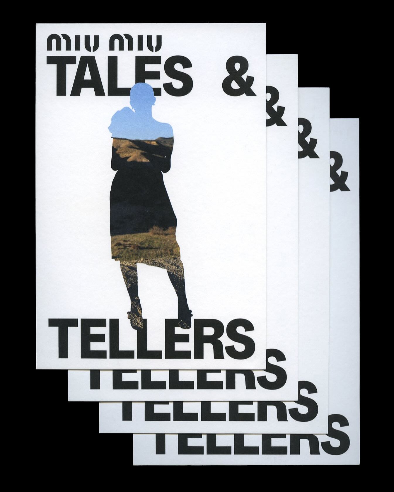
Kern typeface is featured in Tales & Tellers, a Miu Miu campaign that revisits various representations of femininity from past runway shows and short films.
Foundry: Pizza Typefaces Design: 2×4

AG Grafik created a brand identity for a poetry festival, blending experimental layouts with the classic elegance of Timezone.
Foundry: HAL Typefaces Design: AG Grafik
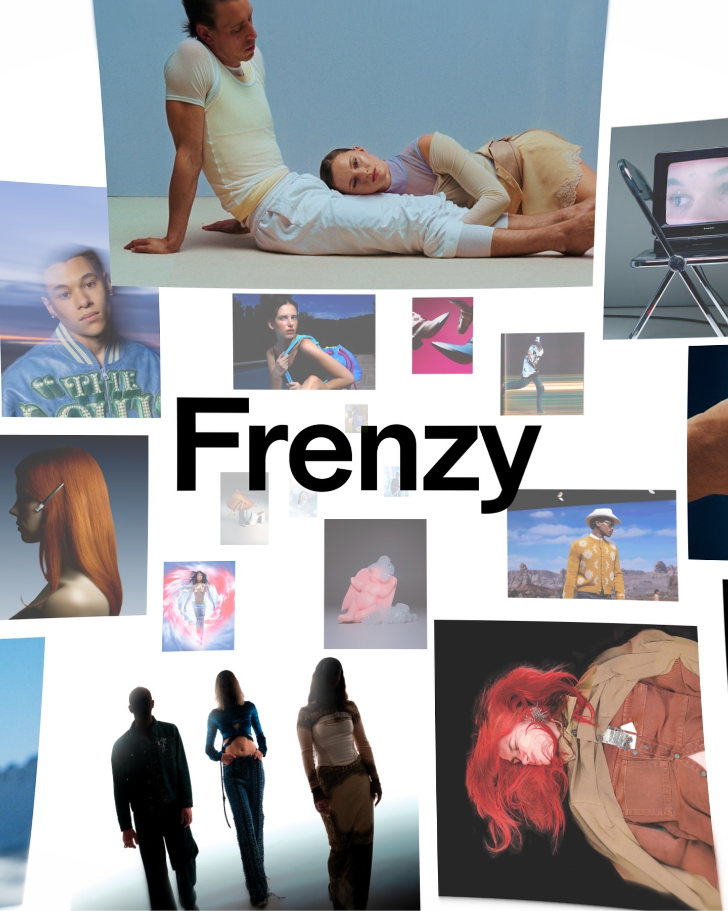
After more than a decade, the production company Frenzy has refreshed its image to show that its bold and contemporary vision remains as relevant as ever. Featuring Modale Antique by Formagari.
Get Modale Antique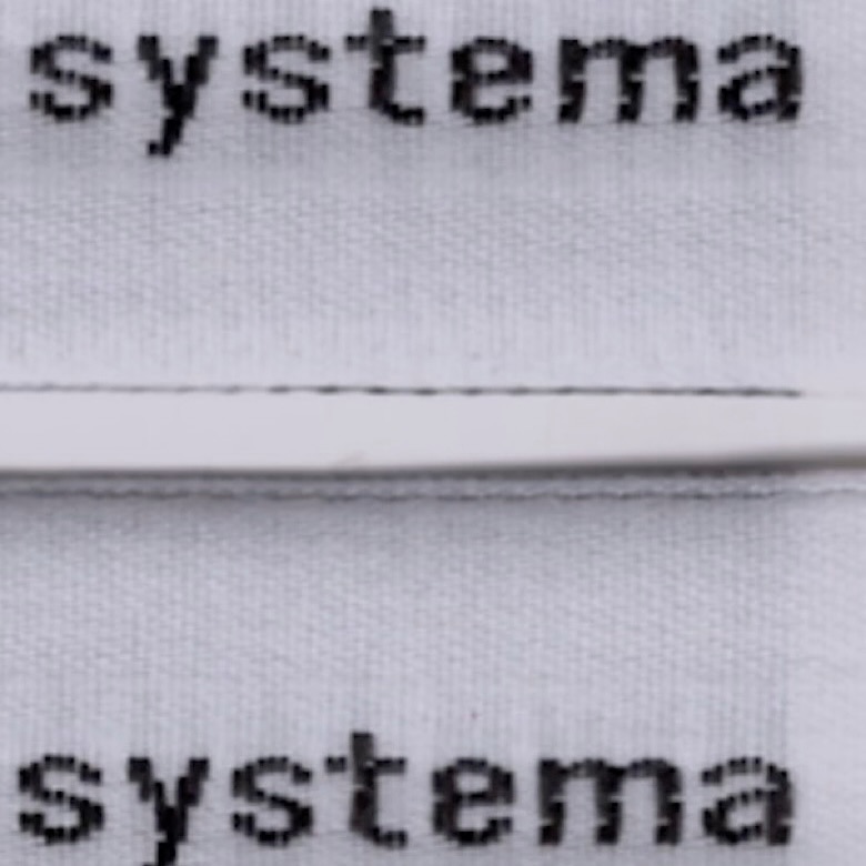
The French studio Plus Mûrs used Diatype Mono by Dinamo for the logo of the sophisticated sports brand, Counter Systema.
Foundry: Dinamo Design: Plus Mûrs
The Gentlewoman magazine released its latest issue using HB Set, an upcoming typeface from HB Type.
Foundry: HB Type Design: The Gentlewoman
With the aim of redefining elegance, Porto Rocha developed a new brand identity for W Hotels, in collaboration with Lineto, created W Supreme.
Foundry: Lineto Design: Porto Rocha
As part of Musée d’Orsay’s rebranding, Orsay Elzevir was created—a typeface inspired by La Belle Époque, reflecting the energy of the period the museum celebrates.
Foundry & Design: Zoo
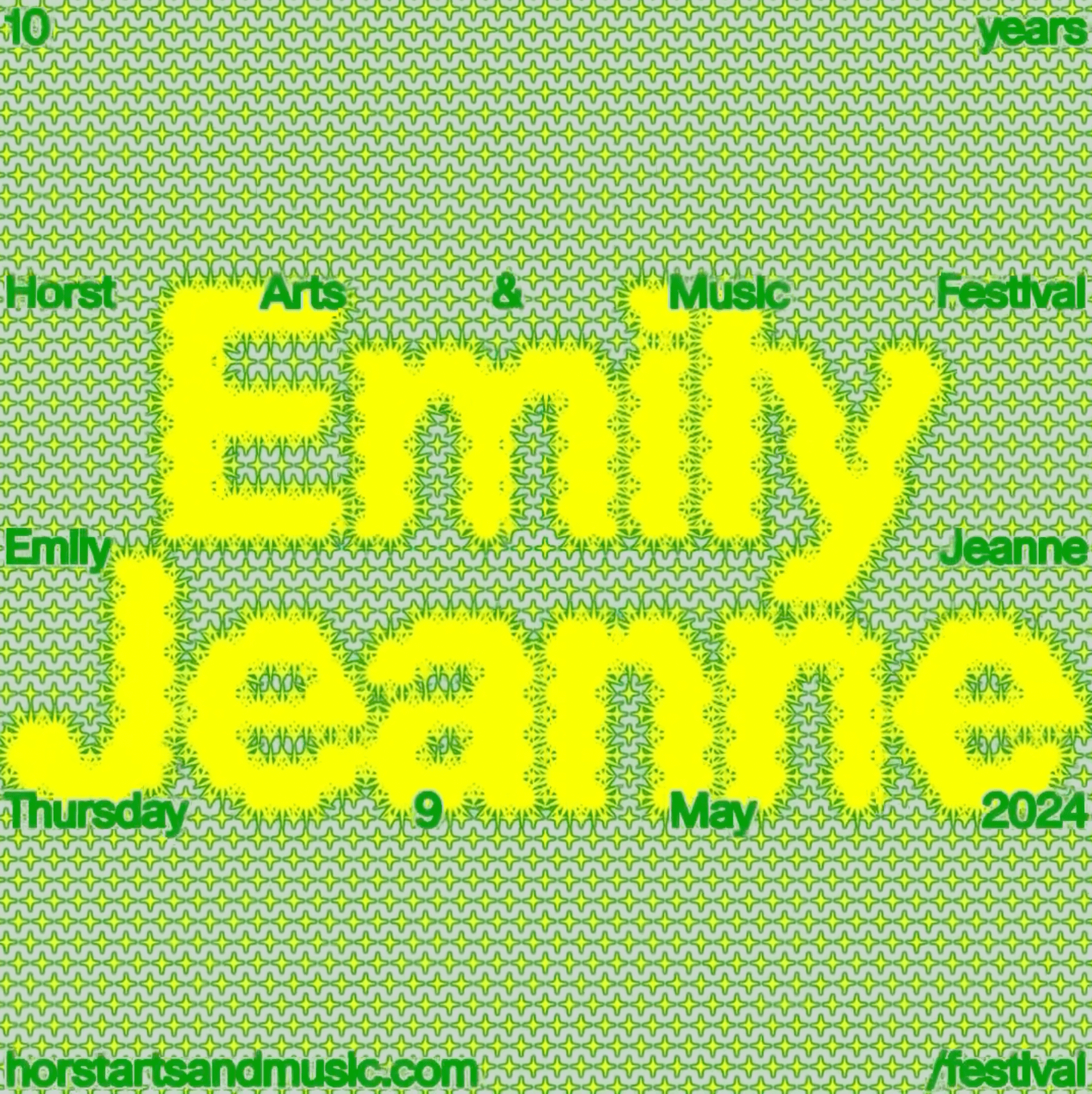
Horst Arts & Music 2024 debuts with a visual identity that connects disciplines, emotions, and practices through a network of symbols, featuring Oracle by Dinamo.
Get Oracle
Technology has made our lives easier, but it seems everything comes at a price. INVOLUT introduces a range of supplements to combat the negative side effects of modern times. Featuring PicNic by Velvetyne.
Foundry: Velvetyne Design: Fuego Camina Conmigo
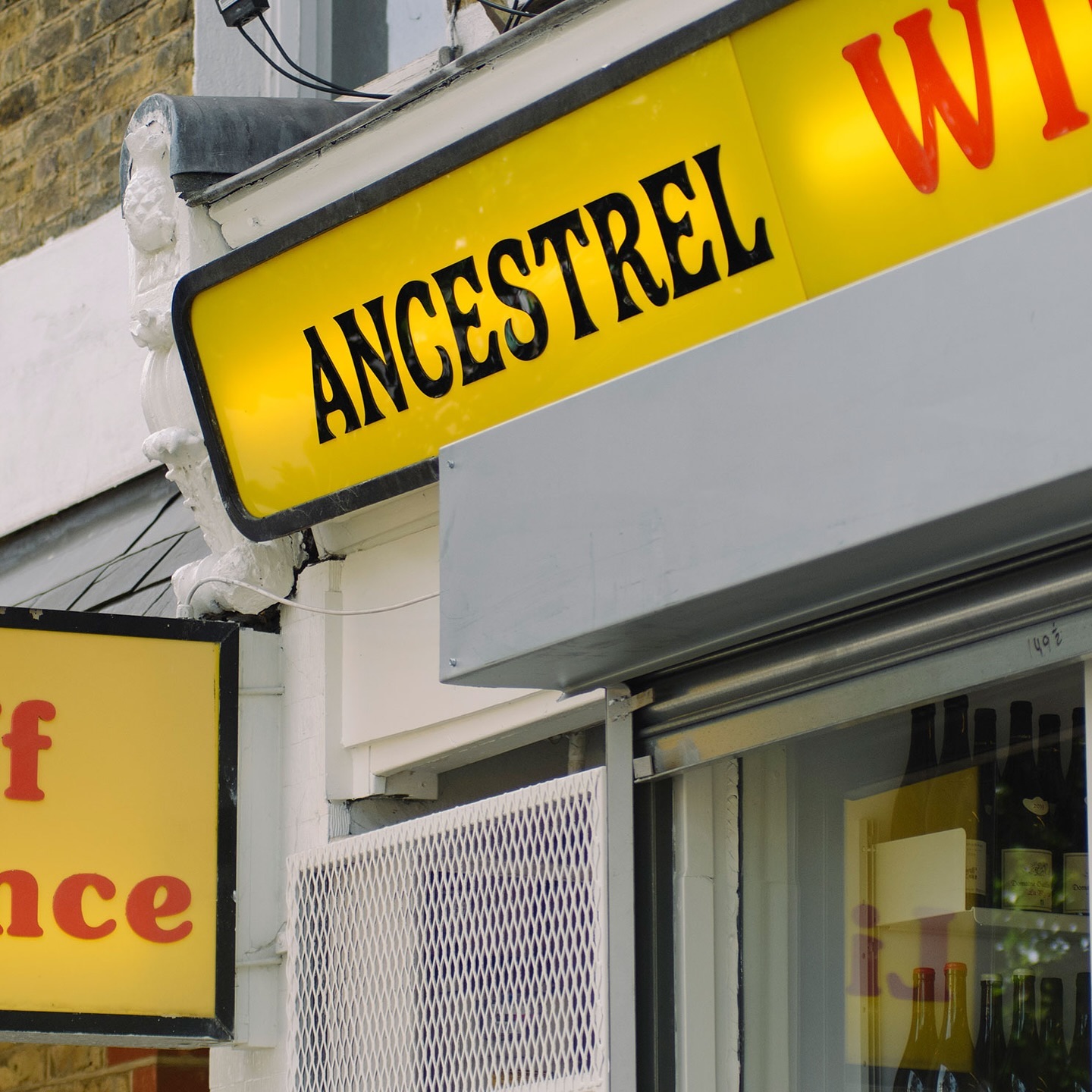
The first store to bring natural wine to the UK, Ancestral Wines, features an identity inspired by the winemaking process and a logo shaped like a grape cluster.
Foundry: Approximate Type Design: All Purpose Studio
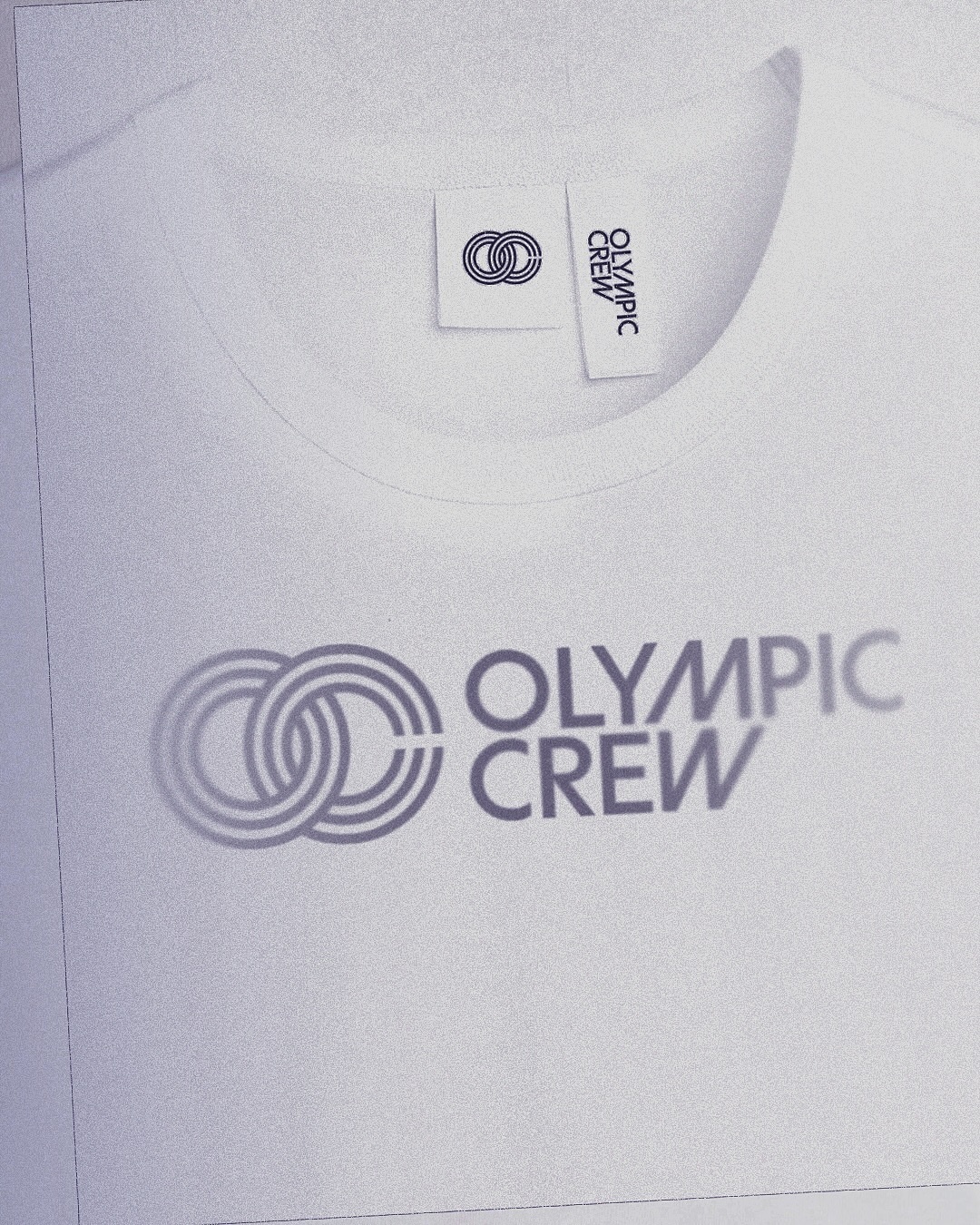
BonTemps studio designed the identity for Olympic Crew, combining the custom logotype and the iconic OC symbol to capture collaboration and modernity. They used the Univers Condensed Bold typeface.
Design: BonTemps
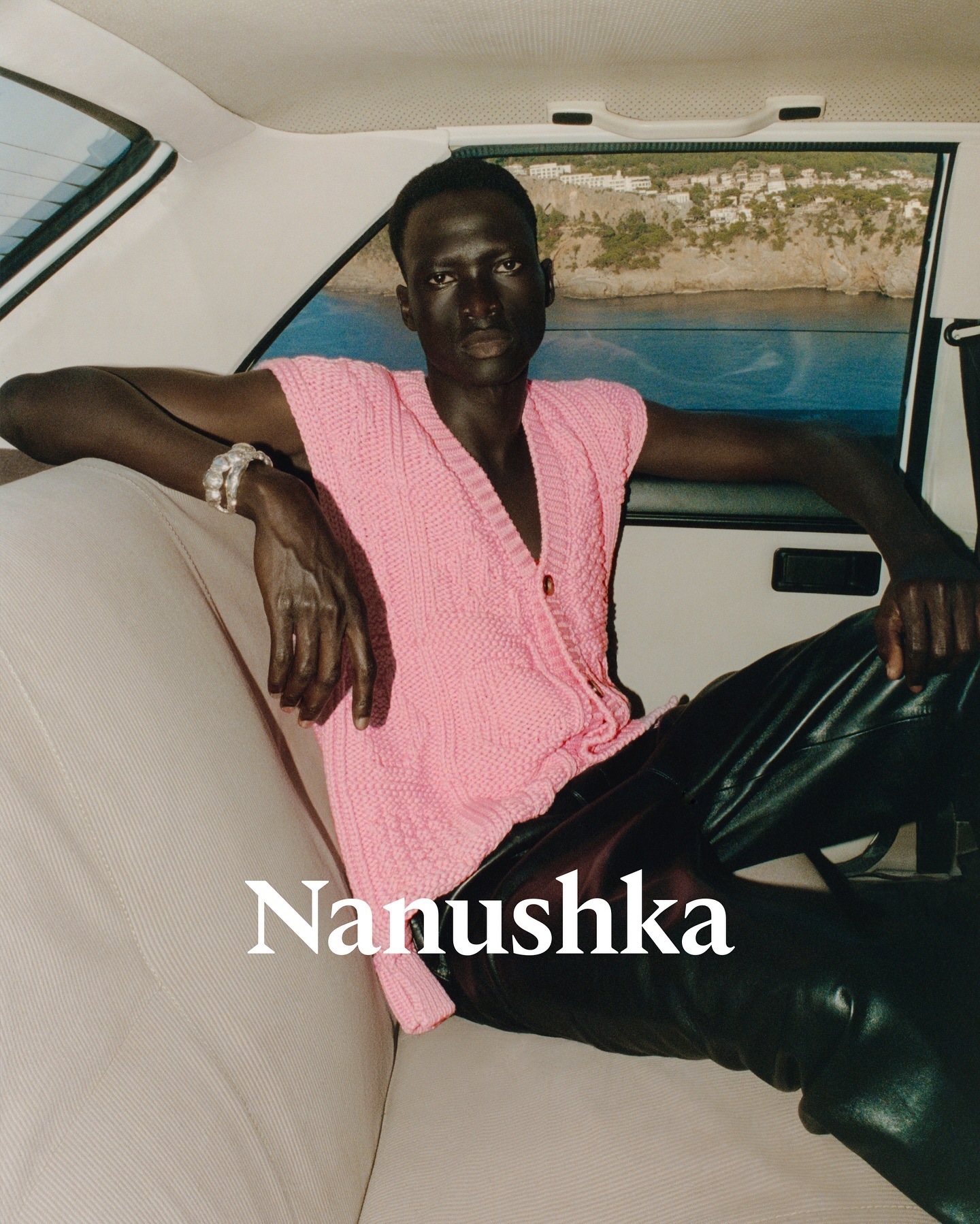
Nanushka is making its mark in the fashion market with inspiration drawn from Hungarian history as well as a wordmark and visual identity rooted in traditional symbols.
Foundry: Any Other Name Design: Any Other Name
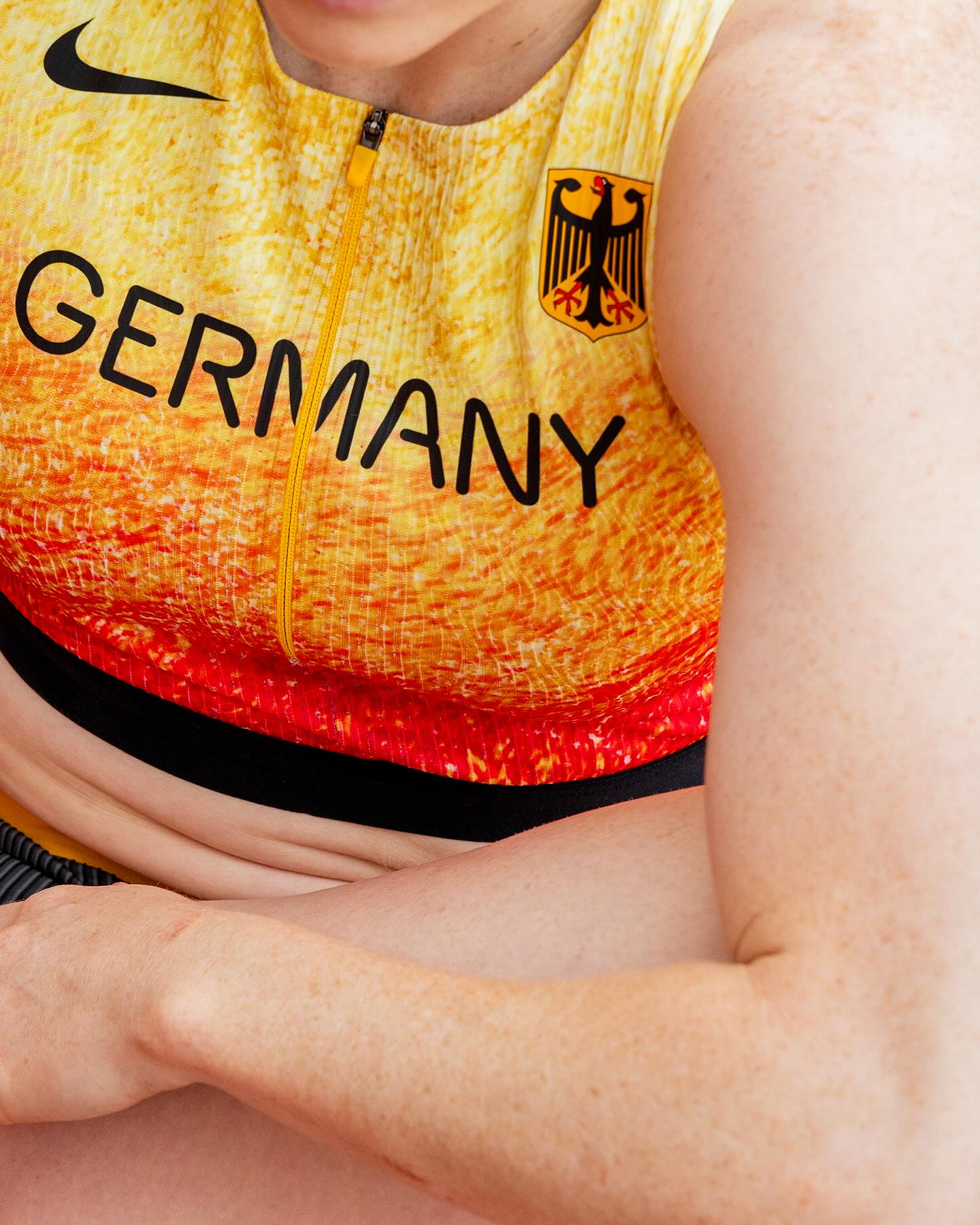
At the world’s largest sporting event, Nike embraced a modern, dynamic, and fluid typeface. In collaboration with Pizza Typefaces, they created the Nike Olympics fonts, a typeface inspired by twisting motion.
Foundry: Pizza Typefaces
A classic typeface that reinvents itself by being interactive; Bonjour Garçon used Neue Haas Unica W1G Black, applying a negative effect in the web redesign they created for the art agency Pedro Booking.
Foundry: Linotype Design: Bonjour Garçon
Elephant magazine showcases the rustic and imperfect details of the ZG Elephant typeface through these graphic spreads. Type and editorial design by Zak Group.
Foundry & Design: Zak Group
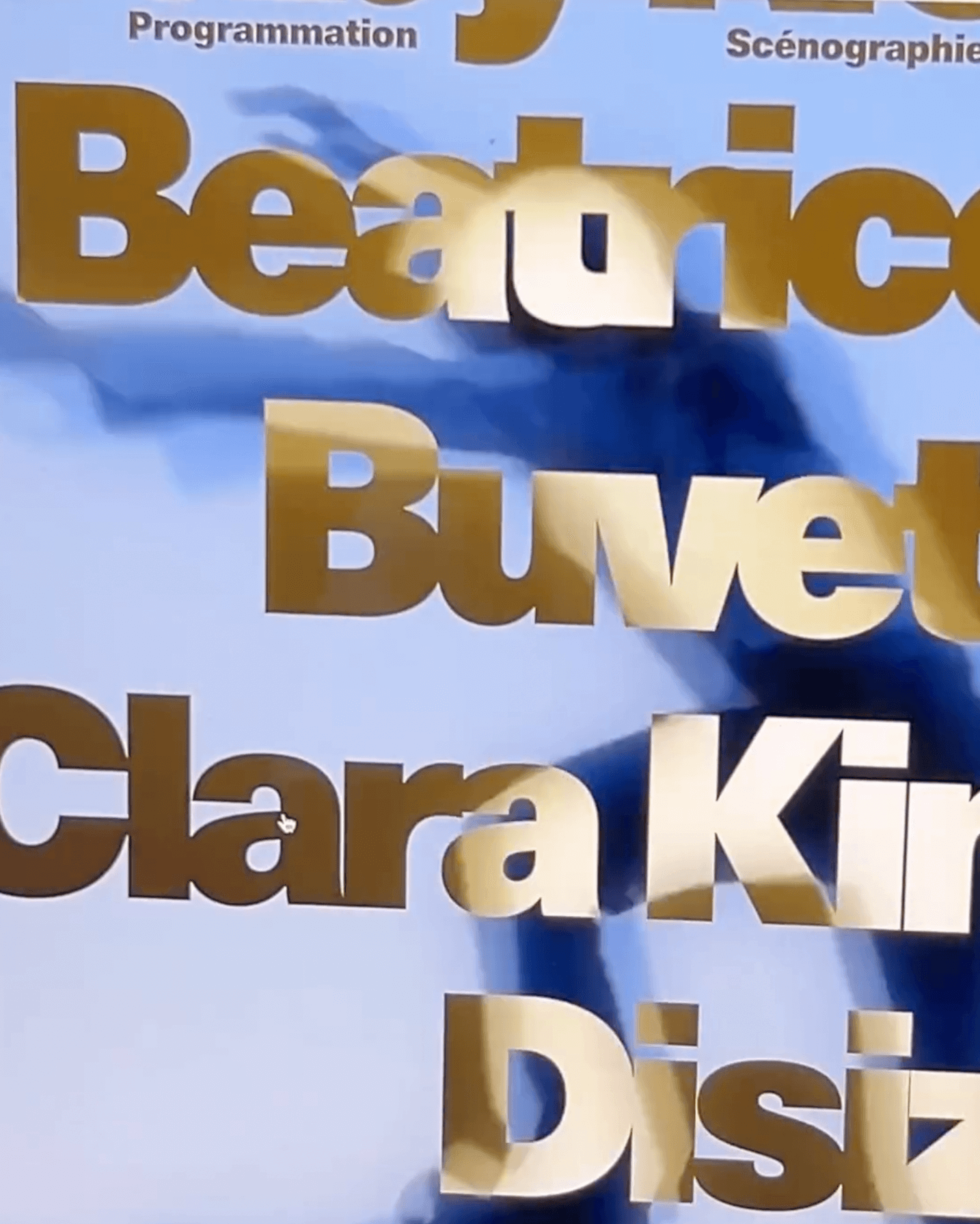
As part of the visual identity that Bureau Borsche created for the Bavarian State Opera, a digitized typeface —developed by Samara Keller— was created, based on a design found in the opera’s facilities.
Foundry: Samara Keller Design: Bureau Borsche
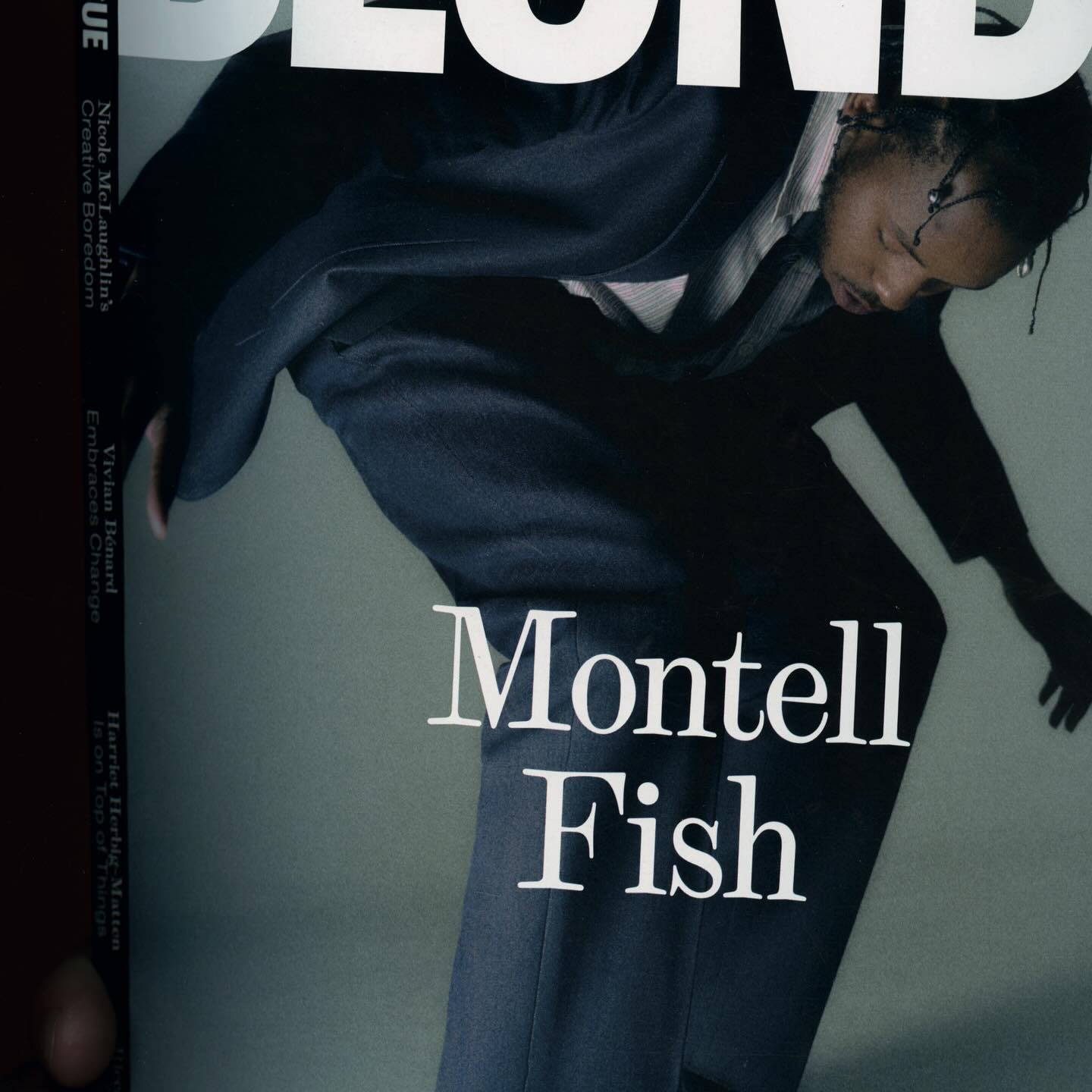
The type selection for Blonde Magazine’s redesign, managed by Hei Agenda, includes Contrast Foundry on the logo, Counter Forms for the serif (Eyla), and sans fonts by Lucas Liccini & Elias Hanzer (HAL Four Grotesk)
Design: Hei Agenda Foundry: Counter Forms, Contrast Foundry, Hal Typefaces

As fun as family movie nights, Moore by Eliott Grunewald was used in this list of films curated by A24 and approved by kids and adults alike. Designed by Jordi Ng and Elana Schlenker.
Foundry: Eliott Grunewald Design: Jordi Ng, Elana Schlenker

Logotype and lettering inspired by the baroque era of the internet, proposed by Muon Studio for Youhee’s visual identity.
Lettering and Graphic Design: Muon Studio

Justin Sloane used this interesting mix of Gothic letters (Castilla by Sharptype) and sans serif (Octave by Josh Finklea) for a vinyl cover.
Foundry: Sharp Type, Josh Finklea Design: Justin Sloane
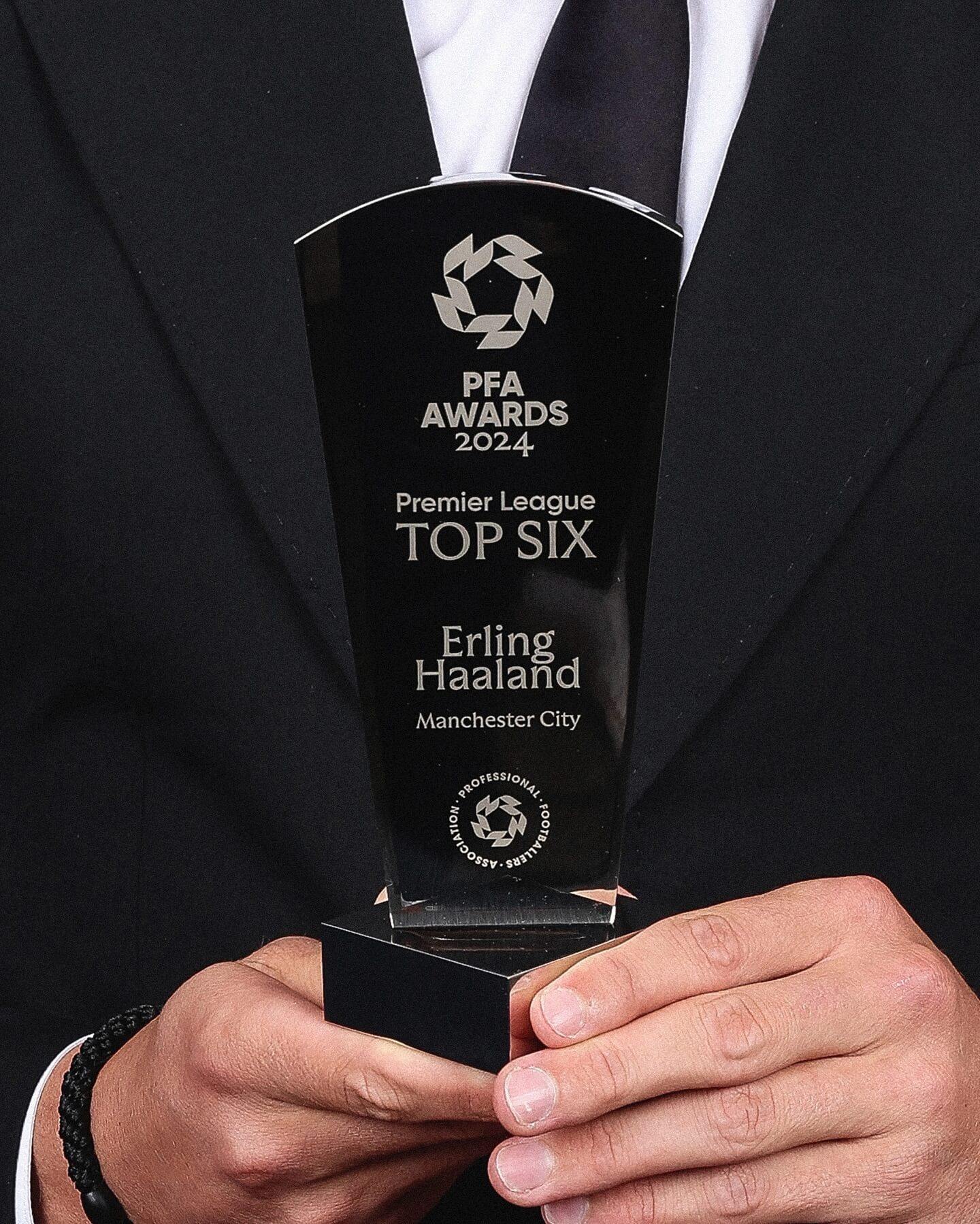
Realm by Approximate Type being used in this annual award ceremony for the best player of the year in the English league.
Foundry: Approximate Type Design: The Lift Agency
This series of keychains, the result of Pauline Esguerra’s exploration with laser cutting, uses, among other typefaces, Eurocat by Maxitype.
Foundry: Maxitype Design: Pauline Esguerra
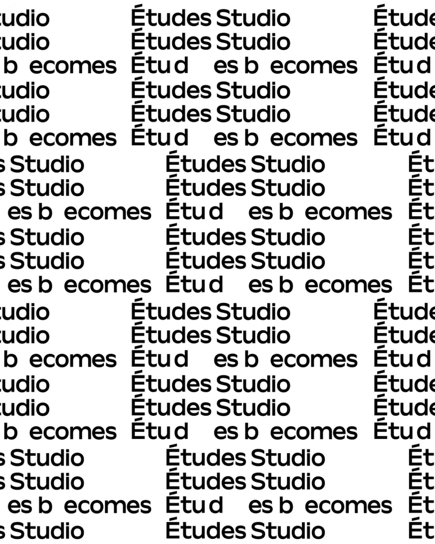
A geometric typeface with humanist features, crafted by Spassky Fischer, for the new identity of Études.
Type and Graphic Design: Spassky Fischer
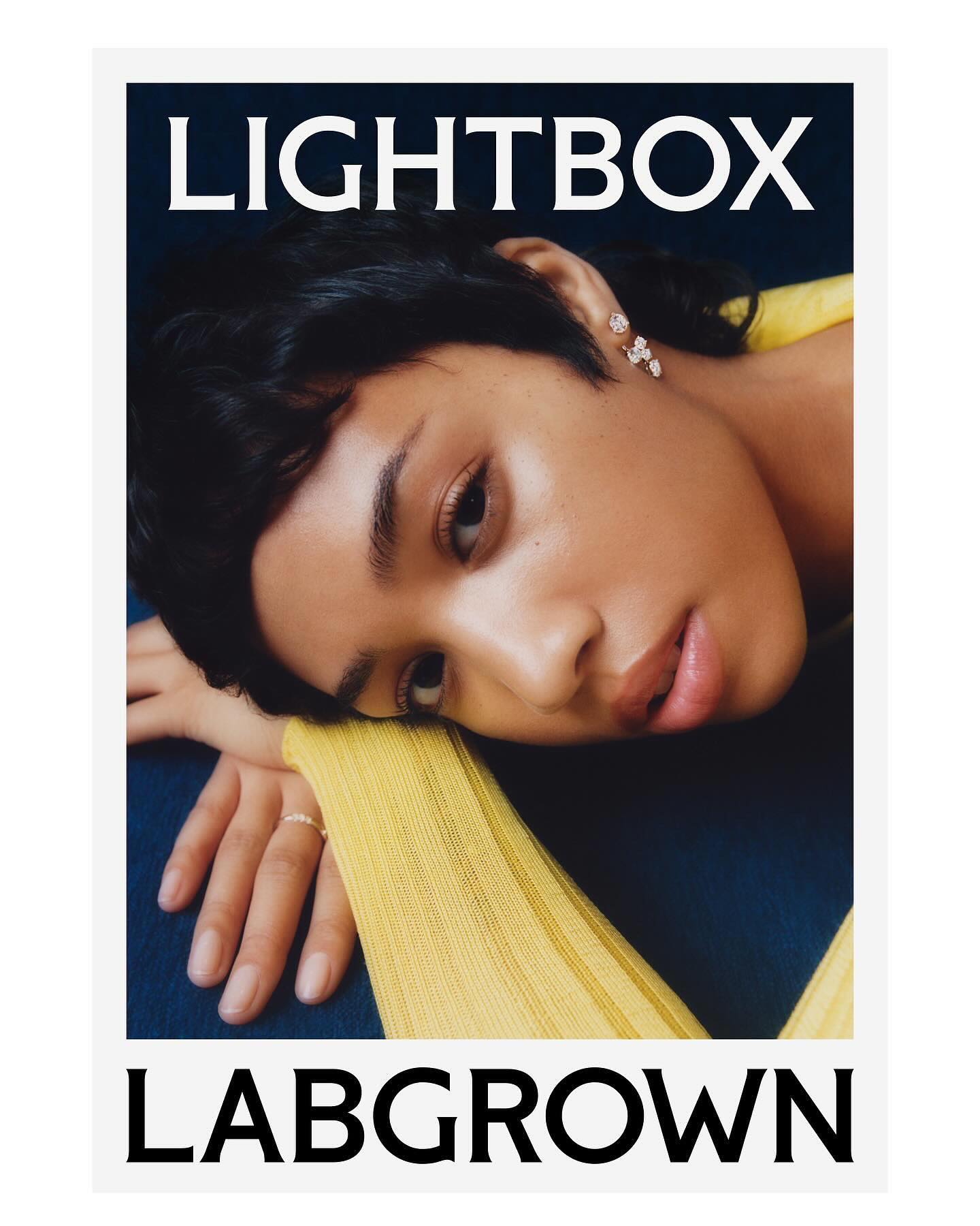
Decade created this visual identity to position an innovative lab-grown diamond brand, proposing a custom flare logo designed by Colophon Foundry.
Foundry: Colophon Foundry Design: Decade
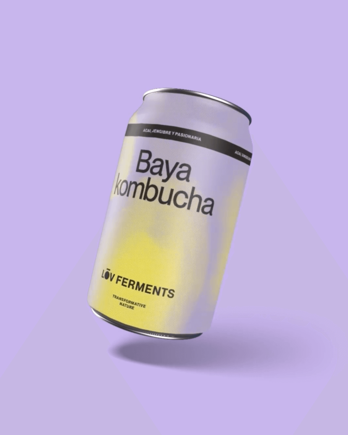
Casa Bien used Neue Montreal by Pangram Pangram and Items by Schick Toikka to build the visual identity for LOV Ferments, a brand set to change the beverage market.
Foundry: Pangram Pangram, Schick Toikka Design: Casa Bien
Three typefaces come together in this warm visual identity for an art exhibition in Paris: Minotaur by Production Type, Diatype by Dinamo, and Feature Deck by Commercial Type.
Foundry: Production Type, Dinamo, Commercial Type Design: ZAINA
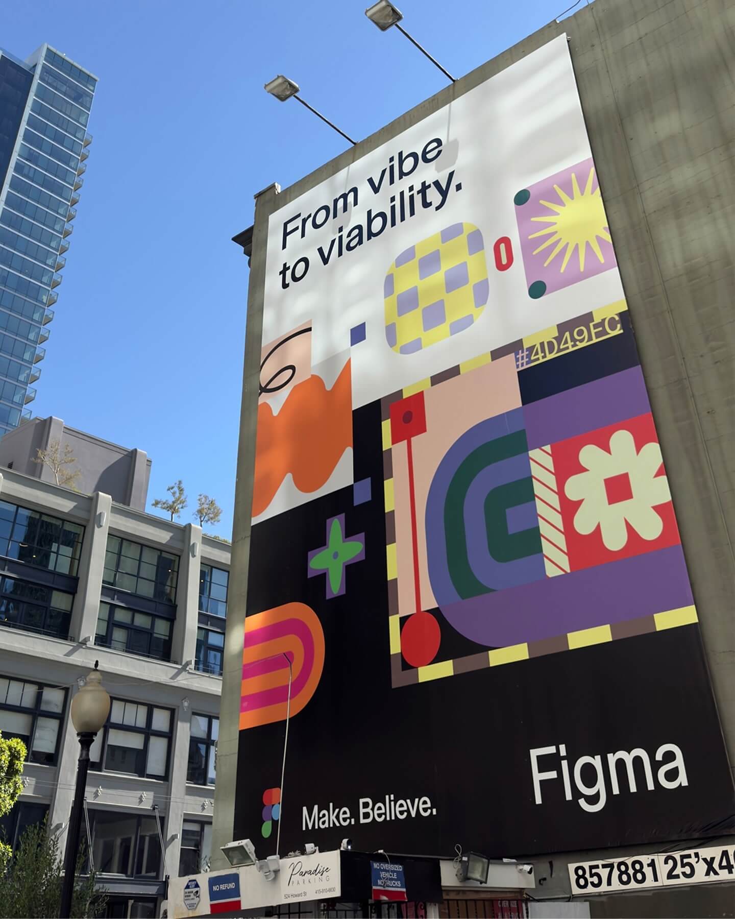
Grilli Type took on this ambitious project and proposed Figma Sans; a typeface with personality but practical, focused on efficiency, and free of unnecessary embellishments.
Foundry: Grilli Type Design: Figma
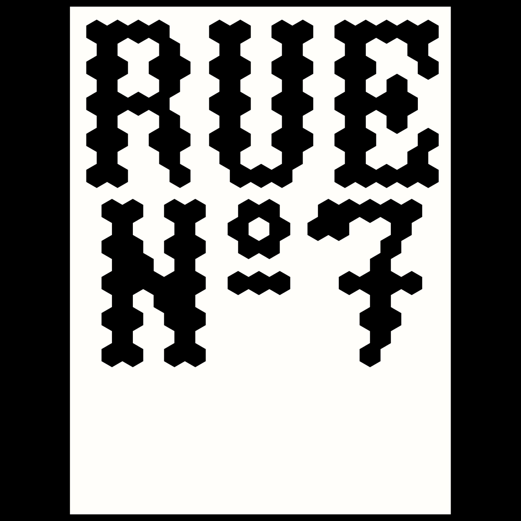
Rajola is a stencil and filled typeface designed by ErrorErrorStudio. It is inspired by and pays tribute to the iconic hexagonal tiles characteristic of the Mediterranean.
Type Design: ErrorErrorStudio
Logotype custom-designed by Bureau Bernklau, drawing inspiration from the distinctive features of Ehmcke Antiqua, an early 20th-century typeface.
Foundry: Bureau Bernklau Design: Bureau Bernklau
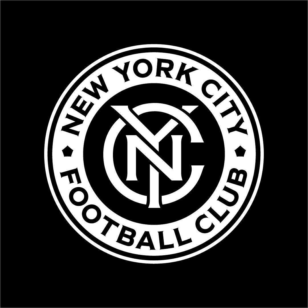
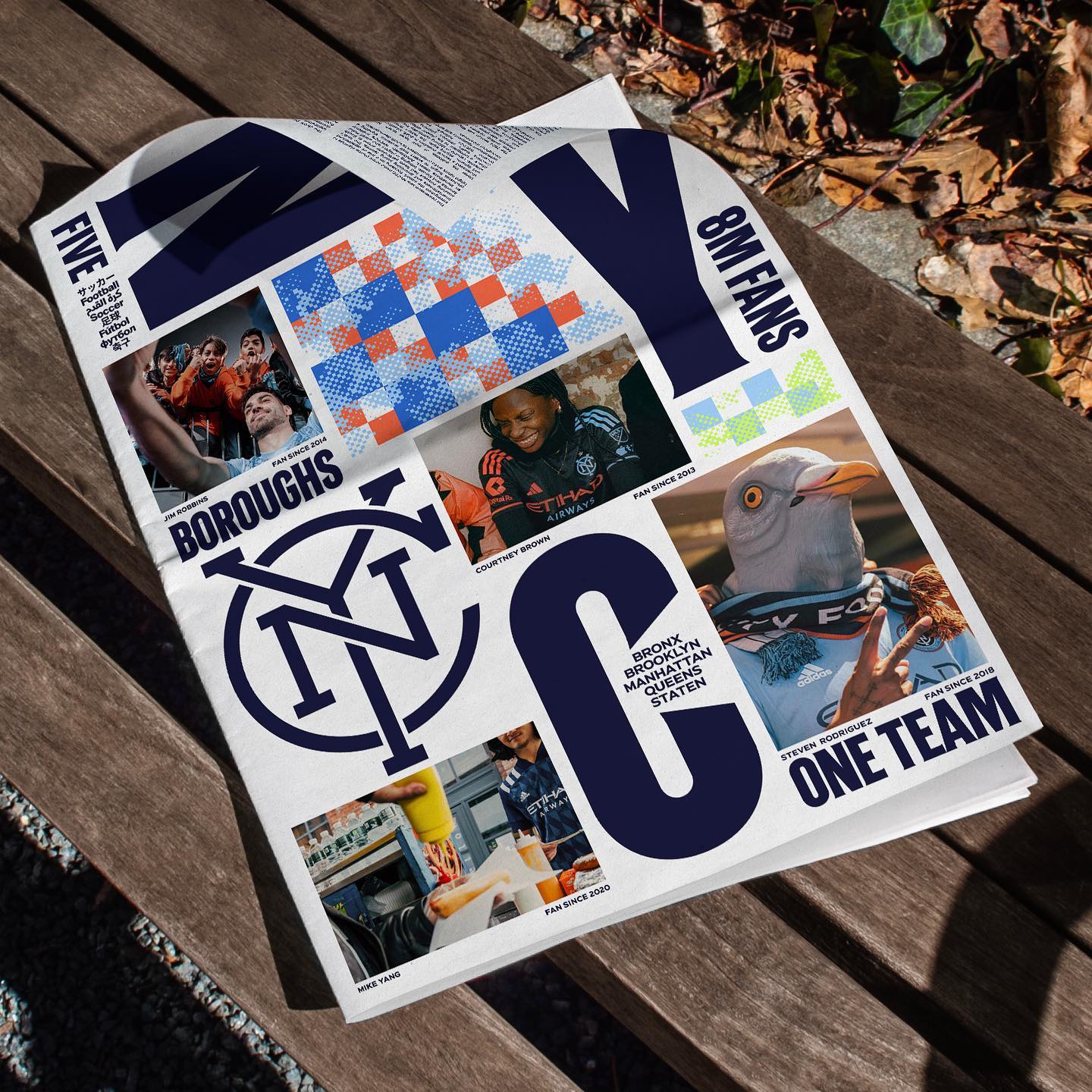
Frere-Jones was tasked with redesigning the New York City Football Club badge, and carefully adjusting each character to fit the circular arc of the badge.
Type Design: Tobias Frere-Jones, Nina Stössinger Design: Gretel
A typeface inspired by 16th-century characters being used in the identity of an exhibition 500 years later; Louise Verstraete used Holger for these posters.
Type Designer: Otis Verhoeve Foundry: Wise Type Design: Louise Verstraete
TSTO gave VUM—a series of Sunday music events—a psychedelic and youthful image.
Get Giigamax
This old Dutch apple syrup design, featuring the Phyllis typeface by Heinrich Wieynck, reminds us that the good things always last.
Foundry: URW Type Foundry
This historic Finnish newspaper refreshed its image with a new logo, using a custom typeface created by Schick Toikka, drawing inspiration from the newspaper’s earlier logos from the 1920s to 1940s.
Design & Foundry: Schick Toikka
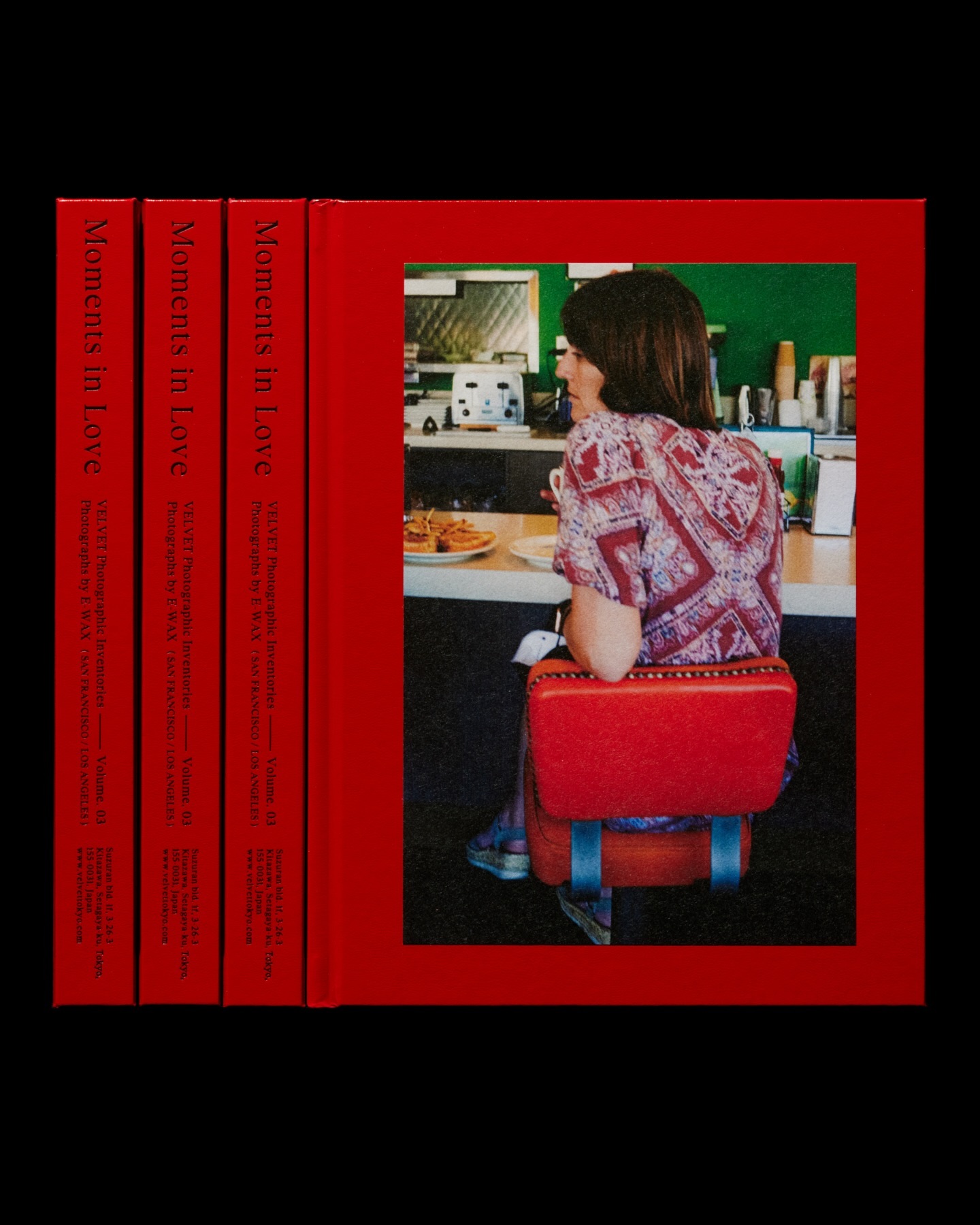
Moments in Love narrates a new way of portraying fashion, blending it with photos of passersby. Designed by the studio Siun, using FT Bureau.
Get FT Bureau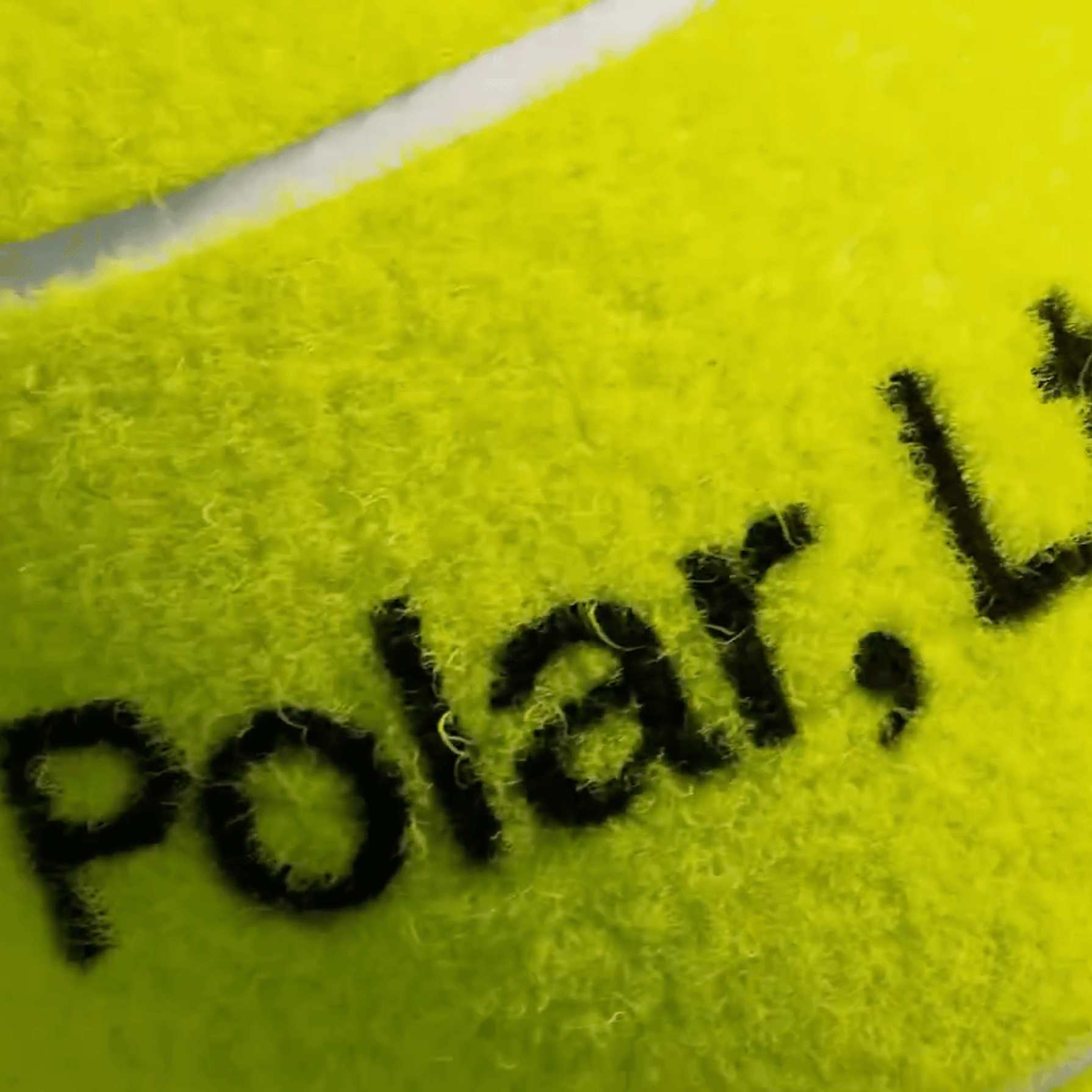
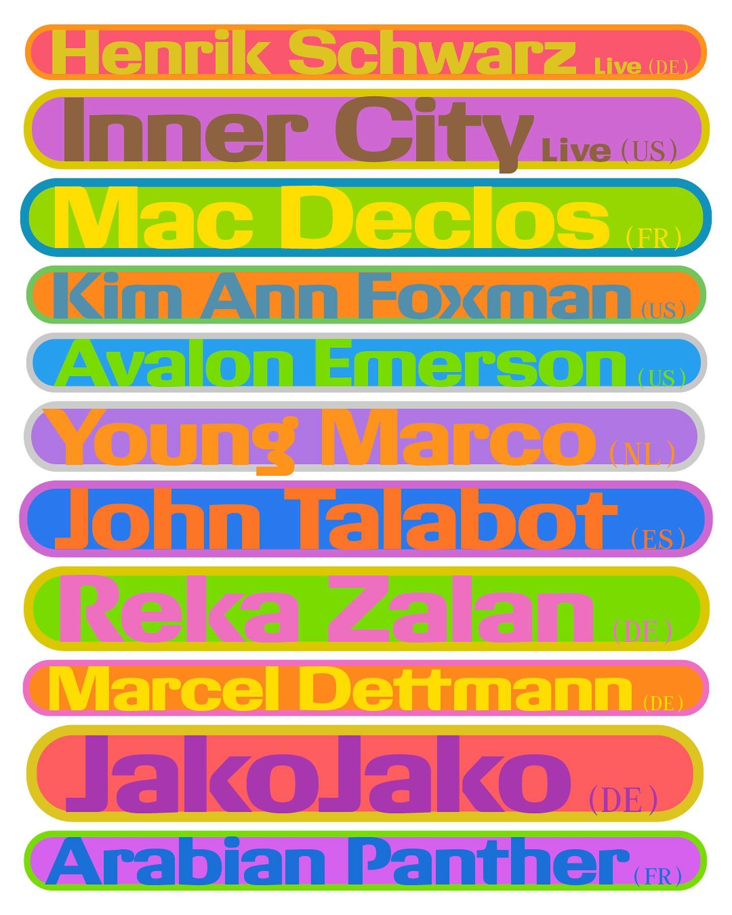
A studio and shop at the same time, or a shop that also functions as a studio; Polar Ltda brings together various design professionals to offer a fresh creative approach.
Foundry: Family type Design: Polar Ltda
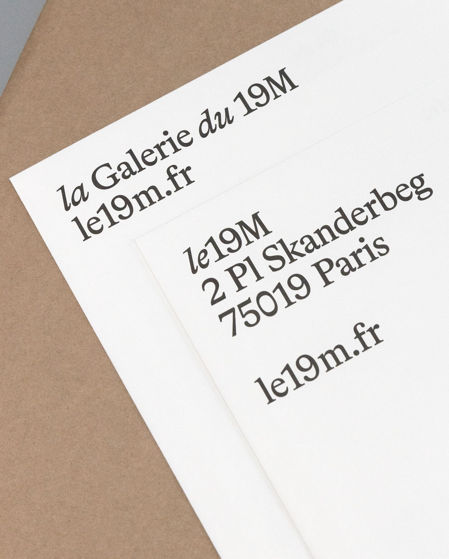
Hort Berlin used this serif typeface with classic and elegant forms (Bradford) for the visual identity they designed for the cultural center le 19M.
Foundry: Lineto Design: Hort Berlin
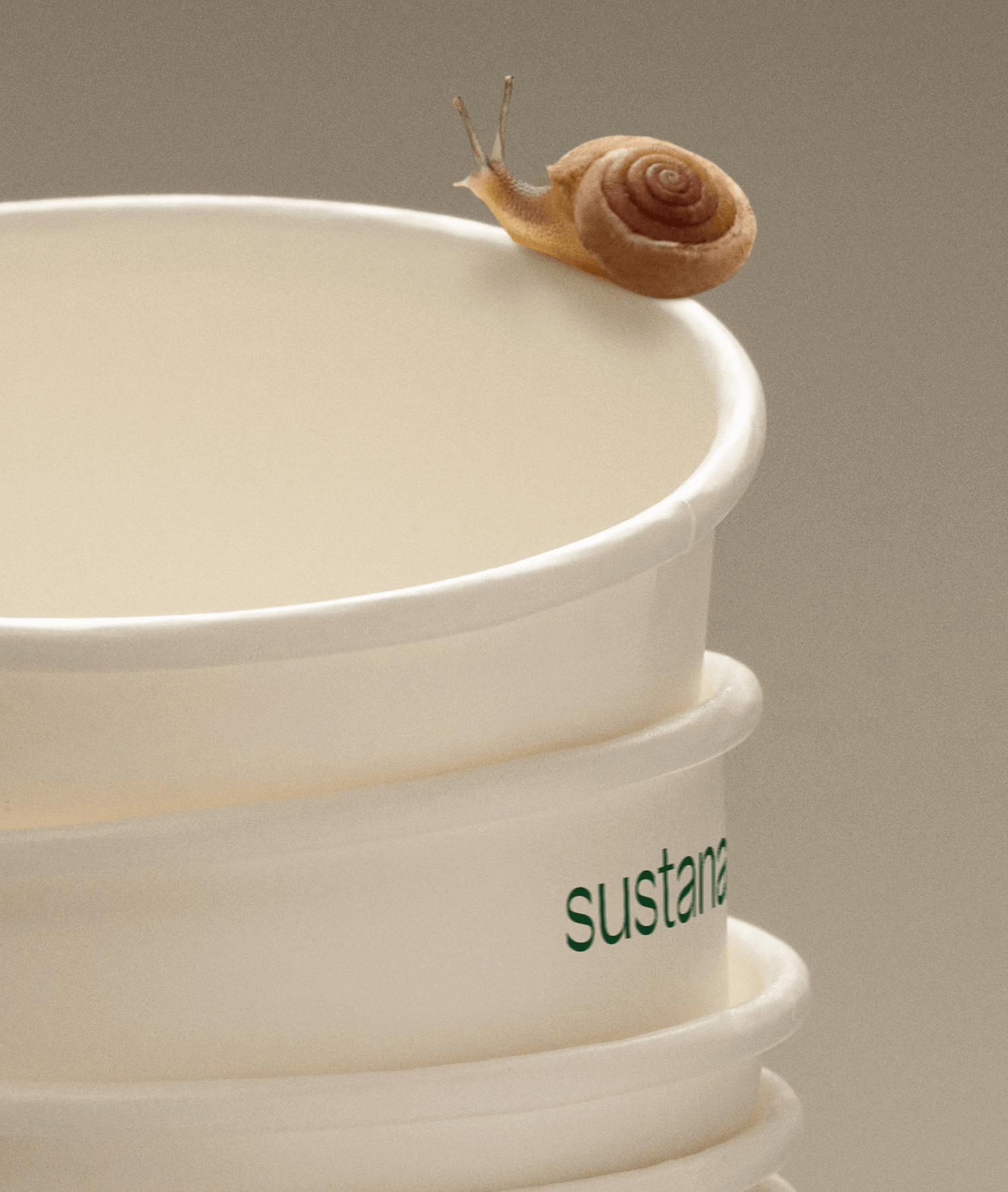
Paper made with clean materials; this was the twist COLLINS gave to this Canadian company, transforming it into Sustana. Custom typography by Sharp Type.
Foundry: Sharp Type Design: COLLINS
A jewelry brand that saves us from monotony and invites us to live creatively. Brand identity and art direction by Tino Nyman, featuring the typefaces Onsite, Exposure and GT Pressura.
Foundry: SOCIOTYPE, 205TF, Grilli Type Design: Tino Nyman
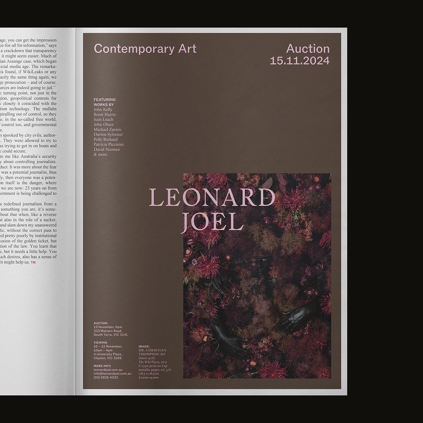
Leonard Joel, one of Australia’s top auction houses, refreshed its identity with Studio Doherty. The concept “Everything old is new again” blends heritage and modernity.
Foundry: Margot Lévêque Type Foundry, ABC Dinamo Design: M. Giesser
Alongside a colorful identity and illustrations, Studio Tux proposed Nordic Pavilion and Roboto Mono as the typefaces for this farm.
Foundry: Scott Vander Zee, Google Fonts Design: Tux
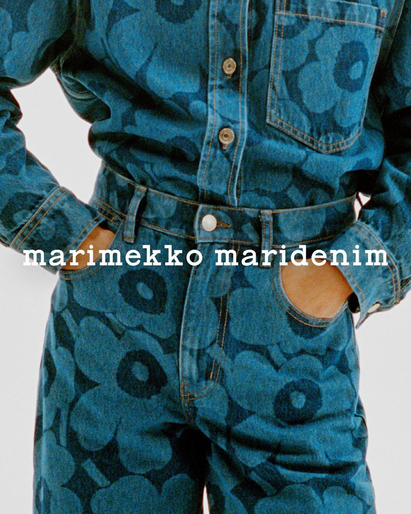
Maridenim just made its debut at the Fall/Winter 2024 show during Copenhagen Fashion Week. Blending their iconic bold designs with a fresh denim twist.
Logo design: Schicktoikka
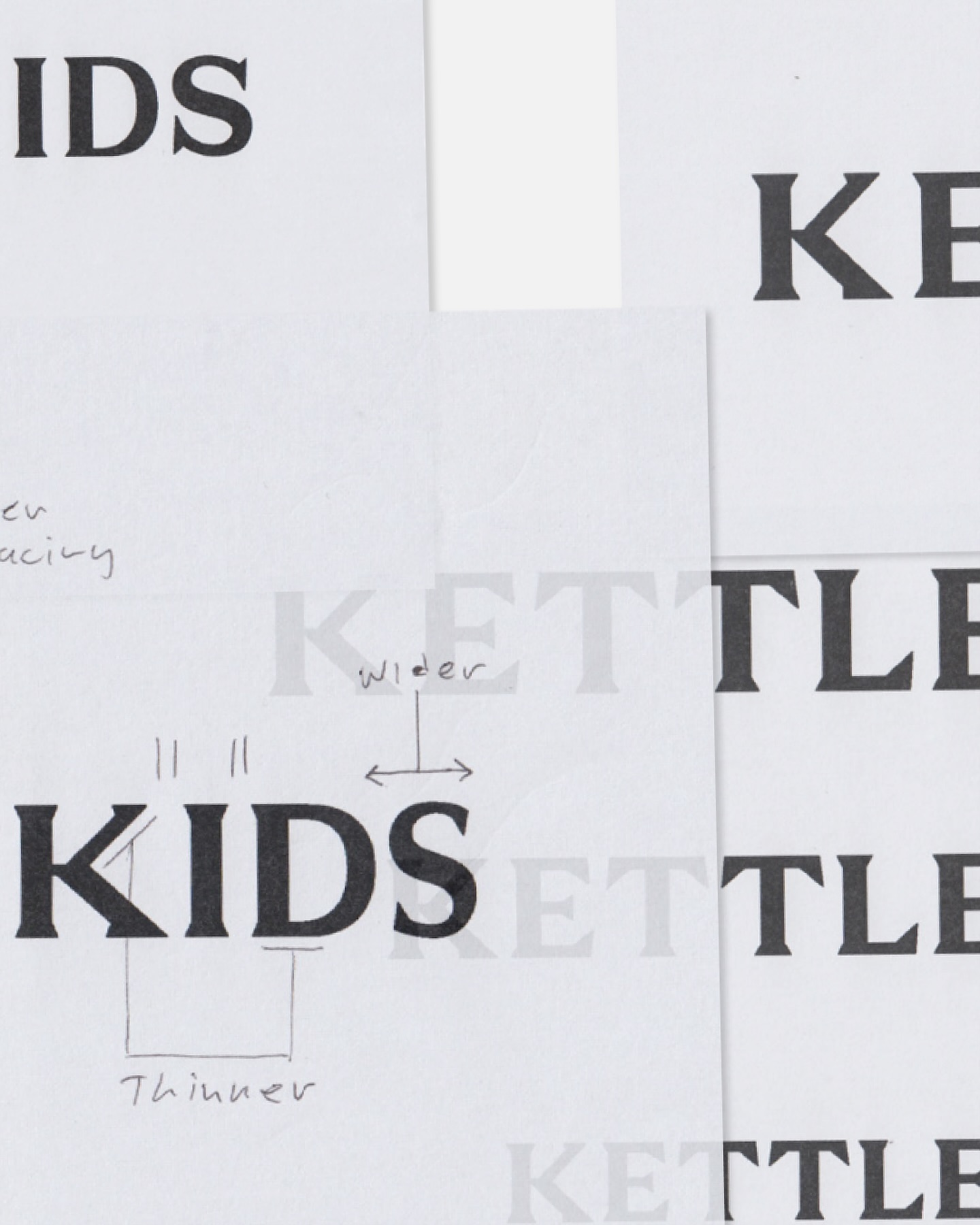
Two Times Elliot designed the logo, typography, and monogram for Kettle Kids, drawing inspiration from London’s historic architecture and signage.
Type & Graphic Design: Two Times Elliot
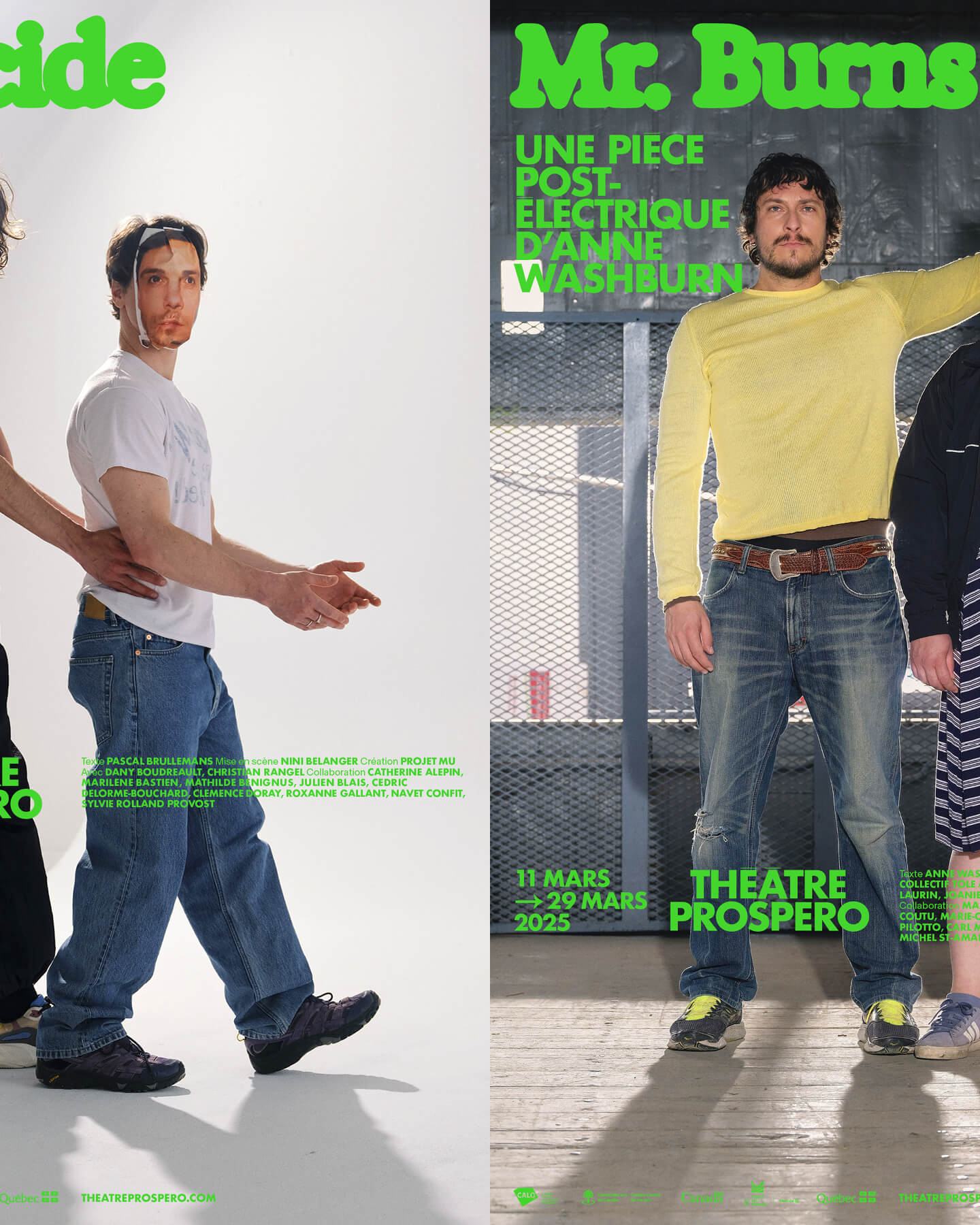
“After all, being together is revolutionary.” That was the main idea behind the 2024-2025 season campaign for Théâtre Prospero, directed and designed by Principal Estudio using Exposure.
Foundry: Federcio Parra Barrios Design: Principal
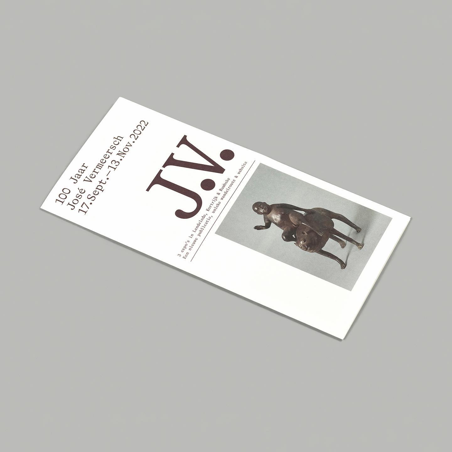
On the 100th birthday of artist José Vermeersch, an exhibition was held to celebrate his work, where the Bradford Mono typeface played a crucial role.
Foundry: Lineto Design: Studio Corbin Mahieu
Inspired by its iconic location—Las Vegas—this hotel embraces warm, sun-faded colors, a custom sober logo with subtle serif hints, and uses National and Nib as its typefaces.
Foundry: Colophon Foundry Design: The New Company
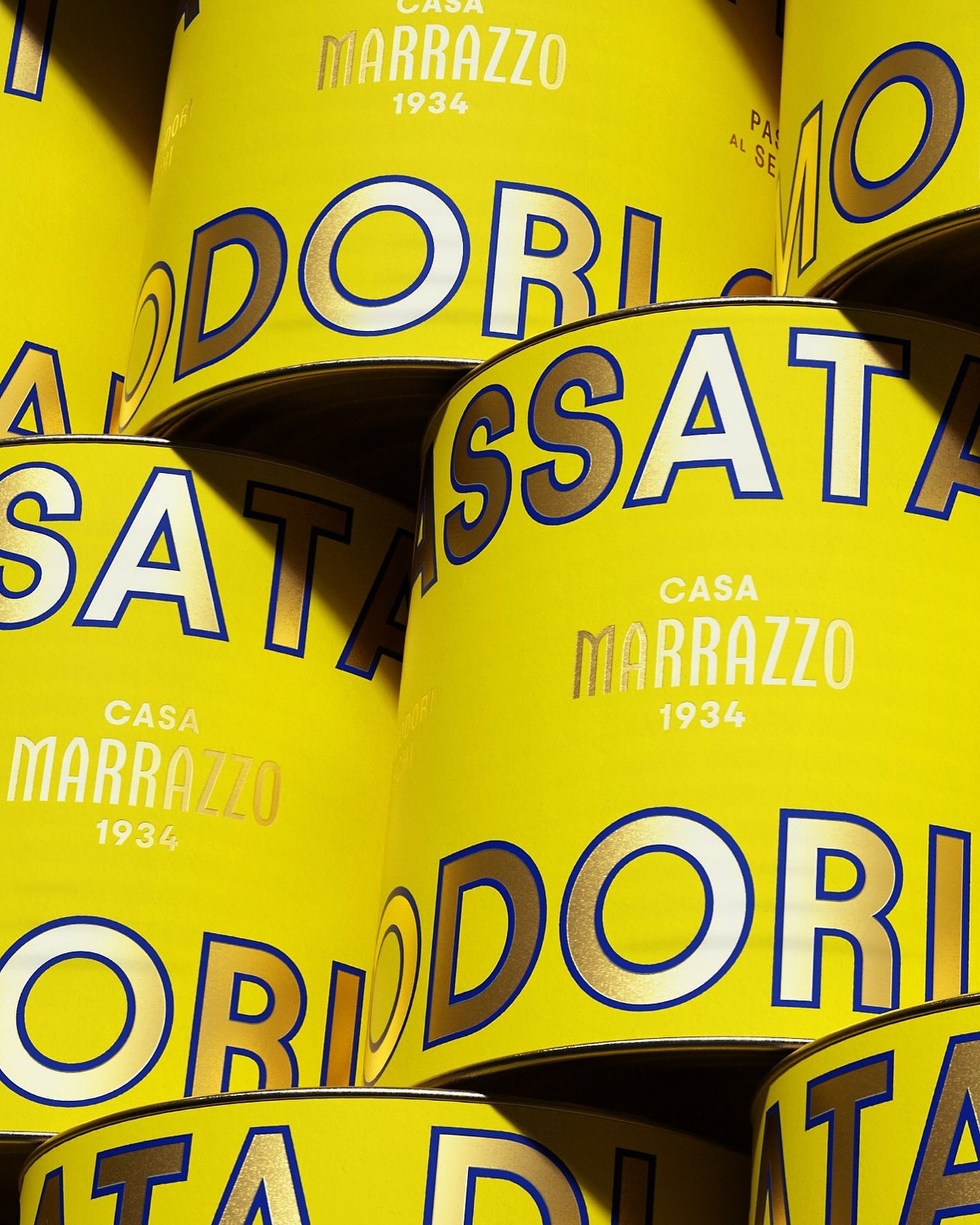
A clean layout, lots of gold, and the Avantt typeface were the elements that the Italian agency Auge Design used for these canned foods full of tradition and flavor.
Foundry: Displaay Foundry Design: Auge Design
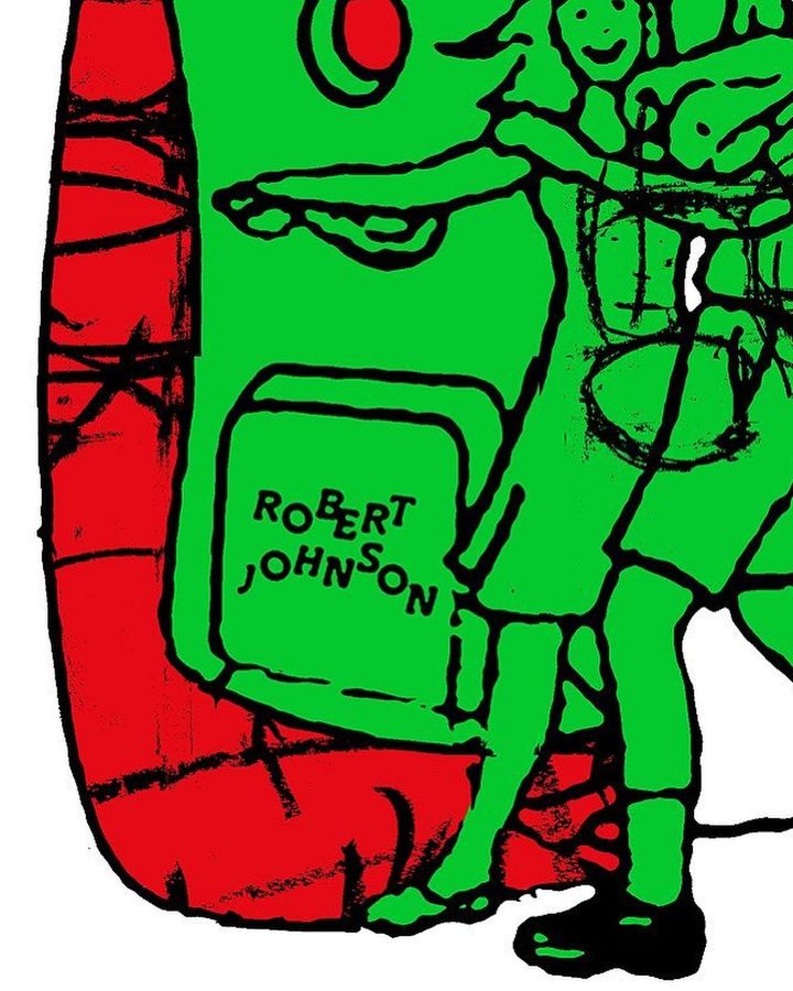
The Robert Johnson Club kicks off the 2024 season with these posters designed by Dominik Keller Studio. Typography used is Cosplay.
Foundry: Out of the Dark Design: Dominik Keller Studio
Memory Studio was inspired by vintage elements, like old book covers, and used Aktiv Grotesk to create the identity for this craft brewery.
Foundry: Dalton Maag Design: Memory Studio
Classics with a modern twist; National 2, Atlas Grotesk, and Atlas Typewriter, were used by Play for the identity they created for Open Research.
Foundry: Klim, Commercial Type Design: Play
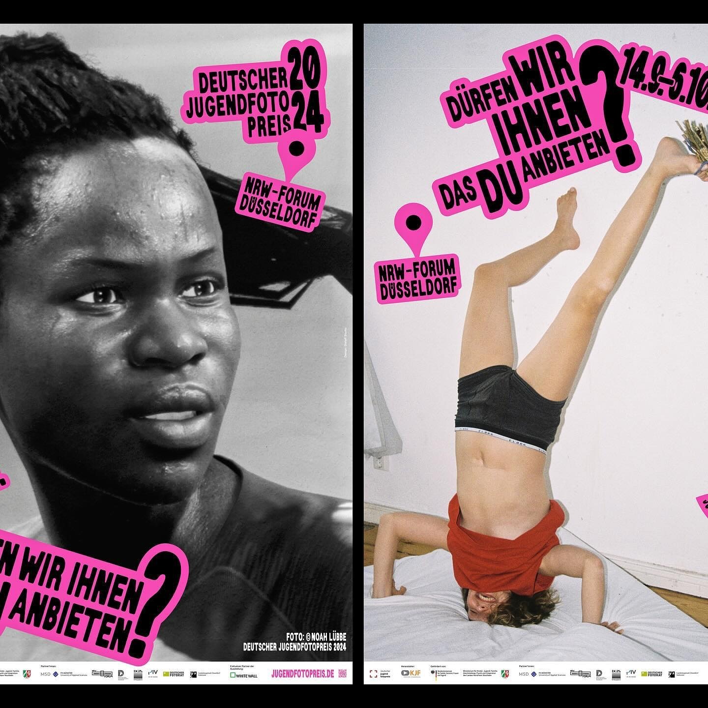
An identity made with stickers that follows no rules in the layouts. Distaff Studio used Serial A as the typeface for the image of this exhibition of the German Youth Photography Prize.
Foundry: DumDum Studio Design: Distaff Studio
Win on Air is the name of the new Nike Air identity, where David Gobber and Hoang Nguyen were part of this project, designing the typography used in the logo, which is a custom version of Generation Mono, another typeface of their own creation.
Foundry: Nguyen Gobber Design: Nike Design Team
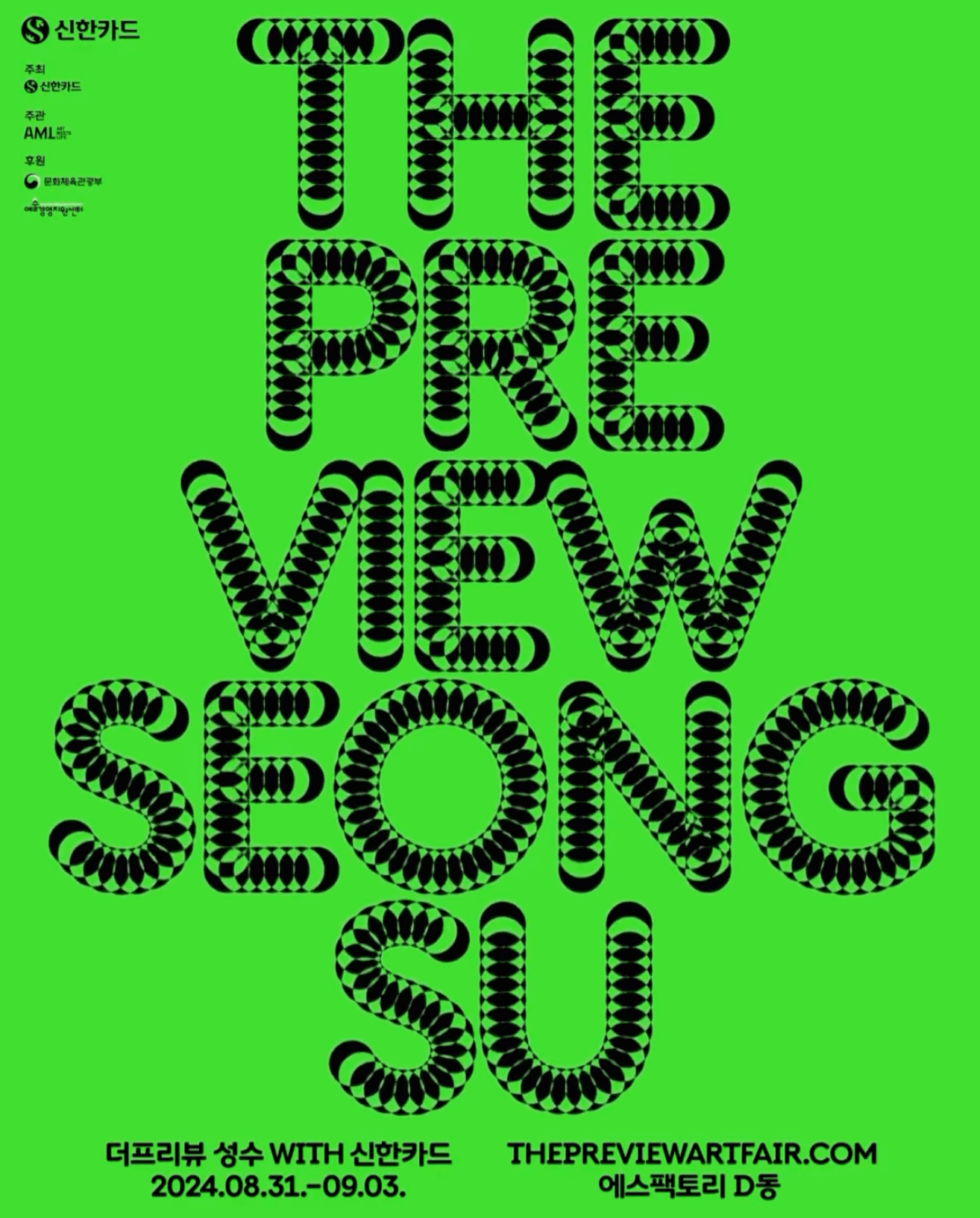
A typeface that –literally– shows its starting point and journey; the Korean graphic designer, @jun.works , included this along with other elements to create the visual identity for @thepreviewartfair.
Graphic and type design: Jun

An affair depicted through typography to create the identity for the Belgian Art and Design Affair, where @otisverhoeve,@bureauclaes, and @pino_type designed three different typefaces incorporating hearts into each letter.
Foundry: @otisverhoeve, @bureauclaes, @pino_type, @natashaldesign, @nemo.lemoine Designers: @verhelstvictor and @corbinmahieu
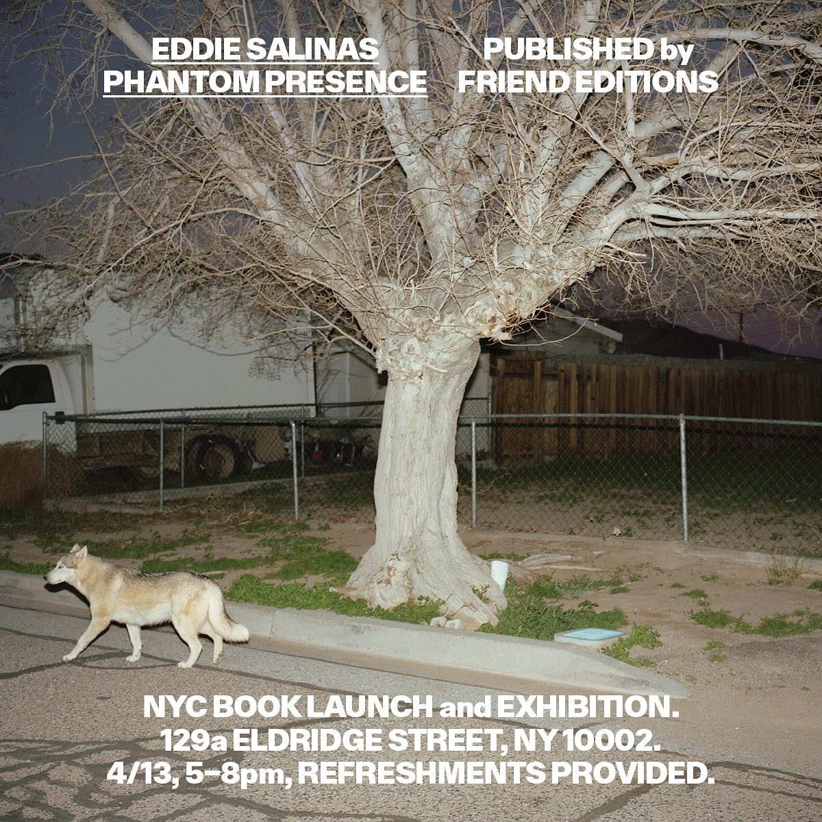
Made to showcase the dramatic and captivating work of Eddie Salinas, the book Phantom Presence was designed by Friend Editions, using All Purpose Grotesk for its interiors.
Foundry: All Purpose Fonts Design: Friend Editions
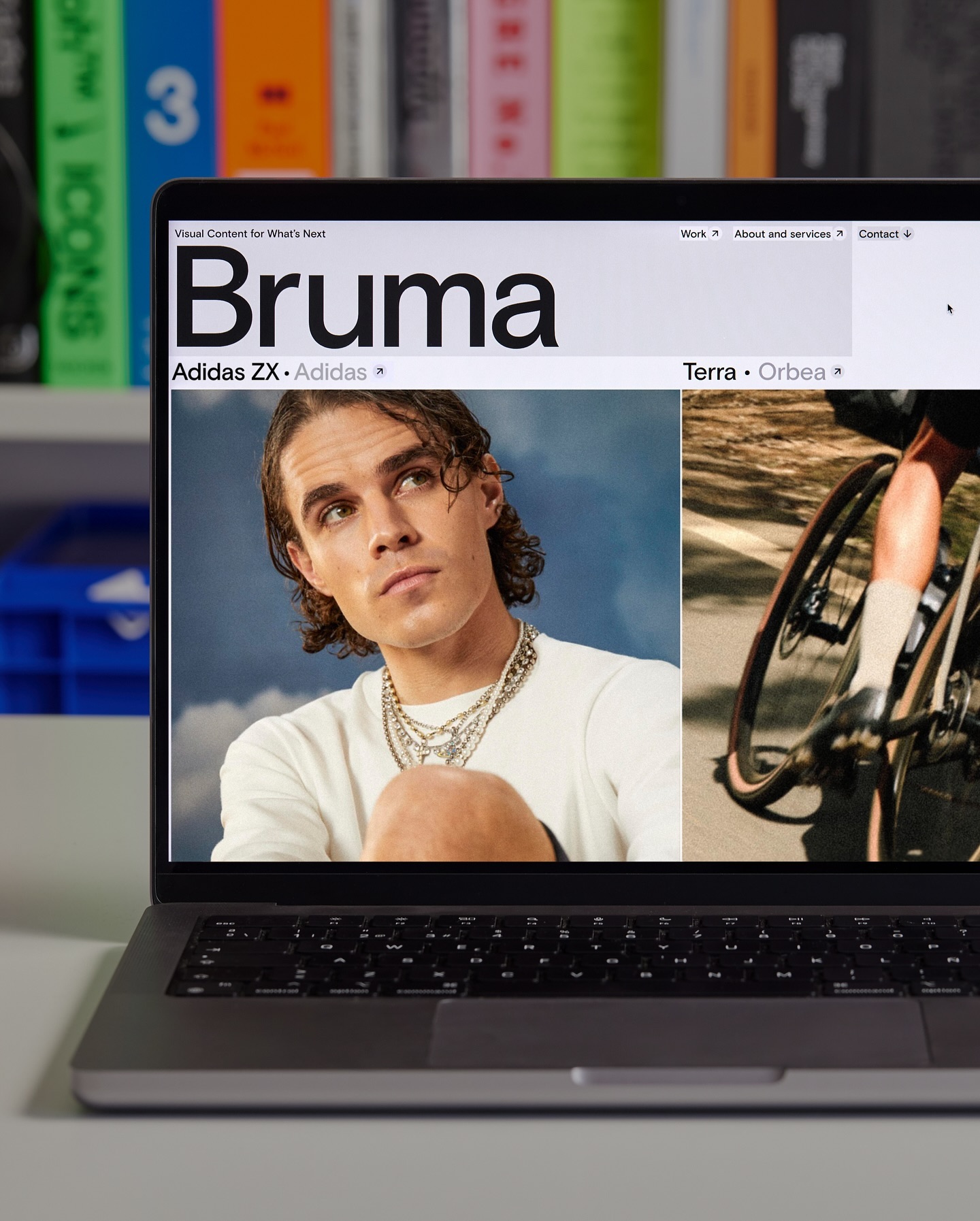
Basis Grotesque is the only typeface used in the identity and website of Studio Bruma, a creative production company to forward-thinking people and brands.
Foundry: Colophon Foundry Design: Leon Romero
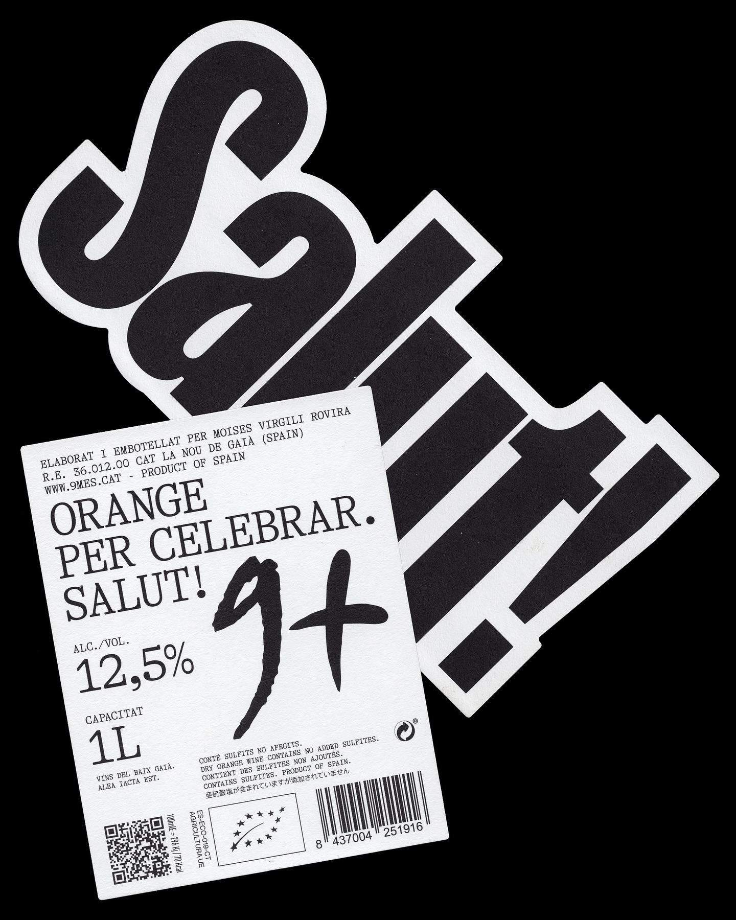
A simple and powerful label for a wine made to celebrate. Principi Studi used FK Screamer for the logo and GT Alpina for the complementary typography.
Foundry: Florian Karsten, Grilli Type Design: Principi Studi
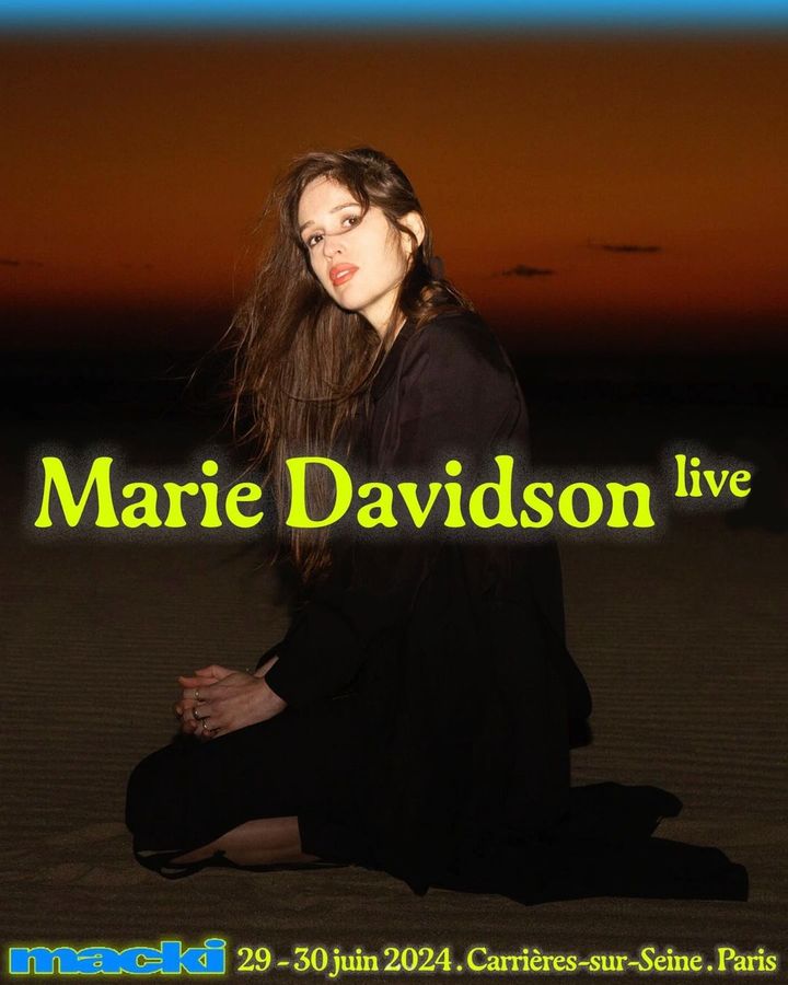
An electric identity designed by DR. ME and an organic serif typeface, Gaya, accompany the 2-day indie music festival hosted by Macki.
Foundry: Out of the Dark Design: DR. ME
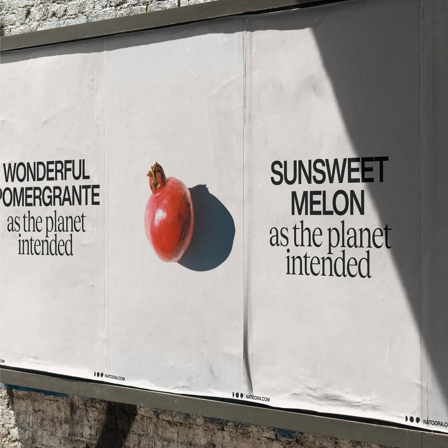
As authentic as nature can be, Justified Studio chose these two typefaces to be part of a sober yet sophisticated identity for the organic food producer Natoora.
Foundry: Displaay Design: Justified Studio
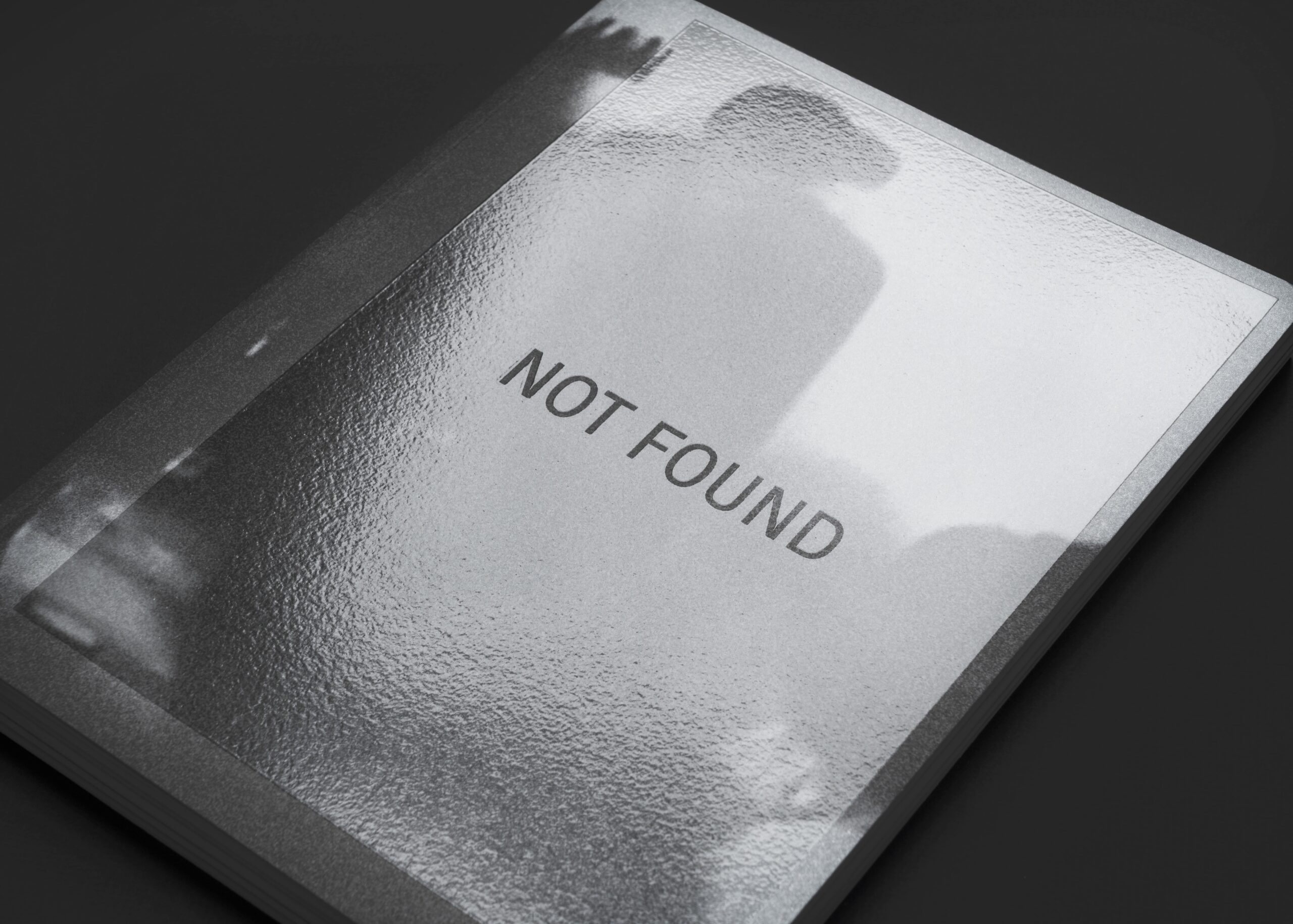
Architecture and how it becomes part of our everyday landscape. For Not Found, Mike Tully proposes an editorial design that plays with the visibility of certain elements using transparent varnish.
Foundry: Optimo Type Foundry Design: Mike Tully

Asfalt will have its first edition featuring an identity filled with color blocks, sports images, a vertical logo using a customized version of Generation Mono, and texts using ABC Diatype.
Foundry: Nguyen Gobber, Dinamo Typefaces Design: Toykyo
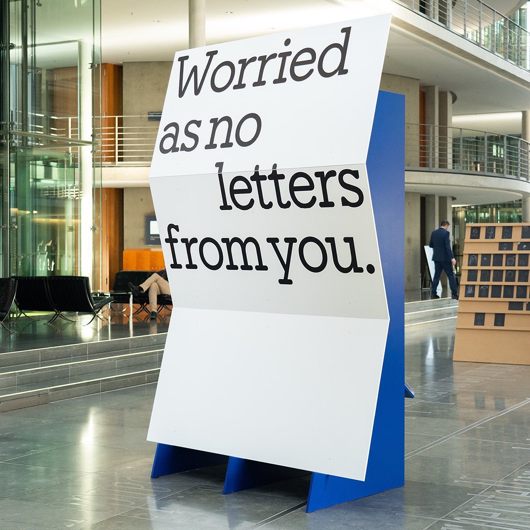
I said, ‘Auf Wiedersehen’ (I said ‘Goodbye’) displays the letters exchanged by five families separated during World War II, hoping to reunite one day. The texts are set in Repost, with supplementary texts in HAL Four Grotesk.
Foundry: HAL Typefaces Design: Distaff Studio
Maximage designed this book with great attention to detail. A custom version of Selecta developed by Maxitype.
Get Selecta
An identity that balances between distinctive and sober is composed of a bold uppercase logo, vibrant colors, and two specially customized typefaces; Saans from Displaay Foundry and LL Ruder Plakat from Lineto. Designed by Porto Rocha.
Foundry: Lineto, Displaay Foundry Design: Porto Rocha
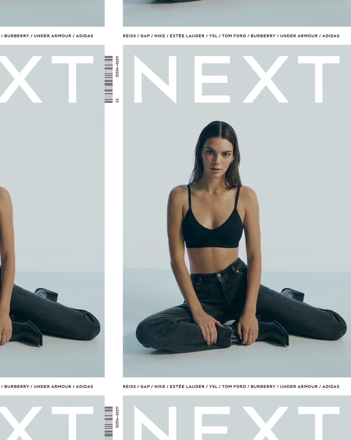
After designing the logo as part of the rebranding for the clothing brand Next, Frost was commissioned again by Six to create an entire typeface based on it.
Learn more
República Studio used Review from Commercial Type for this visual identity, aiming to communicate directly and consistently, while leaving the spotlight to the displayed photographs.
Foundry: Commercial Type Design: Estudio República
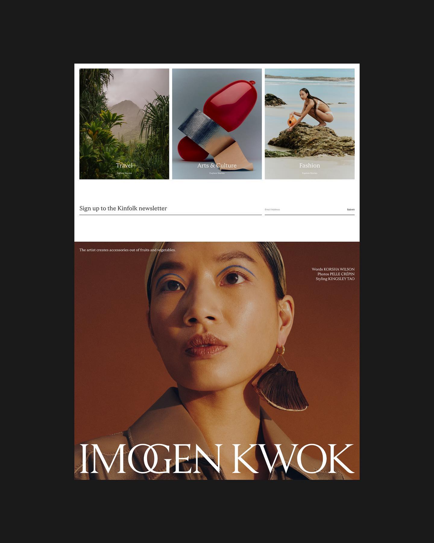
Kinfolk revamped their website with a new custom typeface created by Schick Toikka.
Foundry: Schick Toikka Design: Six, Alex Hunting Studio
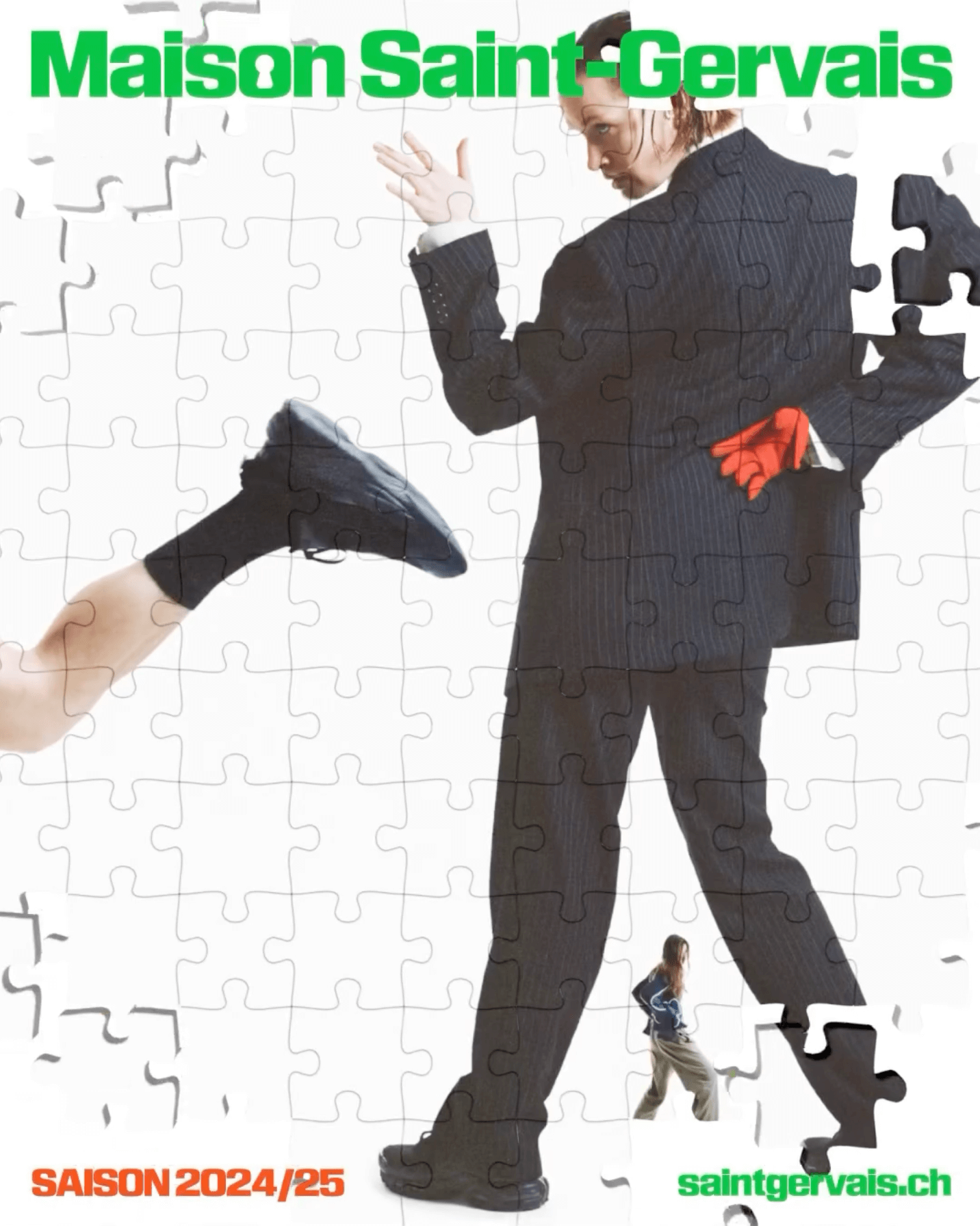
The Swiss graphic design studio Dual Room renewed the image of the Maison Saint-Gervais theater, using KTF Rublena Black.
Foundry: Kyiv Type Foundry Design: Dual Room
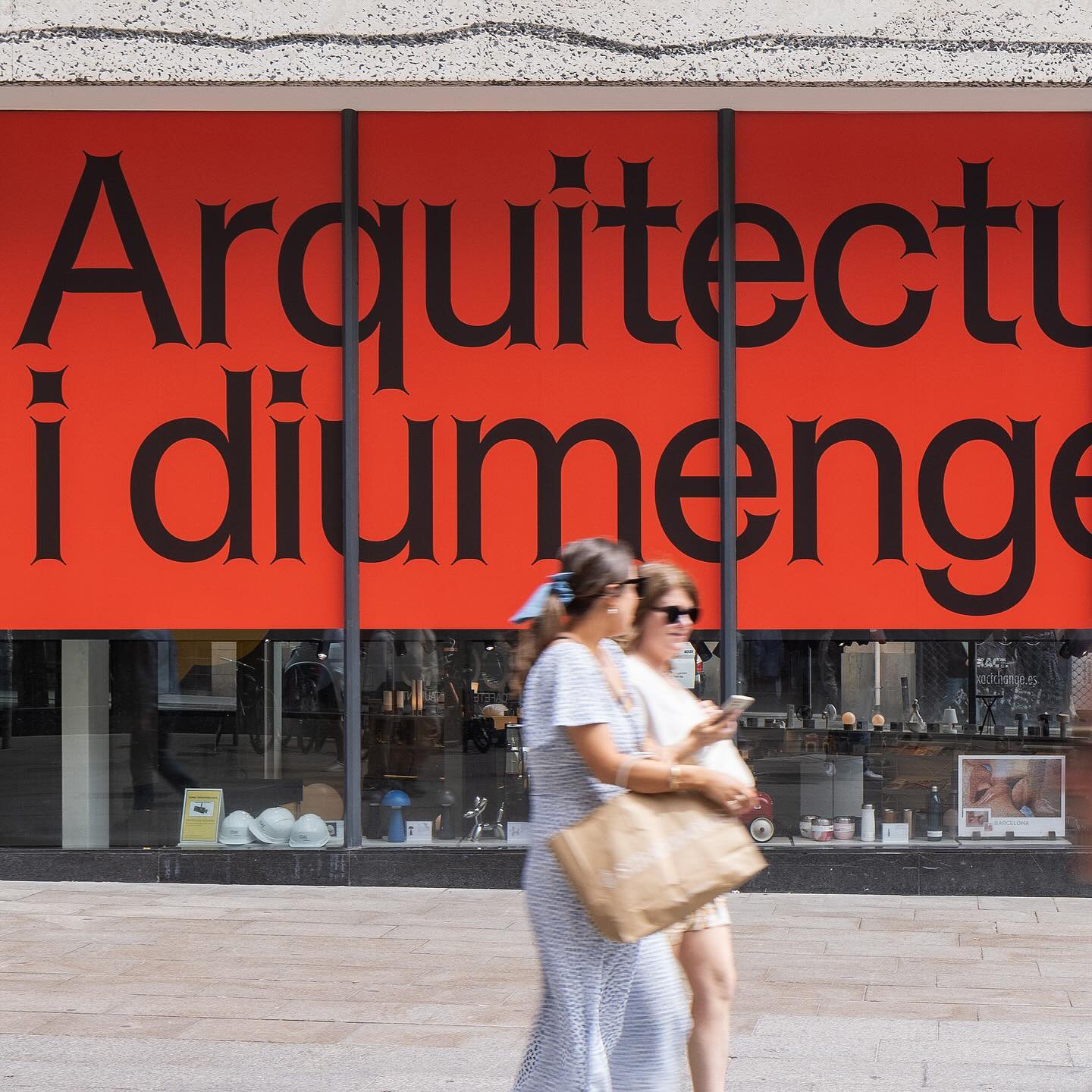
Graphic design for different spaces of this exhibition at the Architects’ Association of Catalonia, by PFP Disseny. Using Helveesti by Dinamo.
Foundry: Dinamo Design: pfp disseny

Workbyworks Studio designed this unconventional serif typeface and visual identity for Steffan Studio.
Design and type design: Workbyworks
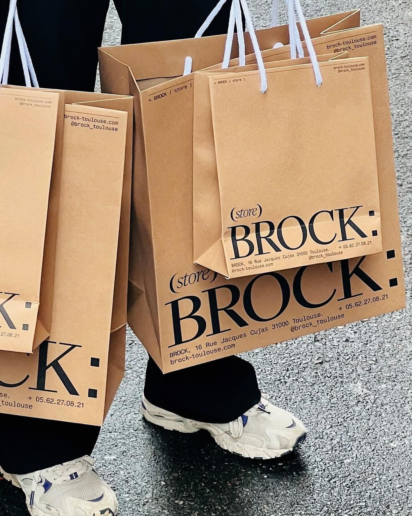
Quatrième Étage revamped the visual identity of the iconic Brock store, selecting the ES Face typeface for its logo, a 19th-century inspired serif with contemporary finishes.
Foundry: Extraset Design: Quatrième Étage
After 9 years, Abmo redesigned its own work, renewing the brand identity of this French restaurant. The typefaces used were Neuf by Eliott Grunewald, Traulha by Yoann Minet, and a custom logo by Keussel Studio.
Foundry: Eliott Grunewald, Bureau Brut, Keussel Studio Design: Abmo
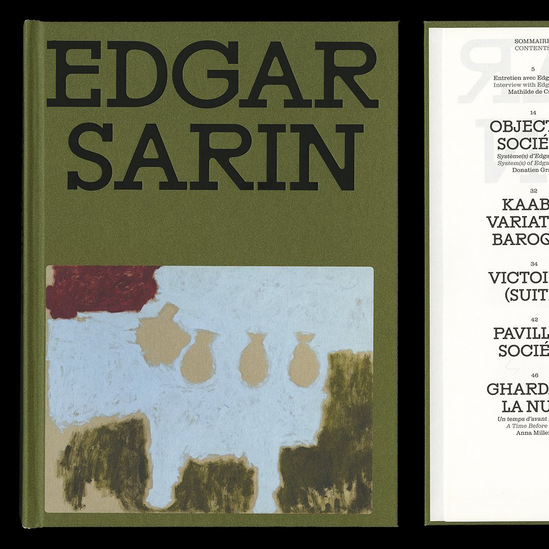
Resonanz B by Out of the Dark and Clarendon Graphic were the typefaces selected by Lisa Sturacci for the editorial design of this book about about Edgar Sarin’s work.
Foundry: Out of the Dark, Optimo Design: Lisa Sturacci
Apparat Bold + Buch Schmal, both from Kimera, were part of the update newkid made for Standard Equipment, a system of household objects.
Foundry: Kimera Corp Design: newkid
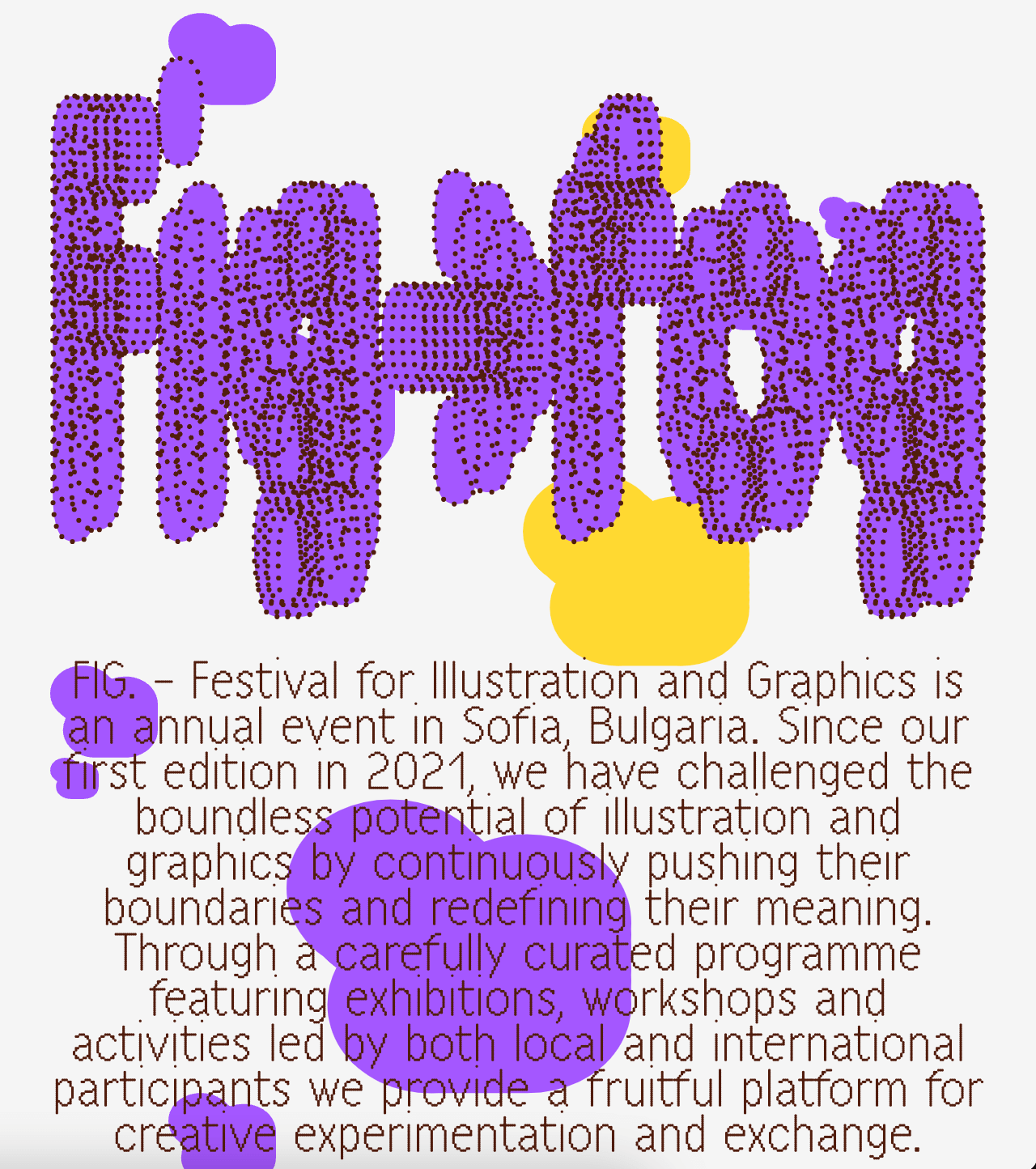
A festival that explores visual creativity to the point of blurring the lines between illustration and graphics; Miroslav Zhivkov created the identity of FIG (Festival for Illustration and Graphics) using Harber.
Foundry: Benoît Bodhuin Design: Miroslav Zhivkov

From Mexican cantinas and their traditional signage, Socker Studio drew inspiration to design the identity, interiors, and typography for the seafood restaurant Con Vista al Mar.
Type & Graphic Design: Socker Studio
Maison Standard used Azeret from Displaay Typefaces for the identity of this exhibition at the National Library of Switzerland, which explains the impact of snow on our society.
Foundry: Displaay Typefaces Design: Maison Standard
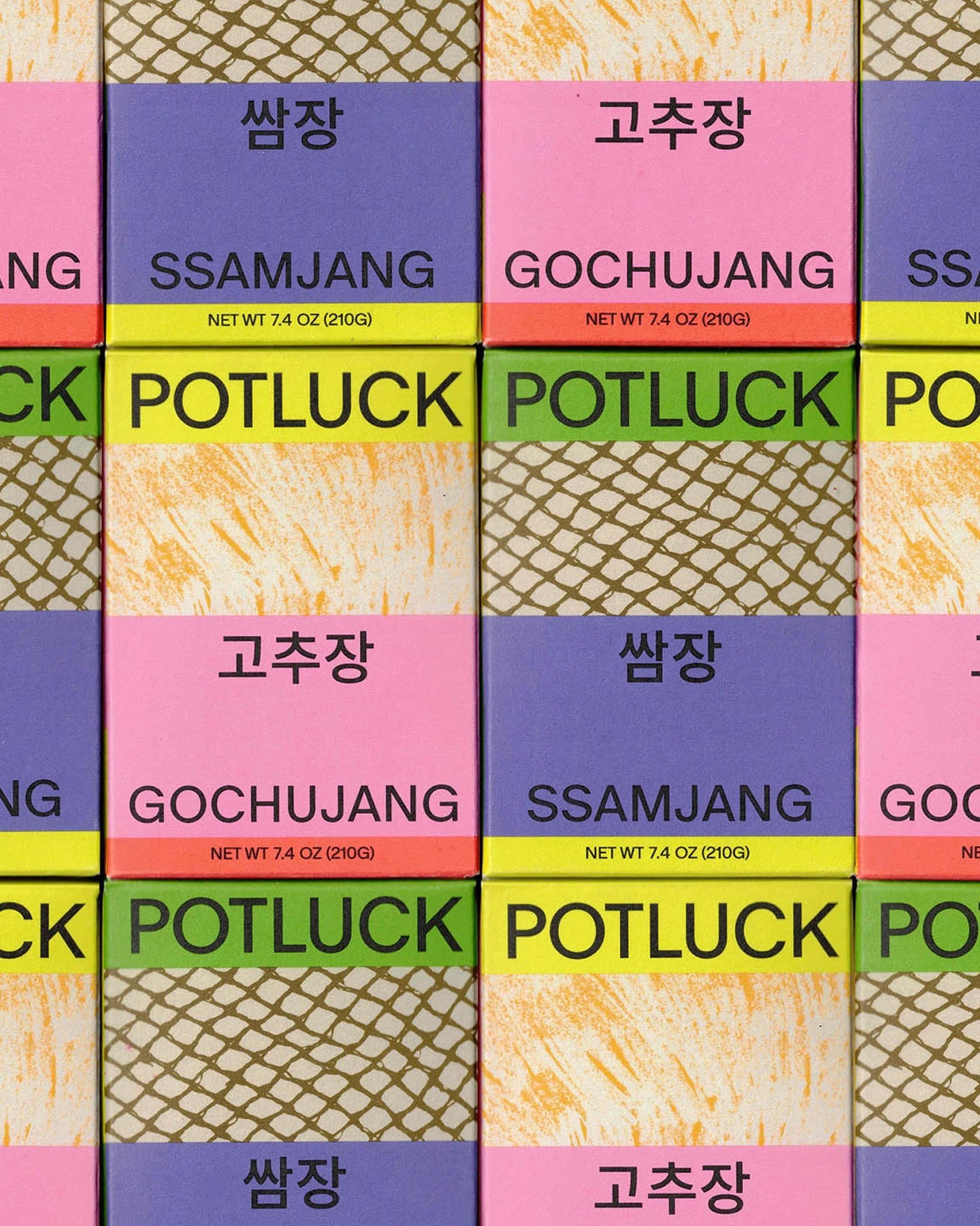
Regrets Only created a visual identity just like Potluck works; bringing together various elements to create something from scratch. Oracle is used as the primary typeface and Source Han Sans as the secondary.
Foundry: ABC Dinamo, Adobe Fonts Design: Regrets Only
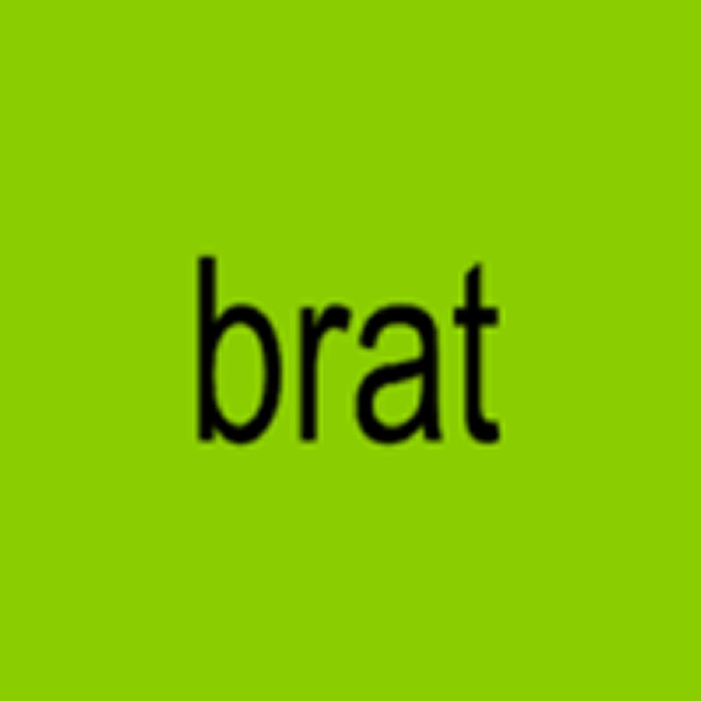
How should an album cover NOT look? Special Offer and Charli XCX decided to answer this question by stretching the word “brat” in Arial. ROM Mono by Dinamo and Neue Haas Unica by Linotype are used in the interior texts.
Foundry: Monotype, ABC Dinamo Design: Special Offer Inc.
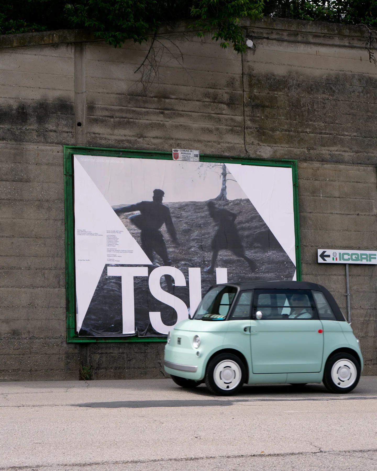
Suisse Int’l Condensed used for this strong and dramatic identity for the Teatro Stabile dell’Umbria. Designed by Due Studio.
Foundry: Swiss Typefaces Design: Due Studio
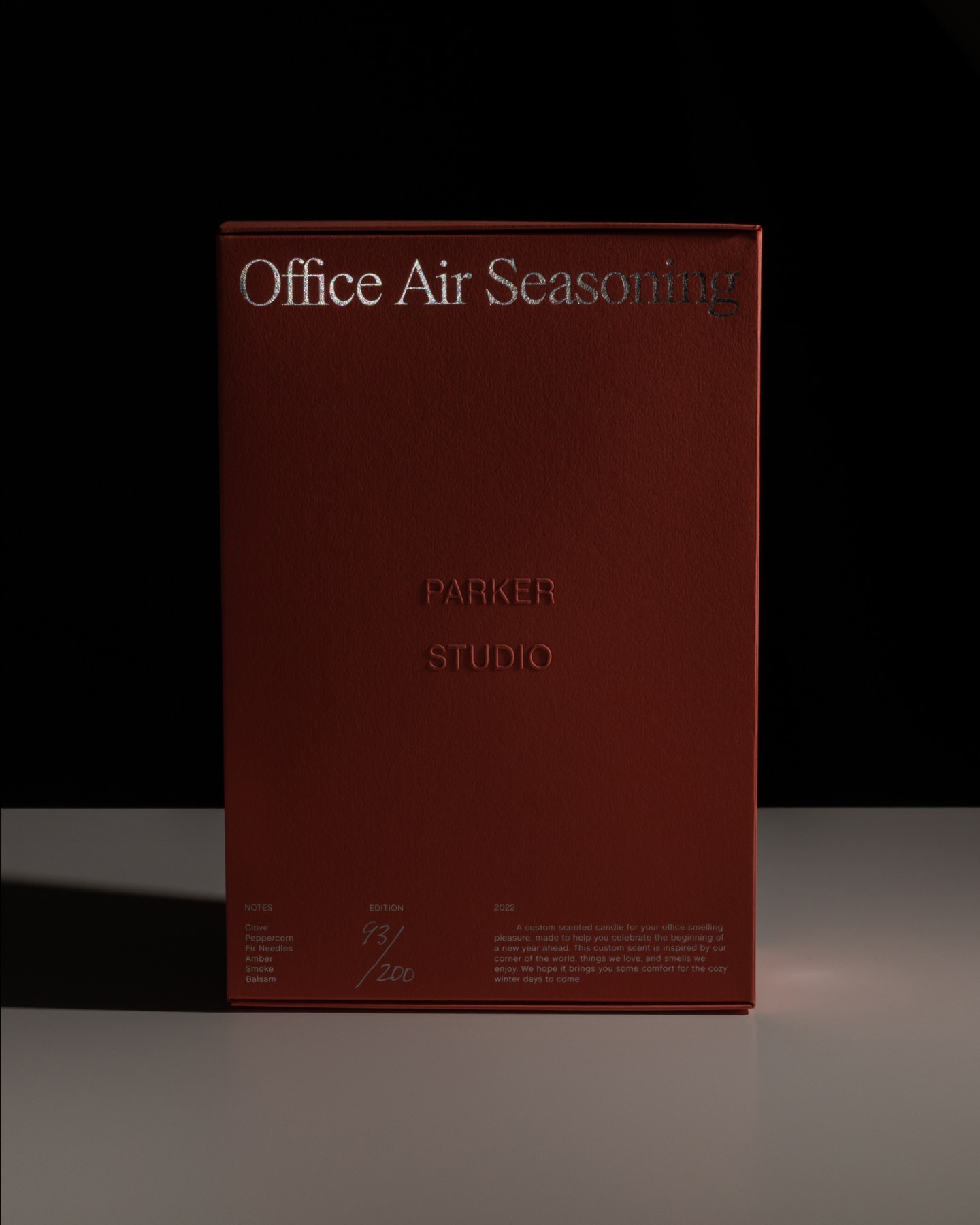
Parker Studio said goodbye to 2022 with this candle, made in collaboration with Imprimerie du Marais. The packaging uses Chalet Book, along with the first printed use of Parker’s PS Times.
Foundry: Parker Studio, House Industries Design: Parker Studio
Moser Crystal launched an autumn collection, and Studio Marvil designed its image using the Atlantic typeface from Heavyweight.
Foundry: Heavyweight Design: Studio Marvil
Andrés Higueros designed this custom typeface for the private dining experiences hosted by La Vera Pasta.
Type and Design: Andrés Higueros
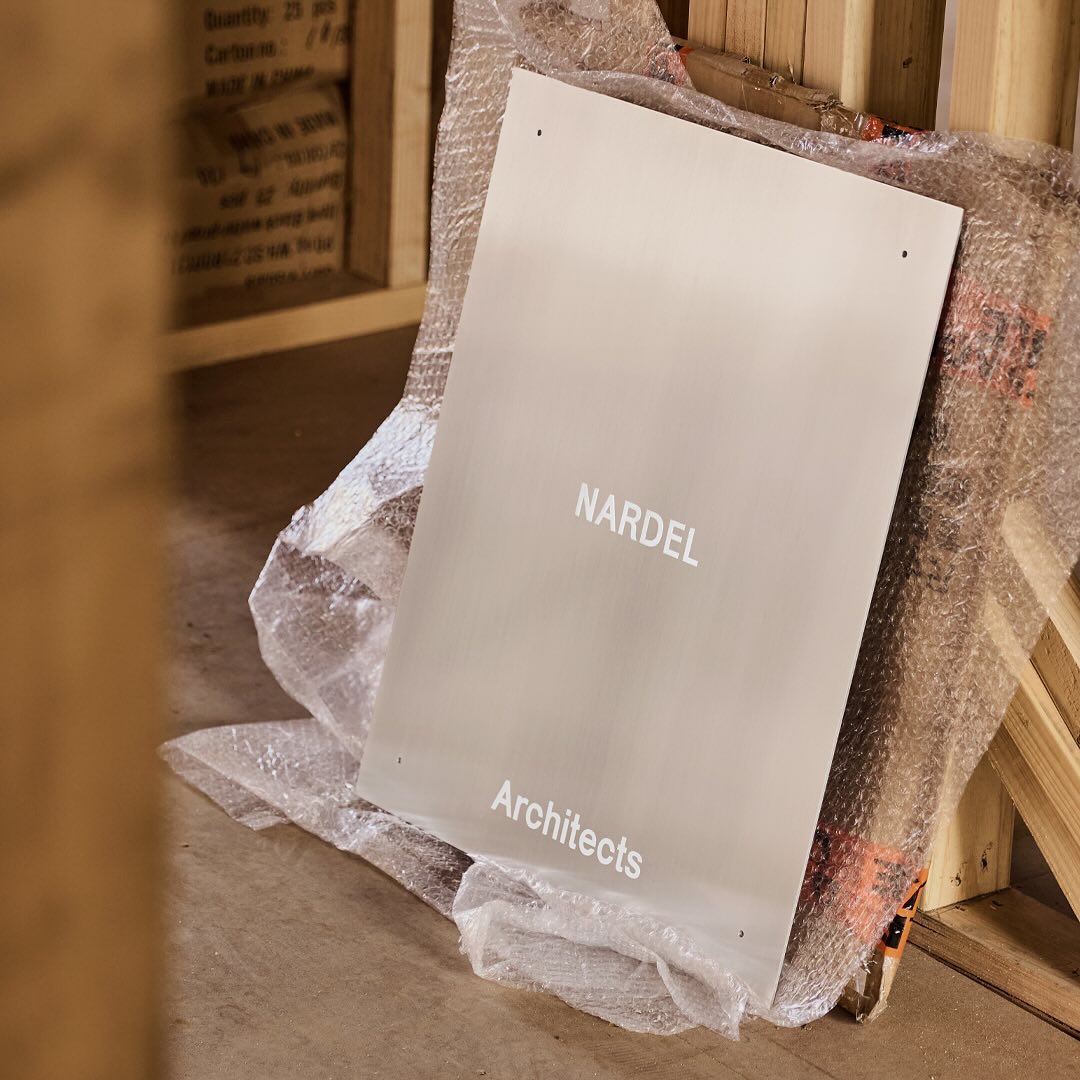
Simple and subtle; Both Studio created a brand identity that aligns with the proposal of Nardel Architects.
Foundry: Velvetyne Design: Both Studio
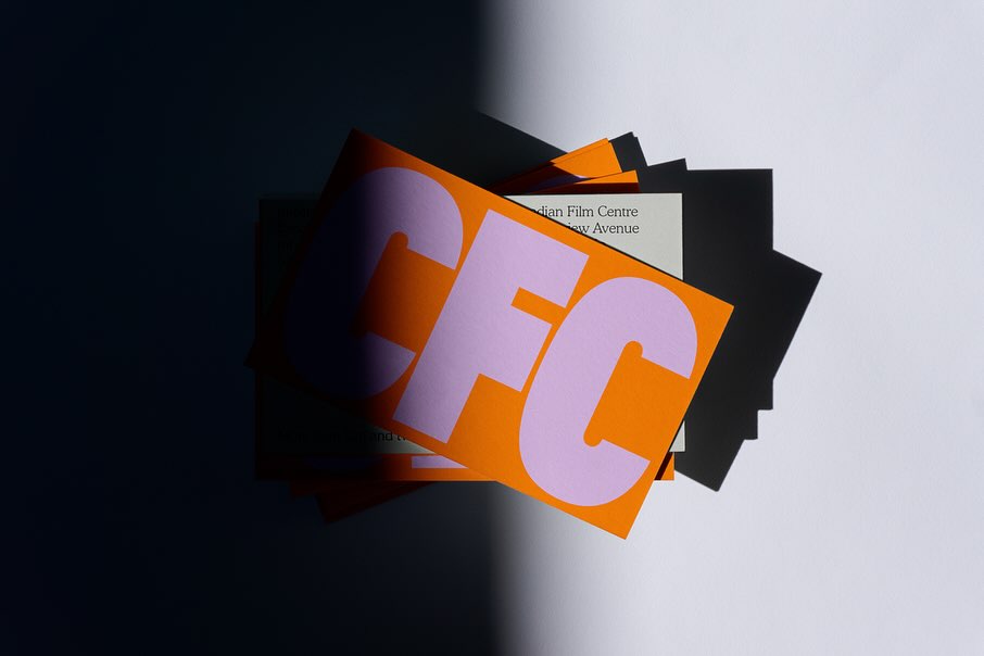
Helping to create a bold and inclusive visual identity, Quentin Coulombier’s Buzz and the well-known Cooper were selected by Underline Studio to represent the Canadian Film Centre (CFC)
Type Designer: Quentin Coulombier Graphic Design: Underline Studio
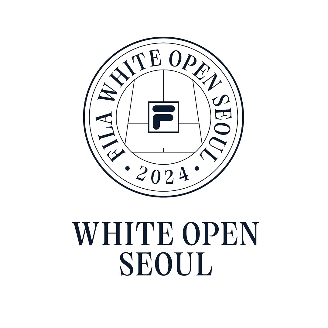
Tartuffo by Bouk Ra for Lift Type in the identity created by Fila Korea for the 2024 White Open Seoul; a tennis open where everyone can participate.
Foundry: Lift Type, Bouk Ra Design: Fila Korea
New typefaces for the new identity of the production company L’Éloi; Principal Studio chose Review by Commercial Type and Skandia by Store Norske Skriftkompani.
Foundry: Store Norske Skriftkompani, Commercial Type Design: Principal Studio
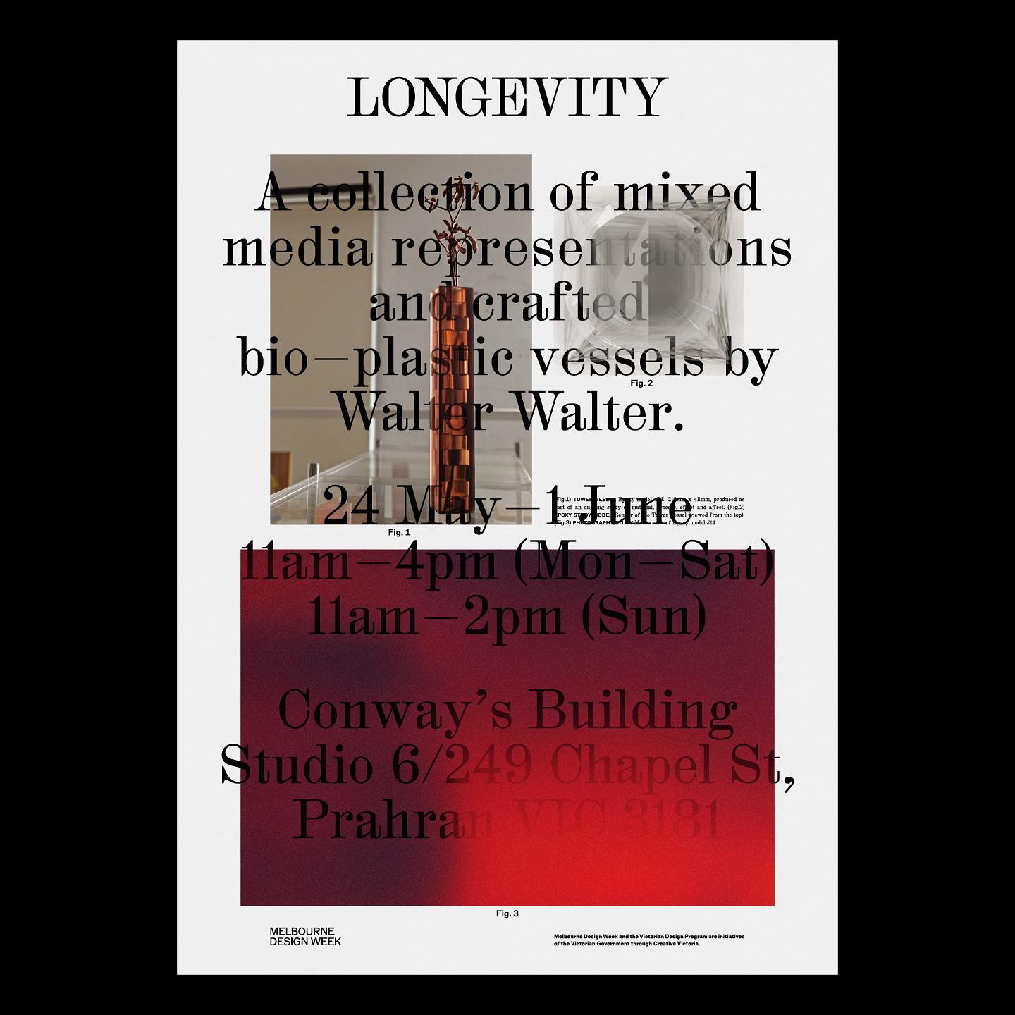
M. Geisser used HAL Colant from HAL Typefaces and ROM from Dinamo for the poster and invitation for the Walter Walter Longevity exhibition.
Foundry: HAL Typefaces, Dinamo Typefaces Design: M. Geisser

Vibrant and loud, just like the conversations after an excellent dinner in Italy, that’s how Grand Bacàn Sans is, a custom typeface created by Pentagram for the Italian restaurant in Brooklyn; Bacàn
Learn More
Low key Design Company used Boris by Giulia Boggio to complement this identity for a friendly, relaxed, and gentle café, just like a wandering sheep.
Foundry: Giulia Boggio, KOMETA Design: low key Design Company
Newsreader by Production Type on the cover of this book addresses collaborations and how to coexist with other ideas.
Foundry: Production Type, Design: Sam Corijn
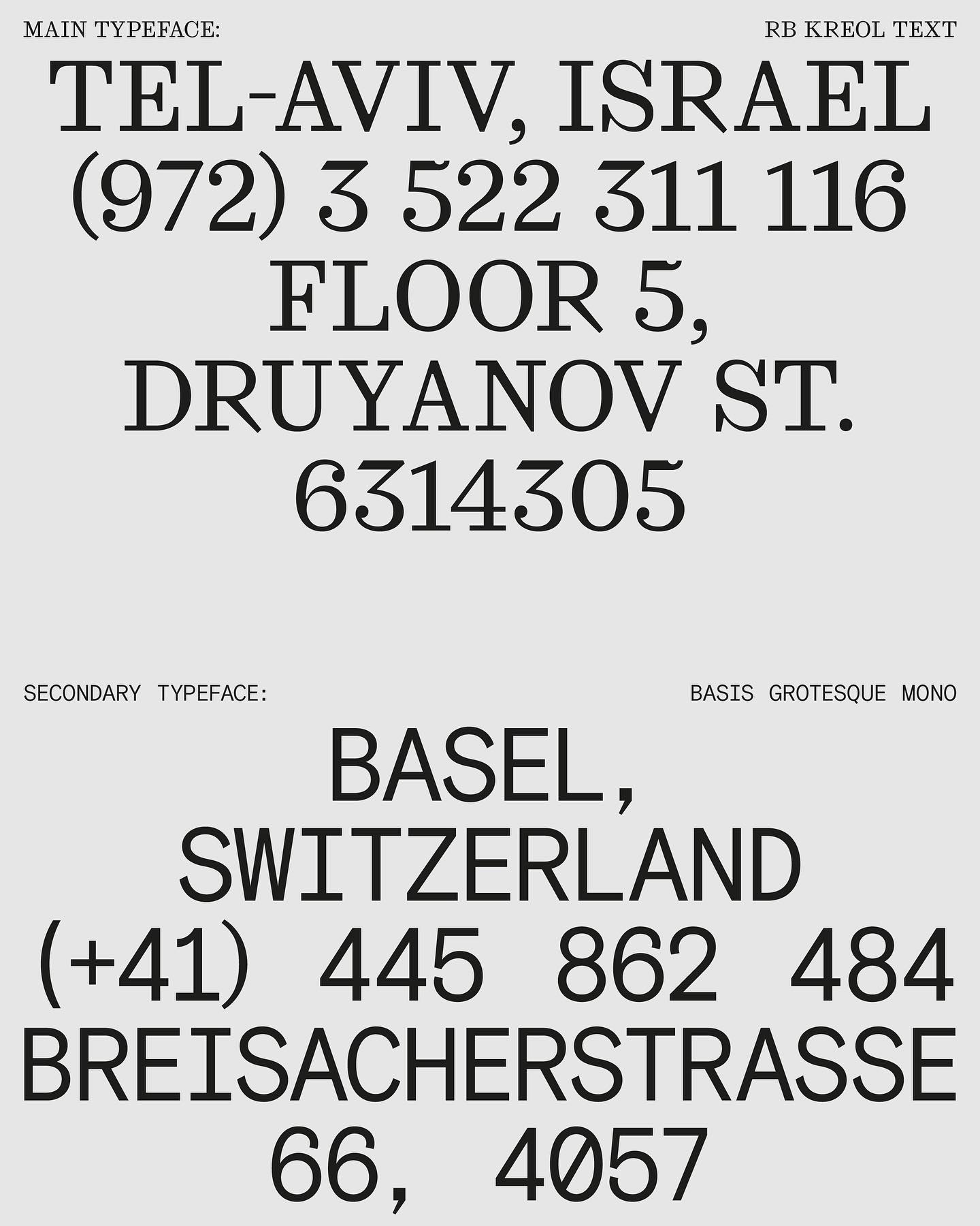
In this website with two main columns constantly changing size, Atipus Studio used RB Kreol Text from Studio René Bieder.
Foundry: Studio René Bieder Design: Atipus Studio

If your job gets complicated, you’re in lockdown, and you love typography, you can always become a type designer with a bit of delusion, passion, and a touch of obsession, just like Giulia.
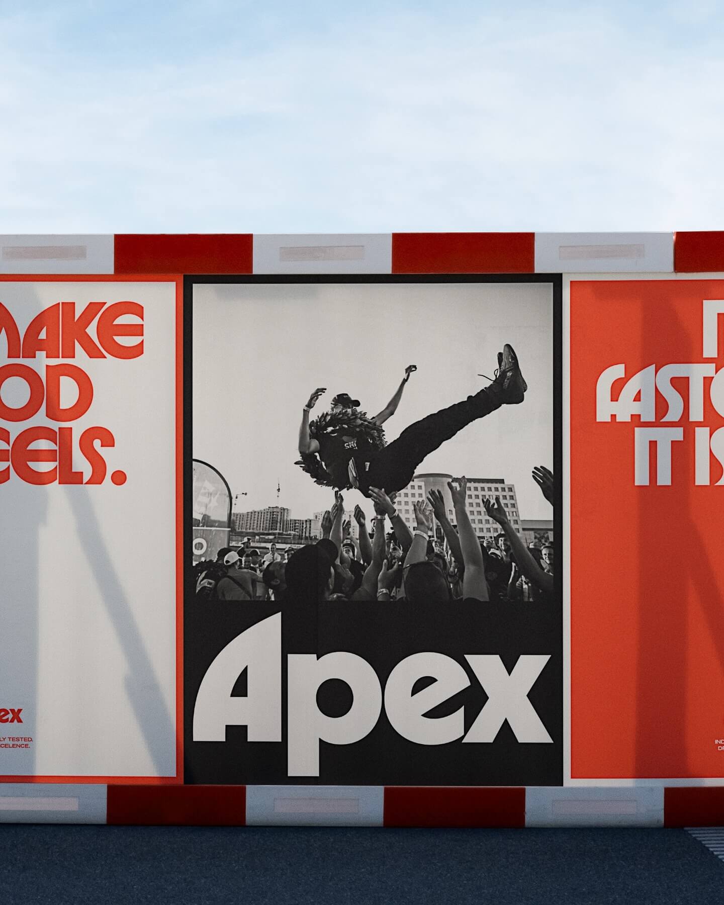
Seeking to stand out in the market, Gold Font created this custom logo for Apex, a premium tire brand, inspired by ITC typefaces.
Learn More
Victor Serif by KOMETA accompanies the photographs taken on a cycling trip with friends in this booklet designed by Familia.
Get Victor Serif
Address Arts leveraged the possibilities of Exposure by 205TF, a variable typeface whose weight was modified to achieve a solid and heavy logo.
Foundry: 205 TF Design: Address Arts
In the identity of this major NYT event, two of its typefaces were combined: NYT Franklin representing the business aspect, and NYT Cheltenham representing the newspaper and news.
Foundry: Matthew Carter Design: Jessi Brattengeier, CC Studio
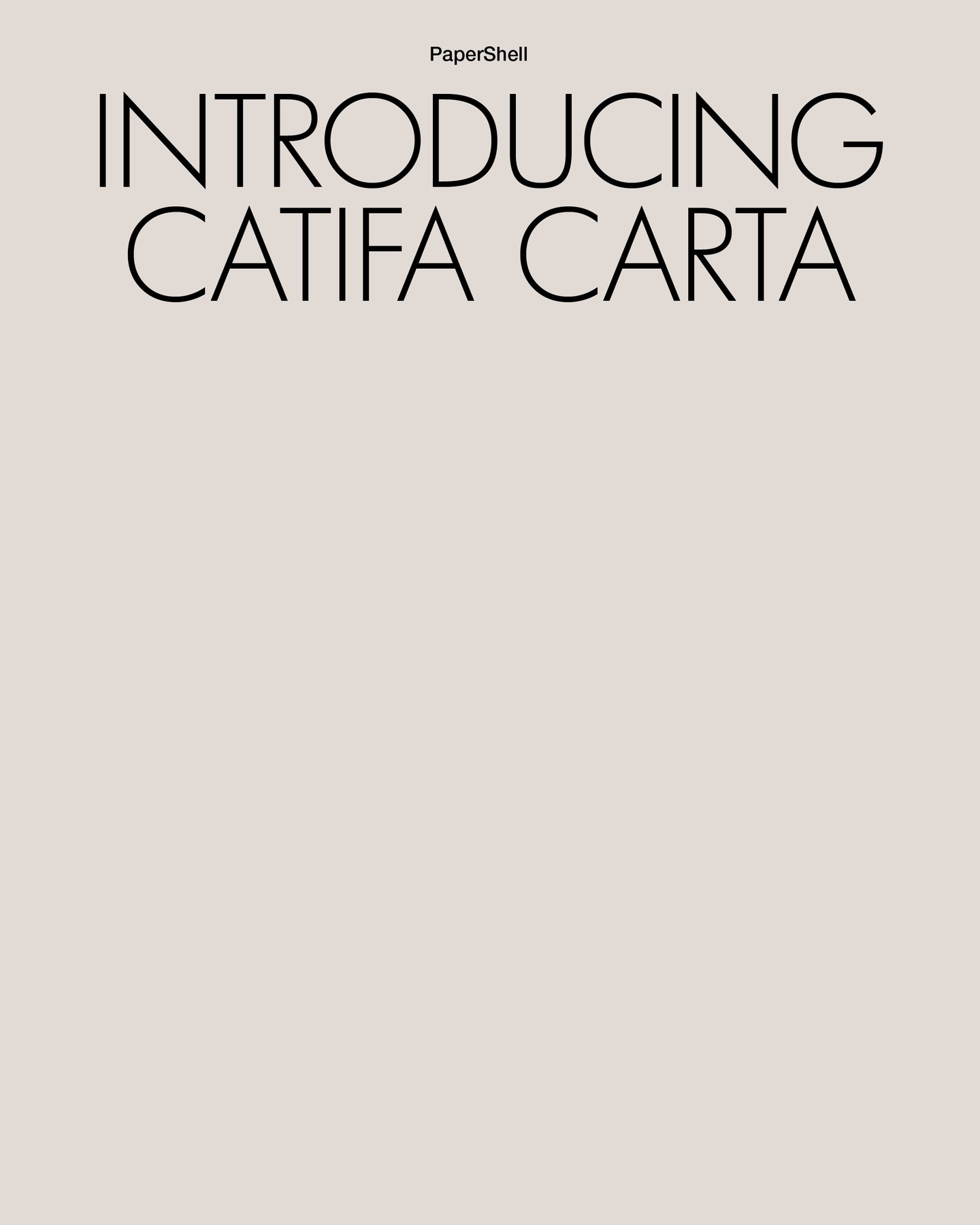
Lightweight like its structure and organic like its composition, Clase BCN proposes using Futura LT Light for headlines and Helvetica Neue for body text in the narrative of Carta Catifa, a chair made with biodegradable materials.
Design: Clase BCN
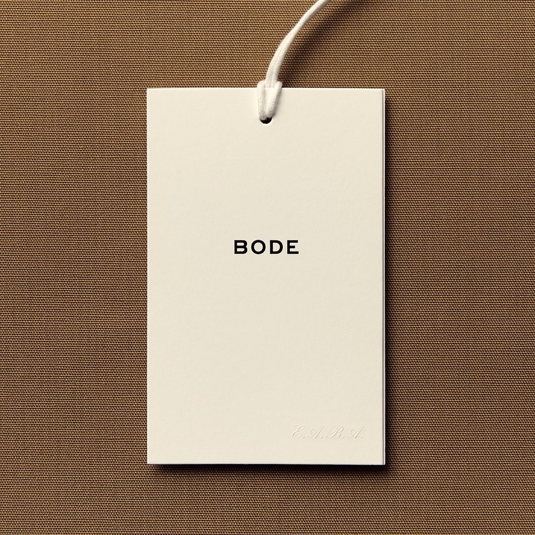
With the minimal amount of elements, Eric Wrenn designed the logo and visual identity for Bode, a New York-based clothing brand.
Type and graphic design: Eric Wrenn
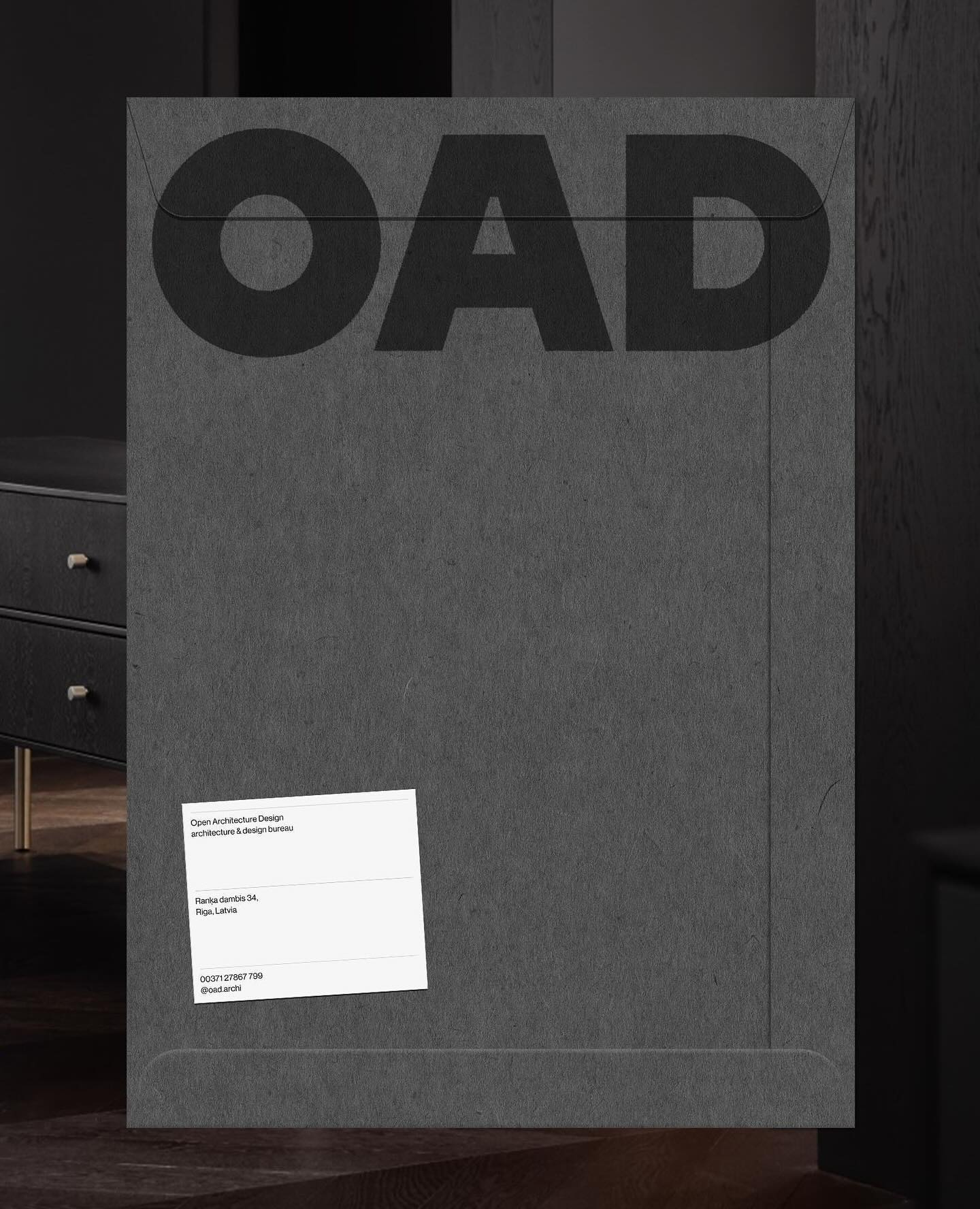
Just like its proposal, OAD (Open Architecture Design) has a strong and impactful lettering as a logo, complemented by Neue Haas Grotesk in its regular weight.
Foundry: Commercial Type Design: Asketic

For the past 3 years, Chejo and SHDW studios have been sharing lunch, and in this book, they compile the recipes they’ve made. Serial A from DumDum fonts is used as the main typography.
Foundry: Dum Dum Studio Design: Chejo Studio
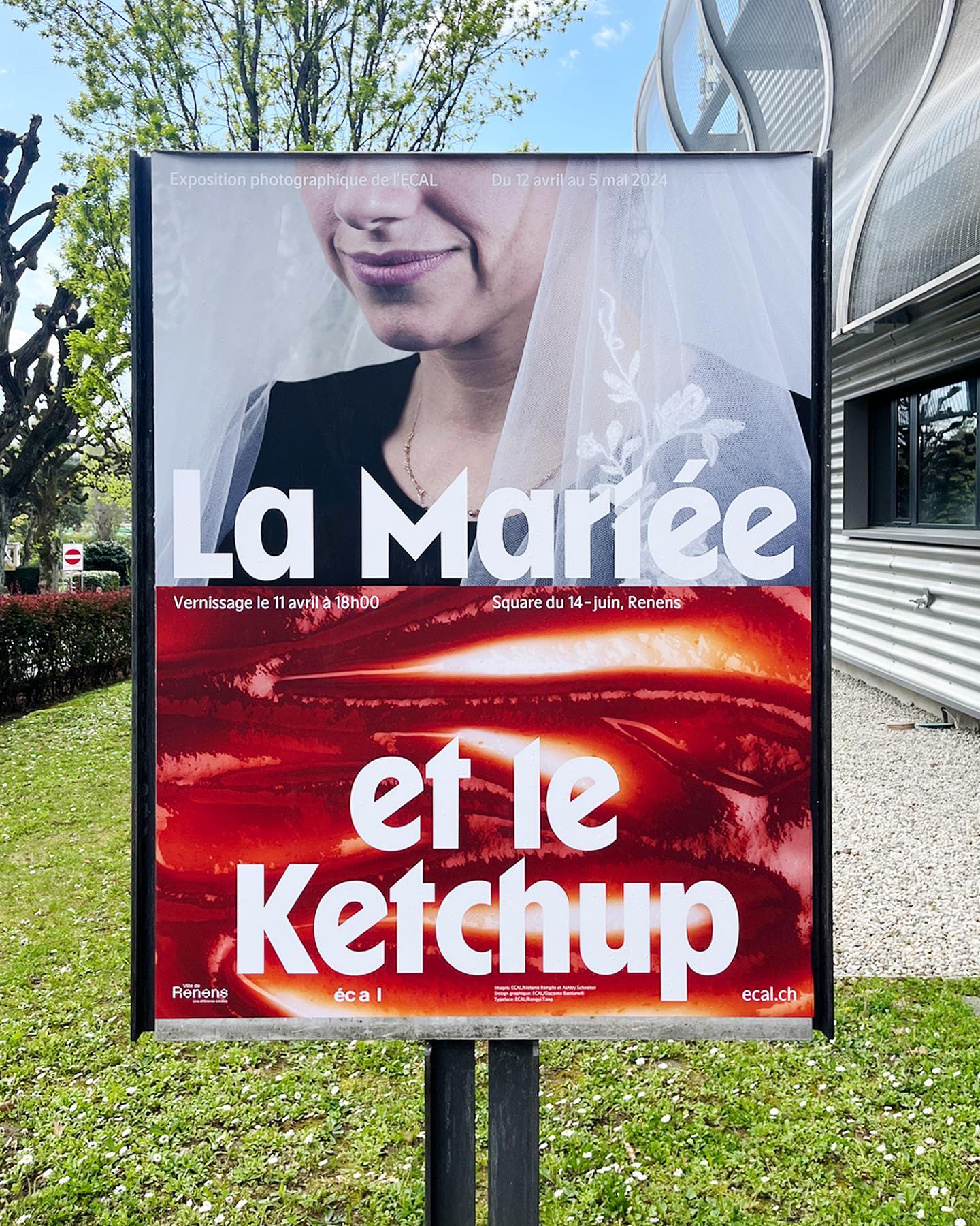
WaterPolo Display by @dontnotdon was used in this series of posters portraying the ordinary and extraordinary aspects of Renens.
Foundry: RongyinotRongyi, ECAL Master Type Design: ECAL Photography
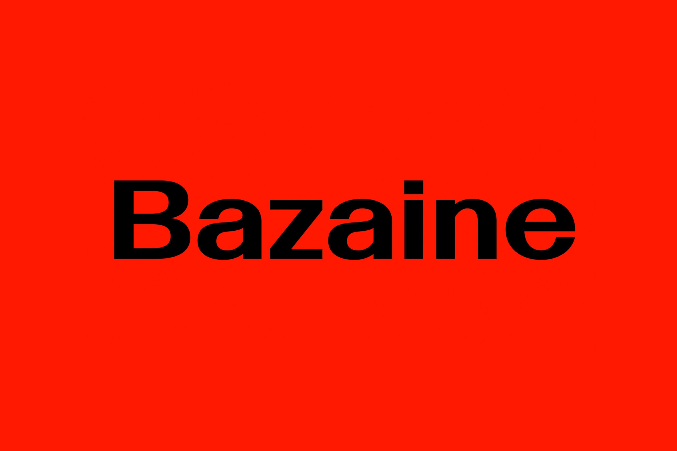
Bazaine and the Path of Ideas
Type Designers: Matthew Fenton, Haakon Spencer, Jack Niblett
Mastering: Christoph Koeberlin
Foundry: British Standard Type
For a constantly moving entity like the PAC (Performing Arts Centre), Porto Rocha, together with AllCaps, created this strong and timeless typography as part of its new visual identity.
Foundry: Porto Rocha, All Caps Design: Porto Rocha
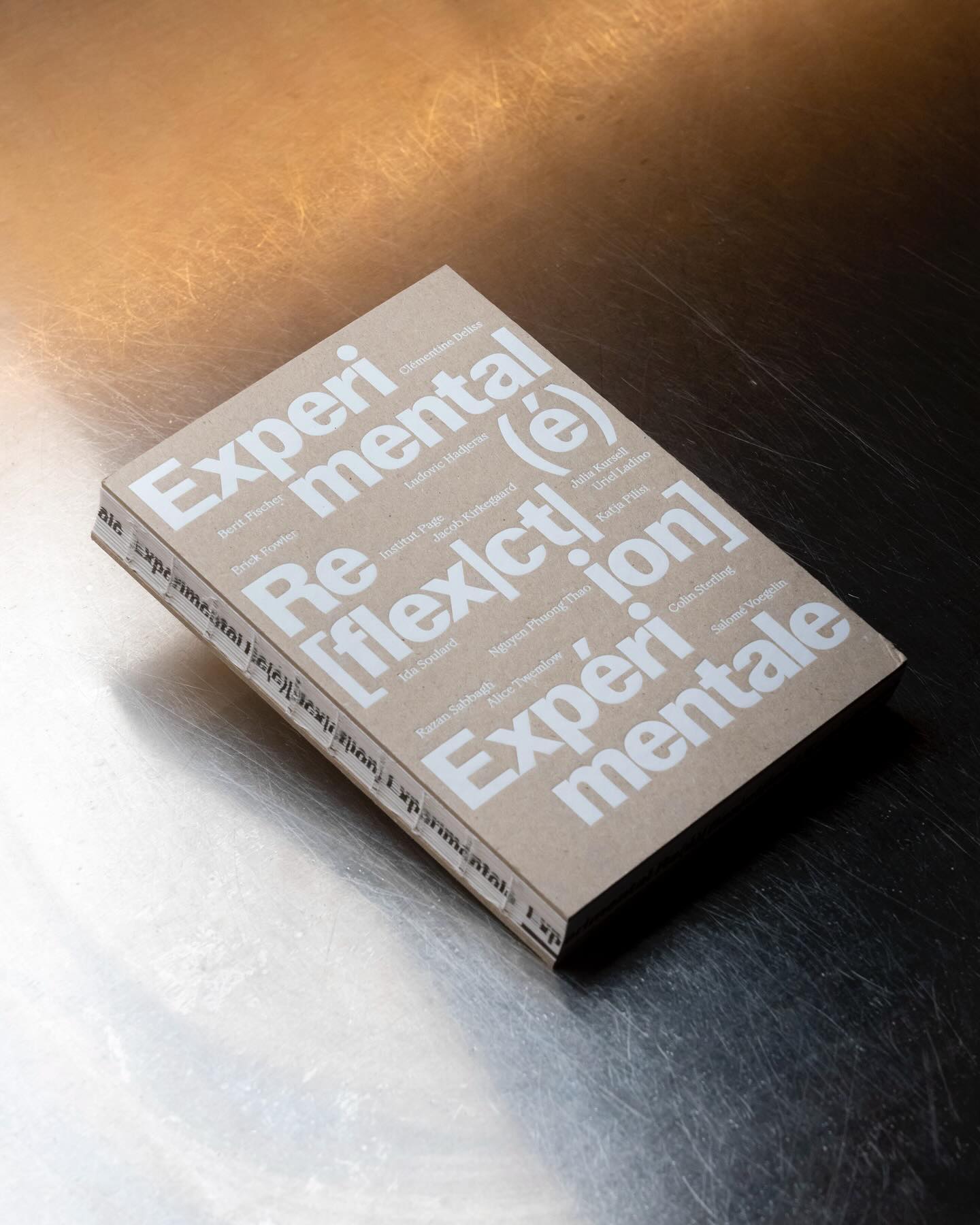
Experimental Re(é)[flex|ct|ion] is an editorial publication that explores concepts such as community, uncertainty, resistance, movement, among others, through explorations and discussions. Hannes Brischke uses ABC Walter Neue and Dark’s Remix A.
Foundry: Dinamo, Out of the Dark Design: Hannes Brischke
Workbyworks Studio created a dynamic 3D logo for the NFT trading platform, Convertible Van Gogh.
Design: Workbyworks Studio
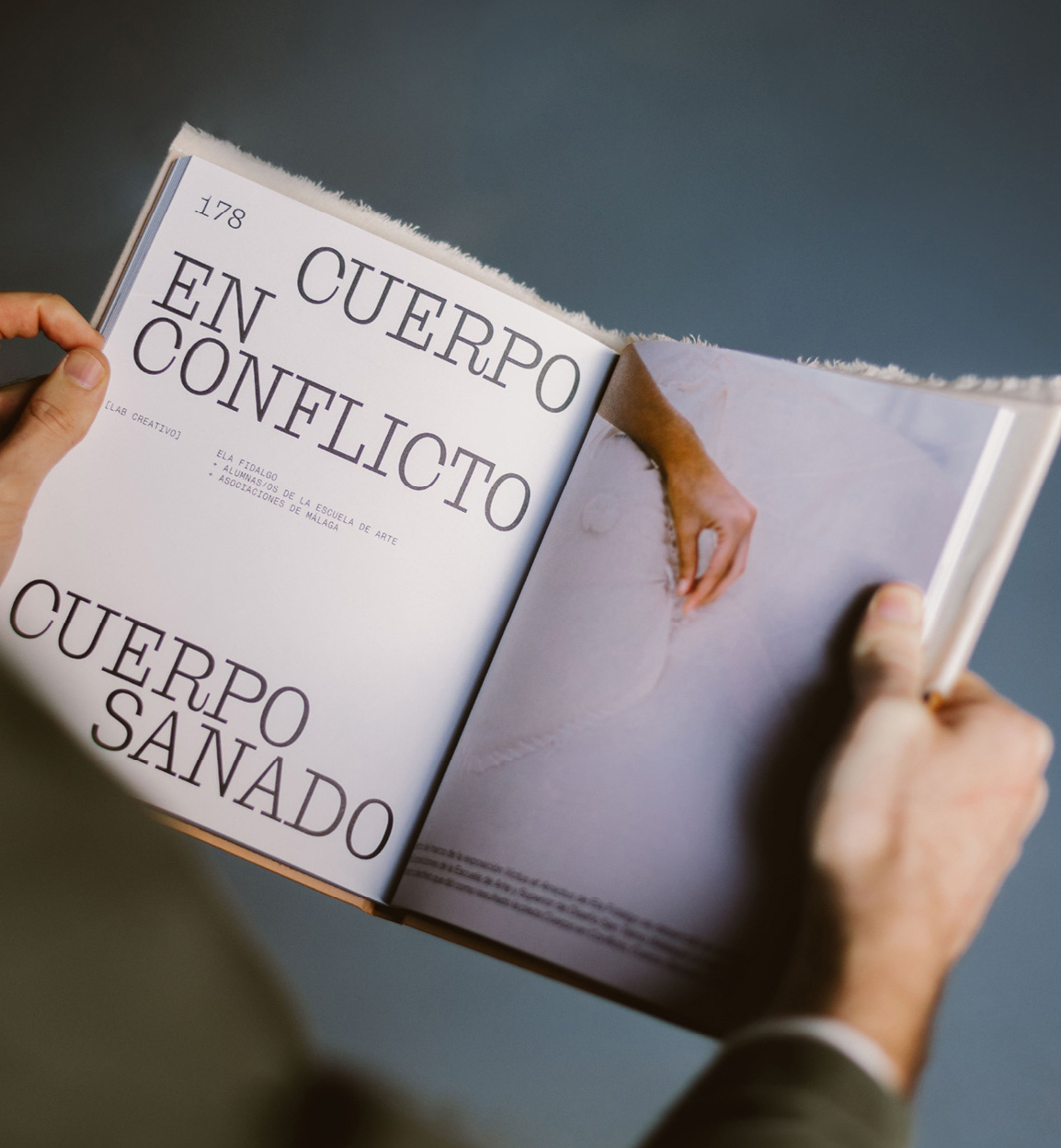
Mixture of materials, papers, and typefaces (Neue Montreal and Cucina); that’s how Tiquismiquis designed this editorial piece that covers Ela Fidalgo’s creative career.
Foundry: Bretagne Type Foundry, Pangram Pangram Design: Tiquismiquis
In this book that compiles the lesbian legacy in Quebec, we find Gerstner-Programm FSL as the main typeface, along with “handwritten” numbers using Sebastian Bobby. Designed by Harrison Fun Studio.
Foundry: Forgotten Shapes, Set Sail Studios Design: Harrison Fun Studio
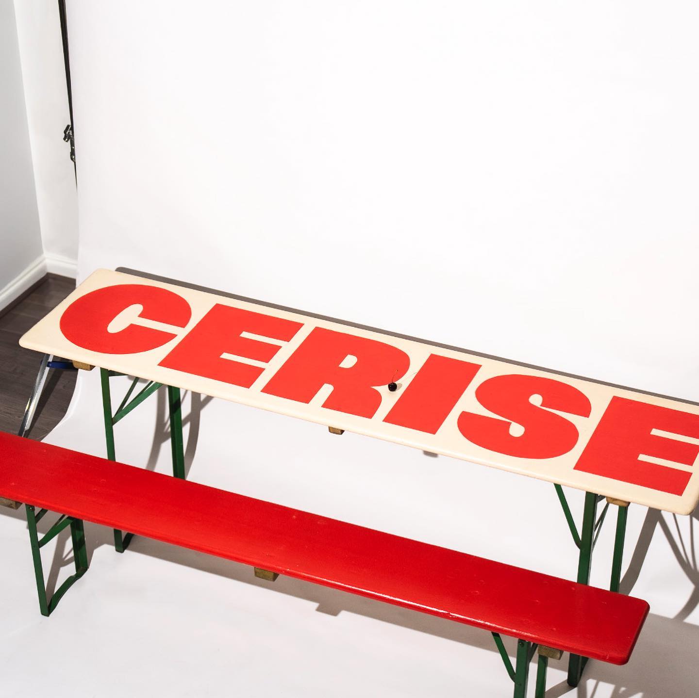
Studio Cerise, a colorful creative studio from East London, used Swinton by Nouvelle Noir for its logo.
Foundry: Nouvelle Noir Design: Studio Cerise
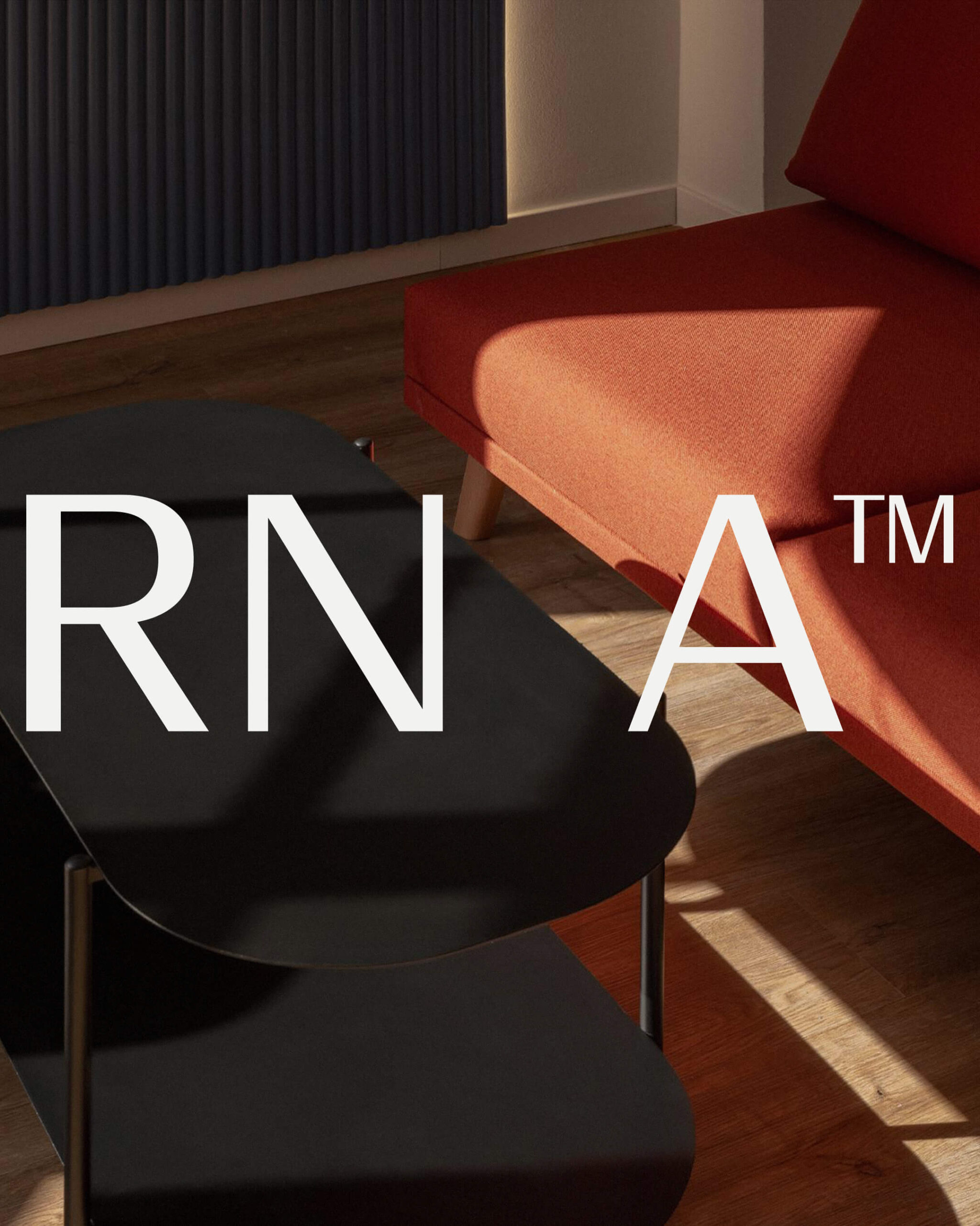
Estudio República used a single weight of Basel Classic from Optimo Type and Courier Prime as complementary, to achieve a human and elegant identity for Rocio Navarro’s brand; RN Arquitectura™.
Foundry: Optimo Type, Google Fonts Design: Estudio República
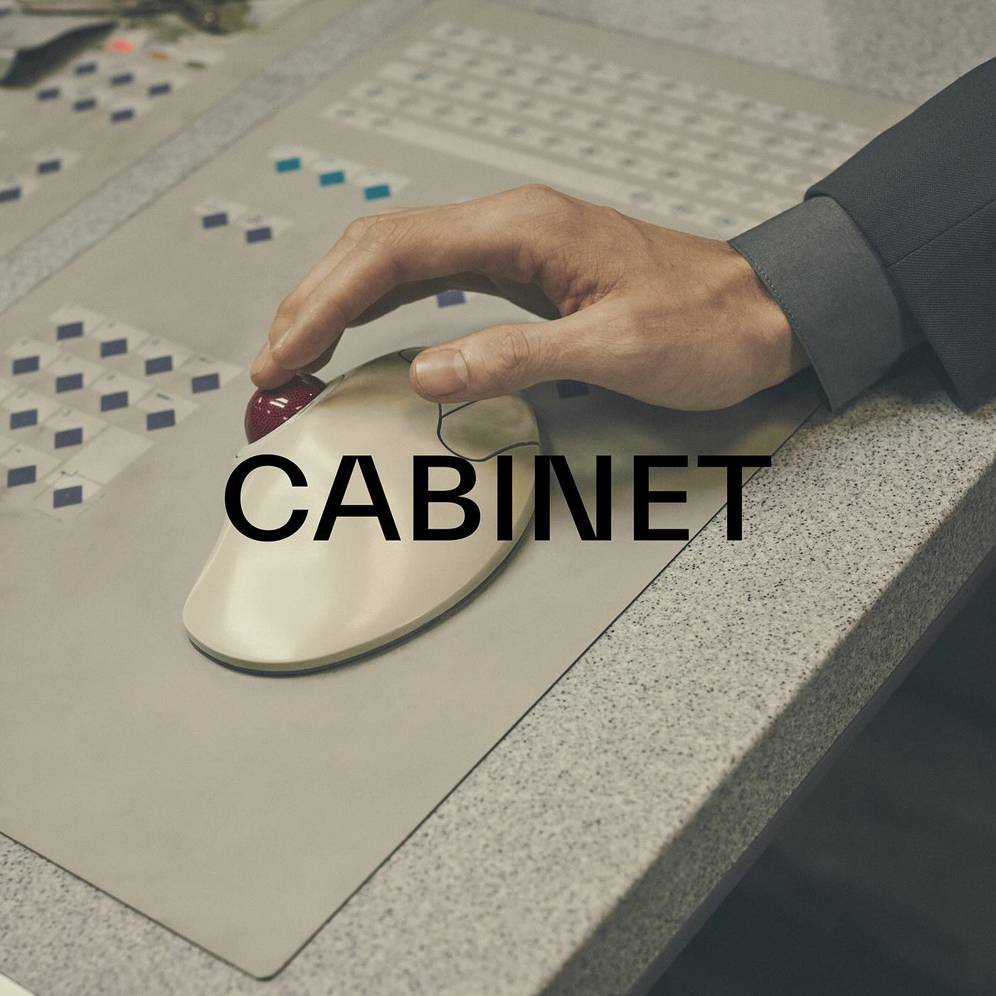
TWK Everett venturing into the fashion industry through the creative studio and fashion brand Cabinet Milano, led by Rossana Passalacqua and Francesco Valtolina.
Foundry: Type Weltkern
Last year, All Caps Type’s Rhetorik serif was featured in Apartamento’s annual cookbook edition #8, which gathers recipes based on tubers in a playful tone.
Foundry: AllCaps Design: Apartamento
This fresh and fun poster design for the Teatro Prospero uses Review Condensed from Commercial Type, a Principal Studio project
Foundry: Commercial Type Design: Principal Studio
How to design the extension of –a very well-known– brand, while also making it unique. Order solves this question with the identity of Journal House, a branch of WSJ dedicated to events.
Foundry: MCKL Type Foundry Design: Order
A story of friendship between agriculture and its natural habitat, between the design by Olsson Barbieri and the Or Lemmen typography proposed by them for the image of an organic orchard in Hardanger, Norway.
Foundry: Or Type Design: Olsson Barbieri
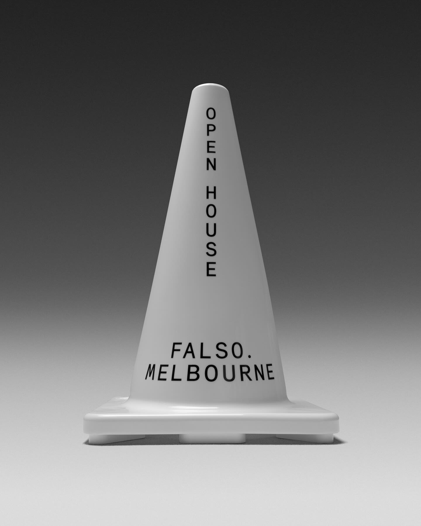
Studio Sly used Modern Era Mono to make Falso Melbourne stand out among all the other real estate agencies.
Foundry: Family Type Design: Studio Sly
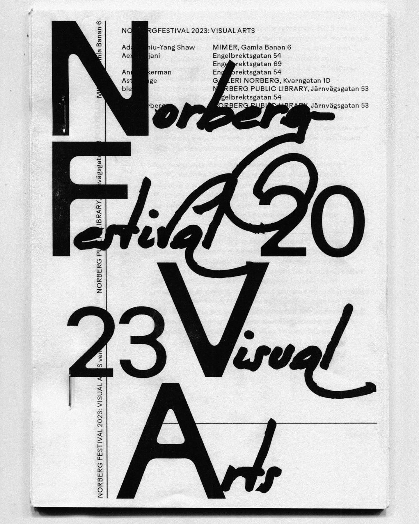
Rauschen B Regular and JHA Times Now Light filled the visual arts program of the Norbergfestival 2023 with personality. Designed by Agga Stage and Alexander Söder.
Foundry: Out Of The Dark, JHA Design: Agga Stage, Alexander Söder
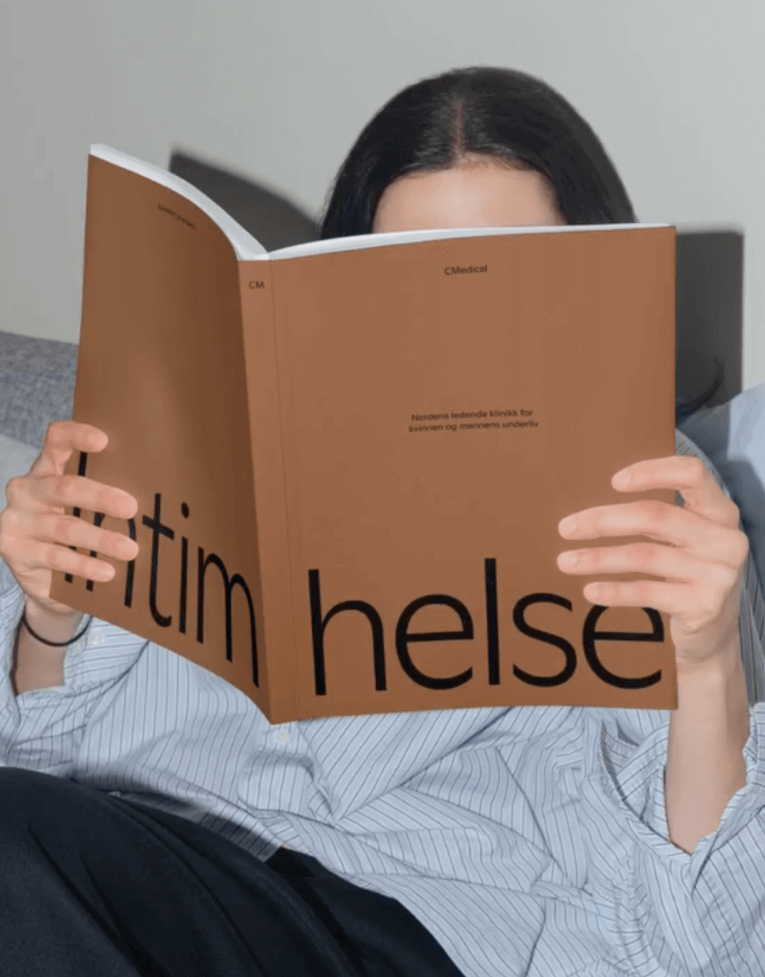
EY Doberman used Ginto from ABC Dinamo in different weights to achieve a consistent stroke throughout the visual identity for CMedical.
Foundry: ABC Dinamo Design: EY Doberman

As a collectible object decorating a space, Christopher Doyle & Co. used Moulin for its unique and attractive features, along with Scto Grotesk, to achieve the elegance and sophistication that the interior design brand, Tom Mark Henry, aimed to convey with its new identity.
Foundry: Commercial Type, Schick Toikka Design: Christopher Doyle & Co.
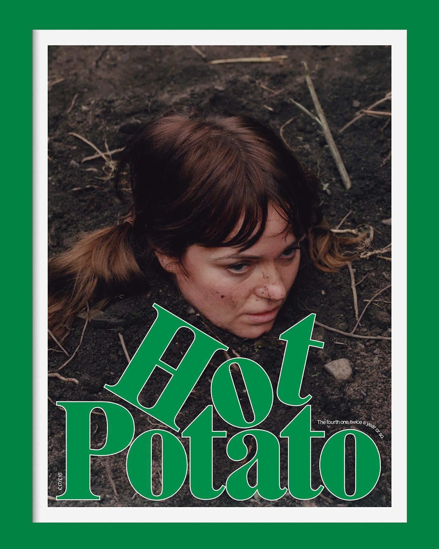
Neue Haas Grotesk is a common typeface on the blog, it works well in many scenarios, for example alongside Marfield in the fourth edition of Hot Potato magazine.
Type Designer: Elliot Grunewald Design: Other Office
Within the vast diversity of ideas in this application, the Pinterest design team, along with Kurppa Hosk, uses the neutrality of Neue Haas Grotesk to continue inspiring all kinds of minds.
Foundry: Linotype Design: Kurppa Hosk
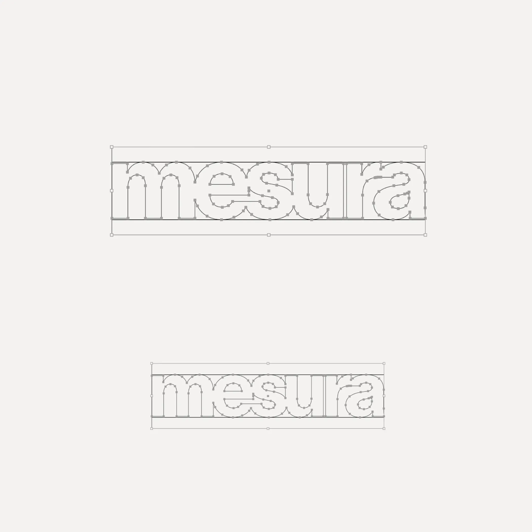
Flexibility was what Mouthwash studio aimed for with the typographic selection they made for the Messura . Kimera’s Waldenburg and Times LT were chosen to give solidity to the brand and possibilities to evolve.
Get Waldenburg
Waldenburg from Kimera Corp was customized to be part of the visual identity for a new line of assistance for people with opioid addiction issues. Designed by Raw Materials and Service Plan
Foundry: Kimera Corp Design: Raw Materials, Service Plan
Express” and “Local” are the typefaces created for New York City FC in the rebranding process carried out by Gretel, in collaboration with the type design studio Frere-Jones.
Foundry: Frere-Jones Design: Gretel NY
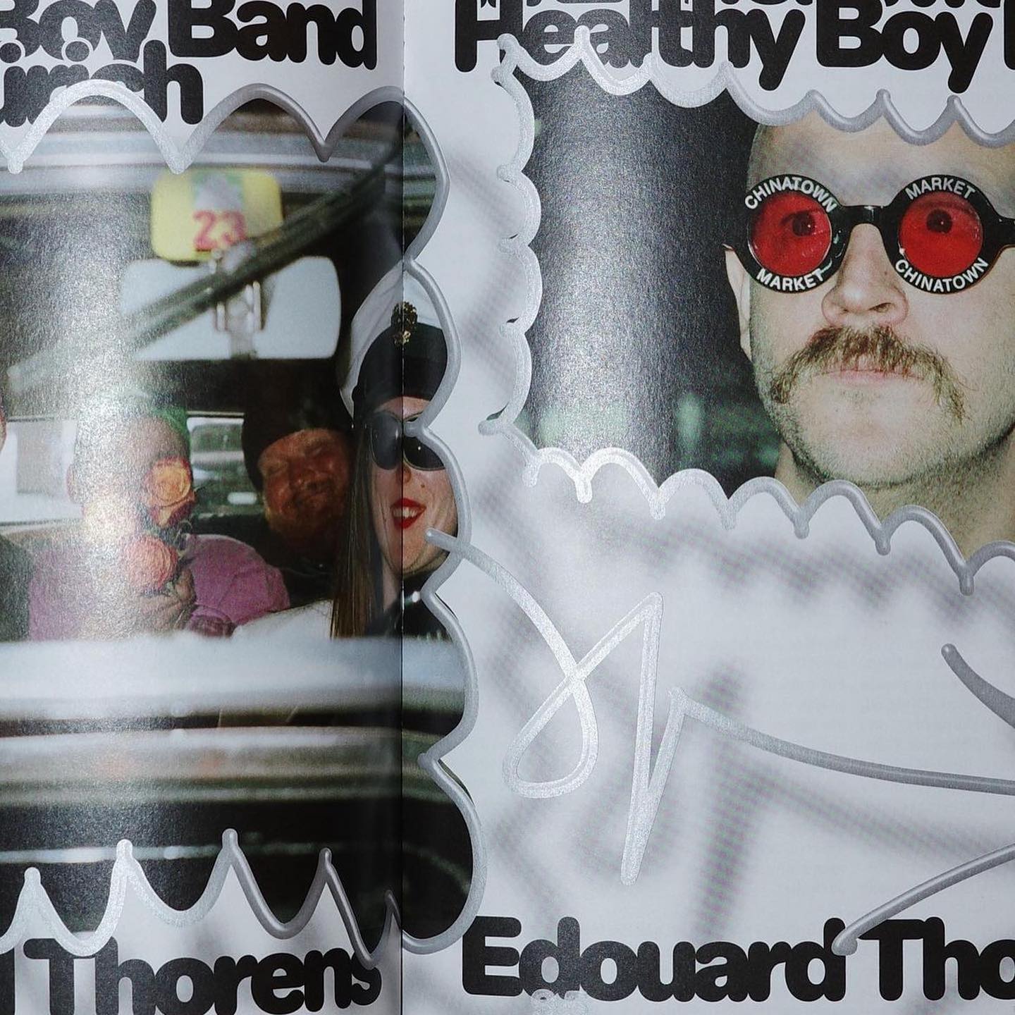
Diatype Rounded from ABC Dinamo is used in Healthy Boy Band, a cultural magazine that is a tribute to graphic design
Foundry: ABC Dinamo Design: Ortner etc.
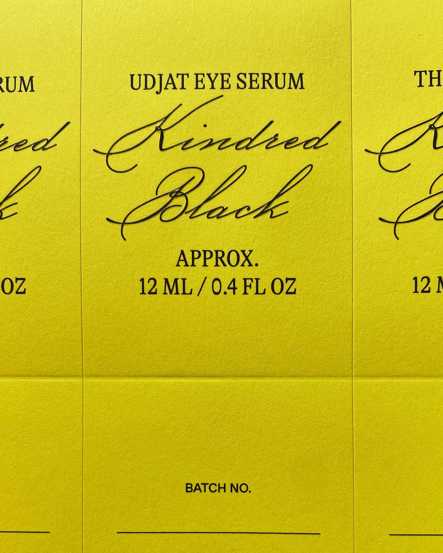
GT Alpina and Monument Grotesk are part of this packaging system that the creative studio Ania et Lucie devised for the glass bottle brand Kindred Black
Foundries: Grilli Type, ABC Dinamo Design: Ania et Lucie
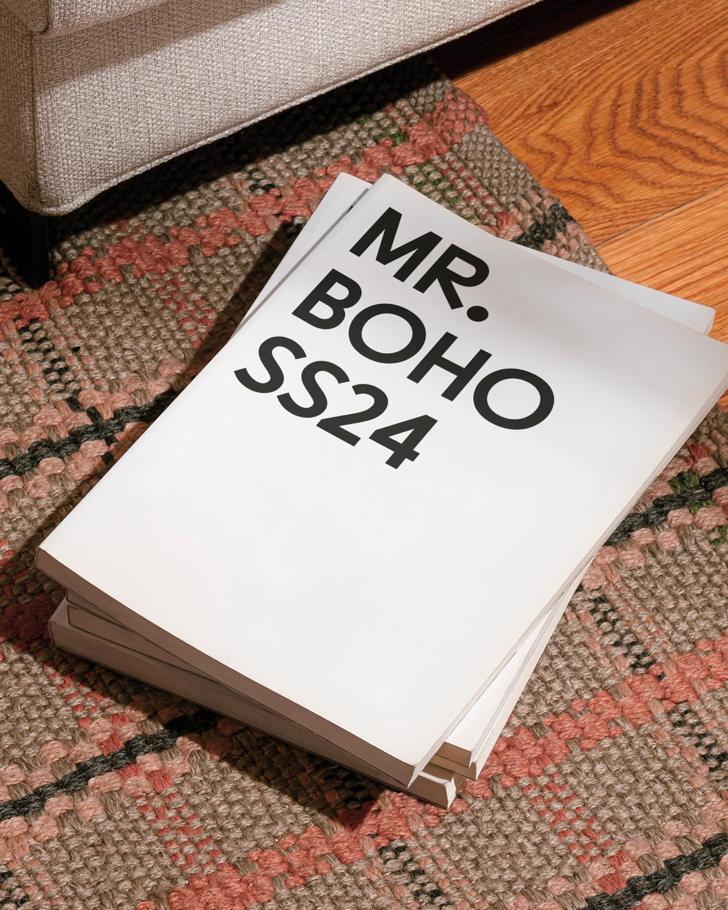
For being the first to create ocular accessories, the Inuit people and their syllabic writing system inspired a custom typeface and a new brand image for Mr Boho eyewear.
Type Design: Laura Meseguer Design: Buenaventura
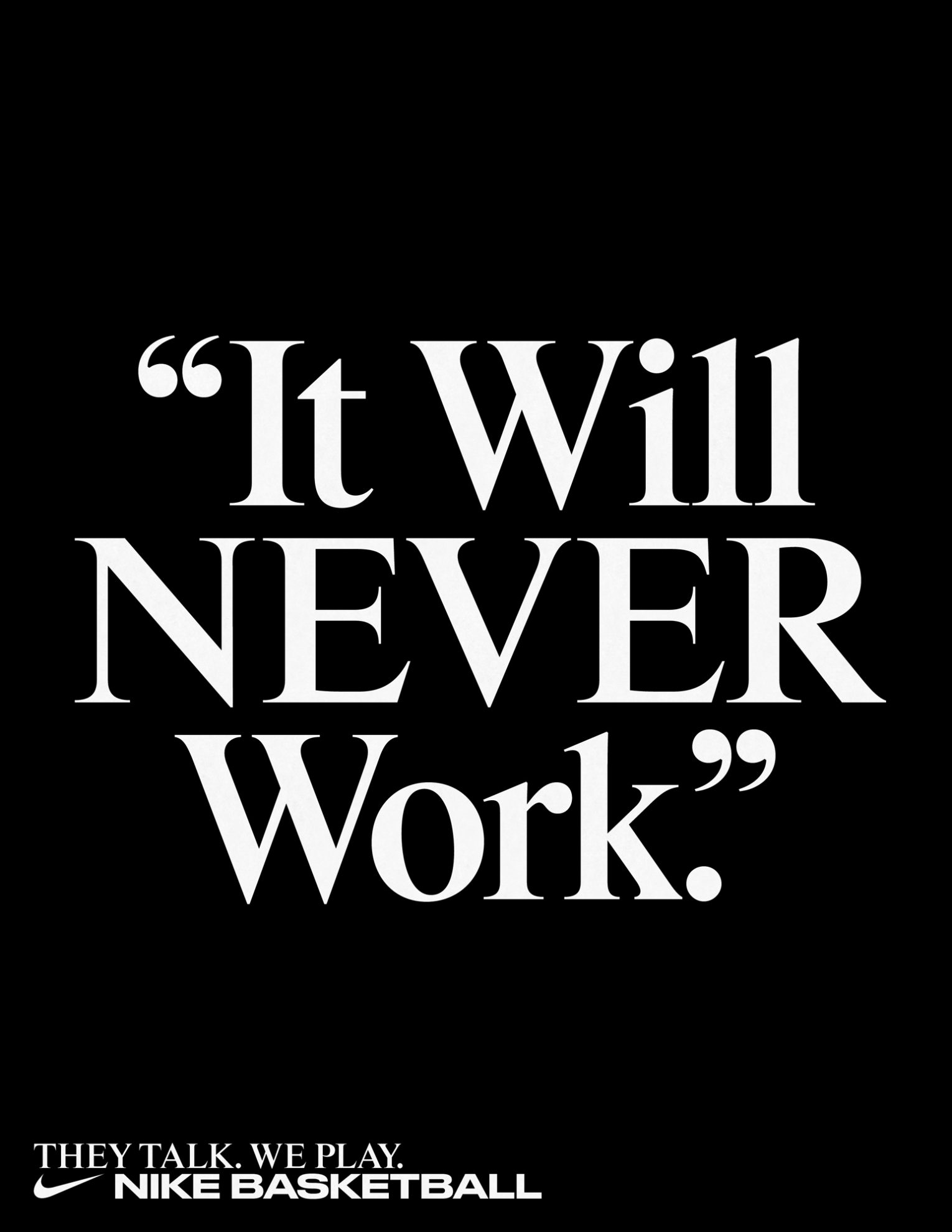
Rhymes by Maxitype in the 2017 campaign for the NBA Finals “They Talk We Play”. Design by Hort and Tim+Tim.
Get Rhymes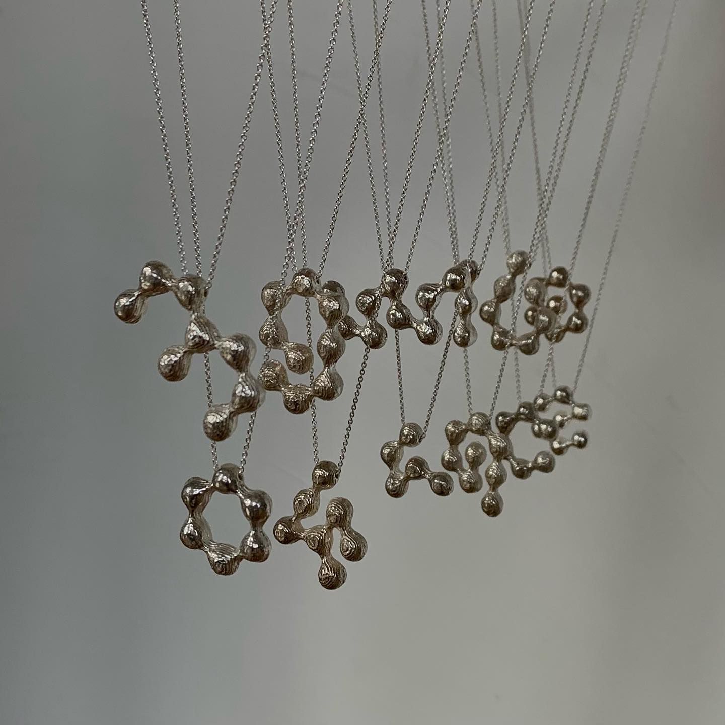
The Belgian design studio Vrints-Kolsteren collaborated with the jewelry brand Fleerackers to create ATOM, a collection of 16 different earrings.
Design: Vrints-Kolsteren
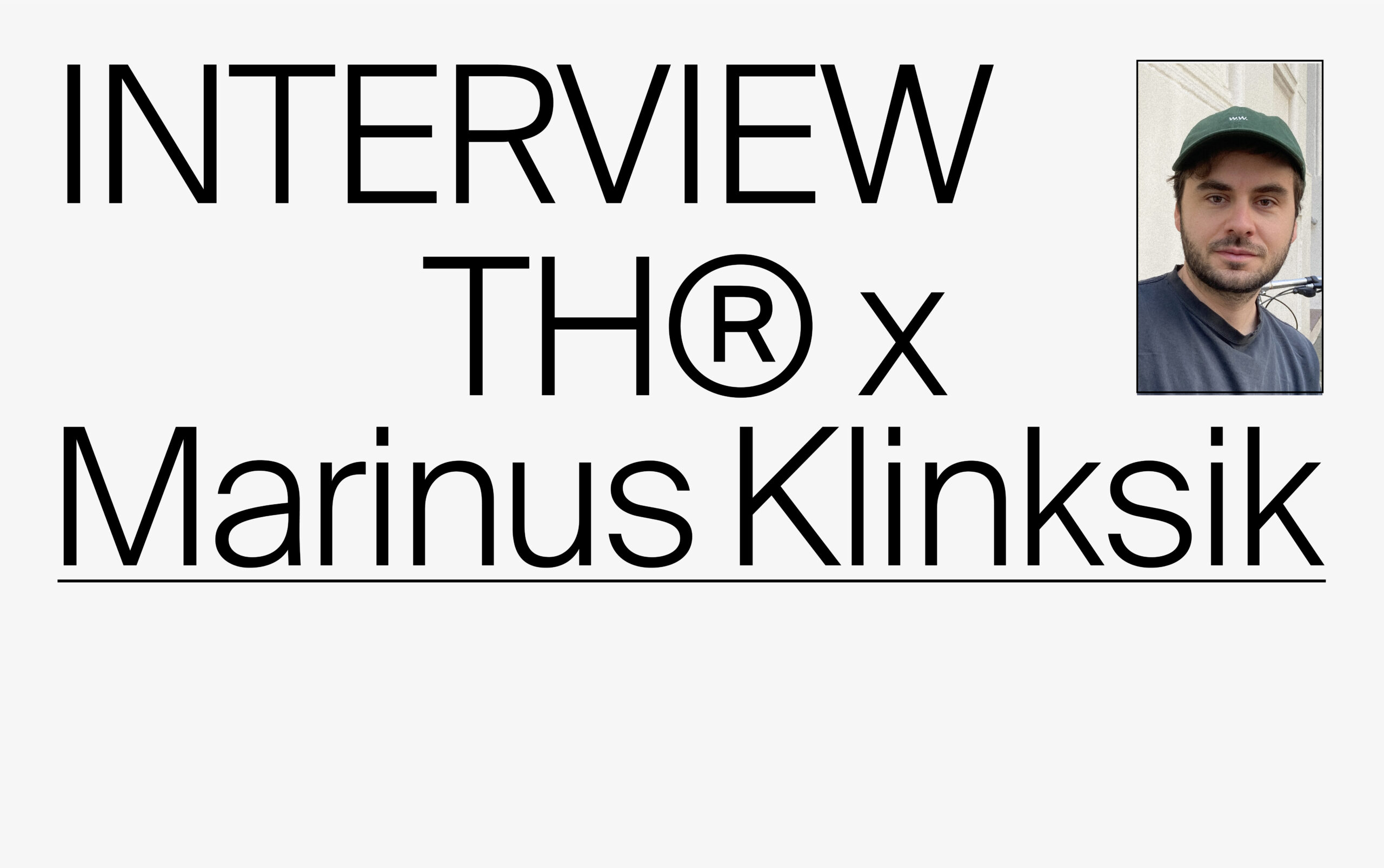
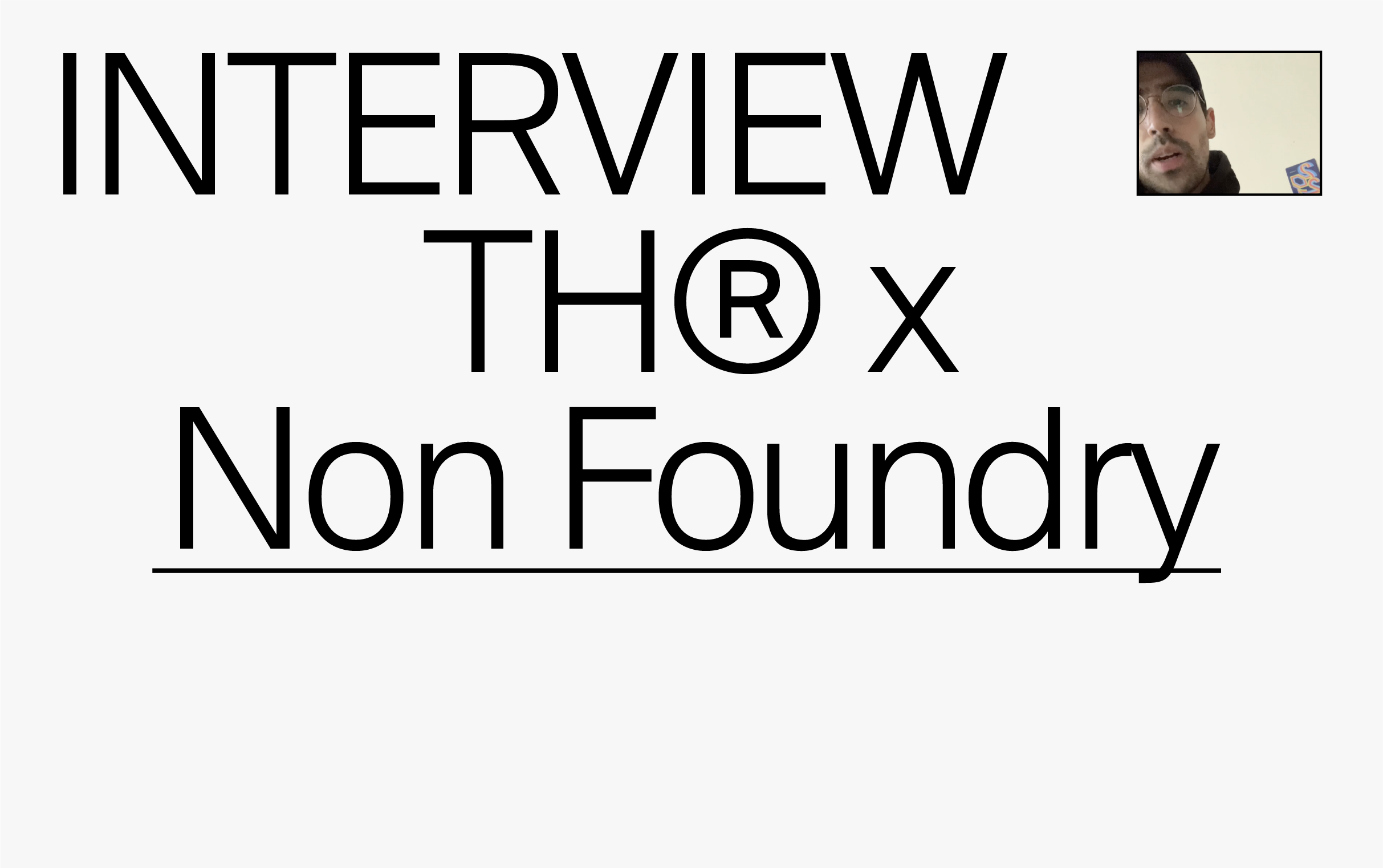
The graphic and typographic practice of Elias Hanzer and Lucas Liccini in the daily search of different unique solutions. The INTERVIEW with HAL Typefaces.
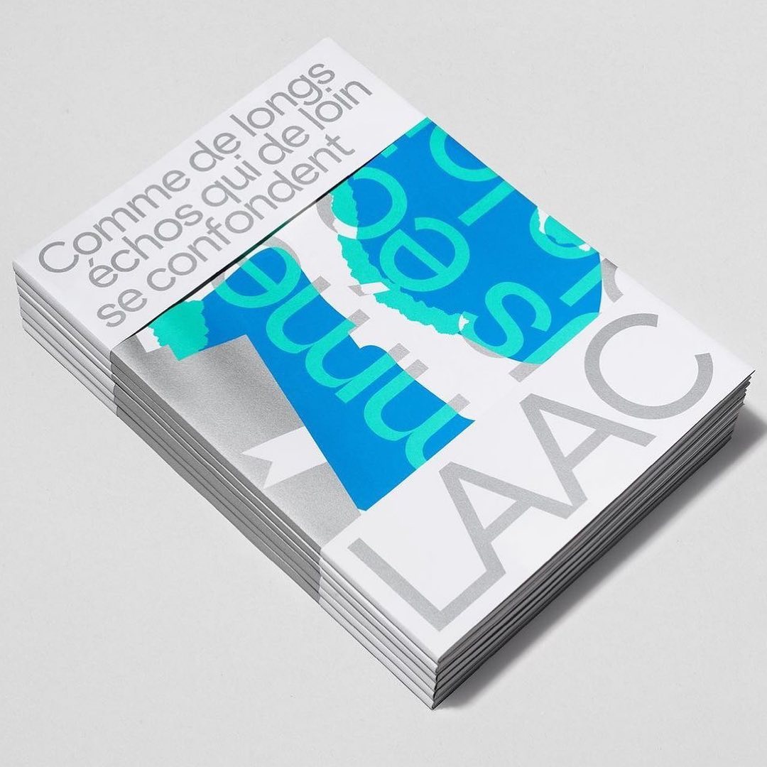
Studio Hudson Catty and Atelier Baudelaire used ES Klarheit Kurrent to design a set of three books celebrating the 40th anniversary of LAAC in Dunkirk.
Foundry: Extraset Design: Studio Hudson Catty, Camille Baudelaire & Olivia Grandperrin
Simple and dynamic, these explorations by Paula de Álvaro use brand elements and basic information to present the Pull&Bear London AW 2023 collection.
Design: Paula de Álvaro
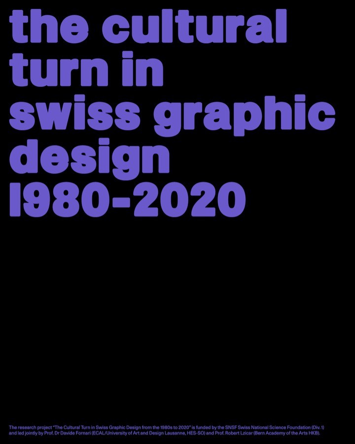
Trekking Sans is a lowercase typeface designed by Bureau Bernklau, for the research project Cultural Turn in Swiss Graphic Design (1980–2020).
Type Design: Bureau Bernklau Design: Frederik Mahler-Andersen, Clio Ha
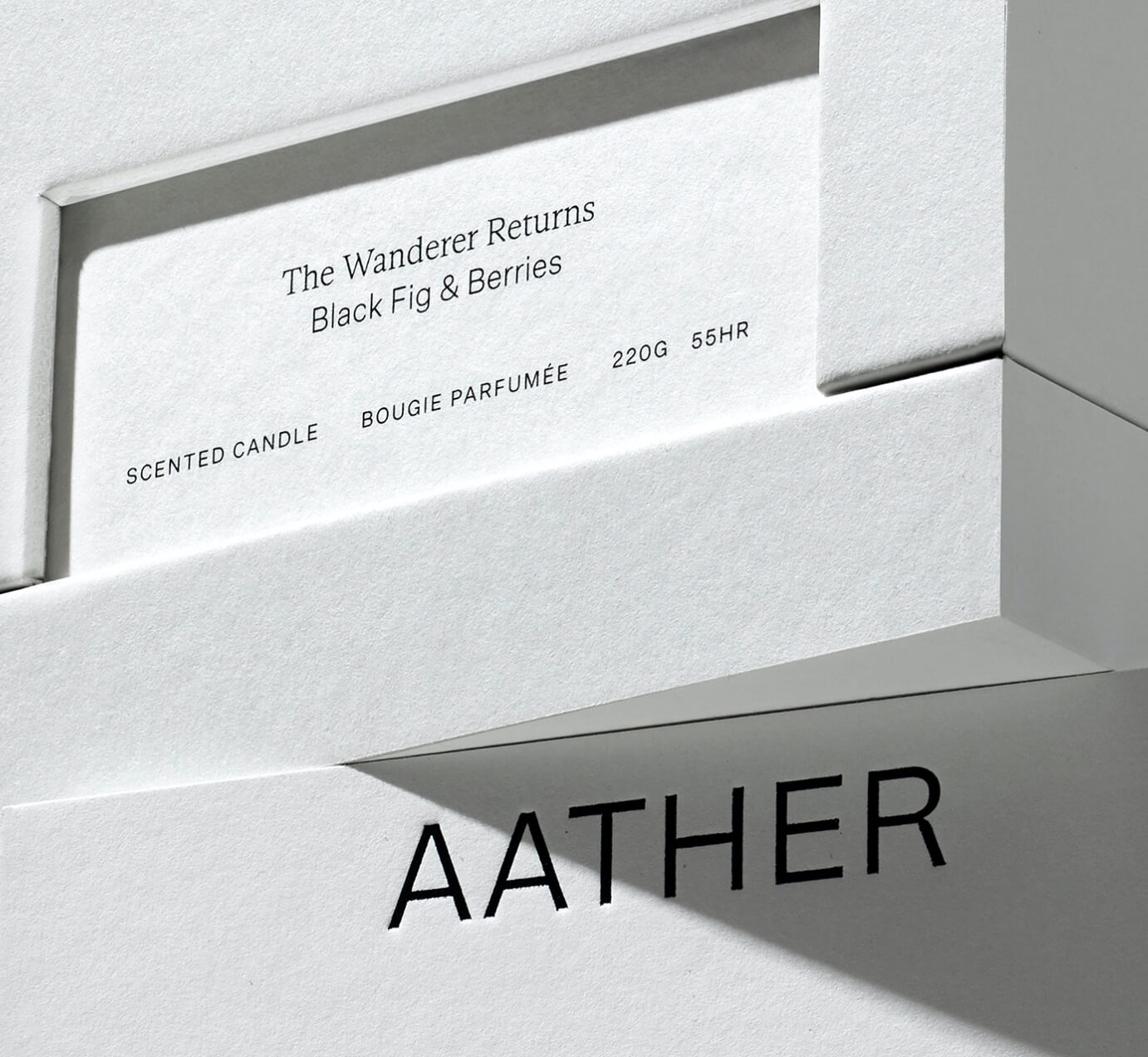
SOCIO Design used Untitled Sans from Klim Type Foundry and Gestura from Socio Type Foundry to complement the visual identity of AATHER’s high-quality candles.
Foundry: Klim Type Foundry, SOCIO Type Foundry Design: Socio Design
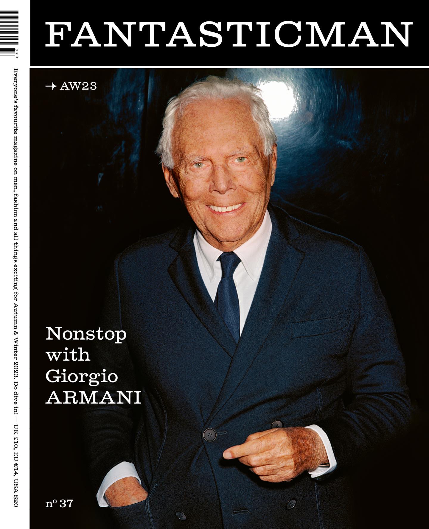
Men’s fashion magazine, Fantastic Man, releases issue 37 with an editorial redesign using Laurenz Brunner’s Diplomat typeface.
Foundry: Laurenz Brunner Design: Fantastic Man

ABC Dinamo and Comission Studio collaborated to develop Rimowa’s custom typeface, building upon Bureau Borsche’s logo for the high-end luggage brand.
Foundry: ABC Dinamo Design: Commission Studio

Editorial New, ITC Franklin Gothic, and Antique No.6 were brought together by The Office of Ordinary Things to create contemporary compositions in the identity of Mad, a agriculture organization.
Foundry: Pangram Pangram, ITC, Commercial Type Design: The Office of Ordinary Things

The foundry From A+, built a wordmark, an alternate script version, and two monograms based on art deco letterforms, for the seafood Californian tavern, Bar Le Côte.
Foundry: A+
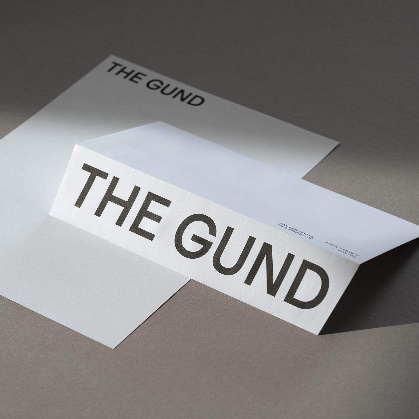
Julien Hébert and Principal Studio collaborated to craft a bespoke friendly typeface for The Gund, academic art museum. Caslon Ionic by Commercial Type as the complementary font.
Type Designer: Julien Hébert Design: Principal Studio Foundry: Commercial Type
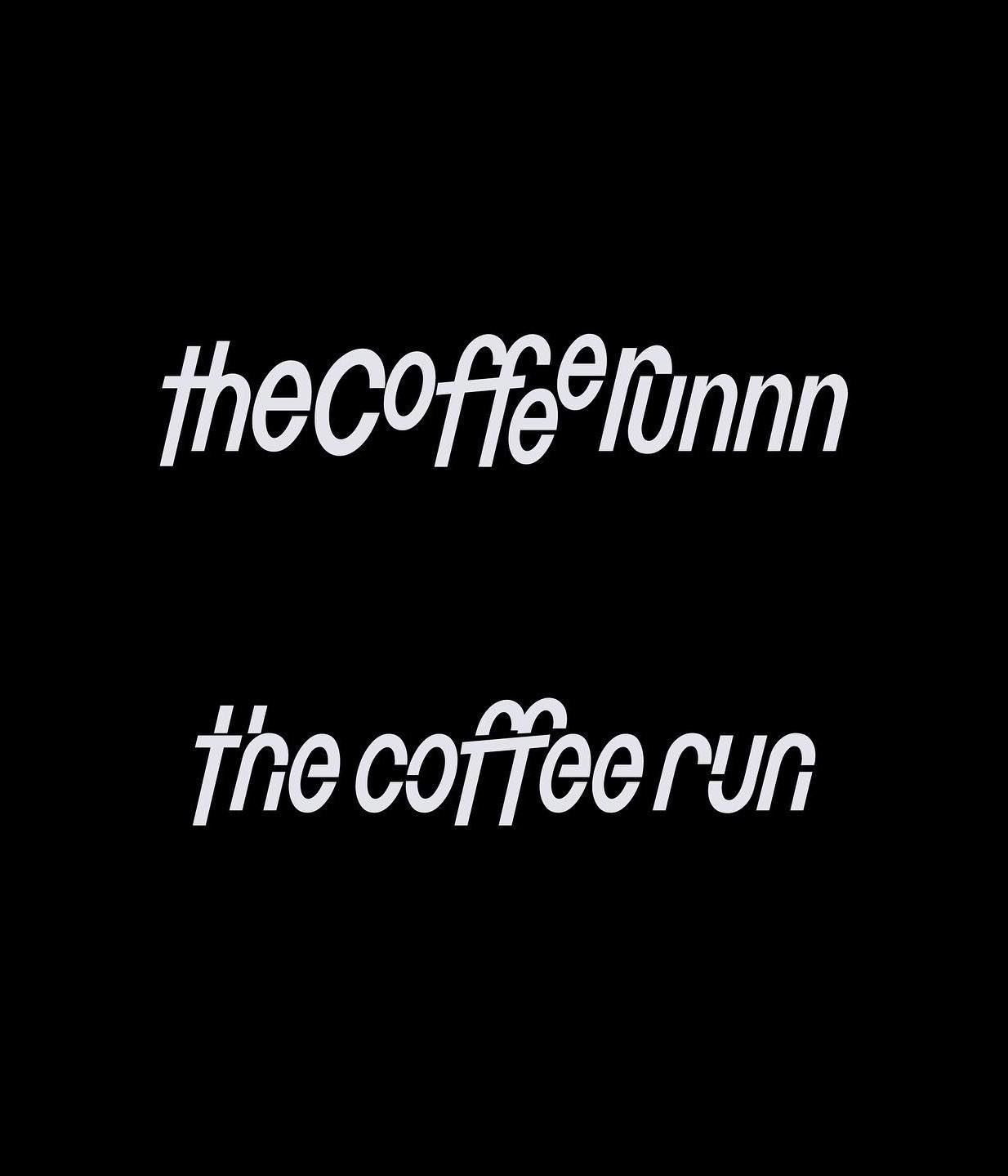
Runners and coffee lovers community, The Coffee Run, asked Dum Dum Studio to create their identity through a bespoke typeface full of dynamism.
Foundry and design: Dum Dum Studio

Supply stencil is the custom typeface Tric Studio inspired by streetwear, metal zines, tapes and the history of stencil, made as part of the identity system for Supply.
Design: Tric Studio

Studio Ard was commissioned to design 15 publications and the signage for the graduation exhibition of the RCA School of Architecture. All is typeset in Prisma Text by Lineto.
Foundry: Lineto Design: Studio Ard

Pastiche Grotesque by Order Type Foundry was customized by Benjamin Tuttle to become the bespoke typeface for the First Choice brand, a new generation of travel lovers. Design by Ragged Edge.
Foundry: Order Type Foundry Design: Ragged Edge

Handwritten sketches by Leandro Senna and The New Company made for the cultural center of gaming, 100 Thieves
Type Designer: Leandro Senna Design: The New Company

Typeset in Rhymes by Maxitype in the book of photographer Werner Amann capturing the nightlife rave scene of the early 1990s. Design by Lamm & Kirch with Caspar Reuss
Foundry: Maxitype Design: Lamm & Kirch / Caspar Reuss

Giacomo Bastianelli designed in AL Linea by Alex Lescieux, the posters that showcase the outcomes of the workshop week at ECAL for first and second-year Master Photography students.
Type Designer: Alex Lescieux Design: Giacomo Bastianelli
Rafael Ribas & Zoo designers graphiques teamed up to design a heavy and solid wordmark for Respect magazine.
Foundry: Rafael Ribas Design: Zoo designers graphiques
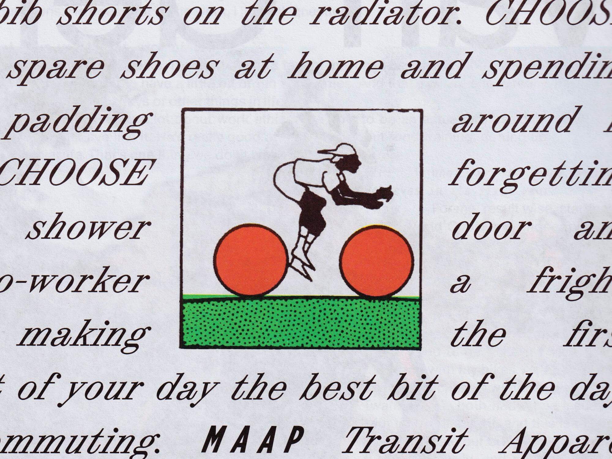
Tric Studio in charge of the design and art direction of second issue of the MAAP publication, Off The Front. The fonts used are ABC Synt and ABC Oracle by Dinamo, and Base Monospace by Emigre.
Foundry: ABC Dinamo, Emigre Design: Tric

LL Catalogue by Lineto at the Grand Prix suisse d’art/Prix Meret Oppenheim, a event recognizing cultural creators in Switzerland.
Foundry: Lineto Design: Adeline Mollard

A expressive custom Hardwear font by Supercontinente, under the creative direction of Gretel NYC, for the branding of Mountain Hardwear.
Foundry: Supercontinente Design: Gretel NYC

Some Days proposed a combination of the Farmacia and Kommuna typefaces for the new scents brand, Ourside.

Experimentation and creativity in this unselected proposal for JoJo logotype, a London-based design practice.
Foundry: Corbin Mahieu Design: Corbin Mahieu
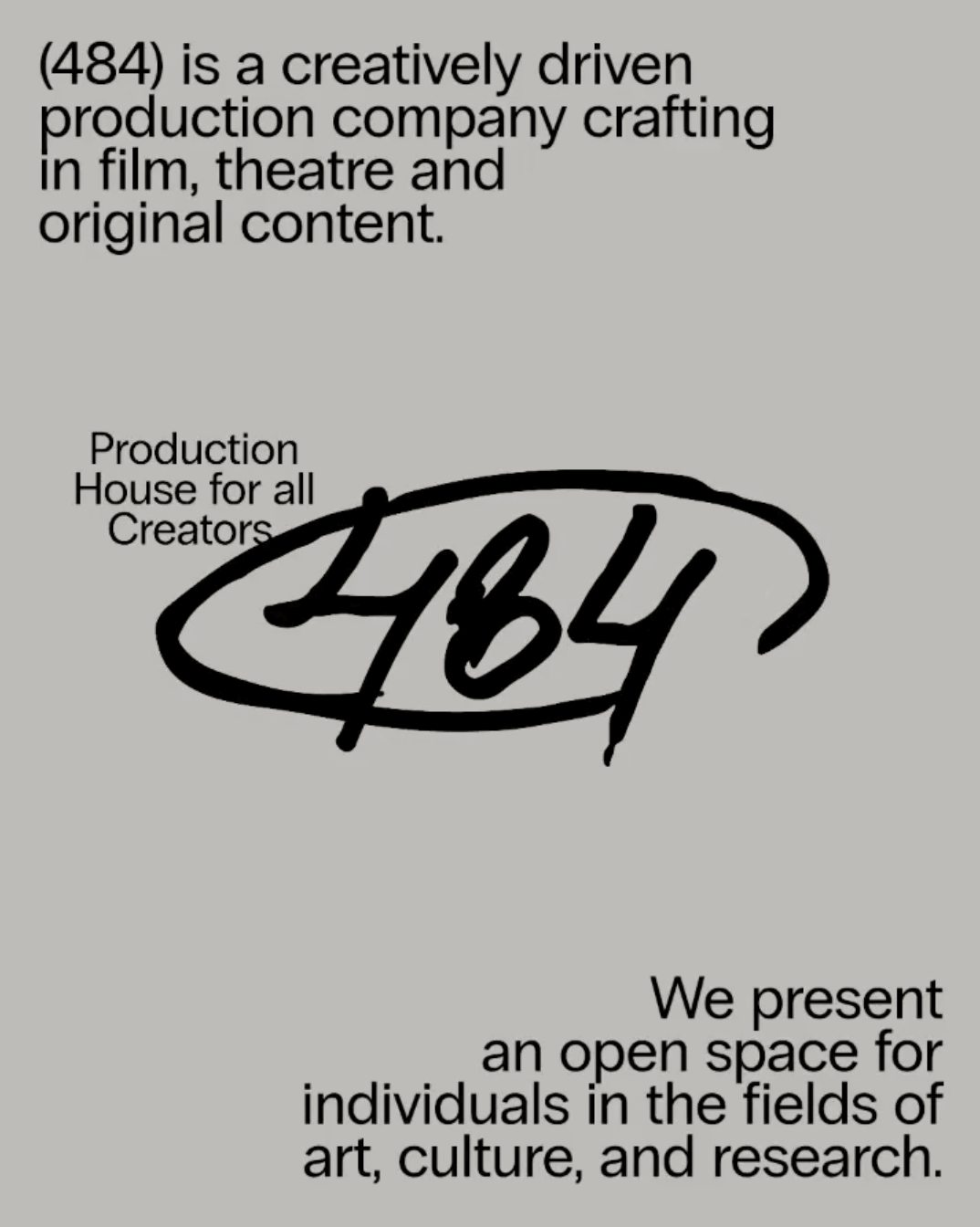
Neue Haas Grotesk, available at Commercial Type, in the identity of (484) Creative Production House. Design by Studio Abraham.
Foundry: Commercial Type Design: Studio Abraham
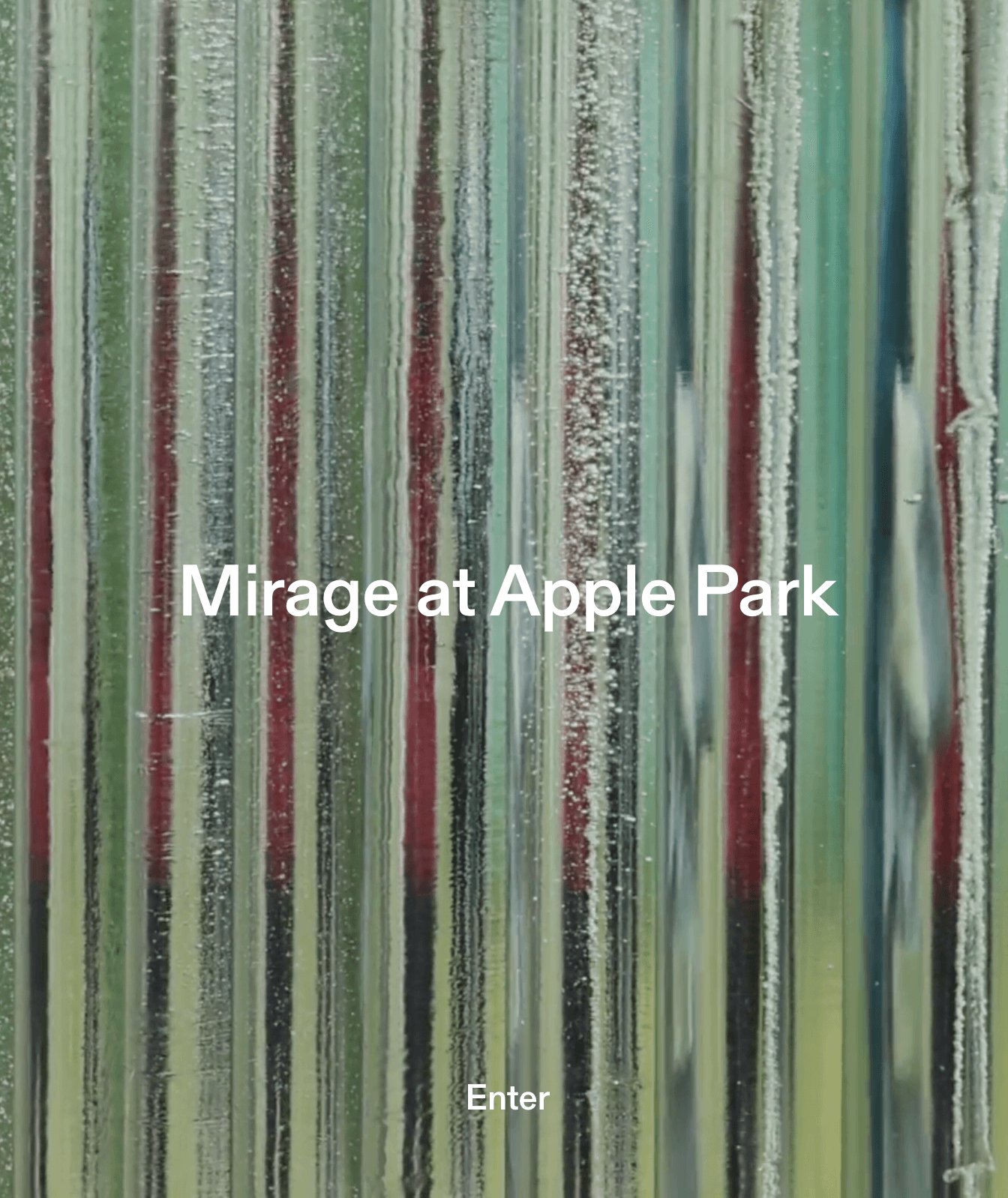
Gerstner-Programm by Forgotten Shapes on the website for Mirage, a sculpture made by artist Katie Paterson and architectural studio Zeller & Moye for Apple Park.
Foundry: Gerstner-Programm Web Design: Rafa Cobiella UX: Seriousandly
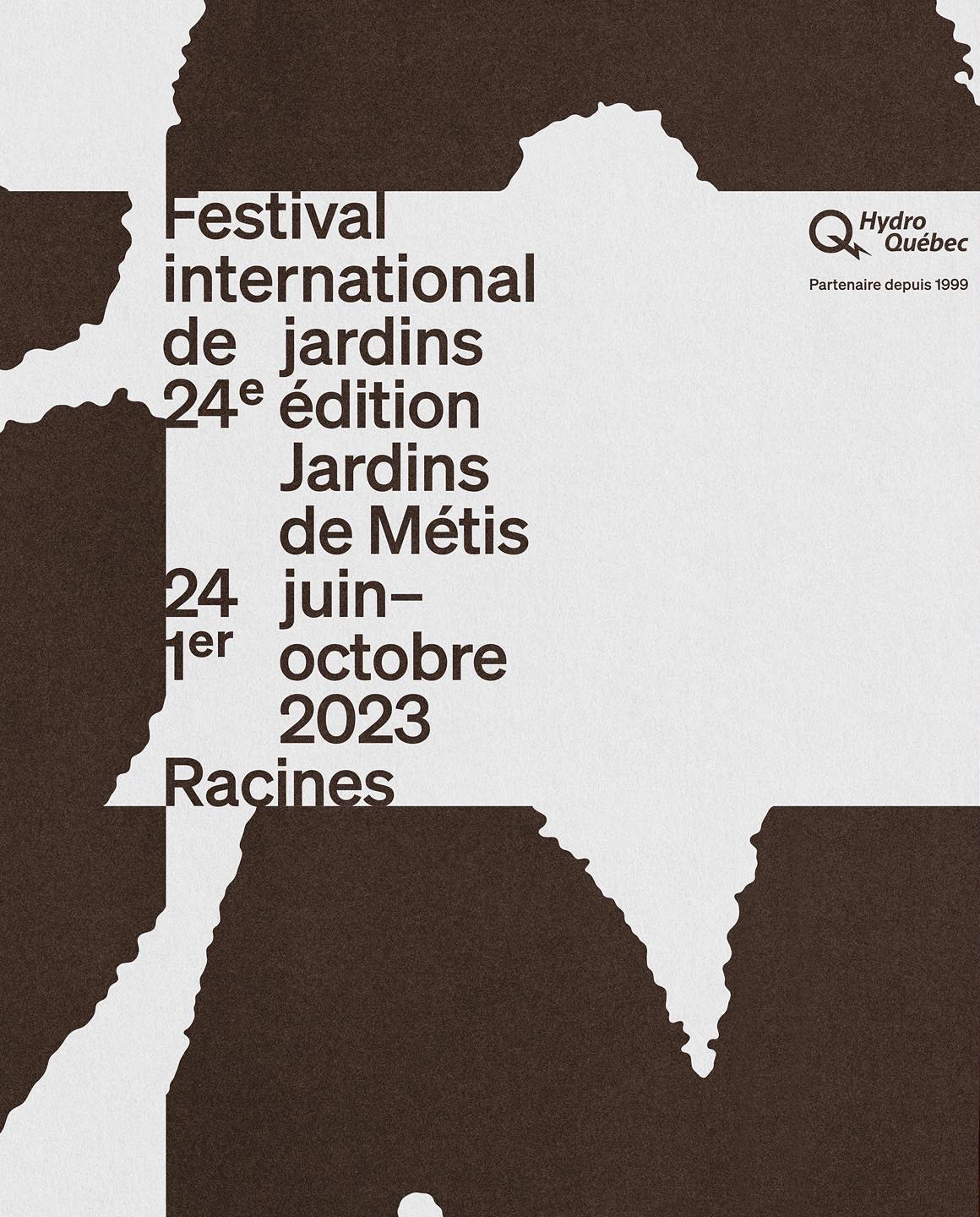
Contrasting an organic-shaped logo within a structured layout, Principal Studio was responsible for creating the 7th campaign for The International Garden Festival.
Design: Principal Studio
FFF Flea is a custom typeface designed by FFF for Mercantic, a Farmer Market. As the secondary typeface, and to create a balance with the geometry of Flea, Affairs by SM Foundry was used.
Foundry: Fonts From Folch Design: Folch Studio

Basile Fournier worked on the identity for Zien, a Web3 platform for contemporary art. The fonts chosen were Unica 77 by Lineto and JHA Times Now by Jan-Hendrik Arnold.
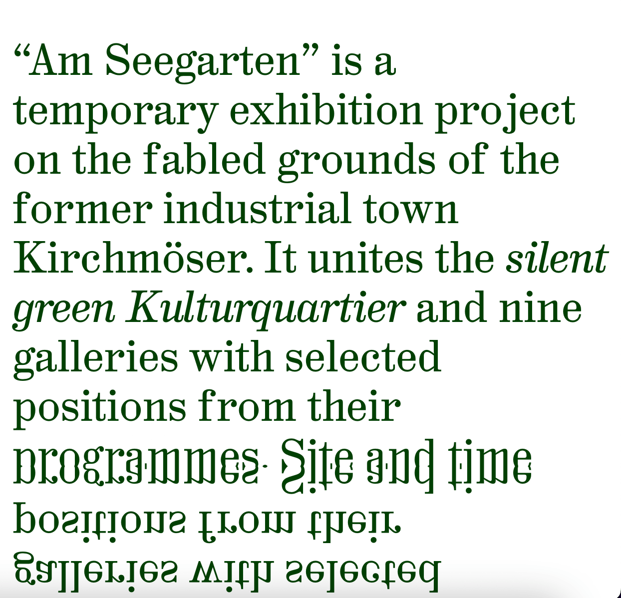
Hal Colant 2.0 (coming soon) on the website with a mirror effect for Am Seegarten, a temporary exhibition in Kirchmöser, Germany.
Foundry: Hal Typefaces Design: Studio Hanli
Leon Romero using Alias Ano by Alias and Suisse Works by Swiss Typefaces in the identity created for the Architecture office Bajet Giramé.

Modern Gothic by AllCaps in the identity of Pascal Hien, a studio that offers expertise within the field of industrial, exhibition and conceptual design.
Foundry: AllCaps Design: Autostrada Studio

A sans and serif custom logo, besides Quadrant Text Mono by Matter of Sorts on the website and identity Querida Studio designed for Laker Studio.
Foundry: Matter of Sons Design: Querida Studio
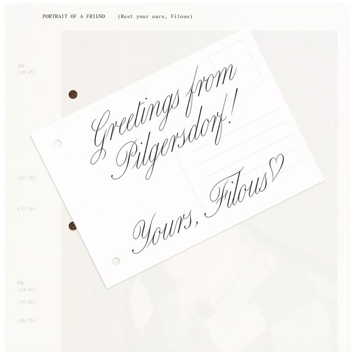
The zine “Portrait of a Friend (Rest Your Ears, Filous)” of the Vienna-based musician Filous, using Carta Nueva by Sharp Type.
Foundry: Sharp Type Design: Simon Merz

The New York Times Magazine team, with a typographic cover displaying NYTM Slab, a custom font developed by A2 Type.
Foundry: A2 Type Design: NYT Magazine

A symmetrical logo that can be read in both directions, alongside a custom typeface to create the branding system for the awe music label.
Studio: Hugo Blanzat
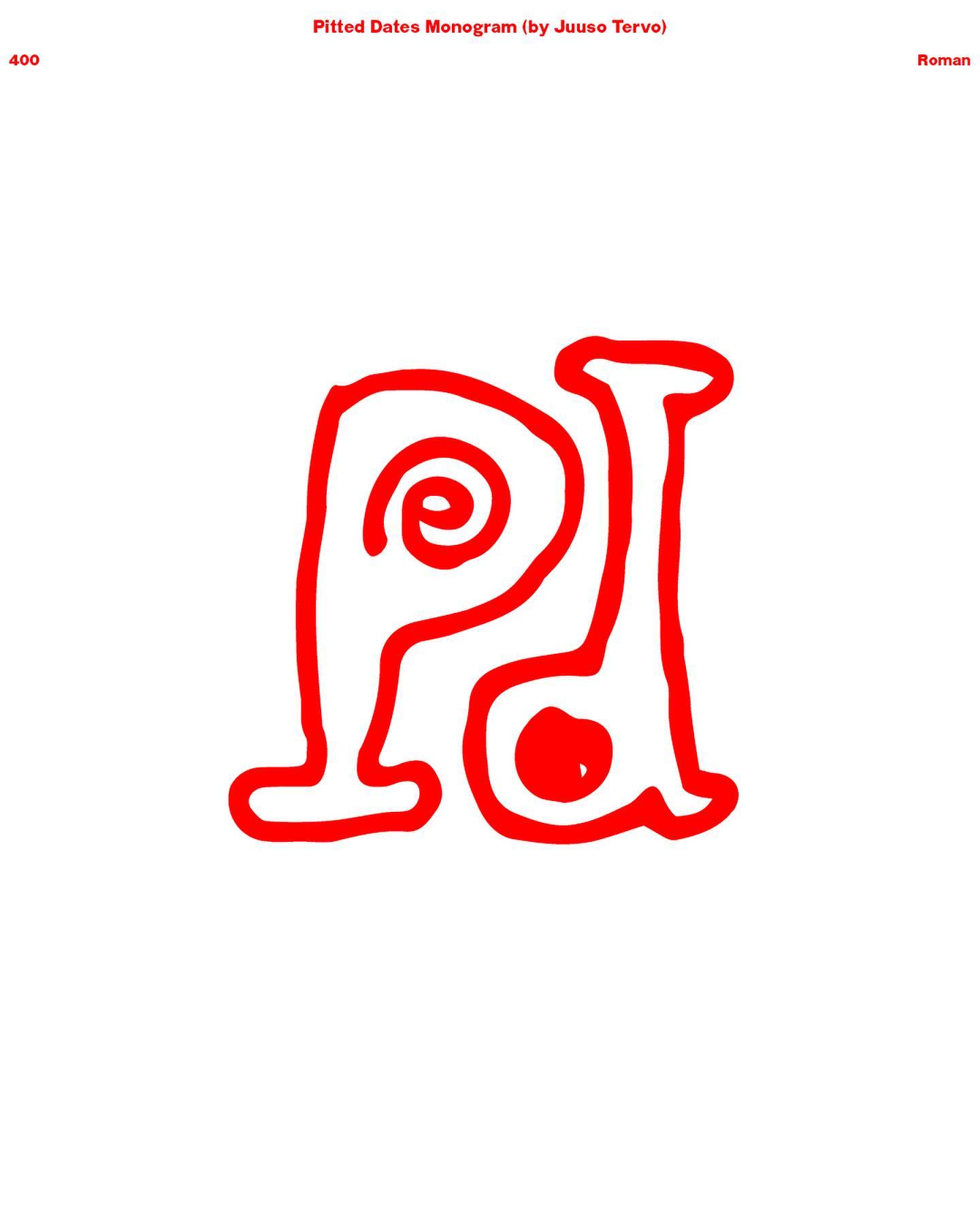
For Pitted Dates, an exhibition platform in Helsinki, a custom sans-serif typeface was created by Schick Toikka with hand-drawn punctuation by Sakari Tervo.
Foundry: Schick Toikka

Mount Agency designed the identity and e-commerce for the clothing brand Flid, using WT Kormelink from Wise Type in the logo and communication.
Foundry: Wise Type Design: Mount Agency

Cofo Cinema 1909 by Contrast Foundry and a display logo designed by Nikita Sapozhkov for Linen Texture, a clothing and textiles shop with a custom tailoring.
Foundry: Cofo Cinema Design: Nikita Sapozhkov
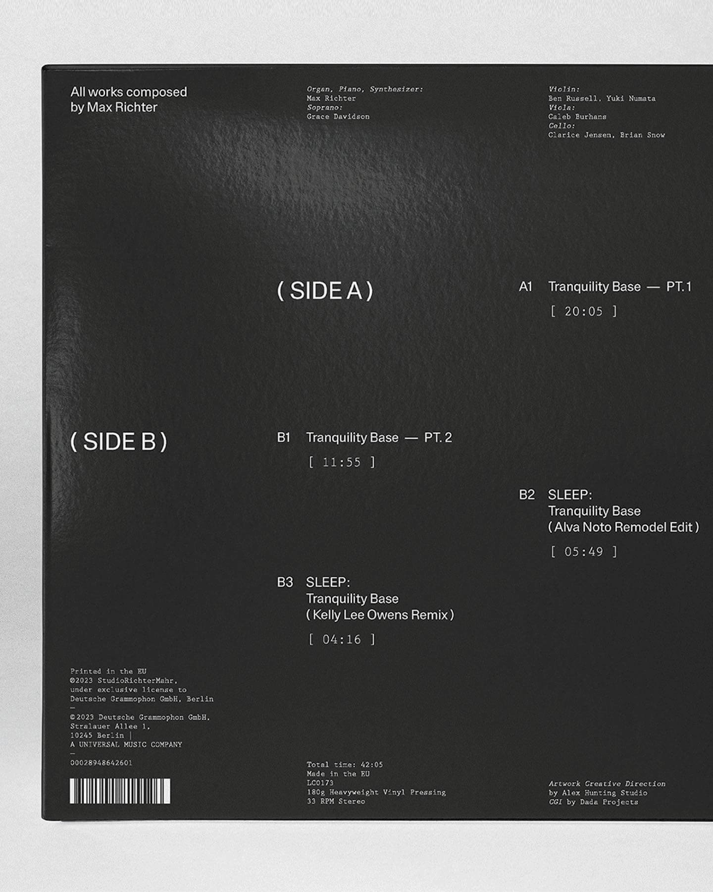
Elegant and functional, Ritcher Sans is born to emphasize the melodies in the latest EP by composer Max Ritcher.
Foundry: Schick Toikka Design: Alex Hunting

A new identity system for the Utah Jazz developed by The New Company, using a custom version of the Plaak typeface from the 205tf french foundry.
Design: The New Company Foundry: 205TF
Hiro builds developer tools that bring Web3 to Bitcoin. In its identity, Porto Rocha chose several fonts from the Aeonik family – Mono, Fono, and Bold –
Foundry: Cotype Foundry Design: Porto Rocha

HAL Timezone by Hal Typefaces in the typographic selection used for the book Pocket Call by Paul Spengemann, designed by Hanzer Liccini.
Foundry: Hal Typefaces Design: Hanzer Liccini
TWK Burns (WIP) by Nolan Paparelli and Alberto Malossi for the identity of Polpo World, a design object entirely made with recycled plastic.
Foundry: Type Weltkern Web Design: Matière Vive Renders: Synthetic Aspect

The identity of Ro Bags, featuring a custom logo by Laura Csocsán and Karl Mono from Source Type.
Logo design: Laura Csocsán Foundry: Source Type
Expressiveness and experimentation in a typeface inspired by urban art and physical tools.
Foundry: The Northern Block Designer: Jonathan Hill
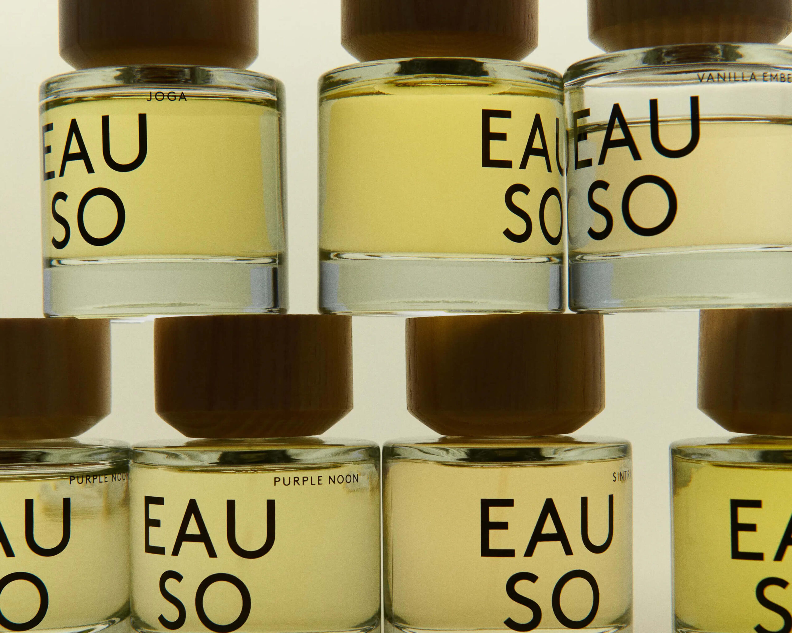
A bespoke headline typeface designed by Regular Practice for the identity of EAUSO VERT, a sustainable fragrance house.
Design: Regular Practice
Custom logo + Futura Extra Bold Condensed in the design and strategy commission entrusted to Aranda Agency by furniture editor BEC1972.
Design: Aranda Agency

Customizing Klarheit Kurrent Book for its logotype, Glasfurd & Walker created a very minimalist and balanced identity for CBD-forward brand, Nowadays.
Foundry: Extraset Design: Glasfurd & Walker

With clean and neutral lines, Ana Mirats Studio creates a custom logo for Vezavena, a brand specialized in knitwear.
Design: Ana Mirats
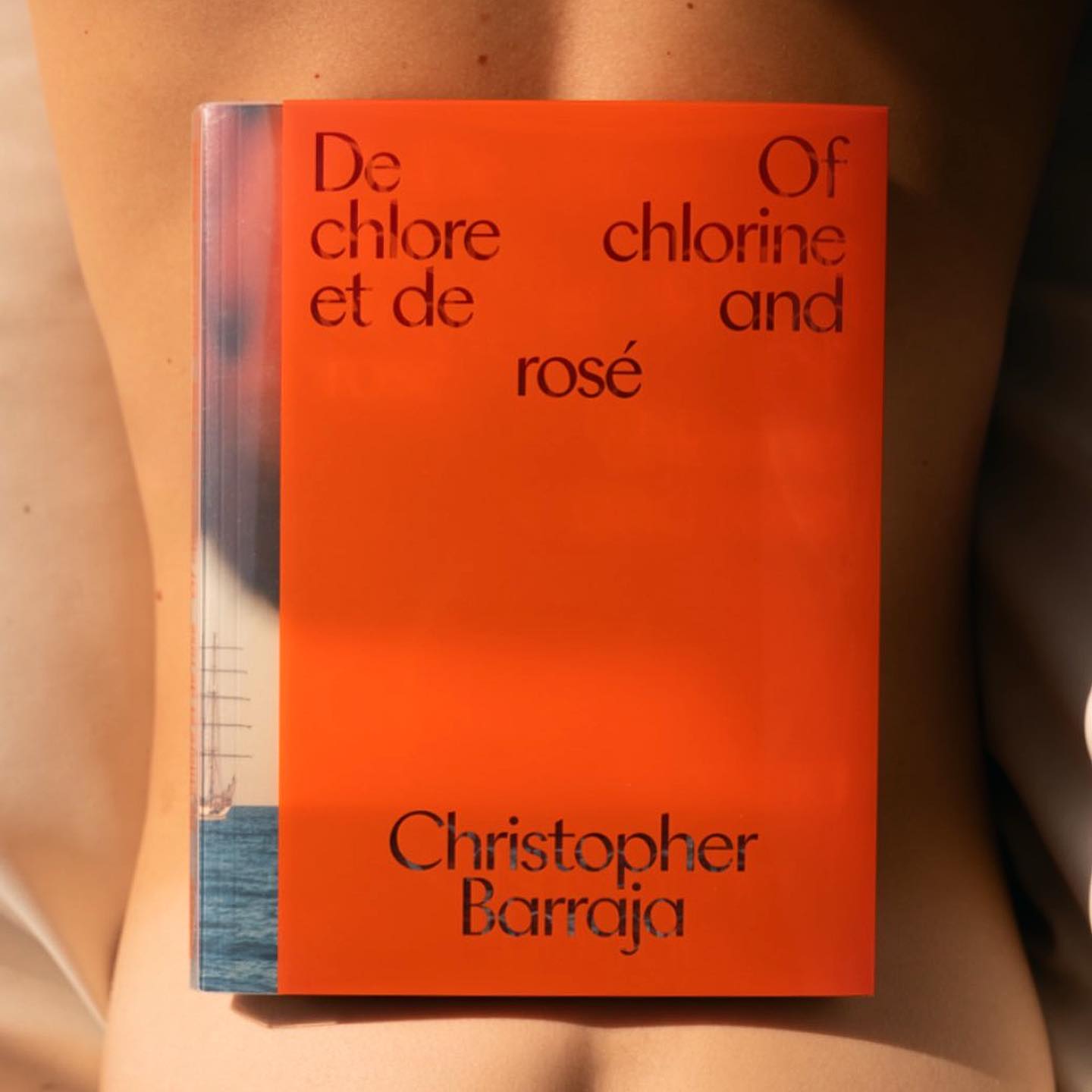
Atlantic by Heavyweight in “De Chlore et de Rosé”, photographer Christopher Barraja first book.
Foundry: Heavyweight Design: Bastien Forato
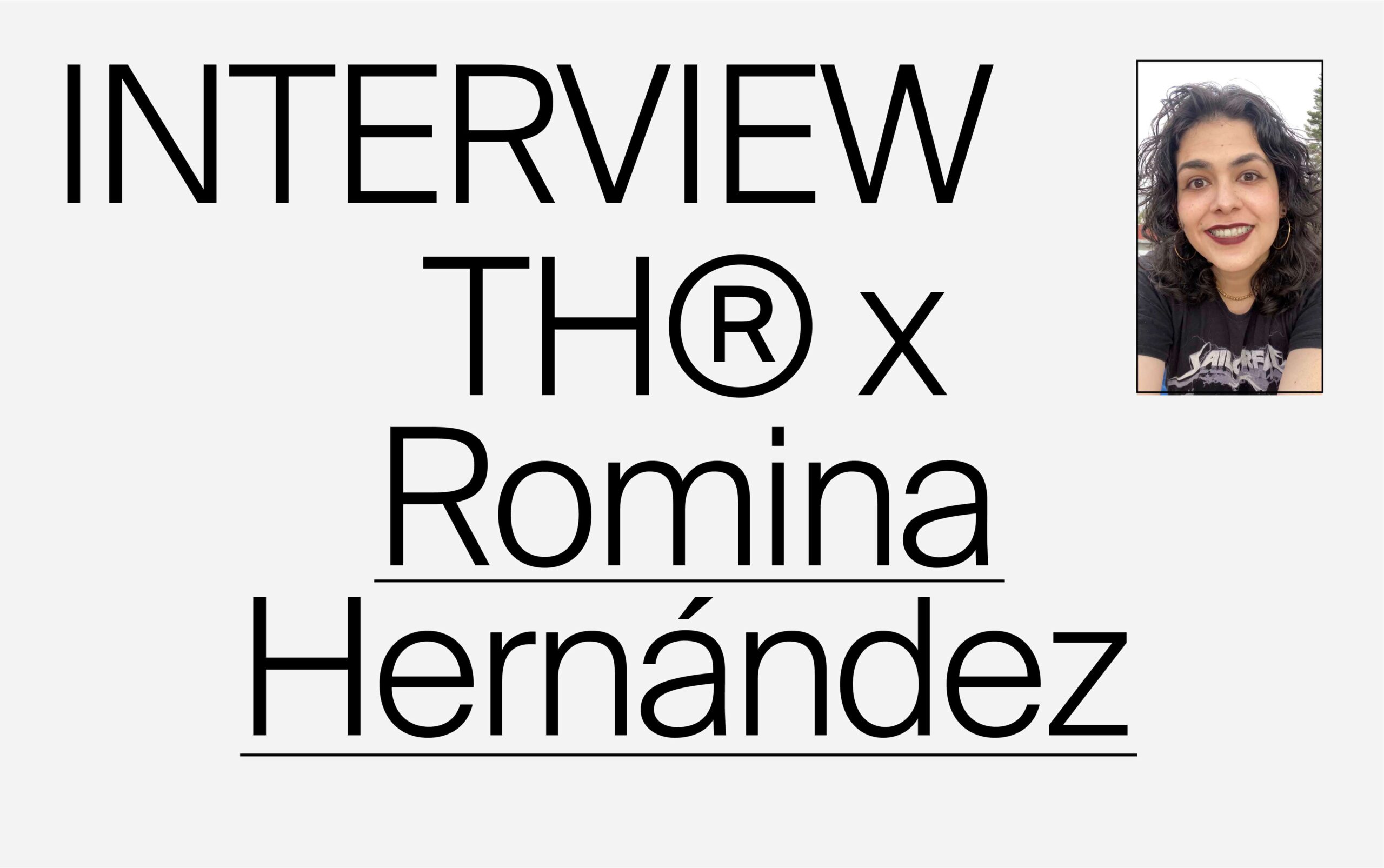
Can industrial design influence decisions in the typographic process? An interview with Romina Hernández.

Studio Bruch, with a custom made lettering and type design, developed the identity of the 1951 established carpentry company, Hea.
Type Design: Studio Bruch Type Studio: Hungarumlaut

A custom monolineal, script wordmark by Federico Sanchez for Interval, a multidisciplinary creative space working across texture, shapes and concepts.
Design: Federico Sanchez Foundry: Pangram Pangram
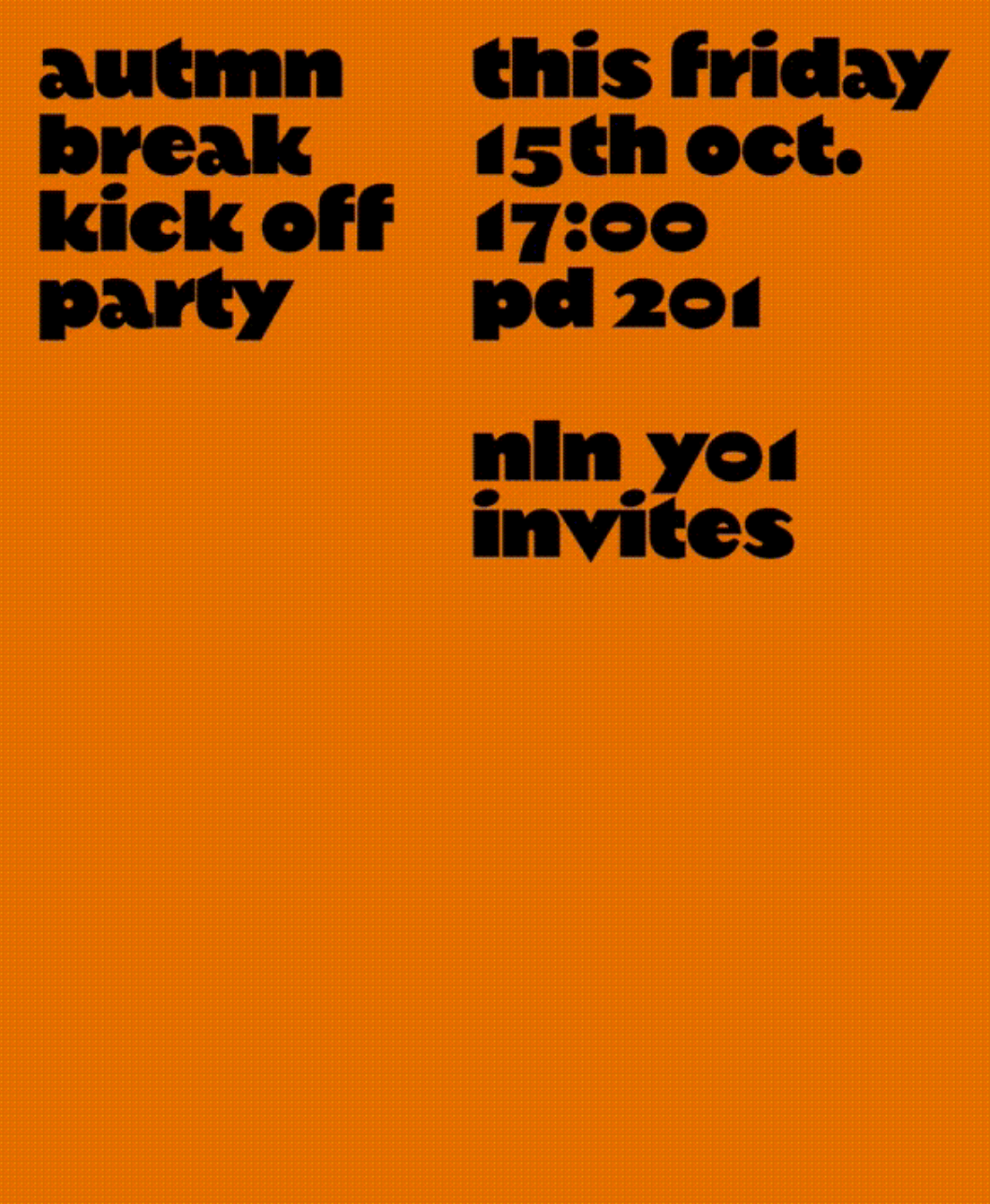
An autumn break party of students at KABK, using Margiel in their posters, a geometrical display font by Warsaw Types.
Foundry: Warsaw Types Design: Daniel Gremme

The humanist and geometric font Centra nº1 by Sharp Type in the full-service production, art buying & casting services company Yours.
Foundry: Sharp Type Design: Basora
A gritty and beautiful array of Kern’s favorite unpublished photographs, using AP Grotesk by All Purpose Fonts in its editorial design.
Foundry: All Purpose Fonts Design: Friend Editions, Oliver Shaw
ToTo Restaurant & Cafe rebranded with a custom typeface by a brilliant collaboration between Bogidar Mascarenas, Hagar Erez & Ark Visual.
Foundry: Bogidar Mascarenas Design: Hagar Erez, Ark Visual
An Iranian graphic design exhibition uses Selecta from Maxitype for its visual identity.
Get Selecta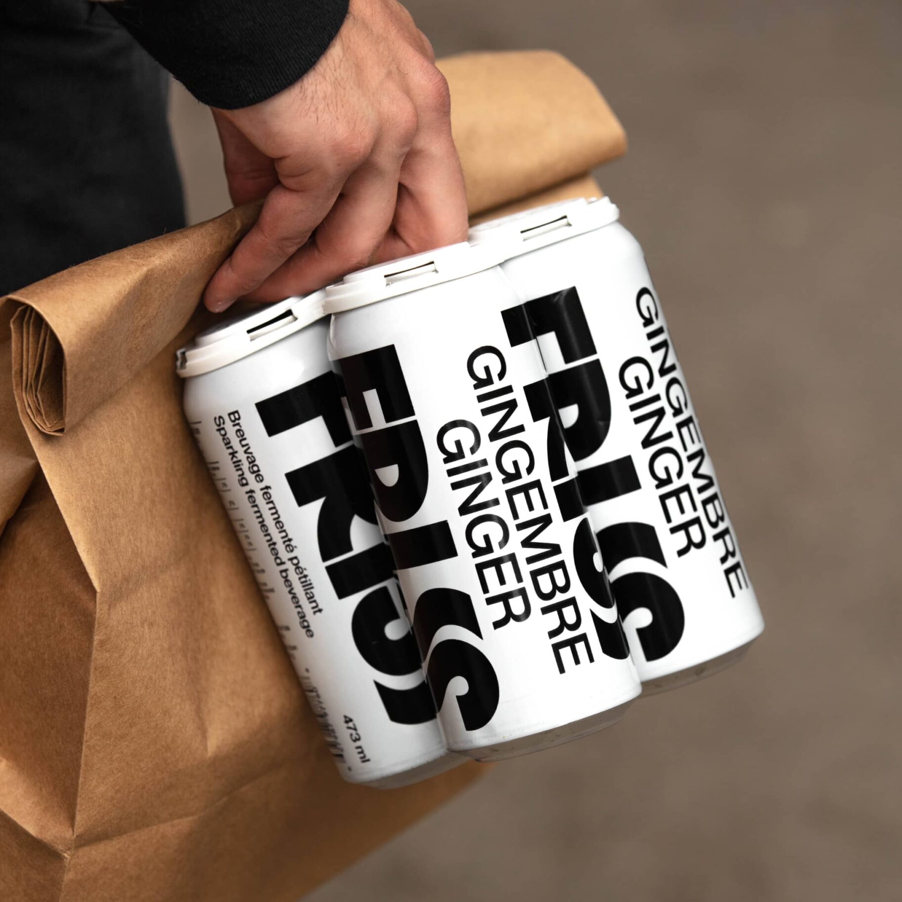
With a playful and minimalist approach, Friss Kombucha utilizes Herbus Bold to set itself apart from competitors.
Foundry: Eliott Grunewald Design: Monozygote

The Octagon is a multi-use building for spiritual practice and growth using a custom typeface developed by 26a1 and Daniel Wenzel.
Foundry: 26a1 Type Designer: Daniel Wenzel

Arizona Flare by Dinamo in the identity of Guild, a new corporate that serves as a bridge between education and employment.
Get Arizona
A winning combination of fonts from ABC Dinamo, Walter Neue and Simon Mono for Satisfy Running x Oakley.
Foundry: Dinamo Design: Actual Source

Geometric and heavy, Skrappa appears as a contrast in the visual identity of Arts Broadcasting Studio at Anteism.
Foundry: Wise Type Design: Juliette Duhé

Sylvan Lanz designed a custom variable font, for soccer Swiss team FC Basel, based on the typographic heritage of the city.
Type Designer: Sylvan Lanz

Omnigroup and Dávid Molnár teamed up in the creation of a custom serif typeface for Swiss literature foundation Jan Michalski.
Foundry: Omnigroup Type Designer: Dávid Molnár

A hand-drawn logo, featuring Mabry and ITC Galliard, in the identity created by Studio Lotta Nieminen for Eadem, a skincare brand.
Design: Studio Lotta Nieminen Foundry: Colophon
A series of posters by different designers showcasing the versatility of DelCentro, a typeface by Israel Hernández.
Type Designer: Israel Hernández

HM Move is a monolinear typeface, full of movement, designed by Colophon Foundry and Gentle Forces for a new clothing line dedicated to exercise.
Foundry: Colophon Foundry Design: Gentle Forces
OMSE and Family Type collaborated to give live to China’s first craft gin with a custom logo and typeface.
Design: Omse Foundry: Family Type
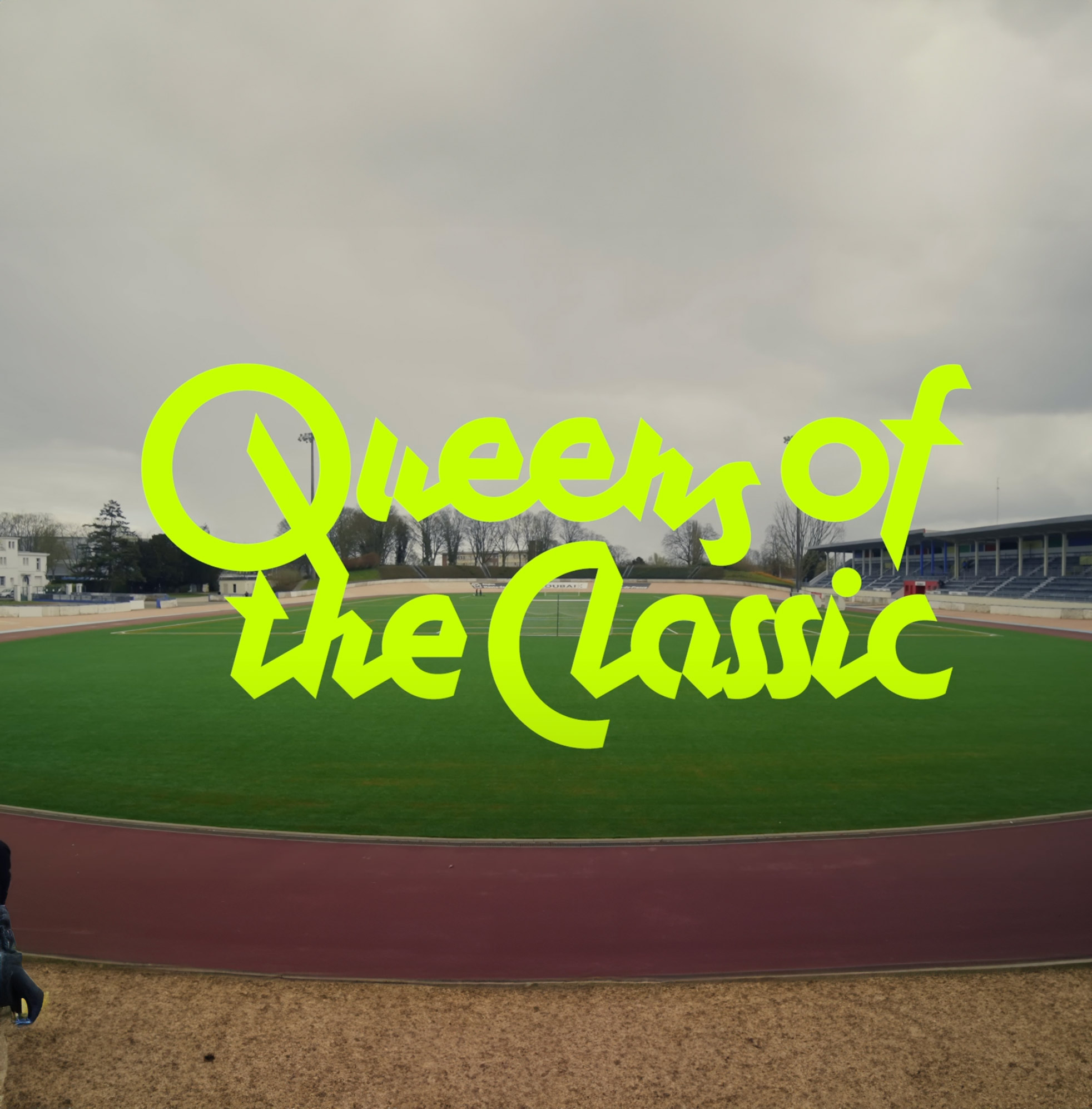
Monaako Script by Altiplano featured in Rapha’s film “Queens of the Classic”.
Foundry: Altiplano
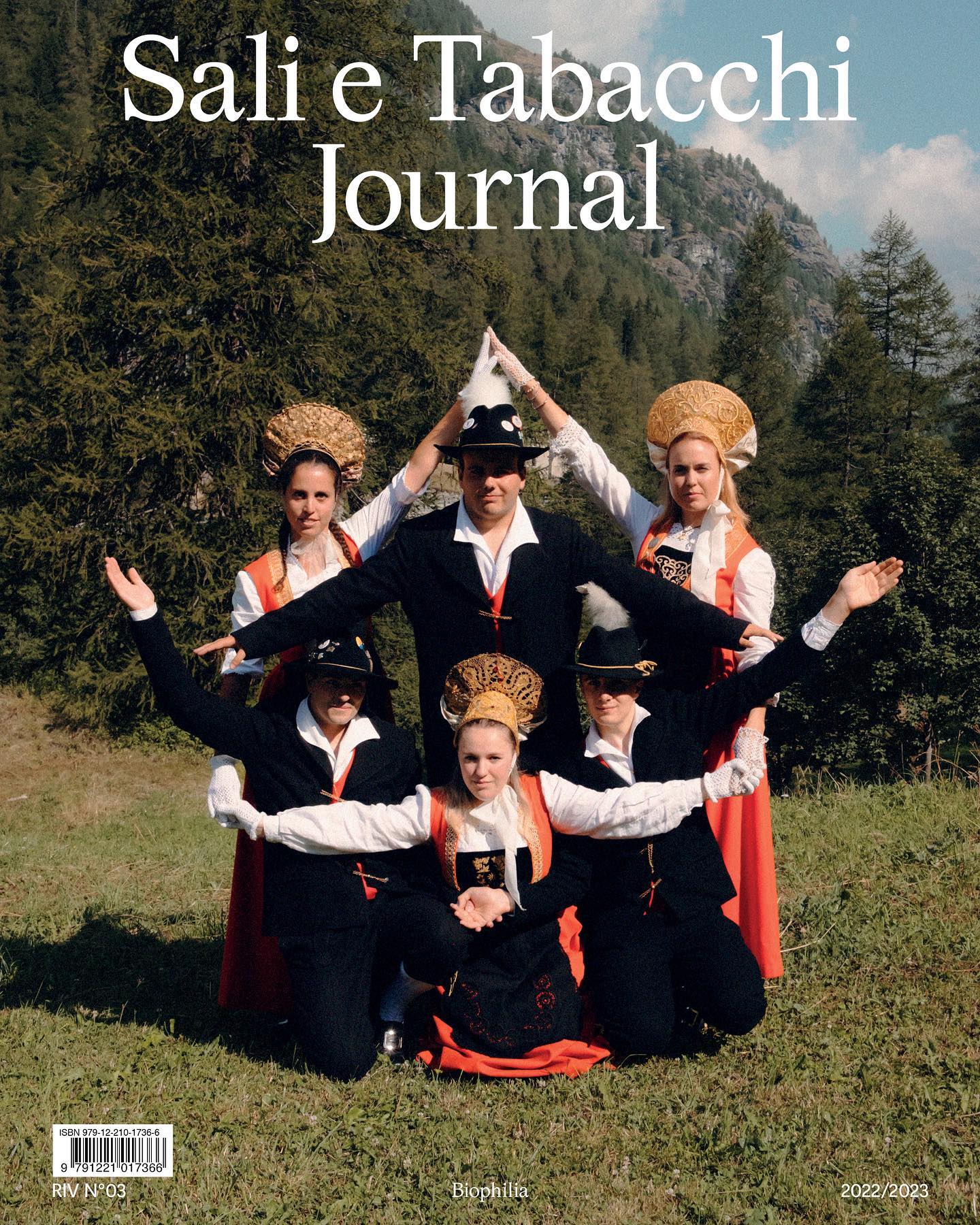
Magister from Omni Type, in the latest Covers of the issue Sali e Tabacchi. Designed by Leonardo Pellegrino.
Foundry: Omni Type Design: Leonardo Pellegrino
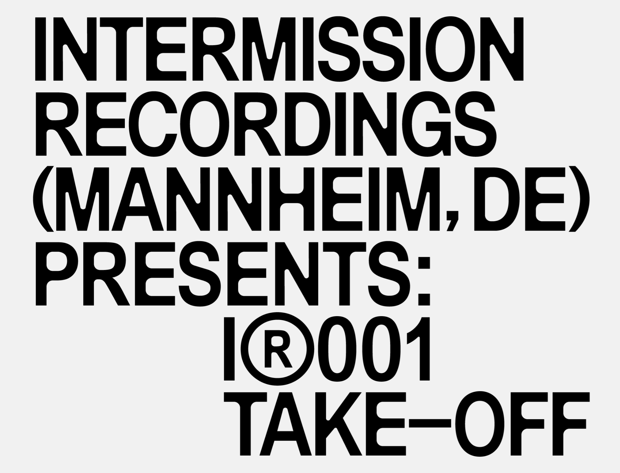
Jose Houdini & Adrián Zorzano designed a custom typography, logotype and cover artworks for the record label Intermission.
Design: Jose Houdini, Adrián Zorzano
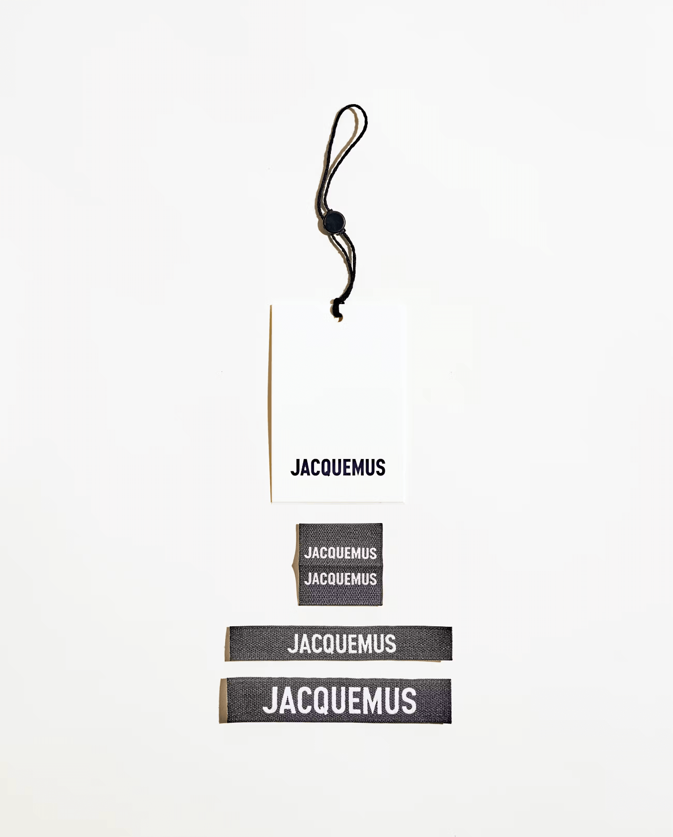
Guillaume Sbalchiero designed a warm sans serif typeface, as well as the global identity for Jacquemus.
Design: Guillaume Sbalchiero

CF Panoptik, a font from Fonts.gr, used in the branding, signage, and communication of The Twenty One, a luxury hotel located in Athens.
Foundry: Fonts.gr Design: Marlon Tate

Rhetorik by All Caps in the issue n.27 of Swiss magazine Zweikommasieben
Design: Dorothee Dähler Foundry: All Caps
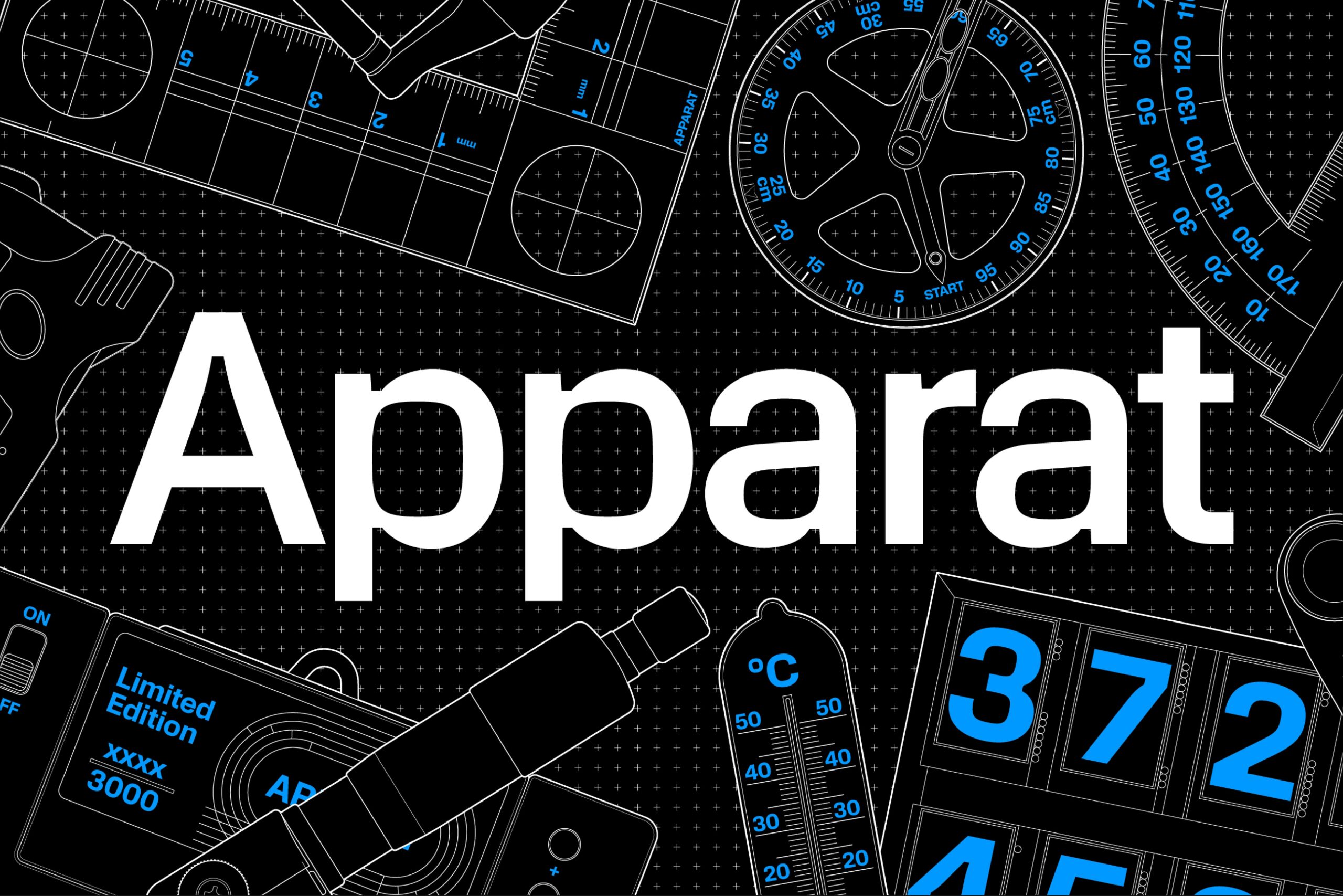
Square or rounded? Maybe both. Apparat is a typeface with an interesting interplay between its shapes and counters, inspired by the fonts of 1970s television.
Type Designers: Michael Clasen, Marcel Saidov Foundry: Kimera
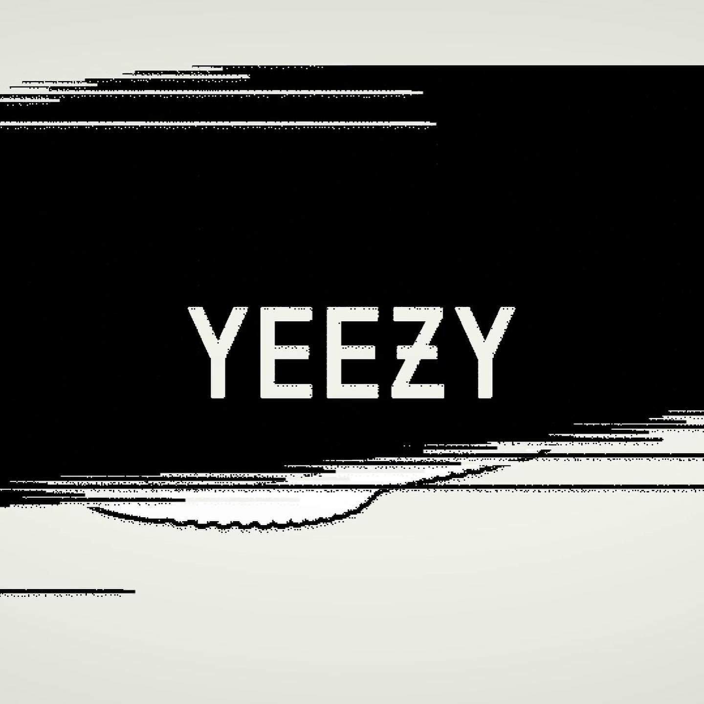
Some years ago, H5 Studio developed the visual identity including a custom font for iconic Kanye’s Yeezy brand.
Type and design: H5

Codea Studio in the creation of a bespoke, expressive typography for the restaurant located in Girona, Mas Sorrer.
More of Codea Studio
Rebranding led by a custom-designed logo for consulting agency EIXO, developed by Sao Paolo-based Studio Tempo.
More about Studio Tempo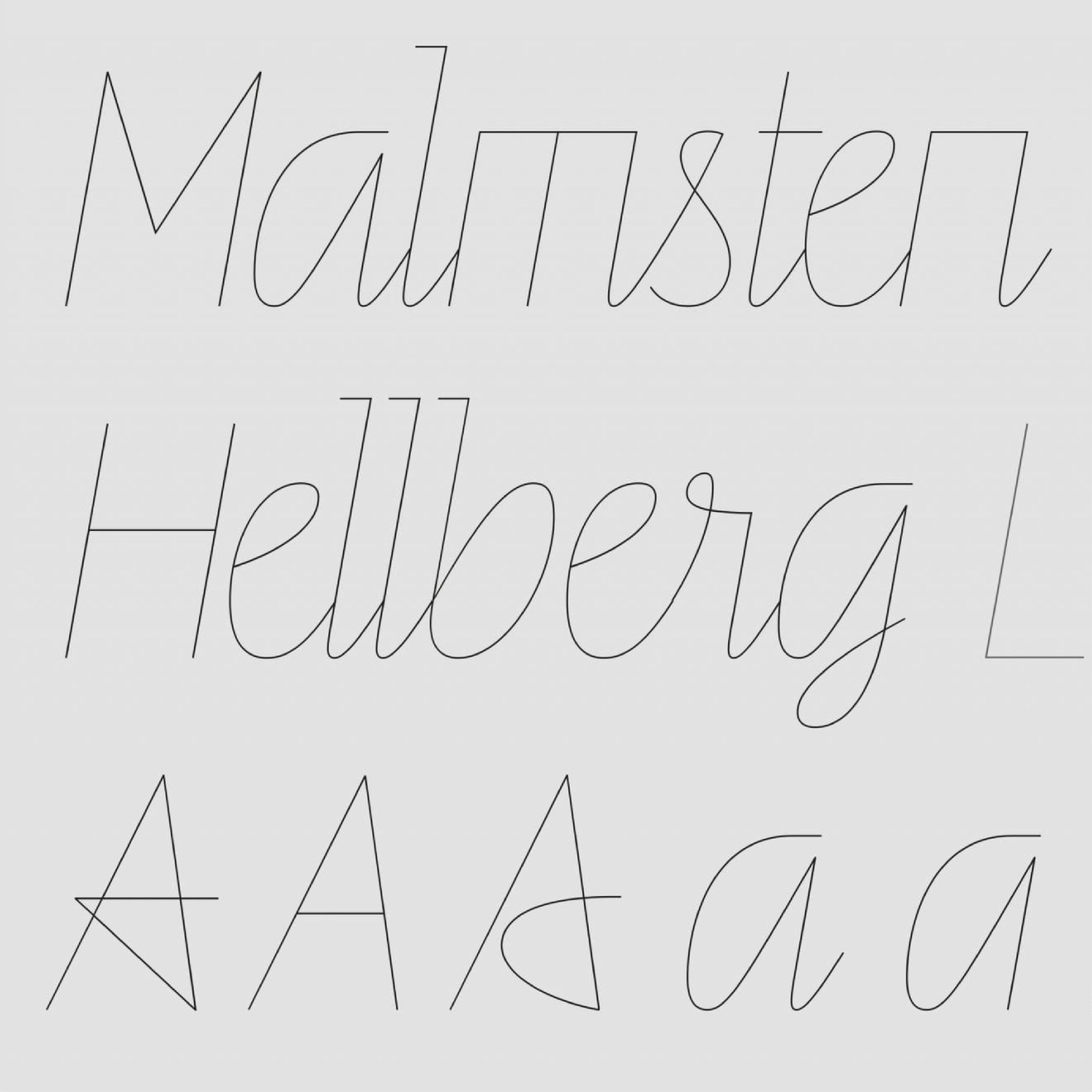
Ten years ago, a unique script typeface, Line, was designed by Göran Söderström and Stefania Malmsten for Rodeo Magazine.
Foundry: Letters From Sweden Design: Malmsten Hellberg,
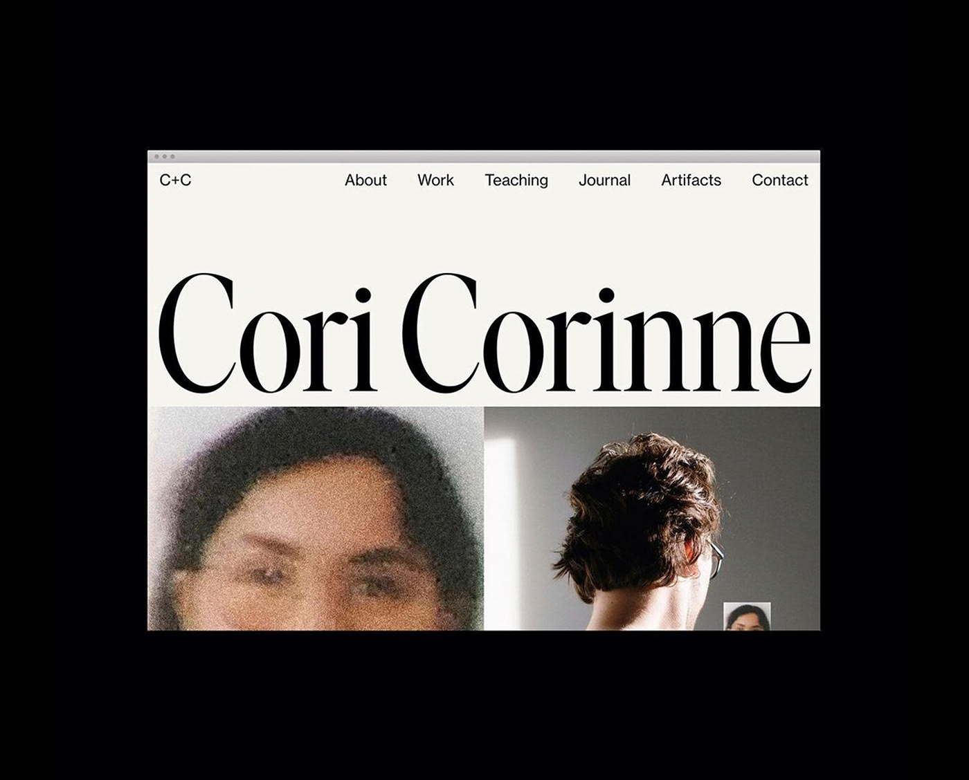
Ivar Display Condensed and Neue Haas Grotesk used in the web portfolio of designer Cori Corinne
Design: Cori Corinne Foundry: Letters From Sweden

Signal Compressed by Emmanuel Besse as part of Production Type catalogue, in Levi’s Performance Denim, a hand-stitched, limited edition publication designed by Leon Romero.
Typography: Emmanuel Besse, Production Type Design: Leon Romero

Keeps Sans is a bespoke display typeface Parker Studio designed as part of the visual identity of Keeps, sustainable furniture.
More of Parker Studio
Schick Toikka’s Krana Fat for nostalgic, cartoon-inspired chips brand, Miett.
Foundry: Schick Toikka Design: Deux Huit Huit

Holise, Neue Helvetica and Ryumin in The Suitcase book design by Jiating Shi.
Type Design: Ines Davodeau Design: Jiating Shi
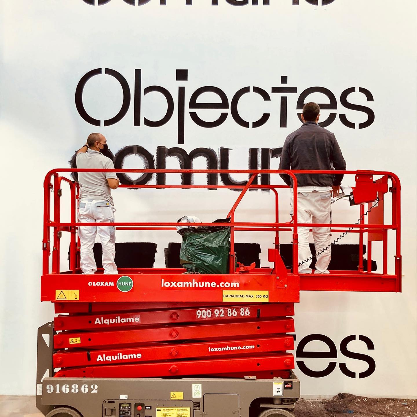
Museu del Disseny used Maxeville from SM Foundry in the exhibition Objetos comunes. Designed by PFP Disseny.
Foundry: SM Design: PFP Disseny

Custom wordmark created by Alex Hunting Studio for Wool (new scandinavian classics). Complementary typefaces GT America by Grilly Type and Noe by Schick Toikka.
Wordmark: Alex Hunting Studio Foundries: Grilly Type, Schick Toikka.
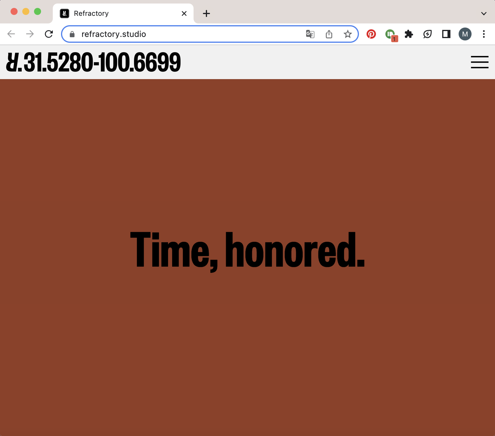
Jeremy Matthews designed the identity for the furniture, lighting and object design studio Refractory, using Founders Grotesk by Klim Type Foundry.
Foundry: Klim Type Foundry Design: Jeremy Matthews
New approaches to typography creation in an industry with greater opportunities and challenges.

Olssøn Barbieri used Cheltenham by Bitstream and Ostia Antica by Bureau Brut in its identity for urban cheese factory Stavanger Ysteri in Norway.
Foundry: Bitstream Design: Olssøn Barbieri

A straight forward logo designed with semi-circle lines by Manual, for Louisa Parris womenswear label.
More of Manual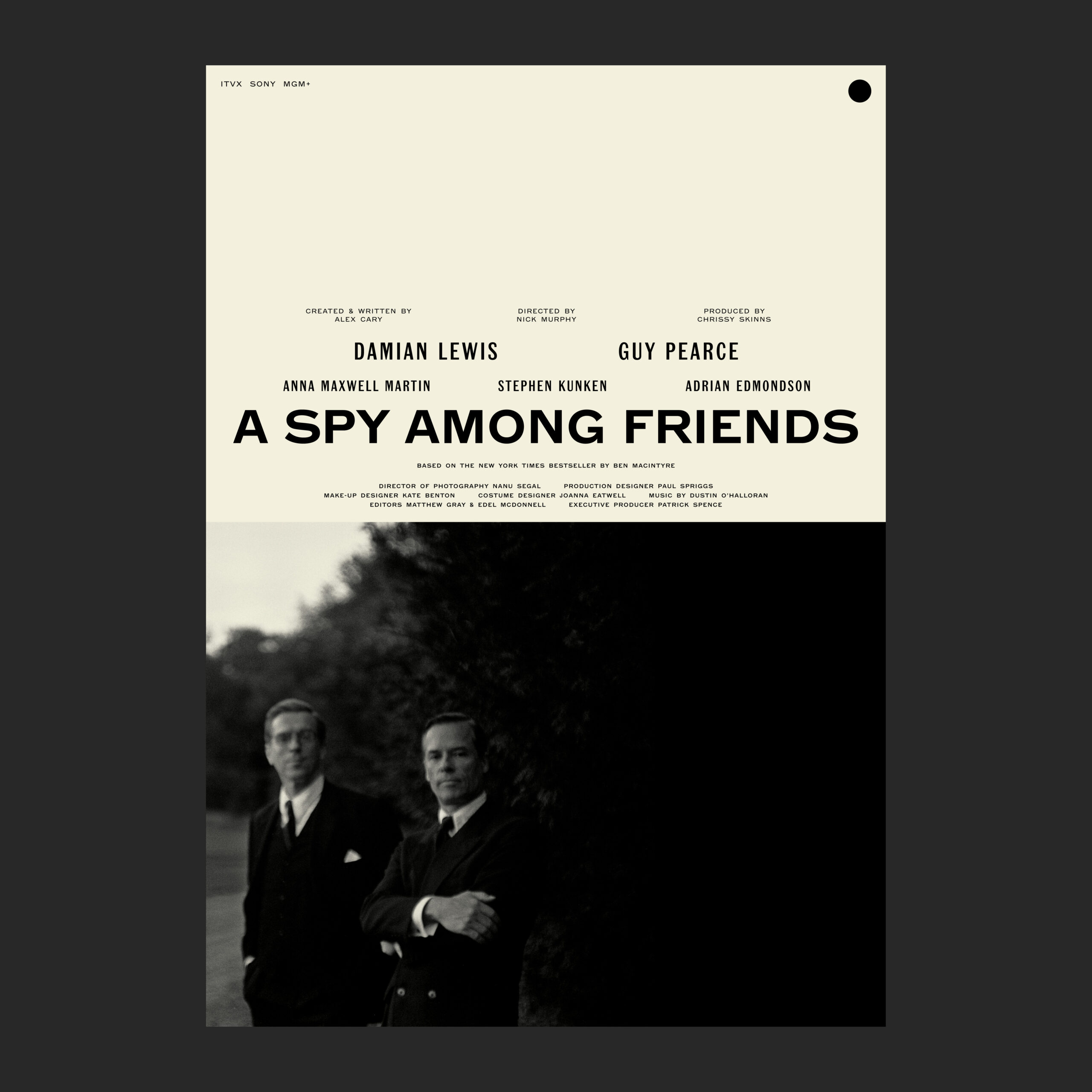
A Spy Among Friends poster using Microscopic and Popular typefaces by A2-TYPE. Design by Matt Willey.
Foundry: A2-TYPE Design: Matt Willey

Karl, a typeface designed by Laurenz Brunner used in the artists’ network Hot Little Pool. Graphics by Anne Büttner. Karl is part of the Source Type catalog.
Type: Laurenz Brunner, Source Type. Design: Anne Büttner

Contemporary Art Fair, Plural, designed by Principal Studio, using Pantasia by Wei Huang, and Rhymes by Jakub Samek for Maxitype, on their website and communications.
Foundries: Counter Forms, Maxitype Design: Principal Studio

Murs à fleurs identity reunites two generations of type designers by using Trabis and Francesco fonts, designed by student and teacher.
Fonts: Francesco, Trabis Design: Maison Solide

Gill Sans Ultra Bold Condensed as a contrast to heavy serif wordmark for giant sandwich shop. By TRiC Studio
Type Designer: Eric Gill Design: Tric Studio
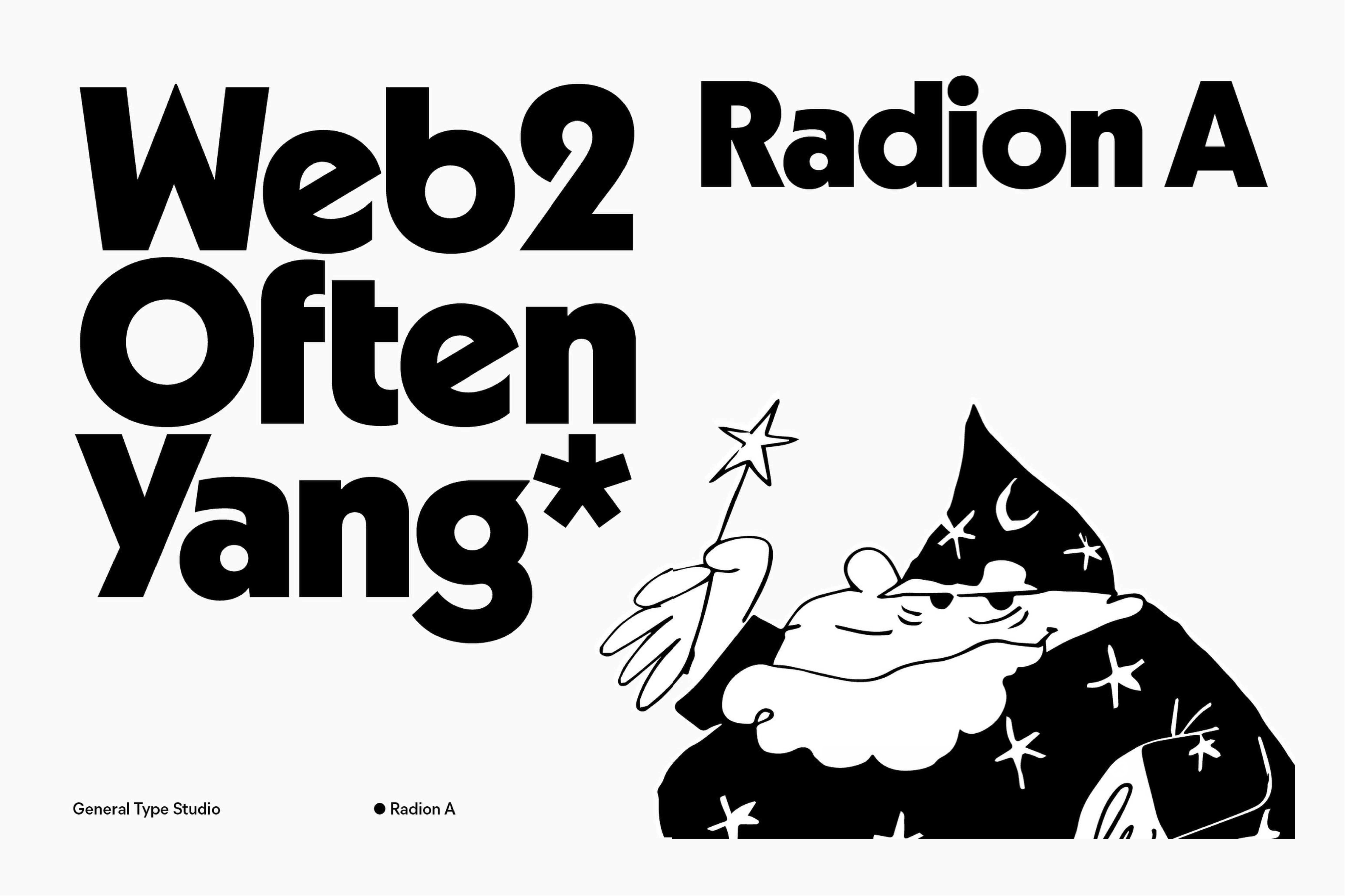
Radion, a typeface family that showcases the ongoing practice of reinterpretations and revivals that enhance fonts from the past century.
Locals, a cozy coffeeshop located in Amsterdam, using System Blank by Frost Type.
Foundry: Frost Type

Naranjo Etxeberria in charge of the identity and custom font “Rise” for Stine Goya fashion brand.
Type design and identity: Naranjo Etxeberria

Letterjuice colaborated with Decimal Studios to create a type system for their rebranding.
Foundry: Letterjuice Studio: Decimal
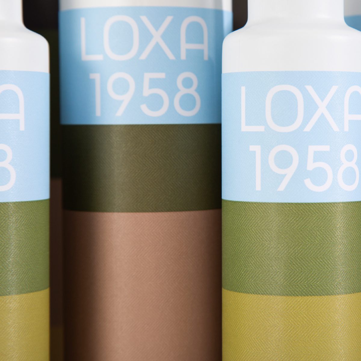
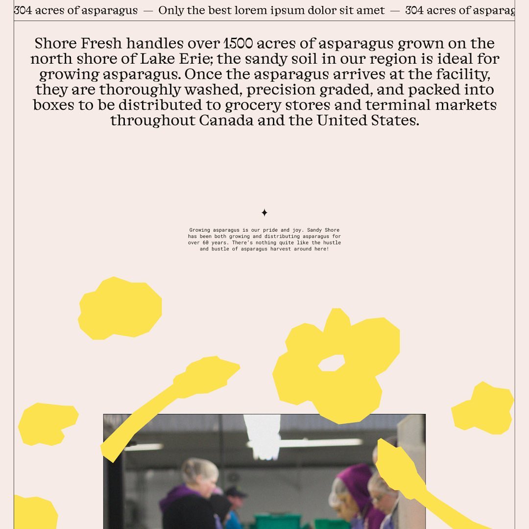
A Decó sign as the inspiration for anamoliz’s custom type for Loxa, an agricultural cooperative in Granada with over 60 years of history.
Type Designer: Ana Moliz Design: Buenaventura
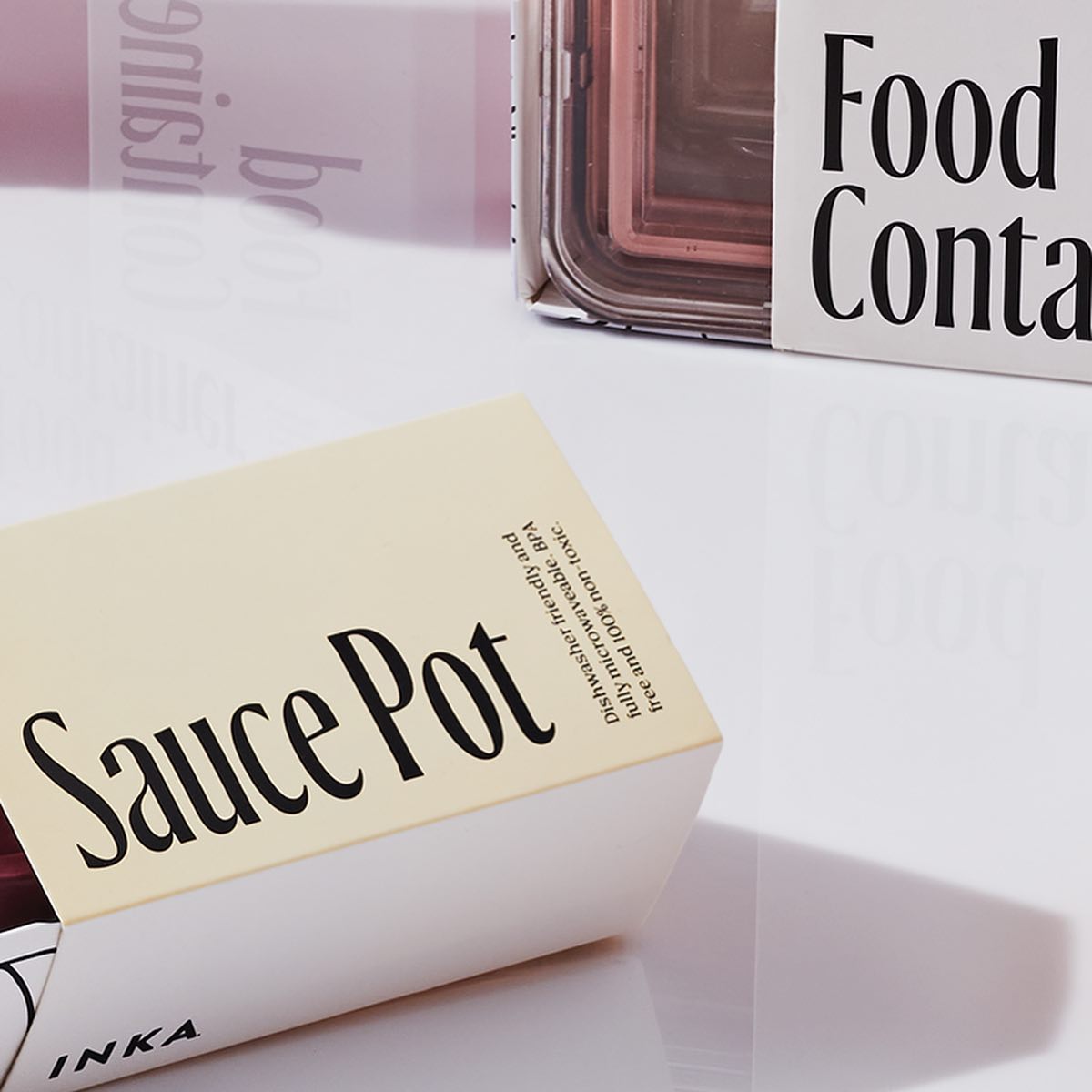
For Inka.world, Ayer deck by Miguel Reyes, part of Commercial Type’s catalog. Elizabeth Goodspeed behind the design.
Foundry: Commercial Type Type designer: Miguel Reyes Design: Elizabeth Goodspeed
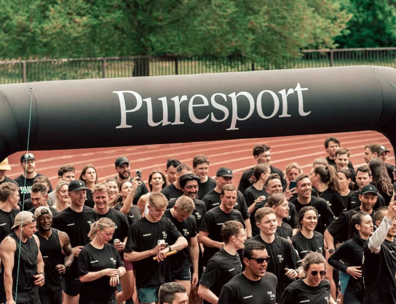
Tiempos by Klim Type Foundry, the world’s first range of natural products for drug-tested athletes, Puresport. Designed by Field of Play.
Foundries: https://klim.co.nz/ Design: https://fieldofplay.studio/

Global rebranding for Théâtre national de la Danse, by Zoo Designers Graphiques, using Lineto’s Supreme Display.
Foundry: Lineto Design: Zoo Designers Graphiques

Mesobis, a cannabis-loving creatives community using Right Grotesk by Pangram Pangram.
Foundry: Pangram Pangram Design: Andrés Higueros
Agipo, Futura and Bradford in the new brand platform designed by Wedge for famous Canadian store, Indigo.
Foundries: Radim Pesko, Paul Renner, Lineto Design: Wedge

Midnight by Colophon Foundry, perfectly fitting in the identity Porto Rocha conceived for the comedy event “Netflix is a Joke”.
Foundry: Colophon Foundry Design: Porto Rocha

For Terravinyada, Atipus created a logo using Reckless by Displaay Type Foundry.
Get Reckless
Rounded and groovy characters by Fonts from Folch in the logotype made for a decentralized contemporary art collection, Salon.
Foundry: Fonts from Folch Design: Folch
The relationship between functionality and aesthetics as a daily practice of Non Foundry.
Release date: May 9 2023
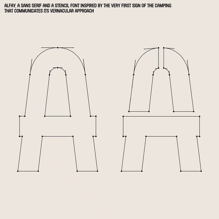
Alfey, the main typeface of Camping Alfacs’ new identity, inspired by the signage the brand had since its beginnings.
Typeface and identity: Leon Romero

Bodigarmascarenas’ WIP preview of Ager font, inspired in cnc machine and heavy machinery.
Type designer: Bodigar Mascareñas
On Running capsule collection in Animo typeface by Heavyweight.
Foundry Heavyweight Design ActualSource

HC Grotesk as a customized version of RT Alias Grotesk for THC NYC cannabis experience.
Foundry Razzia Type, Design Base

Dinamo’s Favorit announcing CDG showcase at Berlin.
Foundry Dinamo, Design Flavious Augustin.